 Login
Login
容器销毁后能否提取容器内标准输出的日志?
13 March 2026 at 16:17
答案是:不能。 应急响应中经常遇到的一类场景,容器内服务有漏洞,但是出事的容器被销毁重建了,此时应急取证需要提
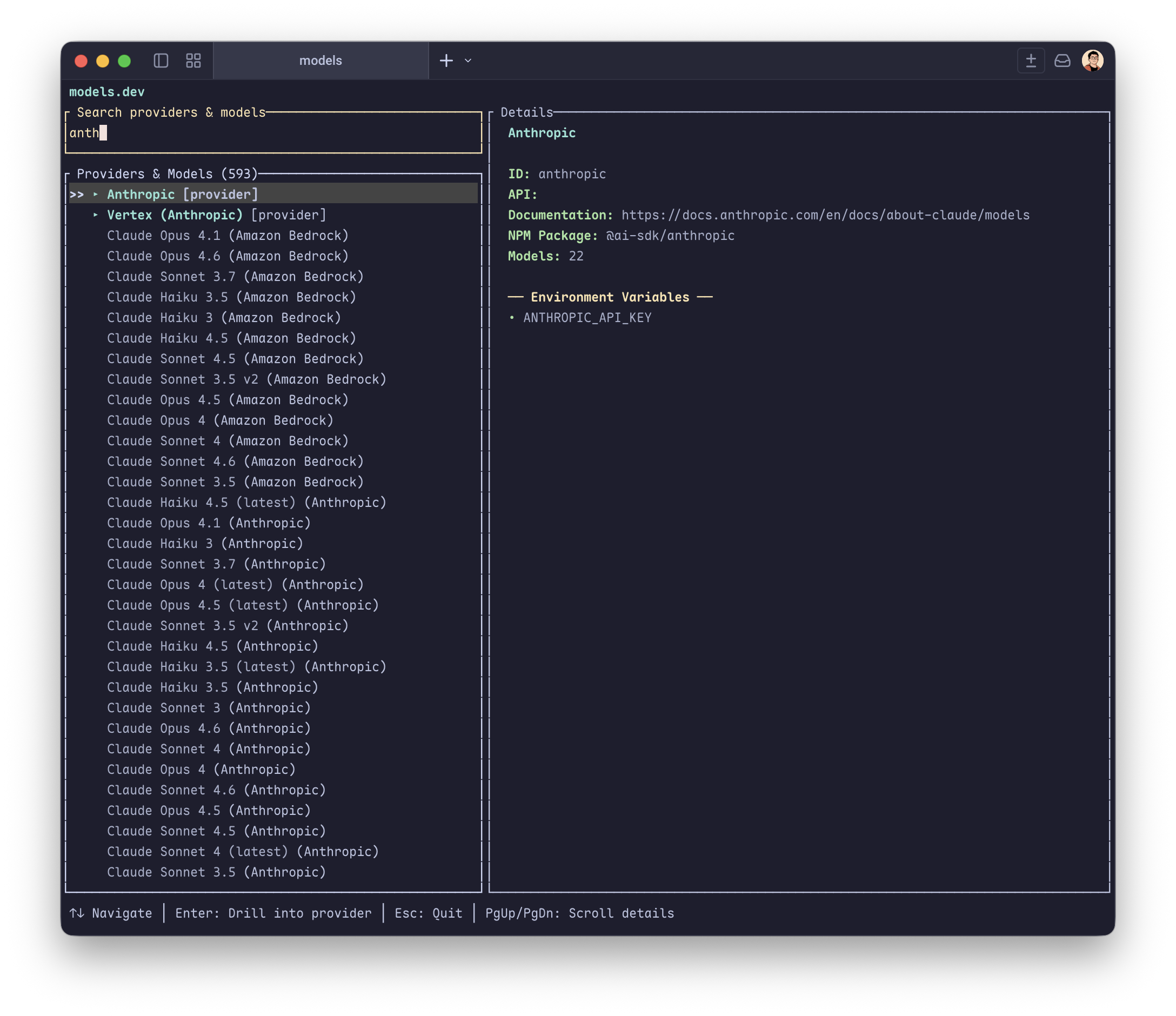
models.dev 是一个很棒的网站,但是随着模型越来越多网站的性能变得越来越糟糕。这个命令行工具读取 models.dev 维护的数据库,提供模糊搜索和信息查看。
Loading preview...brew install geekdada/tap/models
models软件打开之后即可开始在供应商和模型中进行混合搜索。
同时命令行也提供了模糊搜索的功能。模糊搜索是基于供应商名称和模型名称进行模糊搜索。
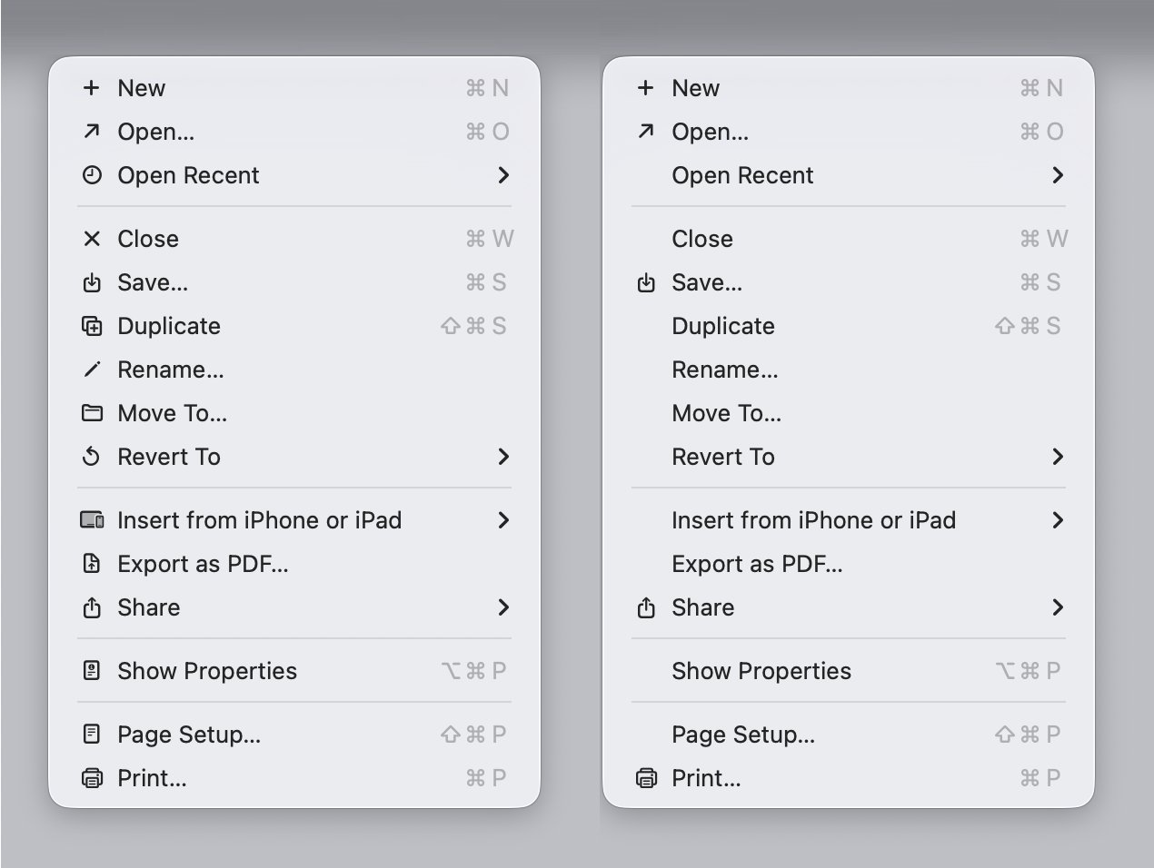
Tahoe 的右键菜单里多了一些莫名其妙的图标,看着碍眼。一行命令关掉:
defaults write -g NSMenuEnableActionImages -bool NO来源:
macOS 窗口边缘的拖拽区域一直很窄,经常对不准。可以通过这个命令增大外侧的可点击区域:
defaults write -g AppleEdgeResizeExteriorSize 8现在各大 Linux 发行版很多都变成 systemd 的形状了,连 Synology DSM 7 都开始用 systemd 了,可以说是 Learn once, operate anywhere。不过有时候还是要在 Mac 机器上部署一些服务,需要用到 launchd/launchctl。
本文以一个熟悉 systemd/systemctl 工具的运维视角,整理了常用的 launchd 相关命令备忘。(说实话我每次都会忘记怎么用,然后得去翻手册……而且网上有时候还会教你用 load/unload 子命令,这些其实都已经标记为过时了,有新的命令替代它们)
launchctl list# 类比 systemctl list-unitslaunchctl print gui/501/uploadserver# -> ~/Library/LaunchAgents/uploadserver.plistlaunchctl print system/com.openssh.sshd# -> /System/Library/LaunchDaemons/ssh.plist# 类比 systemctl status uploadserver.service# -> /etc/systemd/system/uploadserver.service这里的 system/ gui/501/ 叫做 domain-target,com.openssh.sshd 和 uploadserver 叫做 service-name,合起来之后叫做 service-target。service-name 一般就是下面 .plist 配置文件中的 Label。
其中 system/ 顾名思义就是系统级的,system domain,需要 root 权限才能修改。而 gui/501/ user/501/ 则是用户级的 user domain,其中 501 就是用户 uid。gui/<uid>/ 和 login/<asid>/ 下的服务只有用户登录了才会运行。
通常来说需要 GUI 运行的放在 gui/<uid>/ 下面,不需要的放在其他下面。不过考虑到 macOS 作为桌面操作系统的特性,其实一股脑都放 gui 下面也没啥问题。
launchctl bootstrap gui/501 ~/Library/LaunchAgents/uploadserver.plist# 或者系统级的服务,需要 sudo 运行sudo launchctl bootstrap system /Library/LaunchDaemons/com.example.plist# 类比 systemctl start uploadserver.service# 不需要 systemctl daemon-reload如果 bootstrap 提示下面的报错,就说明很可能是服务器已经在运行了,或者服务被 disable 掉了:
Bootstrap failed: 5: Input/output errorTry re-running the command as root for richer errors.launchctl bootout gui/501 ~/Library/LaunchAgents/uploadserver.plist# 或者系统级的服务,需要 sudo 运行sudo bootout bootstrap system /Library/LaunchDaemons/com.example.plist# 除了 .plist 文件路径,也可以用 label 指定launchctl bootout gui/501/uploadserver# 类比 systemctl stop uploadserver.service如果 bootout 提示下面的报错,就说明很可能是服务本来就没有在运行:
Boot-out failed: 3: No such processlaunchctl kickstart -k -p gui/501/uploadserver# service spawned with pid: 17247# 参数:# -k 如果服务已经在运行了,先杀死现有的进程再重启# -p 成功后输出进程的 PID# 类比 systemctl restart uploadserver.service如果 kickstart 提示下面的报错,就说明服务没有 bootstrap:
Could not find service "uploadserver" in domain for user gui: 501一般来说你的 .plist 里配置了 RunAtLoad 的话,bootstrap 了之后默认就是开机启动的,不需要再 enable 一遍。
不过你也可以通过 disable 主动关闭服务的开机启动,这个是否 enable 的状态是 launchd 自己维护的,不会更改 .plist 文件的内容。使用 disable 禁止开机启动之后,想要恢复开机启动就需要用 enable。
launchctl enable gui/501/uploadserver# 类比 systemctl enable uploadserver.servicelaunchctl disable gui/501/uploadserver# 类比 systemctl disable uploadserver.service类似于 systemd 的 Unit File,以 .plist/XML 文件的形式存在:
~/Library/LaunchAgents Per-user agents provided by the user./Library/LaunchAgents Per-user agents provided by the administrator./Library/LaunchDaemons System-wide daemons provided by the administrator./System/Library/LaunchAgents Per-user agents provided by Apple./System/Library/LaunchDaemons System-wide daemons provided by Apple.通常来说我们只会用到前三个。Daemon 和 Agent 的区别:
这里以 ~/Library/LaunchAgents/uploadserver.plist 为例:
<?xml version="1.0" encoding="UTF-8"?><!DOCTYPE plist PUBLIC "-//Apple//DTD PLIST 1.0//EN" "http://www.apple.com/DTDs/PropertyList-1.0.dtd"><plist version="1.0"><dict> <key>KeepAlive</key> <true/> <key>Label</key> <string>uploadserver</string> <key>LimitLoadToSessionType</key> <array> <string>Aqua</string> <string>Background</string> <string>LoginWindow</string> <string>StandardIO</string> <string>System</string> </array> <key>ProcessType</key> <string>Background</string> <key>ProgramArguments</key> <array> <string>/opt/homebrew/bin/uvx</string> <string>uploadserver</string> <string>8888</string> <string>-d</string> <string>/tmp/upload</string> </array> <key>RunAtLoad</key> <true/> <key>EnvironmentVariables</key> <dict> <key>FOO</key> <string>BAR</string> </dict> <key>StandardErrorPath</key> <string>/tmp/uploadserver.log</string> <key>StandardOutPath</key> <string>/tmp/uploadserver.log</string> <key>TimeOut</key> <integer>5</integer></dict></plist>类比 /etc/systemd/system/uploadserver.service:
[Unit]Description=Upload ServerWants=network-online.targetAfter=network-online.target[Service]ExecStart=/root/.local/bin/uvx uploadserver 8888 -d /tmp/uploadRestart=alwaysRestartSec=5Environment="FOO=BAR"StandardOutput=file:/tmp/uploadserver.logStandardError=file:/tmp/uploadserver.log[Install]WantedBy=multi-user.target具体怎么写就不多说了,大部分开机自启 + 守护进程需求用上面的模板就够了,有其他需求的直接看文档。
名字基本可以随便取。另外注意有多个命令行参数的话,要拆成多个 <string>。
现在很多教程里还在用 load/unload,不过在 macOS 10.11 之后,官方手册中已经不再推荐使用这些老的命令,应该使用上面的命令替代。
另外一点需要注意的是,load/unload 通过执行 launchctl 命令时的权限来决定 domain。如果使用 sudo launchctl 执行的,算作 system domain,否则算作 user domain。之前被坑过一次……💩
launchctl load ~/Library/LaunchAgents/uploadserver.plist# 应该替换为 launchctl bootstrap gui/501 ~/Library/LaunchAgents/uploadserver.plistlaunchctl load -w ~/Library/LaunchAgents/uploadserver.plist# 相当于先 enable 再 bootstraplaunchctl unload ~/Library/LaunchAgents/uploadserver.plist# 应该替换为 launchctl bootout gui/501 ~/Library/LaunchAgents/uploadserver.plistsudo launchctl load /Library/LaunchDaemons/com.example.plist# 应该替换为 sudo launchctl bootstrap system /Library/LaunchDaemons/com.example.plistsudo launchctl unload /Library/LaunchDaemons/com.example.plist# 应该替换为 sudo bootout bootstrap system /Library/LaunchDaemons/com.example.plist推荐 Lingon X,有点像以前 Windows 上的那种开机进程管理,可以查看当前系统上有哪些 Agent/Deamon,以及它们的配置,挺方便的。
我记得以前 macOS 设置页面里的启动项管理很垃圾,只能显示部分启动项,但实际上程序想要开机自启有很多种方法:
SMLoginItemSetEnabled)~/Library/LaunchAgents or /Library/LaunchAgents)/Library/LaunchDaemons)搞得有些流氓软件开机自启了你都不知道,比之 Windows 还不如。当时我还准备写篇博客,在不安装第三方清理软件的情况下如何删除这些启动项,但后来不了了之了。
不过好在后来的 macOS 更新把这块的管理补上了,现在在设置页面就可以直接管理上面那些方式添加的启动项,挺好。
使用成品 NAS,在相对省心的同时,也意味着更低的自由度。很多自定义操作都是在和这些定制化 OS 斗智斗勇。
本文介绍了在 QNAP 威联通 NAS(以及 Synology 群晖 NAS)上关闭 ssh 密码登录,仅允许密钥登录的方法。Synology 相对还好,对 OpenSSH 的魔改不多,和普通 Linux 一样修改 /etc/ssh/sshd_config 就好了。
但是 QNAP 这个 B,每次启动 sshd 服务都会重新生成配置,直接修改上述配置文件是没法持久化保存的。
为了避免你被锁在门外,修改自带 sshd 配置之前,最好自己再起一个 ssh 服务,等确认 OK 了之后再关掉。以及最重要的,做好备份!
sudo opkg install dropbearsudo dropbear -F -p 9922 -P /opt/var/run/dropbear.pid -R -w -E如果你不幸已经进不去系统了,可以这样自救(别问我为什么知道🤣):
/etc/init.d/services: rescue-tmp: image: ubuntu:latest container_name: rescue-tmp stdin_open: true tty: true command: /bin/bash volumes: - /etc/init.d:/work⚠ 改文件之前做好备份!
执行 sudo vim /etc/ssh/sshd_config,修改:
PubkeyAuthentication yes ChallengeResponseAuthentication no-PasswordAuthentication yes+PasswordAuthentication no然后 sudo synosystemctl restart sshd.service 重启 sshd 生效,或者在 DSM Web UI 上关闭「启动 SSH 功能」后再打开也可以。
值得一提的是,直接修改 sshd_config 中的 Port,会导致 sshd 监听在两个端口上,一个是 Web UI 上设置的「SSH 端口」,一个是配置文件中配置的端口,而且后者是无法用于登录 Shell 的,会提示 Permission denied, please try again.。
研究了一下,应该是因为 sshd 被魔改过,会读取 /etc/synoinfo.conf 文件里的 ssh_port 配置。
sudo lsof -c sshd# COMMAND PID USER FD TYPE SIZE/OFF NODE NAME# sshd 28232 root cwd DIR 4096 2 /# sshd 28232 root rtd DIR 4096 2 /# sshd 28232 root txt REG 888480 20645 /usr/bin/sshd# sshd 28232 root 3u IPv4 0t0 TCP *:2222 (LISTEN)# sshd 28232 root 4u IPv6 0t0 TCP *:2222 (LISTEN)# sshd 28232 root 5u IPv4 0t0 TCP *:6622 (LISTEN)# sshd 28232 root 6u IPv6 0t0 TCP *:6622 (LISTEN)cat /etc/synoinfo.conf | grep -i port# ssh_port="2222"# sftpPort="3322"# rsync_sshd_port="4422"strings /usr/bin/sshd# SYNOServiceSSHPortGet# /etc/ssh/sshd_config# /etc/synoinfo.conf# Permission denied, please try again.而根据 Reverse Engineering Synology’s OpenSSH 这篇博客里的说法,这个魔改过的 OpenSSH 会校验一些参数,所以无法连接。
不过对于我们的目标「禁用 ssh 密码登录」没什么影响,就这样吧。这些厂商定制化的东西还是少碰,别给整挂了。
大的来了(掩鼻)。
先看看 QNAP 的 sshd 用的什么配置文件:
ps aux | grep sshd# 22714 admin 11504 S /usr/sbin/sshd -f /etc/config/ssh/sshd_config -p 2222cat /etc/config/ssh/sshd_config# Protocol 2# HostKey /etc/ssh/ssh_host_ed25519_key# PermitRootLogin yes# UseDNS no# Subsystem sftp /usr/libexec/sftp-server# AllowTcpForwarding yes# AllowUsers admin prinecho 'PasswordAuthentication no' | sudo tee -a /etc/config/ssh/sshd_config重启 sshd 后,你会惊喜地发现,刚才改掉的配置文件,诶,又被改回来了😁:
sudo setsid /etc/init.d/login.sh restartgrep PasswordAuthentication /etc/config/ssh/sshd_config既然配置文件没法持久化,那就只能从启动脚本下手了。
简单看看 /etc/init.d/login.sh(文件缩进就是这样,我保留了原汁原味):
SSH=/usr/sbin/sshdSSHD_CONF=/etc/config/ssh/sshd_configSSHD_CONF_DEFAULT=/etc/ssh/sshd_configSSH_PORT=`/sbin/getcfg LOGIN "SSH Port" -d 22`update_sshd_config(){ /sbin/mksshdconf ENABLED_SFTP=`/sbin/getcfg LOGIN "SFTP Enable" -u -d TRUE` # ... #Set PermitRootLogin yes OPTION="PermitRootLogin" if [ -z "`grep .*${OPTION}.* ${SSHD_CONF}`" ]; then echo "${OPTION} yes" > ${SSHD_CONF} else sed -i "s/^#\s\?${OPTION}\s\?[yesno]\{1,3\}.*/${OPTION} yes/g" ${SSHD_CONF} fi # ...}# ...case "$1" in start) # for openssh 7.5p1 and later sed -i '/^UsePrivilegeSeparation .*/d' ${SSHD_CONF_DEFAULT} /bin/chmod 0400 /etc/config/shadow* /etc/default_config/shadow update_ssh_client_config if [ `/sbin/getcfg LOGIN "SSH Enable" -u -d FALSE` != FALSE ]; then echo -n "Starting sshd service: " generte_ssh_key if [ ! -f "${SSHD_CONF}" ]; then /bin/cp -f ${SSHD_CONF_DEFAULT} ${SSHD_CONF} fi if [ ! -f "${SSHD_CONF}" ]; then SSHD_CONF=${SSHD_CONF_DEFAULT} fi update_sshd_config sshd_privilege_separation /sbin/daemon_mgr sshd start "$SSH -f ${SSHD_CONF} -p $SSH_PORT" echo "OK" touch /var/lock/subsys/sshd fi ;; # ...esac你可能以为有这个 cp -f ${SSHD_CONF_DEFAULT} ${SSHD_CONF},我们就能通过修改 /etc/ssh/sshd_config 来实现配置持久化了 —— 天真!
实测下来发现 /sbin/mksshdconf 这个二进制每次执行都会重置 /etc/config/ssh/sshd_config 的内容,所以你 cp 了也没有用。我也不知道他们为什么要写一个没有意义的 cp 在那里。🤷
我搜了下,这篇博客 里也有类似的吐槽:
For reasons I can’t fathom, the SSH config on a QNAP seems nuts (If anyone knows why it works this way, please let me know, because I must be missing something obvious).
就算抛开这些不谈,你这个强制 PermitRootLogin yes 是何意啊?
所以我们还是只能改脚本,重启 sshd 后生效:
⚠ 改文件之前做好备份!
--- /etc/init.d/login.sh.bak+++ /etc/init.d/login.sh@@ -83,6 +83,9 @@ update_sshd_config() { /sbin/mksshdconf+ echo 'PasswordAuthentication no' >> ${SSHD_CONF}+ echo 'ChallengeResponseAuthentication no' >> ${SSHD_CONF}+ sed -i "s/PermitRootLogin yes/PermitRootLogin no/g" ${SSHD_CONF} ENABLED_SFTP=`/sbin/getcfg LOGIN "SFTP Enable" -u -d TRUE` if [ "x${ENABLED_SFTP}" = "xTRUE" ]; then注意:系统更新后这个脚本会被重置,需要重新修改。
其实和大部分 Linux 一样啦,写在这里只是为了顺便记一下:
cat << EOF | sudo tee /etc/ssh/sshd_config.d/10-no-passwords.confPubkeyAuthentication yesPasswordAuthentication noKbdInteractiveAuthentication noEOFsshd_config.d 里的序号规则是 小的覆盖大的。
重启 sshd:
# Linux systemdsystemctl restart ssh.servicesystemctl status ssh.service# macOS launchdlaunchctl kickstart -k -p system/com.openssh.sshdlaunchctl print system/com.openssh.sshd让 VNC 远程桌面只能通过 ssh 隧道连接(仅监听 127.0.0.1):
sudo defaults write /Library/Preferences/com.apple.RemoteManagement.plist VNCOnlyLocalConnections -bool yesssh -L 5900:127.0.0.1:5900 mac-mini保不齐这些 NAS 系统后续更新会出什么幺蛾子,可以让 AI 搓一个脚本,放在 Docker 容器里 crontab 定时运行,然后给一个服务器列表,一旦发现任何服务器允许 PasswordAuthentication,就发送通知告警。
修改后的效果:
ssh -o PreferredAuthentications=password,keyboard-interactive prin@192.168.1.10 -p 2222# prin@192.168.1.10: Permission denied (publickey).ssh -o PreferredAuthentications=password,keyboard-interactive prin@192.168.2.10 -p 2222# prin@192.168.2.10: Permission denied (publickey).我的主力 NAS 是 Synology 群晖 DS920+,陪了我也快 4 年了。DS920+ 出厂默认是不支持将 M.2 NVMe SSD 作为存储池的,只能作为缓存使用。后来出的 DS923+ 倒是支持创建 M.2 存储池了,但是只能用它自家的兼容性列表中的盘,也不知道套的哪家 OEM,贵得要死,买是不可能买的这辈子不可能买的。
好在有大神写了脚本 Synology_HDD_db,可以直接修改这个「兼容性列表」所在的数据库,把你在用的硬盘型号加进去。系统一读这个数据库发现型号在里面,就可以正常使用了。不过缺点是每次系统更新后,都需要重新执行一遍脚本。
今天看到关于 飞牛 fnOS 0day 漏洞 的帖子,寻思着也给 DS920+ 更新一下系统,毕竟一直都稳定运行着,也没有特意去升级。虽然我没用飞牛,也没有把服务暴露到公网,不过各家 NAS 系统的 CVE 其实都挺多的,以防万一嘛。
结果升级完系统 NAS 就开始疯狂嘀嘀嘀叫,才想起来还有硬盘兼容性这一茬……太久远了,顺手记录一下,免得下次再忘了。
报错界面是这样的:
这个 M.2 存储池是 2023 年建的,记得当时好像还不需要捣鼓什么兼容性数据库,应该是后来 DSM 7 加上的。
总之就是运行一下 Synology_HDD_db 这个脚本,每次系统更新完都要跑一遍,然后重启设备生效。
# 版本号自己改成最新的wget https://github.com/007revad/Synology_HDD_db/archive/refs/tags/v3.6.119.zip7z x v3.6.119.zipcd Synology_HDD_db-3.6.119sudo -s ./syno_hdd_db.sh -nr --showedits# 用到的脚本参数:# -n, --noupdate Prevent DSM updating the compatible drive databases# -r, --ram Disable memory compatibility checking (DSM 7.x only)# -s, --showedits Show edits made to <model>_host db and db.new file(s)比如我这里用的就是一条致态的 2TB 作为下载盘,另一条 256GB 的作为 HDD 缓存。
脚本运行以后,就会把你目前插着的硬盘加到 NAS 本地的兼容性列表数据库里了。
ls -al /var/lib/disk-compatibility/ | grep ds920+_host_v7# -rw-r--r-- 1 root root 156K Feb 1 02:07 ds920+_host_v7.db# -rw-r--r-- 1 root root 148K Jan 19 17:11 ds920+_host_v7.db.bak# -rw-r--r-- 1 root root 97K Oct 27 2023 ds920+_host_v7.db.new.bak# -rw-r--r-- 1 root root 8 Jan 19 17:11 ds920+_host_v7.release# -rw-r--r-- 1 root root 4 Jan 19 17:11 ds920+_host_v7.versioncat /var/lib/disk-compatibility/ds920+_host_v7.db | jq .所谓数据库,其实就是个大 JSON:
{ "disk_compatbility_info": { // ... "ZHITAI TiPlus7100 2TB": { "ZTA22002": { "compatibility_interval": [ { "compatibility": "support", "not_yet_rolling_status": "support", "fw_dsm_update_status_notify": false, "barebone_installable": true, "barebone_installable_v2": "auto", "smart_test_ignore": false, "smart_attr_ignore": false } ] }, // ... } }, "nas_model": "ds920+"}如果是 DS923+,运行完上面的脚本之后应该直接在 DSM Web UI 上创建存储池就可以了。
DS920+ 还是得自己手搓,记录一下用到的命令(之前参考的是 这篇博客):
# 查看当前的 NVMe 设备,找到你要的 SSDls -al /dev/nvme*sudo fdisk -l /dev/nvme0n1# 给 SSD 分区,有多块盘的话小心别弄错了sudo synopartition --part /dev/nvme0n1 12# 看看当前的 RAID 状态,如果已经有 md5 了就新建 md6cat /proc/mdstatsudo mdadm --create /dev/md6 --level=1 --raid-devices=1 --force /dev/nvme0n1p3# 创建文件系统sudo mkfs.btrfs -f /dev/md6sudo mdadm --detail /dev/md6sudo reboot重启 NAS 后,检查一下:
sudo fdisk -l /dev/nvme0n1# Disk /dev/nvme0n1: 1.9 TiB, 2048408248320 bytes, 4000797360 sectors# Disk model: ZHITAI TiPlus7100 2TB# Units: sectors of 1 * 512 = 512 bytes# Sector size (logical/physical): 512 bytes / 512 bytes# I/O size (minimum/optimal): 512 bytes / 512 bytes# Disklabel type: dos# Disk identifier: 0xae2a9134# Device Boot Start End Sectors Size Id Type# /dev/nvme0n1p1 256 4980735 4980480 2.4G fd Linux raid autodetect# /dev/nvme0n1p2 4980736 9175039 4194304 2G fd Linux raid autodetect# /dev/nvme0n1p3 9437184 4000795469 3991358286 1.9T fd Linux raid autodetectsudo mdadm --detail /dev/md6# /dev/md6:# Version : 1.2# Creation Time : Fri Jun 2 02:16:39 2023# Raid Level : raid1# Array Size : 1995678080 (1903.23 GiB 2043.57 GB)# Used Dev Size : 1995678080 (1903.23 GiB 2043.57 GB)# Raid Devices : 1# Total Devices : 1# Persistence : Superblock is persistent# Update Time : Sun Feb 1 03:25:45 2026# State : clean# Active Devices : 1# Working Devices : 1# Failed Devices : 0# Spare Devices : 0# Name : localhost:6 (local to host localhost)# UUID : 2729425e:28782224:04f5d205:be6fcc6c# Events : 45# Number Major Minor RaidDevice State# 0 259 3 0 active sync /dev/nvme0n1p3然后去 Web UI 的「存储管理器 > 存储空间 > 可用池」,点击「在线重组」就好了。
顺便吐槽一下,这系统升级完把我所有的容器都停了,也不给我自动重启,我还得一个一个过去 docker compose up -d 拉起来……
下次有空的话聊聊 HomeLab 的安全性问题:不仅仅是这次飞牛 fnOS 的路径穿越漏洞,还有之前影响到多个 self-hosted 软件乃至众多生产环境的 React Server Component RCE 漏洞,claude-relay-service 的鉴权绕过漏洞等等,都说明了把内网服务暴露到公网是极其危险的。很多人图方便喜欢搞什么内网穿透、DDNS、公网 IP、域名访问、DMZ、UPnP,殊不知距离被入侵可能只有一步之遥。
Anthropic 官方维护的插件目录,包含 TypeScript LSP 等多个插件。
Loading preview...# 安装方法
/plugin install {plugin-name}@claude-plugin-directory
# 或者通过 Discover 浏览
/plugin > Discover基于 AST(抽象语法树)的代码搜索工具,比传统的 grep 更强大,能够理解代码结构。
Loading preview...# 前置条件:安装 ast-grep CLI
brew install ast-grep # macOS
npm install -g @ast-grep/cli # npm
cargo install ast-grep # cargo
# 添加 marketplace
/plugin marketplace add ast-grep/claude-skill
# 安装插件
/plugin install ast-grepWarp 终端的官方集成插件,提供原生通知功能。当 Claude Code 完成任务或需要用户输入时,会通过 Warp 的通知中心发送系统通知。
Loading preview...# 前置条件:安装 jq
brew install jq # macOS
# 添加 marketplace
/plugin marketplace add warpdotdev/claude-code-warp
# 安装插件
/plugin install warp@claude-code-warp
# 重启 Claude Code 以激活通知这些 Skills 可以通过 npx skills 命令安装。
Vercel 维护的 React 和 Next.js 性能优化指南,包含 40+ 条规则,分为 8 个优先级类别。
Loading preview...npx skills add vercel-labs/agent-skills --skill react-best-practicesVercel 的 Web 界面设计指南,涵盖键盘可访问性、表单行为、导航、用户体验等方面。
Loading preview...npx skills add vercel-labs/agent-skills --skill web-design-guidelinesSupabase 维护的 PostgreSQL 最佳实践指南,涵盖查询性能、连接管理、安全性、Schema 设计等。
Loading preview...npx skills add supabase/agent-skills --skill supabase-postgres-best-practices在使用 Tailscale 网络进行 Hysteria 或其他基于 quic-go 的 QUIC 数据流传输时,您可能会遇到连接不稳定甚至无法传输的问题。这种情况与 Tailscale 的 MTU(最大传输单元)设置密切相关。本文将讨论如何通过调整 MTU 来解决这些问题。
Tailscale 默认使用 1280 字节的 MTU,这是一个适用于 IPv6 最小开销和隧道场景的保守选择。QUIC 协议对 MTU 也有一定的要求,其中最低未分片 MTU 为 1200 字节,这意味着 QUIC 必须至少能够支持 1200 字节的传输才可以正常工作。然而,由于 Tailscale 默认的 MTU 与 QUIC 最小未分片的 MTU 相差无几,这可能会导致一些基于 QUIC 的应用在传输过程中出现问题。
在 GitHub issue #8219 中,有用户提到,通过调整 Tailscale 的 MTU 可以改善这种不稳定情况。而在另一则讨论 #2633 中,也有人解释了 Tailscale 默认的 MTU 与 QUIC 最小要求之间的关系。
为了确保 QUIC 数据流能够顺利地在 Tailscale 网络中传输,您可以尝试将 Tailscale 的 MTU 适度调大。例如,将 MTU 设置为 1350,在实际操作中已经证明可以正常工作。
具体步骤如下:
/etc/default/tailscaled 文件,新增以下行以将 MTU 设置为 1350:TS_DEBUG_MTU=1350sudo systemctl restart tailscaledsudo journalctl -eu tailscaled | grep MTU | tail -n1在调整 MTU 时,请根据您具体的网络环境进行测试,因为不同网络设备和链路可能对 MTU 的支持情况有所不同。过大的 MTU 可能导致数据包分片,反而降低传输效率。因此,找到适合自己网络的 MTU 数值至关重要。
Tailscale 默认的 1280 MTU 值在某些基于 QUIC 协议的数据流传输中可能表现不佳。通过适度增加 MTU,如设置为 1350,可以有效地解决传输不稳定的问题。希望这篇简短的技术博客能帮助您解决在 Tailscale 网络下使用 QUIC 的困扰。
如果您有类似的情况,建议参考以上方法进行尝试,并根据您的具体环境调试最合适的 MTU 值。
Surge 和 Tailscale 因为同为网络工具存在互相冲突的情况,一直以来我都不得不关闭 Tailscale 的某些功能使其工作。这篇文章试图使用一些特殊方法绕过限制,让 Tailscale MagicDNS 和 Surge 共存。
<machine name>.<tailnet name>.ts.net 域名,如果你想省略 <tailnet name> 可以继续往下读。Tailscale can automatically assign DNS names for devices in your network when you use the MagicDNS feature.
Tailnet 内的设备会被分配一个唯一的 100.64.0.0/10 地址。你可以直接访问这个 IP 地址,但是正如直接使用 IP 网上冲浪是个坏主意,直接使用 IP 也不是个好主意。所以 Tailscale 会为每个 IP 也分配一个 ts.net 的地址。
这个域名并非公网 DNS 能够解析,而是由 Tailnet 内 100.100.100.100 这个 DNS 服务器解析的。这一 DNS 服务名叫 MagicDNS。
如图,你只需要记得 machine name,并且开启 Tailscale MagicDNS,在浏览器中输入 https://monitoring 就相当于访问 https://onitoring.yak-bebop.ts.net:443 。
当 Tailscale 启动时它会在路由表中写入下面的内容,告诉系统遇到这些 IP 的请求就交给 Tailscale 的 utun 接口。
Destination        Gateway            Flags               Netif Expire
100.64/10          link#37            UCS                 utun9
100.100.100.100    link#37            UHWIi               utun9
然而当 Surge 的高级模式开启时,Surge 处于某种原因无法将 DNS 查询的数据包发往 utun9,即便你在规则中写了这样的规则。
[Proxy]
Tailscale = DIRECT, interface = utun9

[Host]
*.ts.net = server:100.100.100.100

[Rule]
IP-CIDR,100.64.0.0/10,Tailscale,no-resolve
这个限制似乎并不发生在 TCP 请求,因为后面的解决方案无需加入这些的规则。
我在浏览 Tailscale 文档时发现,他们提供了 API 接口来获取所有的实例名称和地址,这样就能自己实现一个 DNS 解析。下面是脚本内容。
const TENANT_ID = "TENANT_ID";
const TAILNET_NAME = "<NAME>.ts.net";
const ACCESS_KEY = "YOU_KEY";

(async () => {
  $httpClient.get(
    {
      url: `https://api.tailscale.com/api/v2/tailnet/${TENANT_ID}/devices?fields=default`,
      headers: {
        Authorization: `Bearer ${ACCESS_KEY}`,
      },
    },
    function (error, response, data) {
      if (error) {
        $done({});
        return;
      }

      data = JSON.parse(data);

      for (const device of data.devices) {
        const { addresses, name } = device;

        if (
          name === $domain ||
          name.replace(TAILNET_NAME, "ts.net") === $domain
        ) {
          return $done({ addresses, ttl: 2629746 });
        }
      }

      $done({});
    }
  );
})();
使用脚本之前,你需要准备三个字段:
TENANT_ID[Host]
*.<tailnet name>.ts.net = server:100.100.100.100
*.ts.net = script:tailscale-dns
[Script]
tailscale-dns = script-path=tailscale-dns.js,type=dns,debug=false,engine=jsc接下来你便可以使用 <machine name>.ts.net 来连接对应的主机实例。
这个方案无法实现 search domains 所以你至少需要写上 ts.net。由于我不考虑多个 Tailnet 的情况,也不需要记住你 Tailnet 的名称。
脚本的 Key 只有 90 天有效期,你需要定期更新
每次访问 *.ts.net 只要域名解析未过期都会发起一次请求,通常这不是问题,如果你遇到了问题可以在评论中告诉我
自从 Ponte 上线以来,我就一直用它来实现外网访问内网的隧道。这个方案稳定,适应不同类型的宽带网络,无论是 NAT 网络还是公网 IP 都能无感回家。最近无意发现一直以来使用的配置有一个微小的缺陷所以用这篇文章来记录优化的过程。
**2024-06-02 Update: **经 @Blankwonder 指点,后面更新了更简单的办法。
我家的网段是 192.168.114.0/24 ,Surge 的配置中有这样一段:
IP-CIDR,192.168.114.0/24,DEVICE:PYCELLE这样即便身处内网连接也会通过设备 PYCELLE 转发。我家的大部分网络服务都位于这台设备上,但同时也有 NAS 和路由器。一般情况下这么写都没问题,但如果遇到 Mac mini 升级我的 Surge 就完全无法访问内网,电脑使用 NAS 备份也会先经过一次 PYCELLE 再去到 NAS,略显低效。
**2024-06-01 Update: **我为了方便好记给家里的网络设备分配了域名,这些域名能够被公网的 DNS 正常解析。如果你使用 IP 地址访问内网设备那就不存在这篇文章所述的问题。
[Proxy Group]
Ponte Link = subnet, default = DEVICE:PYCELLE, SSID:Wintefell = DIRECT, ROUTER:192.168.114.1 = DIRECT

[Rule]
# 放在靠近末尾的地方
IP-CIDR,192.168.114.0/24,Ponte Link
新的办法借助 Subnet Group 实现了近似的功能。需要注意的是因为不能写更复杂的逻辑判断,所以只要网关地址是 192.168.114.1 就直连。考虑到这个网段不常见,就不再深入推敲了。
解决的思路很简单,在家时直连 192.168.114.0/24 ,在外面时先隧道连接 PYCELLE 再去到目标的地址。Surge 提供 Rule 类型的脚本,能够很容易解决这个问题。
(() => {
  const isHomeWiFi = $network.wifi?.ssid === "Winterfell";
  const isConnectedToLAN = $network.wifi?.ssid === null;
  const isHomeLAN = $network.v4?.primaryRouter === "192.168.114.1";
  const isHome = isHomeWiFi || (isConnectedToLAN && isHomeLAN);
  const { dnsResult } = $request;

  if (!dnsResult || isHome) {
    return $done({ matched: false });
  }

  const isRequestingHomeNetwork = dnsResult.v4Addresses.some((add) =>
    add.includes("192.168.114")
  );

  if (isRequestingHomeNetwork) {
    return $done({ matched: true });
  }

  $done({ matched: false });
})();
是的,我家所有联网的设备都以 GOT 角色或者城市命名了。
这个脚本主要的判断依据有三点:
是否连接了家里的 WiFi 热点
有线连接的设备是否使用 192.168.114.1 作为网关
连接的目的地是否位于 192.168.114.0/24
另外为了使这个脚本生效,你还要在配置中引入它:
[Rule]
#...
#...

# 放在靠近末尾的地方
SCRIPT,home-network,DEVICE:PYCELLE,requires-resolve

[Script]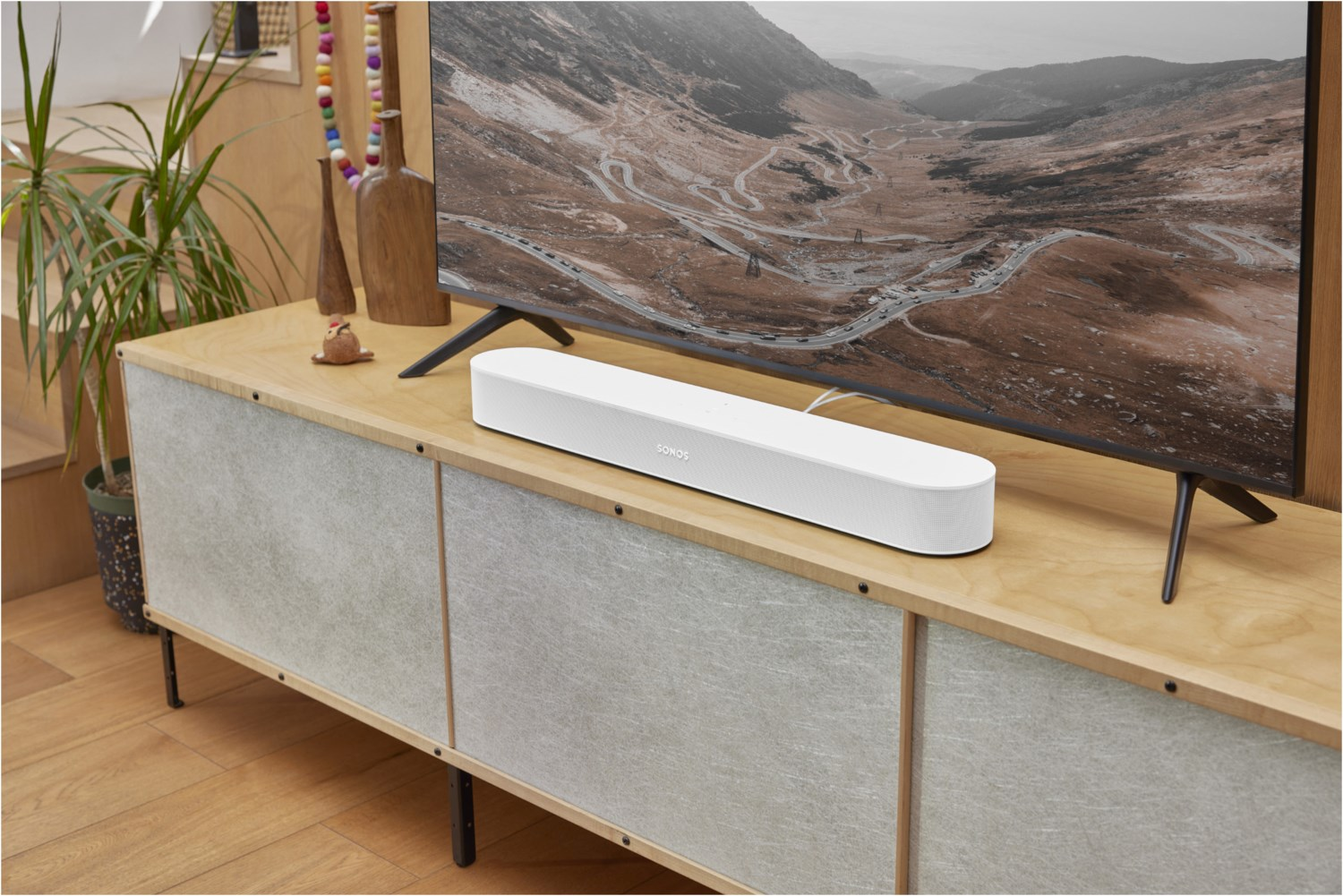
home-network = script-path=home-network.js,type=rule,debug=false,engine=jsc前不久从 Grover 租了个 SONOS Beam Gen 2,在配置 Dolby Atmos 时遇到了点小问题,在这里记录一下最终的配置方法。
SONOS Beam 是一款很实惠并且支持 Dolby Atmos 的回音壁。最近德国 Grover 黒五给出了很实惠的价格我就果断下手了。本来是想租 Arc 的,但苦于我家电视无法壁挂,不能给 Arc 流出足够空间,只能退一步要了 Beam。
这篇文章虽然是关于 Dolby Atmos 的配置,但我想提一下解决另一个有趣的问题。LG C2 的底座高度非常矮,根本无法在不改造底座的情况下容下任何回音壁。我在 Reddit 上意外碰到有个老兄给电视垫了一个 Ikea LACK 书柜架,完美留出一个 Beam 的高度,这才解决了不凿墙使用回音壁的问题。
这款书架的高度是 5 厘米,长和宽非常适合 LG C 系列的底座。书架和底座的高度之和约为 11 厘米。
https://www.reddit.com/r/LGOLED/comments/qeffeo/lg_c1_on_ikea_lack_shelves/
好了,进入正题。
注意你需要把回音壁连接至电视的 eARC 接口。LG C2 的 HDMI 2 是 eARC 接口。
「音频 Sound」-「音频输出 Sound Out」-「使用有线扬声器 Use Wired Speaker」,选择「HDMI(ARC) Device」
「音频 Sound」- 「高级设定 Advanced Settings」-「选择 HDMI 输入音频格式」,选择「比特流 Bitstream」
「音频 Sound」- 「高级设定 Advanced Settings」-「DTV 音频设定 DTV Audio Settings」,选择「自动 Auto」
「音频 Sound」- 「高级设定 Advanced Settings」-「eARC 支持」,选择「开启 On」
「音频 Sound」- 「高级设定 Advanced Settings」-「数字音频输出 Digital Sound Output」,选择「自动 Auto」
如果你能在「设置」-「视频和音频」-「音频格式」中看到如截图所示的样子,「沉浸式音频」处于「开」的状态,则说明设置成功。
随便找一部支持 Dolby Atmos 的电影,如果你能在 SONOS 应用中看到标识则说明音频流被正确识别。
奥本海默已上映,这篇文章将帮助你寻找最适合自己的 IMAX 影厅,并顺便分享一些网络上找到和奥本海默有关的视频。
首先是 橙红 Iris** **带来的影厅选择指南。视频客观对比了 IMAX 和杜比影院的硬件数据和实际体验,我觉得对身在海外的朋友们非常有用。
片中她分享了 **Arvin **老师 整理的全球 IMAX 影厅的 specifications,数据之详尽可以让 nerd 们原地下跪。
https://docs.qq.com/sheet/DQ3FEUUZJdklNSWJP?tab=lxy0hx
下面是一些和奥本海默相关的视频。
IMAX 70mm 胶片如何拼接
如何放映 IMAX 70mm 胶片(南半球唯一一家能够放映 15/70 胶片的影院)
I’ve been using Typlog as my blogging platform for the past few years. It’s been an excellent product for many reasons — extremely low friction editing experience, easy-to-use dashboard, reliability. I have to admit that I don’t write very often, but when I do, it doesn’t give me a hard time. However, an idea has been keeping bugging me for the past few months.
Typlog and other blogging platforms, like Ghost.org (paid version), promise a user-friendly experience, but they’ve rarely used “customization” as a selling point. Typlog supports code injections, custom header/footer, custom HTML contents, etc, which are already better than many blogging platforms (some of the features need the Pro plan). However, customizing a component on the website is still very hard. For example, preview links like Notion.
Another reason that made me really think about migrating to somewhere else was that engineering a dynamic personal website isn’t really different from engineering a product. It’s a great opportunity to learn and experiment stuff. If you look at Brian Lovin’s personal website, it literally has everything you could think of.
https://brianlovin.com/writing/how-my-website-works
It’s funny that before I moved to Typlog, I was using the self-host Ghost and now it’s become an option again. Developing a custom theme for a Ghost blog is tremendous work, not to mention adapting to the big yearly update. Many third-party packages like the S3 storage package haven’t been updated for years. It takes time to keep your instance and theme updated.
The paid service is good, however, it’s not cheap as I’m not a regular blogger, I also don’t need the subscription management feature.
Static Site Generation (SSG) is a quite enticing option as it can be very flexible in styling and other customization aspects. It’s now much easier to generate the website in an automated way, such as using GitHub Actions, as compared to the old way, doing everything locally.
This solution (Gatsby, Hugo, Hexo…) satisfies my current needs. However, if I want to add dynamic content in the future it’d be difficult for the following reasons:
The solutions don’t include a running service, which means I’d need another service to output the dynamic content.
Generating happens in build time, the time consumed only grows over time.
Notion is more than capable of being a CMS, and it’s free! The problem left is how to render the content to a browser, like a blog. There are quite a few cool services doing so.
However, I don’t want to spend more than 10 bucks a month on this 😈.
Spencer first introduced his idea back in 2021, which uses Next.js as the renderer. It got my eyes.
https://spencerwoo.com/blog/nextjs-blog-notion
Next.js probably is one of the coolest projects in the React community. It’s made by Vercel, which probably is one of the coolest companies out there.
Next.js gives different ways to deliver your content.
Server-Side Rendering (SSR)
Static Site Generation (SSG)
Client-side Rendering (CSR)
The last one is what I want to talk about.
If you’ve ever used the SSG before, you know everything hosted on your server is rendered at build-time, meaning if you want to add or change content, you need to build again. ISR, however, doesn’t require the subsequent building. A page would be built when someone accesses the URL. Pages that have already been built can also be updated upon new requests once become expired. How cool is that?
Since it essentially is a Next.js service, it’s up to you to decide which parts are dynamic and which aren’t.
In order to render blocks from Notion, you’ve got two options.
Notion has its official API now. You can query your database, search content and many stuff through the API.
https://developers.notion.com/
react-notion-x consists of two essential parts:
notion-client - A wrapper of the Notion private API used by their clients.
react-notion-x- A collection of React components that transform the raw data into actual pages with Notion-like styling.
Yes, it uses private APIs. The author published another package notion-compat to make it possible to use the official API, but it has a few drawbacks (see the link).
https://github.com/NotionX/react-notion-x/blob/master/packages/notion-compat/readme.md
You’d be amazed by how much react-notion-x can do out of the box. Kudos to Travis Fischer.
What you are seeing right now is the recharged blog that results from my days of work. I have to say “thank you” to Spencer because I copied a lot of things from this blog so that I could have this MVP this fast. I strongly recommend you to read these posts about his website if you are interested in the idea (promise me you will come back).
Loading preview... Loading preview...My blog uses both the official and the private API because the former one handles Collections better and the latter one handles rendering better.
Loading preview...Apart from copying things from Spencer’s website, I tried to solve the problems Spencer mentioned in his post.
Notion stores images (and other assets) on the S3 service. The image URLs you get from Notion’s API, either the private or the public, are signed. They are short-lived instead of permanent. There’s a chance that the page generated by Next.js is still valid but the URLs are expired, and the viewer gets a bunch of 400 errors.
Loading preview...Introducing the Resource Proxy (I know, I’m bad at naming). What it does is shown below.
The key used for indexing each asset is calculated based on the identifier. When the same identifier is requested, no matter what the signature is, the Resource Proxy always point to the same file in the private S3 bucket.
Unlike the Notion S3 bucket, which takes permission very seriously, we don’t need to react if the author changes the permission. Once the asset is saved, it’s there forever.
The Resource Proxy takes care of the dimension as well. It saves the image in a temporary place, probes the dimension using https://github.com/nodeca/probe-image-size, then saves the metadata to the database. The metadata makes it possible to use next/image.
If you have subscribed to my blog, the feed still works, just without the main content. Generating the body content in an RSS feed is not easy as Next.js only allows outputting HTML content unless you fiddle with _server.ts.
https://nextjs.org/docs/advanced-features/custom-server
Will be available soon.
I really enjoyed the process of building this website, especially when I could control almost everything however I’d like.
我有三台 NAS,Synology 群晖、QNAP 威联通和 ZSpace 极空间,前者放在出租屋里作为主力,后两台放在老家作为备份。
因为极空间是 arm64 版本双盘位的,功耗不高,所以和 QNAP 共用一台 UPS 就好了。之前折腾了一下,让极空间作为 Master 通过 USB 连接 UPS,然后 QNAP 作为 Slave 通过 NUT (Network UPS Tools) 局域网连接。
不过因为涉及到系统文件改动,每次极空间系统升级后都需要重新操作一遍,每次我都会忘记要怎么捣鼓……所以写篇博客记录下。
话说 2025 年居然一篇博客都没写,工作太忙了呀,而且总是犯懒。以前上学的时候写博客,不怎么理解那些断更的博主,现在可以体会到那种感觉了……草稿倒是堆了很多,希望明年可以发出来吧!
以 root 权限登录极空间,运行以下命令,然后重启服务即可。
sed -i 's/127.0.0.1/0.0.0.0/g' /zspace/applications/services/nut/config/upsd.confcat >> /zspace/applications/services/nut/config/upsd.users << EOF[admin] password = 123456 upsmon slave allowfrom = %EOFcat >> /zspace/applications/services/nut/config/ups.conf << EOF[qnapups] driver = usbhid-ups port = auto desc = "zspace ups for qnap" lowbatt = 15 pollfreq = 15 offdelay = 60EOF首先要吐槽的就是 QNAP 这个傻逼系统,我已经不知道吐槽过多少次了。
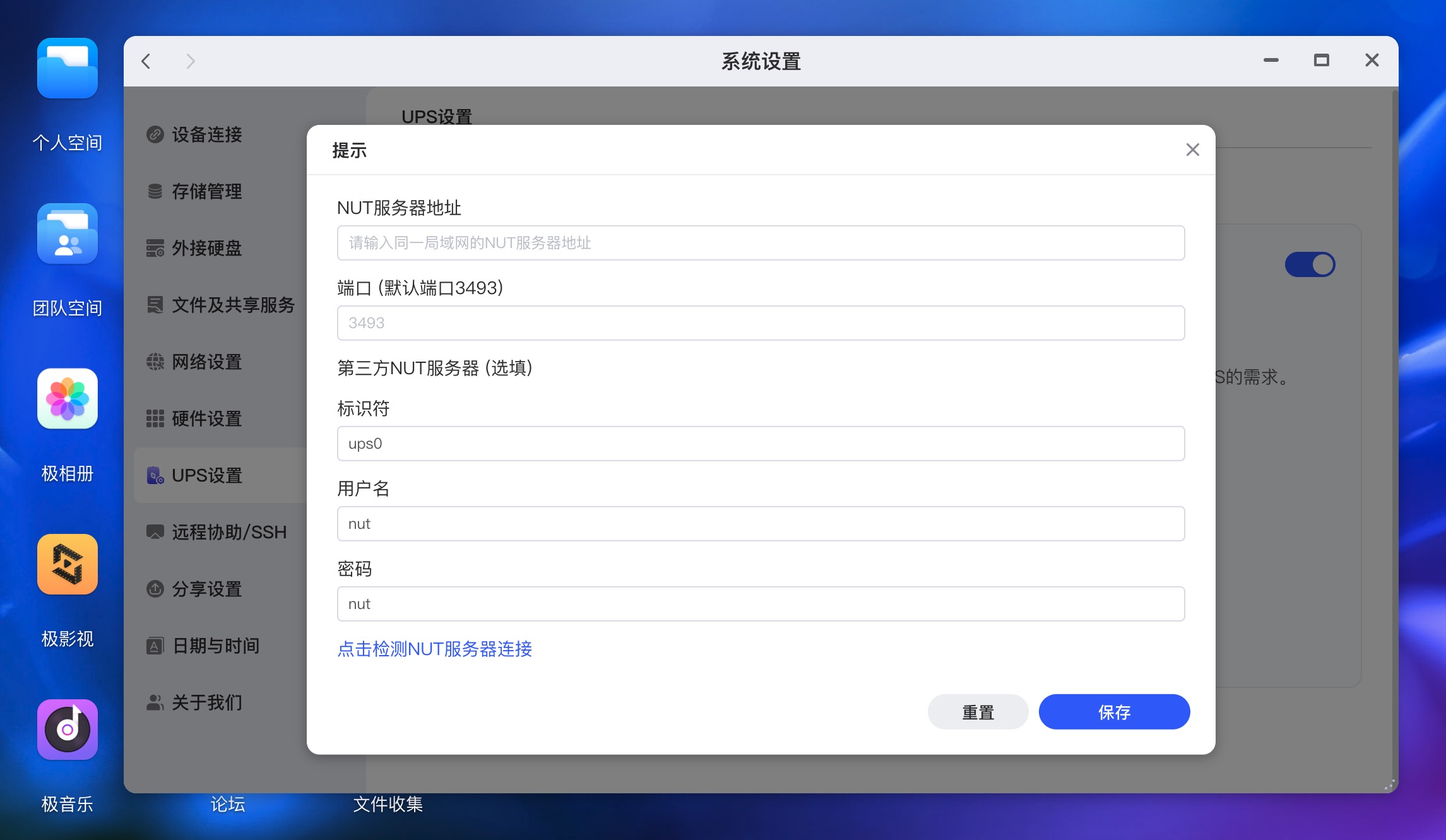
QNAP 的天才工程师的天才设计:在作为 Network UPS Slave 连接时,用户只能指定「网络 UPS 服务器的 IP 地址」这一个选项,剩下的都是写死的:
只要任何一个不对都连不上。Man! What can I say?
所以如果你想让 QNAP 和极空间共享一台 UPS,有两个选择:
不过当时 24 年我折腾的时候,极空间还不支持 NUT Slave 模式。虽然那会儿极空间已经开放了 ssh 和 root 权限(也是这家之前总是被吐槽的一点),但是考虑到如果通过修改系统文件的方式让极空间支持 NUT Slave,可能不稳,毕竟这种定制系统也不知道哪里改了些什么东西。
所以我选择的是极空间通过 USB 物理连接 UPS,启动 NUT Server 作为 Master,QNAP 作为 Slave 客户端连接 NUT Server。
UPS <---{USB Cable}---> ZSpace <---{TCP 3493}---> QNAP (NUT Server) (NUT Client)P.S. 现在(2025 年 12 月)极空间已经支持 NUT Slave 模式了,各种参数都可以自定义,所以更好的方式应该是上述的第一种。不过我懒得去改接线了,先这样吧。又不是不能用.jpg
因为 QNAP 的弱智系统只能接受固定的用户名、密码和 UPS 名称,所以需要修改极空间的 NUT Server 配置。
首先要拿到极空间 NAS 的 ssh 和 root 权限,这里就不赘述了。登上去以后:
ls -al /etc/nut# lrwxrwxrwx 1 root root 33 Sep 17 2024 /etc/nut -> /zspace/applications/services/nutcd /zspace/applications/services/nutls -a ./# . config restart.sh setting.json ups.conf upssched# .. external_ups_setting.json restart_driver.sh start.sh upsd.conf upssched-cmd.sh# client nut.conf restart_upsd.sh stop.sh upsd.users upssched.conf# conf realstart.sh server u2600_tools upsmon.conf然后 cat ./server/nut-server.service 看看配置文件在哪(后续系统版本升级后实际路径可能会变,最好确认一下):
#!/bin/sh#use upsd.confexport NUT_CONFPATH=/zspace/applications/services/nut/config/sbin/upsd -u root看看配置文件 ./config/upsd.conf:
# Network UPS Tools: example upsd configuration file## ... 其他注释省略 ...# =======================================================================# LISTEN <address> [<port>]LISTEN 127.0.0.1 3493LISTEN ::1 3493把这里的 127.0.0.1 改成 0.0.0.0,允许局域网(QNAP NAS)访问。或者也可以起一个 socat 做转发,都行。有需要的话也可以配一下 ACL,只允许 QNAP IP 访问。
cp /zspace/applications/services/nut/config/upsd.conf ~/upsd.conf.baksed -i 's/127.0.0.1/0.0.0.0/g' /zspace/applications/services/nut/config/upsd.conf再看看用户配置文件 ./config/upsd.users:
# Network UPS Tools: Example upsd.users## ... 其他注释省略 ...# --------------------------------------------------------------------------[upsmaster] password = sekret upsmon master actions = SET instcmds = ALL[nut] password = nut upsmon slave allowfrom = %往里面加上 QNAP 需要的用户:
cp /zspace/applications/services/nut/config/upsd.users ~/upsd.users.bakcat >> /zspace/applications/services/nut/config/upsd.users << EOF[admin] password = 123456 upsmon slave allowfrom = %EOF然后再看看 UPS 配置文件 ./config/ups.conf:
# Network UPS Tools: example ups.conf## ... 其他注释省略 ...# ------------------------maxretry = 3xretry = 5pollinterval = 15[ups0] driver = usbhid-ups port = auto desc = "nut ups" lowbatt = 15 pollfreq = 15 offdelay = 60往里面加上 QNAP 需要的 UPS 名称:
cp /zspace/applications/services/nut/config/ups.conf ~/ups.conf.bakcat >> /zspace/applications/services/nut/config/ups.conf << EOF[qnapups] driver = usbhid-ups port = auto desc = "zspace ups for qnap" lowbatt = 15 pollfreq = 15 offdelay = 60EOF最后,重启 NUT 服务:
本来想直接执行 /zspace/applications/services/nut/restart.sh 重启服务的,但似乎缺少某些环境变量,可能不是拿来直接调用的。
可以直接去极空间的网页面板,设置 > UPS 设置,把开关关闭然后再打开就行了。再检查下进程,看到 qnapups 就算成功了。
ps aux | grep ups# root 29716 /usr/share/nut/usbhid-ups -a ups0 -u root# root 29718 /usr/share/nut/usbhid-ups -a qnapups -u root# root 29722 /sbin/upsd -u root不需要做什么,在网页面板上填入极空间 NAS 的局域网 IP 就能连上了。
通过 upsc qnapups@192.168.1.4 查看 UPS 信息:
battery.charge: 100battery.charge.low: 10battery.mfr.date: 2001/01/01battery.runtime: 3618battery.runtime.low: 120battery.type: PbAcbattery.voltage: 13.6battery.voltage.nominal: 12.0device.mfr: American Power Conversiondevice.model: Back-UPS BK650M2-CHdevice.type: upsdriver.name: usbhid-ups顺便看看 QNAP 上的 NUT 服务配置:
ls -al /etc/config# lrwxrwxrwx 1 admin administrators 21 2025-12-31 13:14 /etc/config -> /mnt/HDA_ROOT/.configls -a /mnt/HDA_ROOT/.config/ups# . .. ups.conf upsd.conf upsd.users upsmon.conf配置文件在 /mnt/HDA_ROOT/.config/ups/upsmon.conf:
# Network UPS Tools: example upsmon configuration## ... 其他注释省略 ...# --------------------------------------------------------------------------MONITOR qnapups@192.168.1.4 1 admin 123456 slave#MONITOR zspaceups@192.168.1.4 1 upsmaster sekret slave# ... 其他注释省略 ...RUN_AS_USER adminMINSUPPLIES 1SHUTDOWNCMD "/sbin/shutdown -h +0"POLLFREQ 5POLLFREQALERT 5HOSTSYNC 15DEADTIME 15POWERDOWNFLAG /etc/killpowerRBWARNTIME 43200NOCOMMWARNTIME 300FINALDELAY 5其实我之前也试过直接改这个文件,把 MONITOR 里写死的配置改成极空间的配置。但是试下来发现改完以后虽然服务是跑起来了,但是在 QNAP 的网页面板上不会显示 UPS 信息和已连接到 UPS 设备的图标。也不知道是这系统魔改了什么地方,担心会出现奇怪的问题,遂作罢。
如果你需要将 QNAP 作为 NUT Server,那可以关注 upsd.conf 和 upsd.users 文件,网上也有相关教程。
因为 NUT 的网络协议走的是 TCP 3493,所以就算是异地的 UPS,组建虚拟局域网后也可以互相访问。
这里推荐一个开源的 NUT UPS 管理面板 PeaNUT,用起来挺方便的。
本文记录 https://docs.halo.run 集成 Shiki 代码高亮的过程。
从 Halo 1.x 开始,我们就一直在使用 Docusaurus 来构建 Halo 的文档。直到 Halo 2.21,我们已经累积了大量的文档,期间发现代码块高亮的问题难以解决。Docusaurus 默认使用 Prism.js 来渲染代码块,且几乎没有其他选择。而我们的文档中使用的一些语言或框架(如 Vue),Prism 并没有提供高亮支持,因此长期以来这些代码块都没有显示语法高亮。即使是 Prism 所支持的语言,渲染出来的语法高亮效果也不尽如人意。
直到后来了解到了
目前使用的 Docusaurus 版本是 3.8.0
Docusaurus 的 Markdown 引擎核心为
pnpm add @shikijs/rehype shiki -Dconst { bundledLanguages } = require("shiki");
const { default: rehypeShiki } = require("@shikijs/rehype");
/** @type {import('@docusaurus/types').Config} */
const config = {
// ...
presets: [
[
"classic",
/** @type {import('@docusaurus/preset-classic').Options} */
({
docs: {
// ...
// [!code ++:11]
beforeDefaultRehypePlugins: [
[
rehypeShiki,
{
theme: "catppuccin-mocha",
langs: Object.keys(bundledLanguages),
// or
// langs: ['js', 'ts']
},
],
],
// ...
},
}),
],
],
// ...
};其中,langs 可以只填写所需的语言列表,我这里为了省事直接添加 Shiki 所有语言,主要是因为文档太多,已经懒得去统计用到了哪些语言。
此外,theme 也可以指定多主题,如果需要让文档的暗色和亮色模式下代码块的主题不同,可以按照下面的方式更改:
const { bundledLanguages } = require("shiki");
const { default: rehypeShiki } = require("@shikijs/rehype");

/** @type {import('@docusaurus/types').Config} */
const config = {
  // ...
  presets: [
    [
      "classic",
      /** @type {import('@docusaurus/preset-classic').Options} */
      ({
        docs: {
          // ...
          beforeDefaultRehypePlugins: [
            [
              rehypeShiki,
              {
// [!code --]
                theme: "catppuccin-mocha",
// [!code ++:4]
                themes: {
                  light: "github-light",
                  dark: "github-dark"
                },
                langs: Object.keys(bundledLanguages),
                // or
                // langs: ['js', 'ts']
              },
            ],
          ],
          // ...
        },
      }),
    ],
  ],
  // ...
};

module.exports = config;
然后在 custom.css 中添加:
[data-theme="dark"] pre {
  color: var(--shiki-dark) !important;
  background-color: var(--shiki-dark-bg) !important;
}
[data-theme="dark"] pre span {
  color: var(--shiki-dark) !important;
}
由于我期望亮色和暗色模式下都使用暗色的代码块主题,所以没有添加多主题配置。
由于需要完全让 @shikijs/rehype 接管 Markdown 文档中的代码块渲染,我们需要覆盖 Docusaurus 内部 Pre/Code 的组件,避免被默认的 Prism 处理。Docusaurus 默认提供了 CLI 用于导出 Docusaurus 主题中的组件。
npx docusaurus swizzle @docusaurus/theme-classic MDXComponents/Code --typescript --eject然后打开 src/theme/MDXComponents/Code.tsx 并修改为:
import type { ComponentProps, ReactNode } from "react";
import React from "react";
import CodeInline from "@theme/CodeInline";
import type { Props } from "@theme/MDXComponents/Code";

function shouldBeInline(props: Props) {
  return (
    // empty code blocks have no props.children,
    // see https://github.com/facebook/docusaurus/pull/9704
    typeof props.children !== "undefined" &&
    React.Children.toArray(props.children).every(
      (el) => typeof el === "string" && !el.includes("\n")
    )
  );
}

// [!code ++:3]
function CodeBlock(props: ComponentProps<"code">): JSX.Element {
  return <code {...props} />;
}

export default function MDXCode(props: Props): ReactNode {
  return shouldBeInline(props) ? (
    <CodeInline {...props} />
  ) : (
    <CodeBlock {...(props as ComponentProps<typeof CodeBlock>)} />
  );
}
npx docusaurus swizzle @docusaurus/theme-classic MDXComponents/Pre --typescript --eject然后打开 src/theme/MDXComponents/Pre.tsx 并修改为:
import React, { type ReactNode } from "react";
import type { Props } from "@theme/MDXComponents/Pre";
export default function MDXPre(props: Props): ReactNode | undefined {
  return <pre {...props} />;
}
小插曲:当时到了这一步的时候,突然意识到似乎可以复用之前为 Halo 开发 Shiki 插件时发布的 NPM 包(@halo-dev/shiki-code-element)。因为这个包封装了一个 Web Component,所以肯定可以用在这里,只需要在
pre标签外包裹一个shiki-code即可。尝试了一下确实可行,但这样就必须在客户端渲染了。虽然可行,但始终不如在构建阶段就渲染好。虽然可以尝试使用 Lit SSR,但考虑到文档中有一些代码块使用了 Title Meta,而目前@halo-dev/shiki-code-element还不支持,所以放弃了这个方案。
完成这一步之后,就可以尝试启动开发服务器了。不出意外的话,代码块就可以正常使用 Shiki 来渲染了。
原来 Docusaurus 的默认方案是支持为代码块添加顶部标题的,切换到 Shiki 之后,这一部分需要自行实现,以下是具体步骤:
首先为 Shiki 添加一个自定义的 Transformer,用于解析标题的书写语法和添加代码块参数:
创建 src/shiki/meta-transformer.js:
function parseTitleFromMeta(meta) {
  if (!meta) {
    return "";
  }
  const kvList = meta.split(" ").filter(Boolean);
  for (const item of kvList) {
    const [k, v = ""] = item.split("=").filter(Boolean);
    if (k === "title" && v.length > 0) {
      return v.replace(/["'`]/g, "");
    }
  }
  return "";
}

export function transformerAddMeta() {
  return {
    name: "shiki-transformer:add-meta",
    pre(pre) {
      const title = parseTitleFromMeta(this.options.meta?.__raw);
      if (title.length > 0) {
        pre.properties = {
          ...pre.properties,
          "data-title": title,
        };
      }
      return pre;
    },
  };
}
然后修改配置:
const { bundledLanguages } = require("shiki");
const { default: rehypeShiki } = require("@shikijs/rehype");
const { transformerAddMeta } = require("./src/shiki/meta-transformer");

/** @type {import('@docusaurus/types').Config} */
const config = {
  // ...
  presets: [
    [
      "classic",
      /** @type {import('@docusaurus/preset-classic').Options} */
      ({
        docs: {
          // ...
          beforeDefaultRehypePlugins: [
            [
              rehypeShiki,
              {
                theme: "catppuccin-mocha",
                langs: Object.keys(bundledLanguages),
// [!code ++:3]
                transformers: [
                  transformerAddMeta(),
                ]
              },
            ],
          ],
          // ...
        },
      }),
    ],
  ],
  // ...
};
修改 Pre.tsx 显示标题:
import React, { type ReactNode } from "react";
import type { Props } from "@theme/MDXComponents/Pre";

type PreWithDataTitle = Props & { "data-title"?: string };

export default function MDXPre(props: Props): ReactNode | undefined {
  const title = props["data-title"];
  return (
    <div
      style={{
        ...props.style,
        borderRadius: "var(--ifm-pre-border-radius)",
      }}
      className="shiki-code-wrapper"
    >
      {title && (
        <div className="shiki-code-header">
          <span>{title}</span>
        </div>
      )}
      <div className="shiki-code-content">
        <pre {...props} ref={preRef} />
      </div>
    </div>
  );
}
这里还修改了 MDXPre 标签的组件结构,为后续的功能做准备,其中最外层的
div添加的style属性来自于 Shiki 渲染结果的pre标签的样式,包含背景色和字体默认颜色。
最后我们需要为自定义的 MDXPre 组件结构添加样式,这里为了让结构看起来更清晰,我引入了 SASS 插件:
# 安装所需依赖
pnpm add docusaurus-plugin-sass sass -D
修改配置文件:
/** @type {import('@docusaurus/types').Config} */
const config = {
  // ...
  presets: [
    [
      "classic",
      /** @type {import('@docusaurus/preset-classic').Options} */
      ({
        // ...
        theme: {
// [!code --]
          customCss: require.resolve("./src/css/custom.css"),
// [!code ++:4]
          customCss: [
            require.resolve("./src/css/custom.css"),
            require.resolve("./src/css/shiki.scss"),
          ],
        },
      }),
    ],
  ],
// [!code ++]
  plugins: [require.resolve("docusaurus-plugin-sass")],
};
然后创建 src/css/shiki.scss:
.shiki-code-wrapper {
  overflow: hidden;
  margin-bottom: var(--ifm-leading);
  color-scheme: dark;

  .shiki-code-header {
    padding: 0.5rem 0.75rem;
    border-bottom: 1px solid var(--ifm-color-gray-700);
    font-size: var(--ifm-code-font-size);
  }
}
这样就支持使用原有的语法为代码块添加标题了。
Shiki 原生并不支持在渲染的 HTML 结果中包含行号信息,但社区中有人提供了一种使用纯 CSS 实现的方案,详见:
修改 shiki.scss:
.shiki-code-wrapper {
  overflow: hidden;
  margin-bottom: var(--ifm-leading);
  color-scheme: dark;

  .shiki-code-header {
    padding: 0.5rem 0.75rem;
    border-bottom: 1px solid var(--ifm-color-gray-700);
    font-size: var(--ifm-code-font-size);
  }
// [!code ++:36]
  .shiki-code-content {
    position: relative;

    pre {
      position: relative;
      padding: 0.75rem;
      margin: 0;
      border-radius: initial;
      code {

        counter-reset: step;
        counter-increment: step 0;

        .line {
          position: relative;
        }

        // line numbers start
        .line::before {
          content: counter(step);
          counter-increment: step;
          width: 0.6rem;
          margin-right: 1.1rem;
          display: inline-block;
          text-align: right;
          color: rgba(115, 138, 148, 0.5);
          user-select: none;
        }

        .line:last-child:empty::before {
          content: none;
          counter-increment: none;
        }
        // line numbers end
      }
    }
  }
}
这样就可以默认为所有代码块添加行号显示了。
Docusaurus 默认的代码块有复制按钮,改为 Shiki 之后这部分也需要自行实现,以下是具体步骤:
修改 src/theme/MDXComponents/Pre.tsx:
import React, { type ReactNode, useRef, useState } from "react";
import type { Props } from "@theme/MDXComponents/Pre";

type PreWithDataTitle = Props & { "data-title"?: string };

export default function MDXPre(props: PreWithDataTitle): ReactNode | undefined {
  const title = props["data-title"];
// [!code ++:11]
  const preRef = useRef<HTMLPreElement>(null);
  const [copied, setCopied] = useState(false);

  const handleCopy = () => {
    const code = preRef.current?.innerText || preRef.current?.textContent || "";

    copyText(code, () => {
      setCopied(true);
      setTimeout(() => setCopied(false), 2000);
    });
  };

  return (
    <div
      style={{
        ...props.style,
        borderRadius: "var(--ifm-pre-border-radius)",
      }}
      className="shiki-code-wrapper"
    >
      {title && (
        <div className="shiki-code-header">
          <span>{title}</span>
        </div>
      )}
      <div className="shiki-code-content">
// [!code ++:8]
        <button
          className="shiki-code-copy-button"
          onClick={handleCopy}
          title={copied ? "已复制!" : "复制代码"}
          style={{ ...props.style }}
        >
          <i className={copied ? "tabler--check" : "tabler--copy"}></i>
        </button>
        <pre {...props} ref={preRef} />
      </div>
    </div>
  );
}

// [!code ++:24]
export function copyText(text: string, cb: () => void) {
  if (navigator.clipboard) {
    navigator.clipboard.writeText(text).then(() => {
      cb();
    });
  } else {
    const textArea = document.createElement("textarea");
    textArea.value = text;
    textArea.style.position = "fixed";
    textArea.style.opacity = "0";
    document.body.appendChild(textArea);
    textArea.focus();
    textArea.select();
    try {
      const successful = document.execCommand("copy");
      if (successful) {
        cb();
      }
    } catch (err) {
      console.error("Fallback: Oops, unable to copy", err);
    }
    document.body.removeChild(textArea);
  }
}
添加样式:
.shiki-code-wrapper {
  overflow: hidden;
  margin-bottom: var(--ifm-leading);
  color-scheme: dark;

  .shiki-code-header {
    padding: 0.5rem 0.75rem;
    border-bottom: 1px solid var(--ifm-color-gray-700);
    font-size: var(--ifm-code-font-size);
  }

  .shiki-code-content {
    position: relative;

    pre {
      position: relative;
      padding: 0.75rem;
      margin: 0;
      border-radius: initial;
      code {

        counter-reset: step;
        counter-increment: step 0;

        .line {
          position: relative;
        }

        // line numbers start
        .line::before {
          content: counter(step);
          counter-increment: step;
          width: 0.6rem;
          margin-right: 1.1rem;
          display: inline-block;
          text-align: right;
          color: rgba(115, 138, 148, 0.5);
          user-select: none;
        }

        .line:last-child:empty::before {
          content: none;
          counter-increment: none;
        }
        // line numbers end
      }
    }
// [!code ++:15]
    .shiki-code-copy-button {
      position: absolute;
      top: 0.5rem;
      right: 0.5rem;
      opacity: 0;
      z-index: 2;
      width: 2rem;
      height: 2rem;
      display: flex;
      align-items: center;
      justify-content: center;
      padding: 0.4rem;
      border: none;
      cursor: pointer;
    }
  }
// [!code ++:33]
  &:hover {
    .shiki-code-copy-button {
      opacity: 1;
    }
  }

  .tabler--copy {
    display: inline-block;
    width: 28px;
    height: 28px;
    --svg: url("data:image/svg+xml,%3Csvg xmlns='http://www.w3.org/2000/svg' viewBox='0 0 24 24'%3E%3Cg fill='none' stroke='%23000' stroke-linecap='round' stroke-linejoin='round' stroke-width='2'%3E%3Cpath d='M7 9.667A2.667 2.667 0 0 1 9.667 7h8.666A2.667 2.667 0 0 1 21 9.667v8.666A2.667 2.667 0 0 1 18.333 21H9.667A2.667 2.667 0 0 1 7 18.333z'/%3E%3Cpath d='M4.012 16.737A2 2 0 0 1 3 15V5c0-1.1.9-2 2-2h10c.75 0 1.158.385 1.5 1'/%3E%3C/g%3E%3C/svg%3E");
    background-color: currentColor;
    -webkit-mask-image: var(--svg);
    mask-image: var(--svg);
    -webkit-mask-repeat: no-repeat;
    mask-repeat: no-repeat;
    -webkit-mask-size: 100% 100%;
    mask-size: 100% 100%;
  }

  .tabler--check {
    display: inline-block;
    width: 28px;
    height: 28px;
    --svg: url("data:image/svg+xml,%3Csvg xmlns='http://www.w3.org/2000/svg' viewBox='0 0 24 24'%3E%3Cpath fill='none' stroke='%23000' stroke-linecap='round' stroke-linejoin='round' stroke-width='2' d='m5 12l5 5L20 7'/%3E%3C/svg%3E");
    background-color: currentColor;
    -webkit-mask-image: var(--svg);
    mask-image: var(--svg);
    -webkit-mask-repeat: no-repeat;
    mask-repeat: no-repeat;
    -webkit-mask-size: 100% 100%;
    mask-size: 100% 100%;
  }
}
这样就可以在鼠标悬停到代码块时显示复制按钮了。
Shiki 官方提供了一些非常有用的 Transformers,比如行高亮、代码对比等,这里根据自身需要添加即可。
pnpm add -D @shikijs/transformersconst { bundledLanguages } = require("shiki");
const { default: rehypeShiki } = require("@shikijs/rehype");
const { transformerAddMeta } = require("./src/shiki/meta-transformer");
// [!code ++:4]
const { transformerMetaHighlight } = require("@shikijs/transformers");
const { transformerNotationDiff } = require("@shikijs/transformers");
const { transformerNotationFocus } = require("@shikijs/transformers");
const { transformerNotationErrorLevel } = require("@shikijs/transformers");
/** @type {import('@docusaurus/types').Config} */
const config = {
// ...
presets: [
[
"classic",
/** @type {import('@docusaurus/preset-classic').Options} */
({
docs: {
// ...
beforeDefaultRehypePlugins: [
[
rehypeShiki,
{
theme: "catppuccin-mocha",
langs: Object.keys(bundledLanguages),
transformers: [
// [!code ++:8]
// 行高亮,使用 Meta 信息的方式,比如 ```java {1}
transformerMetaHighlight(),
// 代码对比,使用注释的方式
transformerNotationDiff(),
// 行聚焦,使用注释的方式
transformerNotationFocus(),
// 行高亮的错误和警告变体,使用注释的方式
transformerNotationErrorLevel(),
transformerAddMeta(),
]
},
],
],
// ...
},
}),
],
],
// ...
};
这些 Transformers 只是为对应的行添加了 class,我们需要自行实现样式。以下是完整的 shiki.scss:
.shiki-code-wrapper {
  overflow: hidden;
  margin-bottom: var(--ifm-leading);
  color-scheme: dark;

  .shiki-code-header {
    padding: 0.5rem 0.75rem;
    border-bottom: 1px solid var(--ifm-color-gray-700);
    font-size: var(--ifm-code-font-size);
  }

  .shiki-code-content {
    position: relative;

    pre {
      position: relative;
      padding: 0.75rem;
      margin: 0;
      border-radius: initial;
      code {
        z-index: 1;
        display: block;
        width: max-content;
        position: relative;
        min-width: 100%;

        counter-reset: step;
        counter-increment: step 0;

        .line {
          position: relative;
        }

        // line numbers start
        .line::before {
          content: counter(step);
          counter-increment: step;
          width: 0.6rem;
          margin-right: 1.1rem;
          display: inline-block;
          text-align: right;
          color: rgba(115, 138, 148, 0.5);
          user-select: none;
        }

        .line:last-child:empty::before {
          content: none;
          counter-increment: none;
        }
        // line numbers end

        // highlighted lines start
        .highlighted {
          width: 100%;
          display: inline-block;
          position: relative;
        }

        .highlighted::after {
          content: "";
          position: absolute;
          top: 0;
          bottom: 0;
          left: -0.75rem;
          right: -0.75rem;
          background: rgba(101, 117, 133, 0.16);
          border-left: 1px solid rgba(34, 197, 94, 0.8);
          z-index: 0;
        }

        .highlighted.error::after {
          background: rgba(244, 63, 94, 0.16) !important;
        }

        .highlighted.warning::after {
          background: rgba(234, 179, 8, 0.16) !important;
        }
        // highlighted lines end
      }

      // focus line start
      &.has-focused .line:not(.focused) {
        opacity: 0.7;
        filter: blur(0.095rem);
        transition: filter 0.35s, opacity 0.35s;
      }

      &.has-focused:hover .line:not(.focused) {
        opacity: 1;
        filter: blur(0);
      }
      // focus line end

      // diff start
      &.has-diff .diff {
        width: 100%;
        display: inline-block;
        position: relative;
      }

      &.has-diff .diff.remove::before {
        content: "-";
      }

      &.has-diff .diff.add::before {
        content: "+";
      }

      &.has-diff .diff.remove::after {
        content: "";
        position: absolute;
        top: 0;
        bottom: 0;
        left: -0.75rem;
        right: -0.75rem;
        background: rgb(239 68 68 / 0.15);
        border-left: 1px solid rgb(239 68 68 / 0.8);
        z-index: -1;
      }

      &.has-diff .diff.add::after {
        content: "";
        position: absolute;
        top: 0;
        bottom: 0;
        left: -0.75rem;
        right: -0.75rem;
        background: rgb(34 197 94 / 0.15);
        border-left: 1px solid rgb(34 197 94 / 0.8);
        z-index: -1;
      }
      // diff end
    }

    .shiki-code-copy-button {
      position: absolute;
      top: 0.5rem;
      right: 0.5rem;
      opacity: 0;
      z-index: 2;
      width: 2rem;
      height: 2rem;
      display: flex;
      align-items: center;
      justify-content: center;
      padding: 0.4rem;
      border: none;
      cursor: pointer;
    }
  }

  &:hover {
    .shiki-code-copy-button {
      opacity: 1;
    }
  }

  .tabler--copy {
    display: inline-block;
    width: 28px;
    height: 28px;
    --svg: url("data:image/svg+xml,%3Csvg xmlns='http://www.w3.org/2000/svg' viewBox='0 0 24 24'%3E%3Cg fill='none' stroke='%23000' stroke-linecap='round' stroke-linejoin='round' stroke-width='2'%3E%3Cpath d='M7 9.667A2.667 2.667 0 0 1 9.667 7h8.666A2.667 2.667 0 0 1 21 9.667v8.666A2.667 2.667 0 0 1 18.333 21H9.667A2.667 2.667 0 0 1 7 18.333z'/%3E%3Cpath d='M4.012 16.737A2 2 0 0 1 3 15V5c0-1.1.9-2 2-2h10c.75 0 1.158.385 1.5 1'/%3E%3C/g%3E%3C/svg%3E");
    background-color: currentColor;
    -webkit-mask-image: var(--svg);
    mask-image: var(--svg);
    -webkit-mask-repeat: no-repeat;
    mask-repeat: no-repeat;
    -webkit-mask-size: 100% 100%;
    mask-size: 100% 100%;
  }

  .tabler--check {
    display: inline-block;
    width: 28px;
    height: 28px;
    --svg: url("data:image/svg+xml,%3Csvg xmlns='http://www.w3.org/2000/svg' viewBox='0 0 24 24'%3E%3Cpath fill='none' stroke='%23000' stroke-linecap='round' stroke-linejoin='round' stroke-width='2' d='m5 12l5 5L20 7'/%3E%3C/svg%3E");
    background-color: currentColor;
    -webkit-mask-image: var(--svg);
    mask-image: var(--svg);
    -webkit-mask-repeat: no-repeat;
    mask-repeat: no-repeat;
    -webkit-mask-size: 100% 100%;
    mask-size: 100% 100%;
  }
}
至此,一个比较好看、功能丰富的代码高亮改造方案就完成了,具体修改代码也可以查阅 Halo 文档的 PR: