The Temptation of Saint Anthony 1430-1650
Paintings of scenes from the hagiographies of Christian saints have been enduring favourites, particularly for churches dedicated to that saint, and for sponsors named after them. The lives of some saints are sufficiently complicated as to offer the artist a choice of different scenes, but in the case of Saint Anthony the Great (of Egypt, the Abbot, etc.), paintings are almost confined to his temptation by the devil.
Saint Anthony was born in 251 CE to wealthy parents in Lower Egypt. His parents died when he was 18. He then became an evangelical Christian, and gave his inheritance away to follow an ascetic life. For fifteen years he lived as a hermit. During this time the devil fought with him, afflicting him with boredom, laziness, and dreams of lustful women, before beating him unconscious.
Friends found him and brought him back to health, so he returned to the desert for another twenty years. This time the devil afflicted him with visions of wild beasts, snakes and scorpions, but again he fought back, eventually emerging serene and healthy. He went to Alexandria during the persecution of Christians there, to comfort those in prison. He returned to the desert, where he built a monastic system with his followers.
His attributes are a bell, a pig, a book, the Tau cross (like a capital T), sometimes with a bell pendant. He is commonly shown being tempted in a wilderness, often by naked women, and is associated with fire (“Saint Anthony’s Fire”).
The visionary nature of his temptation, and the temptations offered him, give a painter a wonderful opportunity to exercise their imagination, and to include content that might otherwise be excluded from places of worship. This weekend I show a selection of paintings of this unique story. This article covers paintings before 1650, and the next will cover the period from 1660 to the early twentieth century.

Painted in 1430-32, Stefano di Giovanni’s St Antony Beaten by the Devils identifies the saint by his Tau crucifix. Three devils, clearly fallen angels by their wings, are beating him with clubs. Those devils are fairly conventional figures, part animal and part man, with horns.

Michelangelo’s The Torment of Saint Anthony (c 1487–88) continues the theme. Saint Anthony is now being held aloft by ten or so devils, including a weird fish with many spines and a trunk-like snout. The devil at the lower left of the group has breasts and a face in its perineum, which almost makes it double-ended.
We then reach a watershed in the unique paintings of Hieronymus Bosch. Records make it clear that he painted several different versions of the Temptation of Saint Anthony, of which it appears that the Lisbon triptych from about 1500-10 is the sole complete survivor, and there’s also the remains of another in a fragment in Kansas City.

Inside the triptych now in Lisbon, the left panel shows Saint Anthony being assisted by three others, as he crosses a small wooden bridge, in a state of complete exhaustion, perhaps after being beaten unconscious by the devil. In the countryside around that group are weird human and portmanteau animal figures. In the sky above, Saint Anthony is seen again, being flown around on the back of another invented animal.
The centre panel shows Saint Anthony in the middle, kneeling in prayer and surrounded by bizarre figures, creatures, and objects, as if in a vision of temptation. In the background a town is burning.
The foreground shows more scenes involving bizarre figures, creatures, and objects. At the left, a jumble of them emerges from the huge shell of a strawberry-like fruit. One of those figures is astride a goose, and playing a harp. In the middle is a small pond, in which a hybrid between a fish and a boat is floating, and a man is seen inside another strange creature.
The right panel shows Saint Anthony seated, with a book open in front of him. He is again surrounded by strange figures and creatures from a vision of temptation. The background shows a prominent windmill and towers, behind which is a wintry landscape with snow on the ground.
In the foreground, in front of the saint, is a circular table, half-covered with a white tablecloth. The table is supported by naked human figures, one of whom has his left foot in a large pot. Another wears an armoured glove brandishing a heavy scimitar, but a creature has passed a thin-bladed sword through its neck. At the left edge of the table, another naked human is blowing a curiously curved trumpet. To the right an abdomen with ears and legs, wrapped in a red cloth hat, has a sword stuck into it.

Matthias Grünewald’s slightly later diptych provides useful contrast between the conventional Visit of St Anthony to St Paul on the left, and his Temptation of St Anthony (c 1515) on the right. These daemons are different from Bosch’s, but are nevertheless highly imaginative in their appearance.

The outside of the left panel of Niklaus Manuel’s Antonius altar shows Demons Tormenting St. Anthony (1520). Its daemons, and the wooden clubs with which they attack the saint, are inventive, but still rooted in Stefano di Giovanni’s of a century before.

Lucas van Leyden’s painting of about 1530 appears to have been directly influenced by Bosch. Leading its small procession of strange creatures is a man with a bird’s head, and a long bill, wearing ice-skates, clearly derived from the creature bearing a note in the foreground of the left wing of Bosch’s triptych. There are several other familiar features in those creatures, but the rest of the painting is more conventional.

By about 1540, Cornelis Massijs was still content to paint an almost completely realist image, showing Saint Anthony with two naked women, and another who may be their procuress. But once again there are some small decorations – a pot-bellied man, a creature with an inverted funnel on its head, and a little group at the right – that seem to have invaded from the mind of Bosch.

When we reach Pieter Coecke van Aelst in 1543-1550, the emphasis has changed completely. There are still three normal human figures, of the saint, a tempting nude, and her procuress behind, but the rest of the painting is filled with Bosch derivatives, such as the nun with wings biting someone’s leg, in the foreground. The burning town also makes an appearance in the left distance.

Most of those paintings were made in northern Europe. Looking back at the south, in 1552-3 Paolo Veronese had a profoundly different conception. Saint Anthony is not the bearded and bald old man of the north, but almost a parody of the well-muscled, grappling with a pretty young woman whose left breast seems to have become accidentally bared. Clearly Veronese hadn’t encountered the works of Bosch.

Pieter Huys’s painting of 1577 is more obviously a derivative from Bosch. Saint Anthony could almost have been copied from one of the earlier paintings, and most of the strange figures and creatures have been borrowed and re-interpreted. Musical instruments such as the lute and harp make an appearance, but many of the symbols have been changed. For example, where Bosch’s triptych features round tables with a white cloth, Huys opts for a rectangular table, and the background has a town burning even more violently.
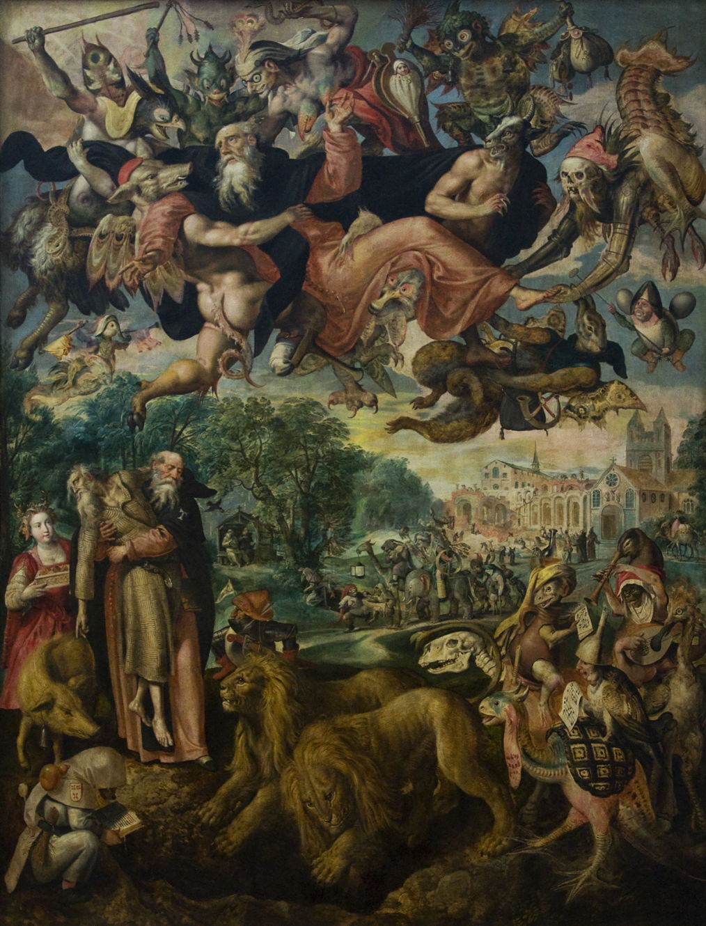
Maerten de Vos’s vision of 1591-4 follows a more traditional line again, although it contains some strange elements that appear more personal. He shows one Saint Anthony apparently carrying another, unconscious Saint Anthony in his arms, rather than the saint supported by friends. There’s a third version of the saint flying in the air, surrounded by daemons, too. That unconscious saint points to a pig, a recognised attribute, but nearby is a pair of lions. One of the more Bosch-like creatures in the right foreground is a portmanteau of human and bird, wears an inverted funnel on its head, and is reading sheet music.

Just a century after Bosch painted his triptych, Jan Brueghel the Elder combines a cavalcade of more traditional figures with a foreground of more bizarre ones derived from Bosch, including an old person’s head with four human legs, and a bird with two heads, one of a cockerel and the other a duck with a clarinet-like bill. A second image of the saint appears in the sky, surrounded by daemons, and a church is on fire in the background.

By about 1650, Joos van Craesbeeck was using some of Bosch’s iconography with his own developments. The use of a human head as a container is probably derived from Bosch’s tree-man and similar devices, but here has become even more realistic. To the right of that, a naked man sits facing backwards on a duck-horse: he is playing a stringed musical instrument, and wearing an inverted funnel on his head. Van Craesbeeck’s humans seem to have grown small red tails too. Oddly, van Craesbeeck doesn’t place the Greek letter Tau on the saint’s robes, but the Roman letter A, perhaps monogrammed with Tau. That appears unique to this painting.
![]()
![]()