Normal view

There are new articles available, click to refresh the page.
Before yesterdayMain stream

【读书笔记】UX for Business

最近看了一本名为 UX for Business 的书,这本书主要在讲设计师如何做有价值的事情。让我们跳出设计画板,在更高的层面理解日常工作。理解做什么,怎么做,怎么做到极致。但个人认为作者写得有些口语化,且不必要的内容重复过多。很多地方讲得比较浅,没有太多案例,推荐指数3颗星吧。

VDP 框架

作者强力推荐了 “VDP 框架” 来确保我们时刻在做正确、有效且对公司有价值的事情。

V for Value 价值

当你的设计同时满足了用户和公司的需求,你就在创造价值。

作者将用户需求分为两类,一类是效率类需求(Efficiency),另一类是娱乐类需求(Entertainment)。当设计师在面对效率优先的场景时,需要帮助用户用更少的时间、精力和钱来做事情,而不是更多。总的来说,就是让用户用更少的成本完成一件事。

举个例子:在烘培店里,如果一个新的烘培配方可以让烘培师用更少的鸡蛋做到和以前一样好吃,那么这就是一个好的配方设计。

聚焦能为用户/公司创造价值的地方:新增、购买、下载等流程。

D for Diagnosis 分析

指的是系统性地收集和分析问题,确保我们在做正确的事。作者在书中分享了做从设计分析到实施方案的思路。

1.了解背景

作者指出 UX 设计师的工作实际上是基于当前的信息和限制(如:业务指标、用户诉求、产品目标、、问题反馈、时间/资源限制等等)来产出解决方案来改进产品。

就像医生在看病时,会问病人有什么症状、有什么感觉、最近吃过什么、有没有对什么过敏等等,通过多种角度来下结论。

UX 设计师也要通过类似的方式来设计,想做出一个好的方案,就需要更多的信息。5W就是一个好的方法:

  • Who:用户是谁?他们的特征和需求是什么?
  • When:什么时候会有这个问题?
  • Where:在哪里会遇到这个问题?
  • What:能解决什么问题?
  • Why:为什么用户需要它?

2.发掘+分析问题

有时候我们收到一些产品体验的反馈,这可能只是一个问题的表象,仅仅解决它只是在打补丁,没有从根源性解决问题。

某个新功能的使用情况不理想,可能并非是该功能设计得不好,而是在上一层的漏斗出现问题。所以想要挖掘到深层次的根源问题,需要通过在多个问题之间来回推敲。

收集足够多的问题,为下一步做准备

3.找到问题共同点

将同类的问题归类好,利用前面的 5W 分析,比如将属于同一个 When 的问题归在一类,同一个 Who 的问题在另一类。

这种做法有时候会让我们不仅仅在做当前需求,还能帮助我们发掘到其他带改进的点。

4.规划改进问题

这一步就是将我们观察、收集到的信息转化为行动了。

前几步我们列出了问题的表象,并将其分类。这一步需要去思考什么引发了这一连串有关联性问题。比如一个页面的 Like 按钮点击量很少,但用户反馈中他们都很喜欢这里的内容,那我们就会假设是 Like 按钮做得不够明显,解决方案随之而来。

我们会进行不止一次的假设,按照可能性的高低来按顺序尝试解决方案。

5.验证结果

最后,将我们觉得可行的解决方案推进上线,基于效果决定是在当前解决方案下改进,还是换一个解决思路,甚至收集更多信息后再次进行设计。

P for Probability 可能性

利用 “可能性” 来优化设计,将价值最大化。作者通过分享了以下观点来阐述可能性在设计中的应用。

1.越靠前、越明显的内容具有更多的可能性。比如一组选项,第一个选项通常来说都是更大概率被选择的。所以,把重要的、能创造价值的内容做得更靠前和明显;

2.事情是线性发展的。你不能在完成第一件事之前完成第二件事,就好比我们在浏览一个导航的时候,如果我们找到了可能合适的跳转入口,我们就会直接点击,不会尝试去看后面的内容了;

3.用户在准备好做决定时才会去做决定。就好比电商场景,用户都会在足够了解产品之后,才决定是否购买,那么“购买”按钮通常就不会是页面上的第一个元素。

4.默认值能影响可能性。默认的值通常是最多人进行选择的,所以要思考怎么设计默认值才能提高用户使用效率,或者对公司有价值。

为内部系统做设计

为公司的内部系统有一个明显的特点:我们的用户不会流失。因为公司的雇员必须按照公司要求用某个系统完成工作,比如登记工作任务的工单系统、用于请假、报销的 OA 系统等等。

我们不需要考虑所谓的参与度、忠诚度,所以在用户价值/公司价值的取舍中,我们可以更多地倾向公司价值。

内部系统对效率的关注度会更高,因为不需要靠这个产品来赚钱。找到流程中的障碍并解决,是内部工具设计师的关键能力。

提升效率不光是对使用内部工具的员工有益,对公司的降低成本这种目标也是有价值的。高效率的工具可以让公司少雇佣一些雇员,帮助公司减少人力成本。作者甚至提到,如果内部工具能让小团队的生产效率提升得足够多,小公司也能和大公司竞争。

为商业化 SaaS 产品做设计

本书中提到一类产品属于 Sales-Driven 销售导向产品,对应到国内常用术语应该叫做商业化 SaaS 产品。

通常来说,做 SaaS 业务的公司通过卖这些获得收入:

  1. 席位:使用该产品的人数;
  2. 数据:使用服务的次数;
  3. 功能/模块:使用更强大功能的能力;

设计师需要清楚自己所负责的 SaaS 产品的收入来源,为公司所出售的服务进行设计。

共鸣片段

To improve conversion (i.e., get more people to finish your flow), think about everything you request from the user like a cost. Every question is a cost. Every minute is a cost

流程优化时,尝试将用户的每一步操作成本降到最低。鼠标移动、点击、鼠标滚轮、视线移动等等,都是操作成本。作者还提到一个观点,可以从最后一步开始优化,从后往前改进。因为在最后一步才导致转化失败会显得之前的努力都是徒劳。

UX is not what you do in Figma or a ticket in agile planning or the contrast of your button labels.
UX is a general process of designing things for humans.

我认为 UX 设计并不仅是 Figma 里一个个连接起来的页面,这只是表达清楚了页面/功能之间的跳转逻辑。UX 设计师是在为用户进行工作,需考虑到用户在流程中的使用所有体验,包括:

  • 浏览页面过程中的体验,比如信息层级设计,内容排版策略(例:恰当地设定文本换行规则);
  • 用户行为与系统交互中的体验,比如在进行增删改查时的功能引导、交互逻辑、操作反馈(例:校验表单的时机)、使用帮助、边缘场景闭环体验等;
  • 利用原生浏览器能力进行体验极致化,比如设置给 “版本号” 或 “错误代码” 的字段设置 user-select: all; 用户需要复制时,右键到文字区域就能自动全选该文本块,省去用鼠标框选的步骤;
  • 等等…

所以有时候做 “体验设计” 并不是在 Figma 里画图(这只是其中一种传达解决方案的形式),而是要提供一切能改进用户体验所需要的智慧结晶。

Design is a process, but not just a one-time process. We iterate!

设计是一个迭代过程,前面提到设计师是基于当前已知的信息和限制来提供解决方案。但世界上很多事情每天都在改变,产品目标会变,用户诉求会变,公司战略会变等等,所以每次迭代都是基于新的已知的信息进行改进。

Most importantly, what is the one thing the users should achieve on this page, if they only do one thing?

这句话提醒设计师,时刻将目标记在心头。当设计方案有陷入“既要又要”、“没有重点” 的困境时,拷问自己:在这个场景中,用户最重要的事情是什么?将最重要的事情做好。

sometimes the best design solutions require the designers and developers to do more work so users can do less.

这个深有同感,设计师和开发者费很大劲儿做出来的迭代,有时候只是帮助用户将使用流程更简化。

结语

第一次写读书笔记,改进的地方很多。但我会坚持阅读,纯粹觉得阅读能让我在这浮躁的社会,所谓的快节奏环境里慢下来。

探索 JPG 和 PNG 图片的压缩表现、算法与应用

前段时间做了些展示页,工作时需要给到切图给前端。以我的习惯,每次都会导出 PNG 并压缩后才交付给前端。有一天我突然想到:

为什么我每次切图时下意识都是会提供 PNG 格式给开发,而不是使用 JPG 格式的图片?这是什么时候开始的习惯?

回想起来应该是我刚刚进职场的时候,在一些设计文章里听过的说法:

  1. PNG 图片支持透明通道,适用场景比 JPG 要更加宽广,无脑 PNG 即可;
  2. PNG 图片支持 “无损压缩”,所以图像质量会比 JPG 好一些。

第一点毋庸置疑,但对于第二点我是有点怀疑的:PNG 图片的质量真的在任何时候都比 JPG 要高吗?并且更想知道所谓的 “无损压缩” 是什么,真有这么厉害的技术?所以我打算花点时间做下研究,顺便将研究结果分享给其他团队的设计师们。

这篇文章是一篇在团队月度分享会的记录,分享会内容主要是在回答这个问题:

JPG 和 PNG 分别适合储存什么类型的图片?

回答完这个问题后,我会简单介绍下 JPG 和 PNG 图片压缩机制。正是因为 JPG 和 PNG 这两种图片格式的压缩机制的不同才导致适合储存不同类型的图片。

以及扩展一下思路,会介绍一个我已经实际工作用过的方法:通过 CSS 的混合模式节省网页图片资源

一、图片压缩分析

分析方法

这次我用了三种类型的图片进行分析,都是我在实际设计工作中有可能导出成位图交付给前端开发的图片类型:

  1. 颜色丰富的 Banner 图:测试压缩算法在细节保持方面的表现
  2. 过渡柔和的背景图:测试压缩算法在处理低色彩复杂度时的表现
  3. 界面设计图:测试压缩对大色块、文字和边缘清晰度的影响

具体的分析过程:拿三个在设计工作中常用到的图片类型(相同尺寸、均无透明通道)进行压缩,以对比 JPG & PNG 图片在压缩前后的表现。分两个维度进行对比:图片体积图像质量

分析结果

一、图片体积对比

由上图对比可以比较直观的看到,前两个类型(颜色丰富的 Banner 图、过渡柔和的背景图)在图片体积上,JPG 格式图片的体积要比 PNG 格式的图片体积小得多。

通过这一轮对比,我们可以得出结论:

  1. 画面颜色丰富、颜色过渡比较细腻柔和的图片,JPG 图片的体积比 PNG 的更小;
  2. 画面颜色越丰富,JPG 图片越能节省空间;
  3. 颜色数量较少时,PNG 图片的体积比 JPG 图片的更小;
  4. PNG 图片在压缩后,色块、文字的边缘的质量会比 JPG 图片要好得多。

二、图像质量对比

对比一:颜色丰富的 Banner 图

这一轮我们会放大图片的局部,对比 JPG 和 PNG 图片在经过压缩后,图像质量的区别。

在颜色丰富的图像中,JPG 图片的颜色过渡质量比 PNG 好得多,即便是压缩过后也能保持柔和的过渡。反观 PNG 图片,则是出现了明显的色块。

在文字、边缘的展示方面,PNG 图片则比 JPG 图片好一些。PNG 图片保持了原本清晰、锐利的边缘,而 JPG 图片则在处理边缘时有些许杂色。

对比二:过渡柔和的背景图

这是一个令人意外的结果,在图像内容比较简单,仅仅只有一些色彩过渡的时候,JPG 和 PNG 图片的质量都很接近。只有在放大很多倍的时候才能看到 PNG 的图片过渡效果比 JPG 要差一些,还是出现了和前一种类型类似的色块现象。

为了探究得更深入些,我在这里用了一张暗色系且过渡柔和的背景图进行同样的压缩测试,这次的测试结果对比会明显很多。

在深色系且有柔和过渡的图片当中,JPG 图像的质量明显比 PNG 要高。如上图所示,PNG 图片的色块和噪点已经比较明显了,而 JPG 仍然保持较柔和的过渡。

对比三:界面设计图

在对比界面设计图时可以看到,PNG 格式的图片在处理色块边缘、文字边缘时都比 JPG 图片要好得多,边缘很清晰锐利,甚至和压缩前的原图没有什么分别。

三、总结

经过上述对三种不同类型图片的图片体积、画面质量对比后,我这里总结出了以下规律:

  1. JPG 格式适用于颜色丰富,过渡柔和,有丰富的颜色渐变和复杂的视觉元素的图片。比如网站 Banner、大场景、3D 渲染图、摄影图片等,此时用 JPG 图片可以得到体积小且颜色漂亮的图片;
  2. PNG 格式适用于颜色数量少,色块切割明显的图片。比如界面、扁平插画、Logo,带有文字的图片等,此时用 PNG 图片可以得到体积小,色彩准确且边缘清晰的图片。

二、图片压缩过程

这一章会探索 JPG & PNG 图片的压缩过程,这也是导致上文提到 JPG 和 PNG 压缩后图像差异的原因。

JPG 图片压缩过程

JPG 图片压缩过程主要有以下几步:

  1. 色彩空间转换(预处理)
  2. 下采样(有损压缩)
  3. 分块和离散余弦变换(预处理)
  4. 量化(有损压缩)
  5. 编码
  6. 存储

在整个压缩过程中会进行两次预处理和有损压缩,分别是第 1、2 步和第 3、4 步。其他步骤与图像质量之间的关系不大,所以我这里就只介绍这两次的预处理和压缩。

第一次预处理和压缩(色彩空间转换和下采样)

我们设计师平常接触到的 “RGB” 或 “CMYK” 色彩空间,一个字母代表一种颜色,比如 “RGB” 意味着 “红绿蓝”,“RGB” 的色值代表红色、蓝色、绿色分别占多少。

而压缩工具拿到 JPG 图片后,会先将图片转换为一个叫 “YCbCr” 的色彩空间。其中 “Y” 代表了这张图片的亮度信息,而 “Cb/Cr” 分别代表图片中蓝色和红色与亮度 “Y” 的差值。经过这种转换,可以针对性地保留更多的亮度信息,而减少色度信息。简单来说就是能够让人眼难以感知到的方式来减少图像中的色彩信息,减少图片文件体积。

色彩空间转换之后,会进行一个叫 “下采样” 的压缩动作。维持亮度信息的同时,统一处理每个 2x2 的像素区块的色度信息(比如在一个 2x2 区块内 4 个像素在色彩上会被统一处理,看起来拥有相同的色度,但明度是不同的)

第二次预处理和压缩(分块、离散余弦变换和量化)

分块、离散余弦变换指的是会将图像分成多个 8*8 像素的色块,然后将其从像素域转换成频率。转换成频率域的意思是能够让电脑分辨图像中的:

  1. 高频成分。颜色变化剧烈的部份,如色块、文字的边缘;
  2. 低频成分。颜色变化平缓的部份,如下图所示的黄色渐变。

而量化则是利用了人类视觉对于图像中的高频变化不是很敏感这一点,通过减少高频区域的数据量,同时在低频区域保持一定精度,让人感觉到图片仍然很清晰。

简单来说,就是压缩算法知道图像里哪些部分的色彩过渡比较缓和,哪些部分的色彩过渡是强烈的,然后对色彩过渡比较强烈的部份使用较高的压缩率。

结论

所以正如前面对比分析时看到的结果那样,JPG 图片对于色彩丰富的图片的压缩效果比较好,因为 JPG 的压缩算法会根据人眼的特点来优化图片的不同区域。

PNG 图片压缩过程

PNG 图片的的压缩过程主要有以下几步,其中只有前三步对图像画质有影响,这里只介绍前三步:

  1. 量化(有损压缩)
  2. 过滤器选择(预处理)
  3. DEFLATE 压缩(无损压缩)
  4. 合成输出

量化

第一步的量化是根据图像的需求选择合适的颜色类型和位深度,简单来说就是直接减少图片的颜色数量。这是最直接有效的压缩方式,同时也对图像质量损耗较大。

下图可以看到一个图像从 24 位(能储存 1677 万种颜色,又称真彩色)减少到 8 位色(能储存 256 种颜色,又称索引色)时,会出现色带现象 (Color Banding)

过滤器选择和 DEFLATE 压缩

这一步才是 PNG 图片的无损压缩。首先会先扫描 PNG 图片的每一行像素,然后以一种新的方式计算每个像素格子的颜色值。比如一个叫 “Sub” 的过滤器,每个像素值是通过当前像素值减去该像素左边像素值得到的;一个叫 “Average” 的过滤器,每个像素值是通过当前像素值减去当前像素左边和上方像素值的平均值得到的。

而 DEFLATE 压缩,这里会用到的方式有很多,比如 LZ77 编码和哈夫曼编码,这里不展开说明了,简单来说就是对过滤过的数据以更优的方式编码,达到减少文件大小的目的。

结论

基于上文提到的过滤器,不难想象到这种无损压缩的方式对于颜色分明的图片 — 比如纯色图标,App 界面截图,扁平插画等 — 很有用,因为像素之间存在细微差异的地方不多,画面上都是大色块居多。

三、其他解决方案

前面提到了很多跟图像压缩相关的事情,这些都是与网页加载优化息息相关的。正好我前段时间做了一个需求,我让前端帮忙做了一件事来节省了大量的图片素材,也算是一次网页加载优化的小案例。

我的设计方案里需要用到八种主题色来作为对卡片的区分,然后我会给这八种主题色的卡片提供一个有简单渐变图像的背景图用以装饰画面,让其过渡不太生硬。设计稿如下图:

如果按常规的做法和给予上文的调研,我将要提供八张代表不同颜色主题且经过压缩的 JPG 图片给到前端。但是在实际工作中,我只提供了一张灰色的背景图,然后让前端帮忙用 CSS 的颜色叠加 “Screen” 方式来给这张灰色图片上色,达到的效果是与设计稿一模一样的。

下面这张图或许能直接地解释其原理,我先提供一个灰色的素材图,里面只有黑和白之间的明度变化,然后前端会写一个颜色块在这个图片上面,最后使用 CSS 属性 background-blend-mode: screen; 将这张灰色的图片和色块进行叠加,得到了与主题色对应的背景图。

最终我仅用一张素材图实现了原本需要八张素材图才能实现的效果,成就感满满!

总结

这次做的调研确实打破了我从业以来多年的错误观念,现在我清晰地知道了:

  1. JPG 和 PNG 适合储存的图像是不一样的;
  2. JPG 和 PNG 的压缩算法导致了图片在压缩后的表现不一样。

虽然这些跟设计技能无关,但也算是一种视野的开拓吧。

这次的分享会是从一个 UI 设计师的角度去探索的,实际上我在 SHEIN 的工作更多是以交互设计师的角色去完成的,我已经有计划在之后的文章中分享更多交互设计的案例,读者们敬请期待吧。

Sharing: 3D modeling & rendering flow on Figma

Sharing: 3D modeling & rendering flow in Figma

Background

Current situation

I have been working for the current company for half a year. I have a clear picture of the working pattern: We are a small design team, but each member has to be responsible for both the UI and UX design for many internal systems.

Some of the design requirements are not complex at all, but the stakeholders want to make the interface aesthetically beautiful and different from other internal systems. In contrast, other demand sides hope designers can provide a clear and understandable solution to tackle the complex interaction flow.

The previous one was much more difficult for me since I was interviewed for the senior UX designer position, and I had not expected to address these design requirements, which may have occurred considerable times.

So it is time-consuming to design a portal website or refine a running internal system since I have to try multiple design solutions to ensure it will be aesthetically beautiful and outstanding.

Ideation

I wonder if 3D pictures could be a great approach to suit this type of design requirements. So I researched external products from large firms, trying to know how they use 3D pictures in their SaaS products.

Screenshots of four different B-end products are shown, focusing on the application of 3D assets within these product interfaces. Each webpage design incorporates 3D elements of various styles to enhance visual appeal and user experience.

After collecting and investing in multiple products, I found the patterns:

  1. 3D pictures are most likely used in landing pages, login pages, portal pages, and the like;
  2. Admin panels and dashboards do not use 3D pictures frequently, but they would appear in entries, feedback, and background decoration.

Conclusion

Based on the pattern above, real working conditions, and small-sized tries, I summarized the first conclusion:

  1. 3D pictures are not frequently used on dashboard pages and system admin. However, using 3D pictures could improve the variety of pages. So it is not worth it to spend so much time on it.
  2. 3D pictures can effectively meet the expectations of demand sides when they want to make their dashboard and admin pages distinguish from other similar sites.

Difficulties

Since I don’t have skills in 3D design, and my working strength is too high to spend much time learning, modeling, and rendering delicate 3D pictures, I just simply searched 3D visual elements on the Internet and then applied them to my deliverable.

Initially, this approach was workable and can help me complete my work quickly. However, drawbacks are uncovered after multiple uses:

  1. Difficulties of matching business contexts. 3D pictures on the Internet support common scenarios well but can’t always precisely describe certain business scenarios.
  2. Lack of series of an element. Although we finally found a perfect 3D picture, it is hard to reach other similar elements from the same series, resulting in poor scalability.
  3. Risks of infringement. Using 3D pictures on the Internet might cause infringement, so applying it directly consists of potential risks.
  4. Inconsistent quality. Free elements are not guaranteed quality and sometimes fail to meet the standards of our design team.

Here, I draw the second conclusion:

Searching for 3D pictures on the Internet has limited effectiveness, so we can’t fully rely on this approach.

After drawing this conclusion, I feel horrible: does it mean that I should strive to learn skills in 3D design? My work strength doesn’t allow me to learn professional 3D software like Cinema 4D or Blender.

The logos of two professional 3D design software are displayed, with CINEMA 4D on the left and Blender on the right, emphasizing their importance in the 3D design field.

After thorough consideration, I think the core demand for me is not to learn 3D software, rather, I should have the ability to gain 3D pictures. Apart from that, the whole process should consist of these features that suit my workflow well:

  1. Quick render. Since it is not worth it to spend much time on it during my work time.
  2. Consistent style. Ensuring our design has great scalability.
  3. Great customizability. It means that I can fully control elements on 3D pictures, ensuring outputs highly represent the business requirements and contexts.

By chance, I know there is a plugin in Figma called “Vector to 3D”. By learning outputs published in the community, it seems that this plugin could meet the features above well, improving my work effectiveness and quality. So I asked my team leader if I could spend some time discovering this plugin and sharing my experiences with team members, and she approved.

Therefore, this post is to record my internal sharing: My experience of how to build 3D modeling & rendering flow in Figma that improves our design effectiveness and quality.

Work with Vector to 3D

Introducing the plugin

This is a paid plugin, we can search for and install it in the Figma community.

A screenshot of the Figma plugin ‘Vector to 3D’ interface shows how to search for and open the plugin page in the Figma community, with the right side displaying the plugin interface during the 3D conversion process.

The control panel is comprised of three parts: Global, Object, and Animation settings. Here I will simply introduce the interface of the first two parts, ensuring all readers learn what this plugin can make.

For the Global setting, we can adjust the cameras, and background on the “General” panel; apart from that, we can set the render quality and details on the following panel called “Render”; and then we can control lights on the next panel named “Light and Shadow”, this panel supports varies functions of lights, like the number, size, position, strength, color and so forth.

A layout settings screenshot of the Figma plugin ‘Vector to 3D’ shows global configuration options for the 3D scene, including modules for rendering quality, shadows, and lighting editor.

For the Object setting, we can make a 3D model by extruding, inflating, or revolving, and then increase the detail of the model by setting “Mesh Quality”. Moreover, this plugin also supports material settings, like roughness, metallic, transmission, and the like.

These features are more than sufficient to handle nearly all of my design tasks.

A screenshot of the configuration interface for individual objects within the Figma plugin ‘Vector to 3D’ displays options for adjusting specific parameters of the 3D object, such as material, color, and refractive index, along with material preset selection.

Make a template

In this part, I will introduce two functions of this plugin: Save Preset and Template Preset.

Saving preset allows us to memorize the current view, modeling, and material settings of the frame. We can reload all the settings by the next open, even sharing with friends.

A screenshot of the configuration saving and loading interface of the Figma plugin ‘Vector to 3D’ shows how to save the current configuration to a Figma layer and how to load preset configurations onto 3D objects.

Templating Preset is not only the masterpiece of connecting the plugin with Figma but also a key factor in effectively generating 3D pictures.

Once we built a template, the plugin would memorize all the raw object preset, next step, we can replace the raw object with anything else, and succeed the raw object preset to it.

This approach is highly convenient for us when producing 3D elements. We just have to create a template, and then we replace various shapes, finally, we can produce endless 3D elements that fit our actual needs well.

How it works: First, we need to set the frame as a component and make the replaceable element that we want to replace with a new one a child component. (In the following example, I set the square bottom as a replaceable element.)

A screenshot of converting elements into components in Figma shows a semi-circular element and a blue rectangle being converted into sub-components.

Second, we duplicate the whole component and tune settings in the plugin, then save it. (In the following example, I make a glass ball and a square bottom base with a metallic surface)

A screenshot of saving 3D configurations in Figma, with the left side showing a blue rectangle component with a pink semi-circle, and the right side showing a 3D sphere and rectangular base generated using the ‘Vector to 3D’ plugin.

Third, we need to create a bunch of shapes that are to replace the replaceable element, making them an individual component and ensuring their layer number, order, and name are the same as the replaceable element.

A screenshot of creating interchangeable elements in Figma displays multiple shapes (square, circle, star) as components.

Last, we can hold the keys “cmd” + “option”, drag a new shape component to replace the replaceable element, and then reload the model again. Now we can see the new shape is applied to the same presets.

A screenshot in Figma shows replacing component elements and reloading the model using Cmd + Option, with the left side showing the process of replacing a circular base with a rectangular base, and the right side displaying the circular base adopting the rectangular base’s style after the replacement.

Now we successfully made a template, we can produce endless 3D elements by creating and inserting new shapes.

Actual practice

Here, I will share a case that is already used multiple times in my daily workflow.

A screenshot shows a blue 3D glass-style icon library, including symbols such as code, star, trash can, like, share, chat bubble, download, dollar sign, lightning, heart, plus sign, and quotation marks.

In this template, the shape of icons and background are replaceable, generating endless pictures and fitting nearly all of my design tasks. So it can be a resource library, empowering other team members.

Meanwhile, I created a color pattern, which not only can be used to represent states like success, fail, warning, and the like but also can be applied to the system with different color themes, ensuring our outputs are highly scalability.

A screenshot shows a color palette icon library with 3D-style icons in red, green, and orange, including symbols such as an exclamation mark, bell, cross, t-shirt, star, directional arrow, checkmark, music note, heart, and play button.

Benefits

In the post above, we learned the interface of Vector to 3D, how to make a template, and how I use this flow in actual workflow.

We are familiar with the 3D design workflow in Figma. To conclude this post, I’d like to summarize the key advantages of this process.

1. Low learning costs

We can simply recognize that the plugin “Vector to 3D” is a lite version of 3D software, simplifying complex functions from traditional 3D software and keeping essential functions.

2. Full design process within Figma

This workflow allows us to produce great 3D elements that don’t have to leave Figma. Apart from that, we can simply tune colors in Figma, which doesn’t like the traditional workflow that always switches from software to software.

3. High scalability

One of the core features of Vector to 3D is that makes up models from vector shapes, by taking advantage of this, we can efficiently produce 3D pictures that effectively meet our needs and align well with business contexts.

4. Consistent styles

The plugin Vector to 3D can coordinate with the components of Figma, not only remembering global presets like lights and cameras; but also allowing replacements to succeed presets like materials and position from previous elements. By templating these presets, we can endlessly produce 3D pictures with the same style.

This workflow is not only successfully used in my daily work but also influences my colleagues. After this sharing, 50% of my team members purchased and used this plugin in their design tasks.

Solution for non-Figma users

If you or your team are not using Figma for work currently, or you are not a designer but just simply want to try the flow from SVG shapes to 3D models, you can visit the online version of Vector to 3D: https://www.meimu.design/vector-to-3d/


Sharing: 3D modeling & rendering flow on Figma was originally published in Bootcamp on Medium, where people are continuing the conversation by highlighting and responding to this story.

分享会文稿:Figma 3D 设计流程分享

分享会文稿封面,标题为 “Figma 3D 设计流程分享”,背景为渐变深色,中心位置展示了两个带有闪电标志的六边形图标,其中左侧图标是平面设计,右侧图标是3D效果设计,表明了从2D到3D的设计转换。

一、背景

现状

在新公司工作快半年了,我对这里的工作模式已经有清晰的了解了。这里的设计师不多,但每个人要负责多个内部系统的 UI 和交互设计。

有些需求方的系统本身业务不复杂,都是简单的增删查改,但希望自己的系统能够与众不同,让人产生眼前一亮的感觉;而有些系统里的功能交互逻辑比较复杂,不同状态、不同情况比较多,希望设计师出一个交互方案能够让功能简单易用。

按这几个月的工作情况来看,第一种情况对我来说比较棘手。因为我当时面试的岗位是交互设计师,所以心理上和能力上都没有预期是要接触这样的需求的,而现实是这种需求的占比还不少。

所以我在遇到这种要为某个系统进行门户网站的设计,或者将内部系统打造得光鲜亮丽的需求的时候,我会耗费比较多时间,以及进行很多的尝试。

想法

于是我就在想:需求方们都希望自己的系统能在一众的高度规范化和模版化的系统中脱颖而出,那么使用 3D 素材会不会是一个比较好的解决方案?

有了这个想法之后,我调研了下网上其他大公司的对外产品,看看他们在 B 端产品中的 3D 素材使用情况。

展示了四个不同 B 端产品的网页截图,聚焦于 3D 素材在这些产品界面中的应用。每个网页设计中都包含了不同风格的3D元素,用以提升界面的视觉效果和用户体验。

看了一圈下来,我得出了这样的规律:

  1. 3D 视觉素材在展示型页面用的较多。如官网首页,门户首页,登陆页等页面;
  2. 在后台界面中使用较少。但也会用在功能入口、状态反馈、背景装饰等场景。

结论

基于这个规律、现实工作中的情况以及小范围的尝试之后,我得出了这样的结论:

  1. 3D 素材在 B 端后台的场景使用的频率不高。恰当使用可以提升画面的丰富程度。但不必在此花太多时间。
  2. 如果遇到需求方要求该项目需要与那种高度模版化的后台有明显区别的时候,使用 3D 素材确实是能满足需求方期待的。

二、难点

由于我没有 3D 设计的能力,同时公司的需求密集程度也似乎不允许我们专门花时间为一些日常需求来渲染 3D 视觉图,所以在最开始我是通过在素材网站上面搜寻 3D 素材,然后直接应用在工作当中。

这个方法最开始很好用,我可以快速地完成需求,但用久了之后发现短板也很明显。

  1. 难以贴近公司业务。网络素材难以贴合公司内部的业务场景。大部份情况下只能找到通用素材,无法满足具体需求。
  2. 缺乏系列素材。即使找到一个合适的素材,但要找到同系列的其他类型素材犹如大海捞针。
  3. 侵权风险。网上找到的素材可能涉及版权问题,直接使用存在风险。
  4. 质量参差不齐。高质量的素材通常需要付费,免费的素材质量参差不齐,难以满足设计内部标准。

所以我得出了一个结论:

仅靠找素材的方式对我们帮助有限,不能完全依靠这种方法。

如果不能仅依靠找素材的话,这意味着我需要有 3D 设计的能力?

当初我得出这个结论的时候,心里感到一丝的恐慌:现在的工作强度,还哪有时间学习复杂的 Cinema 4D 或者 Blender 之类的专业 3D 设计软件啊!

展示了两款专业 3D 设计软件的标志,左侧为 CINEMA 4D 的标志,右侧为 Blender 的标志,表明了这两款软件在 3D 设计领域中的重要性。

然后我再往深处想了想,其实我需要的不是 3D 设计的能力,而是需要有获得 3D 素材的能力!意思是我不一定得会用这种专业的 3D 软件,但我要有办法获得想要的 3D 视觉素材,并且这个过程必须具备以下特点才能满足我的实际工作情境:

  1. 出图耗时短。因为实际工作中就是不值得在这方面投入过多时间。
  2. 风格高度统一。才能保证扩展性,以及系统风格的统一性,而这正正是通过找素材的方式没法做到的。
  3. 可定制程度高。指的是我要有办法定制 3D 素材里面的图像和元素,这样做才能确保产出物贴近实际业务,那用起来才有意义。

在想到这些东西的时候,刚好我了解到有一个叫做 Vector to 3D 的插件,似乎能够满足到以上三点需求,来提升我的工作效率和质量。于是我向领导提出这个设想,她也支持我去探索这个新工具。

这篇文章是公司内部分享会的文稿,记录着我当时探索出来的经验:如何利用 Vector to 3D 插件在 Figma 建立 3D 设计流程来提升我们的设计效率和质量。

三、通过 Vector to 3D 进行工作

插件介绍

这是一款付费插件,可以在 Figma 社区搜索并安装。

Figma 插件 “Vector to 3D” 的界面截图,展示了如何在 Figma 社区中搜索并打开该插件的页面,右侧为插件的操作界面,正在进行 3D 转换操作。

这款插件的 3D 能力分为两部分,全局配置项和当前物体配置项。接下来我将通过介绍这个插件的界面来简单介绍下这款插件。

对于全局配置项,我们可以在 “常规” 面板里配置视角和背景等参数、“渲染” 面板可以配置渲染质量、“光影” 面板可以配置灯光相关参数,如灯光数量 / 大小 / 位置 / 强度和颜色等。

Figma 插件 “Vector to 3D” 的界面布局设置截图,展示了 3D 场景的全局配置选项,包括渲染质量、光影和灯光编辑器等功能模块。

对于单个物体配置项,我们可以通过 “厚度” 或 “旋转” 等的方式建立模型,并使用 “细分品质” 提升模型的质量。值得注意的是,这个软件是通过将矢量图形挤压或旋转生成出 3D 模型的,不能像传统 3D 软件那样有多种建模方式(比如克隆、布尔运算或雕刻等)。

除此之外,该插件还支持配置材质参数,如粗糙度、金属度、折射率等。这些简单材质足以应对绝大部分的 B 端场景了。

Figma 插件 “Vector to 3D” 中单个物体配置的界面截图,展示了对 3D 对象进行具体参数调整的选项,包括材质、颜色、折射率等设置,并显示了材质预设的选择。

制作模版

这一小节会介绍两个该插件的功能,保存配置模版化

保存配置允许我们将当前画框内的视角参数、建模参数和材质参数等记录到该画框当中。下次打开编辑,或者分享给其他人打开的时候可以读取之前的配置,一键将矢量图形变成之前保存好参数的 3D 场景。

Figma 插件 “Vector to 3D” 的配置保存和读取界面截图,展示了如何保存当前配置到 Figma 图层中,以及如何读取预设配置应用到 3D 对象上。

模版化则是该插件与 Figma 原生功能联动的完美范例,也是高效产出 3D 素材的关键因素。

先说效果:插件会将当前物体的配置项(如厚度、位置、材质等)记录,然后用户可以将任意元素与该物体替换,并继承该物体的配置项。

这个能力极大便利了模版化生产素材。我们只要做好一个模版,然后无限替换元素,就可以生产出适用于各种业务场景的素材了。

方法很也简单,我们需要将画框设为组件,想要替换的元素也要作为这个画框组件内的子组件。(下面的例子中,我将圆球的底座作为可替换元素)

在 Figma 中将元素转换为组件的界面截图,显示一个半圆形元素和蓝色矩形被转换为子组件。

将这个画框组件拖一个出来,在插件中设定好 3D 配置并保存。

在 Figma 中保存 3D 配置的界面截图,左侧是一个带有粉色半圆的蓝色矩形组件,右侧展示了使用插件 “Vector to 3D” 后生成的3D圆球和矩形底座。

然后做出其他可供替换的元素,确保图层的数量、排序、命名与画框内的替换元素一致

在 Figma 中创建可替换元素的界面截图,展示了多个形状(正方形、圆形、星形)的组件。

最后我们在左侧面板中按住 Cmd + Option 将其他替换元素与画框内的替换元素进行替换,然后在插件中重新加载一遍模型,我们能看到新的形状也应用上原有替换素材的参数。

在 Figma 中通过 Cmd + Option 替换组件元素并重新加载模型的界面截图,左侧显示将圆形底座与矩形底座替换的操作过程,右侧为替换后继承了矩形底座样式的圆形底座。

这时,我们的模版已经制作成功了,后续只要无限制作替换素材,就可以获得无限的视觉素材。

实际应用

这里分享一个我在工作中实际应用的例子。我制作了一个生成蓝色 3D 玻璃风格图标的模版。

展示了一个蓝色 3D 玻璃风格的图标库,图标包括代码、星星、垃圾桶、点赞、分享、聊天气泡、下载、美元符号、闪电、心形、加号和引号等不同的图形符号。

这个模版中,图标和背景面板的形状均可以替换,由此可以生产出很多种变化,适应不同的业务场景。所以也可以积累成为素材库,供团队的其他成员使用。

同时,我也建立了一个色板,可以用于表达一些状态(成功、失败、警告等),或者用在不同颜色主题风格的系统内。这样我们的模版能产生更多的变化,适用到更多的场景中。

展示了一个色板图标库,图标包括红色、绿色和橙色的3D风格图标,符号包括感叹号、铃铛、叉号、T恤、星星、方向箭头、勾选、音乐符号、心形和播放按钮等不同的图形符号。

四、总结

上文介绍了 Vector to 3D 的界面使用、如何制作模版以及分享了我在实际工作中应用的例子,我们现在已经掌握了在 Figma 中进行 3D 设计的流程。文章的最后总结一下做这件事的优点。

1.学习成本低

可以将 Vector to 3D 理解为是一个简化版的 3D 软件,移除了像传统 3D 软件比如 Cinema 4D、Blender 里面的很多复杂功能,仅保留基础能力。

2.Figma 内完成全流程

用这套工作流程可以使设计师不离开 Figma 工作环境就能生产出不错的 3D 素材,并且出图后也能在 Figma 内进行简单调色。不需要像传统 3D 工作流程那样在不同软件里的来回导出导入。

3.可定制程度高

Vector to 3D 的特点是基于矢量图形生成 3D 模型,所以我们能轻松生产出业务相关的元素,使得视觉素材能高度贴近业务场景。

4.风格高度统一

Vector to 3D 能够与 Figma 组件能力联动。可以将灯光、摄像机等全局参数记忆在组件中,替换子组件也能继承原本的材质、位置参数。同时能够将这些参数模版化,无限产出相同风格的视觉素材。

这套工作流除了在我自己的实际工作中有成功应用,也成功影响到了团队中的其他设计师。在这次分享会过后,团队中有50%成员已经用在需求中使用该插件来生成视觉素材了。

五、非 Figma 工作流

最后看到这里的朋友如果当前团队没有在用 Figma 作为工作软件,或者并非 UI/UX 设计师也想试试通过 SVG 图形制作 3D 模型的过程,这里我贴 Vector to 3D 的网页版连接:https://www.meimu.design/vector-to-3d/

Uplifting your design details with the Case-Sensitive Forms feature

The image features a graphic with a light blue and white gradient background. It includes the text “Uplifting your design details with Case-Sensitive Forms” in bold blue letters and the website “LRD.IM” in smaller text. A 3D letter ‘A’ in a blue, bubble-like design is positioned on the right side of the image.

A curious discovery

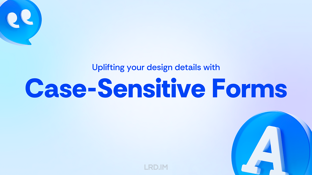
When my workflow had fully transformed from Sketch to Figma, I found there was an option “Case-Sensitive Forms” placed in several typeface setting panels. The appearance of the font might change slightly and occasionally when I enable this setting.

I was interested in this setting option, then I tried to find out concepts and related knowledge about the term “Case-Sensitive Forms.

In this post, I will explain what Case-Sensitive Forms are, when should we implement this feature to uplift our design with several practices, and how to use it in our workflow.

The image shows a settings panel in Figma focusing on typography settings. It highlights the “Case-Sensitive Forms” option, which is clearly marked in a dropdown menu under the “Details” tab. The “Case-Sensitive Forms” setting is encircled in red to emphasize its importance in the typography setup.

Features

The “Case-Sensitive Forms” is a feature of OpenType features, which are like hidden compartments in fonts that allow us to change how fonts look and behave. When we use this feature, the font will:

  1. Shift some punctuation marks up to a higher position;
  2. Change oldstyle figures to modern figures.

Feature 1: Shifting some punctuation marks up to a higher position

In general, punctuation marks are vertically centered with lowercase characters, which is known as “x-height.”

However, when using the Case-Sensitive Forms feature, some punctuation marks are aligned with the height of uppercase characters, which we call “Cap height.”

Comparative display of text alignment with and without Case-Sensitive Forms in Figma, showing punctuation marks adjusted to a higher position.

Feature 2: Changing oldstyle figures to modern figures

Some fonts use oldstyle figures by default to add visual attraction. It is often used in traditional publications like books and newspapers since this font has a rhythmic beauty with varied heights.

When using the Case-Sensitive Forms feature, fonts will be directly changed to modern figures, also known as “lining figures.”

Visual comparison in Figma of oldstyle figures versus modern figures using Case-Sensitive Forms feature.

Realistic practices

Inspiring by the feature 1, shifting some punctuation marks up to a higher position, it is well-suited for compositions that mix uppercase characters, figures, and CJK characters.

Here is a list of compositions that might be visually improved by using the Case-Sensitive Forms feature.

1. International phone number

Because figure glyphs are as high as uppercase characters, the use of Case-Sensitive Forms is ideal for displaying phone numbers that include area codes.

Graphic displaying an international phone number ‘+1(425) 555–0100’ with normal and Case-Sensitive Forms formatting in Figma.

2. Date and time

Similarly, date and time is also well-suited for using the Case-Sensitive Forms feature since they are typically consisted of figures and marks.

Graphic displaying the date ‘2024–06–10 9:39 PM (GMT+8)’ with normal and Case-Sensitive Forms formatting in Figma.

3. All caps text

To make titles or other important information visually prominent, we often capitalize the text, which is also ideal for using the Case-Sensitive Forms feature.

Graphic displaying the text ‘SIGN-UP NOW’ in all caps, with normal and Case-Sensitive Forms formatting in Figma.

4. East Asian typography

East Asian typography looks like a square, meaning the visual height of Chinese, Japanese, Korean, and Vietnamese characters is similar to the “X” letter’s cap height.

Therefore, the Case-Sensitive Forms feature are also fitting for the East Asian typography scenario, ensuring marks are vertically aligned with the characters.

Graphic displaying East Asian typography ‘50条/页’ and ‘NHK | 日本放送协会’ with normal and Case-Sensitive Forms formatting in Figma.

5. Sensitive information

When displaying sensitive information on digital interfaces, such as Social Security Number(SSNs), bank account numbers, and phone numbers, we often use asterisks (*) or dots (•) to partially obscure it. In that case, the Case-Sensitive Forms feature is highly suitable.

Graphic displaying masked sensitive information ‘***-**-1234’ with normal and Case-Sensitive Forms formatting in Figma.

6. Text face

A rare scenario that may be ideal for using the Case-Sensitive Forms feature is text faces, such as “:D” and “:-)”

Graphic displaying text faces ‘:D’ and ‘:-)’ with normal and Case-Sensitive Forms formatting in Figma.

How to use

1. Supported typefaces

Only typefaces that support the OpenType feature of Case-Sensitive Forms can enable this feature.

It means that not ALL typefaces support this feature, even if we implement this setting in design tools or through coding. I’ve simply made a list to clarify which typefaces support it and which not.

Typefaces that support the Case-Sensitive Forms feature:

  1. DIN Pro;
  2. Inter;
  3. San Francisco (fonts for Apple platforms);
  4. Inria Sans;
  5. Warnock Pro…

Typefaces that DO NOT support the Case-Sensitive Forms feature:

  1. Arial;
  2. Helvetica;
  3. Noto Sans;
  4. Roboto;
  5. Source Sans;
  6. Segoe UI…

In other words, the Case-Sensitive Forms feature only works on Apple devices if we use the system default font on our website.

2. Figma

Follow these steps to implement the Case-Sensitive Forms feature in Figma. Select a text layer, then:

  1. Open the “Type settings” panel;
  2. Switch to the “Details” tab;
  3. Check the “Case-sensitive forms” option.
Screenshot of the Figma interface highlighting the Case-Sensitive Forms setting in the type settings panel. Step 1: Select the text layer indicated by a three dots icon. Step 2: Click on the ‘Details’ tab. Step 3: Enable the Case-Sensitive Forms option from a dropdown menu.

3. CSS

To use the Case-Sensitive Forms feature on the website, we just need to simply add font-feature-settings: ‘case’; to the element that we want to implement this feature.

Code snippet displayed in a dark theme editor with CSS properties: font-feature-settings: ‘case’; This is used to implement Case-Sensitive Forms for displaying a phone number.

The CSS Compatibility of this style is quite good. Again, we need to ensure the typefaces support the Case-Sensitive Forms feature; otherwise there will be no changes.

Chart displaying high browser compatibility for CSS font-feature-settings, with most modern browsers showing extensive support for advanced typographic features.

Set as default?

We’ve discussed many scenarios and advantages of using the Case-Sensitive Forms feature. So should we set it as the default style?

My answer is NO.

Although it can uplift visual details with numbers and capital text, it is quite awful when used with lowercase letters, which are more commonly used on our website.

Graphic displaying the sentence ‘I bought apples (and oranges).’ in two styles: normal and with Case-Sensitive Forms in Figma.

However, we can safely implement the Case-Sensitive Forms feature in some components that always consist of numbers, marks, and capital letters. Here is the list of UI components:

  1. Avatar;
  2. Badge;
  3. Pagination (Image viewer, Swiper and the likes);
  4. Letter counter.
Display of various UI components using Case-Sensitive Forms in Figma, including Avatar icons with notification counts, Badge icons with user images, a pagination interface, and a letter counter showing ‘My website is LRD.IM’.

For comparison, let’s see the most common solution in which the Case-Sensitive Forms feature is not implemented on digital interfaces.

Display of various UI components in Figma without Case-Sensitive Forms: Avatar icons with notification counts, Badge icons with user images, a pagination interface, and a letter counter showing ‘My website is LRD.IM’.

Recently, my team has been redesigning our mobile component library. I’ve suggested using the Case-Sensitive Forms feature on the components listed above. Let’s see the outcomes in the future.

References

  1. Feature: case — Case sensitive Forms
  2. 高级排版功能:Case-Sensitive Forms 是什么?

Uplifting your design details with the Case-Sensitive Forms feature was originally published in Bootcamp on Medium, where people are continuing the conversation by highlighting and responding to this story.

Lessons I learned after completing the Google UX Design Professional Certificate

The image is a presentation slide with a dark green background and white text. The text reads “Lessons I learned after completing the Google UX Design Professional Certificate.” The logo “LRD.IM” is also displayed.

Recently, I heard that Coursera has a UX design course developed by Google’s design team. This course covers the entire design process and teaches us how to present our portfolio, prepare interviews, and the like.

It is necessary to enroll in this course even though it is designed primarily for beginners and fresh graduates. It would enhance my English skills on one hand, and deepen my understanding of Western design practices and culture on the other. Since the term “UX design” is called out by Western designers and I am eager to compare Western design cultures with those I’ve experienced in China.

So I enrolled in this online course, trying to spare my time on it. Such as during lunch and dinner breaks on weekdays, or parts of the weekend. I completed the whole certificate within two months. And now I’d like to write down what I learned from this course:

The image shows a dark green presentation slide with four text boxes labeled “New concepts,” “Listening and Reading Proficiency,” “Accessibility and equity,” and “Guidance for Job Hunting.” The text is in white and each box has a rounded edge.
  1. Introducing concepts I had never heard of. Despite my 5+ yoe in a wide range of companies, from startups to large corporations in China, those new concepts opened up a lot of room for me to explore.
  2. Enhancing my listening and reading skills. The course covers plenty of video and reading materials that include industry jargon that translators cannot provide. Moreover, certain phrases and sentence structures are repeatedly used throughout the course. I think my reading skills and speed are slightly improved.
  3. Pointing out concepts like accessibility and equity early throughout the course. I used to think only seasoned designers or well-developed products consider these aspects, however, they are mentioned early on and repeatedly. These concepts resonated with me and will truly influence my work.
  4. Elaborating comprehensive and detailed guidance for designers to prepare their portfolios, resumes, and interviews. They not only tell us what content should be included in our portfolios, but also how to prepare for interviews at different stages. I resonated with these instructions as well, since I did think those details over when looking for a new job.

Table of content

This is a wide banner-like image with a dark green background and the words “New concepts” in large, white text centered across the slide.

New concepts

I have consistently tried to think about and expand design boundaries through different aspects, which requires a breadth of knowledge. Here, I will share several new concepts along with my personal understanding.

Affinity diagram

This is a method of synthesizing that organizes data into groups with common themes or relationships. It can be used in different stages of the design process, such as during brainstorming or after collecting users feedback. The example below focuses on the latter.

After collecting a batch of user feedback, the design team condense each piece of feedback into a single sentence and write it on sticky notes. Then we post them up on a whiteboard or digital tools like Figma. Then the design team look for sticky notes that reference similar ideas, issues, or functionality and collaboratively organizes them into clusters representing different themes.

When I first learned about this approach in the course, I realized that this approach is similar to another method called “Card sorting” that was included in an article I translated earlier named [English to Chinese Translation] How we rebuilt Shopify’s developer docs. Both methods involve clustering sticky notes, naming these groups and summarizing the themes or relationships.

However, card sorting is implemented by external participants and aims to uncover users’ mental models to improve information architecture; Whereas affinity diagramming organizes a large amount of raw data to show the team which problems users are most concerned about and consider high priority.

* This concept is mentioned in Module 3 of Course 4 (Conduct UX Research and Test Early Concepts — Module 3 — Gather, organize, and reflect on data)

Digital literacy

This concept refers to an individual’s ability to gather, communicate, and create content using digital products and the internet. For example, senior adults or those living in areas with poor internet infrastructure may find it difficult to understand interfaces and functionalities, they are considered to have lower digital literacy.

In contrast, young people, especially those working in the information technology industries, are typically familiar with new software and concepts, and can quickly adapt to them.

This course does not dig deeply into this concept, rather, it emphasizes the importance of understanding our users. If our product targets a broad range of users, it is good to consider the needs of users with lower digital literacy. Moreover, this factor should also be considered when recruiting participants for usability tests.

* This concept is mentioned in Module 2 of Course 1 (Foundations of User Experience (UX) Design — Module 2 — Get to know the user)

Deceptive pattern

This concept refers to a group of UX methods that trick users into doing or buying something they wouldn’t otherwise have done or bought.

In the course, instructors clearly point out that this is an unethical and not a good practice. Businesses may lose their clients’ respect and trust once clients realize that they have fallen into deceptive patterns. I will share a few interesting examples that the course provided.

  1. Confirmshaming: Making users feel ashamed of their decision. For example, a subscribe button on a news website usually reads “Subscribe now / No thanks”. BBut if the service provider wants to manipulate readers’ emotions, the text might be changed to: “Subscribe now / No, I don’t care about things around me.”
  2. Urgency: Pushing users to make a decision within a limited time. For example, an e-commerce website might give you a coupon that is only available for 24 hours, prompting you to purchase items without a thoughtful consideration. The course doesn’t judge these marketing strategies or promotions; instead, it suggests that we should avoid putting pressure on users. As designers, we should try our best to balance business promotions and avoid manipulating users’ emotions.
  3. Scarcity: Making users very aware of the limited number of items. For example, a popup or attractive advertisement stating “Only 5 items left in stock.” The course suggests that designers should concentrate on helping users to understand products better, rather than using designs to encourage impulsive buying.

It is really interesting that these deceptive patterns are so common in the Chinese e-commerce industry that it might seem unusual if those strategies were to disappear.

This seems to reflect cultural differences between China and the West. In China, core team members, such as designers, product managers, and operators, collaboratively discuss how to induce and prompt users to make a hasty decision. Also, we regularly hold reflections to discuss and share insights on how to deeply incite users’ motivation.

In 2018, I landed my first job as a UI designer at an e-commerce company. One of my main tasks is designing promotions, such as “claim your vouchers”, “flash sales ending in N hours”, and creating illustrations of red pockets and flying coins, and the like. I didn’t really like these approaches at that time, so I eventually turned to the B2B and SaaS industry, focusing more on UX design.

Although I am not fond of these types of designs, these seem to really help companies grow and generate income. We could stabilize our employment only if our company were earning profits. Perhaps that is an inextricable cycle: obviously, deceptive patterns are unethical and bad as they are inducing and annoying our users, but we must continuously implement these approaches and think about how to make them more effective.

* This concept is mentioned in Module 3 of Course 3 (Build Wireframes and Low-Fidelity Prototypes — Module 3 — Understand ethical and inclusive design)

Biases

The course thoroughly explains a concept called “implicit bias”. It refers to the collection of attitudes and stereotypes associated, influencing our understanding of and decisions for a specific group of people.

For example, imagine you’re designing an app to help parents buy childcare. To personalize your onboarding process, you start by displaying bold text saying, “Welcome, moms. We’re here to help you…”

This is an example of implicit bias, since it excludes every other type of caregiver, like grandparents, guardians, dads and others.

In addition, here are some interesting biases the course introduced:

  1. Confirmation bias. Refers to the tendency to find evidence that supports people’s assumptions when gathering and analyzing information.
  2. Friendliness bias. Refers to the tendency to give more desirable answers or positive comments in order to please interviewers. This usually occurs in usability tests, where participants may not share their honest feedback because they are afraid that real answers or negative comments might offend interviewers and be considered unfriendly.
  3. False-consensus bias. Refers to the tendency that people tend to believe that their personal views or behaviors are more widely accepted than they actually are, and consider others’ opinions to be minor or marginal. For example, an optimist might think that most people around the world are optimistic; or designers can easily understand iconographies and illustrations they created, they might assume other users might easily to understand too.

I was shocked when I was learning this part. I strongly resonated with these biases which I had never perceived before. After all, the course lets us be aware of these biases and provides approaches to help us avoid falling into these pitfalls.

* This concept is mentioned in Module 3 of Course 3 (Build Wireframes and Low-Fidelity Prototypes — Module 3 — Understand ethical and inclusive design)

I listed some concepts above that I had barely encountered in my workspace. Becoming a UX designer appears to require a broad range of knowledge, such as design, the humanities, psychology, and sociology. I am now interested in psychology after completing this course.

This is a wide banner-like image with a dark green background and the words “Listening and Reading Proficiency” in large, white text centered across the slide.

Listening and Reading Proficiency

There are plenty of listening and reading materials involved in the course. Typically, each video lesson is accompanied by an article. If there are additional knowledge points, a single video might be accompanied by two or three articles.

Most instructors in the course speak with American accents. They also speak slowly and clearly, which makes me comfortable and usually allows me to understand without opening closed caption. Sometimes, I need to rewind a few seconds when they are speaking long sentences with many clauses or introducing new concepts, and I will open closed captions if I am still confused.

It is worth pointing out that the course contains lots of industry jargon, and I resonated with this because I used similar approaches or processes in my workspace by using Chinese. As a learner, I created a spreadsheet to record expressions that might be useful, such as:

  1. Above the fold, the content on a web page that doesn’t require scrolling to experience;
  2. Deliverable, final products like mockups or documents that can be handed over to clients or developers to bring designs to life.
  3. Digital real estate, space within the digital interface where designers can arrange visual elements;
  4. Firm parameters, refer to rigid design boundaries or limitations like time, project resources, and budget.

I think it is valuable to collect this industry jargon because it is authentically expressed, which can’t be translated by common translation tools. This will be helpful for me to read design articles and write blogs in English.

This is a wide banner-like image with a dark green background and the words “Accessibility and Equity” in large, white text centered across the slide.

Accessibility and Equity

Accessibility

The course introduces several assistive technologies, such as color modification, voice control, switch devices, and screen readers, which can help people with different types of disabilities to use our products easily.

Instructors also point out that even people who don’t have disabilities, or who do not perceive themselves as having disabilities might benefit from these assistive technologies. The course suggests that we think these factors over throughout the entire design process. For instance:

  1. Supporting color modification. Features that increase the contrast of colors on a screen, like high-contrast mode or dark mode;
  2. Supporting voice control. Allows users to navigate and interact with the elements on their devices using only their voice. They also mention a concept called “Voice User Interface (VUI)”;
  3. Supporting switch devices. This is a one-button device that functions as an alternative to conventional input methods such as the keyboard, mouse, and touch, allowing users to complete common tasks like browsing webpages and typing text;
  4. Supporting screen readers. Allows users with vision impairment to perceive the content. The course suggests that we write alternative text to images, add appropriate aria labels to interactive elements like buttons, and consider the focus order of elements.

Here is a website that demonstrates the color modification feature: HubSpot.com

On the top navigation of this website, it provides a switch for us to toggle a high-contrast mode. Moreover, it also supports reduced motion effects — if I enable the reduced motion setting on my device, this website will minimize motion effects as much as possible.

Equity

The course also introduces a concept called “equity-focused design.”

Instructors clearly define the difference between “equality” and “equity”:

  1. Equality: Providing the same amount of opportunity and support, everyone receives the same thing;
  2. Equity: Providing different amount of opportunity and support according to individual circumstances, ensuring everyone can achieve the same outcomes.

The course also points out that equity-focused design means considering all races, genders, and abilities, especially focusing on groups that have been historically underrepresented or ignored when building products.

They use a survey question as an example: when gathering participants’ demographic information like gender, it is not enough to provide three options: “Male”, “Female” and “Other”. To make our design more inclusive and equitable, we should offer additional choices, including “Male”, “Female”, “Gender-nonconforming”, “nonbinary” and a blank field. The latter provides non-conventional gender options, uplifting those who might be marginalized in conventional surveys. This approach also aims to balance the opportunities for all groups to express themselves, ensuring their voices are treated fairly and heard.

In this lesson, I clearly faced a culture gap from the West. In fact, I don’t really like to dig into this concept deeply, mainly because I can’t determine whether this approach is right. Sometimes I think it is unnecessarily complicated, but at other times, I recognize that there are people with non-traditional genders around us who may truly be eager to be treated fairly.

When I was learning this lesson, I realized that there was an opportunity to incorporate accessibility features into the project I was recently working on. I will write a new post if this project lands successfully.

* This concept is mentioned in Module 2 of Course 1 (Foundations of User Experience (UX) Design — Module 2 — Get to know the user)

This is a wide banner-like image with a dark green background and the words “Guidance for Job Hunting” in large, white text centered across the slide.

Guidance for Job Hunting

In the final course, instructors teach us how to lay out a portfolio and what content should be included. They also inform us the process of interviews and how to thoroughly prepare for interviews.

The guidance they mentioned is for the Western workplace, which may not seamlessly fit in the Chinese workplace. For example:

  1. They point out that designers should have a personal website and case studies regularly. However, Chinese designers prefer to publish their case studies on public platforms like ZCOOL and UI.CN;
  2. They also teach us how to build our digital presence and network through LinkedIn. However, these approaches are not common in the Chinese job market, where the most popular methods are directly submitting resumes and getting recommendations through acquaintances.
  3. They inform us how to handle panel interviews. I have interviewed with a wide range of companies, from startups to corporations, and never encountered panel interviews, which means that the panel interview is not popular in this industry.

I was deeply impressed by how they elaborated on the preparation and important considerations during the interview process. For example:

  1. Research the main business of the company you interview for beforehand, and clearly understand why you are a good fit for the company;
  2. Prepare answers to common interview questions beforehand, such as a personal introduction, your strengths, and descriptions of your case studies;
  3. We should learn how to answer difficult questions using the STAR method, and prepare well before starting an interview;
  4. Adapt the focus and questions according to the interviewer’s role to show you are a professional;
  5. During the interview process, you might be asked to complete a task. Therefore, we should practice the ability to think aloud and clearly define questions, since interviewers might pose vague questions on purpose.

I resonated with the approaches and tricks mentioned in the course that I had previously used, which gave me a strong feeling that I was on the right track.

Additionally, the course also provides detailed instructions on how to pursue freelance design work. For instance:

  1. Clearly identify your target audience and understand why they should choose your service;
  2. Know your competitors, identifying what they can’t provide but you can;
  3. Promote your service and build word-of-mouth by attending online and in-person events, and getting recommended through acquaintances;
  4. Calculate the business expenses, set fair prices for your services, and make financial projections — estimate what your finances will look like in the first month, the first 6 months, and the first year.

* This concept is mentioned in Module 3 of Course 7 (Design a User Experience for Social Good & Prepare for Jobs — Module 3)

To sum it up

Well, above are lessons I’ve learned from the Google UX Design Professional Certificate on Coursera over the past two months. I think that this is an interesting course, although not all content can be applied in my daily work, I’ve also learned the thinking processes and workplace cultures of designers in another part of the world.

I strongly recommend designers reading this post consider to enrolling in the Google UX Design Professional Certificate, by doing this, you might probably gain new insights. The course costs $49 monthly, which is not expensive. It is likely to complete the entire course over two or three months if you have a full-time job.

Things worked as I expected, and I will start my next project in the second half of the year.


Lessons I learned after completing the Google UX Design Professional Certificate was originally published in Bootcamp on Medium, where people are continuing the conversation by highlighting and responding to this story.

完成了 Google UX Design Professional Certificate 后的收获

最近了解到 Coursera 这个平台里面有一个 Google 设计团队出品的的 UX 设计课程,课程里会介绍完整的 UX 设计过程,并且教我们怎么写作品集和准备面试之类的。

即便这是一门面向初学者或应届生的课程,我觉得也有必要参加这个课程看看。一方面能锻炼下自己刚闭关修炼出来的的英语能力,更重要的是还能了解下西方职场的设计流程和设计文化(毕竟 “UX 设计” 这个概念是西方人创造出来的),我一直想对比看看老外的设计文化和自己这几年在国内职场的感受有没有什么异同。

于是就报名参加了这个网课,都是抽时间来学习的。比如工作日吃午饭和吃晚饭那段时间,或者周末的部份时间等等。总共花了 2 个月完成了所有课程。写这篇文章的目的也是记录下结课之后的感受:

图片中央展示四个方框,每个方框内部都用白色中文文字标识了不同的概念:“新的概念”,“听力、阅读能力”,“无障碍和公平”,“求职指引”。
  1. 里面提到的一些概念我没有听说过。即便我工作了 5 年,在小公司和大集团都呆过,里面有些概念仍然给了我很大的探索空间;
  2. 英文听力、阅读能力锻炼。里面有大量的视频和阅读材料,用词应该就是比较地道的行业术语,这些是翻译软件不能提供的。而且里面的材料都会不断重复一些短语或句型。我觉得我的阅读能力和速度是有所提升的;
  3. “无障碍” 和 “公平” 的概念被很早提及并贯穿全课程。我一直以为只有比较成熟的设计师或产品才会考虑到这些,但这些概念在课程中很早就被提及了,而且是反复提及。这触动了我,并真正地影响到了我的工作;
  4. 提供了全面且周到的指引帮助设计师准备作品集/简历/面试。这方面内容他们写得很细,告诉我们作品集里应该包含哪些,针对不同面试阶段所做的准备等。里面写到的东西我很有共鸣,因为我在找工作的时候也会去思考这些细节。
深绿色背景的宽幅 Banner,中间白色大字“新的概念”。

新的概念

工作这几年,我一直会尝试从更多不同的维度来思考和扩展原有的设计边界,做到这点需要有比较宽广的知识面。这里分享下我在课程里了解到的一些新概念,以及我的理解。

Affinity diagram 亲和图

这是一种组织数据的方法。从不同的反馈和数据中整理出他们的相似之处和关系。亲和图可以用在不同的设计阶段,比如在头脑风暴中,或者收集到用户反馈后,这里以后者为例子。

具体做法是在收集好一批用户反馈后,将每一个原始反馈浓缩成一句话,写在便利贴上并将它们都贴在白板上(当然,也可以用在线工具如 Figma 完成)。然后团队成员一起看这些内容,将提到相似概念/问题/需求的便利贴放在一起,并给这一堆便利贴起个名字概括他们的共同点。

根据分组结果,我们可以总结出一些趋势、痛点,了解到我们需要解决的问题也为后续的洞察报告提供了依据。

最开始在课程里了解到这个方法的时候,我突然想起来这与我两年前翻译的文章:【译文】我们如何重建 Shopify 的开发者文档 里提到的 “卡片分类法” 很像,都是将相似的卡片堆成一组,给该组命名,然后得出结论。

但卡片分类法里面 “分类” 的动作是由团队外部的人参与的,并且用于揭示用户的心智模型并为解决网站信息架构问题提供指引;而亲和图则是通过组织大量原始数据,告诉团队有哪些问题是用户关心的,亟待解决的问题。

*该概念在第四门课程的第三个模块中提及 (Conduct UX Research and Test Early Concepts — Module 3 — Gather, organize, and reflect on data)

Digital literacy 数字素养

这个概念大意是指人们对于数字产品、网络来获取信息、交流和创造内容的能力。比如一些年长的人、生活在网络没那么普及的环境中的人,他们对于使用电子设备和互联网就会有些障碍,理解功能和界面也会感到困难。而年轻人,特别是互联网行业的从业者则对这些就比较熟悉,各种新软件、新概念都能很快上手。

课程中对这个概念并没有展开太多,主要是提醒我们作为设计师,要了解到我们的用户是谁。如果是一个面向较宽广的用户群体,最好考虑也到对电子设备和互联网没那么熟悉的人。包括在做可用性测试时,招募的参与者最好也考虑到这个因素。

*该概念在第一门课程的第二个模块中提及 (Foundations of User Experience (UX) Design — Module 2 — Get to know the user)

Deceptive pattern 欺诈性设计模式

指的是一种设计方法:通过设计去诱导用户去做一些本来不想做的事情,或购买本来不想买的东西。

在课程中,明确指出这是不道德的事情,不是好的做法。一旦用户认为自己陷入了欺诈性设计模式当中,公司将会失去用户的尊重和信任。课程中列举了一些例子,我可以拿几个有意思的的分享出来。

  1. Confirmshaming (羞辱性确认): 让用户对自己作出的决定感到愧疚。比如一个新闻网站的订阅按钮,文案里原本可以写 “立即订阅 / 不了,谢谢”,但为了操纵用户的情绪,文案写上 “立即订阅 / 不了,我不关心身边的事情”。
  2. Urgency (急迫性): 引诱用户在 “有限的时间内” 作出决定。比如电商网站里给你送了一张仅限当天使用的优惠券,促使你赶紧付钱消费。课程里指出并重点不是限时促销这件事情,而是在这过程中给用户增加了消费的压力。作为设计师,我们应该在曝光公司的促销活动的情况下,尽量避免操纵用户情绪。
  3. Scarcity (稀缺性): 使用户感受到这件商品非常稀缺。比如一个弹窗推送或明显的广告写着 “商品仅剩 5 件”。课程中建议设计师聚焦于怎么帮助用户更好地了解该产品,而不是利用设计促使他们进行冲动型消费。

有意思的是这几种 “欺诈性设计模式” 在咱们国内电商环境中太常见了,以至于没有这些反而感觉不正常。

看起来这是国内外文化的差异的一种体现。在国内的环境中丝毫不会避讳这些东西,反而设计、产品、运营都会一起构思怎么做才能更好地 “诱导” 用户做某些事情。甚至还会在内部复盘、分享,看看过程中有哪些地方可以继续改进。

2018 年,我的第一份工作是在面向消费者的电商公司里做 UI 设计师,经常要在界面上做出 “领取优惠券”、“秒杀价剩余 N 小时” 和礼包、金币满天飞的插画等设计,正正是因为自己不喜欢做这种设计,之后才转向了更注重 UX设计的做 B 端、SaaS 行业。

虽然自己本身是一点都不喜欢这种设计方式,但这似乎能实打实地帮助到公司获取收入。公司有一份好的收入,大家的工作才能稳定。似乎陷入了一个无法走出的循环 —— 明知道这种设计方式是不对的,是有诱导性质且给用户带来烦扰的,但又不得不继续做,并想办法做得更好。

*该概念在第三门课程的第三个模块中提及 (Build Wireframes and Low-Fidelity Prototypes — Module 3 — Understand ethical and inclusive design)

Biases 偏见

课程里着重介绍了一个叫做 “隐性偏见 (implicit bias)” 的概念。“隐性偏见” 指的是我们潜意识里有一种态度或偏见,影响了我们对某一群体的理解或决定。

比如一个餐厅老板收到两份简历,求职者 A 是一个二十多岁的毕业生,没有餐饮行业经验;而求职者 B 则是一个 50 多岁的人,有 30 多年餐饮行业经验。但最终老板选择了求职者 A,因为他认为年轻人的体力更好,做事情会比 50 多岁的人要快。这就是一个 “隐性偏见” 的例子。

课程中还介绍了其他几种偏见,这里也分享一些我觉得有意思的:

  1. Confirmation bias (确认偏见)。指的是人们在收集信息和分析信息的过程中,倾向于寻找支持自己想法的证据。甚至尝试以更贴近自己预想结果的方式来解释数据;
  2. Friendliness bias (友善偏见)。指的是为了令其他人满意,受访者更倾向于做出访问者希望得到的答案或者做出积极评价。通常发生在可用性测试当中,受访者觉得说出真实答案或负面情绪的答案会被认为冒犯和不友善,不将自己的真正想法说出来;
  3. False-consensus bias (错误共识偏见)。指的是人们倾向于认为自己的观点或行为比实际情况更广泛地被认同,并且觉得其他人的观点或意见是被少数人接受的。比如一个人很乐观主义,就会认为世界上大多数人都是乐观主义;设计师能够很轻松地理解自己设计出来的图标、图像含义,就会认为其他用户也能轻易理解。

学到这里的时候我似乎被当头一棒,我似乎对里面提到的不少偏见都有共鸣,并且自己从来没意识到有这么一回事。总的来说,课程希望我们认识这些偏见,然后提供方法教我们怎么避免这些偏见。

以上列举了几个我在课程里了解到在日常工作中不怎么接触到的概念。可以看出来做一名 UX 设计师似乎得有宽广的知识背景,比如设计、人文、心理、社会学等等。通过这门课程,我觉得我对心理学产生了一些兴趣。

* 该概念在第三门课程的第三个模块中提及 (Build Wireframes and Low-Fidelity Prototypes — Module 3 — Understand ethical and inclusive design)

深绿色背景的宽幅 Banner,中间白色大字”听力、阅读能力”。

听力、阅读能力

课程里面的听力和阅读材料实在是太多了,基本上是一节视频课程,搭配一篇的阅读,如果有其他可以衍生出来的知识点,甚至会多篇阅读。

里面绝大多数老师都是美式口音,语速有刻意地减慢,我听着很舒适,绝大部分情况下不用看字幕。只是到了一些包含大量从句的长句子或新概念时可能会需要倒退一下多听几遍,再听不懂就会开字幕来看。

值得一提的是,里面有大量的行业术语,有很多我在国内日常工作中的用到的设计方法/流程等,这里都有出现到。作为学习者,我自己有做一个表格,把值得记录下来的表达方式都记下来,比如:

  1. Above the fold 指的是在首屏(不用滚动)就能看到的内容;
  2. Deliverable 设计的交付物;
  3. Digital real estate 大概是指视窗范围或可供设计师发挥的空间尺寸;
  4. Firm parameters 指一些设计过程中的限制,如时间,项目资源和预算等…

我觉得积累这种行业词汇有一个宝贵之处是,它的表达很地道,用通用的翻译软件是做不到的。这对我阅读设计经验文章,或者自己用英文写设计博客很有帮助。

深绿色背景的宽幅 Banner,中间白色大字”无障碍和公平”。

无障碍和公平

无障碍

课程中介绍了几种辅助技术 (Assistive Technology),如颜色模式、语音控制、Switch 设备和屏幕阅读器等帮助身体有障碍的人们更好地使用我们的产品。课程强调即便是健全人,或者认为自己是健全人的群体,也有可能会用到这些辅助技术。课程建议我们在设计的全流程都考虑这些因素。具体的做法,比如:

  1. 支持多种色彩模式。如亮色/暗色模式,支持增强对比度和减弱透明度等效果;
  2. 提供语音控制支持。允许用户通过声音来导航和与界面上的元素交互。另外,里面提到有个概念叫做 “VUI”;
  3. 支持一种叫做 “Switch” 的设备。这是一种代替键盘、鼠标或手指等常见输入方式的设备,通常只有一个按钮。用户就是通过一个按钮来实现浏览网页、输入文字等日常操作的;
  4. 支持屏幕阅读器。确保人们可以在看不见屏幕的情况下也能获取到主要内容。课程建议我们给图片添加替代文字,或者给按钮等控件加上合适的标签,并且留意元素的聚焦顺序。

这里分享一个在这方面有所体现的网站:HubSpot.com

这个网站提供了强对比的色彩模式,在顶部导航栏里有开关可以切换。同时也支持减弱动画的效果,如果我的设备在系统设置里设置了减弱动画,这个网站的大部份动效都会被移除。

公平

课程中介绍了一个概念叫做 “以公平为中心的设计” (equity-focused design),并厘清了 “平等” 和 “公平” 这两个概念:

  • 平等是每个人都有相同的机会和支持,即每个人都拿到了同样的东西;
  • 公平是根据每个人不同的情况而提供不同的机会和支持,最终大家都能有相同的结果。

课程中指明,面向 “公平” 的设计,需要考虑到所有种族、性别、能力,特别是一些曾经被忽视和排除的群体

他们以一个问卷问题作为例子:在收集受试者的性别信息时,如果只提供三个选项:“男”、“女” 和 “其他” 是不够的。如果想要更包容和公平我们应该提供:“男”、“女”、“非常规性别”、“非二元性别” 和 “请填写”。后者通过提供非传统性别选项和自定义选项,关注到了那些可能在传统问卷调查中被边缘化的群体。试图平衡不同群体间的表达机会,确保他们的声音被平等对待和听见。

从这门课程里我正面感受到了来自西方文化差异。实际上我不是很想太深入学这里面的门道,主要是我没法判断他们这种做法到底是对还是错,我有时候会认为这是在闲着没事干,有时候又认为我们身边确实也会有这种非传统性别的人,他们或许真的需要被 “平等对待”。

学到这里时,刚好公司的工作中有机会可以让我在设计中加入对无障碍的考量,我便抓紧机会在公司实施了一番。如果我的计划落地成功,我也会在这里分享出来的。

*该概念在第一门课程的第二个模块中提及 (Foundations of User Experience (UX) Design — Module 2 — Get to know the user)

深绿色背景的宽幅 Banner,中间白色大字”求职指引”。

求职指引

最后一课老师教授了我们怎么做作品集、一份作品集里要包含哪些东西、面试的流程、怎么准备面试等。

课程里讲述的都是西方世界的职场规则,有些未必在国内职场适用,比如:

  1. 比如他会提到设计师应该有一个自己的个人网站,里面需要及时更新自己的作品。但在国内大家似乎更喜欢将作品传上平台提高曝光度,比如站酷UI 中国
  2. 他会教我们怎么建立自己在互联网上的形象并通过 LinkedIn 去做 Networking。但似乎在国内的职场上没有这一步,身边的人多数都是直接在网站上投简历,或者有少量的人是熟人内推进去的;
  3. 里面有教我们怎么应对小组面试。我这几年在国内面试了大大小小公司,没试过有小组面试的情况,说明小组面试在我们的行业内不是特别流行。

印象比较深的是在课程里他提到了对于面试的准备,以及面试过程中的注意事项。课程里说得真的挺细的,比如:

  1. 面试前要了解好公司所做的业务,清楚自己为什么适合去那家公司;
  2. 提前准备好一些常用的问题,比如个人介绍、个人优势以及介绍设计案例等;
  3. 学会用 STAR 法则回答困难的问题,在面试前提前练习好;
  4. 根据面试官身份来改变面试的侧重点和要提问的问题,需要体现出自身的专业性;
  5. 面试时可能会有现场测试题。所以我们要练习好将自己的想法说出来的能力,也要有界定清楚问题的能力(因为有时候面试官特意给出很模糊的问题)

有时候刚看看到课程里提到的方法和技巧,正好是我有用过的,我会感到有共鸣,觉得自己的方向是对的。

另外,课程里还有教我们如果想走自由职业,要遵循怎么样的步骤。写得还比较详细,我这里列举几点:

  1. 明确目标用户是哪些群体,他们为什么要选择自己的服务;
  2. 了解自己的竞争对手,看看有没有东西是他们提供不了而自己是可以的;
  3. 通过参加线上推广、线下活动、熟人推荐等方式推销自己的服务和建立口碑;
  4. 计算开支,合理定价,并且制定财务计划 —— 构思第一个月、第六个月或第一年自己的财物状况是怎样的。

*该内容在第七门课程的第三个模块中提及 (Design a User Experience for Social Good & Prepare for Jobs — Module 3)

总结

以上就是我这两个月以来在 Coursera 平台里学习 Google UX 课程的一些收获。我觉得还是挺有意思的一门课程,即便不是所有内容都能在日常工作中应用,但至少知道在地球里的另一个世界,那边的设计师他们的思考习惯、职场文化是怎样的。

我很推荐看到这里的设计师们去这门课程 Google UX Design Professional Certificate 里瞧瞧,相信大部份人都是有收获的。收费不是很贵,是按月来收费。每个月 49 美刀,工作党每天抽点时间来看,一般 2~3 个月都能完成了。

事情按照预期发展,五一假期结束了这门课程,下半年又可以开始捣鼓另一件事情了。

English speaking skills for PTE test

I shared my excitement about the PTE test result in the previous post. In this post, I will detail the English-speaking skills I learned during the three-month learning journey, which specifically meet the PTE test criteria.

PTE’s criteria

Let’s take a look at the two key criteria in the PTE’s speaking component: Pronunciation and Fluency.

Pronunciation and Oral fluency criteria of PTE test

Based on these criteria, I would like to highlight these key points:

Pronunciation:

  1. Vowels and consonants;
  2. Word stress;
  3. Sentence-level stress;
  4. Assimilation and deletions.

Fluency:

  1. Rhythm and phrasing;
  2. No hesitations.

As we can see, the PTE’s test criteria clearly show concepts we must fully understand and perfectly present if we want to achieve a higher score. In the following text, I will present my comprehension of these concepts, supported by related online resources.

Pronunciation

Vowels and consonants

In everyday conversations, sightly mispronounced words often do not significantly disrupt the flow of our discussion. But thanks to modern technology, PTE’s scoring is based on algorithms and is implemented by computers, which can easily detect each mispronunciation. Therefore, the ability to pronounce words clearly and accurately is crucial.

I have tried numerous methods to improve my pronunciation and reduce Chinese accent including speaking loudly, having more emotion, and directly imitating local accents. However, it didn’t work as expected, it did not meet my expectation, resulting in a low score in PTE practice.

Changes occurred the time I met Sun’s tutorials and BBC Learning English collection on YouTube. These pronunciation videos elaborate on vowel and consonant details, with vivid body language and emotion.

As non-native speakers who want to pronounce concisely, we must focus on these particular points:

Mouth Shape
We can try to imitate the mouth shape that vowels and consonants request. For example:

  1. When pronouncing /æ/ sounds like Agriculture and Activity, we should open our mouths as large as possible;
  2. When pronouncing /i:/ sounds like These and Feed, the corners of our mouths should be as far apart as possible.
Mouth Shapes of /æ/ and /i:/

Tongue Position
We should also pay attention to the tongue position. For example:

  1. The /θ/ sound requires us to extend the tongue forward;
  2. The /r/ sound requires us to pull the front part of the tongues back and up and keep the back stable, making our tongues fatter and thicker.
Tongue Position of /θ/ and /r/

Breath
We should also carefully control our breath, ensuring vowels and consonants are presented appropriately. For example:

  1. When pronouncing /θ/ like Through and Thesis, we should ensure that the airflow passes through the gap between our teeth and lips;
  2. When pronouncing /b/ and /p/ like Big and Picture, we should ensure that the airflow is completely blocked and then released suddenly.

Focusing on these points helps us ensure our study paths are on the right track, and consistently improve our pronunciation. In addition, there are two tips:

  1. Don’t try to imitate accents. The PTE test does not expect you to have a perfect British or American accent. For beginners, attempting to achieve such an accent is time-consuming and pointless.
  2. Never compare pronunciations between English and Chinese. For instance, the Cantonese pronunciation 士多啤梨 is often equated with Strawberry in English, which overlooks many nuances. Therefore, it is important to acknowledge that the pronunciation of English and Chinese words are completely different.

Online Resources:

Word stress

Each Chinese character has only one syllable, whereas English words typically consist of two or more syllables.

For example, the word water consists of two syllables: wa-ter, and phenomenon consists of five syllables: phe-nom-e-non. It depends on how many vowel sounds the word includes.

Syllable numbers of the word “the”, “water” and “phenomenon”

Furthermore, an English word consisting of two or more syllables includes both stressed syllables and unstressed syllables. These are indicated by the phonetic symbols found in dictionaries.

For example, the phonetic symbol of agri-cul-ture is /ˈæɡrɪ-kʌl-tʃər/, we can see the stress mark /'/ is placed in the first syllable /ˈæɡrɪ/, which known as a stressed syllable, while others are unstressed syllables.

Stressed syllable and unstressed syllables of the word “agriculture”;

An interesting rule to note is that the stressed syllable can be vary within the same word depending on its function in a sentence. For example:

  • When Project is acting as a noun, it is pronounced: /ˈprɑːdʒekt/
  • When Project is acting as a verb, it is pronounced: /prəˈdʒekt/

What should we do?
Pronounce each syllable with different efforts:

  1. Stressed syllables should be pronounced longer and louder;
  2. Unstressed syllables should be pronounced shorter and thinner, or take place from the Schwa (we will discuss it later.)

When training pronunciation, I strongly recommend exaggerating these nuances to ensure we are on the right track and fully comprehend this concept. Eventually, it should sound natural and require less effort.

Properly presenting word stress is key to making our speech more like English, and it can significantly help in shedding “Chinglish” tendencies.

Online Resources:

Sentence-level stress

To meet this criteria, there are two concepts we should understand: Content/Grammar Words and Stressed Words.

In the English world, there are two types of words within a sentence: Content words and Grammar words.

  1. Content words like nouns, verbs, adjectives, and adverbs play an important role in sentence structure and convey main information.
  2. Grammar words like prepositions, auxiliary verbs, and articles are used to link content words to make a complete sentence, we can’t understand a sentence that only includes grammar words.
In the sentence “I would like to read books,” the content words are “I”, “like” “read” and “books”; while the grammar words are “would” and “to.”

In the sentence “I would like to read books,” the content words are I, like, read and books, they should be pronounced clearly and accurately, while would and to are grammar words, and they should be pronounced more softly than those content words.

The second point is to decide which words should be stressed. This is an easy-to-understand concept but hard to implement when we are facing a complex sentence. I will demonstrate it through Chinese examples:

Two examples of stressed word.

We stress some special words in our mother tongue subconsciously, furthermore, and this often influence the meaning.

For instance, we can express “There are beautiful flowers in the park.” in these different ways:

  1. There are beautiful flowers in the park.” We are pointing out the location;
  2. “There are beautiful flowers in the park.” We are emphasizing the flowers, not buildings or trees;
  3. “There are beautiful flowers in the park.” We are emphasizing the place where the beautiful flowers are located.

I suggest following general rules to avoid the potential risk of making mistakes and mispronunciation because the given text is unpredictable when we are sitting at the PTE test. Here are two steps for consideration:

1. Understanding the text.
Rather than speaking without consideration and comprehension, we should first grasp what ideas the writer attempting to convey before we open our mouths. Furthermore, analyzing the elements and structure of the sentence is crucial, including subjects, verbs, objects, content words, grammar words, and clauses.

2. Marking stressed words and unstressed words.
Generally, we stress one word in a phrase, choosing from a range of words, including objects, gerunds, passive verbs, adjectives, and adverbs. Below are several examples from an actual test:

Globalisation refers to a set of changes rather than a single change.
In the sentence “Globalisation refers to a set of changes rather than a single change,” the stressed words are “set” and “single.”

Stress what authors attempt to emphasize. In this case, the author is declaring it is a set, not a single change.

You will be introduced briefly to the discipline of child psychology.
In the sentence “You will be introduced briefly to the discipline of child psychology,” the stressed words are “introduced,” “discipline,” and “child.”

We always stress adjectives and adverbs that modify a noun. If they are connected, stress the first one. Similarly, when facing a compound noun, we stress the first noun generally.

Although choosing the stressed words is subjective, they should be chosen from an appropriate scope that I mentioned before.

Online Resources:

Assimilation and deletions

These two concepts were the most interesting part of my learning journey. They make our English speaking vivid and dynamic.

Some voices can be transformed in specific circumstances. Below are several examples:

  1. Using the Schwa. Grammar words and articles can be reduced to a “Schwa sound”, such as “to” /tu/ becoming /tə/, and "than" /ðæn/ becoming /ðən/;
  2. Linking vowels. When a word ends with explosive sounds like /t/, /k/, and /p/ and the following word begins with a vowel sound, we link them together, such as that element becoming tha-telement;
  3. Inserting new sounds. When a word ends with a vowel sound and the following word begins with a vowel sound, we often insert a connecting sound. For instance: many of can be many jof.

There are lots of variations in pronunciation that we need to learn and practice. While this might feel overwhelming for some beginners, it is a vital part of speaking like a native and sounding natural. Keep learning from online resources and practice consistently until you feel comfortable.

Some voices can be dropped in specific circumstances. Below are several examples:

  1. Combining sounds. Link the same consonant sounds that are adjacent, such as in big garden, two /g/ sounds becoming one /g:/ sound but a bit longer;
  2. Dropping sounds. In a rapid speech, we sometimes drop explosive sounds between two consonants, such as an important role becomes an importan role;
  3. Holding sounds. Similarly, we hold back explosive sounds without fully releasing them when these sounds between a vowel and a consonant, such as that person becomes tha-person;
  4. Reducing /h/ sounds. When a word ends with explosive sounds and the following word begins with the /h/ sound, we always reduce the /h/ sound, such as "might have" becomes "migh-t(h)ave" and "an hour" becomes "a-nour."

Online Resources:

Fluency

Rhythm and phrasing

These two concepts are related to the term “Thought groups.” When speaking English, we always separate the sentences into several groups by their meanings, emotions, structures or lengths. Here is an example from the real test:

Two examples of separating sentences.
  1. Many papers you write in college / will require you to include quotes / from one or more sources.
  2. The speaker reminisces about his views / of the English Revolution / when he was a student.

In particular, we break sentences down before prepositions such as “of”, “in” and “that.” Importantly, we should NEVER separate compound words like “the English Revolution.”

Furthermore, I suggest breaking the sentence into smaller fragments for practice, like this:

An example of using high pitch and low pitch.
Many papers / you write in college / will require you / to include quotes / from one or more sources.

However, the PTE test would perfer a longer phrase, so I suggest that each group should have 4 to 7 words.

Now we know what is the term “Thought groups” and how to divide a sentence, the next step is to learn how to present it well. This related to the term ‘intonation and it means words pronounced in a high or low pitch accordingly and intermittently.

Intonation can bring rhythm to speaking, however, it is hard to handle and can cause trouble easily for beginners.

An example of using high pitch and low pitch.

What should we do?

  1. Always present a low pitch to the last word of a thought group and the sentence;
  2. Carefully present a slightly high pitch to the adjectives or adverbs that modify a noun or a noun phrase.

No hesitations

PTE test can detect any hesitation or mispronunciation which can negatively influence our final score, especially in the Read Aloud and Repeat Sentence module.

Despite numerous challenges on test day, such as being disrupted by other test-takers or encountering unfamiliar words, I strongly recommend speaking slowly and confidently to avoid potential risks and maintain fluency.

This strategy is crucial: when we face a word or phrase that is difficult to express and may cause hesitations unavoidably, this may affect our scores in both Pronunciation and Fluency. However, if we express these challenging words slowly and confidently, maintaining a natural flow, it might primarily affect our Pronunciation score.

This is why I strongly advocate for speaking confidently, even when making mistakes.

Summary

This article discusses the knowledge I gained on my English learning journey, including methods to improve pronunciation and an understanding of the PTE speaking module criteria.

Additionally, I’ve decided to update posts in English from now on. It may contain numerous grammatical errors, awkward phrasing and word-choice issues, it’s still a necessary step forward. ‘Practice makes perfect’ is the key lesson from this journey.

我在 2023 年结束之前完成了一件大事

PTE 八炸达成,我的 2023 年大圆满了

一位戴着大眼镜的卡通小男孩坐在书房中的书桌前,正在专注地使用笔记本电脑。桌上摆放着几本书和一支笔,而背景中是装满书籍的书架和温暖的室内照明。

风暴中心

在 2023 年初的时候,我拿到一个深圳互联网公司的 Offer,当时给出了一个让我无法拒绝的待遇,我毅然加入了深圳千万打工人中的一员。

入职之后是让人感到惊喜的。公司地理位置优越,能看到深圳湾、春笋大厦和人才公园;公司楼下有一大片鸟语花香的草坪和水池等景观,人与自然能够和谐相处;公司不用打卡,同事之间结构扁平简单,很好沟通。这是我目前为止职业生涯中最好的一家公司了,待遇、环境、人际、交通全部没有可以投诉的地方。还有一只粘人小猫可以天天摸。

公司的猫咪

直到年中,事情发生了变化。

在 6 月底 7 月初的时候,我发现好像每周都会零星消失一些人,时不时会发现桌子突然清空了。事情开始不对劲。

裁员风暴终于席卷了全公司。从 8 月份开始,公司前台每天都堆满了归还的显示器和笔记本,IT 老哥拿小推车推走一批又一批。坐在我前面两排的产品/运营同事逐渐消失,公司人数从我刚入职时 500+ 骤减到 300+。

公司前台的照片。展示了一排被裁员工交还的的十多台苹果银色笔记本和黑色的 21 寸显示器。
员工交还的笔记本电脑和显示器

到了 8 月份,在一个微妙的时间点 — — 还有 2 周就呆满半年的时候,终于轮到我了。

本来应该是周一通知我的,因为要面谈的人太多了,拖到了周三 🤦。现场情况就是在小会议室里聆听 HR 的裁决,然后平静地签字。

第一次直观感受到这么大的裁员风暴,多少感觉到是有点震撼的。

一个决定

我曾经想过在那里做到退休,但无奈只能接受现实。我无法改变 “大环境”,也改变不了那天在会议室里的裁决,我反而在想:

在互联网公司中做设计刚好 5 年了,我好像一直在上班 / 下班、入职 / 离职、准备作品 / 面试,就没做过其他事情了,不如趁这个机会,认真做下自己想做的事情吧。

正好当时我有在因应公司的需要而在自学英文,只是进度有点缓慢,毕竟只能在非工作时间的时间进行。眼下反正当下也没工作了,干脆就放手一搏,全职学几个月,看看能到什么水平,所以最开始的目的是:

  1. 战胜童年阴影。我在学生时代英文应该是没有及格过的,单词不认识、语法看不懂、音标全不会;
  2. 为职业生涯铺路。如果真能学出点什么名堂出来,说不定还能对之后的工作有些帮助(可能也没帮助,但做了可能有,不做一定没);

之后进行更多的了解之后,发现如果拥有一份受西方世界认可的英语成绩,除了能达到上面两个目的,甚至可能会影响我的人生轨迹:有一个之前从未想像过的 “可能性”。

于是,更加坚定了我的信心。虽然我的基础是很菜,过去的事情已经没法改变了,但抱着《没有人生下来就会》的心态,以及这几年在职场里面学习到了设计内/外的很多东西,我是对自己的学习能力是有信心的,认为这个结果会是乐观的。

最终我下了决定要考 PTE Academic。因为如果我想达到我在前文提到的一些目的,将这件事情利益最大化,我的成绩需要是听说读写这四个科目同时在雅思 8 分(对标 PTE 是 79 分)以上。

而在雅思的口语和写作想要拿到 7+ 难如登天。我干脆来一手曲线救国,PTE Academic 虽然不像雅思那样全球通用,但至少在一些西方国家如澳洲、新西兰、英国和加拿大是一样受到政府机构 / 高校认可的。

Pearson 品牌宣传横幅,标语为 ‘Be yourself in any language.’,上方有 @pearsonlanguage 的社交媒体账户名。右侧有三位开心交谈的女士图像,背景为蓝色。

过程感受

于是乎就开始了漫长的备考路。单词不会?积累;语法不会?问 GPT;哑巴英语?跟读,学音标…

这段三个月全职学 PTE Academic 的历程和我之前还在职的时候学设计、学编程很相似:投入了时间和精力研究某项东西之后,我会喜欢观察里面的一些细节和对比不同之处。随着更多的了解,越来越觉得英文世界很有意思:

  1. 我会很乐意看到一些熟词生义。 比如:interest [n. 利益、股份]、current [n. 电流] 和 lead [n. 铅] 等;
  2. 我会经常向 ChatGPT 提问。 比如问它时态的选择、句子结构的分析和近义词之间的选择等,甚至一些不常见的词根我会问它的来源;
  3. 我会很喜欢去了解并尝试做到一些英语发音中的微妙细节。 比如 Flap T / True T, Light L / Dark L 等。当然也包括考试中很看重的发音现象 Linking 和 Reduction。

在整个过程中我几乎没有感到太多难受的地方,没有很沮丧的情绪,比如 “唉,还有这么多题要刷”。反而,我想的是 “明天需要早起半小时多练下 xx”。

海量的学习资源(B站、小红书、YouTube、ChatGPT 以及各大 PTE 备考平台),这让我很难没有进步,在那段时间我似乎每天都有新东西进脑子,甚至还需要排期进脑子:“今天先研究下单词重音,明天再学下怎么用 Schwa”。

屏幕截图展示了两个自学英语资源的网页,右半部分为 YouTube 频道 ‘Accent’s Way English with Hadar’,突出了频道主 Hadar Shemesh 和她的口号 ‘Speak English Like Yourself And Freaking Rock it!’;左半部分显示了 Bilibili 平台上 ‘Belinda的英语学习日记’ 的内容预览,包括多个英语学习视频的缩略图。

三次考试

首考

我在 9 月底开始了解并练习 PTE 这门考试,当时定了目标是练 2 个月看看能到什么水平,根据成绩调整练习方案,所以报名了 11 月 27 号在广州首考试试水。

2023 年 11 月 27 日首考成绩。听力 70,阅读 69,口语 73, 写作 78,总分 72。

在拿到首考成绩单的时候我是惊喜的,原来我的口语也没那么烂(即便有浓重的粤语口音)。分析成绩之后大概能感受到我离目标还差什么:

  1. 阅读差的比较多。 RW、R 需要投更多时间去练,需要有更准的语法判断和分析句子成份能力。而 RO 则需要多做题掌握技巧和对关键词保持敏感;
  2. 而口语和听力则是需要对 RS 投入更多时间,对校园场景和一些常见短语需要有较高的熟练度。RA 继续维持原本练习节奏;
  3. 写作方面已经很接近目标了,所以不需要花太多时间,把时间留给其他题型。

二战

第二次考试我定在了 12 月中旬,18 号。我是希望在 2023 年把这件事结束的,如果这次还没过的话,还有多一两个礼拜能继续复习和再考。

第二次备考只有 20 天的时间,所以我加大了练习强度:

  1. 整个下午都分配给了口语练习,每天基本上练到嗓子冒烟才停止,还特意买了两瓶枇杷膏缓和一下;
  2. 压缩睡眠时间 1~1.5 小时,换取更多的阅读练习时间。因为我觉得阅读需要有足够多的输入,才能从容面对考试中的各种情况。
有趣的是,即便这样,我这段并没有感觉特别困或没精神,反而特别有干劲儿,可能是多巴胺或内啡肽之类的在起作用了。

在进入考场前我是对自己有信心的,甚至有预感这次应该能过。因为我能通过平常的练习和模考中感受我比第一次考试的状态强了很多。

2023 年 12 月 27 日第二次考试的成绩。听力 77,阅读 76,口语 79, 写作 89,总分 80。

好吧,第二次的结果是很明显有提升,口语和写作达标了,但阅读和听力距离 79 的目标还差了一丁点,已经离我的终极目标非常接近了。

从这两次考试成绩给了一个很明显的信号是:我的备考策略是可行的,继续练阅读RW,R,RO,口语继续练 RS,减少写作的投入时间。剩下的就是运气和临场发挥的事情了。

所以我立刻就报了下周的考试,这应该是最后一个机会了,如果拖到 2024 年,那么做这件事情的代价实在太大了。

三战

最终在 12 月 26 号的考试中我稳定发挥,没什么做得特别好的地方,也没太拉跨的表现,我拿到了理想的结果。

2023 年 12 月 27 日第三次考试的成绩。听力 89,阅读 80,口语 79, 写作 90,总分 86。

在考了三次之后达到了目标分数。由于本身就有将一件无聊的事写成长篇大论的能力,这一次写作拿到了喜人的满分 90 分。小小遗憾是听力差 1 分满分,如果有双满分这张成绩单会好看很多 😭。

我总共备考 PTE 的时间是刚好满 3 个月, 这应该是一个不短的时间,尤其对于成年人来说,少工作一天就少一天收入。只是很庆幸备考过程中不断的收到一些正向反馈,这些都能刺激我继续做这件事情。比如前两次成绩的对比,我花了更多精力做的事情,能在数据上有所体现;又比如一些发音技巧,掌握之后口语流利度能明显提升;或者语法知识点,多熟练掌握一个,考试中或许就能又少一处错误。

达到一个这样的成绩实际上离能够流利和老外对话,或者书写中不犯任何语法错误都是仍然有很大一段距离的。但至少我至少战胜了童年阴影,能说出别人听得懂的英文、用简单的书面语言表达自己的想法和看法,看互联网上的英语材料没那么费劲了,现在也不是所有东西都要翻译了。

此外,更重要的是,并且这份成绩给了我一个 “可能性”。

那么,代价是什么?

对我而言,学英语、考 PTE、拿高分,这几件事同时做到的话代价是比较高的。

金钱

这种英语考试可不便宜,我考了三次一共 ¥5,268;
而且做官方的模拟考试是需要收钱的,这里一共 ¥896;
口语的提升离不开口语老师的反馈,我找过不止一个老师,多角度评判我的口语水平,这里是 ¥1,289;
以上大额开销总盛惠 ¥7,453

如果算上其他交通费、考试后的 “奖励自己” 开销和护嗓枇杷膏等小额开销,加起来应该在 ¥7,700 左右。

不过钱倒是还好,总是能挣回来的,毕竟要继续打三十多年的工,这里区区几千块算不了什么。

时间

时间方面是比较要命的,毕竟时间可是买不回来的。

我从 8 月中被裁员,到 12 月底达到目标,这中间隔了 4 个月,后续重新找工作还需要整理简历、投简历、面试等。至少半年没在工作,这种现象是会遭到未来用人单位的盘问以及质疑 (甚至唾弃?) 的。

视力

我的视力受损了。这段时期每天对着电脑的时间比在职的时候长的多。

在职时好歹晚上差不多到点了就回家,为了第二天早起工作还会早点睡觉,周末还有休息。而我这段时间是没有周末,从早上 8 点多一直对着电脑到晚上 12 到 1 点的,一直在看着密密麻麻的英文字母,每周眼睛面对电脑屏幕的时间应该接近翻倍。

一个明显感受是之前在家里玩 Xbox 我是能看清电视上的字的,现在是完全看不清的,必须坐近一点。去医院眼光之后近视度数多了 75 度。

值得吗

尽管代价不菲,但最终能在 2023 年结束前做到了,我坚定地认为 — — 至少当下认为 — — 是绝对值得的。2024 年我能做出新的规划,不用再被这件事纠缠着了。

虽然这段时间我的职业生涯是按下了暂停键,但获得了那个 “可能性”。3 年后我可能会对自己说 “还好当初做了这个决定,不然就…”;或者 “早知道被裁之后立马找工作了,那段时间真是浪费”,我觉得前者的可能性大一些,具体回答是什么,到时候揭晓吧,反正我能让我的网站一直运行到那个时候。

预告

由于这段时间的备考对我的改变最大的是口语 — — 从一个音标都不会的哑巴到到能正常地说出英语,而且英语口语中确实有很多有意思的地方,下一篇博客我会记录下我这段时间对于英语口语这块的认识和分享一些对我有帮助的学习资源。

面向产品设计的 Web 前端分享会(分享会记录)

最近听说部门里面的产品或本地化运营对 Web 前端相关的内容比较感兴趣,正好我有相关的实践经验,所以在公司做了一个 Web 前端相关的分享会。分享内容包含:

  1. 使用 Devtools:介绍 Chrome 浏览器内的模拟、编辑和审查工具;
  2. 网页和部署:介绍 HTML, CSS, JavaScript, React,以及网站的部署和托管;
  3. 网页性能指标:介绍网页性能常用指标和测量工具;
  4. 资源分享:分享浏览器插件、网站和课程推荐。

与以往不同的是,这次分享会中加入了互动环节。我做了一个代码 Playground,尝试帮助观众了解 React,以及 React Props 的概念,并留了两个小任务,给观众尝试去实践对 React 项目进行编码。

完整的分享内容内容请继续浏览本文。

使用 Devtools

这个章节主要介绍 Chrome Devtools 一些可能不为人知的功能,来帮助我们提高日常工作中的效率和解决一些问题。先介绍 Devtool 里面「模拟」相关的功能。

模拟设备和屏幕尺寸

在 Devtool 里打开设备工具栏,在这里除了能够自由调整网页宽高,还能够模拟各种主流设备的屏幕。

甚至还能读取到网页里面的断点样式,提供快捷切换各种断点的方式。

需要注意的是,这里模拟的设备是会带上 UA 的,所以如果想在电脑里调试一些做了移动端特化处理的网站(比如访问主域名时,判断到是手机设备,则会跳到移动端的专门网站),是需要用到这个功能的。

模拟伪类

Devtools 还可以帮助我们排查各种交互状态下的样式问题,最常用的是,比如说我们想仔细排查某个元素的悬停和按下状态的样式,则可以在选中元素之后,勾选对应的伪类选项。

模拟媒体

在渲染面板(需要手动开启,浏览器默认是没有打开这个面板的)能够模拟部分系统设置,比如亮暗模式、打印模式、高对比度和减少动态效果等。

与之对应地,可以扩展一个概念叫做 CSS 的媒体查询,CSS 还可以探测到很多用户设备的属性或者设置,比如设备指针精度、视窗比例、当前是否全屏模式、设备方向等…

能探测的内容很多,但实际能用起来的可能只有寥寥数个,最全面的信息可以取 MDN 上查看。

编辑网页文字样式

Devtools 还提供了一个新的字体编辑器,能够让我们实时更改网页中的字体家族、字体大小、字重等属性。

编辑网页内容

我们在 Devtools 控制台里面执行代码document.designMode = 'on' 后,就可以实时在本地修改网页文字内容了,就跟平常打字一样。很适合用在测试文案长度的场景。最后也会分享一个浏览器插件,能够对网页做更多的编辑。

审查 React 组件

最后介绍一个审查 React 组件的方法,有时候我们想看某个元素是不是用的组件库,或者这个组件包含了什么属性之类的,可以下载 React Developer Tools,然后点选网页中的任意元素,进行审查。

网页和部署

接下来我介绍一下网页构成和网站部署相关的内容。

通常来说,HTML, CSS, JavaScript 是构成网站的三个要素。其中:

  • HTML 用来用于定义网页的结构和内容,可以用来创建网站的各个部分,比如标题、段落、图片、链接等。
  • CSS 用来定义网页的样式和布局,这个可能会是咱们设计师比较熟悉的部分,我们能够利用 CSS 来定义 HTML 元素的各种样式,控制它们的布局和位置。
  • JavaScript 用来实现各种功能逻辑和操作交互。比如响应点击事件、动态修改网页内容,根据条件执行动画效果或展示特定内容等。

CSS 预处理器

上述的三种语言,都有各自对应的语法规则。而 CSS 预处理器,则改进了原有的 CSS 语法,使我们能使用更复杂的逻辑语法,比如使用变量、代码嵌套和继承等。

简单来说,CSS 预处理器能让我们写样式代码的过程更顺畅,使代码有更良好的可读性和扩展性,帮助我们更好地维护代码。

举个简单的例子,比如原本的 CSS 语法中要求我们给每一个元素写样式时,必须以花括号开始和结尾,而且每一条样式规则直接都要以分号隔开,而 Stylus 则能够让我们跳出这个限制。直接用换行和缩进来代替。

CSS 框架

另一个值得一提的概念是 CSS 框架。CSS 框架则提供了一套预设样式,比如颜色板、字体梯度,布局和断点设定等;以及一些常用组件,如导航栏、对话框和页脚等。

简单来说,就是提供了一批开箱即用的样式,便于开发者快速启动项目,同时也会保留高度自定义的空间,用于支持各种各样的需求。通常 CSS 框架都会包含使用某个 CSS 预处理器,甚至内置了一些图标库,主打一个 “开箱即用”。

这里稍微介绍一下一个 CSS 框架:Tailwind CSS。是一个高度定制化的 CSS 框架,通过大量的预定义类名,使开发人员快速构建和设计网页界面。

与其他 CSS 框架相比,有一个显著的特点是 Tailwind CSS 本身不会包装一个组件出来,比如按钮、输入框的样式,没有预设好的。取而代之的是,Tailwind CSS 将各种原子级的 CSS 类名包装起来,比如:

  • 设置左右两边的 Padding,用 px-[...] 类名来实现;
  • 设置一个元素为块级元素, 用block 类名来实现…

如果想要在 TailwindCSS 中,使用打包好的组件,达到开箱即用的效果,可以通过各种官方/非官方的模版或组件生态来进行。比如:

React

接下来介绍另一个概念:React。这是一个用于构建 Web 和原生交互界面的库(是的,它能够用来做 App,不仅仅是网页)。而且引入了 JSX 语法,将 HTML 和 JS 结合起来,以一种更直观和易于理解的方式描述界面的结构和内容。

React 有一点和我们的设计稿很像,就是它的组件思维。在构建用户界面时,React 主张先把内容分解成一个个可以复用的组件(把具体的交互、功能逻辑写在组件里面)。然后在页面中将各个组件连接起来,使数据流经它们。

下图引用了官网中的一个例子,其中:

  1. 完整的应用,可以理解为由多个组件拼接成的完成网页;
  2. 搜索组件,用来获取用户输入;
  3. 数据列表,会根据用户搜索来过滤和展示内容;
  4. 每个列表的表头;
  5. 表格内每条数据。

现在我们用一个具体例子来简单介绍下 React 的组件。

在上图中,展示了一个页面页面 App.jsx 包含了 Profile、Gallery 和 FAQ 组件,以及 Profile.jsx 组件的代码。右侧是输出页面,展示了三个组件拼接而成的页面效果示意图,其中 Profile 组件模块里展示的内容,是和 Profile.jsx 文件内代码一一对应的。

上述的组件只是将一个模块包装起来,使其能够被其他地方复用。但组件内容是固定的。接下来会为大家展示如何向组件传递 Props,实现上文提到的一句话 “使数据流经他们” 。

在上图中,我们先将一些 Props 传递给组件 Profile(比如这里传递了图片的地址、人物姓名和描述),然后在 Profile 组件内接收这些 Props,并在组件代码内使用这些数据。

现在,我们就做出了一个可以复用的组件了,可以根据不同的内容来展示相关的人物信息。

大家有没有觉得这种做法有点熟悉?是的,在 Figma 中,我们的组件里面也有类似的做法。Figma 组件同样同样传递字符串、布尔和组件等内容。

实际上 React 组件可以传递的参数不仅仅只是上面例子中的字符串和布尔值,还能传递数值、函数、对象、Node 类型甚至另一个组件等。

我做了一个简单的 Playground,提前封装好了一个 Profile 组件,会传递一些字符串、布尔值(是否展示网站标签)以及数值(圆角大小),帮助大家更好地理解。

🛝 Playground

我做了一个 🛝 Playground ,大家可以在里面看到这个组件的具体的情况,实际看一遍代码可能会帮助理解 React 的组建和 Props 概念。

同时我也写了两个小任务给到大家去尝试,大家可以在上面的编辑器中自由尝试。

发布网站

到了这里,相信大家对构建一个网站已经有了初步的认识,接下来我为大家介绍下如何将构建好的网站发布的互联网当中,能够真正地被世界各地的人们浏览。

方法一:部署到服务器

这是比较传统的方法,先将项目相关的文件放进服务器里面(比如阿里云 ECS,或轻量服务器等)。然后在服务器内安装 NGINX,索引到项目文件夹,定义好首页、端口、404 等场景,最后将域名解析到服务器 IP。之后我们的网站就能在互联网上被人们访问了。

方法二:托管到服务商

这种是相对省心的方法,将我们项目所在的 GitHub 仓库,链接到服务商的托管服务当中。等于是由服务商来帮我们部署、发布项目,不用自己来配置服务器的各种内容了。下图列举了几种常见的网站托管服务商,分别是:Vercel,Github Pages 和 Netlify。

以 Vercel 来举例,除了能够托管网站之外,对每一次发布进行管理,甚至能够是对不同代码分支进行独立发布,还能收集网站访问数据等。

网页性能

接下来为大家介绍网页性能相关的内容。通常一个网站性能好不好,我们能够在体验时主观地感受到,比如打开时很慢、滚动时卡顿,或者点击按钮后很久才响应等等。但如果要准确地判断到网页的性能到底如何,是需要依赖具体指标的。

下面介绍三个常用的指标,分别是:FCP(首次内容绘制)、LCP(最大内容绘制)以及 CLS(积累布局偏移)。

FCP(首次内容绘制)

FCP 是一个关键指标,用来测量页面从开始加载到第一个页面内容在屏幕上完成渲染的时间。越快的 FCP 时间能够让用户感知到网页有在正常运行,而不是停滞、无响应。

这里提到的 “内容” ,指的是文本、图像(包括背景图像)、<svg>元素或非白色的<canvas>元素。如下图所示,FCP 出现在第二帧。

LCP(最大内容绘制)

LCP 指的从页面开始加载到可视区域内可见的「最大图像」或「文本块」完成渲染的时间。

这里提到的「最大图像」或「文本块」,具体来说是包含<img>元素、内嵌在<svg>元素内的<image>元素、块级文本等。

而测量方式,则是在页面加载过程中,记录视窗内的元素的渲染大小,取尺寸最大的元素,回溯这个元素被完整渲染的时间。注意,如果元素的有一部分在视窗外,在视窗外的部分不会参与到尺寸比较当中。

如下图所示,LCP 发生在第二帧,因为这个时候渲染尺寸最大的文本块被渲染出来了。后续帧当中,可能渲染出了一些图片,但尺寸都比文本块小,所以文本块依然是这个视窗内的最大元素。

CLS(积累布局偏移)

CLS 是指可视区域内发生的最大布局偏移分数。简单来说就是测量页面在加载时,元素的位置出现意外的偏移情况,如果元素尺寸大,而且位置偏移比较远,那么 CLS 分数就会显著增高。

这个指标会跟实际的用户操作或者体验有直接相关,所以应该也会是咱们设计师需要重点关注的内容,因为有时候布局偏移,是会比较影响用户获取信息、或者进行操作,甚至引发一些不可挽回的损失。

然后我来介绍一下测量网页性能的工具吧。我自己用过这两个,发现其实没啥差别,大家看喜好使用即可:

两个工具都能模拟桌面设备或者移动设备,记录多项关键指标的数据,并给出改进建议。

观察页面性能情况,不仅仅是前端技术人员要做的事情,了解到设计师也是可以参与到其中的。

比如 Guillaume Granger,他会比较想控制页面中 JavaScript 的数量,所以它提到,他会将所有用了 JavaScript 相关信息记录在表格当中。之后每次在网页中使用 JavaScript 时,都会跟之前的记录进行比对,判断重要性,决定是否在这个位置上使用 JavaScript。

开发者 Thomas Kelly 则提出了当意识到页面性能出现瓶颈时,需要做的事情,比如:

  • 制定一个目标,团队一起往这个目标前进;
  • 高频收集页面性能数据;
  • 尝试用不同方式来解决同一个问题;
  • 与同伴分享对性能的一些新发现…

资源分享

最后来分享一下相关的资源吧,包含两个插件、三个学习网站以及一个 React 课程。

插件:VisBug

介绍一个谷歌官方出品的插件:VisBug,主要用来帮助用户在浏览网页时进行调试和设计,包括编辑和可视化页面的 CSS,尺寸和字体等元素。

插件:Motion DevTools

Motion DevTools 是一个检查网页动效的插件,可视化和分析用户交互设计中的滚动、动画效果,并支持实时编辑、预览或导出等功能。

网站推荐

接下来介绍三个在国内外拥有较高知名度和影响力的设计师和开发人员。他们的观点、经验分享往往能给我带来一些新的启发。尤其是他们对钻研新技术的热情,是非常强烈的。

课程推荐

最后强烈推荐一门 React 课程——The Joy of React,这个课程我在年初的文章也有提到过,是以互动式课程的形式,由浅入深地讲解 React。从基础的组件 props 和 JSX 知识,到 Hooks、API 设计等等,讲述非常清晰,强烈推荐。

分享会感想

分享完之后感觉效果可能还不错,大家都有各自的收获。而且分享会中也不时有人提出相关问题,我也一一进行解答了。

或者也有对我分享内容的一些补充,比如我在分享完 Devtools 环节的时候,有同事也分享了一个在 Application — Cookie 面板里快速切换网页语言的方法。

后面了解到大家对于 CSS 和 React 那块听的比较迷糊,因为原本没有实践过的话,会对这些没有什么概念。而且大家好像对 🛝Playground 没有什么兴趣,并没有人对里面的内容有什么提问和看法之类的,可能到这一步都比较迷糊?🤔

指标那块倒是有不少同事关心,问了几个问题,比如有哪些方法来去改进几个指标的数据,或者在设计过程中是否可以提前避免性能问题等等。

总体来说和之前的分享会相比,这次分享会的参与度比较不错。

记录一次 AIGC Hackathon 参赛经历和收获

AIGC Hackathon 主题海报,由公司品牌设计师陶老师和 Stable Diffusion 的共同创作

公司在 5 月上旬的时候举办了一场 AIGC Hackathon 比赛,鼓励内部员工基于公司相关业务,利用 AI 技术进行创作,重塑生产力。

这么有意思的活动我当然也要掺一脚,在同事的怂恿和牵线之下,召集到了另一位设计师,以及一位研发大佬。所以加上我总共是 3 个人,2 个设计,1 个研发。但是严格来说应该是 1.5 个设计,1.5 个研发。因为我会参与到前端界面的实现,这也是我想参与这次活动的其中一个主要原因。

先放上我们开发的小工具的最终效果,其实是通过提前录入 SQL 语句规则,然后用自然语言询问 AI,让 AI 帮忙生成一个可用的 SQL 语句:

过程

想法

因为当前我们公司的业务是研发管理平台,所以我想到能通过 AI 帮助我们的主要是提高效率,减少出错,诸如此类的方向。

尤其是我在刚来到公司的时候有一段时间给我学习体验公司产品。中途就看到有个地方生成图表的话,可以选择各种筛选条件,也能用 SQL 来快速筛选,当时我就觉得如果用 SQL 来筛选会比手动一个个条件添加来的快,但我又不会写 SQL 语句,所以就想到一个主题:「输入自然语言,通过 AI 生成一段 SQL 语句」,产品名称就被定为「SQL-Helper」。

最开始我们讨论到有几种实现方式:

  • 产品原生:在公司的产品中搭建一个开发环境,在里面进行对话交互功能的设计和开发。
  • 外部网页:搭建一个网页,在网页里实现对话。
  • 谷歌插件(Popup):在浏览器右上角上添加一个 Popup 入口,点击后打开一个浏览器提供的容器,在上面进行对话交互。
  • 谷歌插件(嵌入网页):在公司的产品当中嵌入一个小卡片,在上面实现对话和配置等,会遮盖部分网页内容。
用树状图展示了三种实现方式的取舍选择方式的示意图。

最终选择了谷歌插件(嵌入网页)的方式,因为这样算是能比较融入到产品当中去,不需要来回切换网页这么麻烦,毕竟是一个对话的产品。而且 Popup 有一个致命问题是,如果鼠标点击到了网页的任何地方,Popup 就会收起,这种体验不适合用在聊天式的产品当中。而直接基于公司产品的开发环境中进行开发,这种做法成本比较大而且难以协作,毕竟团队中只有一个正经的研发。

团队合作

得益于大佬的用爱发电,他花了一个休息日的时间把架子搭起来了,技术栈是:

  • React
  • Ant Design Manifest V3(支持 Chrome 96)
  • Stylus 样式结构支持

最初搭建好的框架。是能够在网页中嵌入一个按钮,点击后打开一个弹窗:

最初搭建好的框架。图片展示了一个浏览器右下角有一个橙色的沙漏图标,点击后会打开一个出现在屏幕中央的弹窗。

这两个地方就是我们作品的主要载体。我们希望点击悬浮窗之后能打开一个聊天小窗口,能在里面填入 SQL 语句相关的 Key 和 Value,然后填入用户的 API Key,并实现与 AI 实时对话。

所以很快,在第一天的时候我们就有了一个大概的原型,中途通过每日下班前的简短碰面来一起决定增加/减少哪些内容。

最开始的原型。在 Figma 中进行的,由方框和简单文案组成的原型图。分为消息模块和配置模块,每个模块的原型图下方列举了一些必做的功能清单。

然后也确定了我们三人小组的分工:

  • 我:前期负责设计界面、实现静态界面。后期参与 Prompt 调试。
  • 另一个设计师:负责界面设计、图标设计、PPT 制作/包装。
  • 研发大佬:负责功能实现,比如表单提交,发送和接收消息,接口调试等。

然后我们就各司其职,我这边按照大佬给的流程,每天把自己做好的部分提交 Pull requests,并标记清楚完成了哪部分,哪部分的功能需要研发大佬来实现等等。

Github 仓库的 Pull requests 截图。展示了 SQL-Helper 仓库中部分 Pull requests 记录,并且用带有圆角的绿色方框高亮由我提交的部分 Pull requests。

整体的时间表如下图(只有五个工作日,时间紧迫。):

时间表截图。记录了三个成员在周一至周五各自的工作,完成的工作会用绿色打勾图标来标记。

一些细节

初试 Ant Design 的感受

平常在设计稿中使用基于 Ant Design 组件的经验有很多,但是自己亲自在代码里使用该组件还是第一次。

一个强烈的感受是,Ant Design 组件库确实很丰富,很多常用的组件都有封装好,主题色更改的功能也很强大。但是想要基于 Ant Design 组件库来做一些客制化的改动,实在是太费劲了(也可能是因为我太菜...)。

比如当时我想实现一个 TextArea 根据容器高度来自动填满高度的话,我的样式代码是如此之多:

在深色主题下 Visual Code 中的代码截图。展示了我使用大量重复的样式来让一个 TextArea 组件自适应高度。

另一个坑是我们的聊天窗口是嵌入到网站当中的,而且原本我们公司的产品也是基于 Ant Design 组件库搭建的,所以会出现很多样式的冲突。

比如我在自己的界面中使用了 Button 组件,而被嵌入的网站中如果也用了 Button 组件,那么样式将会被原本网页覆盖掉。

如果在这种情况下想要自定义样式,需要在 CSS 中通过多种手段来提升样式的优先级。这里是我比较频繁用到的两个提高优先级的方法:

  • 使用选择器提高 Class 的优先级
  • 使用 !important
在深色主题下 Visual Code 中的代码截图。展示了我使用选择器和 !important 的方法来提升所编写的 Class 层级。
CSS 选择器的优先级相关内容可以参考张鑫旭大神的名著《CSS选择器世界》,写得特别详细。

所以后面回想起来,我在改造 Ant Design 组件库花的时间还是太多了。这个组件库可能在做复杂后台的时候好用,但在做这种小应用,发挥创意的地方,我觉得还限制还是太多了。我觉得我们最开始应该选择使用有更高扩展性的组件库,比如前段时间看到的 Radix UI

从文档来看,Radix UI 会组件里面每个 DOM 都提前命名好相关的 ClassName,那么用户在想自定义样式的时候,就方便很多了。

Radix UI 组件库的截图。展示了 Alert Dialog 组件的代码,并且用带有圆角的绿色方框高亮了代码中的四处 className。

对比起 Ant Design,引用一个组件进来后,会生成巨多个没有打标记的 DOM。每个 DOM 的样式巨难选择,想要改组件内某个元素的样式,没有熟练的 CSS 选择器功夫还真搞不定。

但还是得具体试一试才知道 Radix UI 是不是真的好用,或许也会暗藏某些坑。或许我应该拿自己的个人网站来试一试 🤔。

改造弹窗:拖拽和操作

由于这是一个嵌入在网页当中的对话窗口,本着提高一个易用性的初心,我觉得需要对弹窗组件进行魔改,支持以下两种特点:

  • 支持拖拽:允许用户拖拽弹窗标题区域,改变弹窗的位置,以免挡住原本页面中的元素。
  • 移除遮罩:不展示弹窗背后的黑色遮罩,并且弹窗出现的时候,不影响用户操作原本的网页。

仅仅是改造弹窗这块,足足花了我一天。严重影响了我调试 Prompt 的时间,所以感觉很有必要把它记录下来,即便我的做法绝非最佳实践。

拖拽

拖拽这块我是用了一个名为 DragM 的开源库来实现了,因为看到示例里面效果很不错,所以直接用上了。效果确实也很不错,强烈推荐。

过程有点丢人,就不详细描述了。大概是我参照示例代码做到了弹窗能够实现拖拽,但弹窗的关闭按钮却失效了,后面还是得靠研发大佬来修复。

允许操作背景

这个特点的实现简直是噩梦。Ant Design 文档是提供了一个 API 是能够允许我们隐藏掉黑色的遮罩。

Ant Design Modal 组件的 API 截图。用带有圆角的绿色边框高亮 Ant Design Modal的 API。该 API 控制是否展示 Mask,默认是展示的。

但是这只是让我们看不见遮罩,打开弹窗时,原本页面的元素仍然是无法点击的。所以我试了一些方法,比如说将每一个疑似是遮罩的 DOM 设置为 display: none;,然而并不奏效。

最后生效的方法是用 CSS 选择器选中遮罩层,并将其调整为跟弹窗一样大。那么实际上遮罩还是存在的,但已经被修改为和弹窗一样大,并且叠在弹窗的后面,其实谁都感知不到这个透明遮罩的存在。

所以对于弹窗尺寸以外的部分,是没有被遮罩所覆盖的,自然能够正常响应鼠标操作。

这种做法无法适应弹窗高度会动态变化的情况,但我们这次设计的产品中,弹窗的宽高是固定的,所以即便做法比较不成熟,但确实是达到效果了。

结果

比赛最终有点遗憾,距离拿奖仅一步之遥。获得我们组目标奖项的是一个单人成组的高手。 很可惜的是我们就差一点点,因为最后颁奖的时候大佬也提到了我们的作品,说是如果能更好用一些,比如将生成的 SQL 语句自动填进输入框,或者自动应用然后直接生成图表,就有更大的机会获奖了🤦。

确实我们在演示的时候没有将这个这个产品最强大的功能发挥出来。因为本身产品也有些缺陷,限制了我们的演示范围。

最开始我们设想是演示的时候用自然语言多问几个问题,然后 AI 每次回复都很准确,凸显了自然语言生成 SQL 语句的便利性,而且还想演示输入了几个错别字,AI 仍然能够正确地识别我们的意图,回复正确的 SQL 语句。

但实际上我们最终的产品还是有一个明显的 BUG,在连续聊天时,消息队列不正常,AI有时候会回复我问的上上一个问题,而不是紧接着我的提问来进行回答。

这使得我们演示的时候只能问一个问题,简单带过,没有办法将自然语言带来的便捷性完全地展现出来,实属遗憾。

收获

虽然没能获奖,但参与这次公司内部的 AIGC Hackathon 比赛对我来说有三个特别重要的收获。

参赛经验

简单来说就是产品设计和功能开发的边界,需要根据演示需要来进行规划。

之前我在样式实现中花了太多时间(职业病🤦),比如输入框的聚焦效果,聊天气泡出现的动画,发送消息加载中的动画等等,而实际上在演示的时候,这些可能只展示了 1~2 秒,甚至更少。

因为这些内容大概率不会是评委所在意的东西,反而在过程中怎么调试 Prompt,调试过程中遇到什么挑战,怎么解决,怎么选择模型等等,显得团队很沉浸于与 AI 接口进行交互,通过这个项目积累了挺多经验,可能这些才是大佬们有兴趣了解的地方。

我应该早点完成产品界面还原,然后尽快投入到调试 Prompt 当中的。 如果之后再次参与类似的活动,我觉得我的所有工作都会围绕最后一天的演示来进行,其他东西能减就减。

首次参与代码 PR,并且与真正的研发同事合作

这次是我第一次将代码 PR 到其他成员的仓库当中,并且解决代码冲突,编写改动点,同步最新代码等等。这种团队协作的感觉,让作为设计师的我感觉很新鲜和奇妙。

而且各司其职,每个人都做出了超出自己以往经历的内容,然后每天短会同步下今天的进度、明天的工作内容。尤其是路演前一天晚上一起调试 Prompt,然后把最佳表现录屏,录屏中还出现了几次滑稽的意外...这种协作的经历让我感觉很充实,富有激情。

而且我每天都会遗留一两个事项给峰哥来解决,比如:

  • 我做完了一个表单填写框和提交按钮,我就告诉峰哥让他来做表单提交的功能;
  • 我做完了聊天气泡(由AI、用户、系统发出的消息)的三种样式,也是一样让峰哥来做相关的展示逻辑...

真正参与产品代码贡献对我来说是一直想去做的事情,因为我一直觉得如果能由做界面/交互设计的人,来亲手将其创作内容实现出来,是一件很酷的事情,也能够减少很多沟通成本。

参与到 AI 的浪潮之中

我最开始是在去年年底的时候,用 ChatGPT 来帮我解决我重构个人网站时的一些实现问题,中途因为好奇心驱使,也问了很多奇奇怪怪的问题。然后最近也在高频使用 ChatGPT,来作为我学习英语的助手。

而这次比赛不仅给了我一个机会去参与创造一个跟 AI 相关的产品(包括代码也有不少是 ChatGPT 参与的),还给了我推强大的动力去了解 AI 在商业中的场应用景。除了在比赛中看到其他参赛者的创意之外,现在还了解到比如 Atlassian 已经有相关的功能前瞻了。

从 Atlassian 在 5 月 4 日发布的股东信当中,也透露到该公司已经在用 AI 来来为客户提供服务了。

"Now that generative AI has reached consumer-grade maturity with LLMs, we can create magical new experiences for our customers."现在,随着大型语言模型(LLMs)带领生成型人工智能达到了消费级的成熟,我们可以为我们的客户创造魔术般的新体验。

除了 Atlassian,另一个互联网巨头:Shopify 也将 AI 能力应用到其产品当中。比如在商品详情页的编辑界面当中,我们可以输入几个关键字,让 AI 帮忙生成一段商品介绍的文本,还能够调整文本的风格。

Shopify 商品详情页 AI 功能截图。画面是一个卡片叠加在商家管理后台的商品详情页的富文本输入框上,该卡片左侧是一个纵向排列控件的配置面板,第一个是输入框,输入一些关于商品的关键字;第二个是调整文本风格的下拉菜单,第三个是额外的备注。然后右侧是由 AI 生成的文本,用淡紫色背景的文字来区分,并且提供赞和踩的反馈。卡片右下角是一个 Pointer 样式的鼠标指针,选停在保存按钮上方。

Shopify 将同样也是利用 LLM 来实现的生成文本能力,这被官方称为「Shopify Magic」。除了在商品详情页生成商品描述,也能在邮件当中根据活动类型或产品关键字生成邮件标题,或者在主题编辑器中根据要求来生成标题等等。

微软就不必多说了,也已经在 Microsoft 的办公软件上集成了很多 AI 功能。

代码仓库

这里放上我们产品的代码仓库吧,记录这段热血时光:

SQL-Helper · Github

最后,通过这次 AIGC Hackathon 活动,我真正参与到了产品的代码贡献,同时也看到了许多 AI 能力的应用场景。听说公司有产品在研究 AI 能力在业务中的应用,希望之后自己也有机会在商业项目上进行更多相关的实践吧!

近况

太久没发博客了,记录下我最近的状态吧。应该没有人想知道,但若干年后的我可能会想知道。

  1. 近沉迷于学习英文,所以会导致网站、博客的更新会比之前慢一些。
  2. 发现英文还挺有意思的,但在学生时代是看见英文就想睡觉。以前的我应该是比较喜欢数学和历史。
  3. 小目标是今年内能出一篇全英文的博客。全程用英文书写,然后在发布之前先给 ChatGPT 帮忙检查和润色一下。
  4. 个人网站 LRD.IM 正在开发支持切换语言至「英语」的功能。
  5. 有一个前端相关的分享会正在准备进行,是面向部门内产品、本地化运营和设计同事的。
  6. 在手机上开通了 ChatGPT Plus。直观感受是 GPT-4 的回答比 GPT-3.5 靠谱很多很多,应该会持续订阅。
  7. 正在尝试一种新的作息,再多体会一段时间后,可能也会在博客上记录。
❌
❌