The first modern pigment: Prussian blue
Until the advent of chemistry in the eighteenth century, early in the Age of Enlightenment, the vast majority of pigments occurred in nature, even if the minerals or plant matter from which they were derived had to be specially processed. The first truly synthetic pigment was so ancient that it had been forgotten completely by the Middle Ages: Egyptian blue was originally made before about 3000 BCE by heating together powdered rocks and sand, but that was an exception. It wasn’t until the early years of the eighteenth century that a hydrated iron hexacyanoferrate complex soon known as Prussian blue was synthesized.
No one knows who first made Prussian blue, nor exactly when it was first synthesized. It seems to have appeared initially around 1704, and its origins have been attributed variously to Diesbach in Berlin, or Mak in Leipzig. For once its name is appropriate, as it was a product of the Prussian Empire. Its potential as a colourant was recognised by 1710 when it went on sale in Berlin, and by about 1724 it was being manufactured across Europe.

Among the earliest surviving oil paintings to use Prussian Blue is that by Adriaen van der Werff and Henrik van Limborch, of Jacob Blessing the Sons of Joseph. This was started by van der Werff before he died in 1722, and the paint containing Prussian blue pigment is thought to have been applied by him to the curtain at the upper left. After van der Werff’s death, his pupil Henrik van Limborch finished the painting between 1727-28.
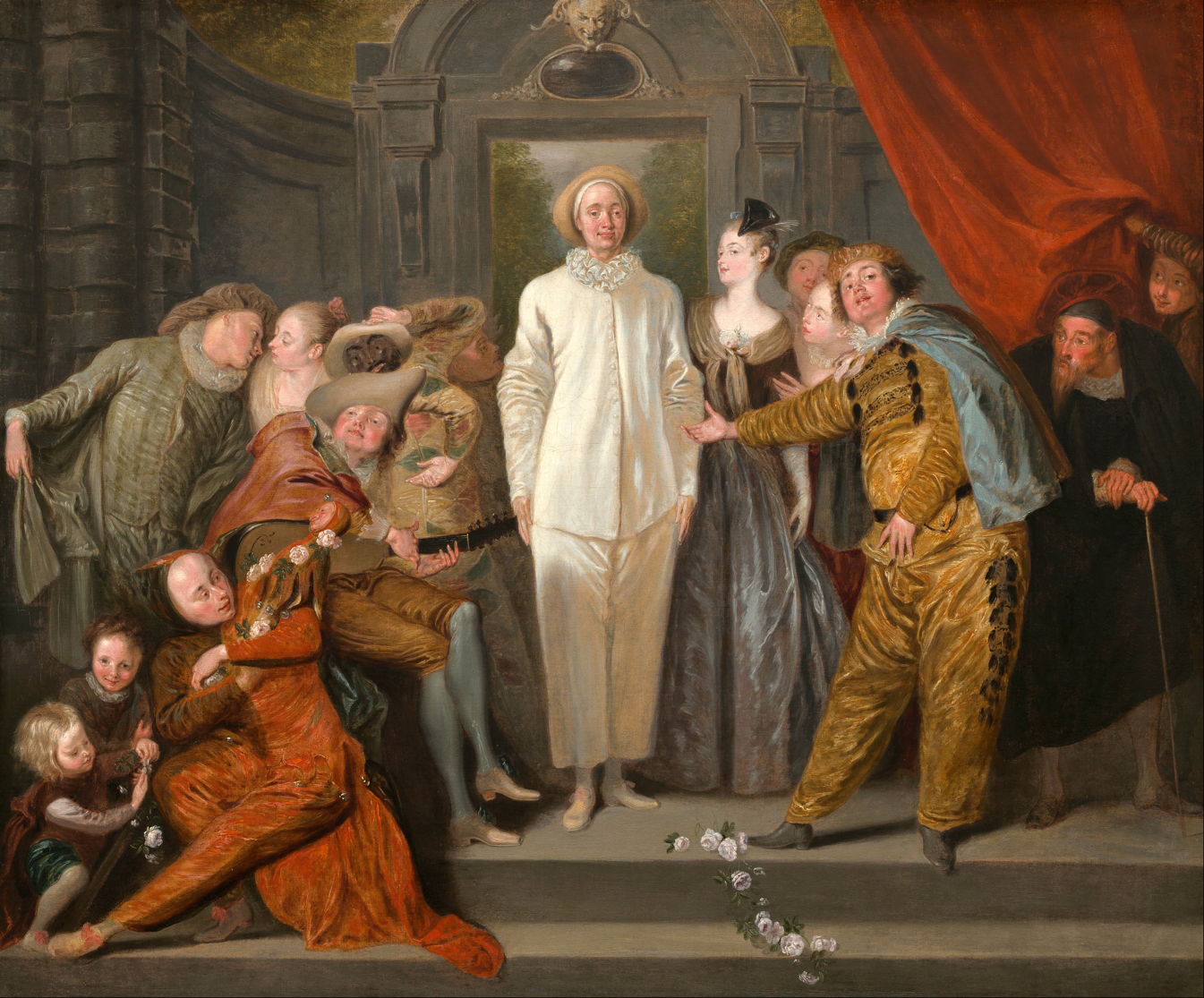
Another early example of the proven use of Prussian blue is Antoine Watteau’s The Italian Comedians from about 1720.

Canaletto is one of the first Masters to have used the new pigment extensively. Grand Canal from Palazzo Balbi toward the Rialto from 1720-23 has been attributed to him as one of his earliest surviving works, and its blues have been found to contain Prussian blue.

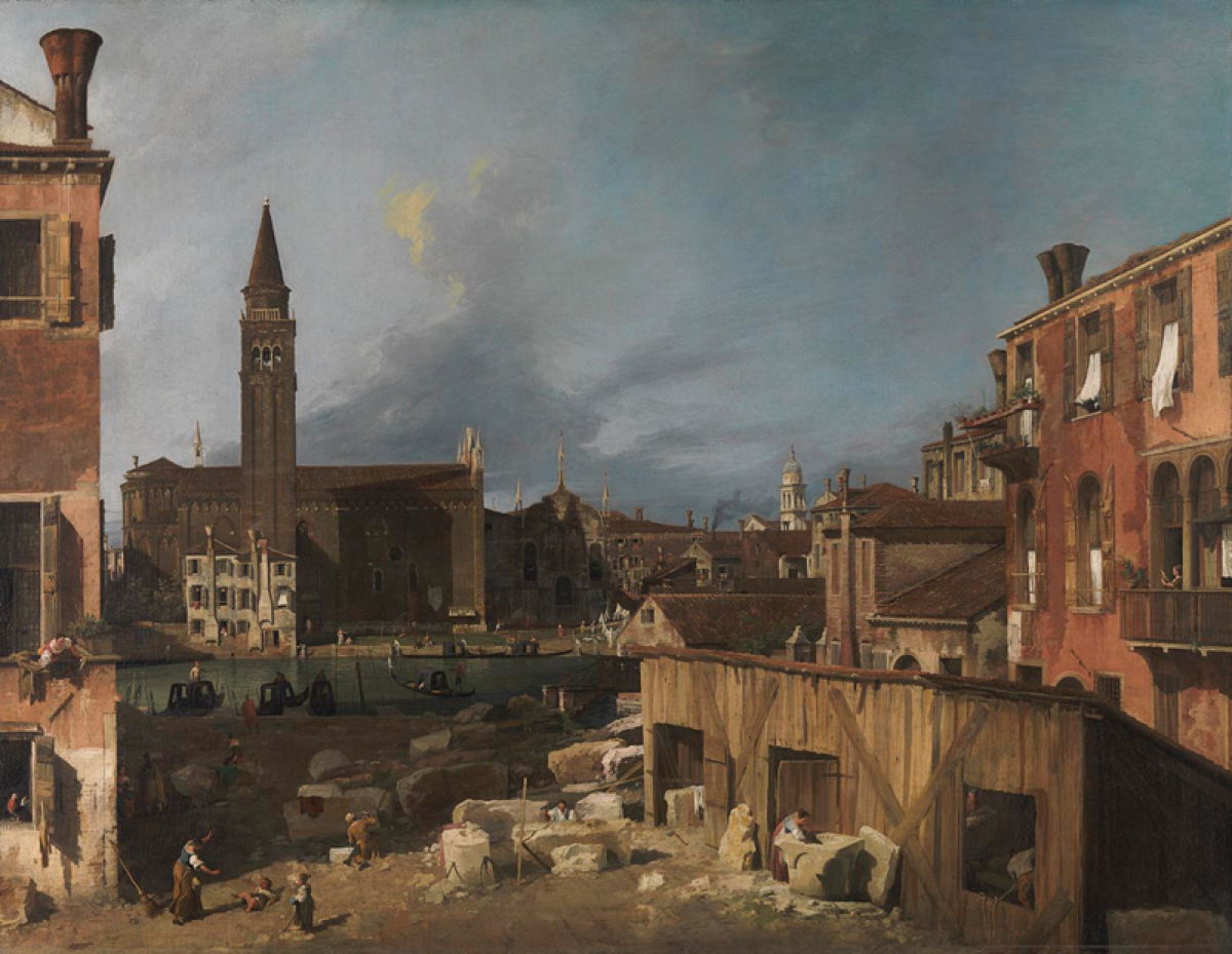
Canaletto was quick to adopt the pigment for use in almost all his paintings, including this view of the Rio dei Mendicanti from 1723-24, above, and his famous The Stonemason’s Yard (c 1725), below.
As experience was gained in using this pigment, it became controversial. Some artists were confident that its colour was stable and didn’t change or fade, but others experienced problems as bad as or even worse than those of the notoriously fugitive indigo blue, which it had generally replaced. It has gradually become understood that adverse results of lightfastness testing (and experience in paintings) have depended on the mixture of Prussian blue with other colours, particularly with white paint, and the presence of impurities in the pigment.
By the middle of the eighteenth century, Prussian blue was widely used with a range of binding media, with the notable exception of fresco and other alkaline media with which it proved incompatible.

William Hogarth’s paintings in his Marriage A-la-Mode series have been found to contain both smalt and Prussian blues. In The Tête à Tête (c 1743), smalt has been found in the ornate carpet, and I suspect that the ornamental pillars behind the woman rely on Prussian blue, at least in part. Hogarth trained as Prussian blue came to the ascendant, and wouldn’t have painted much before it had become widely available.
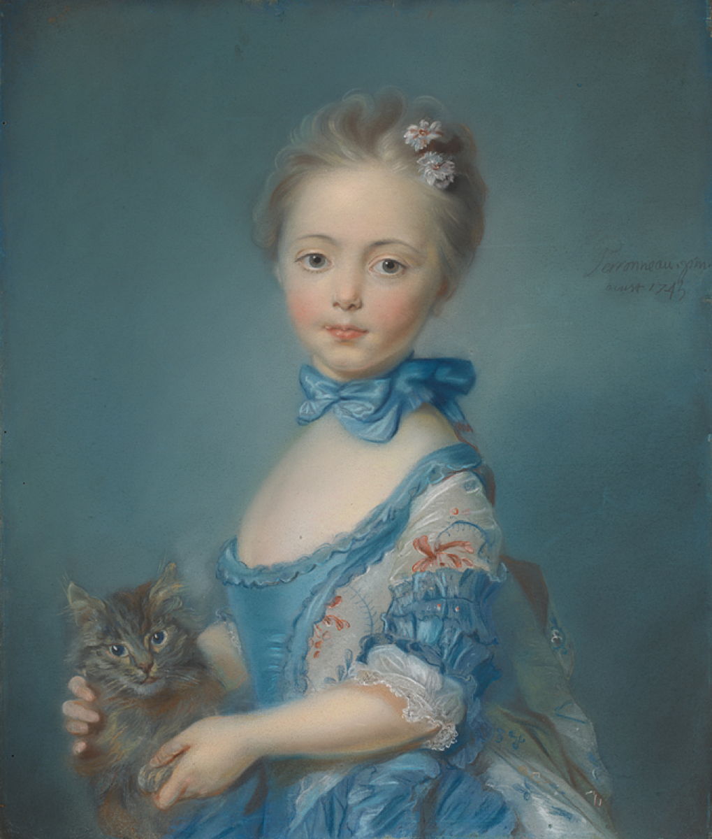
Jean-Baptiste Perronneau’s A Girl with a Kitten from about 1743 is a fine example of the use of Prussian blue in pastels: the girl’s blue dress and the background have both been found to contain the pigment.

Prussian blue also became popular in water-based media. William Blake’s Lucia Carrying Dante in his Sleep, from his series depicting Dante’s Divine Comedy painted in watercolour between 1824-27, is a good example. In this and several other of his paintings, Blake used the pigment on its own and mixed with gamboge yellow in what was known as Prussian green.

Prussian blue pigment has been found in the blue passages in Whistler’s The Princess from the Land of Porcelain (1863-65), from his Peacock Room, shown above and in the detail below.

The use of different blue pigments varied markedly among the French Impressionists and their successors. Paul Cézanne and Georges Seurat appear to have used Prussian blue seldom if at all, but it’s well known in the work of Edgar Degas, Claude Monet and Vincent van Gogh.

Although Monet’s Bathers at la Grenouillère (1869) contains cobalt blue in the brighter mid-blues of the water surface and details in the boats, darker blues towards the left, and in the clothing of some of the figures and their reflections, are almost certainly Prussian blue.

Vincent van Gogh’s portrait of La Mousmé from 1888 illustrates some of the difficulties of identifying pigment use. Its unusual title is derived from the Japanese word musume, meaning girl; at the time the French word was understood to mean an ‘easy’ girl.
Infra-red images demonstrate van Gogh’s use of at least two different blues, one of which has been identified as Prussian blue. The two (or more) blue pigments aren’t distributed evenly: on the girl’s jacket, the three blue stripes to the left of the row of buttons contain the most Prussian blue, while the three under her right armpit, which look darker, contain little or no Prussian blue. Van Gogh also mixed yellow with Prussian blue to form the green of the flowers she holds in her hand.
Prussian blue remained a popular pigment in oil and watercolour paints well into the twentieth century, and is still offered in commercial ranges. For many artists, though, it has been replaced by much more recent synthetic blue pigments, such as phthalocyanine (‘phthalo’) blue, introduced around 1970, and is seldom used in Prussian green.
Reference
Barbara H Berrie (1997) Artists’ Pigments, vol 3, ed Elisabeth West Fitzhugh, Archetype. ISBN 978 1 904982 76 0.
![]()