The Republican response to the release of a suggestive note to Jeffrey Epstein apparently signed by President Trump followed a familiar pattern of deflection.
Speaker Mike Johnson, who did not emerge from his office on Monday in the hours after the drawing was released, eventually said he had not seen President Trump’s note.
On the face of it, watercolour painting should be the simplest of all the more popular painting media. The paper is both support and ground, the paint layer is thin, with a little binder of gum arabic and a diluent of plain water. Although some have tried using varnish and other protective layers, in the great majority of watercolour paintings, that’s all there is.
In practice, though, as anyone who has taken watercolour painting seriously knows, there’s a great deal more to it. Much of that is hard to see and can only be inferred from images of watercolour paintings.
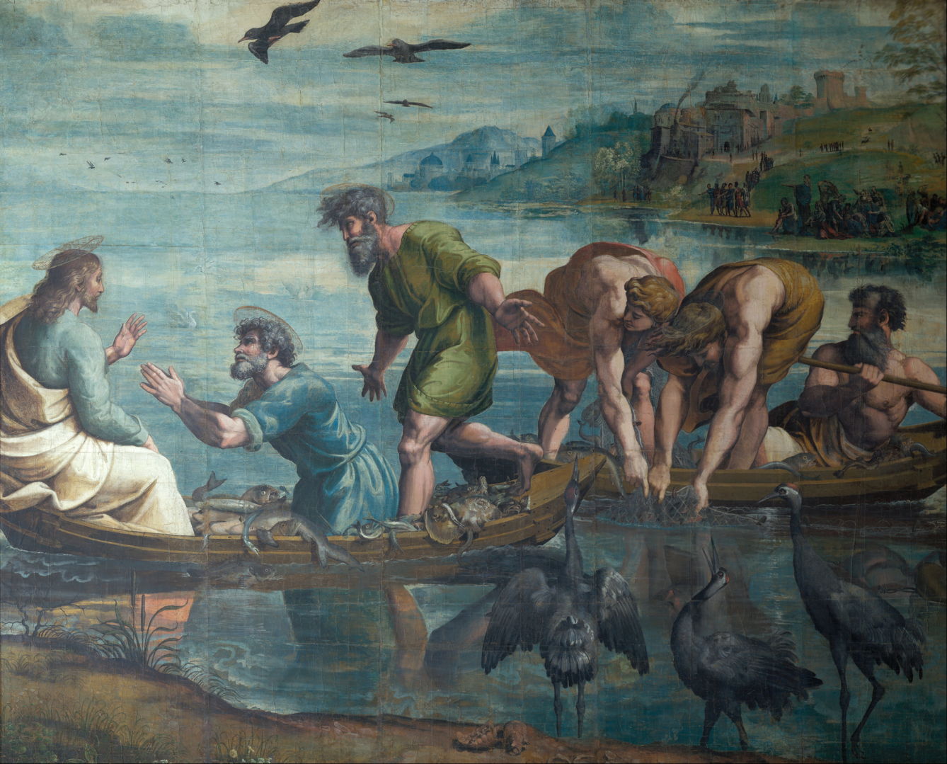
Raphael (Rafael Sanzio de Urbino) (1483–1520), The Miraculous Draft of Fishes (c 1515-16), bodycolour over charcoal on paper, mounted on canvas, 319 x 399 cm, The Royal Collection of the United Kingdom, UK. Wikimedia Commons.
Raphael’s The Miraculous Draft of Fishes (c 1515-16) is among the earliest large paintings made using opaque watercolour. Because of limitations in the manufacture of paper at the time, it was made on many sheets that have been mounted on canvas. At around 3 x 4 metres (10.5 x 13 feet), it’s huge by any standards, and even today would probably need to be painted on multiple sheets and mounted on added support.
Over three centuries later, the Pre-Raphaelite artist Marie Spartali Stillman painted her watercolours in layers, using a combination of transparent and opaque watercolour on paper that had been hot-pressed to give it a satin-smooth finish. When re-wetted with another layer of wet paint, watercolour usually becomes liquid again, resulting in the layers mixing. Great care and skill is required to apply wet watercolour on dry paint in the way that she did. Even then some paintings simply don’t work, the layers mix and that attempt has to be discarded. When successful, the end result can resemble layered oil paints, which don’t suffer the same problem when dry paint is overpainted.
Marie Spartali Stillman (1844–1927), The Childhood of Saint Cecily (1883), watercolour and graphite heightened by gouache, 101 x 74 cm, Private collection. Wikimedia Commons.
The Childhood of Saint Cecily (1883) was one of the last paintings Stillman composed when she lived in Florence, as reflected in its idealised Tuscan background. As with so many paintings of saints, it departs from even the most inventive of hagiographies, here for the patron saint of music, Cecilia. The saint is shown playing a harp-like psaltery, while an angel adjusts the garland on her head. She has worked subtle patterns into the blue fabric on the arm of the angel, and in the side of the instrument. Flowers and hair have fine detail with sharp highlights, just as might be seen with oils.
Marie Spartali Stillman (1844–1927), Love’s Messenger (1885), watercolor, tempera and gold paint on paper mounted on wood, 81.3 × 66 cm, Delaware Art Museum, Wilmington, DE. Wikimedia Commons.
Love’s Messenger (1885) is probably the finest of her single-figure paintings, and was her most successful ‘problem picture’. The woman stands by her embroidery at an outside window. On her right hand is a messenger dove/pigeon, to which a letter is attached. She clutches that letter to her breast with her left hand, implying that its contents relate to matters of the heart. The dove is being fed corn, which could either be its reward for having reached its destination (thus the woman is the recipient of the message), or preparation for its departure (she is the sender). Despite being exhibited at the Grosvenor Gallery in 1885, and elsewhere, this painting didn’t sell until after she had reworked the background in the 1890s, which must have been a feat in itself.
Marie Spartali Stillman (1844–1927), Love’s Messenger (detail) (1885), watercolor, tempera and gold paint on paper mounted on wood, 81.3 × 66 cm, Delaware Art Museum, Wilmington, DE. Wikimedia Commons.
A detail view of Love’s Messenger shows how her watercolour technique results in a facture more closely resembling that of oils, although this painting is an extreme example with its use of tempera too. This was accomplished by using transparent watercolours more like oil glazes, and gouache (opaque watercolour) for details.
Marie Spartali Stillman (1844–1927), Beatrice (1896), watercolour and gouache on paper mounted on board, 57.6 × 43.2 cm, Delaware Art Museum, Wilmington, DE. Wikimedia Commons.
Her portrait of Beatrice (1896) refers to Dante’s Vita Nuova, through Dante Gabriel Rossetti’s popular translation into English. In this her first version, she shows Dante’s beloved Beatrice lost in contemplation while reading, an intimate insight set firmly in the Pre-Raphaelite mediaeval. This was exhibited at the New Gallery later that year.
Marie Spartali Stillman (1844–1927), Beatrice (detail) (1896), watercolour and gouache on paper mounted on board, 57.6 × 43.2 cm, Delaware Art Museum, Wilmington, DE. Wikimedia Commons.
This detail view of Beatrice provides more insight into her exacting technique.
Over the same period, other artists were developing techniques for use on cold-pressed paper with its coarser texture.
At a time when most watercolour painting was still disparagingly considered to be ‘drawing’ for routine topographic views, Alexander Cozens developed specialist techniques, such as keeping ‘reserved space’ to let his white paper ground show through, wet on wet as well as wet on dry application of paint, and scratching out. He also employed both transparent and opaque paints for different effects.
JMW Turner did a great deal to advance both technique and the critical reception of large watercolour works painted in the studio, although even today his oils are much better known, with a few exceptions such as his sublime paintings of the Rigi.
Winslow Homer (1836–1910), The Watcher, Tynemouth (1882), transparent and opaque watercolor, with rewetting, blotting, and scraping, heightened with gum glaze, over graphite, on moderately thick, slightly textured, cream wove paper (all edges trimmed), 21.3 × 37.7 cm, Art Institute of Chicago, Chicago, IL. Wikimedia Commons.
Towards the end of the nineteenth century, Winslow Homer earned his place as one of the greatest watercolour painters of America during a period spent in a fishing community in north-east England. The advanced techniques which he used are shown well in The Watcher, Tynemouth (1882), and include both transparent and opaque paints, rewetting and blotting to remove paint for highlights, scraping, application of wax to resist the adherence of paint, and the use of pure gum solution as a glaze. In this case, his paper is only lightly textured, though.
Perhaps the greatest exponent of these techniques was another American, John Singer Sargent.
John Singer Sargent (1856-1925), Simplon Pass: The Tease (1911), transparent watercolour, opaque watercolour and wax over graphite pencil on paper, 40 x 52.4 cm, Museum of Fine Arts, Boston, MA. Wikimedia Commons.
Sargent’s most radical watercolours were painted when he stayed with various friends in the Bellevue Hotel, at the top of the Simplon Pass, in the summers before the First World War. While his family and friends whiled away their days in leisure, Sargent got them to pose for a unique series of informal portraits. They may have been reclining at leisure, but Sargent took those watercolours very seriously, and deployed an amazing array of techniques. Among the finest is his Simplon Pass: The Tease from the summer of 1911.
John Singer Sargent (1856-1925), Simplon Pass: The Tease (detail) (1911), transparent watercolour, opaque watercolour and wax over graphite pencil on paper, 40 x 52.4 cm, Museum of Fine Arts, Boston, MA. Wikimedia Commons.
One of his most unusual techniques, used extensively here, is wax resist. Before applying paint, Sargent scribbled over areas intended to be vegetation, using a soft wax crayon, probably made from beeswax. On fairly rough paper, that wax is deposited unevenly, and when painted over using watercolour it shows the white paper through. This creates disruptive patterns of near-white in the midst of the greens, and a superb textural effect, as shown in this detail.
Edward Robert Hughes (1851-1914), Night with her Train of Stars (1912), watercolour, bodycolour and gold medium, 76.2 x 127 cm, Birmingham Museum and Art Gallery, Birmingham, England. Wikimedia Commons.
In complete contrast, Edward Robert Hughes’ Night with her Train of Stars of the following year has been painted in a controlled and meticulous manner, although it too uses advanced techniques, particularly in the sky and background. I suspect that some of the latter may have relied on the scattering of salt grains to impart its fine texture. In other passages he has allowed different colours to rewet and blur what would otherwise be sharp edges.
Of course, AI can now mimic these when provided with suitable original material to plagiarise. But there’s still nothing like an original painted by a master.
In the first of these two articles showing masterly landscape paintings of summer storms, I had reached John Constable in the early 1830s.
Constant Troyon (1810–1865), The Approaching Storm (1849), oil on canvas on board, 116.2 x 157.5 cm, The National Gallery of Art, Washington, DC. Wikimedia Commons.
Of Constant Troyon’s early paintings the most outstanding must be The Approaching Storm from 1849. Set on a river worthy of Constable, two anglers appear to be readying themselves for the torrential rain heading towards them, while others still wander in the last patch of sunshine on the far bank.
Jules Noel (1815-1881), Panorama of the Town of Dieppe (c 1865), further details not known. Image by Philippe Alès, via Wikimedia Commons.
Jules Noel’s Panorama of the Town of Dieppe (c 1865) shows a large picnic party on the cliffs overlooking the town of Dieppe on the coast of northern France. These families seem blissfully unaware of the dark clouds and heavy rain already over the land to the right.
Albert Bierstadt (1830-1902), A Storm in the Rocky Mountains, Mt. Rosalie (1866), oil on canvas, 210.8 x 361.3 cm, Brooklyn Museum, New York, NY. Wikimedia Commons.
One of the finest and most dramatic of Albert Bierstadt’s paintings from his second expedition to the West in 1863 is this of A Storm in the Rocky Mountains, Mt. Rosalie from 1866. Its foreground shows a pastoral valley floor with a native American camp, in mottled light. Some people and their animals are seen making haste to return from the pastures to the shelter of the camp. A small rocky outcrop has trees straggling over it, which are silhouetted against the brilliant sunlight on the lake behind, in the middle distance.
Behind the lake the land rises sharply, with rock crags also bright in the sunshine. In the background the land is blanketed by indigo and black storm-clouds. Those are piled high, obscuring much of Mount Rosalie, but its ice-clad peaks show proud, high up above the storm, with patches of blue sky above and beyond them. A single large bird, an eagle perhaps, is seen in silhouette, high above the lake.
Volodymyr Orlovsky (1842–1914), Harvest (1882), oil on canvas, 62 x 100 cm, National Art Museum of Ukraine Національний художній музей України, Kyiv, Ukraine. Wikimedia Commons.
It was Volodymyr Orlovsky’s painting of Harvest on the steppe in Ukraine, in 1882, that apparently earned the artist’s promotion to Professor in the Imperial Academy.
Winslow Homer (1836–1910), Hurricane, Bahamas (1898), watercolor and graphite on wove paper, 36.7 × 53.5 cm, The Metropolitan Museum of Art, New York, NY. Wikimedia Commons.
Few artists ever get to witness tropical storms, but after his time painting winter storms at Cullercoats in England, Winslow Homer witnessed and painted this Hurricane, Bahamas in 1898.
Gustav Klimt (1862–1918), Approaching Thunderstorm (The Large Poplar II) (1903), oil on canvas, 100.8 x 100.7 cm, Leopold Museum (Die Sammlung Leopold), Vienna, Austria. Wikimedia Commons.
In 1903, Gustav Klimt spent his summer holiday at Attersee with his partner’s family, where he painted this landscape of an Approaching Thunderstorm. Many of his other landscape paintings made during his summers away show no sky at all, but this is an exception.
Pierre Bonnard (1867-1947), Thunderstorm at Vernouillet (1908), oil on canvas, 50.2 x 65.1 cm, Private collection. The Athenaeum.
Thunderstorm at Vernouillet is an atmospheric landscape painted by Pierre Bonnard in 1908, or the following year. Vernouillet is on the southern bank of the river Seine, midway between the centre of Paris and Monet’s property at Giverny.
Tom Thomson (1877–1917), Thunderhead (1912-13), oil on canvasboard, 17.5 x 25.2 cm, National Gallery of Canada / Musée des beaux-arts du Canada, Ottawa, ON. The Athenaeum.
The young Canadian artist and canoeist Tom Thomson excelled in rapid sketching in oils, with several witnessed accounts of him dashing off a painting in little more than fifteen minutes. As a result he was able to capture many transient effects, such as the passing thunderstorm in Thunderhead from 1912-13.
If you’re fortunate, the storm is soon gone, its humid air blows away, and summer returns.
Arkhyp Kuindzhi (1841-1910), After a Thunderstorm (1879), further details not known. Wikimedia Commons.
Arkhyp Kuindzhi specialised in painting in spectacular light. After a Thunderstorm from 1879 is one of his oil sketches capturing the brilliant colour and light following heavy summer rain on the steppe.