Cuomo Calls for Rebuilding Rikers Island and Keeping the Complex Open
© Vincent Alban/The New York Times
我的所有双网卡主机都有一个网络用来访问互联网(以下简称 eth ),另一个网络用于局域网设备之间互相访问(以下简称 lan ,这个带宽更高),linux 通过 avahi 来提供 mdns 服务让其他主机可以发现本机上的服务,默认情况下 avahi 会随机使用 eth 或 lan 其中一个的 ip ,我希望始终使用的是 lan 的 ip ,这个要如何实现?
这个问题我尝试过以下方法:
1 ,通过修改/etc/avahi/avahi-daemon.conf 的 allow-interfaces 来强制 avahi 只为 lan 提供服务,但是这会导没有 lan 网络的设备无法访问本机的服务。
2 ,通过 iptables 阻止其他的双网卡主机通过 eth 来访问本机的 avahi 服务,结果 iptables 的方法也不管用,具体情况如下:
root@server:/home/d# iptables -L INPUT -v -n
Chain INPUT (policy ACCEPT 2698 packets, 253K bytes)
pkts bytes target prot opt in out source destination
20 4975 DROP udp -- * * 192.168.1.4 0.0.0.0/0 udp dpt:5353
20 4894 DROP udp -- * * 10.0.0.3 0.0.0.0/0 udp dpt:5353
root@server:/home/d#
上面的两条规则阻止了 develop 这台机通过 eth 或 lan 来访问本机的 avahi 服务,结果在 develop 这台机上仍然可以看到本机的 smb 服务:
d@develop:~$ avahi-browse -atp | grep -i server
+;lan-br;IPv4;SERVER;_device-info._tcp;local
+;eth-br;IPv4;SERVER;_device-info._tcp;local
+;lan-br;IPv4;SERVER;_smb._tcp;local
+;eth-br;IPv4;SERVER;_smb._tcp;local
d@develop:~$
我完全想不通 iptables 为啥不管用,除了 iptables 我也想不到有其他方法能实现我想要的效果,希望有经验的 v 友能指导一下。
Authorized users only. All activities may be monitored and reported.
Activate the web console with: systemctl enable --now cockpit.socket
Last login: Tue Feb 18 22:59:31 2025 from 192.168.130.102
Welcome to 6.6.0-76.0.0.80.oe2403sp1.x86_64
通过 SSH 登陆,Authorized users only 这个提示打两便,强迫症受不了。
查了下,一个是/etc/issue ,一个是/etc/issue.net,或者是这个/etc/motd
无论如何都不美观,就像一个 web 元素要刷新,非要把整个页面都刷新。在其他系统中也没见过这种搞法。
美国政府停摆后,美国驻中国大使馆的社交媒体账号暂停更新,除紧急信息之外。
美国驻华使馆星期五(10月3日)在X平台发文称,由于拨款问题未决,除紧急的安全和安保信息外,此账户将不会定期更新,直至恢复全面运作。
美驻华使馆的官方微博账号也在星期三(1日)之后,暂停更新。此前,该账号发出美国国务卿鲁比奥祝贺中国国庆的新闻声明,并在星期二(9月30日)发帖说,为庆祝中国国庆和中秋节,使馆将在10月1日至6日闭馆。
在这之前,美国在台协会(AIT)星期三也在官方脸书账号宣布,因应美政府停摆,AIT社群账号将不会定期更新,唯独紧急信息之外。
AIT也称,政府停摆期间,台北办事处与高雄分处,以及美国国内外领事单位,仍将尽可能提供已预约的护照与签证服务。
综合外电报道,美国国会错过了周二午夜的拨款期限,导致美国联邦政府时隔近七年再度停摆,数十万联邦雇员被迫无薪休假,部分公共服务中断。由于党派分歧严重,分析认为,这次停摆时间可能比以往更久。
美国总统特朗普趁着政府停摆期间,冻结亲蓝州的260亿美元(约335亿新元)资金,兑现打击民主党的威胁。民主党警告,此举将导致许多人失业,并指责特朗普以国家痛苦作为政治勒索手段。
极氪 9X 的上市发布会开始之前,在社媒上刷到一个段子。
大致意思是说,中国新势力们目前在卖的车里面,可能没有比极氪 9X 更能吸引大老板们的了。
评论区有人不服,说你不把迈巴赫和尊界 S800 等等放在眼里 ?
贴主说你仔细看看,极氪 9X 车尾部的六根横线刚好组成了周易的上上卦——乾卦,六爻定乾,车主的健康、权谋、贵人运都集中在上面,而 9X 的机盖的筋线和立面的格栅形成明暗对比,类似八卦阴阳鱼一动一静,一阴一阳,包罗万象,奥妙无穷。
不知道大老板们信不信这套风水玄学,但极氪 9X 能在 2025 年把 50 万元的全尺寸 SUV 预售出去 4 万辆,靠的肯定不止是这个无比大气、排面十足的外观。
极氪 9X 车身尺寸为 5239 / 2029 / 1819mm,轴距 3169mm,比同样价位段的问界 M9 略大一些。
配置方面则从 Max 版本起跳,分为 Max、Ultra、Hyper 以及曜黑版四种配置,价格为 45.59 万元至 58.99 万元起。
四种版本之间的差异主要来自于电机数量、电池容量以及辅助驾驶系统,Hyper 以及曜黑版采用三电机四驱,70 度电池以及潜力浩瀚 H9 辅助驾驶系统。
我们先来看看之前极氪没怎么提过的内饰部分。
极氪 9X 采用的是「2+2+2」的六座布局,提供了琥珀棕、极地白以及月影蓝三种内饰配色,其中极地白和琥珀棕采用上深下浅的撞色方案。
中控台的整体设计风格相对简约,配备了 47 英寸 AR-HUD 抬头显示以及由悬浮式中控屏+副驾屏组成的 16 英寸双联屏,车机内搭载双高通骁龙 8295 芯片来保证流畅度,内置的是 Zeekr AI OS 7 智能座舱操作系统。
同时,新车采用了四辐式多功能方向盘以及怀挡式换挡机构,中控屏下方还保留着一排机械按键,副仪表台前端设计有双手机位的储物槽,集成了 50W 手机无线充电功能。
整个座舱能明显感受到极氪 9X 在豪华氛围营造上的「堆料」。
新车在车内材质上使用了大面积的皮质包覆和带花纹的实木饰板,镀铬实体按键、水晶旋钮和氛围灯设计很好的提升了座舱内的乘坐质感。
极氪 9X 在后排搭载了两张独立座椅,配备了腿托,其头枕内部还配有扬声器,并具备通风、加热以及按摩功能,还支持支持 180 度旋转、左右横移、一键零重力模式以及躺姿模式。第三排座椅两侧则设计有设计有扶手、杯架以及电动调节控制拨杆。
视听体验上,极氪与英国音响品牌 Naim 合作,配备 Naim 殿堂之声音响系统,全车共有 32 个扬声器、8 个座椅振子、40 个独立通道独立调音,峰值功率 3868 千瓦,采用 9.2.4.8 布局。宾利飞驰、欧陆 GT、添越等车型都使用了其提供的音响系统。
新车的后排娱乐屏则被安装在一根可以前后大幅度移动的滑轨上,其可以前后移动至二排或者三排乘客前方,既保留了完整的全景天窗,也让三排乘客可以拥有良好的观影体验。
保持车内的舒适感,不能只靠座椅,车辆的行驶质感也是很重要的影响因素。
为了让 9X 强大的马力转化为顶级的行驶质感,极氪在新车上搭载了浩瀚 AI 数字底盘,并且首发了「闭式双腔空气悬架 + 双阀 CCD 电磁减振器」,并且匹配了之前只用在库里南和阿斯顿·马丁 DBX 上的 48V 主动防倾杆技术。
双腔空悬能够实现媲美硬派越野的 288mm 最大离地间隙,其悬挂抬升速度更是传统方案的四倍以上;48V 主动稳定杆则赋予了这台大型 SUV「接近零侧倾」的动态表现,其在在日常行驶中可智能分配支撑力,而在极限过弯或碰撞预判时,具备主动车身调节能力,这是此前传统机械结构所无法比拟的。
而「定海智能中枢」能够用 AI 算法识别路面信息,并实时调用辅助驾驶系统和整车感知元件,统一地指挥底盘、动力和座舱等多个域的执行器。
由此极氪 9X 可以实现,以中低速(50km/h)绕桩行驶依然能保持车身平稳、120km/h 复杂工况爆胎保持直线行驶、高速遇上较大横风车身偏移小于 20 厘米等复杂工况中依然稳定行驶的能力。
而在减轻驾驶负担的辅助驾驶能力上,极氪 9X 的 Max 和 Ultra 版本将搭载千里浩瀚 H7 系统,两个高配版本则是千里浩瀚 H9 系统。
极氪重点介绍了千里浩瀚 H9 的能力。
在硬件配置上,新车将搭载双 Thor-U ,算力超过 1400Tops,以及包括 5 个激光雷达在内的全车 43 个智驾传感器,有未来升级至 L4 智驾的潜力。
在车端, H9 版本的极氪 9X 将搭载两个端侧大模型,从而形成大模型的冗余。极氪表示,如果主大模型的决策出现偏差,那么备份大模型将马上进行纠正,最大限度地保证智驾系统的安全运行。
而在功能上,除了车位到车位的全场景辅助驾驶能力和无图园区漫游外,搭载 H9 方案的 9X 还带来了全球首个红外 AEB 功 能,在人眼都看不清的浓雾里面,也能精准识别行人或者其他障碍物。
五个激光雷达和两套大模型已经很夸张了,而极氪 9X 在动力和续航方面的堆料,则更显得「不讲武德」。
极氪 9X 是第一且唯一采用全栈 900 V 高压架构动力系统的混动车型,其拥有全球第一套兆瓦级三电机,最大马力超过了 1400 匹,其功率等效于一台 36 缸发动机。
这为极氪 9X 带来了 3.1 秒的零百加速成绩,最高车速达到了 240 公里,在所有全尺寸 SUV 中排名第一,不仅超越了对标的保时捷卡宴,即便是和法拉利 Roma、保时捷 911、兰博基尼 Huracán 比比加速,也完全不是问题。
另外,即使在电量低于 20% 的亏电状态下,极氪 9X 的零百加速表现也几乎没变,与满电状态下仅相差 0.2 秒。
极氪 9X 全系都是大电池,有 50 / 70 度两种电池容量可选,纯电续航里程分别为 300km 和 355km,综合续航里程约为 1165km 左右。
依托 900V 高压架构和与宁德时代联合开发的 6C 电池,极氪 9X 从 20% 充至 80% 电量仅需 9 分钟,比市面上绝大多数纯电车型还要快。
更夸张的是,极氪 9X 发动机的峰值功率高达 145kW,这个功率甚至超过了不少快充桩,即便是车辆持续以 120km/h 的高速行驶,也可以实现边开边充电。
不难看出,此次极氪 9X 做产品的思路很简单,主打一个性能、舒适、豪华全都要。极氪在宣传中的对标车型也是全尺寸 SUV 的集大成者,如劳斯莱斯库里南、路虎揽胜等等。
而从市场竞争的角度出发,极氪 9X 的竞争对手其实只有问界 M9 和理想 L9 这两位,9X 比理想的价格稍高,但提供了更强的动力性能和更丰富的配置。
问界强调智能、理想绑定家庭场景,极氪则更强调豪华感与科技感。
此外,极氪 9X 身上多少还带着点展示极氪品牌技术能力的意味,作为极氪旗下的第一台混动车型,9X 展示出来的能力是整个极氪品牌的技术高峰,也直接决定着市场对于极氪后续的高端车型,如 9X 光辉版的预期和信心。
#欢迎关注爱范儿官方微信公众号:爱范儿(微信号:ifanr),更多精彩内容第一时间为您奉上。
一年前,当仰望 U9 在德国纽博格林北环赛道交出 7 分 17 秒的圈速、在 ATP 测试场跑出 391 km/h 的极速时,外界的评价是:还行,但不够亮眼。
对于仰望的工程师而言,这背后同样藏着一丝「不甘」。回国后,他们拒绝了庆功宴,转身投入到了一项更疯狂的计划中。
一年后的现在,答案正式揭晓。
9 月 20 日晚,比亚迪在郑州赛车场发布了仰望 U9 的极致赛道版——仰望 U9 Xtreme(简称 U9X)。它带着两项颠覆性的新纪录而来:
全球汽车极速榜首:496.22 km/h。
纽博格林北环圈速:6 分 59 秒 157。
从「中国电车极速纪录」到「全球第一」,仰望撕掉了所有的定语。仰望总经理胡晓庆表示,要实现这一点,起点是一个目标:整车需要 3000 匹马力。「要知道,许多传统超跑的功率仅为 750 匹,这意味着,U9X 单个车轮的动力,就足以媲美一台完整的超级跑车。」胡晓庆说。
如此巨大的功率,对电压提出了极高的要求。仰望为此打造了全球首个量产全域 1200V 超高压平台。这得益于比亚迪的垂直整合能力,工程师得以在自家的碳化硅芯片中「百里挑一」,筛选出最优秀的组件来满足 U9X 的需求。
值得注意的是,为这辆仰望 U9 提供能量的,依旧是一块磷酸铁锂电池。面对「为何不用能量密度更高三元锂」的疑问,仰望的解释是:对于超跑而言,磷酸铁锂在耐高温性、低电量放电能力以及安全性上拥有更确切的优势。
胡晓庆表示,这块赛道级刀片电池,让 U9X 获得了「纽北劳模」的称号——在赛道日可以全天候满负荷运转,无需更换电池。
但强大的动力输出只是第一步,如何有效控制才是关键。
这就要归功于易四方与云辇-X 的技术架构。易四方的四电机独立驱动,让 U9X 的扭矩控制响应速度做到了传统机械结构的 10 到 20 倍,能够实时、精准地为每个车轮分配扭矩。在纽北 177 个弯道的测试中,超过 60% 的制动能量依靠电机进行动能回收,极大减轻了传统刹车系统的负担。
一个更极致的例子是,在去年的一次测试中,车辆在接近 300 km/h 的高速下发生爆胎,正是依靠易四方系统的瞬间调整,车身姿态被牢牢稳住。
而云辇-X,则首次在超跑领域引入了「垂向控制」。它不再是那个用于展示的「跳舞」功能,而是通过主动控制四个悬架的垂向姿态,实现载荷的精准转移,为每个轮胎榨取出最大的抓地力。
当然,这套技术架构在带来优异操控的同时,也增加了车重。为了抵消这一点,仰望首次将航空航天级的金属 3D 打印技术引入到车身设计中,其整个前舱和后舱结构均采用 3D 打印的铝合金部件,刹车卡钳则使用了 3D 打印的钛合金。
最终的结果是,U9X 的整车重量相比 U9 降低了 100 公斤。衡量车身轻量化水平的轻量化系数,也从 U9 的 0.95 进一步优化到了 0.83,数值越小意味着效率越高。
极速跑那么快,圈速跑那么快有什么用?高速限速 120km/h。
面对这样的质疑,胡晓庆在发布会上用高铁举例:
20 年前,火车的时速不过 60 多公里,没人能想象今天 350 km/h 的高铁带来的便利。「总有人要为未来而造车,」胡晓庆说,「我们认为这件事情很酷,它就是仰望应该干的事情。」
她强调,U9X 并非停留在实验室的成果,它是一款完全符合量产标准的车型。
今晚,仰望 U9X 正式宣布面向全球限量发售 30 台,并已开启预定。每一台车都将提供独一无二的整车定制方案。至于其售价,发布会现场并未公布。
发布会的最后,还有一个细节被提及:U9X 测试车的外观涂装上,印满了首批 U9 车主的名字。胡晓庆说,这是仰望表达感谢的方式,「没有你们的支持,就没有 U9X 的世界第一。」
这或许正是仰望 U9X 的意义所在:它不仅是一台刷新纪录的机器,更是一个技术图腾,承载着用户的信任与中国汽车工业向上的愿景,在全球性能之巅,书写下属于自己的篇章。
#欢迎关注爱范儿官方微信公众号:爱范儿(微信号:ifanr),更多精彩内容第一时间为您奉上。
每年在评测新 iPhone 的时候,爱范儿总会反复问一个问题:
新 iPhone 贯彻了怎样的设计哲学?
今年,苹果给出了三个清晰无比的答案——
造出极致轻薄 iPhone Air 的,是设计至上的苹果,为此,他们不惜在产品上做出了诸多妥协;
造出性能猛兽 iPhone 17 Pro 的,是技术驱动的苹果,他们用别出心裁的方式,造出了迄今为止最 Pro 的 iPhone;
而造出真香机 iPhone 17 的,是库存克星的苹果,他们用强大的供应链整合能力和自研技术优势,造就了高端手机市场里的价格屠夫。
这种明晰的定位,比前几年依靠屏幕尺寸和处理器性能,使人对大 Plus 和小 Pro 左右为难的情况截然不同。作为一名 iPhone 用户,我很清楚我该换什么手机——朋友圈里比往年晒得更多的订单截图,也佐证了这一点。
由于 iPhone Air 推迟发售,今年爱范儿评测的重心将会放在 iPhone 17 系列上,而经过这一周多的体验,我们得到了一个有趣的结论:
今年的 iPhone 17 系列,比以往任何时候,都更像「安卓」手机——这当然是褒义。
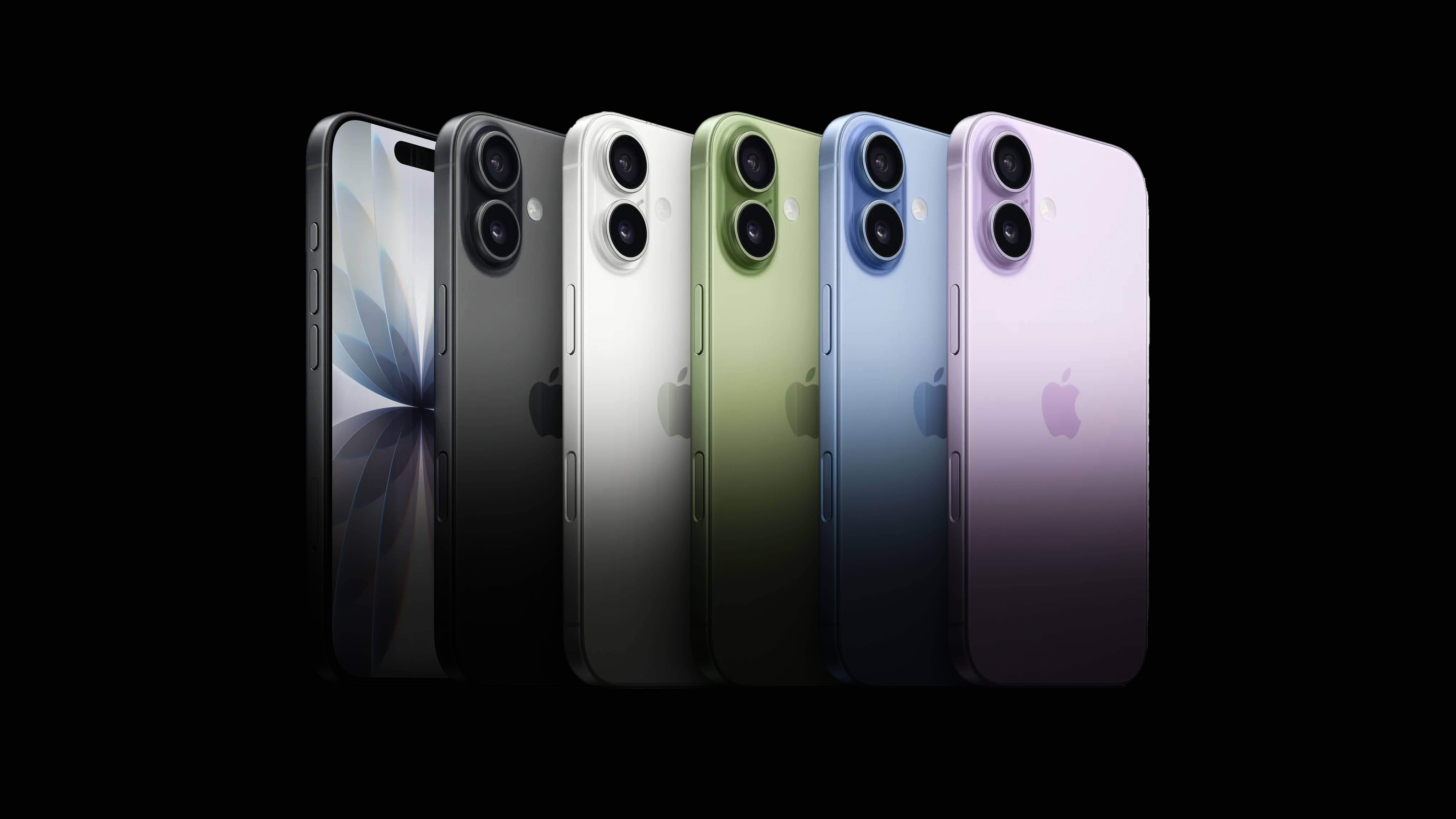
自 iPhone 11 以来,「标准版」的 iPhone 就总给人一种「标配即减配」的印象——但 iPhone 17 是个令人惊喜的例外。
有关 iPhone 17 的一切讨论,都离不开这块全新的屏幕——如果仅从硬件参数上看,iPhone 17 的屏幕几乎就是去年 iPhone 16 Pro 的同款。
这是 ProMotion 推出以来,标准版 iPhone 第一次用上高刷新率屏幕,打破了「ProMotion 必须要 Pro」的魔咒——
1-120Hz 可变刷新率,支持常亮显示的 LTPO 屏幕,甚至边框宽度都比 iPhone 16 缩窄了不止一点:
ProMotion 高刷屏带来的爽快感不言而喻,哪怕 iPhone 的调度策略不是全时锁定 120Hz,但相比 iPhone 16 上面那种字面意义上的「顿挫感」,仍然是巨大的提升。
更重要的是,今年愿意换标准版的人,大多是 12、13 代的老用户,我们在公众号评论区甚至见到了一位仍在使用 iPhone 7 Plus 的朋友。iPhone 17 加上 ProMotion,对于他们来说是真正意义上的「体验超速」了。
比起 iPhone 16 Pro,iPhone 17 的屏幕户外峰值亮度也更高,一举来到了 3000 尼特,甚至还用上了隔壁三星 Ultra 旗舰以及一些折叠屏机型会用到的抗反射涂层(Anti-reflective coating)。
根据我们的上手体验,iPhone 17 在晴朗户外的可读性相比 iPhone 16(甚至 16 Pro)都有相当程度的提升。其抗反射效果与三星类似,体现为屏幕在户外强光下,玻璃泛白、发灰的情况有所减轻。
只不过 iPhone 17 的屏幕抗反射效果只是相比前代明显,但是距离三星那种「让黑色更黑」的效果还有着不小的差距。哪怕是没有抗反射涂层、只贴了官方 AR 膜的 Z Fold7,也比 iPhone 17 更深邃一些:
iPhone 17 今年使用了第二代超瓷晶玻璃,在滑动时有点微微地涩手,且因为抗反射涂层的加入,选贴膜也变得更加考究。无论是为了改善手感,还是想保留抗反射能力,我们都建议优先选择 AR 膜。
更加倒反天罡的是,苹果甚至连 iPhone 17 的充电速度都做出了改进,最高充电功率来到了 35W 左右。
我们用 40W 的充电头实测,iPhone 17 的电量从 0 到 50% 只需要约 25 分钟,而充满则需要 80 分钟——有时候起床发现忘了充电,洗漱的时间临时充一会,也够 iPhone 应应急了。
至于影像方面,iPhone 17 在两个方面做出了升级——超广角镜头从 1200 万像素升级到 4800 万像素,以及用上了新的正方形 CMOS 前摄。
虽然最近两年各家厂商都在发力长焦,但超广角镜头作为视觉冲击力最强的那个视角,仍然具有相当的不可替代性。本次 iPhone 17 升级到去年 16 Pro 同款的超广角,让拍出类似这样的可用画面成为了可能:
而本次全系标配的这套新的前摄——苹果称之为 Center Stage 前置摄像头——则是一个非常精妙的功能,因为它做到了一件和哈苏 X2D II 100C 差不多的事情:
用更精密的硬件和更复杂的功能,让拍摄本身变得简单。
放在 iPhone 17 上,就是现在 iPhone 可以自行判断你的自拍画面里有多少人、然后根据检测到的人脸数自动调整前摄的缩放和画幅,用更复杂的功能实现了更无感的操作。
根据爱范儿的测试,iPhone 17 会在只有一个人的时候保持普通竖向构图、两个人的时候切换广角但维持竖向,在画面进入第三个人且人脸比较分散的时候切换为横构图——在这个过程中,你的手都是完全不需要扭动,更不需要按任何按钮。
而得益于新的 2400 万像素正方形传感器,无论切换横竖构图,最后拍出来的自拍照分辨率都可以达到 1800 万像素,相比之前的 1200 万前摄仍然是可感的提升。
此外,苹果本次加入的前后同时录像功能也是相同的「机制复杂、简化摄影」的逻辑,虽然这项功能本身不新鲜,但是别忘了——它是建立在 iPhone 行业第一的录像能力和 iOS 无出其右的软件生态基础上的。
在大升级的屏幕和小改进的影像能力之外,iPhone 17 基本保持了与 iPhone 16 一样的三维和重量(17 比 16 略高 2mm、略重 7 克)。屏幕能够从 6.1 升级到 6.3 寸,主要就是得益于显著缩窄的边框。
至少在 iPhone Air 正式开售之前,iPhone 17 依然是整个 17 系列中手感最轻巧的那台。更重要的是, iPhone 17 的最低存储空间升级到了 256GB,加量不加价。
与其说这是 iPhone 17,不如说这是一台少了长焦镜头的 iPhone 16 Pro,特别是有了观感明显的 Pro 功能,你甚至可以当它是 16 Pro「青春版」。
iPhone 17 也是我们今年最推荐更新的机型,如果你是 iPhone 15 之前的用户,这是一个换机的好时机。
比起「压倒性好评」的 iPhone 17 标准版,iPhone 17 Pro 的风评倒是褒贬不一,分歧主要集中于外观设计。
在经历过 15 Pro 和 16 Pro 两代钛金属之后,苹果在 iPhone 17 Pro 上放弃钛合金、重新回归了最传统的铝合金。但这并非保守和倒退的体现,而是苹果整了一个更大的活——
在新的铝合金机身上,苹果尝试了一种新的加工工艺:热锻铝金属一体成型(Heat-forged aluminum unibody)。这是一种手机行业不常见、但在汽车工业领域已经被广泛应用的加工技术。
▲苹果发布会上演示的一体成型机身|Apple
相比 CNC 工艺只能在成品铝料块上加工,热锻一体成型工艺因为需要在金属的「再结晶温度」以上进行,可以避免金属内部在加工过程中形成不规则结晶区,组成疏松和气孔结构,从而最大程度发挥出铝合金的强度、韧性和抗疲劳性能。
这种一体成型工艺的优点,一上手便知——
前两代 Pro 的确极大改善了「硌手」的口碑,而 iPhone 17 Pro 更大的边框弧度,又一次将 iPhone 16 Pro 远远甩在后面,甚至可以称之为「手感最好的直屏 iPhone」。
除了手感大升级,从钛金属换回铝合金还带来了另外两项材料优势——由于铝合金比钛合金更容易着色,今年的 iPhone 17 Pro 多出了这个醒目的「星宇橙」,比起前几年的「禁欲系」配色鲜亮不少。好不好看见仁见智,但包你换了新机一眼就能被认出来。
此外,钛金属虽有重量和强度上的优势,导热性能却并不优秀,而铝的热导系数接近钛的 20 倍,iPhone 17 Pro 的散热能力相比 16 Pro 提升是非常明显的。
在聊实际散热手感之前,先分享一些发热测试数据:将 iPhone 16、17 两代 Pro Max 屏幕调至最大亮度,并打开 4K 120Hz 进行录像,这样可以比较好的排除户外机身升温的干扰、更清楚的看到散热路径。
首先是上一代 iPhone 16 Pro Max:从热成像延时中可以看到,16 Pro Max 的发热点位非常集中,主板位置的最高温度接近 45°C,且由于背板玻璃和钛合金中框导热不畅,机身的下半部分始终没有怎么升温,无法有效参与到机身的散热过程中:
iPhone 16 Pro Max 4K 120 帧最高亮度录制半小时,最高温点位约 44.8 度
再看全新 iPhone 17 Pro Max:
这样的效果转换到游戏场景中,就是我们手持 17 Pro 玩《崩坏 星穹铁道》的时候,可以明显感觉到边框、背板和镜头凸台都在均匀发热,说明处理器的热量被有效传递到了更大面积的机身上、与空气热交换的效率更高。
iPhone 17 Pro Max 4K 120 帧最高亮度录制半小时,最高温点位约 42.6 度
更好的散热表现,意味着 iPhone 17 Pro 能够更有持续性地进行性能释放——无论是拍照、游戏,还是高强度回微信,手机都只是温温地不烫手。散热越好,降频越少,手机当然也没那么容易卡顿了。
同样,升级的散热也能够支持 iPhone 17 Pro 更长时间地高功率充电。实测下来,我们发现 iPhone 17 Pro 的最高充电功率可以长时间稳定在 30W 以上,Pro Max 甚至可以稳定地以 35W 的功率进行充电。
使用苹果官方的 40W 充电头, Pro 和 Pro Max 在 20 分钟以内就能充到 50% 的电量,和 iPhone 17、iPhone Air 等沿用三明治结构的机器相比,整体充电速度快了不少。
▲iPhone 17 Pro Max 充电曲线图,蓝色折线为充电功率,红色折线为电流,绿色折线为电压
诚然,VC 均热板在 Android 高端手机上已经屡见不鲜,但敢于果断抛弃大面积玻璃背板、将铝合金机身和 VC 共同设计为一个整体发挥效果,我们依然会感叹这确实是「技术驱动」的苹果,才能造出来的产品。
技术驱动这一点,落到 iPhone 17 Pro 全新升级的影像系统上,同样成立——我说的,就是那颗 4800 万像素的 4 倍长焦镜头。
iPhone 16 Pro 上面那颗 5 倍 1200 万像素的长焦镜头,经常被人诟病传感器过小、解析力不够,而 iPhone 17 Pro 将长焦原生倍率缩减到更常用的 4 倍(等效全画幅 100mm),并且将传感器面积扩大了 56%,不仅可以输出 4800 万像素的全尺寸照片,也能进一步裁切、当做的 1200 万像素的 8 倍长焦(等效全画幅 200mm)镜头来用,可以说进可攻退可守。
毕竟 iPhone 17 Pro 系列的主摄仍然是 24mm,从 1x 到 8x 实际上囊括了 24-200mm 的所有焦段——四舍五入,也相当于那颗被誉为「天涯镜」的腾龙 28-200mm 装在 iPhone 上了。
这套大底长焦的配置,也是许多国产影像旗舰手机采纳的方案——其带来的直接优势,就是 iPhone 17 Pro 调用长焦的频率相比 16 Pro 有了明显提升。
与此同时,苹果新的图像处理管线也不再固执己见,变得更愿意用适当的涂抹交换纯净度,显著提高了长焦的可用性:
影像系统的另一个重大更新,是全焦段都用上了 4800 万像素的融合镜头,使得 iPhone 17 Pro 系列的多镜头一致性更上一层楼,且超长焦和超广角镜头都变得更好用了,就算是在弱光或者室内环境,也能拍出质感在线的照片,而不至于满屏噪点:
超广角(0.5x):
超长焦(8x):
可惜的是,尽管 iPhone 传感器面积变大了,总的来说还是不够大……和国产旗舰相比,依然逃不过「底大一级压死人」的命运:
除了硬件升级,苹果还给原相机 app 加上了一款新的摄影风格「珠光」(Bright)。它的出片效果有点类似加两档曝光的富士胶片配方,是社交网络上最流行的色彩风格之一,更能轻松拍出适合亚洲肤色的「白里透红」效果,避免标准风格的黄蜡色调。
如果你用 iPhone 拍人像很多的话,爱范儿甚至建议你可以将「珠光」作为默认的摄影风格来使用。值得一提的是,它并非 Pro 系列独占,iPhone 17 以及更新 iOS 26 之后的 iPhone 16 系列都可以获得。
今年的 iPhone 17 Pro 仍然是「有史以来影像能力最好」的 iPhone。如果你此前就喜欢用 iPhone 拍、在 iPhone 上修、直接用 iPhone 发图的话,iPhone 17 Pro 是近年表现最好的一代,甚至掏出「苹替」Android 影像旗舰的机会都变少了。
至于今年 ProRes Raw 录制规格、Genlock 以及时间码功能的加入,更多是为了方便 iPhone 融入影视剧组中的工作流。
过去的一段时间,我们越来越多地看到 iPhone 出现在一些电影机难以触达的角落,比如《F1:极速狂飙》车身上用 iPhone 相机总成改装的固定机位,以及《惊变 28 年》中用十几台 iPhone 拼搭出的子弹时间相机:
图|TheVerge
iPhone 17 Pro 上这些准专业功能(包括 299 美元的 Blackmagic 时间码拓展坞)可以帮助 iPhone 进一步在影视行业片场中站稳脚跟,整体来讲是在向着光谱中「更加专业化」的那一端推进的——
这也是我们在今年 iPhone 17 全系列机型中看到的最大趋势:iPhone 17 让普适的更加普适,而 iPhone 17 Pro,则是让专业的更加专业。
而那个没有数字代际后缀的 iPhone Air 又代表了什么呢?
由于国行 iPhone Air 推迟上市,评测也一并推迟了——编辑部那个对 Air 望眼欲穿的同事,只能自制壁纸解解馋了。
但,这并不妨碍我们为 iPhone Air 定下论调:尽管它既不普适也不专业,但 iPhone Air 代表的,仍然是那个「设计至上」的苹果。
此前,爱范儿曾报道过苹果在接下来两年的 iPhone 路线图,提到了由于要给折叠屏让路,iPhone 18 标准版可能和 e 系列一起推迟到 2027 年春季发布——明年秋季只有 iPhone 18 Pro/Max,和传闻中的折叠屏 iPhone。
图|9to5Mac
这样就将 iPhone 原本完全基于数字划分的机型迭代逻辑做出了调整。
爱范儿猜测:苹果接下来除了按照「秋季 Pro 春季标准版」的规律更新数字系列之外,还会不定期的推出像 iPhone Air 这样不含数字、只描述产品特点的设备。
这样的好处有两个,一是可以将 iPhone 的热度在一年的时间跨度里分配得更平均,避免了此前 9 月份发布、来年 Q2 和 Q3 的销售数据落底,要靠国补/大促「挽尊」的情况。
而是,这样做可以给用于技术验证的 iPhone 机型留下充足的空间,让苹果可以跳出传统的模式,做一些更加大胆的尝试。
今年的 iPhone Air 就是如此,它肯定不如 iPhone 17 实用,也不如 iPhone 17 Pro 好用。这也是爱范儿在开头提到的「妥协」所在——但 iPhone Air 却美得不可方物,更重要的是,给未来的 iPhone 留足了想象空间。
比如类似曾经的 12 寸 MacBook 与 M1 MacBook Air 一样,iPhone Air 的零件集成度非常高,主板几乎完全压在了镜头凸台下方,将剩余的空间全部留给了电池和尾插。
图|Apple Newsroom
这样的布局在 6.5 寸的 iPhone Air 里或许显得有些捉襟见肘,但是如果放在传闻中空间更充裕的「纯玻璃 iPhone」里面呢?
iPhone Air 最大的意义,就在于其设计上的各种技术实践——专为无线连接性能定制的 N1 芯片、超高整合度的「高原」(plateau) 主板、抛光钛合金中框……许多激进的设计和妥协的功能,就这样被嵌入到同一部手机当中,有一种矛盾之美。
虽然 iPhone Air 和三星Galaxy S25 Edge 在硬件形态上都是超薄手机,但两者的产品思路是很不一样的。
三星的 S25 Edge 是将现有直板机的技术压缩到极致形成的超薄,优点是实用性更强,但是对于其他形态的指导和借鉴意义就没那么大了,是一种形态终末期的集大成者。
但 iPhone Air 是一款外在虽然近似,但内在和以往截然不同的产品,和当年的 iPhone X 一样,更像是新物种的开端。
当然,客观的现实就是,成熟技术的集大成者就是要比新物种的开路先锋更实用也更便宜,即使 iPhone Air 能够如期上市,我们仍然不推荐大家盲目下订。
纵观今年的 iPhone 17 系列,我想你也会有类似的熟悉感:标准版加量不加价,旗舰款堆散热堆影像,还有概念机秀肌肉——所有这一切,不就是典型的「安卓思维」吗?
这里的「安卓」当然是褒义——国补到手价 5499 元的 iPhone 17 标准版截至开放预订前(约发布会后 30 小时左右),在单一电商平台已经积攒了超过 300 万预约量,是去年的十五倍。
可以预见的是,在今年的双十一、明年的 618,甚至明年的双十一时,叠加了平台优惠、店铺优惠和国补「3 buff」的 iPhone 17……没准会在一整年中的大部分时候销量霸榜。
尽管那时一定会有配置比它高、价格比它低的选择出现,但在 4000-6000 高端手机主流价位段,绝大多数消费者的选择是非常朴素的——高刷屏、性能好、充电快、拍照也过得去的新 iPhone,面对标新立异的同名手机,依然有着强大的竞争力。
我们可以用一个常见的商业概念来描述这样的需求:总拥有成本(Total Cost of Ownership, TCO)。不只是硬件,消费者对于系统和生态未来预期的「心理成本」,实际上也是手机 TCO 的构成部分。
而 iPhone 17 搭配 iOS 26,就是这个价位段一套 TCO 相对较低且稳定的选择,一台下单之后不需要担心马上过气的水桶机,同时拥有着现在行业内最强大的系统生态号召力。
iPhone 17 Pro 和 Pro Max 则比以往更加偏向「专业化的影视工具」,非常利好小型制作组、个人频道、规模不大的片场等等——《F1》电影爆火之后,苹果已经在电影制片行业站稳脚跟,后面应该能看到更多 iPhone 参与制作的影视内容。
至于 iPhone Air,我想会逐渐成为下一个世代 iPhone 设计的基准,通往智能手机进化的尽头。
无论如何,我们在今年的三台新 iPhone 上,看到了库存克星的苹果,也是技术驱动的苹果,更是设计至上的苹果——这是属于苹果的三位一体。
我当然希望每年的每一款 iPhone 都能臻于完美,也同样欢迎 iPhone 像「安卓」手机一样好用——只是对于本就竞争激烈的主流价位段,新 iPhone 的到来,可能会给竞争对手们,狠狠上点强度。
#欢迎关注爱范儿官方微信公众号:爱范儿(微信号:ifanr),更多精彩内容第一时间为您奉上。
刚刚,苹果开完了 2025 年的秋季发布会。
爱范儿第一时间在发布会现场,上手体验了今年四款全新的 iPhone,直接说感受——
和以往一条大道从标准版通往 Pro Max 不同,今年的 iPhone,的确是近年来最丰富有趣的一次,也是最值得买的一次。
这是 iPhone 的「大年」,也是 iPhone 走向「多样化」的元年,在这个热闹的十字路口,选择变多了,也变难了。
在体验后,我们也总结了这篇指南,帮你拨开迷雾,找到那台最适合你的 iPhone。
先说结论,方便你对号入座:
目前,关于 iPhone Air 的 eSIM 还有诸多问题等待回答,除了官网信息外,我们参考了苹果以往的 eSIM 情况并进行汇总,供大家参考:
这么多年来,iPhone 标准版一直有个意难平:没有高刷。
作为「旦用难回」的功能,高刷可能不如芯片、影像那样显眼,但它对体验的影响却是立竿见影的——习惯了高刷屏的丝滑流畅,再回到 60Hz,眼睛就会立刻抗议。
正所谓,由奢入俭难。
而在之前,苹果的策略一直是把最好的屏幕和长焦镜头、LiDAR 这些专业功能牢牢绑在一起,结果就是许多人为了屏幕,不得不硬拔预算,入手 Pro。
今年,这块最后的短板,终于得到补齐。苹果的「良心」,已经下探到 6000 元价位了。
ProMotion 高刷新率的下放,让 iPhone 17 标准版的屏幕刷新率终于来到了最高 120Hz。
这个数字带来最直观的改变,是 iPhone 17 标准版变得跟手了许多。根据爱范儿在现场体验区的上手感受,快速划过屏幕时,文字和图片不再有明显的模糊拖尾;在应用切换时,动画过渡也更流畅顺滑,操作过程更自然,让日常的每一次操作看起来更清晰、更轻快。
当然,为了产品线的区隔,iPhone 17 搭载的 A19 处理器,按惯例还是比 Pro 系列的 A19 Pro 稍逊一筹,不过比前代性能和功耗都有所提升,完全足以应对日常使用。
另外,iPhone 17 的屏幕也将与 Pro 系列看齐,从前代 6.1 英寸来到 6.3 英寸,亮度来到了 3000 尼特,同时前置摄像头的尺寸是前代的两倍,换为了方形 CMOS 传感器,并升级到 1800 万像素,上一代独属于 Pro 系列的 4800 万像素超广角摄像头也来到了 iPhone 17 标准版上。
可以说,今年的 iPhone 17 就是没有长焦的 iPhone 16 Pro。
最后,iPhone 17 标准版的起步存储为 256GB,起步价格为 5999 元。
如果考虑到部分地区的国补,17 标准版 256GB 的价格可能会来到 5499,如果再叠加部分老机型的以旧换新,可能一个 iPhone 12 Pro 用户的换机成本只需要两到三千,却能换到最新的 A19 芯片、8GB 运行内存和新的影像系统。
这样的 iPhone 17,是等等党的强力起钉器,注定也会是未来好几年里的最强「钉子户」。
综上所述,我个人认为今年的 iPhone 17 标准版是最值得购买的机型,这是一台不再让人纠结的「水桶机」,努力补齐了最后的短板,也守住了大多数人的钱包。
它最适合的,是那些务实、理性的用户,如果你手握 6000 至 7000 的预算,离不开苹果生态,希望手机能用得久一点、舒服一点,但又觉得 Pro 系列的很多功能(比如长焦、LiDAR)对自己来说是不必要的需求。
那么,今年的 iPhone 17 标准版,就是那个最稳妥、也最聪明的选择。
如果说标准版的升级是「补齐」,那 Pro 系列的进化,就是一次彻底的「起飞」。
最大的惊喜,毫无疑问来自藏在全新横向 Deco 设计中的那个三摄模组。
过去,即便是 Pro 系列,在广角、超广角和长焦之间切换时,你偶尔也能感觉到画质和色彩上的不统一。而这一次,三颗 4800 万像素主摄级别的传感器,彻底解决了这个问题。
无论你是在录制视频时平滑地从超广角变焦到长焦,还是在拍照时切换不同焦段构图,都能获得几乎同样出色的画质和细节,各焦段镜头切换时的「跳跃感」将不复存在,画质保持高度一致,整个影像体验会变得前所未有地连贯。
更值得一提的是,Pro 和 Pro Max 独占的那颗全新 4800 万像素长焦镜头。它的原生焦段是 4×(约 100mm),加上无损变焦,最高可达 8× (约 200mm)光学级效果,同时 CMOS 尺寸比前代的 5× 长焦增加了 56%,远摄能力直接翻倍,解析力也获得了提升,进一步拓展了 iPhone 焦段的可用范围。
同时,iPhone 17 Pro 与 Pro Max 可以拍摄 ProRes RAW 格式视频,这是一种相当专业的视频格式,拥有极大的后期空间。
另一边,iPhone 17 Pro 和 Pro Max 配合满血 A19 Pro 芯片,无论是日常轻量级操作,还是影像创作或大型游戏这样高功耗场景,都能提供苹果阵营最佳的使用体验。
当然,今年 Pro 型号在售价和起步规格上也有微妙变化——iPhone 17 Pro 的起步内存来到了 256GB,售价为 8999,比前代的 128GB 起售价高了 1000 元,看齐前代的 256GB;
而 iPhone 17 Pro Max 的起步价为 9999。
上 Pro 的门槛进一步提高,也算是一种变相涨价了。
所以问题来了——Pro 和 Pro Max,适合谁?
对于今年的 Pro 和 Pro Max 来讲,芯片、影像系统以及机身材质一模一样,屏幕尺寸和电池容量是唯二的区别。
如果你手握九千元以上的预算,且对影像有明确的要求,特别是经常拍视频,抑或是演唱会常客,对长焦有较大需求,那么就可以跳过标准版,直接上 17 Pro——
Pro 的意义,就是用绝对的性能,抹平现实与创作欲之间的距离,你可以收获 ProRAW、Log 等专业影像格式,拥有更多的后期空间,以及更大的焦段可用性。
而如果你极其看重续航,或者是重度手游或影音用户,追求大屏沉浸和持久续航,那么配备 iPhone 序列最大电池和 6.9 英寸屏幕的 Pro Max,才是你的最终答案。
在如今这个信奉「多即是好」的时代,当所有手机都在比谁的摄像头更多、电池更大、机身更重时,iPhone Air 的出现,显得如此格格不入。
像乔布斯从牛皮纸袋里抽出的第一代 MacBook Air 一样,iPhone Air 同样做出了取舍——唯一的摄像头,意味着你放弃了长焦和超广角的便利性;更薄的机身,也几乎注定了它的续航不会是第一梯队。
5.6 毫米的厚度、超薄的电池以及背部那颗孤零零的摄像头,都在传递一个信号:这是一台性格鲜明、定位大胆的产品。
值得一提的是,在 iPhone Air 上,苹果选择搭载曾经独属于 Pro 和 Pro Max 的 A19 Pro 芯片,为这个超薄新机型配备了强悍的性能。
之前爱范儿的报道和分析来看,iPhone Air 的出现有两个目的——
近年来,iPhone 的创新趋于平稳迭代,饱受创新缺乏的诟病,但智能机已经进入平稳期,哪怕是苹果也跳不出这个循环,如果在已有机身上玩不出花样,那就另起炉灶,重新定义一个机身,以此来看智能手机市场是否还有可以拓展的空间。
部分调查结果,也为苹果的试探提供了一定的底气——
SellCell 的调查中,有 47.5% 的人表示 iPhone Air 机身变薄电池缩小「可以接受」,但与此同时在愿意升级的原因中,现有手机续航不够用的占比,高达 53.2% 的用户。
这个数据表明,在一群追求「水桶机」的用户之外,还存在着将近一半的另一群人:他们对手机的「感觉」——握在手里的感觉、放在口袋里的感觉的重视,超过了对功能和续航的执念。
而另一个目标,则是实验。
据多方消息称,苹果打算在未来推出折叠 iPhone,对于折叠屏这样形态与直板机型完全不同的手机而言,设计思路也会相应改变,如此多的元器件、电池、影像模组,怎么高度集成在极低厚度的设备中?
此时,iPhone Air 就是一个无比合适的试验田,为折叠 iPhone 的设计与制造积攒宝贵的经验,并加以验证。
我想,这也是为什么这个机型最后取名 Air,而没有加入 17 家族的序列中的原因。
那么,这台极具个性的 iPhone Air,适合谁呢?
其实,刚刚的分析中已经讲得很明白了,如果你不在意手机的影像能力,平日里只有扫码需求,也没有续航焦虑,同时想尝试一些新鲜东西,或者追求一定的精致与差异化,而且恰好手里有 8000 元以上的预算。
那么 iPhone Air 是个比其他版本都更有个性的选择。
当然,需要注意的是,iPhone Air 没有实体 SIM 卡槽,而 eSIM 只有中国联通支持,需要用户持身份证前往线下营业厅办理激活。
不过根据最新消息,中国电信回应上海证券报表示,电信的 eSIM 手机业务已全面准备就绪,将在获得工业和信息化部商用试验正式批复后,向用户正式开放。
几乎同时,中国移动官方微博也表示,中国移动已支持 eSIM 手机业务,稍后放开服务将另行通知。
▲ 图片源自 中国资本市场法定信息披露平台
在 iPhone 的最后,我们还想提一个暂时没有人注意的升级——随 iPhone 17 系列而来的,还有全新的 AVS (Adjustable Voltage Supply)动态充电技术。
这种技术本来用于大功率设备上,在高电压区间中做细节操作,让性能更稳定,而 iPhone 17 系列支持的是专为手机、平板和轻薄本这样功率不算高的设备专门设计的 SPR AVS。
这个技术,有什么直观的好处呢?
简单来说,SPR AVS 更聪明、也更细致,能在充电过程中精准调节电压,不像传统充电那样死撑硬涨,导致多余能量变成了热量,而是文火慢炖、按需供给,手机需要多少,就精准地提供多少,尽最大努力避免手机发热。
同时,SPR AVS 也能让充电的整个动态过程变得前所未有地稳定,避免重新握手,电压过渡平滑得你几乎感觉不到。
这些优点落到实际体验上,就是你最在意的电池健康度,会比现在更「坚挺」。
值得一提的是,制糖工厂的 AI 小电拼,将会通过 OTA 成为首个支持 SPR AVS 的动态电源,覆盖到所有 AI 小电拼用户,让这项技术直接来到你们的新手机中。
最后,我们还是来看看 iPhone 之外的东西——
在秋季发布会上,苹果更新了 AirPods Pro 产品线,重构了内部设计、低音变得更加饱满、续航也有所增加且降噪效果达到上代两倍的 AirPods Pro 3 来到我们面前,尤其值得提一的是,AirPods Pro 3 的售价较前代没有涨价,依旧是 1899 元,可谓是加量不加价了。
如果你对续航、降噪有更进一步的需求,或是旧耳机已经不堪重负,那么 AirPods Pro 3 非常推荐购买。
而另一边,Apple Watch S11 的外观设计并没有大变化,带来了更耐磨的屏幕,同时还上线了血压提醒和睡眠评分的功能(血压提醒功能可能需要等待国行审核通过后上线),售价 2999 元起。
不过,要提醒一句的是,Apple Watch S11 并没有升级芯片,大家关心的快充也没有回归,同时血压提醒功能会逐步下放到 S9 及以后的机型。
换句话说,如果你用的是这以后的机型,那么除非有特殊需求,也没有升级的必要(甚至到现在,我还在用 S4)。
聊了这么多,让我们将目光放回今天的主角 iPhone。
毫无疑问,今年是 iPhone 久违的一个「大年」。
延续多年的设计,在这一代上终于出现了大改,让别人看出你用新 iPhone,终于不用只靠颜色了——全系标配的高刷、加量的起步内存、全新的机身设计,配合液态玻璃设计的更新,整个 iPhone 阵容都焕发出久违的新鲜感。
而另一边,这也是 iPhone 走向多样化的元年——
这意味着苹果终于开始正视用户群体的多样性,你不再需要在几个相似的选项里做排除法,或是为不需要的功能白白付钱,而是可以根据自己的预算和最核心的需求,直接找到那个「天选之机」。
从我的角度来看,今年的 iPhone,可以算是这几年里升级幅度最大的一代了。
那么,应该立刻就换吗?
如果你手上的 iPhone 是 15 系列以前的机型,或是已经卡顿到影响日常使用,或者你恰好是今年某款新机精准命中的目标用户,那么别犹豫,现在就是最好的时机。
同时,在 iPhone 17 标准版面前,我认为 iPhone 15 和 16 两代标准版已经完全丧失了竞争力,可以越过,直接考虑 iPhone 17,至于 Pro,大家根据需求判断即可,如果手上宽裕,顶配的 2T 也不是不行。
但如果你手上的设备还用着挺顺手,只是单纯被新鲜感所吸引,那不妨再等一等——从各路消息来看,iPhone 的「大年」才刚刚开始,我们念叨了很久的打孔屏、屏下摄像头、甚至是全玻璃机身,可能都在不远的未来排队等着了。
如果你对苹果生态没有强需求,又或者是想要换换别家的手机,试下花样更丰富的国产阵营,那也可以再等等——即将到来的年底,还有一大批国产旗舰整装待发。
不过话说回来,数码产品终究是服务于人的,在能力范围内,选一台能让你用得开心、拍得尽兴的设备,然后去生活,去创作,去记录,这或许比无尽的等待更有意义。
毕竟,早买,早享受嘛。
#欢迎关注爱范儿官方微信公众号:爱范儿(微信号:ifanr),更多精彩内容第一时间为您奉上。
In this second and concluding article showing the seasons in paintings, I resume with one of the treasures of the Louvre in Paris. Towards the end of his life, Nicolas Poussin’s hands developed a severe tremor making painting fine details very difficult. Despite that, his final years saw some of his greatest landscape paintings, and standing head and shoulders above those is his series of the Seasons, believed to have been painted between 1660-64.
Each of these is both a fine painting of an idealised landscape, together with narrative referring to a Biblical story. They not only move through the seasons of the year, but through the times of the day, starting in the early morning of Spring, and ending at night for winter, a device used later by others including William Hogarth.
Spring starts at the beginning of the Bible, with the story of Adam and Eve in the Garden of Eden. Eve is persuading Adam to join her in an apple, the opening step of the Fall.
For Summer, Poussin chose the story of Boaz discovering Ruth gleaning after the wheat had been cut in his fields, as told in the Book of Ruth. In its contrasting Italian coastal setting, this shares common ground with earlier paintings of the Brueghels.
Poussin refers to a story from the Book of Numbers for Autumn, in which Israelite spies visited the Promised Land, and brought back grapes as evidence of what lay ahead.
Winter returns to the Book of Genesis, to show the great flood, with lightning crackling through the sky, and survivors trying to escape the rising waters. This also demonstrates Poussin’s lifelong dread of snakes: one is slithering up the rocks on the left, and there is another in the water, although not visible in this image.
Early in William-Adolphe Bouguereau’s career he was commissioned to paint a series showing The Four Seasons (1854-55) for the music pavilion in the garden of the Monlun banking family in La Rochelle. In keeping with their opulent surrounds, these were painted on gold grounds, a layer of gold leaf into which the artist embossed a geometric pattern to result in this unusual appearance. He painted a series of young women with seasonal attributes. These include the flowers of Spring, with their reference to Flora, sheaves of ripened corn (Ceres), a bacchante with her goblet of wine and thyrsus, and wrapped up for winter with snow on her clothing.
The greatest series of mythological allegories of the seasons is that painted in the final years of Eugène Delacroix’s life. These were commissioned by the Alsacian industrialist Frederick Hartmann, and completed just before the artist’s death in 1863. Although considered to be allegories, in that they don’t directly show each season, they are unconventional in using stories from classical myths that are tied into the seasons.
For Spring, Delacroix chose Eurydice Bitten by a Serpent while Picking Flowers (Eurydice’s Death), in which the bride Eurydice is bitten on the foot (or ankle) by a snake immediately after her wedding, and dies.
For summer, the story is another tragic myth of Diana Surprised by Actaeon, again set in the season shown. Actaeon stumbled across the goddess bathing when he was out hunting; as a result of his unintentional glimpse of her naked body, he’s turned into a stag and killed by his own hunting dogs. He’s already in transition, with antlers growing from his head.
Delacroix’s choice for autumn draws on the common association between that season and wine, with Bacchus and Ariadne. After being abandoned on the island of Naxos by Theseus, who had promised to marry her, Ariadne is discovered by the young Bacchus. Here, the god has just arrived and is helping the gloomy and despondent Ariadne to her feet. They then fall in love and marry.
For the final season of winter, the artist chose Juno Beseeches Aeolus to Destroy Ulysses’ Fleet, with a slight conflation between the stories of Ulysses and Aeneas. In the Aeneid, Juno offers Aeolus a nymph as a wife if he will let loose his winds on the fleet of Aeneas. That he does, and the fleet is driven onto the coast of North Africa by a winter storm.
At the end of the nineteenth century, Alphonse Mucha made several series of prints showing the four seasons. Among these is The Four Seasons, probably from around 1897-1900. These make interesting comparison with Bouguereau’s more conventional paintings above.
A Masque for the Four Seasons, painted in oils between 1905-09, was possibly Walter Crane’s last major work in oils. This draws on Botticelli’s Primavera, in its frieze before a dense woodland background, and copious seasonal wild flowers. Its four Grace-like women are colour-coded from the Spring on the left.
The seasons are also a pervasive feature of much of East Asian art, and I close with a relatively modern example.
Araki Jippo 荒木 十畝 painted Birds and Flowers of Four Seasons 四季花鳥 on silk in 1917, which makes a fascinating comparison with the landscapes of de Momper.
当我们在苹果发布会现场拿到这台最受瞩目的新 iPhone 的时候,不禁回想起了 2014 年拿起 iPhone 6 的那个遥远的下午。
iPhone Air 的机身最薄处仅为 5.6mm,搭配上这个为了维持机身强度而使用的抛光钛金属边框,iPhone Air 无疑是本次四款新机中最「显贵」的那一台。
而 iPhone Air 惊艳的手感并不止它的厚度,还有相当大的一部分来自于它的重量。iPhone Air 的机身总重仅为 165g,真正握在手中时已经有了一种不真实的纤薄感。
不过由于 iPhone Air 将主板集成在了机身顶部的相机 deco 内部,它的顶部凸出相比细窄的机身就显得更突兀了,拿在手上也会稍微有一点点头重脚轻。
此外,屏幕正面的超瓷晶面板 2 搭配 120Hz 的 ProMotion,在某种程度上让我们提前体验到了未来「纯玻璃 iPhone」那种把屏幕握在掌心的感觉。
另外由于 iPhone Air 的主板全部集中在镜头 deco 区域,让手掌完美避开了 A19 Pro 处理器的集中发热区域,拿在手中使用的时候机身温度非常克制。
只不过这么薄这么轻,iPhone Air 的电池容量和续航就不是那么乐观了。超薄的钢壳电池和底部单扬声器几乎占据了 5.6mm 机身内的全部空间,想要用的舒心,还是得带上这块同样薄薄的 MagSafe 磁吸充电宝。
如果说 iPhone Air 拿在手上的第一观感是轻盈的不真实,iPhone 17 Pro 就像是一块沉甸甸的红砖。
由于机身结构设计的调整,今年的 iPhone 17 Pro 从钛铝融合边框又回归了铝合金,雾面的锻造铝金属一体成型机身给予了今年 iPhone 17 Pro 极为扎实的手感,比起手机,拿在手里更像是一台专业影视设备。
而 iPhone 17 Pro 今年的功能点也的确是向着专业影视功能发展的。贯穿机身上半部的 deco 给更大的传感器和镜头留出了空间,放下了一块比 iPhone 16 Pro 面积大了 56% 的新长焦传感器。
而面积变大的传感器,搭配上苹果全新设计的四重反射棱镜,让 iPhone 17 Pro 的光学变焦范围达到了 16 倍,最长等效 200mm 的光学品质变焦,突然让 iPhone 也有了成为演唱会神器的潜力。
翻到正面,iPhone 17 Pro 的屏幕第一眼看上去就比以前通透许多,因为今年的 Pro 系列用上了一个我们心心念念很久的功能——抗反射涂层。这下在户外拍摄时,「看不清屏幕」再也不能成为拍不好的借口了。
针对户外拍摄,iPhone 17 Pro 还有另一个杀手锏:VC 均热板。过去我们总说 iPhone 只要堆散热就是好手机,现在 iPhone 17 Pro 的散热跟上主流,机身里面的 A19 Pro 处理器也能更好的发挥实力了。
只不过当我们同时拿起 iPhone Air 和 iPhone 17 Pro 的时候,17 Pro 背面铝合金 + 超瓷晶玻璃的手感告诉我们,iPhone Air 的超薄磁吸充电宝是无法与 Pro 机型兼容的——
在这个 Air 和 Pro 都大幅升级的时候,标准版 iPhone 17 拿在手上的感觉就没有那么惊艳了。除了屏幕尺寸从 6.1 寸涨到了 6.3 寸之外,iPhone 17 与 iPhone 16 的手感几乎是一模一样的。
但在几乎相同的手感之下,iPhone 17 却带来了堪称今年最炸裂的升级。因为刚刚滑开锁屏的第一秒就会发现,iPhone 17 竟然也用上了高刷屏。
并且它不是 90Hz、不是恒定刷新率,而是满血的 1~120Hz ProMotion 自适应刷新技术。除此之外,微微涩手的超瓷晶玻璃 2 面板,以及熄屏时的全屏 AOD 都表明:
这是自 iPhone 13 以来,标准版与 Pro 版最近身肉搏的一次。
除了屏幕大升级,iPhone 17 同样升级到了看齐 Pro 的全焦段 4800 万像素模组,广角与超广角全部升级为了 4800 像素传感器。并且除了后置,苹果还为前摄带来了一项新变革:正方形传感器。
放到我们的现场体验中就是:正方形的传感器可以让你竖着拿手机的时候,也能直接拍出横向构图的自拍照,并且更大的传感器面积也让照片比以前「拍完再裁」的画质提升了不止一个档次。
此外,A19 处理器升级的算力还为 iPhone 17(以及全系列)带来了另一项新的相机功能:前后双录。我们在现场可以一边录周围的各大科技博主,一边录自己拿着 iPhone 17 的表情,怎么录都是现场感满满。
虽然从充电盒上,我们看不出今年的 AirPods Pro 3 相比前代有什么变化,但是戴进耳朵里的那一刻,体验上的差距就迅速涌现了出来。
虽然耳机盒没有变,但是今年的 AirPods Pro 3 优化了耳机机身的结构设计,让耳机能够更加紧密地与耳道贴合。搭配新款五种尺寸填充泡沫的耳塞,AirPods Pro 3 的音质依然维持了以往的水准。
但让耳机更贴合耳道,不仅仅是为了音质,同时也是为了今年耳机新增的另一项功能:心率追踪。通过在耳机外侧集成苹果迄今体积最小的心率传感器,让耳机也有了跟踪心率的功能。
再搭配上 Apple Watch 的心率数据,双端的数据互相矫正,可以为用户提供更加准确的运动追踪和指导,这下真的是听歌健身两不误了。
另外 AirPods Pro 3 的主动降噪能力也有不小的提升,根据我们在现场的实感,或许是算法得到了优化,AirPods Pro 3 对于嘈杂人声的降噪能力相比前代有了不小的进步。
而 AI 功能苹果自然也没有落下,AirPods Pro 3 搭载了一项可以与 iPhone 联动的同声传译功能,在耳机播报的同时,你可以选择用手机展示文字或者直接让 iPhone 代你念出来。只不过目前看来,这项功能在国内还要等待 Apple Intelligence 的落地才能使用。
虽然 Apple Watch Ultra 3 是史上屏幕最大的 Apple Watch,但这个提升主要是由于屏幕边框进一步收窄,手表本身的尺寸没有太大变化。
除了大屏幕,Apple Watch Ultra 3 还用上了广视角 OLED 屏幕,现在斜着看表盘,屏幕亮度会更高,观感会更清晰。
得益于全新的 LTPO 3 技术,Apple Watch Ultra 3 的功耗更低,现在能够显示每秒跳动的表盘。
戴在手上,还是熟悉的感觉:重量和存在感相当明显,方形表盘依旧硌手,如果追求佩戴舒适感的,建议还是选择 Series 11 或者 SE 3。
不仅是屏幕最大,Apple Watch Ultra 3 还是电池最耐用的 Apple Watch,能够佩戴使用 42 小时,开启低功耗模式之后,还能提供长达 72 小时的续航。
Apple Watch Ultra 3 最大的更新,当属于全新的卫星通信功能,在没网的户外,也能靠卫星传递求救信息。
而对于更多用户来说,Apple Watch Ultra 3 全新支持的 5G 网络连接,是一个更常用的新功能,国内三大运营商都首发支持。
健康能力方面,Apple Watch Ultra 3 支持全新的高血压预警功能,戴满 30 天就能告诉你有没有高血压风险,不过国内暂不支持。不过国行能用上全新的睡眠评分功能,每天早上打开 Apple Watch 或者 iPhone,就能知道昨晚睡眠得了多少分。
除了 Apple Watch Ultra 3,苹果还发布了 Apple Watch Series 11,外观变化不大,以及屏幕更大、边框收窄的 Apple Watch SE 3,三款手表均支持 5G 通信,并且是我们在国内三大运营商也能享受到的。
#欢迎关注爱范儿官方微信公众号:爱范儿(微信号:ifanr),更多精彩内容第一时间为您奉上。
Create a new folder inside your Documents folder, and inspect its permissions in the Finder’s Get Info dialog. You should see that you, as the owner of that folder, have Read & Write privileges, your group staff can only read it, as can everyone. Have you ever wondered how that new folder, or any new file, gets its permissions set in that way? This article explains how, and how you can control that.
Although it might appear to be of little use, there are circumstances when it becomes really important, for example when you create folders and files in shared locations. What if you were to use a sharepoint on a NAS that you shared with several others, and created folders and files there, with those same permissions? Although your colleagues would be able to read that folder and documents, they wouldn’t be able to write to them. Instead, you’d want those to give both Read & Write privileges to everyone in your group, and that’s something you can set with your umask
.
Your Mac has at least two umasks, stored in /private/var/db/com.apple.xpc.launchd/config. One for all your user processes, including the Finder and apps that you run, the other for system processes, stored in the same place. If you want to override the default umasks, then you do so using the launchctl
command in Terminal. Before you can do that, you need to know how to specify those umasks using octal numbers.
The most compact and convenient way to express permissions isn’t in hexadecimal, but octal, and that’s standard across all Unix-based systems. Open a file or folder in my free utility Precize, for instance, and it reports its Posix permissions as three octal digits, together with the names and ID numbers of the owner and group.
A complete set of permissions actually consists of four octal digits, but the first is used for special bits (setuid, setgid and sticky), which don’t concern us here. The next and most important three digits give the permission settings for the owner, group, and everyone else, in that order.
Each digit is the sum of up to three numbers:
So the standard permissions set on that new folder you created work out thus:
and the octal permissions of that folder are given as 755. For a shared folder where all in the group need both read and write access, you might want octal permissions of 775 instead.
Octal permissions are used in many places in Unix, hence in command tools like chmod
, used to set and change permissions. They’re also used if you want to set your own umask.
Having mastered octal permissions, you now need to understand how a umask is applied to them. It would be far too simple for you to simply specify the umask as the octal permissions, so, as the name suggests, the number you set as a umask is subtracted from the default octal permissions. Default permissions are almost invariably 666 for files, and 777 for folders, the latter to allow for search. Thus the default user umask is 022:
To return to my example of someone who is sharing folders with colleagues in their group, and all of them need both read and write access to those shared folders and files, a simple way to accomplish this is for each to change their user umask to 002 from the default of 022. To do that as an admin user, enter the commandsudo launchctl config user umask 002
But before you use that, check there’s a folder at /private/var/db/com.apple.xpc.launchd/config. If there isn’t, that command will result in an error that you can correct by creating that folder.
This applies to all files and folders created by the processes run by a user, no matter where they are created, so extends beyond their shared folders.
Setting a system umask should be exceedingly rare, as that alters the permissions of folders and files created by macOS background services and whole lot more, and could cause utter chaos or security problems. If you really need to, use the same command but with system
instead of user
in the command line.
Whenever you have changed either the user or system umask, you need to restart your Mac to ensure the new setting is enforced.
Setting a umask doesn’t guarantee that every new folder and file will be created with those permissions, though, as processes with root privileges can set their own umask and are also able to set custom permissions where they wish. If you find a third-party app not respecting the user umask, when there’s no good reason to do different, contact its developer and complain. Good behaviour is essential for apps that work in shared environments.
Apple’s detailed support noteman chmod
Not everyone in the Dutch Republic enjoyed a Golden Age of material wealth. There were some who found worldly goods and pleasures of the flesh were hollow and fleeting, and expressed that in a new sub-genre of Vanitas.
This stems from a long Christian tradition of the worthlessness of earthly possessions, and the promise of life after death. These are crystallised in the wisdom literature of the Bible, in particular a verse from Ecclesiastes, given in the Latin translation of the Vulgate as vanitas vanitatum omnia vanitas, or vanity of vanities, all is vanity, although here the word vanity refers to feelings of emptiness and futility, rather than conceit.
Vanitas paintings thus point to:
Because those are abstract concepts, the challenge in every Vanitas painting is to find the right symbols, generally accomplished through an allegorical language. They also overlap with other themes in painting such as the Memento mori, the reminder of one’s own mortality.
These have their origins in the Flemish Renaissance, as in Jan Sanders van Hemessen’s Vanitas from about 1535-40. This features an unusual androgynous angel with butterfly wings, cradling a human skull with fragmentary Latin inscriptions. Within the skull is an inset window, through which there is a tiny landscape view. This artist started his career in Antwerp, and is thought to have moved to Haarlem after 1550.
When Vanitas paintings first became popular in the Dutch Republic, they were most commonly expressed in carefully composed still lifes. Clara Peeters’ Fruit, Dead Birds and a Monkey (1615-20) shows a typically strange collection of objects: at first glance a basket of fruit, but the grapes are covered with bloom, a peach is going rotten, and there is a fly on an apple. The little monkey, busy feeding from nuts, is gazing at a small pile of dead birds.
These became elaborate and contrived at times, and sometimes involved a self-portrait.
In Peeters’ Vanitas Portrait of a Woman, the artist gazes into the distance, probably a carefully-angled mirror to see her own reflection. Beside her head is a bubble, a sign of Vanitas. In front of her, on the table, are the contents of a still life, with the worldly symbols of Vanitas: gold and silver coins, jewellery, a couple of dice, with their association with chance and earthly pleasures such as gambling.
In Cornelis de Vos’s Allegory on Transitoriness (1620-29), a mother, possibly the artist’s wife, sits looking full of Vanitas, as her two children blow soap bubbles. Around her, the family’s most valuable possessions are piled up: gold, silver, porcelain, a lute, a string of pearls and other jewellery, and the younger child’s foot rests on a sack of cash. De Vos was Flemish, with his workshop in Antwerp, and often collaborated with Peter Paul Rubens.
Carstian Luyckx, another Flemish painter from Antwerp, brings in additional objects to his undated Allegory of Charles I of England and Henrietta of France in a Vanitas Still Life. These include a globe representing the physical world, the gall from a tree, a snuffed-out candle, seashells, and coral. He uses another common device found in Vanitas painting: an open book, here showing King Charles I, who was executed in 1649, and his wife Henrietta Maria of France, who was deposed as queen of England by the civil wars, forcing her to flee to France in 1644.
David Bailly’s Self-Portrait with Vanitas Symbols (1651) is a complex web of allegory containing multiple portraits referring to the past. The figure shows him as a much younger man, holding the maulstick he used in painting. His true self-portrait at the time is in the painting held with his left hand. Next to that is a painting of his wife, who had already died, and a ghostly image of her is projected onto the wall behind the wine glass.
Gathered in front of the artist are ephemera and other Vanitas objects: the snuffed-out candle, a glass of wine, flowers, and soap bubbles, together with a string of pearls and a skull. If that message isn’t clear enough, he provides the quotation on a piece of paper: vanitas vanitum et omnia vanitas, together with his signature and date. This painting is also unusual for its innovative use of colour and monochrome passages to distinguish its features from their ground. Bailly worked in the city of the Dutch Republic that became most strongly associated with Vanitas painting, Leiden.
Gerard ter Borch’s younger half-sister Gesina modelled for some of his paintings and trained as a painter herself. Between 1667-69, brother and sister painted this Memorial Portrait of Moses ter Borch (1645-1667) to commemorate their younger brother Moses, also a promising artist, who was killed in the Second Anglo-Dutch War in the summer of 1667. Centred on his full-length posthumous portrait, he’s surrounded by Vanitas symbols, including a snake, butterfly, watch, a small pipe, armour, an hourglass, a skull, shells, weapons, snails, fungal decay, and withering flowers. The ter Borchs worked from Amsterdam, although Gerard seems to have travelled more widely.
Evert Collier’s A Vanitas from 1669 is another collection, showing additional objects which became involved in the allegory, including a sword, armour, fine fabrics, and ornamental feathers. Collier was born in North Brabant, trained in Haarlem, then moved to Leiden.
Some later Vanitas paintings developed the theme of young boys blowing bubbles, as in Karel Dujardin’s Boy Blowing Soap Bubbles, an Allegory on the Transitoriness and Brevity of Life from 1663. Dujardin worked in Amsterdam.
今年最重要的游戏掌机,当然是任天堂 Switch 2 无疑,但第二重要的,我认为当属将于今年 10 月 16 日正式发售的 ROG Xbox Ally。
这款产品在硬件参数上只能说是一款配置高端的 PC 掌机产品,真正重要的,是它里面搭载的系统——微软专门为掌机产品优化过的 Xbox 版本 Windows。
因此这款产品能引发这么多关注也不奇怪了,因为它很可能将为 Windows 掌机翻开崭新的一页。
至于定价如何,华硕和微软称,还「需要多时间来弄清楚宏观经济对定价的影响」,因此暂未公布产品售价。
网上有爆料称,中端的 ROG Xbox Ally 售价 599 欧元,折合人民币约 4986.68 元;高端的 ROG Xbox Ally X 售价 899 欧元,折合人民币约 7486.73 元。
The Verge 编辑拿到 ROG Xbox Ally 后,第一件事并不是马上启动游戏开玩,而是将设备重启,看看微软如何将 Windows 隐藏在 Xbox 界面之下。
开机后,ROG Xbox Ally 显示的就是正常的 Windows 登录界面,不过现在可以使用手柄输入 PIN 码,比传统的 Windows 掌机要更方便。
▲ 图源:The Verge
而完成登录之后,Windows 11 的界面就消失了,直接进入全新的「Xbox」界面,用户直接使用手柄进行交互,从中选择游戏启动。
实际上,这个「Xbox」本质上是一个应用,界面非常接近 Windows 自带的「Xbox」应用,默认全屏显示,隐藏了需要键鼠操作的传统桌面。
用户可以通过 Game Bar 退出全屏的 Xbox 应用,或者利用 Xbox 按钮打开后台任务切换器进入「Windows 桌面」,这时候系统会弹出提示,告诉用户即将进入 Windows 桌面,建议使用触摸屏或鼠标键盘来改善桌面体验。
这个新界面解决的不止 Windows 不方便手柄交互的问题,同样也触及了 Win 掌机长久以来由于 Windows 11 过于臃肿导致的低性能、高能耗这些弊病。
由于开机直接进入这个 Xbox 界面,因此机器不需要全量加载一整个 Windows 11,像是桌面壁纸、任务栏以及其他玩游戏不需要的进程就不会被启动,因此能节省大约 2GB 的运行内存用于游戏。
而如果开机后切换进一次 Windows 桌面模式,那就会启动整个 Windows 系统,需要重启整台设备才能回到「轻量级」模式,重新获得节省出来的 2GB 的运行内存。
▲ Windows 桌面模式,图源:PC Gamer
为了让玩家避免回到完整的 Windows 桌面,微软为 Xbox 界面加入了尽可能丰富和完善的功能。Game Bar 可以可以直接连接蓝牙和 Wi-Fi 网络,管理设备。
甚至微软还主动去「兼容」其他的游戏平台。如果安装了 Steam,那么 Xbox 应用可以读取 Steam 游戏库,将里面的游戏整合到 Xbox 界面之中,不需要切换到 Windows 界面单独打开 Steam。
以及一个全新的「我的应用」选项卡,将下载的第三方应用整合进 Xbox 应用之中,进一步减少用户回到 Windows 桌面的频率。
The Verge 还发现了一个有趣的设置,可以将 ROG Xbox Ally 的启动器从 Xbox 改成 Steam 或其他游戏平台,微软目前没有透露这个功能的作用,难道说 ROG Xbox Ally 还能爆改 Win 版「Steam Deck」?
除了上面这些亮点,Xbox 官方还官宣了一个全新的「掌上兼容计划」:与众多游戏工作室合作,对数千款游戏的掌上兼容性进行了测试、优化和认证,让玩家只需要细微的设置就能畅玩游戏。
▲
图源:YouTube@Matthew Moniz
届时,玩家能直接查看库里中游戏对掌机的兼容性,包含「掌机优化」和「基本兼容」的大标签,以及 Windows 性能适配指示器——如果一款游戏同时标有「掌机优化」以及「应该能玩得很好」或「应该能玩得不错」的性能指示,说明它在 Win 掌机上能有相当不错的表现。
这很好解决了 SteamOS 上的一个现存问题:当一款游戏显示「兼容」SteamOS 时,有时候只是意味着它「能玩」,但由于性能的问题,玩起来可能会很遭罪。
对于做一款「Xbox Win 掌机」这件事,微软可以说是非常认真的。为了解决设备启动游戏时编译着色器消耗大量时间和性能的问题,微软开发了一个新的功能:将一个编译器缓存包和游戏同步下载,玩家启动游戏时就不需要从头开始编译着色器了。
由于目前还不是最终的正式版本,目前 ROG Xbox Ally 还会有一些小bug,比如有时候玩着玩着会不小心触发 Windows 11 的通知中心。
The Verge 也发现有时候设备的 Xbox 按键无法使用,玩《战争机器:重装上阵》时遇到了典型的 Windows 应用窗口无响应问题。
讲完这个最重要的系统,是时候看看这款游戏机玩起来究竟怎么样了。
从外观上我们可以发现,比起更规整的 ROG Ally X,两款 ROG Xbox Ally 都在两侧增加了一个「握把」的设计,看起来从 Xbox 手柄上获得不少灵感。
▲ 图源:PC Gamer
PC Gamer 的编辑对这个设计赞不绝口,让这个大块头游戏机握在手里的感觉非常舒适,甚至给了他一种「很轻」的错觉——实际上 ROG Xbox Ally 和 ROG Ally 重量非常接近。
Tom’s Guide 测试了好几款游戏在更高配置 ROG Xbox Ally X 的运行情况:
▲ ROG Xbox Ally X 运行《战争机器:重装上阵》,图源:YouTube@Matthew Moniz
对于配置略逊一筹的 ROG Xbox Ally,低画质下运行《极限竞速:地平线 5》能跑到 40-45FPS,Tom’s Guide 认为这款低配掌机更适合运行独立游戏,而不是 3A 大作。
由于目前 ROG Ally X 还未正式发行,大部分媒体都只能在科隆游戏展上浅玩,大家最期待的休眠、续航问题,目前还没能实测出区别。
不过有工作人员表示,微软和 ROG 官方都注意到了 Windows 休眠能耗高、常唤醒的问题会极大影响玩家体验,因此对此进行了针对性的优化。
▲ 图源:Tom’s Gudie
微软官方下场助攻,「含着金汤匙出生」的 ROG Xbox Ally 在这个越来越热闹的 PC 掌机市场有了一个人无我有的独特优势,加上 ROG 本身也靠前几代 Ally 累积了不少知名度和口碑,在 Win 掌机之中还是非常具有竞争力的。
比起销量和体量完全不是一个量级的任天堂 Switch 2,ROG Xbox Ally 真正的竞争对手或许还是 PC 掌机的销量担当 Steam Deck。微软亲自优化的 Windows,这次能反超 SteamOS 吗?
▲ 运行 SteamOS 的 ROG Ally X,图源:Tom’s Guide
目前看来,这个「Xbox 版魔改 Windows」,有一点「既要又要」的感觉:
既想通过一个新的界面已经瘦身,让 Windows 能以一种更高效的方式跑在这些主打便携性的掌机上;但又不舍得大动 Windows,或者说 OEM 厂商也想保留一个完整的 Windows。
毕竟,要想说服消费者买这些均价四五千的昂贵掌机,而不是更便宜、玩游戏效果甚至更好的 Switch 或者 Steam Deck,完整 Windows 提供的娱乐能力甚至应急生产力,是另一个有力的理由。
▲ 图源:The Verge
这种解决方案究竟效果如何,还有待 ROG Xbox Ally 正式面世之后的实际体验解答。
就目前的试玩情况,几家上手玩过 ROG Xbox Ally 的媒体和博主都对这套全新的 Xbox 界面以及「轻量版」Windows 给出了好评,认为微软在为掌机优化 Windows,以及推动 Xbox 与 Windows 融合上都迈出了相对坚实的一步。
但现在只有一款 ROG Xbox Ally,微软还能应付地很好,为其准备一系列的认证或云端编译器,以后产品数量越来越多,如何保证每一台「Xbox」掌机都有出色体验,是微软想要扩张这个品牌一定会面对的问题。
附上两款 ROG Xbox Ally 掌机的参数:
ROG Xbox Ally:
ROG Xbox Ally X:
#欢迎关注爱范儿官方微信公众号:爱范儿(微信号:ifanr),更多精彩内容第一时间为您奉上。
Another of the new genres to emerge and develop in the Dutch Golden Age is animal painting. This appears to have started among Flemish painters at the end of the sixteenth century, but didn’t become popular until about 1640, when a succession of painters in the Dutch Republic depicted domestic animals as part of their landscapes.
Aelbert Cuyp is thought to have painted this Landscape with Cattle when he was only about nineteen, in 1639. It’s set against the background of the city of Dordrecht, the oldest in the two provinces of Holland, and situated on the Rhine-Meuse-Scheldt river delta. The herdsman and animals in the foreground are engaged in diversions from that landscape: the man is taunting a billy goat, while the cow at the far right is urinating copiously.
Cuyp continued to develop his landscapes with more diverse themes. Orpheus with Animals in a Landscape from about 1640 is one of at least two different paintings he made of this story from mythology. Here he has included a wide range of both domestic and exotic animals and birds, including a distant elephant, an ostrich, herons and wildfowl.
His paintings of domestic animals also took him indoors, for example in this fascinating painting of Sheep in a Stable from about 1645. The sheep are faithfully depicted, and surrounded by objects suggesting elements of a still life. In the foreground are empty mussel shells, a couple of earthenware pots, and two wickerwork baskets with some scarlet cloth. He also renders the texture of the fleeces using painterly brushstrokes, particularly that of the standing ram.
Artists who had travelled to lands in the growing Dutch Empire sent back paintings of the animals they saw there. Albert Eckhout, who had been born in Groningen, accompanied John Maurice, Prince of Nassau-Siegen, Dutch governor of Brazil, when he landed at Recife in January 1637, to document local inhabitants and wildlife.
Eckhout’s Study of Two Brazilian Tortoises is believed to have been painted in Brazil in about 1640.
Paulus Potter was probably the first dedicated animal-painter, through his brief career in Delft, The Hague and Amsterdam.
Potter’s first masterpiece is The Bull (also widely known as The Young Bull) (1647), which is nearly life-sized, and almost hyperreal in its surface details. Originally intended just as a portrait of the central bull, Potter enlarged the canvas to accommodate (from the left) a ram, lamb, ewe, herdsman, cow, and above them a bird of prey, possibly a buzzard. Beyond them are more cattle in the meadows, which recede to the church of Rijswijk, which is between Delft and The Hague.
He went on to paint portraits such as Two Pigs in a Sty (1649), featuring two hairy pigs at rest. Many of the older breeds of pig were more hirsute than modern varieties, and Potter has painted their coats realistically, as well as skilfully lighting the face of the sow sat on her haunches.
Potter’s Cows Grazing at a Farm from 1653 was one of his last paintings, and apart from its meticulous detail, its rich lighting effects might be more typical of Corot two hundred years later. Potter died tragically young the following year, but the new sub-genre was taken up by others, including Adriaen van de Velde.
Van de Velde’s undated Milkmaid with Cow and Goats in Front of a Barn is a farmyard delight, with the cow being milked looking directly at the viewer.
The Hut (1671) was one of van de Velde’s last paintings, and has long been esteemed in the Netherlands. It’s one of his most natural compositions, sparkling with bright colour in the clothing and animals. The artist even adds the reality, perhaps as a touch of humour, of some fresh cowpats.
Jan Weenix’s early painting of a Landscape with Shepherd Boy from 1664 reveals his true forte in the realistic depiction of the sheep and dog.
Some specialised even further: Melchior d’Hondecoeter concentrated on birds and game.
Concert of the Birds (1670) is one of his more elaborate paintings featuring a wide range of native species.
D’Hondecoeter painted this huge Portrait of Three Children in a Landscape with Game in the latter half of the 1600s. The children appear to have taken to field sports at a very early age, and have here amassed an impressive ‘kill’, with their muzzle-loading gun, although I hope that an unseen adult may have had a hand in its use. The lone tortoise being ignored by each of the children and dogs is slowly crawling its way towards them, as if it has just emerged into the wrong painting.
As we near the end of Tahoe’s incubation period, and Apple’s engineers code its last fixes and tweaks ready for its launch in just a few weeks, I’d like to reflect on what macOS 26 has to offer beyond its marketing headlines.
While there are several worthwhile new features such as the Phone app, Magnifier, and live translation, there’s nothing to compare with the fundamental changes in recent versions of macOS that brought the SSV, Shortcuts, System Settings and Apple Intelligence. Instead Tahoe is overwhelmingly about its human interface.
Every new design of the Mac’s operating systems that I can recall has elicited outcry from many. Understandably, the majority almost invariably want constancy, the same Finder and app icons that we’ve become so familiar with. It’s only human. It’s also a sure route to what others will condemn as stale, as it hasn’t been refreshed for so many years.
Personally, I don’t like to see a design on my Mac. If I notice it, then it’s a distraction. I’d much prefer to have an interface as clean as the whistles of the late Classic Mac OS period: lean, purposeful and lacking in visual trickery or frippery. But I accept that, without all the adornments and animations, many today would wonder why their Mac needed a GPU. I confess that I was never a fan of the original Aqua interface either. Given that its declared goal was to “incorporate colour, depth, translucence, and complex textures into a visually appealing interface”, I wonder whether much the same could be said of Tahoe.
Perhaps the most striking feature of this redesign is its lack of contrast between elements and tools in window controls and their contents, whether its appearance is set to light or dark mode, or one of its new in-between variants. You can see this clearly in most screenshots of Tahoe, such as those posted by Apple, and as far as I can see it hasn’t improved during beta-testing. This is also universal, and isn’t confined to apps using the more novel SwiftUI, although I have to keep pinching my thigh to remind myself that SwiftUI is now six years old, only two years younger than APFS. The contrast in stability and maturity between the two couldn’t be greater.
You can of course ‘improve’ contrast by enabling Reduce Transparency in Accessibility settings, but in doing so you lose most if not all of Tahoe’s Liquid Glass effects, as they depend on the transparency you’ve just turned off.
Transparency is a good example of design being given priority over readability or content. Because the appearance of the upper layer containing controls or content depends on what is underneath, it’s down to chance whether the greyed text you’re struggling to read happens to be over a background that further reduces its contrast. In the worst case, you could find yourself having to move a window so you can read part of it clearly, not a sign of a good human interface.
My other major concern with Tahoe’s new look is that it seems not to recognise the differences between Macs, iPads and iPhones, in terms of displays, input controls, and apps. Rather than sameness, I’d much rather have consistency that recognises the difference between manipulating Xcode’s compound windows containing dense structured text on a 27-inch display, and checking a family photo filling the 6.1-inch display of an iPhone.
One of my favourite controls in macOS is the Combo Box, a versatile and elegant hybrid of the popup/dropdown/pulldown menu/button and a text entry box. I can’t recall seeing one used in iOS, as it would be clumsy and inappropriate. It’s well supported for macOS in AppKit but hasn’t yet been implemented in SwiftUI. If controls are going to be common across all Apple’s operating systems, then macOS is about to lose one of its best.
It seemed only appropriate that, in the weeks before Apple releases OS 26 across Macs and devices, Tim Cook should go to the White House to pay its corporate tribute in a block of materialised Liquid Glass mounted on pure bling. But the image that I keep thinking of in fear, is that of Elon Musk demonstrating the resilience of his Cybertruck’s window by throwing a metal ball at it, in November 2019. I just hope Tahoe’s Liquid Glass doesn’t go the same way.
Lovis Corinth wasn’t the only artist to have his own suit of armour. Rembrandt apparently bought at least one, while Jean-Léon Gérôme seems to have kept a suit hanging in his studio.
The End of the Pose (1886) is the first of Gérôme’s series of unusual compound paintings, which are at once self-portraits of him as a sculptor, studies in the relationship between a model and their sculpted double, and further forays into issues of what is seen, visual revelation, and truth.
Here, while Gérôme cleans up, his model is seen covering up her sculpted double with sheets, as she remains naked. Hanging against the wall behind is a complete suit of armour, and there is a single red rose on the wooden platform on which the model and statue stand.
Armour has occasionally been purely symbolic, most famously in the collaborative painting of Touch by Jan Brueghel the Elder and Peter Paul Rubens in their series The Five Senses from 1618.
Touch extends beyond its title to encompass other tactile sensory modalities. Heat is associated with a brazier, fine touch with brushes nearby. Much of the panel is devoted to a collection of armour, weapons, and their manufacture by gunsmiths and armourers. The many suits on display, seen in the detail below, appear to be equipment that isolates rather than stimulates the sense of touch.
During the nineteenth century, many painters looked back at the age of knights and chivalry, which inspired German Romantics, Pre-Raphaelites, and some of the last academic artists of the century.
The crusades presented Carl Friedrich Lessing with an ideal combination of mediaeval history, romance, and chivalry. In The Return of the Crusader from 1835, he shows a lone knight in full armour dozing as his horse plods its way up a path from the coast. Although his armour is still shiny, a tattered battle pennant hangs limply from his lance. This is based on a Romantic poem by the writer Karl Leberecht Immermann (1796-1840).
Edmund Blair Leighton’s Conquest from 1884 shows a stereotype knight in shining armour walking through an arch with its portcullis raised, a fair maiden walking behind him, as this victor enters the castle he has just conquered. The knight appears to be an idealised self-portrait.
Leighton’s The Accolade (1901) apparently shows Henry VI the Good – of Poland, not the British Henry VI – being dubbed a knight. Every link in his chain mail has been crafted individually.
Manuel García Hispaleto’s Don Quixote’s Speech of Arms and Letters (1884) shows the hero, his squire Sancho Panza behind, delivering one of his many orations after dinner, in a full suit of armour, as you would.
Eugène Delacroix visited tales of chivalry in his Combat Between Two Horsemen in Armour, painted at some time between 1825-30.
Plate armour continued to be worn by soldiers well into the twentieth century, and appears in some paintings of contemporary history.
Paul-Émile Boutigny’s undated Scene from the Franco-Prussian War shows soldiers from both sides of this short war in 1870-71. The soldier on the left is French, and holds a French Chassepot musketon with a long yataghan bayonet, while his colleague on the right appears to be Prussian, with his pickelhaube spiked helmet and a heavy cavalry cuirass that’s essentially modernised armour. (I’m grateful to Boris for his expert interpretation of this motif.)
François Flameng’s undated scene of Germans from the First World War shows the odd combination of archaic plate armour with modern gas masks.
Finally, as everyone knows, a knight goes to their grave in their armour.
Briton Rivière’s Requiescat from 1888 epitomises the faithful relationship between a dog and its master. As the knight’s body is laid out clad in armour, so his dog sits pining by the side of his body.
Although there are a few still life paintings from classical Roman times, the first known in modern painting was made by Hans Memling in about 1485, and Caravaggio painting one in about 1599. There were precious few until after 1610, and it wasn’t until the Dutch Golden Age that they appeared in any quantity. Once they started, they quickly became popular, and may have accounted for as much as 10% of all paintings sold in Leiden, for instance. Their success was the result of religious intolerance.
Unlike the Italian Renaissance, the Flemish Renaissance revelled in the faithful depiction of surface textures and adventures in optics. Centres such as Antwerp trained painters in the skills needed, but Flanders and Brabant formed the Catholic Spanish Netherlands, where religious paintings were expected. Artists who followed the Reformed tradition rather than Catholicism or who wanted to paint secular works found themselves oppressed, and many migrated to the north, to paint in the Dutch Republic.
One of the most successful of the pioneer still life painters of the early seventeenth century was also a woman, Clara Peeters, and one of the finest still life painters of any age. We don’t even know when she was born, but she seems to have trained in Antwerp, then pursued her career successfully in the Dutch Republic. She’s thought to have been internationally successful by 1611, when at least four of her paintings were sold to Spain. Her last reliably-dated works are from 1621, although there are a few attributed to her from later.
Venetian Glass, Roemer and a Candlestick (1607) is one of Peeters’ earliest known works, which shows an extraordinary skill in rendering the varied surfaces and their optical properties. It is also one of the first still lifes in which the artist has included their own image reflected in the motif, here the base of the candlestick holder.
As in many still lifes, its contents have interesting symbolic meaning. The confectionery shown is sweet and ephemeral, the ring a sign of earthly riches and temporal relationships, the fly an indicator of earthly decay, and the burning candle combines remembrance with the strict limits on lifespan in this world. This is not just a still life, but an expression of vanitas, the futility and limits of our earthly existence, a theme for a separate article in this series.
Her paintings from 1611 that ended up in the Spanish Royal Collection, and are now in the Prado, move on from that impressive start.
This Table is laid out for a meal, with its range of food and surfaces with different optical properties. Settings for meals, particularly that of breakfast, were later to become a sub-genre in their own right.
Over the coming centuries, still life paintings featuring game were to become popular throughout Europe. Peeters’ Still Life with Game Piece and Poultry is their ancestor. Shells are another vanitas association.
Her Still Life of Fish and a Candlestick is one of the earliest and most accomplished paintings of the fruits de mer, which were to find favour with William Merritt Chase nearly three centuries later.
In the last of these from the Spanish collection, Clara Peeters makes another cameo appearance in its reflections, providing tantalising glimpses of herself.
The following year, her still life with Flowers and Gold Cups of Honour (1612) reveals multiple miniature self-portraits reflected in the gold cup at the right.
In her still life with Cheeses, Almonds and Pretzels from about 1615, her surface and optical rendering is breathtaking, and all thoughts of vanitas have gone. This is a celebration of the thoroughly earthly and sensuous pleasures of food. These are sustained in several of her other later paintings.
She hadn’t entirely forgotten the spiritual dimension, though. Another of her most interesting paintings returns to the concept of vanitas and the ephemeral.
Peeters established herself an international reputation, sold her paintings into major art collections, and pioneered what was to come in the rest of the century, yet is omitted from many accounts of painting in the Dutch Golden Age.
By this time, still life paintings were enjoying growing popularity in the buoyant market of the Dutch Golden Age. Ambrosius Bosschaert (1573–1621) painted this Flower Still Life in oil on copper in 1614, during the early years. He had been born in Antwerp, but because of the threat of religious persecution moved to Middelburg in the Dutch Republic, where he founded a school of floral painting.
At first its eclectic mixture of different flowers and flying insects appears haphazard. These merit a deeper reading, though: the flowers include carnation, rose, tulip, forget-me-nots, lilies of the valley, cyclamen, violet and hyacinth. These could never, at that time, have bloomed at the same time. The butterflies, bee and dragonfly are as ephemeral as the flowers around them. This too has more than a touch of vanitas.
By 1620, still life paintings were much in demand in northern Europe, and had ceased being occasional curiosities. Bosschaert’s career and family business was founded on the still life, which had come of age at last.
Collations of food grew ever more inventive, with Pieter Claesz combining a table of bread and delights in his Still Life with Musical Instruments from 1623. His underlying themes here are the rich browns of the food, wood and tortoise, and their curved forms. Claesz had been born near Antwerp, trained in that city and became a master there in 1620, when he too migrated to the Dutch Republic, where he established his studio in Haarlem.
Other artists developed the still life in the direction of food, as shown in Willem Kalf’s Still Life with Ewer, Vessels and Pomegranate from about 1645. He brings together an impressive variety of surface optical effects too, in this bravura display of technique.
Still life paintings pressed on into culinary exhibitions, usually centred on the breakfast table (ontbijtjes), which in Spain developed into bodegone, populated by caterers and their customers at roadside stalls.
Another fine example is Pieter Claesz’s Still Life with Salt Tub from about 1644, with its combination of bread, fish, sea salt, and an ornate glass goblet with its optical effects.
I’ve already shown some still life paintings including living creatures. Those developed into another sub-genre of dead game, which in turn linked to hunting and the depiction of wildlife.
Jan Weenix specialised in this sub-genre. His Still Life of a Dead Hare, Partridges, and Other Birds in a Niche from about 1675 is one of a large number of finely detailed and realistic paintings which he made. Weenix was born in Amsterdam, where he lived and worked for much of his life, but was a Catholic who worshipped in ‘hidden’ churches that were tolerated in the Dutch Republic.
These piles of animal corpses spilled out into a strangely dark countryside, in paintings such as his Still Life of Game including a Hare, Black Grouse and Partridge, a Spaniel looking on with a Pigeon in Flight from about 1680. These became popular at the time, and Weenix was commissioned to decorate the houses of the rich with large murals on canvas, and to paint series for European royal courts. The more ostentatious paintings were known as pronkstilleven.
Others used the still life as a link to what later became natural history painting.
For their familiarity, bright colours, and natural beauty, butterflies were popular in the Dutch Golden Age, particularly in smaller paintings such as still lifes destined for the collector’s cabinet. Nicolaes de Vree’s undated Forest Floor Still Life with Flowering Plants and Butterflies from the latter half of the seventeenth century is a fine example of a painting that goes beyond the normal still life and depicts a more natural scene.
Still life painting during the Dutch Golden Age flourished and brought commercial success to many artists. It also laid the foundations for several sub-genres which were to be developed later. Far from being the lowest of the genres, for around a century in the Dutch Republic they were among the most innovative and exciting.
To make its graphical interface work, the Mac needed a high-performance graphics system, for which the late Bill Atkinson (1951-2025) and Andy Hertzfeld designed and implemented QuickDraw. When it came to driving printers, though, Steve Jobs licensed the new page description language PostScript from Adobe, where it had just been developed by John Warnock (1940-2023), Charles Geschke (1939-2021) and others. PostScript is a stack-based interpreted language that could take many seconds or even minutes to image a page for printing, so wasn’t practical for doing much else at that time.
In the early 1990s, as desktop publishing became dominant among Mac users and we were all sending one another faxes, several companies recognised the need for a universal document format that could display laid-out text and graphics. Among them was Adobe, where Warnock formulated the aims of what he then referred to as Interchange PostScript or IPS, and so led the development of Portable Document Format. It’s telling that the final sentence of his proposal reads: “In any event corporations should be interested in site-licensing arrangements.”
When the first version of PDF was released in 1993, with its Carousel reader app, it faced competition from other similar ideas, and Adobe found itself competing against products including Farallon’s Replica, and Tumbleweed’s Envoy that gained the support of WordPerfect, then a popular cross-platform word processor. PDF didn’t become dominant until Adobe distributed its reader app free, rather than charging $50 for it as it had initially.
For many years, the only way to create really good PDFs was using Adobe’s Acrobat Distiller app, costing $695 for a single-user licence. That ingested PostScript files, created on the Mac by printing to a file, and transformed them into PDFs that could in turn only be read using Adobe’s software. Although PostScript was by then a prerequisite for all publishing work on Macs, it wasn’t until 1996, when PDF reached version 1.2 in Acrobat 3.0, that it captured the prepress market, which it consolidated in 1998 with the PDF/X-1 standard.
This is Acrobat Distiller 4.0 running on Mac OS 9.1 in early 2001, showing a few of its bewildering array of options for turning PostScript files into PDF.
At the same time, John Warnock’s aspirations for success in enterprise markets were being realised, and PDF steadily became the standard for fixed-format electronic documents, with the support of the US Internal Revenue Service and Adobe’s free cross-platform Acrobat Reader.
When Steve Jobs established NeXT in 1985 he must have become the only person to have licensed PostScript from Adobe twice, as NeXTSTEP adopted Display PostScript as the centrepiece of its graphics, developed collaboratively between NeXT and Adobe. At the time many thought this to be a mistake, as PostScript isn’t as efficient a graphics language as QuickDraw, despite Adobe’s efforts to accelerate it.
When NeXT and Mac merged to form the beginnings of Mac OS X in 1997, Display PostScript was replaced with PDF as the central graphics standard for both display and printing, in what was dubbed Quartz 2D. This was first demonstrated at WWDC in 1999 and lives on today in macOS. At the time, Apple’s in-house PDF engine in Quartz was one of few, alongside Adobe’s.
Prior to Mac OS X, Adobe Acrobat, both in its free viewer form and a paid-for Pro version, had been the de facto standard for reading, printing and working with PDF documents on the Mac. The Preview app had originated in NeXTSTEP in 1989 as its image and PDF viewer, and was brought across to early versions of Mac OS X, where it has remained ever since.
This PDF shows Apple’s original iPod promotional literature from late 2001.
Adobe continued providing its free Acrobat Reader for Mac OS X, here seen in 10.0 Cheetah.
The full paid-for version of Adobe Acrobat provided an extensive suite of editing tools, here in Mac OS X 10.1 Puma in early 2002.
By Mac OS X 10.3 Panther in 2003, Apple was claiming that Preview was “the fastest PDF viewer on the planet”, capable of navigating and searching text within PDF documents “at lightning speed”. This worked with the Mac’s new built-in support for faxing, which rendered received faxes in PDF to make them easier and clearer to access.
This is an early Keynote Quick Reference guide from 2003, viewed in Preview.
At that time, Preview was also able to convert Encapsulated PostScript (EPS) files and raw PostScript to PDF, so they could be saved in the more accessible format, and printed easily.
This page from the 9/11 Commission Report of 22 July 2004 is being viewed in Preview.
Acrobat Distiller remained an important component in Adobe’s paid-for product, even though Mac OS X was capable of generating its own PDFs. It’s seen here in Mac OS X 10.4 Tiger in 2005.
This is Acrobat Pro in 10.4 Tiger in early 2006, showing its long list of supported export formats.
Since those heady days, Preview has been relatively neglected. Revision of both the Quartz PDF engine and its API brought a spate of bugs that only abated with macOS Sierra. Preview has adopted an uncommon model for PDF annotations that often doesn’t work well with other PDF products, but it has remained very popular for completing electronic forms. Then, in macOS Ventura, Apple removed all support for converting EPS and PostScript to PDF, most probably as a result of security concerns, and their progressive disuse.
Although rumours of the death of Preview continue to prove unfounded, it’s unlikely to feature again as one of the strengths of macOS.
John Warnock (1991) The Camelot Project, on the Internet Archive’s Wayback machine.
Laurens Leurs’ The history of PDF.
If RunningBoard’s copious log entries record the life cycle of apps, can we use them to our advantage? To test this out, I’ve analysed a section of log using waypoints and information provided in RunningBoard’s entries.
Waypoints, or landmarks if you prefer, are essential for navigating the log. In an ideal world we would always know when any significant event occurred, timed to the millisecond. In practice we may only be able to estimate to the nearest few seconds or minutes. Without some means of discovering exactly when to obtain log extracts, you can waste many hours trying to pin down when something happened, and in many cases will be forced to abandon the hunt.
My aim was to separate RunningBoard log entries into those handling its assertions, which should represent life-cycle events, and job descriptions giving details of apps launched. To try this yourself, open LogUI and set the Start date and time to the start of the period of interest. Set the Period to at least 100 seconds, and Max entries to 2,000 or more. Then set the Predicate popup menu to read subsystem, and type in com.apple.runningboard
so that LogUI only gets entries from that subsystem. Click on the Get Log tool in the toolbar, and check you get at least 1,000 entries.
Click on the Save JSON tool to save the whole of this excerpt. To view all the RunningBoard assertions acquired over that excerpt, type acquiring assertion
in the search box at the top right, and press Enter.
The window name then changes to append the text from the search box.
To save this limited selection of entries, first click on the Reduce tool to discard all the others, then click on the Save JSON tool again and save the entries using a different filename. Repeat that using each of three search terms:
acquiring assertion
to see RunningBoard’s outline of life cycle events,constructed job
to see job descriptions for newly launched apps,extension overlay
to see similar information for appexes and similar extensions.In my case, I analysed a period of 4 minutes of user activity on a Mac mini M4 Pro running macOS 15.6, during which there were 6,580 RunningBoard entries, suggesting that the whole log would have had well over 50,000 entries in that time, far too many to attempt any more detailed analysis. My search terms found 305 assertions acquired, 3 job descriptions constructed, and 20 extension overlays submitted.
The three captured represented the three apps I had launched over those four minutes, Cormorant, DelightEd and Consolation 3. Each of them has a platform ID of 1, as notarized macOS apps. I also noticed that one was run in app translocation, although this was long after its first run. Recent versions of macOS, Sequoia in particular, appear prone to this, when an app that should have cleared quarantine gets stuck in perpetual app translocation.
While I had expected to find those three app launches, I didn’t expect to see any appexes being run over this period. Those encountered consisted of three widgets, none of which had ever been opened, and five QuickLook thumbnail extensions. Most of these were run multiple times, with ScappleThumbnail appearing on six occasions. All were platform 1, except for the widgets, all three of which are bundled in macOS, for the FindMy widget and NewsToday2. They were platform 6, and subject to RunningBoard’s resource controls.
RunningBoard’s log entries here give potentially valuable insights that might otherwise be missed.
It’s straightforward to construct a narrative of the key events that took place over that period of 4 minutes using a selection of assertions acquired. Rather than reproduce the whole of each of those waypoints, here they are laid out in more readable form.
11:40:50.424950 Acquiring assertion targeting app application.co.eclecticlight.Cormorant.10809046.10809052(501)
description "LS launch co.eclecticlight.Cormorant" ID:424-620-716
target: application.co.eclecticlight.Cormorant.10809046.10809052(501)
attributes: domain:"com.apple.launchservicesd" name:"LaunchRoleUserInteractive" sourceEnvironment:"(null)"
This marks the start of the launch process for Cormorant, handled in the normal way through LaunchServices and RunningBoard.
11:41:18.304367 Acquiring assertion targeting app application.co.eclecticlight.DelightEd.10206240.10206246(501)
description "LS launch co.eclecticlight.DelightEd" ID:424-620-756
target: application.co.eclecticlight.DelightEd.10206240.10206246(501)
attributes: domain:"com.apple.launchservicesd" name:"LaunchRoleUserInteractive" sourceEnvironment:"(null)"
This is the same for DelightEd.
11:41:20.050166 Acquiring assertion targeting [xpcservice com.apple.appkit.xpc.openAndSavePanelService([app application.co.eclecticlight.DelightEd.10206240.10206246(501) :1553])(501) 1576:1576]
description "viewBridge:1576" ID:424-391-769
target: 1576
attributes: domain:"com.apple.launchservicesd" name:"RoleViewBridge" sourceEnvironment:"(null)"
DelightEd is here being used to open a document using the openAndSavePanelService, a separate process.
11:41:44.171636 Acquiring assertion targeting app application.co.eclecticlight.Consolation3.430650.430692(501)
description "LS launch co.eclecticlight.Consolation3" ID:424-620-788
target: application.co.eclecticlight.Consolation3.430650.430692(501)
attributes: domain:"com.apple.launchservicesd" name:"LaunchRoleUserInteractive" sourceEnvironment:"(null)"
This is the launch of Consolation 3, a user error on this occasion!
Two long runs of assertions were discovered, both involving syncing the address book for Contacts.
11:41:57.462118 Acquiring assertion targeting [osservice com.apple.AddressBook.SourceSync(501):1610]
description "App is holding power assertion" ID:424-362-811
target: 1610
attributes: domain:"com.apple.appnap" name:"PowerAssertion" sourceEnvironment:"(null)", RBSAcquisitionCompletionAttribute policy:AfterApplication
The first of these was to sync the Address Book with its source in iCloud, and lasted 12.181 seconds.
11:42:11.840349 Acquiring assertion targeting [osservice com.apple.AddressBook.abd(501):1625]
description "Contacts shared filesystem lock" ID:424-1625-857
target: 1625
attributes: domain:"com.apple.common" name:"FinishTaskUninterruptable" sourceEnvironment:"(null)", RBSAcquisitionCompletionAttribute policy:AfterApplication
Shortly after that completed, synced data was updated by a service abd
(Address Book Daemon?) that I had been unaware of. This only lasted 2.238 seconds.
RunningBoard’s assertions seldom appear for single-shot shell commands, and most commonly handle executable bundles rather than bare Mach-O binaries. They also don’t appear to provide clear information recording when apps are quit normally.
macOS comes with no support for the file systems most likely to be used by Linux. This article suggests how you might be able to access them, for example when a NAS system is connected directly to an Apple silicon Mac, or when you need to access external storage that has been used with a Linux system.
I believe Paragon Software’s extFS is the only generally available commercial solution, and is described here. If you only need access for a short period, it’s free to use for up to ten days, but must be licensed for $39.95, €39.95, or £38.81 if you want to unlock it to use for any longer. Paragon also offers support for accessing APFS from Linux and Windows.
If you need more than simple access to the contents of the file system, you can also combine extFS with an Ubuntu VM running in UTM to access backups made using Duplicity, for example. This is detailed here by Benjamin, to whom I’m very grateful for information about extFS and for inspiring this note.
Benjamin Fleischer’s free fork of Google’s MacFUSE software should be able to implement a fully functional alien file system running in user space. Its latest release 5.0.5 is compatible with current betas of macOS Tahoe as well as older versions back to macOS 12. However, some report that it isn’t able to deliver reliable support for Ext4 and similar. In theory, this should now be simpler, as recent versions of macOS can support macFUSE without requiring a kernel extension, and there’s an alternative backend in recent versions of macFUSE to support that. Project front page.
Jeff Geerling’s walkthrough using macFUSE with ext4fuse.
This is based on the libkrun
microVM hypervisor, available separately from here. It has the advantage that it doesn’t rely on either kernel or system extensions, and is available from here. I’ve been unable to discover how reliable this is on Apple silicon, if it works at all.
If you know of other ways of doing this with an Apple silicon Mac, please provide details in a comment.
Dante has been rescued from three wild beasts by the ghost of Virgil, who leads him along the only possible route, taking them to the gate of Hell. Inscribed above that gate is a forbidding series of lines leaving the traveller in no doubt that they’re going to a place of everlasting pain and tortured souls. This culminates in the most famous line of the whole of the Divine Comedy:
Lasciate ogne speranza, voi ch’intrate
traditionally translated as Abandon hope all ye who enter here, but perhaps more faithfully as Leave behind all hope, you who enter, and is seen written in William Blake’s own hand below.
Virgil explains its meaning to Dante before the two enter. Dante is then struck by the terrible sounds that he hears, those of tormented sinners in Hell mixed with the noise of the first group of dead: those who have been refused entry to Hell or to Heaven, because of their cowardice in failing to choose between God and the Devil. They form a river of naked bodies drawn by a banner, their faces constantly stung by wasps and hornets, streaking them with blood and tears.
Among them is one who has been identified as Pope Celestine V, who resigned from office in 1294, and another candidate is Pontius Pilate, who refused to pass judgement on Christ.
Then Charon, an irascible old man with white hair and coal-black eyes, appears in his boat. He tells Dante to get away from the dead, as he won’t be carried across by him with those souls, and will have to arrange another crossing. Virgil intercedes to ensure that they too will be ferried across the marshy River Acheron to Hell.
Those souls destined for Hell rush to board the boat, with Charon sweeping them in using his oar to hit those who are slow. The boat then carries them across, as another load gathers on the shore ready for its return.
There is then a violent gust of wind and a red bolt of lightning, and Dante loses consciousness.
Although Dante doesn’t describe his crossing of the Acheron in Charon’s boat, this has been imagined by several painters.
In 1822, the young Eugène Delacroix painted one of his finest narrative works, The Barque of Dante, showing the pair crossing a stormy river Acheron in a very small boat. He painted this quickly, over an intense period of a little over two and a half months, just in time for submission to the Salon. Dante, wearing his distinctive scarlet chaperon (hat), holds his hand up as he leans back onto the shoulder of Virgil his guide. This has been interpreted as showing how, when we encounter challenges from the modern we should look to tradition for support.
This is one of the most remarkable paintings of the Inferno, as an early experiment with colour. In the detail below, water droplets on the bodies of those surrounding the boat contain at least three different colours: their reflected highlights are pure white, the rest of the body of the droplet and its trail are the dark green of the water below, and the droplet itself has a shadow of the same pink that Delacroix uses to shade flesh. Their overall effect is of an unusually three-dimensional and realistic droplet.
The artists
José Benlliure y Gil (1855–1937) was a Spanish painter who was born in Valencia but spent much of his working life in Rome, where he became the director of the Spanish Academy there. After painting small genre works, he turned to classical narratives including the painting shown here.
William Blake (1757–1827) was a British visionary painter and illustrator whose last and incomplete work was an illustrated edition of the Divine Comedy for the painter John Linnell. Most of his works shown in this series were created for that, although he did draw and paint scenes during his earlier career. I have a major series on his work here.
Eugène Delacroix (1798–1863) was a major French painter whose Romantic and painterly style laid the groundwork for the Impressionists. In addition to many fine easel works, he painted murals and was an accomplished lithographer too. Many of his paintings are narrative, and among the most famous is Liberty Leading the People from 1830. This article introduces a series featuring his major works.
Gustave Doré (1832–1883) was the leading French illustrator of the nineteenth century, whose paintings are still relatively unknown. Early in his career, he produced a complete set of seventy illustrations for translations of the Inferno, first published in 1857 and continue to be used. These were followed in 1867 by more illustrations for Purgatorio and Paradiso. This article looks at his paintings.
Alexander Dmitrievich Litovchenko (1835-1890) was born in Kremenchuk, Ukraine, but spent most of his career painting historical events in Russia. His painting of Charon won him a gold medal.
Paolo Vetri (1855–1937) was a precocious Italian painter who was born in Sicily. He was a pupil of the great narrative artist Domenico Morelli, and completed several major murals as well as many easel paintings.
References
Robin Kirkpatrick (trans) (2012) Dante, The Divine Comedy, Inferno, Purgatorio, Paradiso, Penguin Classics. ISBN 978 0 141 19749 4.
Richard Lansing (ed) (2000) The Dante Encyclopedia, Routledge. ISBN 978 0 415 87611 7.
Guy P Raffa (2009) The Complete Danteworlds, A Reader’s Guide to the Divine Comedy, Chicago UP. ISBN 978 0 2267 0270 4.
Prue Shaw (2014) Reading Dante, From Here to Eternity, Liveright. ISBN 978 1 63149 006 4.