Medium and Message: Glazes and optical effects
Many of the greatest paintings succeed in part because they use optical effects in their paint layer. This takes advantage of the fact that thinner layers of paint aren’t completely opaque, so allow some light to pass through them. In watercolours, transparent paints are often referred to as transparent watercolour, while those that are opaque are known as gouache or body colour. In oils, different pigments result in degrees of opacity, expressed as their covering power.

This cross-section of the paint layer from Honoré Daumier’s The Strongman (c 1865) demonstrates how many oil paintings consist of a series of layers, with several pigments present through their depth. Generally, the most opaque are applied first, and on top of those come a series of thinner transparent layers or glazes. Together these allow complex combinations of reflection and refraction of light, generating optical effects.
Layered oil painting technique is best seen in paintings that have been abandoned before completion.
The British portrait painter Sir Joshua Reynolds received a conventional training in traditional and conservative methods with roots dating back to the late 1600s. He painted in layers, starting with dead colouring, the laying in of shadows and lights, then blending in transitions of shading and colour wet-on-wet. Highlights were then brought out, and shadows glazed, to produce a series of thin layers of oil paint, and a smooth, finished paint surface.

Those early stages are shown well in this abandoned portrait of Mrs Robinson from about 1784, where most of the paint layer is sufficiently thin as to allow the texture of the canvas to show through. When used with ‘lean’ paint, this dried quickly and complies with the longstanding edict of applying ‘fat’ over ‘lean’, so that the lowest layers dry first.
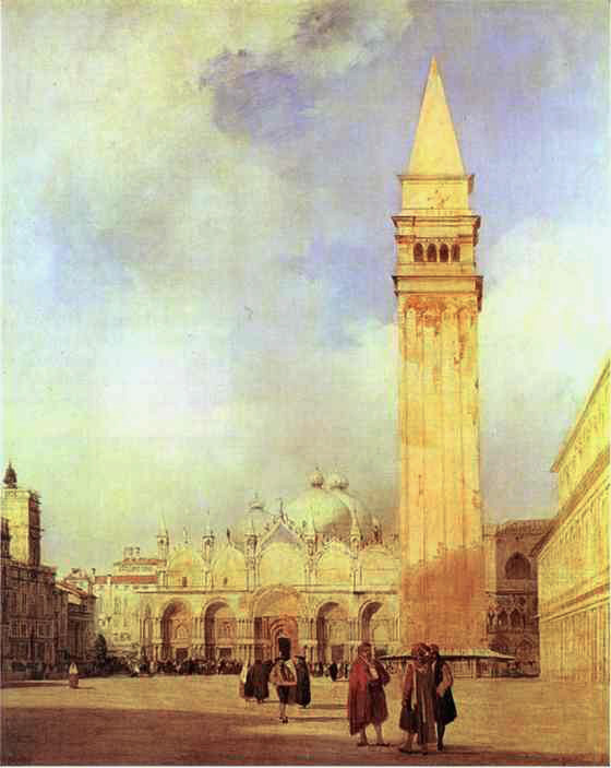
Richard Parkes Bonington’s unfinished Venice: The Piazza San Marco (1827-28) shows signs that it might have been among his best. Its buildings have a golden glow from the setting sun, but those colours would undoubtedly have been enhanced by rich glazes had he lived long enough to complete it.
Occasionally the paint layer develops problems that demonstrate the effects of glazes.

In Abraham Bloemaert’s The Adoration of the Magi from 1624, the cloak of the Virgin Mary appears to use two different blues, with its lower passages painted in the duller hue of indigo, which has faded. The dullest areas are those that had the thinnest ultramarine glazes applied, much of which have now abraded away during subsequent cleaning of the painting. The unprotected indigo has therefore suffered sufficient exposure to fade, as well as losing those rich glazes.

JMW Turner’s Approach to Venice (1844) was painted with very thin transparent glazes over thick white impasto, creating a distinctive flickering effect in its highlights.

Despite the artist’s efforts to get the white impasto to dry more quickly, the glazes dried first, and cracked as they became stressed over the white that was still wet. This hasn’t been helped by the later conservation process of lining, which places an additional layer on the back of the canvas to help the support do its job.
Although a wide range of pigments have been used successfully in glazes, some were developed specifically for the purpose. From the fifteenth century onwards, verdigris pigment was mixed with natural resins for use in glazes. This produces a different pigment from regular verdigris, as the copper combines with the resin acids to form what is known as copper resinate.
A popular technique among many masters to produce an intense green was to paint an underlayer using verdigris, over which several glazing layers of copper resinate were then applied. Although generally reliable and stable, verdigris and copper resinates have a tendency to turn brown on the surface. Thankfully this affects relatively few paintings.

Tintoretto used copper resinate glazes in several of his paintings, most notably the rich, varied, and often lush vegetation in his Saint George and the Dragon from about 1555.

Studies at the National Gallery, London, have found copper resinate in three of the four paintings in Paolo Veronese’s series The Allegory of Love. In the third of these, Respect (c 1575), the pigment was found in the man’s intense green cloak, and the duller gold-brown brocade patterning on the wall behind his hand (detail below). The surface of that wall has superficial brown discoloration of the paint layer.

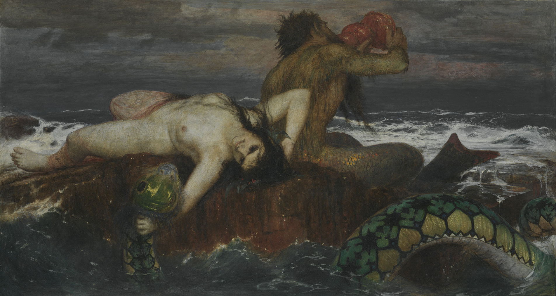
One of the last major uses of copper resinate is in Arnold Böcklin’s Triton and Nereid from 1874. This is reported as being painted in tempera, but copper resinate glaze appears to have been used to develop the intense green patterns on the sea monster in the foreground. This is consistent with Böcklin adhering to traditional techniques despite working in the late nineteenth century.
During that century, painting slowly in multiple layers with glazes progressively fell from favour. By the end, many oil painters had adopted techniques in which much or all of a painting was made at once, known as direct, alla prima or au premier coup.
![]()