Reading view
Zerotier + Openwrt异地组网高阶配置
0889挖矿团伙rootkit后门溯源排查记录
密码保护:某APT组织溯源记录
探索 JPG 和 PNG 图片的压缩表现、算法与应用

前段时间做了些展示页,工作时需要给到切图给前端。以我的习惯,每次都会导出 PNG 并压缩后才交付给前端。有一天我突然想到:
为什么我每次切图时下意识都是会提供 PNG 格式给开发,而不是使用 JPG 格式的图片?这是什么时候开始的习惯?
回想起来应该是我刚刚进职场的时候,在一些设计文章里听过的说法:
- PNG 图片支持透明通道,适用场景比 JPG 要更加宽广,无脑 PNG 即可;
- PNG 图片支持 “无损压缩”,所以图像质量会比 JPG 好一些。
第一点毋庸置疑,但对于第二点我是有点怀疑的:PNG 图片的质量真的在任何时候都比 JPG 要高吗?并且更想知道所谓的 “无损压缩” 是什么,真有这么厉害的技术?所以我打算花点时间做下研究,顺便将研究结果分享给其他团队的设计师们。
这篇文章是一篇在团队月度分享会的记录,分享会内容主要是在回答这个问题:
JPG 和 PNG 分别适合储存什么类型的图片?
回答完这个问题后,我会简单介绍下 JPG 和 PNG 图片压缩机制。正是因为 JPG 和 PNG 这两种图片格式的压缩机制的不同才导致适合储存不同类型的图片。
以及扩展一下思路,会介绍一个我已经实际工作用过的方法:通过 CSS 的混合模式节省网页图片资源。
一、图片压缩分析
分析方法
这次我用了三种类型的图片进行分析,都是我在实际设计工作中有可能导出成位图交付给前端开发的图片类型:
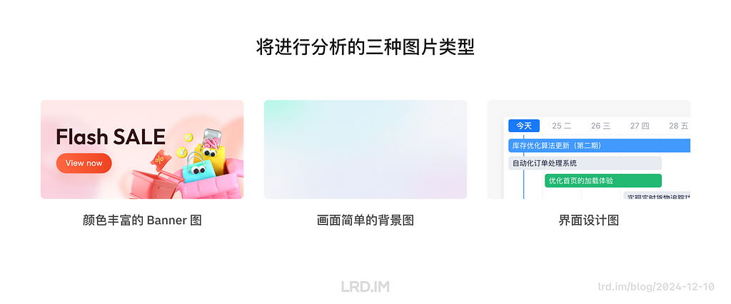
- 颜色丰富的 Banner 图:测试压缩算法在细节保持方面的表现
- 过渡柔和的背景图:测试压缩算法在处理低色彩复杂度时的表现
- 界面设计图:测试压缩对大色块、文字和边缘清晰度的影响
具体的分析过程:拿三个在设计工作中常用到的图片类型(相同尺寸、均无透明通道)进行压缩,以对比 JPG & PNG 图片在压缩前后的表现。分两个维度进行对比:图片体积和图像质量。

分析结果
一、图片体积对比
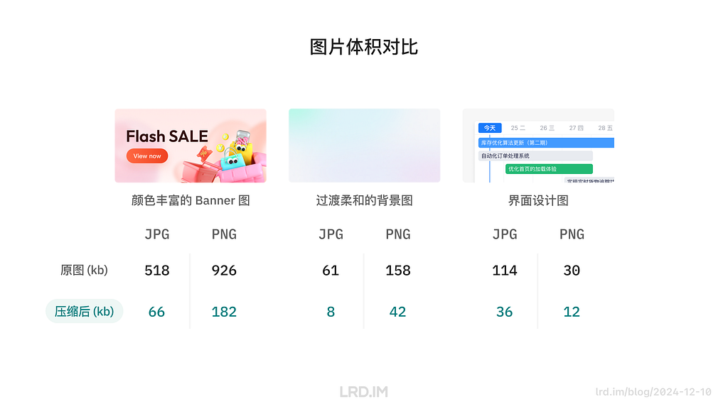
由上图对比可以比较直观的看到,前两个类型(颜色丰富的 Banner 图、过渡柔和的背景图)在图片体积上,JPG 格式图片的体积要比 PNG 格式的图片体积小得多。
通过这一轮对比,我们可以得出结论:
- 画面颜色丰富、颜色过渡比较细腻柔和的图片,JPG 图片的体积比 PNG 的更小;
- 画面颜色越丰富,JPG 图片越能节省空间;
- 颜色数量较少时,PNG 图片的体积比 JPG 图片的更小;
- PNG 图片在压缩后,色块、文字的边缘的质量会比 JPG 图片要好得多。
二、图像质量对比
对比一:颜色丰富的 Banner 图
这一轮我们会放大图片的局部,对比 JPG 和 PNG 图片在经过压缩后,图像质量的区别。
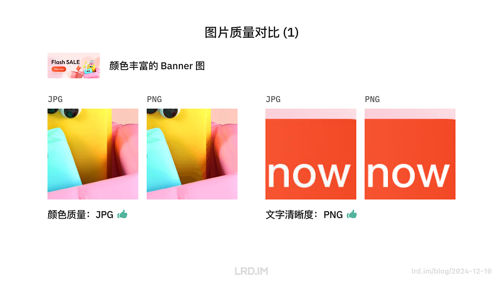
在颜色丰富的图像中,JPG 图片的颜色过渡质量比 PNG 好得多,即便是压缩过后也能保持柔和的过渡。反观 PNG 图片,则是出现了明显的色块。
在文字、边缘的展示方面,PNG 图片则比 JPG 图片好一些。PNG 图片保持了原本清晰、锐利的边缘,而 JPG 图片则在处理边缘时有些许杂色。
对比二:过渡柔和的背景图
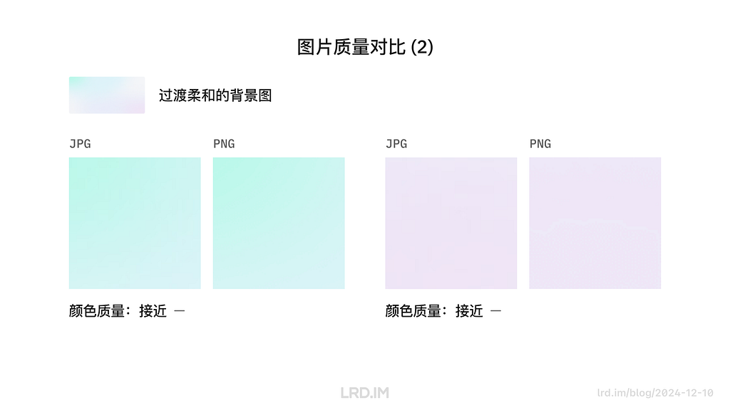
这是一个令人意外的结果,在图像内容比较简单,仅仅只有一些色彩过渡的时候,JPG 和 PNG 图片的质量都很接近。只有在放大很多倍的时候才能看到 PNG 的图片过渡效果比 JPG 要差一些,还是出现了和前一种类型类似的色块现象。
为了探究得更深入些,我在这里用了一张暗色系且过渡柔和的背景图进行同样的压缩测试,这次的测试结果对比会明显很多。
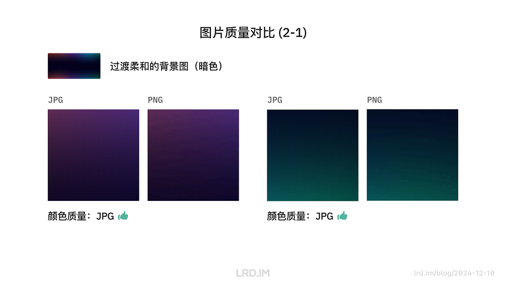
在深色系且有柔和过渡的图片当中,JPG 图像的质量明显比 PNG 要高。如上图所示,PNG 图片的色块和噪点已经比较明显了,而 JPG 仍然保持较柔和的过渡。
对比三:界面设计图
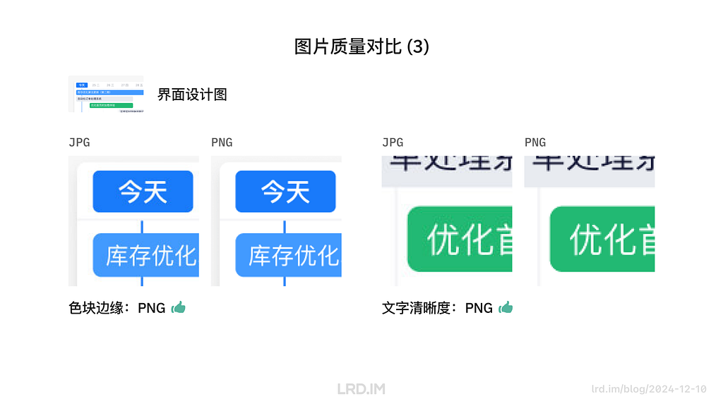
在对比界面设计图时可以看到,PNG 格式的图片在处理色块边缘、文字边缘时都比 JPG 图片要好得多,边缘很清晰锐利,甚至和压缩前的原图没有什么分别。
三、总结
经过上述对三种不同类型图片的图片体积、画面质量对比后,我这里总结出了以下规律:
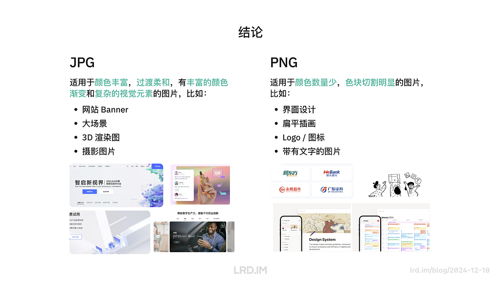
- JPG 格式适用于颜色丰富,过渡柔和,有丰富的颜色渐变和复杂的视觉元素的图片。比如网站 Banner、大场景、3D 渲染图、摄影图片等,此时用 JPG 图片可以得到体积小且颜色漂亮的图片;
- PNG 格式适用于颜色数量少,色块切割明显的图片。比如界面、扁平插画、Logo,带有文字的图片等,此时用 PNG 图片可以得到体积小,色彩准确且边缘清晰的图片。
二、图片压缩过程
这一章会探索 JPG & PNG 图片的压缩过程,这也是导致上文提到 JPG 和 PNG 压缩后图像差异的原因。
JPG 图片压缩过程
JPG 图片压缩过程主要有以下几步:
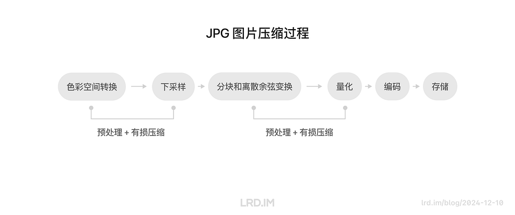
- 色彩空间转换(预处理)
- 下采样(有损压缩)
- 分块和离散余弦变换(预处理)
- 量化(有损压缩)
- 编码
- 存储
在整个压缩过程中会进行两次预处理和有损压缩,分别是第 1、2 步和第 3、4 步。其他步骤与图像质量之间的关系不大,所以我这里就只介绍这两次的预处理和压缩。
第一次预处理和压缩(色彩空间转换和下采样)
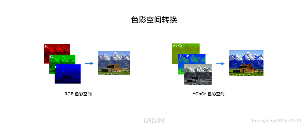
我们设计师平常接触到的 “RGB” 或 “CMYK” 色彩空间,一个字母代表一种颜色,比如 “RGB” 意味着 “红绿蓝”,“RGB” 的色值代表红色、蓝色、绿色分别占多少。
而压缩工具拿到 JPG 图片后,会先将图片转换为一个叫 “YCbCr” 的色彩空间。其中 “Y” 代表了这张图片的亮度信息,而 “Cb/Cr” 分别代表图片中蓝色和红色与亮度 “Y” 的差值。经过这种转换,可以针对性地保留更多的亮度信息,而减少色度信息。简单来说就是能够让人眼难以感知到的方式来减少图像中的色彩信息,减少图片文件体积。
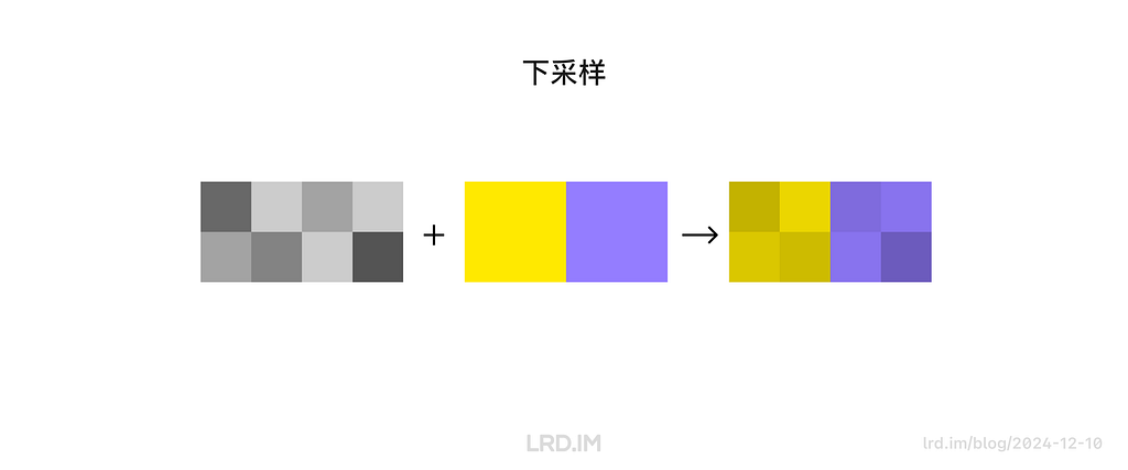
色彩空间转换之后,会进行一个叫 “下采样” 的压缩动作。维持亮度信息的同时,统一处理每个 2x2 的像素区块的色度信息(比如在一个 2x2 区块内 4 个像素在色彩上会被统一处理,看起来拥有相同的色度,但明度是不同的)
第二次预处理和压缩(分块、离散余弦变换和量化)
分块、离散余弦变换指的是会将图像分成多个 8*8 像素的色块,然后将其从像素域转换成频率。转换成频率域的意思是能够让电脑分辨图像中的:
- 高频成分。颜色变化剧烈的部份,如色块、文字的边缘;
- 低频成分。颜色变化平缓的部份,如下图所示的黄色渐变。
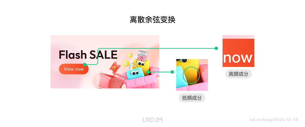
而量化则是利用了人类视觉对于图像中的高频变化不是很敏感这一点,通过减少高频区域的数据量,同时在低频区域保持一定精度,让人感觉到图片仍然很清晰。
简单来说,就是压缩算法知道图像里哪些部分的色彩过渡比较缓和,哪些部分的色彩过渡是强烈的,然后对色彩过渡比较强烈的部份使用较高的压缩率。
结论
所以正如前面对比分析时看到的结果那样,JPG 图片对于色彩丰富的图片的压缩效果比较好,因为 JPG 的压缩算法会根据人眼的特点来优化图片的不同区域。
PNG 图片压缩过程
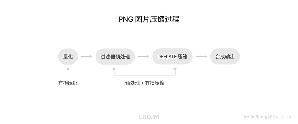
PNG 图片的的压缩过程主要有以下几步,其中只有前三步对图像画质有影响,这里只介绍前三步:
- 量化(有损压缩)
- 过滤器选择(预处理)
- DEFLATE 压缩(无损压缩)
- 合成输出
量化
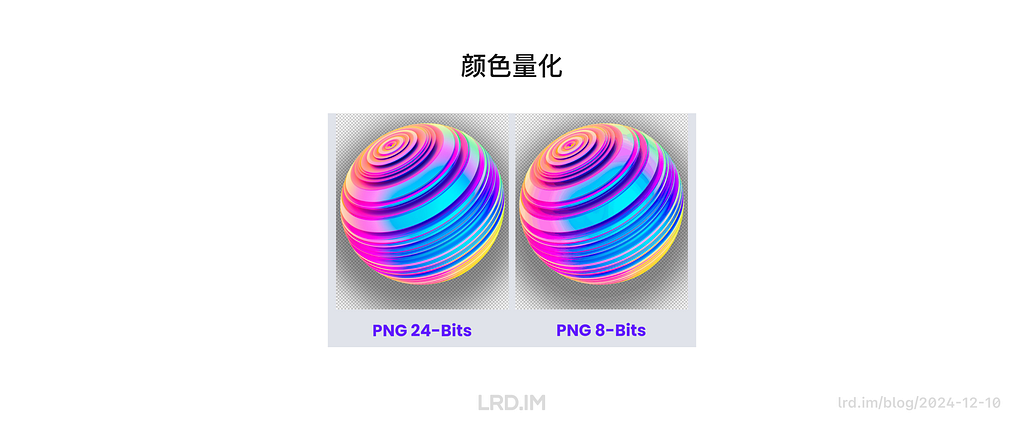
第一步的量化是根据图像的需求选择合适的颜色类型和位深度,简单来说就是直接减少图片的颜色数量。这是最直接有效的压缩方式,同时也对图像质量损耗较大。
下图可以看到一个图像从 24 位(能储存 1677 万种颜色,又称真彩色)减少到 8 位色(能储存 256 种颜色,又称索引色)时,会出现色带现象 (Color Banding)
过滤器选择和 DEFLATE 压缩
这一步才是 PNG 图片的无损压缩。首先会先扫描 PNG 图片的每一行像素,然后以一种新的方式计算每个像素格子的颜色值。比如一个叫 “Sub” 的过滤器,每个像素值是通过当前像素值减去该像素左边像素值得到的;一个叫 “Average” 的过滤器,每个像素值是通过当前像素值减去当前像素左边和上方像素值的平均值得到的。
而 DEFLATE 压缩,这里会用到的方式有很多,比如 LZ77 编码和哈夫曼编码,这里不展开说明了,简单来说就是对过滤过的数据以更优的方式编码,达到减少文件大小的目的。
结论
基于上文提到的过滤器,不难想象到这种无损压缩的方式对于颜色分明的图片 — 比如纯色图标,App 界面截图,扁平插画等 — 很有用,因为像素之间存在细微差异的地方不多,画面上都是大色块居多。
三、其他解决方案
前面提到了很多跟图像压缩相关的事情,这些都是与网页加载优化息息相关的。正好我前段时间做了一个需求,我让前端帮忙做了一件事来节省了大量的图片素材,也算是一次网页加载优化的小案例。
我的设计方案里需要用到八种主题色来作为对卡片的区分,然后我会给这八种主题色的卡片提供一个有简单渐变图像的背景图用以装饰画面,让其过渡不太生硬。设计稿如下图:
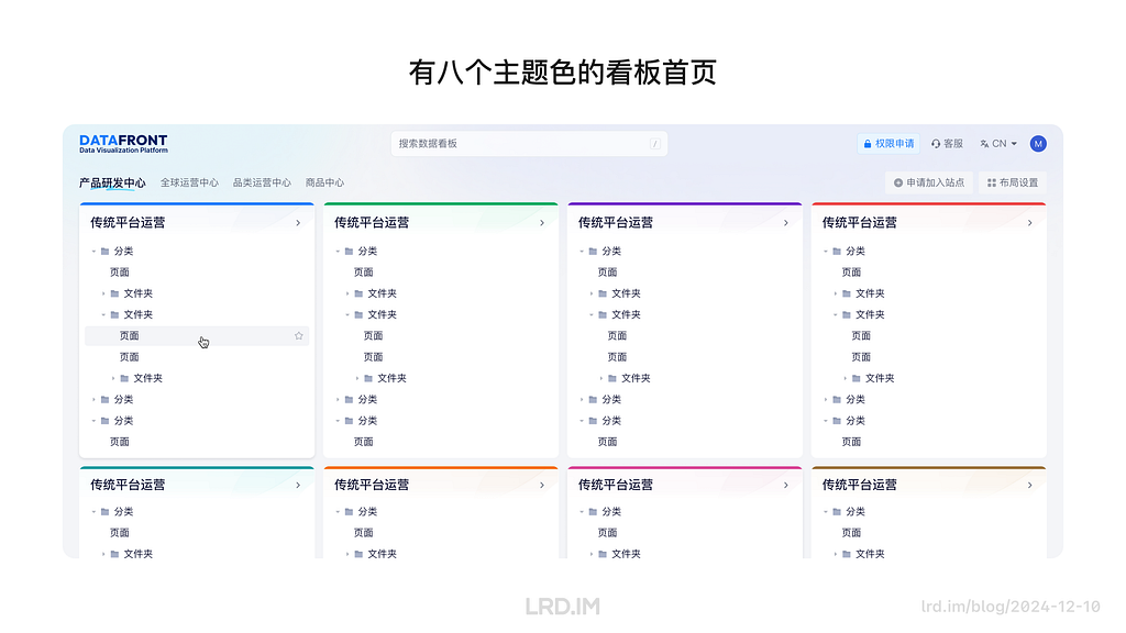
如果按常规的做法和给予上文的调研,我将要提供八张代表不同颜色主题且经过压缩的 JPG 图片给到前端。但是在实际工作中,我只提供了一张灰色的背景图,然后让前端帮忙用 CSS 的颜色叠加 “Screen” 方式来给这张灰色图片上色,达到的效果是与设计稿一模一样的。
下面这张图或许能直接地解释其原理,我先提供一个灰色的素材图,里面只有黑和白之间的明度变化,然后前端会写一个颜色块在这个图片上面,最后使用 CSS 属性 background-blend-mode: screen; 将这张灰色的图片和色块进行叠加,得到了与主题色对应的背景图。
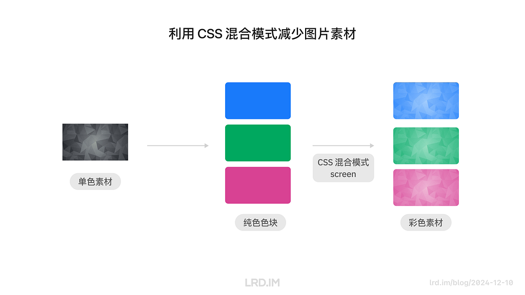
最终我仅用一张素材图实现了原本需要八张素材图才能实现的效果,成就感满满!
总结
这次做的调研确实打破了我从业以来多年的错误观念,现在我清晰地知道了:
- JPG 和 PNG 适合储存的图像是不一样的;
- JPG 和 PNG 的压缩算法导致了图片在压缩后的表现不一样。
虽然这些跟设计技能无关,但也算是一种视野的开拓吧。
这次的分享会是从一个 UI 设计师的角度去探索的,实际上我在 SHEIN 的工作更多是以交互设计师的角色去完成的,我已经有计划在之后的文章中分享更多交互设计的案例,读者们敬请期待吧。
解决 Tailscale 上 Hysteria 和其他 QUIC 数据流传输问题
解决 Tailscale 上 Hysteria 和其他 QUIC 数据流传输问题
- 编辑
/etc/default/tailscaled文件,新增以下行以将 MTU 设置为 1350:
- 重新启动 Tailscale 以应用新配置:
- 通过以下命令确认是否生效:
Sharing: 3D modeling & rendering flow on Figma
Sharing: 3D modeling & rendering flow in Figma
Background
Current situation
I have been working for the current company for half a year. I have a clear picture of the working pattern: We are a small design team, but each member has to be responsible for both the UI and UX design for many internal systems.
Some of the design requirements are not complex at all, but the stakeholders want to make the interface aesthetically beautiful and different from other internal systems. In contrast, other demand sides hope designers can provide a clear and understandable solution to tackle the complex interaction flow.
The previous one was much more difficult for me since I was interviewed for the senior UX designer position, and I had not expected to address these design requirements, which may have occurred considerable times.
So it is time-consuming to design a portal website or refine a running internal system since I have to try multiple design solutions to ensure it will be aesthetically beautiful and outstanding.
Ideation
I wonder if 3D pictures could be a great approach to suit this type of design requirements. So I researched external products from large firms, trying to know how they use 3D pictures in their SaaS products.
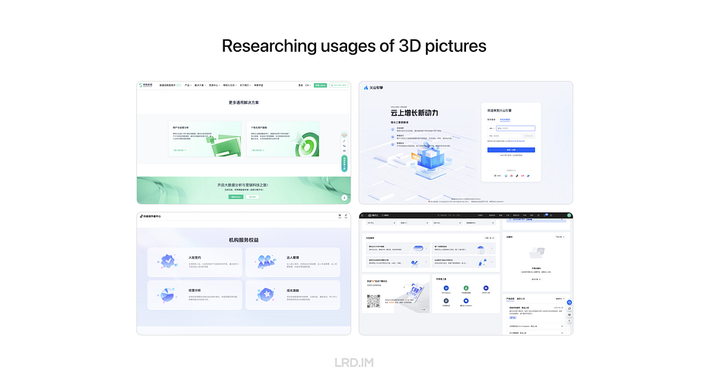
After collecting and investing in multiple products, I found the patterns:
- 3D pictures are most likely used in landing pages, login pages, portal pages, and the like;
- Admin panels and dashboards do not use 3D pictures frequently, but they would appear in entries, feedback, and background decoration.
Conclusion
Based on the pattern above, real working conditions, and small-sized tries, I summarized the first conclusion:
- 3D pictures are not frequently used on dashboard pages and system admin. However, using 3D pictures could improve the variety of pages. So it is not worth it to spend so much time on it.
- 3D pictures can effectively meet the expectations of demand sides when they want to make their dashboard and admin pages distinguish from other similar sites.
Difficulties
Since I don’t have skills in 3D design, and my working strength is too high to spend much time learning, modeling, and rendering delicate 3D pictures, I just simply searched 3D visual elements on the Internet and then applied them to my deliverable.
Initially, this approach was workable and can help me complete my work quickly. However, drawbacks are uncovered after multiple uses:
- Difficulties of matching business contexts. 3D pictures on the Internet support common scenarios well but can’t always precisely describe certain business scenarios.
- Lack of series of an element. Although we finally found a perfect 3D picture, it is hard to reach other similar elements from the same series, resulting in poor scalability.
- Risks of infringement. Using 3D pictures on the Internet might cause infringement, so applying it directly consists of potential risks.
- Inconsistent quality. Free elements are not guaranteed quality and sometimes fail to meet the standards of our design team.
Here, I draw the second conclusion:
Searching for 3D pictures on the Internet has limited effectiveness, so we can’t fully rely on this approach.
After drawing this conclusion, I feel horrible: does it mean that I should strive to learn skills in 3D design? My work strength doesn’t allow me to learn professional 3D software like Cinema 4D or Blender.

After thorough consideration, I think the core demand for me is not to learn 3D software, rather, I should have the ability to gain 3D pictures. Apart from that, the whole process should consist of these features that suit my workflow well:
- Quick render. Since it is not worth it to spend much time on it during my work time.
- Consistent style. Ensuring our design has great scalability.
- Great customizability. It means that I can fully control elements on 3D pictures, ensuring outputs highly represent the business requirements and contexts.
By chance, I know there is a plugin in Figma called “Vector to 3D”. By learning outputs published in the community, it seems that this plugin could meet the features above well, improving my work effectiveness and quality. So I asked my team leader if I could spend some time discovering this plugin and sharing my experiences with team members, and she approved.
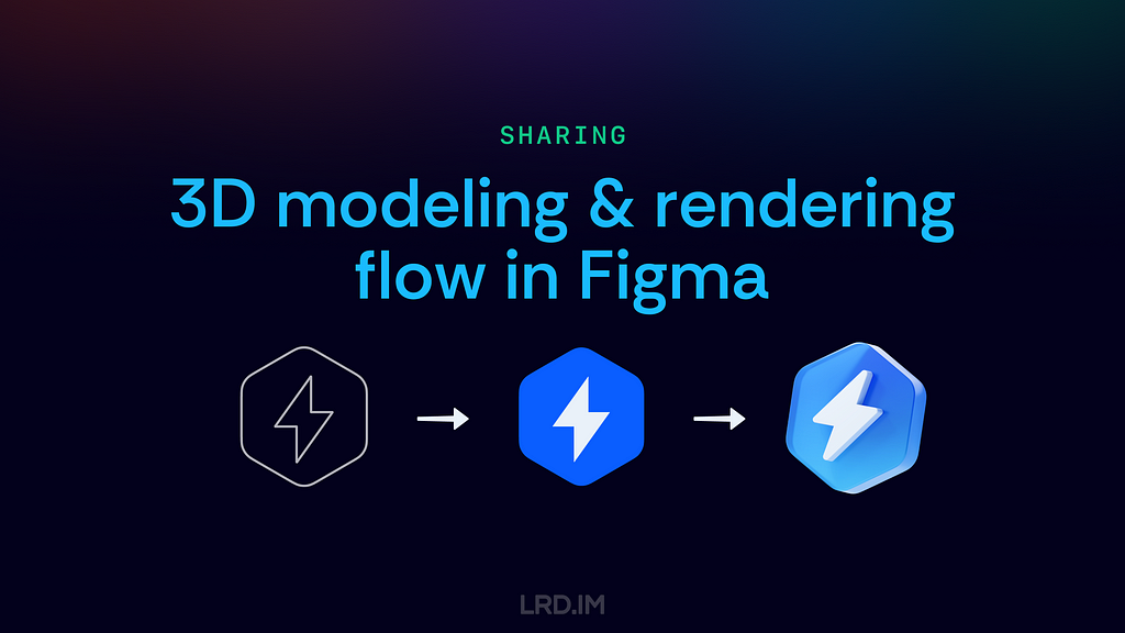
Therefore, this post is to record my internal sharing: My experience of how to build 3D modeling & rendering flow in Figma that improves our design effectiveness and quality.
Work with Vector to 3D
Introducing the plugin
This is a paid plugin, we can search for and install it in the Figma community.
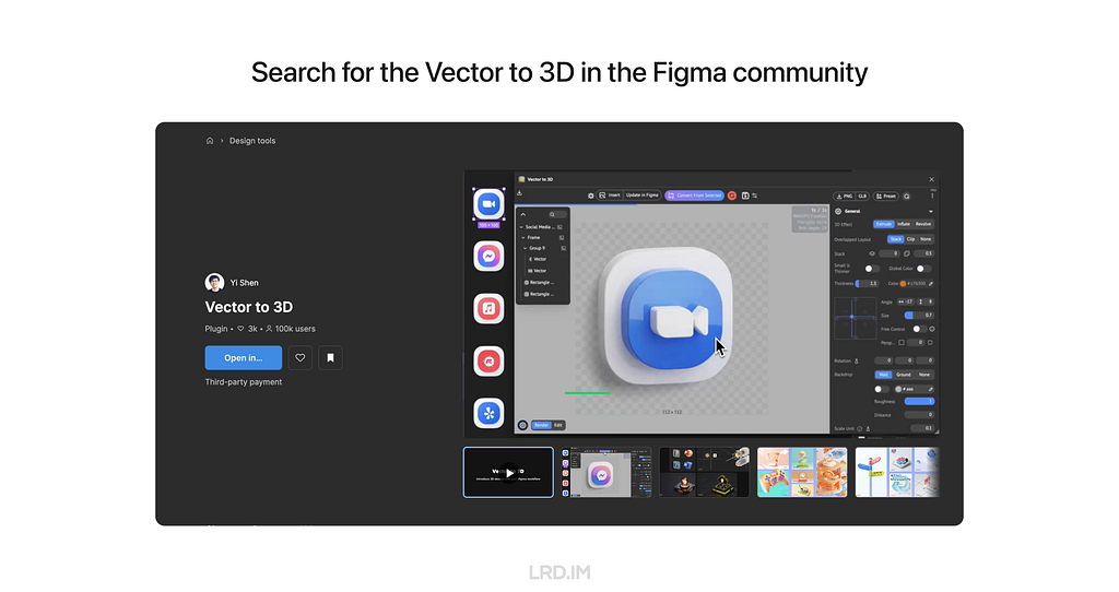
The control panel is comprised of three parts: Global, Object, and Animation settings. Here I will simply introduce the interface of the first two parts, ensuring all readers learn what this plugin can make.
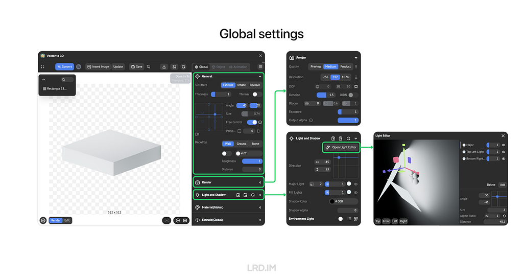
For the Global setting, we can adjust the cameras, and background on the “General” panel; apart from that, we can set the render quality and details on the following panel called “Render”; and then we can control lights on the next panel named “Light and Shadow”, this panel supports varies functions of lights, like the number, size, position, strength, color and so forth.
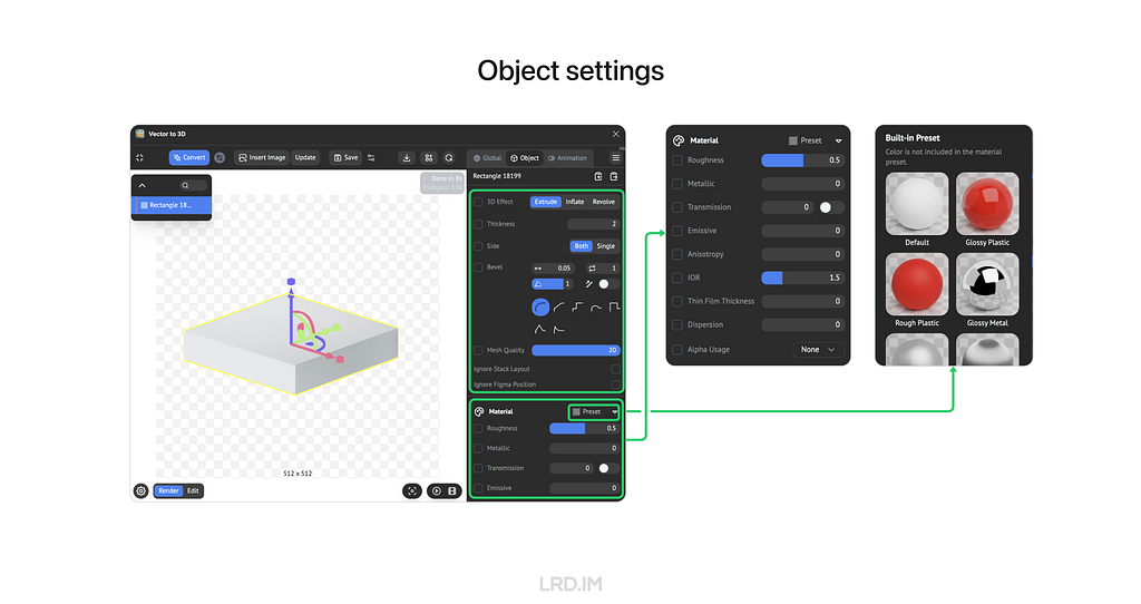
For the Object setting, we can make a 3D model by extruding, inflating, or revolving, and then increase the detail of the model by setting “Mesh Quality”. Moreover, this plugin also supports material settings, like roughness, metallic, transmission, and the like.
These features are more than sufficient to handle nearly all of my design tasks.
Make a template
In this part, I will introduce two functions of this plugin: Save Preset and Template Preset.
Saving preset allows us to memorize the current view, modeling, and material settings of the frame. We can reload all the settings by the next open, even sharing with friends.
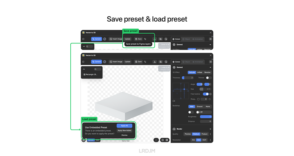
Templating Preset is not only the masterpiece of connecting the plugin with Figma but also a key factor in effectively generating 3D pictures.
Once we built a template, the plugin would memorize all the raw object preset, next step, we can replace the raw object with anything else, and succeed the raw object preset to it.
This approach is highly convenient for us when producing 3D elements. We just have to create a template, and then we replace various shapes, finally, we can produce endless 3D elements that fit our actual needs well.
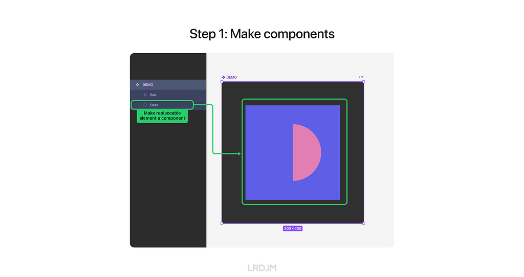
How it works: First, we need to set the frame as a component and make the replaceable element that we want to replace with a new one a child component. (In the following example, I set the square bottom as a replaceable element.)
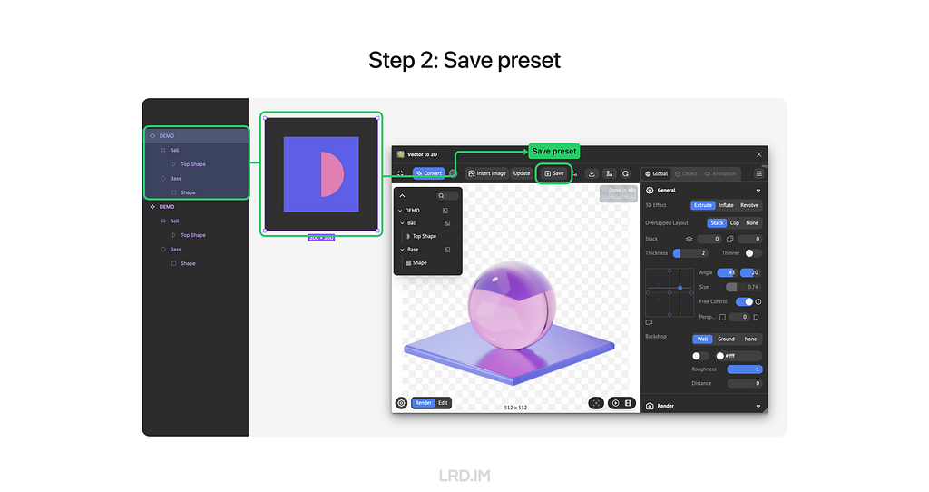
Second, we duplicate the whole component and tune settings in the plugin, then save it. (In the following example, I make a glass ball and a square bottom base with a metallic surface)
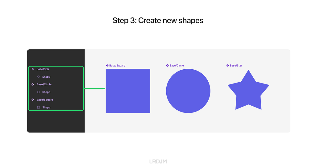
Third, we need to create a bunch of shapes that are to replace the replaceable element, making them an individual component and ensuring their layer number, order, and name are the same as the replaceable element.
Last, we can hold the keys “cmd” + “option”, drag a new shape component to replace the replaceable element, and then reload the model again. Now we can see the new shape is applied to the same presets.
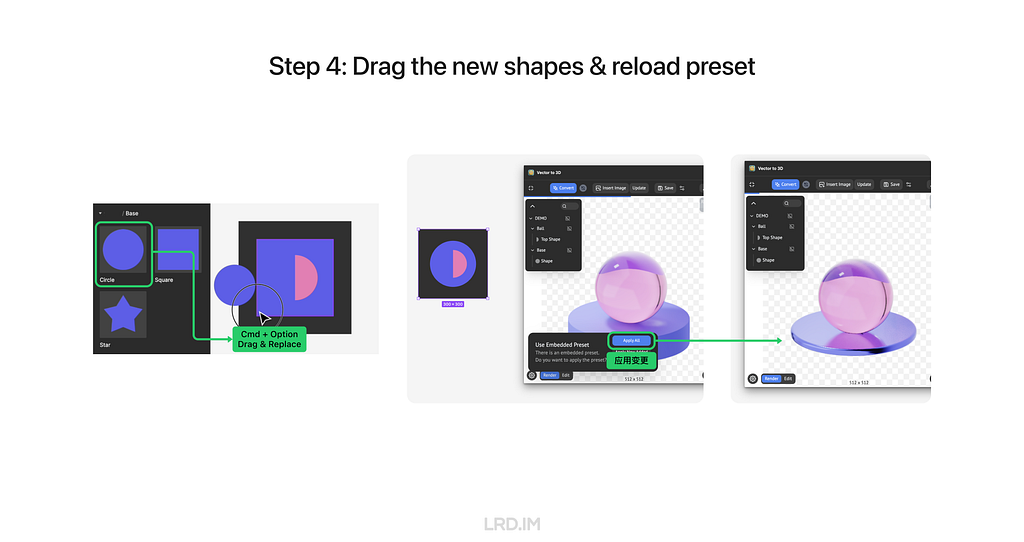
Now we successfully made a template, we can produce endless 3D elements by creating and inserting new shapes.
Actual practice
Here, I will share a case that is already used multiple times in my daily workflow.
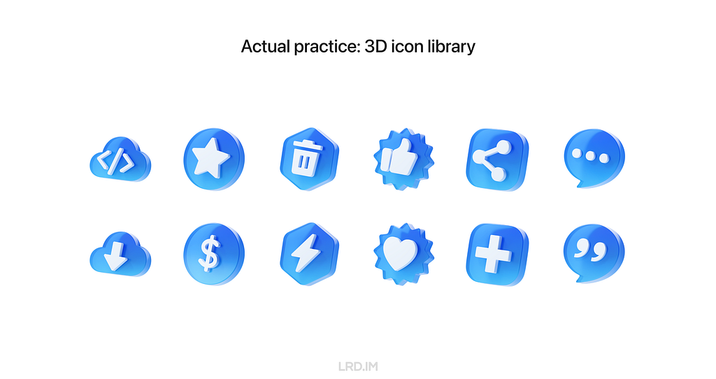
In this template, the shape of icons and background are replaceable, generating endless pictures and fitting nearly all of my design tasks. So it can be a resource library, empowering other team members.
Meanwhile, I created a color pattern, which not only can be used to represent states like success, fail, warning, and the like but also can be applied to the system with different color themes, ensuring our outputs are highly scalability.

Benefits
In the post above, we learned the interface of Vector to 3D, how to make a template, and how I use this flow in actual workflow.
We are familiar with the 3D design workflow in Figma. To conclude this post, I’d like to summarize the key advantages of this process.
1. Low learning costs
We can simply recognize that the plugin “Vector to 3D” is a lite version of 3D software, simplifying complex functions from traditional 3D software and keeping essential functions.
2. Full design process within Figma
This workflow allows us to produce great 3D elements that don’t have to leave Figma. Apart from that, we can simply tune colors in Figma, which doesn’t like the traditional workflow that always switches from software to software.
3. High scalability
One of the core features of Vector to 3D is that makes up models from vector shapes, by taking advantage of this, we can efficiently produce 3D pictures that effectively meet our needs and align well with business contexts.
4. Consistent styles
The plugin Vector to 3D can coordinate with the components of Figma, not only remembering global presets like lights and cameras; but also allowing replacements to succeed presets like materials and position from previous elements. By templating these presets, we can endlessly produce 3D pictures with the same style.
This workflow is not only successfully used in my daily work but also influences my colleagues. After this sharing, 50% of my team members purchased and used this plugin in their design tasks.
Solution for non-Figma users
If you or your team are not using Figma for work currently, or you are not a designer but just simply want to try the flow from SVG shapes to 3D models, you can visit the online version of Vector to 3D: https://www.meimu.design/vector-to-3d/
Sharing: 3D modeling & rendering flow on Figma was originally published in Bootcamp on Medium, where people are continuing the conversation by highlighting and responding to this story.
使用KAPE自动化采集并分析Windows取证数据
Windows磁盘取证-回收站和搜索索引
Windows磁盘取证-SRUM 数据库
分享会文稿:Figma 3D 设计流程分享
一、背景
现状
在新公司工作快半年了,我对这里的工作模式已经有清晰的了解了。这里的设计师不多,但每个人要负责多个内部系统的 UI 和交互设计。
有些需求方的系统本身业务不复杂,都是简单的增删查改,但希望自己的系统能够与众不同,让人产生眼前一亮的感觉;而有些系统里的功能交互逻辑比较复杂,不同状态、不同情况比较多,希望设计师出一个交互方案能够让功能简单易用。
按这几个月的工作情况来看,第一种情况对我来说比较棘手。因为我当时面试的岗位是交互设计师,所以心理上和能力上都没有预期是要接触这样的需求的,而现实是这种需求的占比还不少。
所以我在遇到这种要为某个系统进行门户网站的设计,或者将内部系统打造得光鲜亮丽的需求的时候,我会耗费比较多时间,以及进行很多的尝试。
想法
于是我就在想:需求方们都希望自己的系统能在一众的高度规范化和模版化的系统中脱颖而出,那么使用 3D 素材会不会是一个比较好的解决方案?
有了这个想法之后,我调研了下网上其他大公司的对外产品,看看他们在 B 端产品中的 3D 素材使用情况。
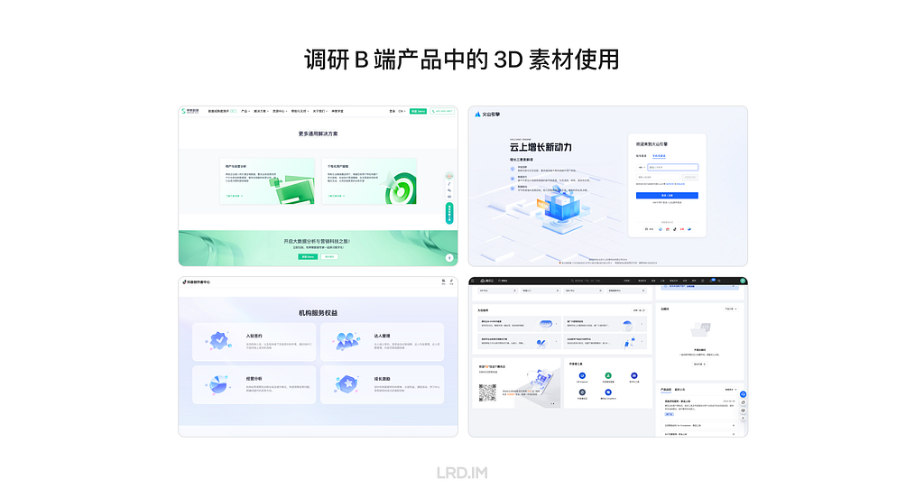
看了一圈下来,我得出了这样的规律:
- 3D 视觉素材在展示型页面用的较多。如官网首页,门户首页,登陆页等页面;
- 在后台界面中使用较少。但也会用在功能入口、状态反馈、背景装饰等场景。
结论
基于这个规律、现实工作中的情况以及小范围的尝试之后,我得出了这样的结论:
- 3D 素材在 B 端后台的场景使用的频率不高。恰当使用可以提升画面的丰富程度。但不必在此花太多时间。
- 如果遇到需求方要求该项目需要与那种高度模版化的后台有明显区别的时候,使用 3D 素材确实是能满足需求方期待的。
二、难点
由于我没有 3D 设计的能力,同时公司的需求密集程度也似乎不允许我们专门花时间为一些日常需求来渲染 3D 视觉图,所以在最开始我是通过在素材网站上面搜寻 3D 素材,然后直接应用在工作当中。
这个方法最开始很好用,我可以快速地完成需求,但用久了之后发现短板也很明显。
- 难以贴近公司业务。网络素材难以贴合公司内部的业务场景。大部份情况下只能找到通用素材,无法满足具体需求。
- 缺乏系列素材。即使找到一个合适的素材,但要找到同系列的其他类型素材犹如大海捞针。
- 侵权风险。网上找到的素材可能涉及版权问题,直接使用存在风险。
- 质量参差不齐。高质量的素材通常需要付费,免费的素材质量参差不齐,难以满足设计内部标准。
所以我得出了一个结论:
仅靠找素材的方式对我们帮助有限,不能完全依靠这种方法。
如果不能仅依靠找素材的话,这意味着我需要有 3D 设计的能力?
当初我得出这个结论的时候,心里感到一丝的恐慌:现在的工作强度,还哪有时间学习复杂的 Cinema 4D 或者 Blender 之类的专业 3D 设计软件啊!

然后我再往深处想了想,其实我需要的不是 3D 设计的能力,而是需要有获得 3D 素材的能力!意思是我不一定得会用这种专业的 3D 软件,但我要有办法获得想要的 3D 视觉素材,并且这个过程必须具备以下特点才能满足我的实际工作情境:
- 出图耗时短。因为实际工作中就是不值得在这方面投入过多时间。
- 风格高度统一。才能保证扩展性,以及系统风格的统一性,而这正正是通过找素材的方式没法做到的。
- 可定制程度高。指的是我要有办法定制 3D 素材里面的图像和元素,这样做才能确保产出物贴近实际业务,那用起来才有意义。
在想到这些东西的时候,刚好我了解到有一个叫做 Vector to 3D 的插件,似乎能够满足到以上三点需求,来提升我的工作效率和质量。于是我向领导提出这个设想,她也支持我去探索这个新工具。
这篇文章是公司内部分享会的文稿,记录着我当时探索出来的经验:如何利用 Vector to 3D 插件在 Figma 建立 3D 设计流程来提升我们的设计效率和质量。
三、通过 Vector to 3D 进行工作
插件介绍
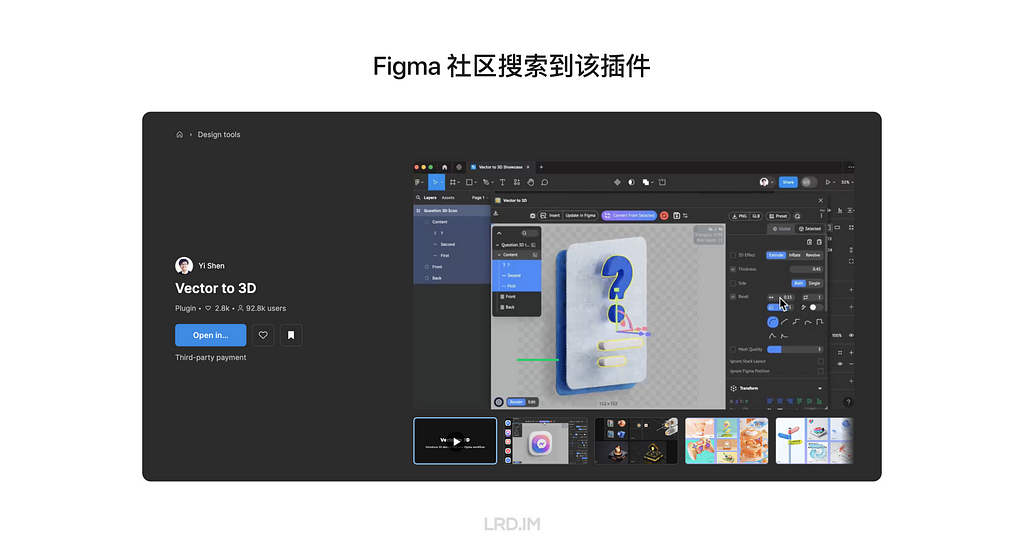
这是一款付费插件,可以在 Figma 社区搜索并安装。
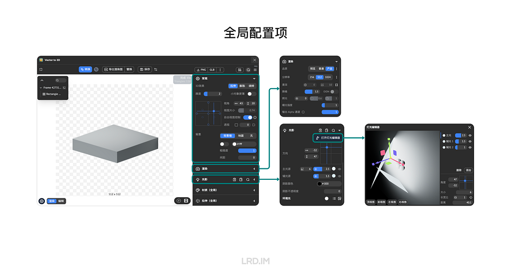
这款插件的 3D 能力分为两部分,全局配置项和当前物体配置项。接下来我将通过介绍这个插件的界面来简单介绍下这款插件。
对于全局配置项,我们可以在 “常规” 面板里配置视角和背景等参数、“渲染” 面板可以配置渲染质量、“光影” 面板可以配置灯光相关参数,如灯光数量 / 大小 / 位置 / 强度和颜色等。
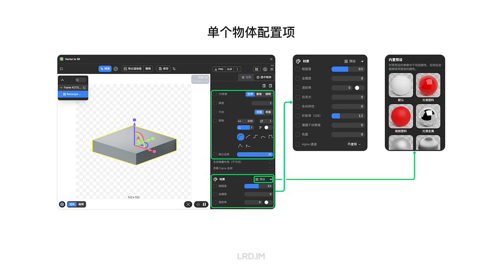
对于单个物体配置项,我们可以通过 “厚度” 或 “旋转” 等的方式建立模型,并使用 “细分品质” 提升模型的质量。值得注意的是,这个软件是通过将矢量图形挤压或旋转生成出 3D 模型的,不能像传统 3D 软件那样有多种建模方式(比如克隆、布尔运算或雕刻等)。
除此之外,该插件还支持配置材质参数,如粗糙度、金属度、折射率等。这些简单材质足以应对绝大部分的 B 端场景了。
制作模版
这一小节会介绍两个该插件的功能,保存配置和模版化。
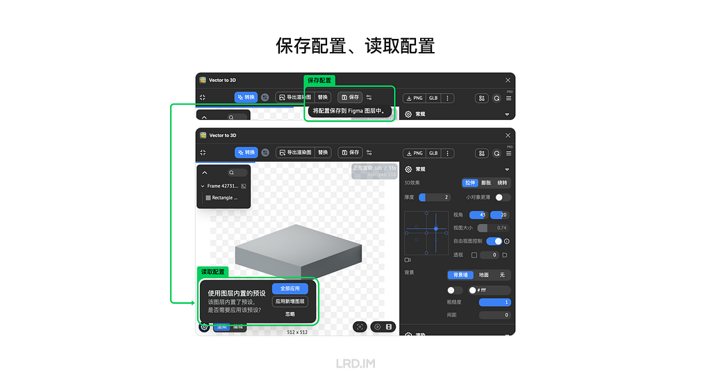
保存配置允许我们将当前画框内的视角参数、建模参数和材质参数等记录到该画框当中。下次打开编辑,或者分享给其他人打开的时候可以读取之前的配置,一键将矢量图形变成之前保存好参数的 3D 场景。
模版化则是该插件与 Figma 原生功能联动的完美范例,也是高效产出 3D 素材的关键因素。
先说效果:插件会将当前物体的配置项(如厚度、位置、材质等)记录,然后用户可以将任意元素与该物体替换,并继承该物体的配置项。
这个能力极大便利了模版化生产素材。我们只要做好一个模版,然后无限替换元素,就可以生产出适用于各种业务场景的素材了。
方法很也简单,我们需要将画框设为组件,想要替换的元素也要作为这个画框组件内的子组件。(下面的例子中,我将圆球的底座作为可替换元素)
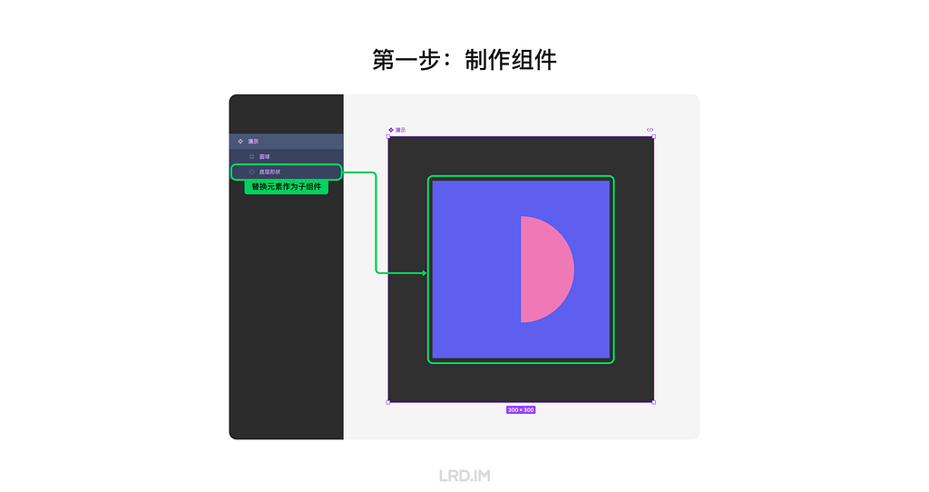
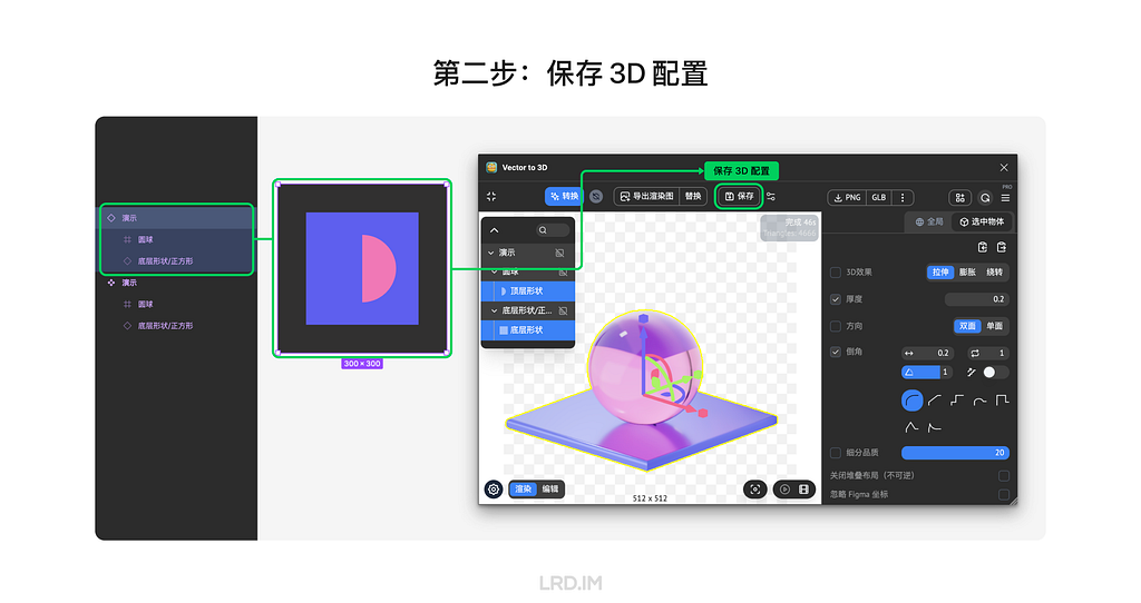
将这个画框组件拖一个出来,在插件中设定好 3D 配置并保存。
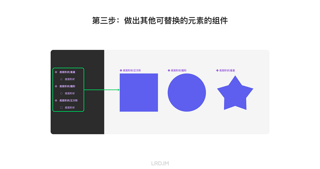
然后做出其他可供替换的元素,确保图层的数量、排序、命名与画框内的替换元素一致
最后我们在左侧面板中按住 Cmd + Option 将其他替换元素与画框内的替换元素进行替换,然后在插件中重新加载一遍模型,我们能看到新的形状也应用上原有替换素材的参数。
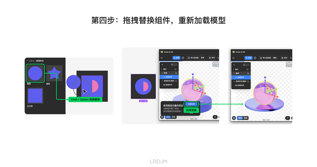
这时,我们的模版已经制作成功了,后续只要无限制作替换素材,就可以获得无限的视觉素材。
实际应用
这里分享一个我在工作中实际应用的例子。我制作了一个生成蓝色 3D 玻璃风格图标的模版。
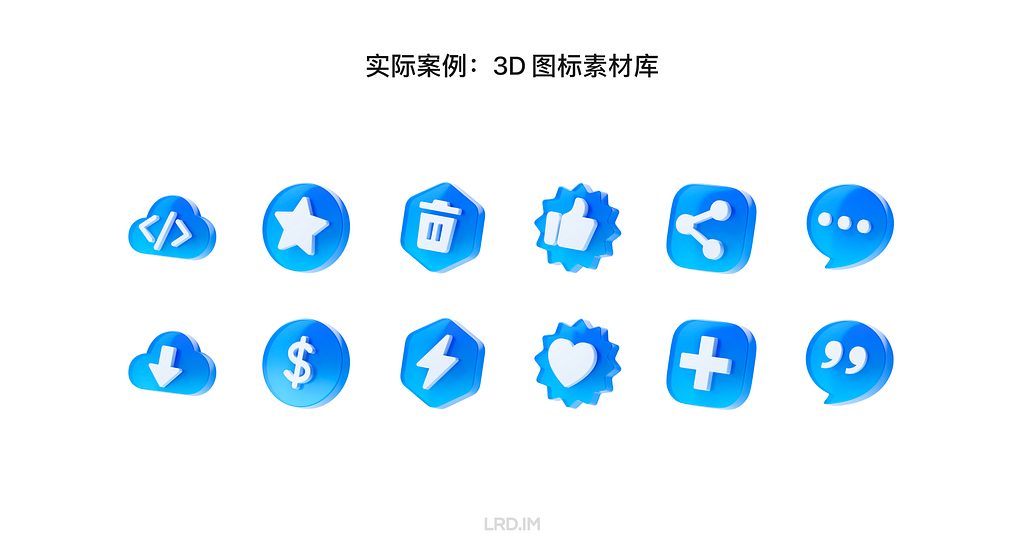
这个模版中,图标和背景面板的形状均可以替换,由此可以生产出很多种变化,适应不同的业务场景。所以也可以积累成为素材库,供团队的其他成员使用。
同时,我也建立了一个色板,可以用于表达一些状态(成功、失败、警告等),或者用在不同颜色主题风格的系统内。这样我们的模版能产生更多的变化,适用到更多的场景中。
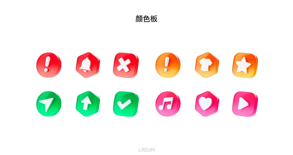
四、总结
上文介绍了 Vector to 3D 的界面使用、如何制作模版以及分享了我在实际工作中应用的例子,我们现在已经掌握了在 Figma 中进行 3D 设计的流程。文章的最后总结一下做这件事的优点。
1.学习成本低
可以将 Vector to 3D 理解为是一个简化版的 3D 软件,移除了像传统 3D 软件比如 Cinema 4D、Blender 里面的很多复杂功能,仅保留基础能力。
2.Figma 内完成全流程
用这套工作流程可以使设计师不离开 Figma 工作环境就能生产出不错的 3D 素材,并且出图后也能在 Figma 内进行简单调色。不需要像传统 3D 工作流程那样在不同软件里的来回导出导入。
3.可定制程度高
Vector to 3D 的特点是基于矢量图形生成 3D 模型,所以我们能轻松生产出业务相关的元素,使得视觉素材能高度贴近业务场景。
4.风格高度统一
Vector to 3D 能够与 Figma 组件能力联动。可以将灯光、摄像机等全局参数记忆在组件中,替换子组件也能继承原本的材质、位置参数。同时能够将这些参数模版化,无限产出相同风格的视觉素材。
这套工作流除了在我自己的实际工作中有成功应用,也成功影响到了团队中的其他设计师。在这次分享会过后,团队中有50%成员已经用在需求中使用该插件来生成视觉素材了。
五、非 Figma 工作流
最后看到这里的朋友如果当前团队没有在用 Figma 作为工作软件,或者并非 UI/UX 设计师也想试试通过 SVG 图形制作 3D 模型的过程,这里我贴 Vector to 3D 的网页版连接:https://www.meimu.design/vector-to-3d/
Windows高级事件日志分析
Telethon实现自动回复tg bot菜单消息
Iceland 2024.08
🇮🇸Iceland 2024.08


rsync+tls 实现远程数据同步加密传输
开发ko内核模块,无依赖实现监控DNS请求进程
使用Sysmon进行威胁狩猎
加密程序:如何应对勒索软件攻击(下)
加密程序:如何应对勒索软件攻击(中)
加密程序:如何应对勒索软件攻击(上)
Uplifting your design details with the Case-Sensitive Forms feature
A curious discovery
When my workflow had fully transformed from Sketch to Figma, I found there was an option “Case-Sensitive Forms” placed in several typeface setting panels. The appearance of the font might change slightly and occasionally when I enable this setting.
I was interested in this setting option, then I tried to find out concepts and related knowledge about the term “Case-Sensitive Forms.”
In this post, I will explain what Case-Sensitive Forms are, when should we implement this feature to uplift our design with several practices, and how to use it in our workflow.
Features
The “Case-Sensitive Forms” is a feature of OpenType features, which are like hidden compartments in fonts that allow us to change how fonts look and behave. When we use this feature, the font will:
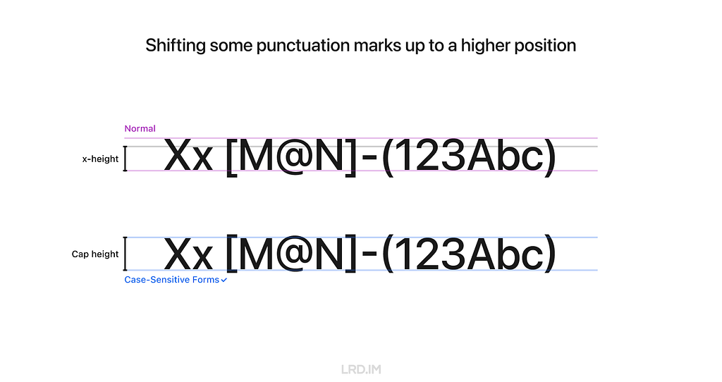
- Shift some punctuation marks up to a higher position;
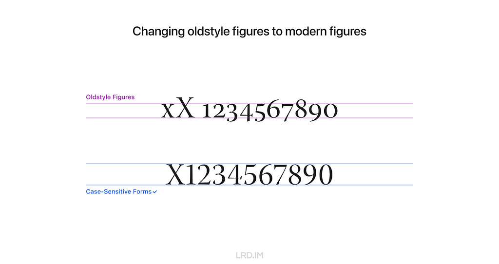
- Change oldstyle figures to modern figures.
Feature 1: Shifting some punctuation marks up to a higher position
In general, punctuation marks are vertically centered with lowercase characters, which is known as “x-height.”
However, when using the Case-Sensitive Forms feature, some punctuation marks are aligned with the height of uppercase characters, which we call “Cap height.”
Feature 2: Changing oldstyle figures to modern figures
Some fonts use oldstyle figures by default to add visual attraction. It is often used in traditional publications like books and newspapers since this font has a rhythmic beauty with varied heights.
When using the Case-Sensitive Forms feature, fonts will be directly changed to modern figures, also known as “lining figures.”
Realistic practices
Inspiring by the feature 1, shifting some punctuation marks up to a higher position, it is well-suited for compositions that mix uppercase characters, figures, and CJK characters.
Here is a list of compositions that might be visually improved by using the Case-Sensitive Forms feature.
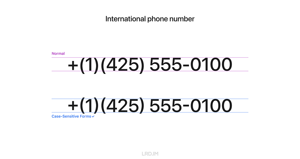
1. International phone number
Because figure glyphs are as high as uppercase characters, the use of Case-Sensitive Forms is ideal for displaying phone numbers that include area codes.
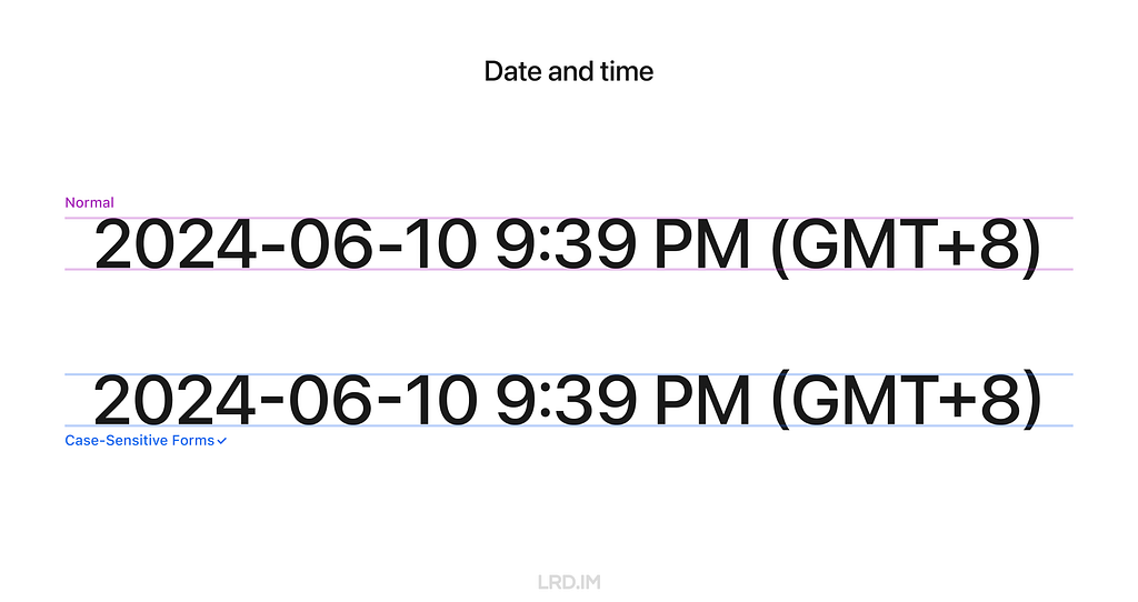
2. Date and time
Similarly, date and time is also well-suited for using the Case-Sensitive Forms feature since they are typically consisted of figures and marks.
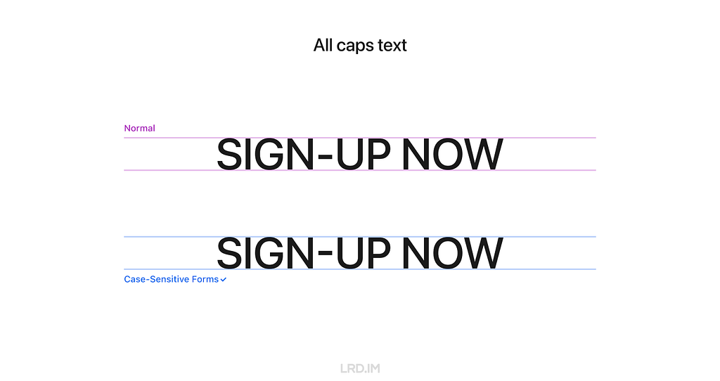
3. All caps text
To make titles or other important information visually prominent, we often capitalize the text, which is also ideal for using the Case-Sensitive Forms feature.
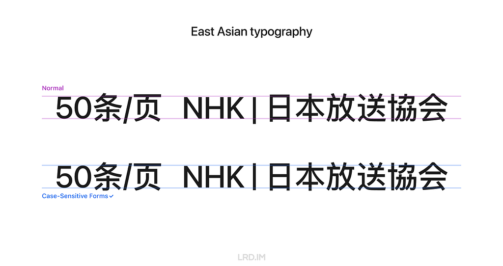
4. East Asian typography
East Asian typography looks like a square, meaning the visual height of Chinese, Japanese, Korean, and Vietnamese characters is similar to the “X” letter’s cap height.
Therefore, the Case-Sensitive Forms feature are also fitting for the East Asian typography scenario, ensuring marks are vertically aligned with the characters.
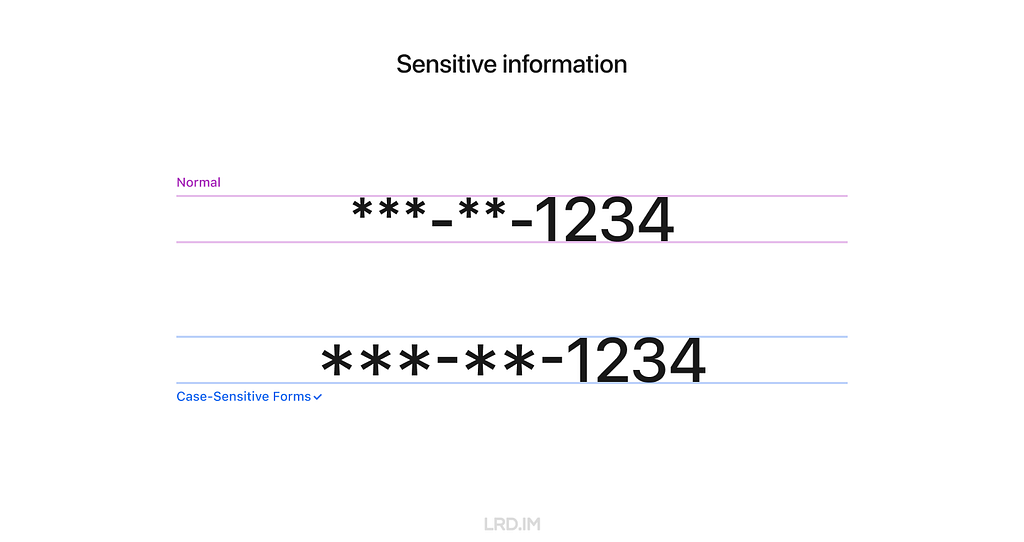
5. Sensitive information
When displaying sensitive information on digital interfaces, such as Social Security Number(SSNs), bank account numbers, and phone numbers, we often use asterisks (*) or dots (•) to partially obscure it. In that case, the Case-Sensitive Forms feature is highly suitable.
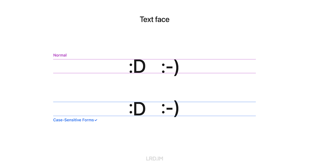
6. Text face
A rare scenario that may be ideal for using the Case-Sensitive Forms feature is text faces, such as “:D” and “:-)”
How to use
1. Supported typefaces
Only typefaces that support the OpenType feature of Case-Sensitive Forms can enable this feature.
It means that not ALL typefaces support this feature, even if we implement this setting in design tools or through coding. I’ve simply made a list to clarify which typefaces support it and which not.
Typefaces that support the Case-Sensitive Forms feature:
- DIN Pro;
- Inter;
- San Francisco (fonts for Apple platforms);
- Inria Sans;
- Warnock Pro…
Typefaces that DO NOT support the Case-Sensitive Forms feature:
- Arial;
- Helvetica;
- Noto Sans;
- Roboto;
- Source Sans;
- Segoe UI…
In other words, the Case-Sensitive Forms feature only works on Apple devices if we use the system default font on our website.
2. Figma
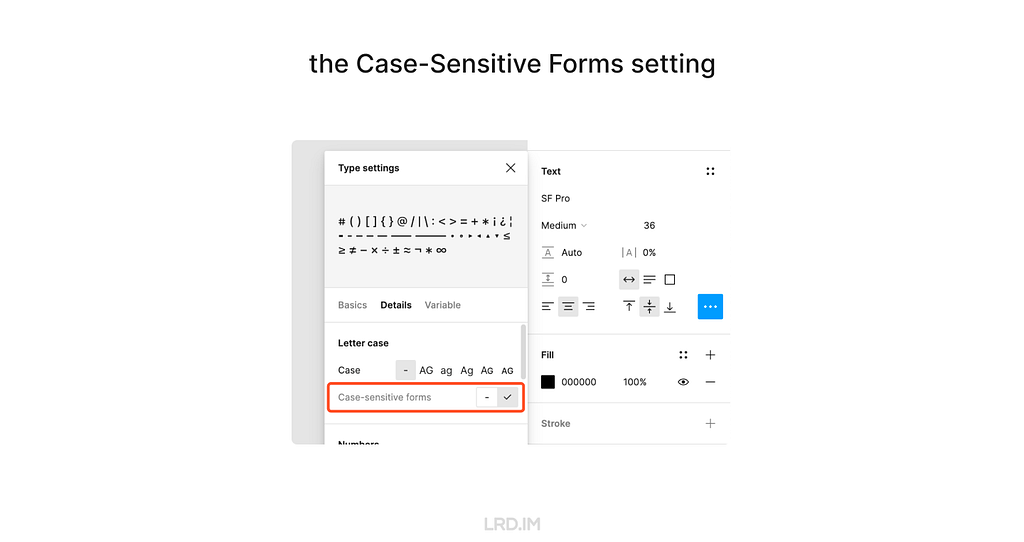
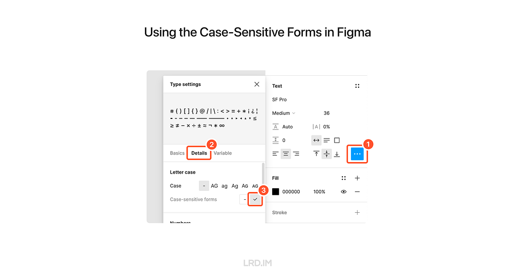
Follow these steps to implement the Case-Sensitive Forms feature in Figma. Select a text layer, then:
- Open the “Type settings” panel;
- Switch to the “Details” tab;
- Check the “Case-sensitive forms” option.
3. CSS
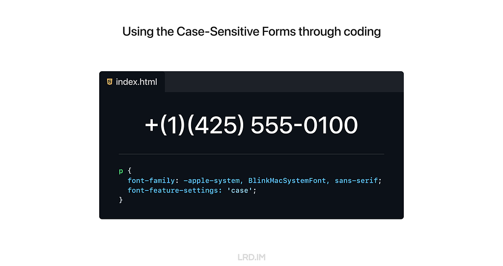
To use the Case-Sensitive Forms feature on the website, we just need to simply add font-feature-settings: ‘case’; to the element that we want to implement this feature.
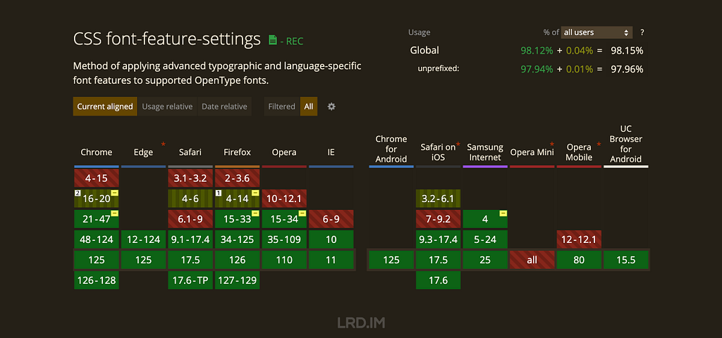
The CSS Compatibility of this style is quite good. Again, we need to ensure the typefaces support the Case-Sensitive Forms feature; otherwise there will be no changes.
Set as default?
We’ve discussed many scenarios and advantages of using the Case-Sensitive Forms feature. So should we set it as the default style?
My answer is NO.
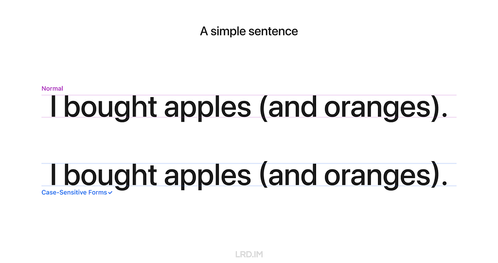
Although it can uplift visual details with numbers and capital text, it is quite awful when used with lowercase letters, which are more commonly used on our website.
However, we can safely implement the Case-Sensitive Forms feature in some components that always consist of numbers, marks, and capital letters. Here is the list of UI components:
- Avatar;
- Badge;
- Pagination (Image viewer, Swiper and the likes);
- Letter counter.

For comparison, let’s see the most common solution in which the Case-Sensitive Forms feature is not implemented on digital interfaces.
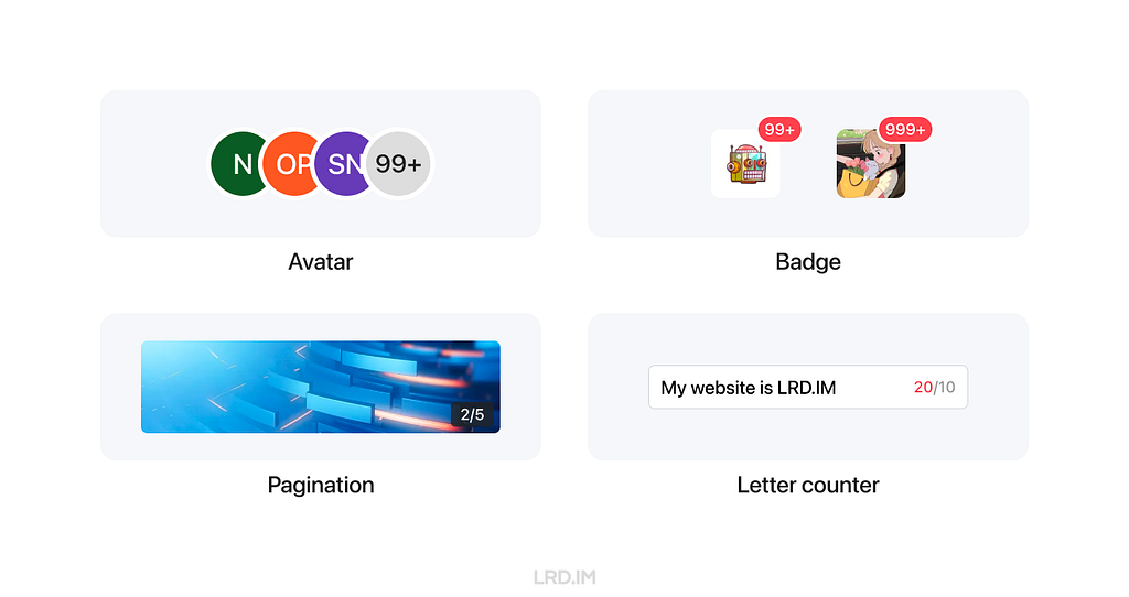
Recently, my team has been redesigning our mobile component library. I’ve suggested using the Case-Sensitive Forms feature on the components listed above. Let’s see the outcomes in the future.
References
Uplifting your design details with the Case-Sensitive Forms feature was originally published in Bootcamp on Medium, where people are continuing the conversation by highlighting and responding to this story.
让 Tailscale MagicDNS 和 Surge 共存
🧭让 Tailscale MagicDNS 和 Surge 共存
<machine name>.<tailnet name>.ts.net 域名,如果你想省略 <tailnet name> 可以继续往下读。
Tailscale can automatically assign DNS names for devices in your network when you use the MagicDNS feature.
100.64.0.0/10 地址。你可以直接访问这个 IP 地址,但是正如直接使用 IP 网上冲浪是个坏主意,直接使用 IP 也不是个好主意。所以 Tailscale 会为每个 IP 也分配一个 ts.net 的地址。100.100.100.100 这个 DNS 服务器解析的。这一 DNS 服务名叫 MagicDNS。
https://monitoring 就相当于访问 https://onitoring.yak-bebop.ts.net:443 。
TENANT_ID

TAILNET_NAME- 你可以在 这里 找到,填入包含ts.net的名称
ACCESS_KEY- 你可以在 这里 申请 API access tokens,有效期最长 90 天
<machine name>.ts.net 来连接对应的主机实例。ts.net。由于我不考虑多个 Tailnet 的情况,也不需要记住你 Tailnet 的名称。
- 脚本的 Key 只有 90 天有效期,你需要定期更新
- 每次访问
*.ts.net只要域名解析未过期都会发起一次请求,通常这不是问题,如果你遇到了问题可以在评论中告诉我
更加高效的 Surge Ponte 网络分流
🏃♂️更加高效的 Surge Ponte 网络分流
192.168.114.0/24 ,Surge 的配置中有这样一段:
192.168.114.0/24 ,在外面时先隧道连接 PYCELLE 再去到目标的地址。Surge 提供 Rule 类型的脚本,能够很容易解决这个问题。- 是否连接了家里的 WiFi 热点
- 有线连接的设备是否使用
192.168.114.1作为网关
- 连接的目的地是否位于
192.168.114.0/24
String.prototype.includes ,假设你家的内网有多个网段可能需要下面的函数来判断子网。CDN+OpenResty 实现丝滑访问的登录态缓存站
密码保护:某国产防泄密沙盒绕过漏洞
应急响应-统计日志中单个ip访问流量大小
某航空WIFI破解,无限制空中上网
Lessons I learned after completing the Google UX Design Professional Certificate

Recently, I heard that Coursera has a UX design course developed by Google’s design team. This course covers the entire design process and teaches us how to present our portfolio, prepare interviews, and the like.
It is necessary to enroll in this course even though it is designed primarily for beginners and fresh graduates. It would enhance my English skills on one hand, and deepen my understanding of Western design practices and culture on the other. Since the term “UX design” is called out by Western designers and I am eager to compare Western design cultures with those I’ve experienced in China.
So I enrolled in this online course, trying to spare my time on it. Such as during lunch and dinner breaks on weekdays, or parts of the weekend. I completed the whole certificate within two months. And now I’d like to write down what I learned from this course:
- Introducing concepts I had never heard of. Despite my 5+ yoe in a wide range of companies, from startups to large corporations in China, those new concepts opened up a lot of room for me to explore.
- Enhancing my listening and reading skills. The course covers plenty of video and reading materials that include industry jargon that translators cannot provide. Moreover, certain phrases and sentence structures are repeatedly used throughout the course. I think my reading skills and speed are slightly improved.
- Pointing out concepts like accessibility and equity early throughout the course. I used to think only seasoned designers or well-developed products consider these aspects, however, they are mentioned early on and repeatedly. These concepts resonated with me and will truly influence my work.
- Elaborating comprehensive and detailed guidance for designers to prepare their portfolios, resumes, and interviews. They not only tell us what content should be included in our portfolios, but also how to prepare for interviews at different stages. I resonated with these instructions as well, since I did think those details over when looking for a new job.
Table of content

New concepts
I have consistently tried to think about and expand design boundaries through different aspects, which requires a breadth of knowledge. Here, I will share several new concepts along with my personal understanding.
Affinity diagram
This is a method of synthesizing that organizes data into groups with common themes or relationships. It can be used in different stages of the design process, such as during brainstorming or after collecting users feedback. The example below focuses on the latter.
After collecting a batch of user feedback, the design team condense each piece of feedback into a single sentence and write it on sticky notes. Then we post them up on a whiteboard or digital tools like Figma. Then the design team look for sticky notes that reference similar ideas, issues, or functionality and collaboratively organizes them into clusters representing different themes.
When I first learned about this approach in the course, I realized that this approach is similar to another method called “Card sorting” that was included in an article I translated earlier named [English to Chinese Translation] How we rebuilt Shopify’s developer docs. Both methods involve clustering sticky notes, naming these groups and summarizing the themes or relationships.
However, card sorting is implemented by external participants and aims to uncover users’ mental models to improve information architecture; Whereas affinity diagramming organizes a large amount of raw data to show the team which problems users are most concerned about and consider high priority.
* This concept is mentioned in Module 3 of Course 4 (Conduct UX Research and Test Early Concepts — Module 3 — Gather, organize, and reflect on data)
Digital literacy
This concept refers to an individual’s ability to gather, communicate, and create content using digital products and the internet. For example, senior adults or those living in areas with poor internet infrastructure may find it difficult to understand interfaces and functionalities, they are considered to have lower digital literacy.
In contrast, young people, especially those working in the information technology industries, are typically familiar with new software and concepts, and can quickly adapt to them.
This course does not dig deeply into this concept, rather, it emphasizes the importance of understanding our users. If our product targets a broad range of users, it is good to consider the needs of users with lower digital literacy. Moreover, this factor should also be considered when recruiting participants for usability tests.
* This concept is mentioned in Module 2 of Course 1 (Foundations of User Experience (UX) Design — Module 2 — Get to know the user)
Deceptive pattern
This concept refers to a group of UX methods that trick users into doing or buying something they wouldn’t otherwise have done or bought.
In the course, instructors clearly point out that this is an unethical and not a good practice. Businesses may lose their clients’ respect and trust once clients realize that they have fallen into deceptive patterns. I will share a few interesting examples that the course provided.
- Confirmshaming: Making users feel ashamed of their decision. For example, a subscribe button on a news website usually reads “Subscribe now / No thanks”. BBut if the service provider wants to manipulate readers’ emotions, the text might be changed to: “Subscribe now / No, I don’t care about things around me.”
- Urgency: Pushing users to make a decision within a limited time. For example, an e-commerce website might give you a coupon that is only available for 24 hours, prompting you to purchase items without a thoughtful consideration. The course doesn’t judge these marketing strategies or promotions; instead, it suggests that we should avoid putting pressure on users. As designers, we should try our best to balance business promotions and avoid manipulating users’ emotions.
- Scarcity: Making users very aware of the limited number of items. For example, a popup or attractive advertisement stating “Only 5 items left in stock.” The course suggests that designers should concentrate on helping users to understand products better, rather than using designs to encourage impulsive buying.
It is really interesting that these deceptive patterns are so common in the Chinese e-commerce industry that it might seem unusual if those strategies were to disappear.
This seems to reflect cultural differences between China and the West. In China, core team members, such as designers, product managers, and operators, collaboratively discuss how to induce and prompt users to make a hasty decision. Also, we regularly hold reflections to discuss and share insights on how to deeply incite users’ motivation.
In 2018, I landed my first job as a UI designer at an e-commerce company. One of my main tasks is designing promotions, such as “claim your vouchers”, “flash sales ending in N hours”, and creating illustrations of red pockets and flying coins, and the like. I didn’t really like these approaches at that time, so I eventually turned to the B2B and SaaS industry, focusing more on UX design.
Although I am not fond of these types of designs, these seem to really help companies grow and generate income. We could stabilize our employment only if our company were earning profits. Perhaps that is an inextricable cycle: obviously, deceptive patterns are unethical and bad as they are inducing and annoying our users, but we must continuously implement these approaches and think about how to make them more effective.
* This concept is mentioned in Module 3 of Course 3 (Build Wireframes and Low-Fidelity Prototypes — Module 3 — Understand ethical and inclusive design)
Biases
The course thoroughly explains a concept called “implicit bias”. It refers to the collection of attitudes and stereotypes associated, influencing our understanding of and decisions for a specific group of people.
For example, imagine you’re designing an app to help parents buy childcare. To personalize your onboarding process, you start by displaying bold text saying, “Welcome, moms. We’re here to help you…”
This is an example of implicit bias, since it excludes every other type of caregiver, like grandparents, guardians, dads and others.
In addition, here are some interesting biases the course introduced:
- Confirmation bias. Refers to the tendency to find evidence that supports people’s assumptions when gathering and analyzing information.
- Friendliness bias. Refers to the tendency to give more desirable answers or positive comments in order to please interviewers. This usually occurs in usability tests, where participants may not share their honest feedback because they are afraid that real answers or negative comments might offend interviewers and be considered unfriendly.
- False-consensus bias. Refers to the tendency that people tend to believe that their personal views or behaviors are more widely accepted than they actually are, and consider others’ opinions to be minor or marginal. For example, an optimist might think that most people around the world are optimistic; or designers can easily understand iconographies and illustrations they created, they might assume other users might easily to understand too.
I was shocked when I was learning this part. I strongly resonated with these biases which I had never perceived before. After all, the course lets us be aware of these biases and provides approaches to help us avoid falling into these pitfalls.
* This concept is mentioned in Module 3 of Course 3 (Build Wireframes and Low-Fidelity Prototypes — Module 3 — Understand ethical and inclusive design)
I listed some concepts above that I had barely encountered in my workspace. Becoming a UX designer appears to require a broad range of knowledge, such as design, the humanities, psychology, and sociology. I am now interested in psychology after completing this course.

Listening and Reading Proficiency
There are plenty of listening and reading materials involved in the course. Typically, each video lesson is accompanied by an article. If there are additional knowledge points, a single video might be accompanied by two or three articles.
Most instructors in the course speak with American accents. They also speak slowly and clearly, which makes me comfortable and usually allows me to understand without opening closed caption. Sometimes, I need to rewind a few seconds when they are speaking long sentences with many clauses or introducing new concepts, and I will open closed captions if I am still confused.
It is worth pointing out that the course contains lots of industry jargon, and I resonated with this because I used similar approaches or processes in my workspace by using Chinese. As a learner, I created a spreadsheet to record expressions that might be useful, such as:
- Above the fold, the content on a web page that doesn’t require scrolling to experience;
- Deliverable, final products like mockups or documents that can be handed over to clients or developers to bring designs to life.
- Digital real estate, space within the digital interface where designers can arrange visual elements;
- Firm parameters, refer to rigid design boundaries or limitations like time, project resources, and budget.
I think it is valuable to collect this industry jargon because it is authentically expressed, which can’t be translated by common translation tools. This will be helpful for me to read design articles and write blogs in English.

Accessibility and Equity
Accessibility
The course introduces several assistive technologies, such as color modification, voice control, switch devices, and screen readers, which can help people with different types of disabilities to use our products easily.
Instructors also point out that even people who don’t have disabilities, or who do not perceive themselves as having disabilities might benefit from these assistive technologies. The course suggests that we think these factors over throughout the entire design process. For instance:
- Supporting color modification. Features that increase the contrast of colors on a screen, like high-contrast mode or dark mode;
- Supporting voice control. Allows users to navigate and interact with the elements on their devices using only their voice. They also mention a concept called “Voice User Interface (VUI)”;
- Supporting switch devices. This is a one-button device that functions as an alternative to conventional input methods such as the keyboard, mouse, and touch, allowing users to complete common tasks like browsing webpages and typing text;
- Supporting screen readers. Allows users with vision impairment to perceive the content. The course suggests that we write alternative text to images, add appropriate aria labels to interactive elements like buttons, and consider the focus order of elements.
Here is a website that demonstrates the color modification feature: HubSpot.com
On the top navigation of this website, it provides a switch for us to toggle a high-contrast mode. Moreover, it also supports reduced motion effects — if I enable the reduced motion setting on my device, this website will minimize motion effects as much as possible.
Equity
The course also introduces a concept called “equity-focused design.”
Instructors clearly define the difference between “equality” and “equity”:
- Equality: Providing the same amount of opportunity and support, everyone receives the same thing;
- Equity: Providing different amount of opportunity and support according to individual circumstances, ensuring everyone can achieve the same outcomes.
The course also points out that equity-focused design means considering all races, genders, and abilities, especially focusing on groups that have been historically underrepresented or ignored when building products.
They use a survey question as an example: when gathering participants’ demographic information like gender, it is not enough to provide three options: “Male”, “Female” and “Other”. To make our design more inclusive and equitable, we should offer additional choices, including “Male”, “Female”, “Gender-nonconforming”, “nonbinary” and a blank field. The latter provides non-conventional gender options, uplifting those who might be marginalized in conventional surveys. This approach also aims to balance the opportunities for all groups to express themselves, ensuring their voices are treated fairly and heard.
In this lesson, I clearly faced a culture gap from the West. In fact, I don’t really like to dig into this concept deeply, mainly because I can’t determine whether this approach is right. Sometimes I think it is unnecessarily complicated, but at other times, I recognize that there are people with non-traditional genders around us who may truly be eager to be treated fairly.
When I was learning this lesson, I realized that there was an opportunity to incorporate accessibility features into the project I was recently working on. I will write a new post if this project lands successfully.
* This concept is mentioned in Module 2 of Course 1 (Foundations of User Experience (UX) Design — Module 2 — Get to know the user)

Guidance for Job Hunting
In the final course, instructors teach us how to lay out a portfolio and what content should be included. They also inform us the process of interviews and how to thoroughly prepare for interviews.
The guidance they mentioned is for the Western workplace, which may not seamlessly fit in the Chinese workplace. For example:
- They point out that designers should have a personal website and case studies regularly. However, Chinese designers prefer to publish their case studies on public platforms like ZCOOL and UI.CN;
- They also teach us how to build our digital presence and network through LinkedIn. However, these approaches are not common in the Chinese job market, where the most popular methods are directly submitting resumes and getting recommendations through acquaintances.
- They inform us how to handle panel interviews. I have interviewed with a wide range of companies, from startups to corporations, and never encountered panel interviews, which means that the panel interview is not popular in this industry.
I was deeply impressed by how they elaborated on the preparation and important considerations during the interview process. For example:
- Research the main business of the company you interview for beforehand, and clearly understand why you are a good fit for the company;
- Prepare answers to common interview questions beforehand, such as a personal introduction, your strengths, and descriptions of your case studies;
- We should learn how to answer difficult questions using the STAR method, and prepare well before starting an interview;
- Adapt the focus and questions according to the interviewer’s role to show you are a professional;
- During the interview process, you might be asked to complete a task. Therefore, we should practice the ability to think aloud and clearly define questions, since interviewers might pose vague questions on purpose.
I resonated with the approaches and tricks mentioned in the course that I had previously used, which gave me a strong feeling that I was on the right track.
Additionally, the course also provides detailed instructions on how to pursue freelance design work. For instance:
- Clearly identify your target audience and understand why they should choose your service;
- Know your competitors, identifying what they can’t provide but you can;
- Promote your service and build word-of-mouth by attending online and in-person events, and getting recommended through acquaintances;
- Calculate the business expenses, set fair prices for your services, and make financial projections — estimate what your finances will look like in the first month, the first 6 months, and the first year.
* This concept is mentioned in Module 3 of Course 7 (Design a User Experience for Social Good & Prepare for Jobs — Module 3)
To sum it up
Well, above are lessons I’ve learned from the Google UX Design Professional Certificate on Coursera over the past two months. I think that this is an interesting course, although not all content can be applied in my daily work, I’ve also learned the thinking processes and workplace cultures of designers in another part of the world.
I strongly recommend designers reading this post consider to enrolling in the Google UX Design Professional Certificate, by doing this, you might probably gain new insights. The course costs $49 monthly, which is not expensive. It is likely to complete the entire course over two or three months if you have a full-time job.
Things worked as I expected, and I will start my next project in the second half of the year.
Lessons I learned after completing the Google UX Design Professional Certificate was originally published in Bootcamp on Medium, where people are continuing the conversation by highlighting and responding to this story.