macOS apps manage the contents of their own windows, drawing and refreshing them as needed. To assemble all those into what you see on the display requires the services of the master compositor, WindowServer. From the moment the login window appears during startup, WindowServer is hard at work, and remains so until you shut your Mac down. Without WindowServer there could be no GUI.
Open Activity Monitor, and you’ll see WindowServer close to the top of the lists of CPU, Memory and Energy users, and when it’s getting into trouble that’s always a good place to check what’s going on. You may also notice that it’s one of a pair of processes including distnoted with their own user, _windowserver. They’re part of a group of interconnected services that handle window management, compositing of windows into the display image, and event-routing for apps, with distnoted responsible for system message notification. In the log, WindowServer is often associated with the com.apple.SkyLight subsystem.
Compositing
You can get a good idea of what WindowServer does using screenshots. Using Command-Shift-4, then pressing the Space Bar and selecting a window, you’ll get a shot of an individual window, as shown in the examples below.
WindowServer then positions them according to their current locations on the whole display, and produces a layered composite, as you’ll see in a screenshot taken with Command-Shift-3.
That composite is then sent through the graphics driver to graphics output hardware.
With its central position in managing windows and compositing them, WindowServer is also responsible for handling Spaces (introduced in Mac OS X 10.5 Leopard), window tabs, multiple displays, and behaviours that stream or extract parts or all of a display image, such as taking screenshots. Because WindowServer knows which app’s windows are where, and which are at the front, it also routes events to each app. For example, when you click on a window it’s WindowServer that determines which app owns it, and passes the event to that app to handle.
Increasing demands
This has become more involved since the introduction of Catalyst apps from macOS 10.14 to 11, and more so since Apple silicon Macs have brought the ability to run iOS and iPadOS apps. iOS uses a series of -board services in its GUI, including SpringBoard as the Home Screen manager instead of the Finder, FrontBoard to manage the app’s scenes, and FuseBoard its menus, which are now run in macOS as well. RunningBoard, which manages the resources available to apps and processes, has been incorporated into macOS for some years.
The introduction of Stage Manager in macOS Ventura in 2022 has also been stretching WindowServer, and can substantially increase its demands on CPU and memory.
Troubleshooting
You can reduce WindowServer’s workload by closing tabs and windows, turning Stage Manager off, reducing the number of Spaces, and quitting non-essential apps. Even when window or tab contents aren’t visible, they still have to be managed.
If WindowServer stops working, for instance when it crashes, not only does everything on the display(s) freeze, but routing of input events such as clicks or taps also stops. Although in the past macOS has sometimes been able to log the current user out and restart WindowServer, fatal WindowServer problems are now most likely to result in a kernel panic or a complete freeze. If your Mac freezes rather than restarts, a forced shutdown may be your only way forward. Recurrent WindowServer crashes suggest a problem with the graphics driver or graphics hardware, and should always be reported to Apple via Feedback.
Summary
WindowServer works between app window management and display drivers to composite windows and on-screen items, producing the image to be displayed.
With distnoted it also routes events to apps, and manages system message notification.
Demands on its services are increased with Spaces and Stage Manager, and it works with the different expectations of Catalyst and iOS/iPadOS apps running in macOS.
When it fails, displays freeze and input responses cease. If those don’t precipitate a kernel panic and restart, a forced shutdown may be the only solution.
The update from macOS Tahoe 26.1 to 26.2 is fairly large, but appears to be largely routine maintenance, together with some important security updates.
At last, Apple has provided more detail of some of the improvements and changes in this summary. These include a new Edge Light feature to light your face during low-light video calls, Podcasts gaining automatic chapter generation, filters added to the Games library, AirDrop codes providing an additional means of verification with unknown contacts, and enhancements to Freeform tables.
Security release notes report a total of 46 vulnerabilities addressed. Among those are multiple WebKit vulnerabilities, including two that Apple believes have been exploited already “in an extremely sophisticated attack against specific targeted individuals” in earlier versions of iOS. Those alone make 26.2 a compelling early update.
The build number of macOS 26.2 is 25C56, it updates iBoot firmware to version 13822.61.10 on Apple silicon Macs and Intel firmware to 2094.40.1.0.0 (iBridge 23.16.12048.0.0,0). Note that Intel Macs only have an update to iBridge, and not their EFI firmware this time.
Significant changes seen in bundled apps include:
Freeform, to version 4.2
Music, to version 1.6.2
Passwords, to version 2.2
Safari, to version 26.2 (21623.1.14.11.9)
TV, to version 1.6.2.
Significant changes seen in /System/Library are relatively few, with many minor increments to build numbers. Notable changes include:
All AGX kernel extensions are updated
AppleDockConnect is a new kernel extension to accompany AppleDockChannel
AppleThunderboltRDMA is another new kernel extension
APFS is updated to version 2632.40.17, a tiny increment
the webcontentfilter kext has been removed
there is no change in the RichText.mdimporter for Spotlight indexing, implying that no bugs have been fixed in it.
The total number of bundles in that folder has only increased slightly, from 9785 to 9832.
One common criticism of the new Liquid Glass option added to Appearance settings in 26.1 is that Reduce transparency in Accessibility settings no longer reduces some transparency effects. There has been no change in that behaviour in 26.2, which continues to apply Liquid Glass effects in locations such as sidebars despite Reduce transparency being turned on. Our cries have clearly fallen on deaf ears.
I have also confirmed, as I suspected from the lack of change in the RichText.mdimporter, that the ‘LG bug’ in Spotlight remains, and still hasn’t been fixed.
Apple has just released the update to bring macOS Tahoe to version 26.2, and security updates to Sequoia and Sonoma to bring them to 15.7.3 and 14.8.3 respectively. The latter two should also have associated Safari updates.
The update to 26.2 is about 3.78 GB to download to an Apple silicon Mac, and 2.5 GB for an Intel Mac. Some Macs may require larger downloads, though, with some in excess of 10 GB.
Tahoe 26.2 introduces Edge Light to light your face during low-light video calls, improves Podcasts with automatic chapter generation, adds filters to the Games library, adds AirDrop codes as an additional verification with unknown contacts, enhances Freeform tables, and more. Fuller release notes are available here, and are a significant improvement in themselves.
Security release notes for Tahoe report a total of 46 vulnerabilities addressed. Among them are multiple WebKit vulnerabilities, including two that Apple believes have been exploited already “in an extremely sophisticated attack against specific targeted individuals” in earlier versions of iOS. Notes for Sequoia list 25, and those for Sonoma 21. The Safari update for Sequoia and Sonoma does address those critical vulnerabilities.
Its macOS build number is 25C56, it updates iBoot firmware to version 13822.61.10 on Apple silicon Macs and Intel firmware to 2094.40.1.0.0 (iBridge 23.16.12048.0.0,0), and brings Safari to version 26.2 (21623.1.14.11.9).
During the first few years of the twentieth century, the former Nabi painter and print-maker Félix Vallotton had concentrated on painting mysterious interiors, as well as portraits and other figurative works.
Félix Vallotton (1865–1925), Le Bain turc (The Turkish Bath) (1907), oil on canvas, 30.5 x 195.5 cm, Les Musées d’art et d’histoire de Genève, Geneva, Switzerland. Wikimedia Commons.
By 1907, when he painted this Orientalist Turkish Bath, his figures had become modern in appearance. With their tied-up hair, it would be easy to mistake this as a painting from fifty years later.
Félix Vallotton (1865–1925), Andromeda Standing with Perseus (1907), oil on canvas, 92 x 73 cm, Private collection. Wikimedia Commons.
That same year, he started painting scenes from classical myth, here Andromeda Standing with Perseus (1907). This shows the sea monster Cetus heading for a defenceless Andromeda, as hero Perseus charges to her aid through a cleft in the black sky. He has lost his classical attribute of the head of Medusa, and here rides the winged horse Pegasus while holding a knight’s lance. The horse’s wings form an edge to the black sky as it carves through the air. Each figure is colour coded: green for the sea monster, pink for the near-victim, and blue for the hero, against a straw-coloured sea.
Félix Vallotton (1865–1925), The Rape of Europa (1908), oil on canvas, 130 x 162 cm, Kunstmuseum Bern, Bern, Switzerland. Wikimedia Commons.
The following year, he again broke with convention in his painting of The Rape of Europa (1908). In this clean and simplified account, we look out to sea as the naked Europa clambers onto the back of Jupiter disguised as a brown bull. Given the long-established literary and artistic tradition of the bull being white, this can only have been a deliberate choice on his part.
Félix Vallotton (1865–1925), La Mare, Honfleur (The Pond) (1909), media and dimensions not known, Kunstmuseum Basel, Basel, Switzerland. Wikimedia Commons.
In addition to mythological narratives, Vallotton started painting more landscapes, some of which are unusual and innovative, like La Mare, Honfleur (1909), showing a pond at night near the north coastal town of Honfleur. The black plane of the water has ripples travelling from a point at the right edge. In the left foreground is a stand of long grass and weeds bowed over in an arc, and behind the blossom on a tree glows in the dark.
Félix Edouard Vallotton (1865-1925), Perseus Killing the Dragon (1910), oil on canvas, 160 x 233 cm, Musée d’art et d’histoire de Genève, Geneva. By Codex, via Wikimedia Commons.
Vallotton returned to the story of Perseus and Andromeda in 1910, in his Perseus Killing the Dragon, which is no sequel to his earlier work. Here he catches the height of peripateia and action, as Perseus is slaying Cetus. Andromeda, long freed from her chains, squats, her back towards the action, at the far left. Her face shows a grimace of slightly anxious disgust towards the monster. Perseus is also completely naked, with no sign of winged sandals, helmet of Hades, or any bag containing Medusa’s head. He is braced in a diagonal, his arms reaching up to exert maximum thrust through the shaft of a spear impaling Cetus through the head. The monster is shown as an alligator, its fangs bared from an open mouth.
Félix Vallotton (1865–1925), Coquèterie (Sauciness) (1911), oil on canvas, 89 x 116 cm, Private collection. Wikimedia Commons.
In Sauciness from 1911, we see a young woman still undressed in her white chemise, her unmade bed behind. She looks at herself in the mirror of a small dressing table, wondering what to wear.
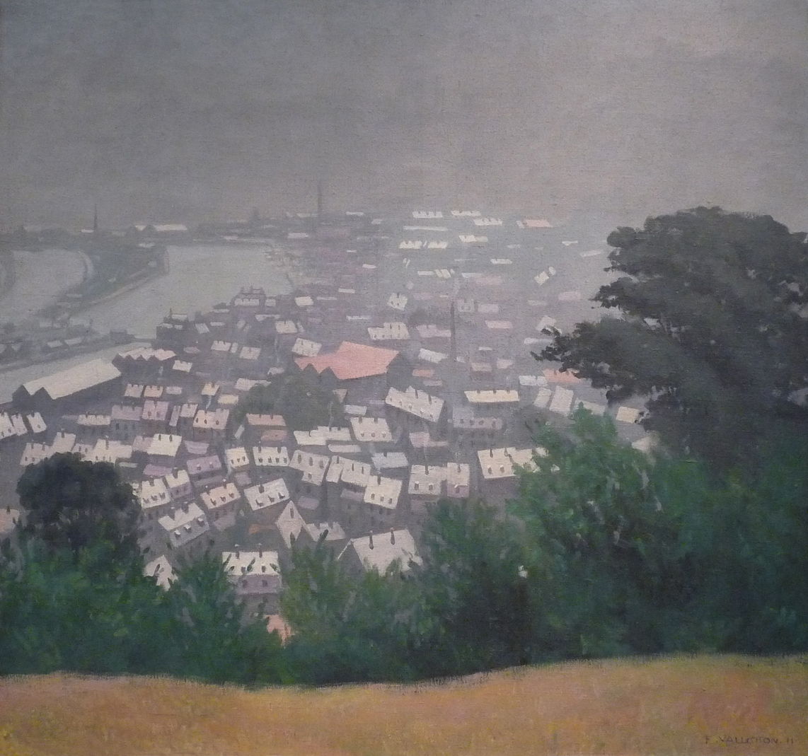
Félix Vallotton (1865–1925), Honfleur in Fog (1911), oil on canvas, dimensions not known, Musée des Beaux-Arts, Nancy, France. Image by Ji-Elle, via Wikimedia Commons.
His Honfleur in Fog from 1911 isn’t a conventional view of this small port on the north French coast, as it looks down from Mont-Joli to the west of the town centre. It captures exactly the sort of transient effects that had been the concern of Impressionism, but in Vallotton’s distinctive style.
Félix Vallotton (1865–1925), Night With Light Fog (1913), further details not known. Wikimedia Commons.
In 1913, Vallotton returned to transient atmospheric effects in Night With Light Fog. Influenced by his print-making, he distils this scene into simple geometry, with almost two-thirds of his canvas the vague purple forms of the town and sky, and three simple bands below it. The lone lamppost and figure at the extreme left restore context.
Félix Vallotton (1865–1925), Self-portrait in a Dressing Gown (1914), oil on canvas, 81 x 65 cm, Musée cantonal des beaux-arts, Lausanne, Switzerland. Wikimedia Commons.
He painted this Self-portrait in a Dressing Gown at a turning point in 1914, just as the world was about to enter the Great War, and he was to enter his fifties, the start of the next and final article in this account of his career and art.
The Messages app is a wonderful way to keep in touch with friends and relatives no matter where they are, and share photos and videos. This article tries to answer the seemingly simple question as to where those are stored, and what this has to do with syndication. I’m grateful to Jack for asking.
Sharing in Messages
If you have more than one Mac or Apple device connected to iMessage, and share that via Messages in iCloud, you’ll no doubt have discovered that shared photos and videos sync across them reasonably well. Delete an image on one, and it should be removed on all the others so long as they’re running, awake and can sync with iCloud.
Those shared photos and videos don’t appear in your System Photo Library, though, unless you save them there. That System Photo Library can share its contents using iCloud Photos, Shared Albums and iCloud Shared Photo Library, but those are separate from sharing in Messages. Turn all Photos sharing off and that doesn’t affect those shared in Messages.
Unfortunately, information about those shared images and videos, and control over them, is primitive in macOS compared with iOS. On an iPhone, you can manage storage for Messages in iCloud in much greater detail, and can view those that are taking up most space. That isn’t offered in macOS 26 Tahoe, only the total space used by Messages in iCloud. Nor is there any Photos library or other location obvious on your Mac that appears to store them.
Syndication Photos Library
Jack isn’t the first to discover this, but if you care to look in ~/Library/Photos/Libraries you’ll find a hidden Photos library named Syndication.photoslibrary that has a similar if not identical structure to a regular photoslibrary. If you look inside that, in the path scopes/syndication/originals you’ll see folders numbered with a single hexadecimal digit, and inside those are many of the shared photos and videos from Messages.
Try copying or duplicating Syndication.photoslibrary into your Picture folder, then launch the Photos app with the Option key held so you’re asked to select a Photos library to open. There pick Syndication.photoslibrary and browse its contents. Although that should look similar to the images and videos still stored in your local Messages, you may well notice there are differences, with the Syndication Photos Library containing more, sometimes a great deal more, than Messages.
But there’s more
Checking on my iPhone, Settings there reports that Messages is currently using 523 MB for photos, 14.7 MB for videos, and 1.1 MB for GIFs and Stickers, making a total of just under 540 MB. Yet on my iMac Pro Syndication.photoslibrary is only 394.1 MB, nearly 150 MB smaller, and on my Mac mini M4 Pro it’s a huge 1.14 GB, although each of them should be storing the same photos and videos. Some users have reported Syndication.photoslibrary of huge size, sometimes tens of GB, suggesting that they either never perform housekeeping on shared images and video in Messages, or theirs have accumulated many orphaned items.
Those Syndication Photos Libraries are the location of photos and videos for Messages, though. Try deleting a photo or two in Messages, and you’ll see each of them update in synchrony.
There’s another puzzle too: if you have some older Photos Libraries, look inside them and you may well see photos and videos in folders in the path scopes/syndication/originals, just as you do in Syndication.photoslibrary. This suggests that the separate Syndication Photos Library may have originally been saved in the current System Photo Library rather than in ~/Library/Photos/Libraries/Syndication.photoslibrary.
My last mystery comes from the list of open files provided by Activity Monitor. With both Messages and Photos apps running, guess which has the database inside Syndication.photoslibrary open? No, not Messages, but Photos.
Conclusions
~/Library/Photos/Libraries/Syndication.photoslibrary is the Photos Library now used to store shared photos, videos, GIFs and Stickers for the Messages app.
Although it syncs changes promptly, some local copies appear to accumulate contents that aren’t removed by Messages.
As a result, some Syndication Photos Libraries grow far larger than required, but there’s no way to force them to purge unused contents.
Throughout much of Europe, bread has been a staple food for the whole of recorded history, and has become a symbol of life in both language and visual art.
Jean-François Millet (1814–1875), Ceres (The Summer) (c 1864-65), oil on canvas, Musée des Beaux-Arts, Bordeaux, France. Wikimedia Commons.
For the classical civilisations of the Mediterranean, this was embodied in the goddess of Jean-François Millet’s Ceres (The Summer) from about 1864-65. She stands, her breasts swollen and ready for lactation, her hair adorned with ripe ears of wheat, a sickle in her right hand to cut the harvest, and a traditional winnow to separate grain from chaff in her left hand. At her feet is a basketful of bread, with ground flour and cut sheaves of wheat behind. The background shows the wheat harvest in full swing, right back to a group of grain- or hay-stacks and an attendant wagon in the distance.
Bread and its sharing is one of the central symbols of Christian beliefs, most notably in the Last Supper, the meal shared by Christ with his disciples before his crucifixion.
Giampietrino (1495–1549), copy after Leonardo da Vinci (1452–1519), The Last Supper (c 1520), oil on canvas, 298 x 770 cm, The Royal Academy of Arts, London. Wikimedia Commons.
The most famous painting of The Last Supper, and one of the best-known works in the European canon, is of course Leonardo da Vinci’s. Giampietrino’s copy from about 1520 gives the closest impression today of what the original must have looked like. Even this copy has been horribly mutilated: the upper third was cut off, and its width reduced, but at least what remains gives a better idea of the original’s appearance.
Leonardo’s composition wasn’t entirely revolutionary for the time. Previous paintings of The Last Supper had spread the apostles along the length of a table, with Christ at its centre. However, Judas Iscariot was usually placed alone on the near side, his back to the viewer, and sometimes with his bag of silver visible behind his back.
Leonardo shows the moment of surprise and denial when Christ announces that one of those sat around the table would betray him. In this, he was perhaps the first artist to assemble the apostles into small groups, a feature that has been repeated in innumerable images following this. Arrayed along the front of the table is a series of round bread rolls and small glasses of red wine.
Paolo Veronese (1528–1588), The Supper at Emmaus (c 1559), oil on canvas, 241 × 415 cm, Musée du Louvre, Paris. Wikimedia Commons.
After his crucifixion and resurrection, Christ appeared several times to his disciples. In The Supper at Emmaus, painted here by Paolo Veronese, two disciples had travelled on the road from Jerusalem to Emmaus as pilgrims, and recognised Christ as he “sat at meat with them, he took bread, and blessed it, and brake, and gave it to them.”
The painting contains separate passages to cue this narrative: on the far left is an asynchronous ‘flashback’ referring to the journey to Emmaus. Christ is in the centre of the painting, identified by his halo, and in the midst of breaking bread. With him at the table are the two bearded figures of the disciples, dressed as pilgrims and bearing staves. On Christ’s right is a servant, acting as waiter to the group. The onlookers dressed in contemporary costume are an aristocratic Italian family of the day, whose portraits are combined.
Christian rites reiterate the Last Supper in Eucharist, and the blessing of bread plays other roles in its religious ceremonies.
Mykola Pymonenko (1862–1912), Waiting for the Blessing (1891), oil on canvas, 133 x 193 cm, Rybinsk Museum-Preserve Рыбинский историко-архитектурный и художественный музей-заповедник, Rybinsk, Russia. Wikimedia Commons.
Mykola Pymonenko’s Waiting for the Blessing (1891) shows the scene at a country church in Ukraine at dawn on Easter Sunday. The local population is crowding inside, while the women gather with their Paska, traditional ornamental bread that must be blessed before it can be eaten as a brunch.
Bread appears elsewhere as a symbol of life, particularly in the context of poverty and charity.
Edmund Blair Leighton (1852–1922), The Charity of Saint Elizabeth of Hungary (c 1895), oil on panel, 26.7 x 20.3 cm, location not known. Wikimedia Commons.
Edmund Blair Leighton’s Charity of Saint Elizabeth of Hungary from about 1895 shows a famous woman who built a hospital where she personally served the sick. Born in 1207, she died in 1231 at the age of only twenty-four. Leighton doesn’t show her in a nursing role, though, but handing out loaves to feed the poor.
Elizabeth Nourse (1859–1938), The Family Meal (1891), engraving from Charles M. Kurtz, ‘Illustrations from the Art Gallery of the World’s Columbian Exposition’, Philadelphia, 1893, further details not known. Wikimedia Commons.
Elizabeth Nourse painted some social realist works looking at the lives of the rural poor. Among these is The Family Meal from 1891, which was awarded a medal at the World’s Columbian Exposition in Chicago in 1893, and is seen here as an engraving in its catalogue. Parents sit with their two young children at an almost bare table. Their meal consists of a pot of soup and the remains of a loaf of what appears to be stale bread. The older child looks expectantly at her mother, who stares despondently at the table. Her husband stares down at his empty bowl.
Philip Hermogenes Calderon (1833–1898), “Lord, Thy Will Be Done” (1855), oil on canvas, 55.9 x 46.4 cm, The Yale Center for British Art, New Haven, CT. Wikimedia Commons.
The wonderfully named Philip Hermogenes Calderon painted his “Lord, Thy Will Be Done” in 1855. This quotation is derived from the Gospel account of what became the Lord’s Prayer, and has subsequently been used on many Christian religious occasions.
A young mother cradles her baby on her lap, looking up to the left. She’s living in difficult circumstances, but isn’t destitute, and wears a wedding ring on her left hand. The carpet is badly worn, and the coal scuttle empty, but there’s a loaf of bread on the table: she has her ‘daily bread’, another reference to the Lord’s Prayer. A portrait of a fine young man hangs above the mantlepiece, indicating her husband and the baby’s father is currently absent on military service. Several issues of The Times newspaper are scattered on the floor at the right, as if the woman has been following news of a military campaign overseas. Under the table is a letter, most probably from her husband.
Christian Krohg (1852–1925), The Struggle for Existence (1889), oil on canvas, 300 x 225 cm, Nasjonalgalleriet, Oslo, Norway. Wikimedia Commons.
Christian Krohg’s The Struggle for Existence, also translated as The Struggle for Survival from 1889 shows Karl Johan Street in Oslo in the depths of winter, almost deserted except for a tight-packed crowd of poor women and children queuing for free bread. These people are wrapped up in patched and tatty clothing, clutching baskets and other containers in which to put the food. A disembodied hand is passing a single bread roll out to them, from within the pillars at the left edge. That was yesterday’s bread; now stale, the baker is giving it away only because he cannot sell it.
Google is so helpful now when you ask it to solve a problem, such as how to free up space on your Mac. Not only can it make its own suggestions, but it can tap into those from AIs like ChatGPT and Grok. This article shows how that can bring you malware, thanks to the recent research of Stuart Ashenbrenner and Jonathan Semon at Huntress.
Please don’t try anything you see in this article, unless you want AMOS stealer malware on your Mac.
I started by entering a common search request, clear disk space on macOS, the sort of thing many Mac users might ask.
At the top of Google’s sponsored results is an answer from ChatGPT, giving its trusted web address. When I clicked on that, it took me to ChatGPT, where there’s a nice clear set of instructions, described impeccably just as you’d expect from AI.
This helpfully tells me how to open Terminal using Spotlight, very professional.
It then provides me with a command I can copy with a single click, and paste straight into Terminal. It even explains what that does.
When I press Return, I’m prompted for my password, which I enter.
Although I was a bit surprised to see this prompt, it looks genuine, so I allowed it.
Far from clearing space on my Mac, the malware, an AMOS stealer, has gone to work, saving a copy of the password I gave it, in the /tmp folder, and installing its payload named update.
Scripts like .agent are installed in my Home folder, and my (virtual) Mac is now well and truly owned by its attacker.
As Ashenbrenner and Semon point out, this marks a new and deeply disturbing change, that we’re going to see much more of. We have learned to trust many of the steps that here turn out to lead us into trouble, and there’s precious little that macOS can do to protect us. This exploit relies almost entirely on our human weakness to put trust in what’s inherently dangerous.
First, distrust everything you see in search engines. Assess what they return critically, particularly anything that’s promoted. It’s promoted for a reason, and that’s money, so before you click on any link ask how that’s trying to make money from you. If that’s associated with AI, then be even more suspicious, and disbelieve everything it tells you or offers. Assume that it’s a hallucination (more bluntly, a lie), or has been manipulated to trap you.
Next, check the provenance and authenticity of where that click takes you. In this case, it was to a ChatGPT conversation that had been poisoned to trick you. When you’re looking for advice, look for a URL that’s part of a site you recognise as a reputable Mac specialist. Never follow a shortened link without unshortening it using a utility like Link Unshortener from the App Store, rather than one of the potentially malicious sites that claims to perform that service.
When you think you’ve found a solution, don’t follow it blindly, be critical. Never run any command in Terminal unless it comes from a reputable source that explains it fully, and you have satisfied yourself that you understand exactly what it does. In this case the command provided was obfuscated to hide its true action, and should have rung alarm bells as soon as you saw it. If you were to spare a few moments to read what it contains, you would have seen the command curl, which is commonly used by malware to fetch their payloads without any quarantine xattr being attached to them. Even though the rest of the script had been concealed by base-64 encoding, that stands out.
If you did get as far as running the malicious script, then there was another good clue that it wasn’t up to anything good: it prompted you for a System Password:. The correct prompt should just be Password:, and immediately following that should be a distinctive key character that’s generated by macOS for this purpose. Then as you typed your password in, no characters should appear, whereas this malware showed them in plain text as you entered them, because it was actually running a script to steal your password.
Why can’t macOS protect you from this? Because at each step you have been tricked into bypassing its protections. Terminal isn’t intended to be a place for the innocent to paste obfuscated commands inviting you to surrender your password and download executable code to exploit your Mac. curl isn’t intended to allow malware to arrive without being put into quarantine. And ad hoc signatures aren’t intended to allow that malicious code to be executed.
As I was preparing this article Google search ceased offering the malicious sponsored links, but I expect they’ll be back another time.
AI is certainly transforming our Macs, in this case by luring us to give away our most precious secrets. This isn’t a one-off, and we should expect to see more, and more sophisticated, attacks in the future. Now is the time to replace trust with suspicion, and be determined not to fall victim.
Apple has just released an update to XProtect, bringing it to version 5324. As usual, it doesn’t release information about what security issues this update might add or change.
This version adds another new Yara rule in its TIMELYTURTLE series, for MACOS.TIMELYTURTLE.SWNOA, and amends the recent rules for MACOS.SOMA.AUENB and MACOS.DUBROBBER.CHBI. In the new XPScripts.yr file introduced in XProtect 5322, it reverses the order of the two rules and amends MACOS.OSASCRIPT.COTABR.
You can check whether this update has been installed by opening System Information via About This Mac, and selecting the Installations item under Software.
A full listing of security data file versions is given by SilentKnight and SystHist for El Capitan to Tahoe available from their product page. If your Mac hasn’t yet installed this update, you can force it using SilentKnight or at the command line.
If you want to install this as a named update in SilentKnight, its label is XProtectPlistConfigData_10_15-5324
Sequoia and Tahoe systems only
This update has already been released for Sequoia and Tahoe via iCloud. If you want to check it manually, use the Terminal command sudo xprotect check
then enter your admin password. If that returns version 5324 but your Mac still reports an older version is installed, you should be able to force the update using sudo xprotect update
Painting in the Dutch Republic during the Golden Age was rich in landscapes, interiors and images of everyday life, but didn’t abandon storytelling. Many of Rembrandt’s finest works are religious narratives and tales drawn from classical mythology and history. This article shows a selection of paintings by the less famous, and how their stories extended beyond those that had been most popular in the Renaissance.
Adriaen van de Velde (1636–1672), The Annunciation (1667), oil on canvas, 128 x 176 cm, Rijksmuseum Amsterdam, Amsterdam. Wikimedia Commons.
The Annunciation (1667) is a large canvas, and among the few religious paintings that Adriaen van de Velde made following his marriage to a Catholic woman, and his conversion to Catholicism. Although the angel is a little awkward, it seems hard to believe that this was painted by a landscape specialist.
Adriaen van de Velde (1636–1672), Vertumnus and Pomona (1670), oil, 76.5 x 103 cm, Kunsthistorisches Museum, Vienna. Wikimedia Commons.
Three years later, van de Velde painted a classical myth in his superb Vertumnus and Pomona (1670). Vertumnus was the Roman god of seasons and change, who could assume whatever form he wished. Book fourteen of Ovid’s Metamorphoses tells the story of his transformation into the form of an old woman, seen here on the left, so that he could gain entry to Pomona’s orchard and seduce her. Sadly, the yellow he used to mix greens has faded in parts, leaving some of his vegetation blue.
Jan Lievens (1607–1674), Quintus Fabius Maximus (1656), media not known, 203 x 175 cm, Paleis op de Dam, Amsterdam, The Netherlands. Wikimedia Commons.
Jan Lievens’ painting of Quintus Fabius Maximus from 1656 may refer to this Roman’s victory at Tarentum, as told in Plutarch’s Lives. The great Carthaginian general Hannibal was only five miles away at the time of the Roman repossession of Tarentum, and this made Hannibal realise the impossibility of mastering Italy.
Paintings of fables, that had already started to become popular among Flemish artists at this time, appeared in the Republic to the north. Among them was the story of the Satyr and the Traveller, or the Man and the Satyr. A man made friends with a satyr; when the man’s hands were cold, he blew on them to warm them up. When the two were eating together, the man blew on his hot food in order to cool it down. The satyr decided that he couldn’t trust a creature whose breath blew both hot and cold, so broke off their friendship.
Constantijn à Renesse (1626–1680), Satyr at the Peasant’s House (1653), oil on canvas, 168 x 203 cm, Muzeum Narodowe w Warszawie, Warsaw, Poland. Wikimedia Commons.
In 1653, Constantijn à Renesse, a former pupil of Rembrandt, painted his version of this fable in Satyr at the Peasant’s House. This shows one of the family blowing on the hot food in their spoon, although at this stage the satyr hasn’t reacted to the contradiction.
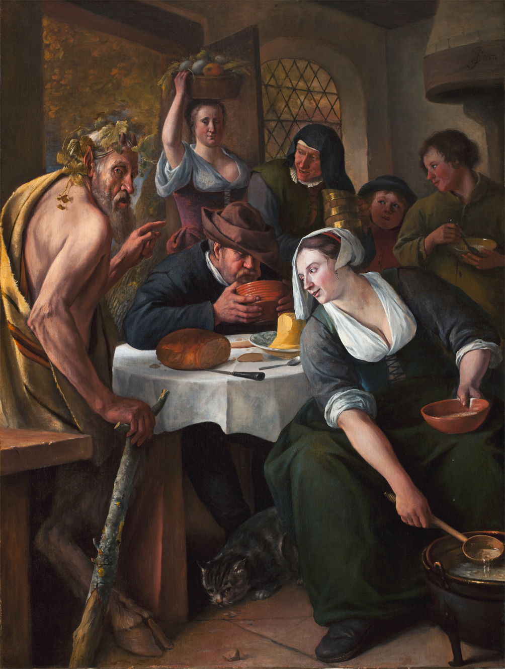
Jan Steen (1625/1626–1679), The Satyr and the Peasant “Who Blows Hot and Cold” (c 1660), media and dimensions not known, Museum Bredius, The Hague, The Netherlands. Wikimedia Commons.
Jan Steen, in his telling of The Satyr and the Peasant “Who Blows Hot and Cold” from about 1660, gives a clearer account, with the satyr looking worried at the viewer, as a man (still wearing his hat) blows on a bowl of hot stew. He also pays attention to delightful details such as the cat skulking under the table, and a rich supporting cast.
Steen went on to paint two unusual accounts of what happened in schools across country districts in the Republic.
Jan Steen (1625/1626–1679), The Village School (c 1665), oil on canvas, 110.5 x 80.2 cm, National Gallery of Ireland Gailearaí Náisiúnta na hÉireann, Dublin, Ireland. Wikimedia Commons.
His The Village School from about 1665 shows physical punishment in a contemporary school. The child at the right holds out a hand for teacher to strike it with a wooden spoon, and is already wiping tears from his eyes. A girl in the middle of the canvas is grimacing in sympathy.
Jan Steen (1625/1626–1679), The Village School (c 1670), oil on canvas, 81.7 x 108.6 cm, Scottish National Gallery, Edinburgh, Scotland. Wikimedia Commons.
A few years later, Steen painted a scene in a larger and more chaotic classroom, in The Village School from about 1670. Although there are two staff sat at the teachers’ desk, the man is distracted, perhaps in cutting himself a fresh quill. The woman teacher sat next to him is engaged in explaining something to a pupil. Around them, all hell is breaking loose. In the distance, a boy is stood on one of the trestle tables. Older children are teaching younger ones, and a small group at a table at the right are trying to write while others get up to mischief. One younger child in the middle of the foreground has fallen asleep against a hat.
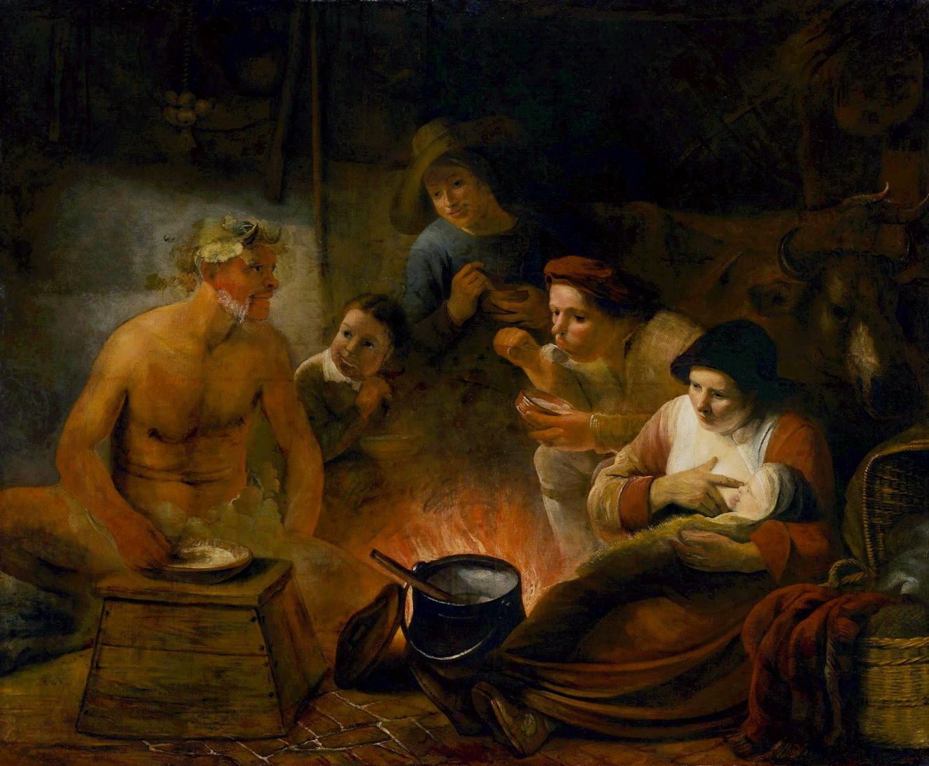
Gerrit Dou (1613–1675), The Young Mother (1658), oil on panel, 73.5 x 55.5 cm, Koninklijk Kabinet van Schilderijen Mauritshuis, The Hague, The Netherlands. Wikimedia Commons.
Gerrit Dou approaches social realism in his detailed account of The Young Mother from 1658. As she sits at her needlework, her child is attended in their wickerwork crib by a young nurse. Around them is an eclectic collection of objects, from a large cabbage, hanging game and a bundle of carrots at the right, to a bird cage and an upholstered chair at the left. Suspended above them is a chandelier, and a wooden spiral staircase ascends to the next floor. This family appears to be living in affluent squalor.
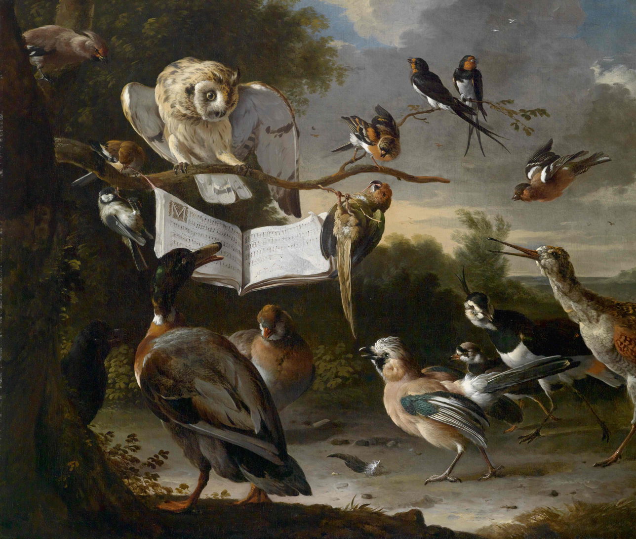
Melchior d’Hondecoeter (1636–1695), Concert of the Birds (1670), oil on canvas, 84 x 99 cm, Private collection. Wikimedia Commons.
There was even an anthropomorphic fad for paintings showing gatherings of birds ‘singing’ together, and I think Melchior d’Hondecoeter’s Concert of the Birds from 1670 is probably the best example of those entertaining paintings.
The first thing I discovered when I started hunting provenance extended attributes (xattr) was a bug in my free utility xattred. This can result in the app crashing when using its Crawler to explore xattrs on items in a folder. I have fixed that in this new version 1.7, available below.
My hunt was by and large successful, with a great many com.apple.provenance xattrs caught. There are some interesting problems, though.
Looking through the contents of the main Applications folder, there are three groups of apps:
Those with Apple certificates, including bundled apps and those delivered through the App Store (which are all signed by Apple, not their developer), which have no provenance xattr as they don’t register with provenance tracking.
Apps with third-party certificates that have been installed simply, which have a single provenance xattr on the app bundle containing that app’s provenance ID.
Apps with third-party certificates that have been installed or updated using a third-party app such as their Sparkle update mechanism, whose entire contents have provenance xattrs attached by the installer/updater, so not bearing the app’s provenance ID.
Examining files in the ~/Documents folder, there are plenty with provenance xattrs, and a great many with quarantine xattrs bearing information about their history including origin. Although some of the provenance IDs on them don’t match with those of apps, there’s sufficient to provide useful information about many without accessing the ExecPolicy database’s Provenance Tracking table. Therefore I will proceed to code up Providable over the next couple of weeks.
This new version of xattred should fix that crashing bug in its Crawler feature, that enables you to scan folders for information about their xattrs.
I have also looked at an issue that I’ve experienced when editing some xattrs such as the new com.apple.icon.folder type used in Tahoe to customise the appearance of folders. When editing them, some of the double-quotation marks used in text content can become changed to ‘smart’ quotes, which isn’t in the least bit smart, as it prevents that xattr from functioning correctly. Although that feature is disabled for that text view, macOS seems to be ignoring its setting and substituting smart quotes regardless. Provided that you’re aware of this danger and take care to ensure that all quotation marks are non-smart, you can edit xattrs successfully. Hopefully this will be improved in the future.
xattred version 1.7 for macOS 11.5 or later is available from here: xattred17
from Downloads above, from its Product Page, and via its auto-update mechanism.
Centuries of experience with painting using oil paints have proved the importance of a robust support and a ground that isolates the paint layer from its support. Older use of wood panels with a gesso ground consisting largely of gypsum or chalk ensured the paint layer wouldn’t be subjected to mechanical stress, and would remain isolated from the underlying wood. Canvases became popular because of their relative lightness particularly in larger sizes, but still require an isolating ground layer both to protect the canvas from damage by the paint, and to prevent discolouration of the paint.
When sketching in oils in front of the motif became increasingly popular in the late eighteenth century, those paintings weren’t intended for public view, but as an aid for the artist when composing finished paintings in the studio. Rather than gather hundreds of small oil sketched on canvas or panels, the first plein air painters usually used paper or cardboard as support and ground. Subsequently, when their studios were sold off following their death, surviving oil sketches were usually laid on canvas for preservation and display.
Although he probably wasn’t the first to compile a library of oil sketches, those gathered by Pierre-Henri de Valenciennes when he was painting in the Roman Campagna in the 1780s are among the most brilliant. This untitled view of the countryside near Rome is thought to have been painted in about 1783.
Thomas Jones (1742-1803), A Wall in Naples (c 1782), oil on paper laid on canvas, 11.4 x 16 cm, National Gallery, London. Wikimedia Commons.
At about the same time, the Welsh painter Thomas Jones was doing the same thing in and around Naples as well. This tiny view of A Wall in Naples was painted in about 1782, and is now one of the gems in London’s National Gallery. Below is a detail.
Thomas Jones (1742-1803), A Wall in Naples (detail) (c 1782), oil on paper laid on canvas, 11.4 x 16 cm, National Gallery, London. Wikimedia Commons.Thomas Jones (1742-1803), The Capella Nuova outside the Porta di Chiaja, Naples (1782), oil on paper, 20 x 23.2 cm, Tate Britain, London. Wikimedia Commons.
Jones was taught by the Welsh artist Richard Wilson, but none of his oil sketches have survived. Jones’ Capella Nuova outside the Porta di Chiaja, Naples is another example that’s significantly larger, and now in the Tate Gallery.
Valenciennes went on to assemble a large library of his oil sketches that he used for his studio paintings following his return to Paris. He was admitted to the Academy in 1787, published an influential manual of perspective and painting in 1799, and became Professor of Perspective at l’École des Beaux-Arts in Paris in 1812.
Among the aspiring young landscape painters who followed in the footsteps of Valenciennes was Camille Corot, who was taught by Achille Etna Michallon, who in turn had been taught by Valenciennes. Corot painted in the Roman Campagna between 1825-28, using the same techniques of applying his oil paint direct to sheets of paper.
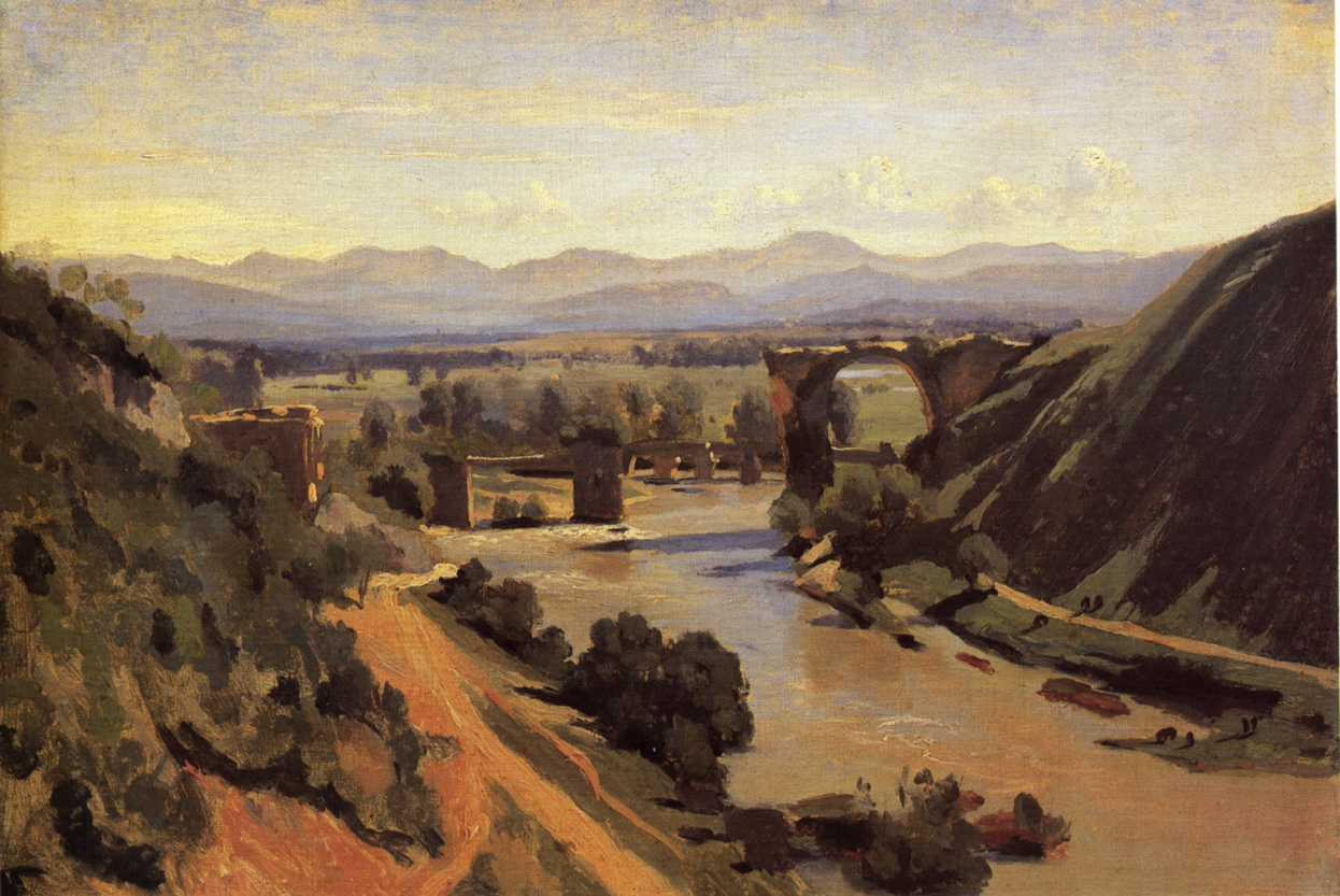
Jean-Baptiste-Camille Corot (1796-1875), View of Rome: The Bridge and Castel Sant’Angelo with the Cupola of St. Peter’s (1826-7), oil on paper on canvas, 26.7 x 43.2 cm, Fine Arts Museums of San Francisco. WikiArt.
Corot painted this View of Rome: The Bridge and Castel Sant’Angelo with the Cupola of St. Peter’s in 1826-27. This is one of the best-known bridges over the River Tiber, and not far from the centre of the city. The view is taken from the north-east of the bridge, on the ‘left’ bank, probably close to the Piazza di Ponte Umberto I, looking towards the south-west (‘right’ bank). The painting is sketchy rather than finely finished, and appears to have been painted en plein air onto a sheet of paper that has subsequently been laid on canvas.
Jean-Baptiste-Camille Corot (1796-1875), View of the Convent of S. Onofrio on the Janiculum, Rome (1826), oil on paper mounted on canvas, 22 x 33 cm, Fitzwilliam Museum, Cambridge, England. WikiArt.
This View of the Convent of S. Onofrio on the Janiculum, Rome is another from Corot’s first campaign in Rome.
Jean-Baptiste-Camille Corot (1796-1875), The Bridge at Narni (1826), oil on paper, 34 x 48 cm, Musée du Louvre, Paris. WikiArt.
Corot’s years in Italy were formative in his own development, and one of the key elements he put in place to hand on to Camille Pissarro and other Impressionists. The Bridge at Narni is one of his finest oil sketches.
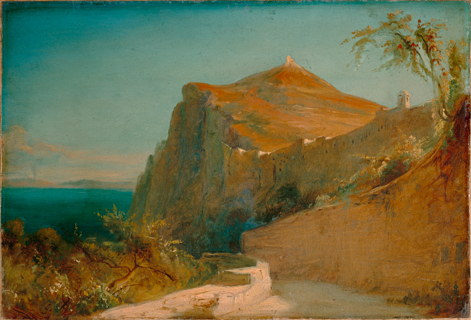
Carl Eduard Ferdinand Blechen (1798-1840), Tiberiusfelsen auf Capri (Tiberius Rocks, Capri) (1828-9), oil on paper mounted on canvas, 20.5 x 30 cm, Lower Saxony State Museum, Hanover. Wikimedia Commons.
Others followed Valenciennes’ instructions, among them Carl Blechen, a brilliant German landscape painter who sketched the Tiberius Rocks, Capri during a visit in 1828-29, again on paper.
Carl Eduard Ferdinand Blechen, (1798-1840) Galgenberg bei Gewitterstimmung (A Scaffold in a Storm) (c 1835), oil on paper mounted on board, 29.5 x 46 cm, New Masters Gallery, Dresden. Wikimedia Commons.
Blechen’s late oil sketch of A Scaffold in a Storm was painted in about 1835, shortly before he succumbed to severe depression. This anticipates many elements of Impressionism: it appears to have been executed rapidly in front of the motif (although a view from his studio over Berlin and Brandenburg), with many brush-strokes plainly visible; details are composed of stylised marks; it is an everyday if not banal subject, with an informal composition.
However, the French Impressionists seldom if ever sketched in oils on paper, as their paintings made in front of the motif were intended to be sold to and viewed by the public, for which paper wasn’t considered suitable. Times had changed.
The Achilles heel of T2 Macs is booting from external storage. Although it’s simple to create a bootable external disk for a T2 Mac, to boot from it you have to allow the Mac to boot from any external disk, removing much of its boot security. Apple silicon Macs were designed to boot almost as securely from external disks as they do from the internal SSD, and that makes setting up a bootable external disk more complicated. This article explains how you can do that for macOS 26 Tahoe.
In this respect, Apple silicon Macs have two central principles:
They always start the boot process from their internal SSD. If that’s not functioning correctly, then they can’t boot at all.
They will only transfer the boot process to an external system when the user has access to a private key making them an Owner of that system, through the Mac’s LocalPolicy system. That’s the part that can cause problems.
Planning
There are alternatives to booting from external storage. If there’s sufficient space, you can install multiple versions of macOS on the internal SSD, or you can run macOS as a guest operating system in a virtual machine (VM). VMs are limited in some important respects, though, as they can’t run most apps from the App Store or use AI, although they can now access iCloud and iCloud Drive.
Like any other Mac, Apple silicon models can only boot from versions of macOS they’re compatible with. You can check which your Mac can run using Mactracker. A VM is the only solution for running older and incompatible versions of macOS, and it gets messy installing versions that are compatible but older than the currently installed major version of macOS. This is because its installer may be blocked by the more recent macOS, for which you’ll need to create a bootable installer disk and run the installation from that. Apple describes how to do that in this support article. For the remainder of this article, I assume that you’re installing a second or subsequent copy of the current version of macOS to an external disk.
Connect and prepare the external disk
First catch your disk, and connect it to one of the non-DFU ports on your Mac. For example, on my Mac mini M4, that’s either the left or right Thunderbolt port, as the middle one is its DFU port. On all other Apple silicon Mac minis, that’s either the centre or right port as you look from the rear, as their DFU port is the one on the left. If you try to install macOS to a drive connected to an Apple silicon Mac’s DFU port, then it’s doomed to fail, and that’s the most common cause of failure. More information on the DFU port is here.
Reformat that disk as you want to use it, with at least one APFS container containing a single APFS volume in regular APFS format, not encrypted.
Download and run the installer
Next catch your installer. Oddly, Apple seems to have stopped providing the current release of macOS through the App Store, so the simplest way to download it in the GUI is from the links provided by Mr. Macintosh, and there are many alternatives. You want a regular installer, not an IPSW image file that you might use to create virtual machines.
Run the installer app from your main Applications folder.
When it asks you whether you want to install macOS on your current system, click on Show All Disks…
Select your external disk from the list and click Continue. If your disk isn’t recognised or listed there, reformat it and start again.
Ownership
This is the important part of the installation; if it fails, the external disk won’t be bootable.
For the macOS system on your external disk to be bootable, it needs a LocalPolicy created for it on your Mac’s internal SSD. To ensure that only fully authorised users can configure and change LocalPolicy, those Image4 files are signed, and an Owner Identity Certificate (OIC) is attached to them. Creating and maintaining LocalPolicies requires a user to have access to the private Owner Identity Key (OIK) in the Secure Enclave, making that user an Owner.
Any user with access to the Volume Encryption Key for the internal storage also has access to the OIK, and has Ownership. By default, that includes all users added after FileVault encryption is enabled on a Data volume, for example. To be able to boot from that second OS, it requires a LocalPolicy with an OIC attached, and Ownership has to be handed off to an Install User created when that OS is installed.
Handing off Ownership to the Install User is more of a problem, as users are only created when the installation is complete. To accommodate that, macOS offers to copy a user from the current boot system as the Install User, and the primary admin user, on the second OS. Provided that you agree to that, the Install User created is actually a Key Encryption Key (KEK) for your password and hardware keys, which is then used to encrypt the OIK as it’s handed over to the new copy of macOS on the external disk. Thus, the installer requests that user’s password to gain access to the OIK for the new macOS in the Secure Enclave.
Following these steps should ensure that works correctly.
When prompted to select the user to be owner of the new boot volume group, pick the current admin user, and tick to copy their account settings.
You’ll then be prompted to enter that user’s password to authenticate as the owner.
Completing installation
Installation follows, and is (as ever) highly non-linear, and may even appear to stall. Persevere, and it will then close apps and restart to complete.
When you’re eventually prompted to Create a Computer Account, it’s simplest to create a local admin account for the owner. The new copy of macOS will then take you through personalising your new system, and, if you’ve added support for your Apple Account, it will do the 2FA dance for iCloud and Apple Account, and so on.
Once configured, you can share that external disk between Macs, but each time you boot from it on a different Mac, you can expect to repeat the 2FA dance for iCloud and Apple Account.
Updates
Once installed, you’ll almost certainly want to keep that external system up to date. To do that, start up from that disk, and use Software Update as normal. Although you could download that latest macOS installer and run that, that’s a much larger download and there’s always the risk it might run a clean install, forcing you to restore from your latest backup. Apple no longer provides downloadable updaters for macOS.
When you update macOS on that Mac, the firmware in it will be updated by the most recent version of macOS you have installed or updated it to, whether that’s on the internal or external disk. To update firmware, you have to install the appropriate macOS update on that Mac. If you update your external disk using another Mac, then that won’t update the firmware in your Mac. That can only be done by performing that update on that Mac.
Key steps
Consider alternatives, including an additional system on the internal SSD, or using a VM instead.
Connect the external storage to a non-DFU port and format it in APFS, not encrypted.
Download and run the appropriate full macOS installer. macOS Tahoe isn’t currently available from the App Store, though.
Select the external disk as the installation target.
Select the current admin user to be Owner of the new system, copy their account settings, and authenticate with that user’s password.
Create a local admin account for that user, if possible.
Complete 2FA to connect to the Apple Account, as necessary.
Update the external system when booted from it, using Software Update.
Some stories in Boccaccio’s Decameron attained fame less in the original, more in their later retelling. A good example is the tragic tale of Lisabetta related by Filomena on the fourth day, when it was the fifth about those whose love ended unhappily.
In 1818, the British poet John Keats (1795-1821) wrote his version, titled Isabella, or the Pot of Basil, which was published two years later, shortly after the poet’s untimely death at the age of just twenty-five, and it quickly became one of his most popular works. Here I will tell Boccaccio’s original, using his version of the names, being mindful that Keats called his leading lady Isabella rather than Boccaccio’s Lisabetta. Her lover’s name, common to both accounts, is Lorenzo.
Following the death of a rich merchant of Messina, his three sons inherited his riches, while their sister remained unmarried despite her beauty and grace. Lisabetta and Lorenzo, a Pisan who directed operations in one of the family’s trading establishments, fell in love with one another, and their relationship was consummated.
The couple tried to keep their affair secret, but one night one of her brothers saw her making her way to Lorenzo’s bedroom, and Lisabetta remained unaware of her discovery. Her brother was distressed, but decided to keep quiet, and to discuss it with his brothers next morning.
The following day, the brothers decided that they would also keep quiet until the opportunity arose to end their sister’s relationship. Some time later they pretended they were going to the country for pleasure, and took Lorenzo with them. When they reached an isolated location, they murdered Lorenzo and buried his body. They then told their sister that they had sent him away on a trading mission.
Lisabetta was anxious for her lover’s return, and persistently asked her brothers for news of him. Eventually, one of them rebuked her for this nagging, so she stopped mentioning him altogether, but each night kept repeating his name and pining for him. One night, having finally fallen asleep in tears, she saw him in a dream, in which he said that her brothers had murdered him, and revealed where his body was buried.
In her grief, Lisabetta obtained the permission of her brothers to go to the country for pleasure. Once she had located where she thought Lorenzo was buried, she quickly found his corpse, which remarkably showed no signs of decay. As she couldn’t move his whole body for more appropriate burial, she cut off his head and concealed it in a towel.
When she returned home, Lisabetta cried greatly over Lorenzo’s head, washing it with her tears, then wrapped it in cloth and put it in a large pot. She covered it with soil and in that planted some sprigs of basil. These she watered daily with her tears, as she sat constantly beside the pot in between bouts of crying over it. As a result, the basil grew strong and lush, and richly fragrant.
William Holman Hunt (1827–1910), Isabella and the Pot of Basil (1867), oil on canvas, 187 x 116 cm, Laing Art Gallery, Newcastle upon Tyne, England. Wikimedia Commons.
William Holman Hunt’s Isabella and the Pot of Basil from 1867 is intricately detailed, with several references to the story, such as the relief of a skull on the side of the pot, a red rose on a tray by Lisabetta’s left foot, and a silver watering can at the bottom right. Behind her is the image of a bedroom, possibly showing Lorenzo coming to her in a flashback to their affair.
Joseph Severn (1793-1879), Isabella, or the Pot of Basil (1877), further details not known. Wikimedia Commons.
Joseph Severn’s Isabella, or the Pot of Basil from 1877 appears remarkably high in chroma, and shows Lisabetta fondly embracing the pot and crying over the basil. Severn had been a personal friend of John Keats, and painted this just a couple of years before his own death.
Edward Reginald Frampton (1870-1923), Isabella, or the Pot of Basil (date not known), further details not known. Wikimedia Commons.
Edward Reginald Frampton’s Isabella, or the Pot of Basil was probably painted towards the end of the nineteenth century, or possibly in the early twentieth. Lisabetta is kneeling before her pot of basil at an altar, with a crucifix behind.
Ricciardo Meacci (1856-1938), Isabella and the Pot of Basil (1890), watercolour, dimensions not known, Private collection. Wikimedia Commons.
Ricciardo Meacci’s watercolour of Isabella and the Pot of Basil from 1890 shows Lisabetta embracing her pot of basil, as her three brothers watch with growing anger at her behaviour.
Her brothers began to suspect something, so had the pot removed from her room. This deepened their sister’s grief, and she kept asking after the pot.
John Melhuish Strudwick (1849-1937), Isabella (c 1886), oil on board, 31.1 x 23.2 cm, location not known. Wikimedia Commons.
John Melhuish Strudwick’s Isabella from about 1886 shows Lisabetta staring in grief at the stand on which her pot of basil had stood. Through the window, two of her brothers are seen making off with the pot, and looking back at her.
The brothers examined its contents and discovered Lorenzo’s head. Scared that his murder might cause them problems, they reburied the head, wound up their business, and left Messina for Naples. Lisabetta’s grief only grew deeper, and destroyed her health completely. Still asking for her pot of basil, she finally cried herself to death. Although the brothers had done everything to keep these events secret, eventually they became widely known, and were celebrated in folk verse.
John Everett Millais (1829–1896), Isabella (Lorenzo and Isabella) (1848-49), oil on canvas, 103 x 142.8 cm, Walker Art Gallery, Liverpool, England. Wikimedia Commons.
The first and still greatest depiction of Keats’ retelling is John Everett Millais’ Isabella (Lorenzo and Isabella) from 1848-49, completed before he was twenty, and one of the earliest examples of Pre-Raphaelite art. This is a composite of references to Keats’ poem and Boccaccio’s story, set at an imaginary family meal which the three brothers, Lisabetta and Lorenzo are taking together.
Lorenzo is sharing a blood orange with Lisabetta, white roses and passion flowers climbing from behind their heads. The dog, acting as a surrogate for Lorenzo, is being petted by Lisabetta, but one of her brothers aims a kick at it. Other symbols are shown of the plot to kill Lorenzo: a brother staring at a glass of red wine, spilt salt on the table, and a hawk pecking at a white feather. The pot of basil is already on the balcony, awaiting Lorenzo’s head. When exhibited at the Royal Academy in 1849, it was accompanied by verses 1 and 21 of Keats’ poem.
Quarantine extended attributes, xattrs named com.apple.quarantine, aren’t attached to all files downloaded to Macs. Although once described as a voluntary scheme, putting files into quarantine is determined by a set of rules. This article explains how those rules work in macOS 26 Tahoe.
The default rule for apps that don’t run in a sandbox is that all new files they create don’t have a quarantine xattr attached to them. This is simple to verify by creating a new file using an app that hasn’t been obtained from the App Store, and isn’t one of Apple’s. Although it’s likely to get a MACL xattr attached, no quarantine xattr should accompany that. The same should also apply to files created by sandboxed apps, including TextEdit.
Info.plist
Although some processes and apps may explicitly attach quarantine xattrs, for example in AirDrop, this is a behaviour normally delegated to macOS by a setting in the app’s Info.plist, LSFileQuarantineEnabled. When that’s set to true, all files created by that app should bear the xattr. You can verify that by inspecting the Info.plist file in apps that download items from the internet, such as Safari, where it’s normally listed immediately below the app’s LSApplicationCategoryType.
No changes can be made to the Info.plist in a signed app, as those would break its signature.
CoreTypes.bundle
If that setting in Info.plist is false, or it doesn’t appear in the Info.plist, then there are additional and overriding settings contained in Exceptions.plist in the CoreTypes bundle, at /System/Library/CoreServices/CoreTypes.bundle/Contents/Resources. That long list contains five dictionaries:
Additions, which assigns a lot of app categories, sets Java version requirements, and determines default settings for quarantine on files created by apps.
AppNapOverrides, which sets App Nap behaviours.
HighResolutionOverrides, which overrides High Res options for apps.
LaunchOverrides, which can disable specific version ranges of apps from being launched; these prevent older apps from being run.
MergeDocumentTypes, which merges some document types such as doc and docx for specific apps.
Overrides, which can override other settings.
Included in the Additions dictionary you should find overriding settings for the popular BitTorrent client Transmission, reading: <key>org.m0k.transmission</key>
<dict>
<key>LSApplicationCategoryType</key>
<string>public-category.internet</string>
<key>LSFileQuarantineEnabled</key>
<true/>
</dict>
Referring to the app by its ID of org.m0k.transmission, the first of those assigns the app to an app category of public-category.internet, then sets the app to attach the quarantine xattr to all documents that it creates, including everything that it downloads.
Among the existing overrides in Tahoe, for example, are org.pythonmac.unspecified.BitTorrent and org.xlife.Xtorrent, to ensure that Transmission, Xtorrent and PythonMac BitTorrent clients should write quarantine xattrs to all their downloaded files. Although this Exceptions property list doesn’t cover every client, it should ensure that most do protect their downloads by attaching a quarantine xattr.
The CoreTypes bundle isn’t in the Signed System Volume of macOS, but is protected from change. Thus, there’s no way the user can alter which apps add the quarantine xattr to new files they create.
Mach-O binaries
I don’t know how this system works with command tools, which are single file executables. They can have an Info.plist embedded in the executable, but this is rare unless they need to be notarized. The most popular tool for downloading files from the internet must be curl, used in commands of the form curl [URL] -o [localfile]
to download the file named in the URL to a local file named localfile. It’s simple to demonstrate that the download then doesn’t have any quarantine xattr attached to it, and those don’t gain the xattr when extracted from archives either.
While this does offer the user a way to download files that don’t have any quarantine xattr attached, it’s also almost universally used for the same purpose by malicious software.
Summary
By default, apps don’t normally attach the quarantine xattr to files they create.
Most apps that can download files from the internet opt to attach the xattr by setting LSFileQuarantineEnabled to true in their Info.plist.
Some of those that don’t, have that overridden in the Additions dictionary of Exceptions.plist in CoreTypes.bundle.
One notable exemption is the command tool curl, which is also used by malware to escape quarantine.
Claude Monet had first visited London as he sought refuge from the Franco-Prussian War in 1870-71, when he painted one of the early impressions of the River Thames in mist, shown in yesterday’s article. He was to return just before the end of the century, when his fortunes had changed and he could afford to travel in search of motifs. Where better than the River Thames for the optical effects of mist, fog and smog?
Monet had started painting formal series during the 1880s, when he was enjoying commercial success at last. From about 1896, almost all his works were part of a series. He started travelling through Europe in search of suitable motifs for these, visiting Norway in 1895, and later Venice. When he returned to London in 1899, and in the following two years, Monet chose a different view of the Palace of Westminster, from a location at the opposite end of Westminster Bridge, for his series of 19 paintings. These were all started from the second floor of the Administrative Block at the northern end of the old Saint Thomas’s Hospital on the ‘south’ bank, and completed over the following three or four years.
Claude Monet (1840–1926), The Houses of Parliament, Sunlight Effect (1903), oil on canvas, 81.3 × 92.1 cm, Brooklyn Museum, New York, NY. Wikimedia Commons.
His The Houses of Parliament, Sunlight Effect (1903) is more radical than his painting of thirty years earlier, showing little more than the Palace in silhouette, the sun low in the sky, and its broken reflections in the water.
Claude Monet (1840–1926), The Houses of Parliament, Sunset (1903), oil on canvas, 81.3 × 92.5 cm, The National Gallery of Art, Washington, DC. Wikimedia Commons.
The Houses of Parliament, Sunset (1903) shows the same view in better visibility, but with the sun setting and a small boat on the move in front of the Palace.
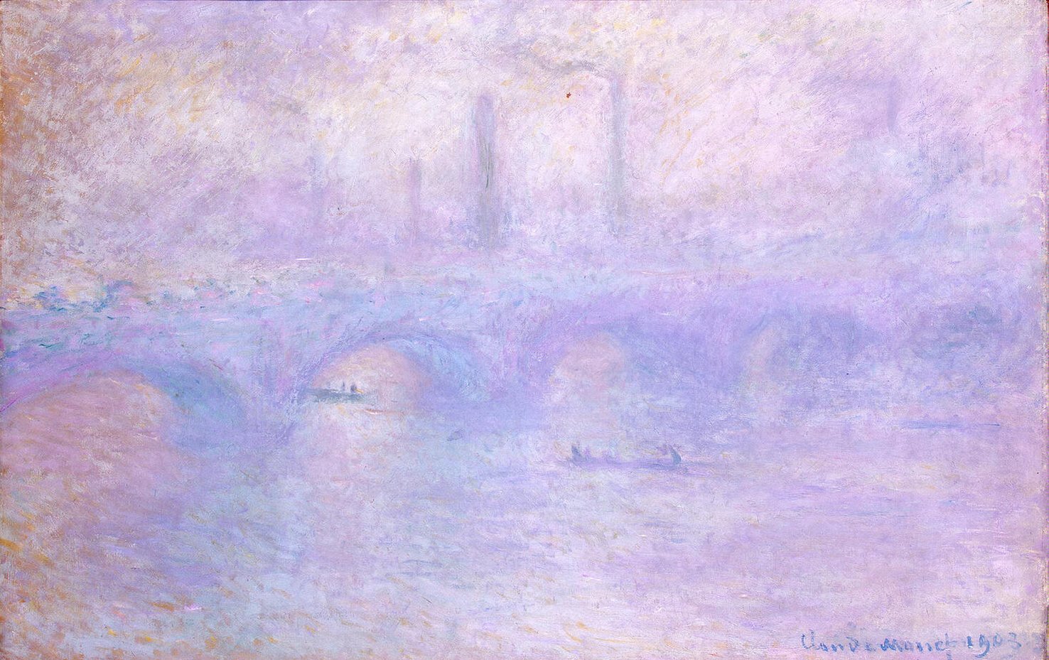
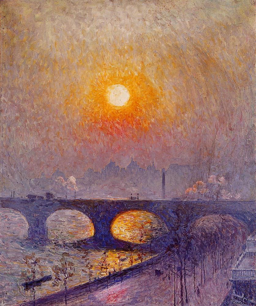
Claude Monet (1840–1926, Waterloo Bridge. Effect of Fog (1903), oil on canvas, 65.3 x 101 cm, Hermitage Museum Государственный Эрмитаж, Saint Petersburg, Russia. Wikimedia Commons.
Monet’s Waterloo Bridge from 1903 is the ultimate conclusion of his paintings of fog, in which only the softest of forms resolve in its pale purple and blue vagueness, his common destination with the paintings of Turner over fifty years earlier.
Claude Monet (1840–1926), The Houses of Parliament, Stormy Sky (1904), oil on canvas, 81.5 × 92 cm, Palais des Beaux-Arts de Lille, Lille. Wikimedia Commons.
In The Houses of Parliament, Stormy Sky (1904) the sun is higher and further to the south, allowing Monet to balance the silhouette of the Palace with its shadow cast on the water, and the brightness in the sky with its fragmented reflections.
Henri Le Sidaner (1862–1939), St. Paul’s from the River: Morning Sun in Winter (1906-07), oil on canvas, 90 x 116 cm, Walker Art Gallery, Liverpool, England. Wikimedia Commons.
Henri Le Sidaner also visited Britain on several occasions, and in 1906-07 painted this view of St. Paul’s from the River: Morning Sun in Winter, which may have been inspired by Monet’s series paintings of Rouen Cathedral, here expressed using his own distinctive marks.
Émile Claus (1849-1924), (Sunset over Waterloo Bridge) (1916), oil on canvas, dimensions not known, location not known. WikiArt.
Emile Claus’s Sunset over Waterloo Bridge (1916) was painted from a location on the north bank of the Thames slightly to the east of Waterloo Bridge, the north end of which is prominent, and looks south-west into the setting sun, up river. Claus painted several views of Waterloo Bridge while he was in London, but doesn’t appear to have attempted any formal series, such as Monet’s.
Claus isn’t formulaic in his treatment. He uses billowing clouds of steam and smoke to great effect, and his inclusion of the road, trees and terraces in the foreground, on the Embankment, provides useful contrast with the crisp arches of the bridge, and the vaguer silhouettes in the distance. Like Monet’s series, this was probably painted from a temporary studio inside a building.
Emile Claus (1849–1924), Morning Reflection on the Thames in London (1918), oil on canvas, 72 x 92 cm, Museum voor Schone Kunsten, Ghent, Belgium. Wikimedia Commons.
Claus’s Morning Reflection on the Thames in London, from 1918, is a view over the Embankment and river that’s desaturated and made vaguer by fog.
Lesser Ury (1861–1931), London in Fog (1926), oil on canvas, 67 x 97 cm, location not known. Wikimedia Commons.
My last example is another view over the River Thames, this time by Lesser Ury. London in Fog from 1926 doesn’t appear to be a nocturne, but looks at the effects of fog on both lights and their reflections.
On 4 December 1952, a high pressure system settled over London. The wind fell away, and fog and smoke were trapped under a temperature inversion. The following day the whole of the city and an area totalling over one thousand square miles were blanketed in smog that remained until 9 December. It’s estimated that directly caused over ten thousand deaths. A succession of laws and a major campaign to eliminate open coal fires in London resulted in great improvement, although a decade later there was another lesser smog, perhaps the event I remember from my childhood. The beauty of those paintings can also be deadly.
This week brought a timely revisit to remind myself just how common the three security extended attributes (xattr) have become, and to see whether we can make use of any of them for our own purposes.
How common?
Checking through one of my ~/Documents folders containing a modest 57,884 files, nearly 60% of them have at least one xattr. By far the most common is com.apple.quarantine on 48%, followed by com.apple.provenance at 14%. Some way behind those, but still one of the most frequent, is com.apple.macl on 2.8%.
Having explained what I think macOS does with all those xattrs, the next step is to ask whether we can use them for our direct benefit. Of the three, quarantine seems least useful to anything beyond Gatekeeper. MACL is like a boil on the bum, and the only time you’ll notice it is when it gets in your way. I can’t make sense from its contents either, but as it’s protected by SIP, there’s little a utility could do to alleviate our suffering, so we just have to learn to live with it. I’m surprised how uncommon it is in comparison with the nuisance it can cause.
Promising provenance
It’s the provenance xattr that looks most promising, and Koh M. Nakagawa has followed up his recent research into its function with an open-source command toolShowProvenanceInfo that can look up provenance IDs found on files, in the ExecPolicy database’s Provenance Tracking table, although that requires root privileges for access.
Apps and executable code signed by third-parties rather than Apple are added to that table when they’ve successfully completed their first run. Each is given a unique provenance ID number that is attached to them in a com.apple.provenance xattr. When they then perform any of 11 types of file operation, such as creating a file or opening one in write mode, that app’s provenance ID is attached to the file in its own provenance xattr.
As apps and other executables that have been entered into that table have their own provenance xattrs, it shouldn’t be too much of a burden to build an independent database from those, together with other information about the executable with that provenance ID. That can then be used to examine provenance xattrs on arbitrary files, to identify which app last worked with that file, the primary task of a new GUI utility I’ve already dubbed Providable.
In addition to telling you which app with a provenance ID last changed a document, there are other functions that Providable could perform. Those property lists forming the basis for Background Items listed in Login Items & Extensions settings are normally created and changed by their owning app. When a third-party app with a provenance ID does that, the property list gains a provenance xattr that can be used to identify the app responsible. That can in turn provide information that’s often sadly lacking from the list of extensions, including the location of the app rather than that of the property list.
One obvious hole in this plan is the fact that apps that are signed by Apple, including those bundled in macOS and everything installed from the App Store, don’t get assigned provenance IDs. They therefore can’t be traced and identified from the files they create or change, as they operate outside the provenance tracking system.
Providable
My outline design for Providable is therefore to inspect provenance IDs saved as xattrs to the apps in the Data volume, and to display their details in a list you can refer to. Alongside that, a window lets you drop files on it for checking. Each will be examined for a provenance xattr, and those that have one will then be associated with the app in the list, providing its path and other details.
Provenance IDs can also be assigned to command tools and other executables, and a later version will allow you to check those in popular locations, and add them to the database so files can be matched to them as well. I don’t currently know how useful that might be, but we should get a better idea once the first version of Providable is in use.
I invite your ideas and comments, please, before I start coding.
One of the enduring memories of my childhood, spent partly in London, is walking in smog, then commonly known as a pea-souper. The combination of dense fog and smoke was so thick I could barely make out street lights, and the streets were for once almost empty, as vehicles could only proceed at walking pace.
This weekend I present a selection of paintings of mist, fog and maybe even a touch of smog on the River Thames, in and near London. Today’s paintings come from the pioneers of the nineteenth century, and tomorrow’s from the twentieth.
Many of JMW Turner’s greatest paintings take advantage of the optical effects of mist and fog. Being a Londoner, he must have experienced these all too frequently.
These peaked in Turner’s famous painting of a Great Western Railway train crossing the River Thames at Maidenhead: Rain, Steam, and Speed, exhibited at the Royal Academy in 1844. The whole image is fogbound and vague, and proved a precursor to the approach of the Impressionists after his death.
Claude Monet (1840–1926), The Thames below Westminster (1871), oil on canvas, 47 x 73 cm, The National Gallery, London. Wikimedia Commons.
Less than thirty years later, when he was taking refuge from the Franco-Prussian War, Claude Monet’s The Thames below Westminster (1871) is less Impressionist. Painted from the Embankment to the north of Westminster Bridge, near what is now Whitehall, the three towers to the south are almost superimposed, and aerial perspective is exaggerated by the mist. The river is bustling with small paddleboat steamers. In the foreground a pier under construction is shown almost in silhouette. Small waves and reflections on the river are indicated with coarse brushstrokes, suggesting this is a rapid and spontaneous work.
Winslow Homer (1836–1910), The Houses of Parliament (1881), watercolour on paper, 32.3 x 50.1 cm, Hirshhorn Museum and Sculpture Garden, Washington, DC. Wikimedia Commons.
A decade later, The Houses of Parliament is Winslow Homer’s faithful representation of the Palace of Westminster when viewed from the opposite bank of the Thames, to the north (downstream) of the end of Westminster Bridge. The tide is high under the arches of Westminster Bridge, and small boats are on the river. This classic watercolour makes an interesting contrast with Monet’s later oil paintings I show tomorrow: Homer provides little more detail, the Palace being shown largely in silhouette, but works with the texture of the paper and careful choice of pigment to add granularity. He provides just sufficient visual cues to fine detail, in the lamps and people on Westminster Bridge, and in the boats, to make this a masterly watercolour.
Jules Bastien-Lepage (1848–1884), The Thames, London (1882), oil on canvas, 54 x 74.3 cm, Philadelphia Museum of Art, Philadelphia, PA. The Athenaeum.
The following year, Jules Bastien-Lepage paid a return visit to the city, when he painted The Thames, London. This view of industrial docklands further downstream maintains detail into the far distance, except where it’s affected by the smoky and hazy atmosphere typical of the city at that time. It was this section of the river that was also painted on several occasions by James Abbott McNeill Whistler.
Tom Roberts (1856-1931), Fog, Thames Embankment (1884), oil on paperboard, 31.6 x 46 cm, Art Gallery of New South Wales, Sydney. Wikimedia Commons.
Tom Roberts’ Fog, Thames Embankment (1884) is painted from a similar location to Monet’s The Thames below Westminster above, on the Embankment to the north of Westminster Bridge, but is cropped more tightly, cutting off the tops of the Victoria and Elizabeth Towers. The Palace and first couple of arches of Westminster Bridge appear in misty silhouette, with moored barges and buildings on a pier shown closer and crisper. He renders the ruffled surface of the river with coarse brushstrokes, different from those of Monet.
Camille Pissarro (1830–1903), Charing Cross Bridge, London (1890), oil on canvas, 60 x 90 cm, National Gallery of Art, Washington, DC. Wikimedia Commons.
Among six paintings that Camille Pissarro started work on during his visit to England in 1890 was this view of Charing Cross Bridge, London from Waterloo Bridge. For this he made a sketch in front of the motif, then following his return to his studio in Éragny he painted this in oils. This looks south-west, towards a skyline broken by the Palace of Westminster and the familiar tower of Big Ben.
Frederick Childe Hassam (1859-1935), Houses of Parliament, Early Evening (1898), oil on canvas, 33 x 41.6 cm, Private collection. WikiArt.
In Frederick Childe Hassam’s Houses of Parliament, Early Evening (1898), the sun has already set, and he is viewing the Palace in the gathering dusk from a point on the opposite (‘south’) bank, perhaps not as far south as Lambeth Palace. The Victoria Tower is prominent in the left of the painting, the Central Tower is in the centre, and the most distant Elizabeth Tower is distinctive with its illuminated clock face. Moored boats in the foreground provide the only other detail. His rough facture gives a textured surface to the water.
Numbers – as in maths, not Apple’s spreadsheet – were there at the dawn of computing, and have played a major part in hardware, system software and apps ever since. This article explains some of the numeric types used by your Mac, and how they can catch you out.
Numbers in computing fall into two broad classes: those represented exactly, which are mainly integers, and those normally approximated, including most floating point numbers.
Integers
These are the simplest to represent in binary and hexadecimal, and those that play the fewest tricks. They come in several varieties, determined by their size in bytes, and whether they can be negative rather than only positive. Some of us still remember when the standard integer was represented in just eight bits. The largest unsigned integer is then 1111 1111 in binary, or FF in hexadecimal, that’s 255 in regular decimal notation. If one of those bits is used to indicate whether they include negative values, they can only lie between -127 and +127.
Soon integers grew to 16 bits, then 32, and now the standard length of 64 bits, offering a range of numbers beyond our comprehension, or even the largest of distributed file systems.
Most problems that arise in integers do so from any of five causes:
the order of bytes, which can be ‘big-endian’ or ‘little-endian’ according to processor type and setting;
conversion between different lengths;
whether signed or unsigned;
overflow, in which the product of two integers requires a number larger than the maximum for their length;
arithmetic operations such as division, when performed by zero.
Together, these can result in quite complex errors. For example, suitably misinterpreted as a signed integer using the wrong byte order, the 32-bit unsigned integer for 65,535 (0000 FFFF) can become -2,147,418,112 (FFFF 0000).
Floating point numbers
Integers are fine for counting integral objects such as people and file sizes, but in the real world most things have to be measured in floating point or decimal numbers like 3.14159. In maths, those numbers come from a continuous range that has to include extremely large positive and negative values, and many very close to zero. They’re most familiar to us from engineering or scientific notation expressing them in terms of a number from 1.0 to almost 10.0, multiplied by a power of ten, e.g. 1.68301 x 10e-6, which is just above zero at 0.00000168301.
The most widely used form of floating point number in macOS is the Double, which uses 64 bits to encode a number using similar principles to engineering/scientific notation, only the powers used aren’t decimal but binary, making them more difficult to read and understand. In decimal notation, with the radix 10, 0.00000168301 has the significand of 1.68301 and the exponent of -6, making it 1.68301 x 10e-6. As a computer Double, the radix is 2 (binary), so it has a significand of 1.76476389376 and an exponent of -20, making it 1.76476389376e-20.
Some Doubles are exact expressions of the number they’re trying to represent. An obvious example is 1.0, represented as 1.0e0, but even fairly simple numbers like 71.3927 are confusing, with a representation of 1.1155109375e6 (radix 2). To convert between regular decimal floating point and 32- and 64-bit floating point numbers, and their hex representations, my free Mints has a Floating Point Explorer window. This is explained here.
Unlike mathematical numbers, there’s a finite number of different Doubles, and their distribution is far from even. The same Double representing 71.39270000000000 also represents 71.39270000000001, and all the numbers in between them, all but one of which is only an approximation. Around those numbers, there are roughly 70 trillion different floating point numbers per unit (1.0) step in number. These become more dense around zero, and less dense at the extreme ends of the number line. As Doubles become larger in absolute value (disregarding their sign), so they become less precise in absolute but not relative terms.
Errors
Because they’re only approximations, Doubles suffer several problems that can adversely affect calculating with them. These include rounding and cancellation errors.
Rounding errors occur because Doubles have fixed length, so the last place has to be rounded up or down to give the best approximation to the real number. The standard for floating point (IEEE 754) specifies no less than five different rounding functions, that can result in a Double being rounded up or down. Although the relative errors from rounding should be small, they can accumulate in long series of calculations to the point where they affect overall accuracy.
Cancellation errors can be very large, even when only the result of a single operation. This term refers to potentially highly inaccurate results from subtracting numbers that are very close in value. When almost all the digits of the result are lost, these errors can be catastrophic, and may cause the order of calculations to determine the result.
These can be illustrated by two simple calculations, each of which should return a result of exactly 0.0: ((10000000.001 - 10000000.000) - 0.001) * 1.0e8
and (10000000.001 - (10000000.000 + 0.001)) * 1.0e8
Yet using Swift Doubles, the first returns the incorrect result of 0.016391277311150754.
With a whole IEEE standard to themselves, floating point numbers have grown their own subdivision of errors and non-errors. The most commonly encountered of these is the NaN, Not a Number, which used to puzzle those plugging through spreadsheets when a formula attempted a heinous crime such as division by zero. The joy of NaNs is their propagation: once a NaN creeps into a calculation, it’s likely to turn the whole thing NaN. Then there are two different signed zeroes, +0 and -0, or if you really want a choice, why not have an unsigned zero too, and then decide whether you want all three to be equal or not.
Others
Some systems also support extended precision beyond Doubles. One of the advances brought by the first widely used maths coprocessor, Intel’s 8087, was the availability of 80-bit Extended calculations. Although valuable for some, in general, mixing precisions leads to further strange errors that can prove hard to trace. macOS tries to avoid those, and ARM processors don’t have any Extended features, which have to be implemented in additional libraries for those that need them.
Most recently, to accommodate AI using neural networks, smaller floating point numbers have become popular. bfloat16 numbers use only 16 bits of storage, but cover the same range as 32-bit floating point numbers with reduced precision. These promise huge gains in speed by allowing arithmetic instructions on twice the numbers at once, and are supported in CPUs in Apple’s M2 and later chips, and in GPUs.
You will occasionally come across other numeric formats, including fixed point and arbitrary precision. These don’t normally have any direct support in general purpose processors, but are implemented in libraries, making them considerably slower and non-transferable. And then there are arrays of numbers in vectors and matrices, complex numbers, and everything else that mathematicians have devised. There is no end.
Further reading
Start with Jean-Michel Muller et al (2018), Handbook of Floating-Point Arithmetic, 2nd ed, Birkhäuser, ISBN 978 3 319 76525 9. Then progress to Peter Kornerup and David W Matula (2010), Finite Precision Number Systems and Arithmetic, Cambridge UP, ISBN 978 0 521 76135 2. Complete the basics with Jean-Michel Muller (2006), Elementary Functions, Algorithms and Implementation, 3rd ed, Birkhäuser, ISBN 978 1 4899 7981 0. You can then progress to matrices, for which there is a huge literature.
In 1900, the Swiss painter and print-maker Félix Vallotton was granted French citizenship. He had cut back on his prints to paint more, and the paintings that he made were no longer Nabi, but explored themes and ideas that were to prove influential later in the twentieth century. He also broadened his interests: in the early years of the new century, he wrote eight plays and three novels, although none achieved much success.
Félix Vallotton (1865–1925), The Laundress, Blue Room (La Lingère, Chambre Bleue) (1900), oil on paper laid on canvas, 50 x 80 cm, Dallas Museum of Art, Dallas, TX. Wikimedia Commons.
In 1900, he followed his earlier mysterious interiors with The Laundress, Blue Room, set in the Vallotton apartment in Paris, with two of his step-children squatting on the folds of large fabric sheets, inside a bedroom with blue decor. Two women are sat working, one apparently on the sheets, the other on separate fabrics.
Félix Vallotton (1865–1925), Le Pont Neuf (1901), oil on cardboard, 37 x 57 cm, Kunstmuseum Winterthur, Winterthur, Switzerland. Wikimedia Commons.
Vallotton’s view of the oldest of the great bridges of central Paris, in Le Pont Neuf from 1901, is strange. Like some of the unconventional views of bridges painted in the late nineteenth century, its emphasis is on unusual perspective form, but it manages to avoid showing Pissarro’s dense throng of people, or its place among prominent buildings, and is almost unrecognisable.
Félix Vallotton (1865–1925), Woman Searching in a Cupboard (1901), oil on canvas, 78 × 40 cm, Private collection. Wikimedia Commons.
Woman Searching in a Cupboard from 1901 shuts out half its image with black screens and the doors to the cupboard, giving it a strongly geometric tone. The woman, in spite of a lamp by her side, is little more than a black silhouette too, who appears to absorb the light falling on her. The lamp itself is strange, with a shade showing some sailing ships at sea, its stand being a vertical statuette of Truth, perhaps?
Félix Vallotton (1865–1925), Poker (1902), oil on cardboard, 52 x 67 cm, Musée d’Orsay, Paris. Wikimedia Commons.
Maybe we should read Vallotton’s lamps more carefully. For the following year (1902), he painted this quartet of gamblers in a Poker session. Tucked away in a plush back-room behind a club or bar, these four are in full evening dress, playing for stakes that could be breathtaking and bankrupting. In the centre foreground is another lamp with a patterned shade, showing sailing boats, I think.
Félix Vallotton (1865–1925), Five Painters (1902-03), oil on canvas, 145 x 187 cm, Kunstmuseum Winterthur, Winterthur, Switzerland. Wikimedia Commons.
Then in 1902-03, Vallotton painted one of the seminal records of the Nabis: Five Painters, showing Pierre Bonnard (seated, left), Félix Vallotton (standing, left), Édouard Vuillard (seated), Charles Cottet and Ker-Xavier Roussel (standing, right).
His next views of interiors I find quite cinematic, as if stills from a movie, perhaps reflecting his modern approach to composition and lighting, more akin to those developed by cinematographers of the future rather than painters of the past. They also appear to have been influences over the New Objectivity that developed in central Europe in the 1920s, and later American artists like Edward Hopper.
Félix Vallotton (1865–1925), Interior, Woman in Blue Searching in a Cupboard (1903), oil on canvas, 81 x 46 cm, Musée d’Orsay, Paris. Image by Oakenchips, via Wikimedia Commons.
For his Interior, Woman in Blue Searching in a Cupboard from 1903, Vallotton painted his wife Gabrielle from the back as she stood searching in a cupboard of books.
Félix Vallotton (1865–1925), Interior with Woman in Red (1903), oil on canvas, 92.5 x 70.5 cm, Kunsthaus Zürich, Zürich, Switzerland. Wikimedia Commons.
Vallotton’s Interior with Woman in Red from 1903 develops the framing effect of multiple sets of doors, drawing the eye deeper towards a distant bedroom. The woman wearing a red dress looks away, her skirts swept back as if she has been moving towards the three steps dividing this interior into foreground and background. There are tantalising glimpses of detail on the way: discarded fabric on a settee, clothing on a chair in the next room, and half a double bed with a bedside lamp in the distance.
Félix Vallotton (1865–1925), Woman Reading in an Interior (1904), oil on board, 60.3 x 34.6 cm, Museum of Fine Arts, Houston, TX. Wikimedia Commons.
There’s dispute as to whether this painting shows a Woman Reading in an Interior, as given by its French title, or a woman writing, which appears to be its translation. Vallotton painted this in 1904, and charged it with rather less mystery, although I wonder if the lower of the paintings on the wall might be one of Degas’ works showing horseriding. As usual, the single figure doesn’t show her face as she sits at the small bureau, backlit by the window and its stained glass.
Félix Vallotton (1865–1925), Interior, Bedroom with Two Figures (1904), oil on cardboard, 61.5 × 56 cm, Hermitage Museum Государственный Эрмитаж, Saint Petersburg, Russia. Wikimedia Commons.
Interior, Bedroom with Two Figures from 1904 is one of the last of his series of mysterious interiors, and worthy of the sub-genre of the ‘problem picture’. This is another bedroom, in which the lady of the house is standing over her maid as the latter is sewing up an evening gown for her. The mistress stands with her back to the viewer, but her face is revealed in her reflection in the large mirror on the wardrobe at the back of the room. In that, the maid is all but invisible. These three figures appear in a perspective recession, and to the right of the wardrobe is a doorway, presumably leading through to the master’s bedroom.
Félix Vallotton (1865–1925), The Models’ Smoke Break (1905), oil on canvas, 130 x 195.5 cm, Kunstmuseum Winterthur, Winterthur, Switzerland. Wikimedia Commons.
In this period before the Great War, Vallotton also painted portraits, and several nudes. But the figurative painting from 1905 that I find most fascinating is this, of The Models’ Smoke Break. In an era when most adults smoked, rest periods for models, like those for other workers, were usually termed ‘smoke breaks’ even though neither woman is smoking.
Instead, one model is reclined in a pose (not a pose, as it’s a break) reminiscent of Manet’s Olympia (1863). Instead of her maid bringing her a bouquet, though, she holds a single wilted blue flower, and chats idly to another model who sits by her feet. I wish I could identify the paintings reflected in the mirror behind them, although I think the upper double portrait is that of Vallotton’s parents painted in 1886. That below looks like a coastal landscape, perhaps of Honfleur.
To follow these, Vallotton turned to classical myths.
Over the last few years, files and apps on our Macs have started to bristle with unfamiliar extended attributes (xattr). The oldest is the quarantine xattr, containing the quarantine flag, dating back to the introduction of Gatekeeper in 2012. Although its primary purpose is to determine which apps should undergo first run checks, it’s also to be found on many files. Then in macOS Catalina, the MACL xattr appeared and now seems to get attached to pretty well everything, no matter where it has come from. It was joined by the provenance xattr in macOS Ventura, and that too is spreading like wildfire on both apps and files. This article reviews why they’re there, and what you can do about them.
Quarantine
Since its introduction, Gatekeeper has drawn a distinction between apps that originated outside the Mac, and those that can be fully trusted, when performing security assessments on the first occasion. To enable that, apps that download items from the internet, or transfer them from another system on the same network, attach a quarantine xattr to every file that arrives on your Mac. When archives are decompressed, for example, the quarantine xattr is propagated to every file they contain. Gatekeeper then performs full first run checks on those apps, and in the right circumstances they may be run in translocation.
This com.apple.quarantine xattr is also attached to non-executable files, where its role isn’t clear, as they aren’t checked by Gatekeeper, and their quarantine flag isn’t cleared after they have been opened for the first time. However, you’ll find them on all items that have been downloaded by an app or tool that attaches them. As this xattr isn’t protected in any way, it’s straightforward to remove, although you should avoid doing so for apps whose origins could be suspicious, as that would prevent Gatekeeper from running its additional checks.
MACL
This is thought to be an abbreviation for Mandatory Access Control List, and might be intended to preserve privacy while allowing the user to open files. The com.apple.macl xattr is now probably the most common of all, as these get attached to any and every file, including apps, even if they were created on that Mac and never left its local storage.
This xattr contains 72 bytes of what could be two UUIDs, or just binary data. However, it’s protected by SIP, preventing any user from stripping it. This can be responsible for problems, for example files that can’t be opened in their default editor app, and some that can’t be saved. In the past one way of triggering this blocking behaviour was to set a document to be opened by default using an app other than its normal app, then saving it from that app before trying to open it again.
Perhaps the simplest way to remove this xattr is to copy the file to another volume, where the xattr is no longer protected by SIP, stripping it using my free editor xattred or the xattr command tool, then copying that back to its original location. Although it’s likely to be given another MACL xattr shortly, that should be less prone to cause problems.
Provenance
Most recent versions of macOS have what’s known as a Provenance Sandbox that enables the security system to track the origins of files, and trace which app has altered them. This has recently been detailed in full in Koh M. Nakagawa’s account of XProtect Remediator. It operates quite differently from the regular app sandbox, and doesn’t appear to impose any restrictions.
Apps that aren’t signed by Apple are assigned an 11-byte integer when they first clear Gatekeeper’s checks, and those are entered into the Provenance Tracking table in the ExecPolicy database, and attached to the app in the com.apple.provenance xattr. When that app performs operations like opening a file in write mode, or creating a new one, the same xattr with that app’s provenance ID is attached to the file. Thus, by checking the provenance ID on any file with the xattr, the app that last wrote to the file can be identified.
Provenance IDs and xattrs aren’t assigned to Apple’s own apps, or those installed from the App Store, but they are to apps that are signed using certificates other than Apple’s, and those that are notarised. When a file is created or changed by an app without a provenance ID, no xattr is attached to that file, and any existing xattr is left unchanged.
This is a powerful tool in gathering security intelligence. For example, suppose a Mac has just installed previously unknown malware that started to write files in one of the locations watched by behavioural XProtect under one of its Bastion rules. Those could be inspected, perhaps by one of the scanning modules in XProtect Remediator, the provenance ID checked against details in the Provenance Tracking table, and information forwarded to Apple for further investigation.
Evidence so far suggests that you don’t want to try to tamper with the provenance xattr, as it doesn’t appear to have any role in blocking access to files, and is working on our side. Like the MACL xattr, it’s now normally protected by SIP, so can’t be removed directly.
Summary
com.apple.quarantine is likely to be found on any app or file downloaded or transferred from another system, but appears harmless.
com.apple.macl is likely to be attached to most apps and files, even those that have remained local at all times. It can sometimes cause problems including blocking the file from being opened or saved, but is hard to remove as it’s protected by SIP.
com.apple.provenance is used to track which app has created or modified files. This can be important in security intelligence, so shouldn’t be removed, although it appears harmless and is working for our benefit.
The craft of the blacksmith goes back long before the Iron Age, but once our ancestors had learned to work cast iron (by turning it first into wrought iron), in about 1200 BCE, it became one of the key crafts in many societies. It’s also the only craft represented by a deity in the classical Greek pantheon, in the god Hephaistos, translated by the Romans to Vulcan.
He had the misfortune to have been born lame, as a result of which Hera tried to be rid of him, and threw him into the sea. He was there cared for by Thetis and others. He later assumes his role as the god of fire, volcanoes, and crafts allied to blacksmithing, including sculpture.
In paintings, Vulcan is characteristically seen in his forge, as in Tintoretto’s painterly Vulcan’s Forge (1578), one of four mythological paintings he made for the Atrio Quadrato in the Palazzo Ducale in Venice. Tintoretto was clearly familiar with the division of labour in a blacksmith’s workshop. The two well-muscled men wielding large hammers are strikers, whose brute force is more important. Vulcan is the older man at the left, who strikes the casting with his small hammer to tell them where theirs should strike.
Diego Velázquez (1599–1660), The Forge of Vulcan (1630) [41], oil on canvas, 223 x 290 cm, Museo Nacional del Prado, Madrid, Spain. Wikimedia Commons.
Homer’s story of the adulterous affair of the wife of Hephaistos, Aphrodite (Venus), with Ares (Mars) is retold by Ovid in his Metamorphoses, the likely source for Diego Velázquez’s The Forge of Vulcan from 1630. This shows Apollo, at the left, visiting Hephaistos (to the right of Apollo) in his forge, to tell him about this infidelity.
Lovis Corinth (1858–1925) Homeric Laughter (1909), oil on canvas, 98 × 120 cm, Bayerische Staatsgemäldesammlungen, Munich. Wikimedia Commons.
Homeric Laughter (1909) is one of Lovis Corinth’s most complex, even abstruse, paintings of classical myth. He provides a good clue as to its interpretation in his inscription (originally in German translation): unquenchable laughter arose among the blessed gods as they saw the craft of wise Hephaistos
together with the reference to Homer’s Odyssey book 8 line 326.
In this first version, Corinth shows Aphrodite recumbent on the bed, shielding her eyes from the crowd around her. Ares struggles with the net securing the couple, looking frustrated. Hephaistos, clad in black with his tools slung around his waist, is talking to Poseidon (who wears a crown) with Dionysos/Bacchus behind him (clutching a champagne glass). At the right edge is Hermes/Mercury, with his winged helmet. Sundry putti are playing with Ares’ armour, and an arc of putti adorns the sky.
The blacksmith also features in some accounts of the origin of Pandora.
John Dixon Batten (1860-1932), The Creation of Pandora (1913), tempera on fresco, 128 x 168 cm, Reading University, Reading, England. Wikimedia Commons.
John Dixon Batten’s The Creation of Pandora was painted anachronistically in egg tempera on a fresco ground by 1913. Batten was one of the late adherents of the Pre-Raphaelite movement, and is now almost forgotten. This work had been put into storage in 1949 and wasn’t rediscovered until 1990.
Pandora is at the centre, having just been fashioned out of earth by Hephaestus, who stands at the left, his foot on his anvil. Behind them, other blacksmiths work metal in his forge. At the right, Athena is about to place her gift of a robe about Pandora’s figure, and other gods queue behind to offer their contributions.
There are several fine paintings of regular blacksmiths at work over the centuries. The earliest I have been able to locate is a disturbing detail in the central panel of Hieronymus Bosch’s triptych The Last Judgment from about 1495-1505.
Hieronymus Bosch (c 1450–1516), The Last Judgment (central panel, detail) (c 1495-1505), oil on oak panel, left wing 99.5 x 28.8 cm, central panel 99.2 × 60.5 cm, right wing 99.5 × 28.6 cm, Groeningemuseum, Bruges, Belgium. Wikimedia Commons.
Among the torments featured in the centre panel are painful punishments in the blacksmith’s at the top.
Francisco Goya (1746–1828), The Forge (1812-16), oil on canvas, 181.6 x 125.1 cm, The Frick Collection, New York, NY. Wikimedia Commons.
Francisco Goya’s Forge from 1817 is a superb depiction of the physically demanding work of the blacksmith. Its extensive use of black is also a herald of the Black Period to come in Goya’s paintings at the end of that decade.
Alfred Sisley (1839-1899), Forge at Marly-le-Roi (1875), oil on canvas, 55 x 73.5 cm, Musée d’Orsay, Paris. EHN & DIJ Oakley.
Sisley’s Forge at Marly-le-Roi from 1875 shows the village blacksmiths still at work long after the Industrial Revolution brought steam-powered hammers.
Ernst Josephson (1851–1906), Spanish Blacksmiths (1882), oil on canvas, 128.5 x 107 cm, Nasjonalgalleriet, Oslo, Norway. Wikimedia Commons.
Ernst Josephson’s Spanish Blacksmiths from 1882 shows a smith in the shredded remains of his white shirt, and his striker to the right in his black waistcoat, with a horseshoe hanging below the roof of their forge in Seville.
Döme Skuteczky (1849–1921), In the Smithy (1897), mixed media, 28 × 21 cm, location not known. Wikimedia Commons.
Döme Skuteczky’s painting In the Smithy from 1897 shows another smithy, this time in Slovakia.
These days, across much of Europe the traditional blacksmith earns their keep from forging horseshoes for the many horses ridden for pleasure.
Programs running in windowing environments, applications as we used to know them, have more complicated requirements than those run from a command line. Rather than embed all the resources they require for windows, menus and the rest in a single file, Mac OS broke new ground by putting those into resources stored in the app’s resource fork.
This is QuarkXPress version 4.11 from around 2000, with its resources displayed in the resource editor ResEdit. Executable code was also stored in CODE resources, and every file contained type and creator information to support the illusions created by the Finder.
Mac OS X
When Mac OS X was designed, it switched to the bundle structure inherited from NeXTSTEP. Instead of this multitude of resources, apps consisted of a hierarchy of directories containing files of executable code, and those with what had in Mac OS been supporting resources. Those app bundles came to adopt a standard form, shown below.
The bundle name has the extension .app, and contains a single directory Contents. Within that, the executable code is in the MacOS directory, which may contain both the main executable for the GUI app and any bundled command tools provided. Another directory contains Resources, including the app’s custom icon, and components of its GUI. In some apps, there’s another directory of Frameworks containing dylibs (libraries).
There are also two important files, Info.plist and PkgInfo. The latter contains the same type and creator information inherited from Classic Mac OS, and apparently isn’t mandatory although it appears universal. The information property list is essential, as it specifies the names of the executable and its icon file in Resources, the minimum version of macOS required, type declarations of the app’s documents, version numbers, and more.
When running a command tool in macOS, its Mach-O executable is launched by launchd, whose purpose is to run code. Launching an app is more demanding, although the app’s executable is still launched by launchd. Before that can happen, macOS starts the launch process using LaunchServices and RunningBoard, which rely on information obtained from Info.plist and other components in the app bundle.
macOS
This structure remained stable until the introduction of code signatures in Mac OS X 10.5 Leopard in 2007. Accommodating those added a directory named _CodeSignature containing the signature in a CodeResources file. That includes code directory hashes (CDHashes) to check the integrity of the contents of the app bundle. Apps distributed by the App Store include a store receipt in another directory, _MASReceipt. Since 2018, when Apple introduced notarization, the ‘ticket’ issued by Apple can be ‘stapled’ into the app bundle as the file CodeResources.
Many apps come with additional items that might in the past have been installed by them in their Library/Application Support folders and elsewhere, but are now included in the app bundle. These can include the following directories:
Library, containing folders of LaunchDaemons and LoginItems that would previously have been installed in either the main Library folder, or that in the user’s Home folder;
XPCServices, for executable code that the app uses to provide specific services;
Plugins, for some types of app extension (Appex);
Extensions, for other types of app extension, including app intents.
You may also come across other components, including a version.plist in Apple’s apps.
This centralisation of components in the app bundle has brought several benefits. Being self-contained, apps are easier to install and update, and cleaner to remove. Their components are less likely to go missing, and most of all they’re held within the protection of the app’s signature and notarisation, an important improvement in security.
Assembling these into a diagram shows how the anatomy of an app has grown over the last few years.
Components shown in pale yellow are either mandatory or essentially universal. Those shown in green are found in apps distributed through the App Store, while that shown in blue is the stapled notarisation ticket (optional). You will also see additional folders and components such as Automator workflows, scripts, and others.
There is no difference in structure between apps built for current Intel and Arm architectures. That’s because binaries in the MacOS folder (and executable code in other directories like Frameworks, XPCServices and Plugins) contain platform-specific code in a single Mach-O executable. Thus, an app that’s Universal and runs native on both architectures includes code for both in its single ‘fat’ code file, and they even have separate signatures stored within common files.
in the seventeenth century, series paintings such as the four seasons and five senses tend to be created by Flemish rather than Dutch masters. There’s at least one notable exception, which also includes some of the most overt visual humour of the Dutch Golden Age, painted by Jan Miense Molenaer (c 1610-1668).
Molenaer seems to have spent much of his life in Haarlem, where he’s thought to have been an apprentice of Frans Hals. Other than marrying a fellow apprentice, Judith Leyster, in 1836, and the couple moving their shared studio to Amsterdam for eleven years, little seems known about his life.
Jan Miense Molenaer (c 1610–1668), The Dentist (1630), oil on panel, 66 x 81 cm, Herzog Anton Ulrich-Museum, Braunschweig, Germany. Wikimedia Commons.
The Dentist, painted in 1630, is one of his earlier paintings, and declares his interest in everyday life. A small crowd has gathered outside a church, where a fashionably dressed man is pulling a tooth from a local. The victim is dressed in tatters, with large holes at both his knees and worn-out shoes. Most around him have their hands clasped in prayer, presumably that the victim doesn’t break free and hit his dentist.
Several of Molenaer’s surviving paintings show the making of music, including A Young Man playing a Theorbo and a Young Woman playing a Cittern from about 1630-32. This is set in the interior of an upper middle class home, with a maid serving a meal in the right background. A theorbo is a member of the lute family, and is plucked, while a cittern has metal strings and is more like an ancestor of the guitar.
Jan Miense Molenaer (c 1610–1668), Allegory of Vanity (1633), oil on canvas, 102 x 127 cm, Toledo Museum of Art, Toledo, OH. Wikimedia Commons.
Several musical instruments also feature in his Allegory of Vanity from 1633, one of his vanitas paintings. An older woman is passing a fine-tooth comb through the long tresses of a younger woman, to check and remove parasites like lice. She is holding a mirror, and resting a foot on a human skull rather than a foot-warmer. The conventional lapdog is replaced by a golden statue, and the young boy in front of her is holding a device used to make bubbles. The woman’s jewellery is on display on a table at the right, and her make-up shown in a dressing table on the left.
Jan Miense Molenaer (c 1610–1668), Card Players by Lamplight (c 1634), oil on panel, 44 × 51 cm, Private collection. Wikimedia Commons.
Molenaer painted many scenes inside taverns and other places where drinking and gambling took place. His Card Players by Lamplight from about 1634 shows a card game in progress by the light of a lamp mounted on a stand in the foreground. The player looking directly at the viewer clearly thinks he holds the winning ace.
Jan Miense Molenaer (c 1610–1668), Family portrait of Jan Miense Molenaer (c 1635), oil on panel, 62.3 × 81.3 cm, Frans Hals Museum, Haarlem, The Netherlands. Wikimedia Commons.
In about 1635, Molenaer painted his family playing music together. Judging by the portraits hanging behind them, the artist is at the extreme left, but his wife Judith Leyster only seems to be shown in her portrait.
Two years later, he painted The Five Senses, relatively small works on panels whose origins are obscure. Most series like these are commissioned, as the chances of finding a purchaser for the whole series are low. These appear to have been completed when he was in Amsterdam, and were only purchased for the Mauritshuis in 1893.
Jan Miense Molenaer (c 1610–1668), Sight (1637), oil on panel, 19.6 x 23.9 cm, Mauritshuis, The Hague, The Netherlands. Wikimedia Commons.
Sight is one of the more straightforward to read, with a man gazing wistfully into an empty flask by the light of the lamp on the table in front of him.
Jan Miense Molenaer (c 1610–1668), Hearing (1637), oil on panel, 19.4 x 24.2 cm, Mauritshuis, The Hague, The Netherlands. Wikimedia Commons.
Hearing is more of an allusion, as three men carouse noisily over a mug of drink.
Jan Miense Molenaer (c 1610–1668), Taste (1637), oil on panel, 19.6 x 24.1 cm, Mauritshuis, The Hague, The Netherlands. Wikimedia Commons.
Taste stays in the same drinking room, as one man savours the last drop of drink, while another lights his pipe from the hot embers in a small earthenware container.
Jan Miense Molenaer (c 1610–1668), Touch (in series The Five Senses) (1637), oil on panel, 19.5 x 24.2 cm, Koninklijk Kabinet van Schilderijen Mauritshuis, The Hague, The Netherlands. Wikimedia Commons.
Touch is rich in ribald humour. The man on the left has thrust his left hand up to grope inside the woman’s skirts, for which she is about to bring her slipper down forcefully on his head.
Jan Miense Molenaer (c 1610–1668), Smell (1637), oil on panel, 19.5 x 24.3 cm, Koninklijk Kabinet van Schilderijen Mauritshuis, The Hague, The Netherlands. Wikimedia Commons.
Smell completes the series with the best of his visual jokes. The woman on the right is cleaning up the bum of the infant on her lap. This also shows severe fading on her skirt, which was painted using indigo with lead white. The original was far darker, as can be seen by the deeper blue at the edge of the panel, where the frame has shielded the pigment from light.
Although Molenaer continued to paint prolifically, this series marks his zenith, with fine examples of genre paintings during the Dutch Golden Age.
Many apps now use helpers and services to handle some of their work. Good reasons for this include needing to perform a task at a higher level of privilege, and for utilities installed into the menu bar. Background helpers can then be run as root, or provide a periodic service, split out from the main app. You manage them in System Settings, in the Login Items & Extensions part of General settings. This article looks at those set there to Open at Login, and others listed in App Background Activity. I’ll keep Extensions for another occasion.
Login Items
These are normally apps intended to be opened automatically when you log into your Mac, and most can be opened manually if you prefer. To add an app or remove it, use the + and – buttons.
To log in without any of those Login Items being started automatically, press and hold the Shift key when you click on the Log In button (at the right end of your password), and keep it held until the Dock appears. You may be asked to enter your password a second time, in which case once you have done that, press and hold the shift key again while clicking on the Log In button. Existing login items won’t then be opened until you log in again.
Background Items
Background items aren’t normally apps as such, but usually small binaries run by launchd as LaunchAgents or LaunchDaemons, in accordance with their property lists. Your control over them is limited: all you can do is turn them off and on.
If you try disabling some of them, you may see that they’re automatically re-enabled. Many appear unidentifiable, and a few have ⓘ Info buttons, to reveal where their property list is on your Mac, but many don’t. One useful piece of information given for some is whether that item affects all users, in other words is installed in a folder outside your Home folder, including the main Library and Applications folders.
Apple maintains a preference file containing details of many helpers and other executables used by major third-party apps. This may help you identify those that appear in LogIn and Background Items. This can be found at /System/Library/PrivateFrameworks/BackgroundTaskManagement.framework/Versions/A/Resources/attributions.plist
Safe mode
Diagnosing problems with helpers and services is extremely difficult, and made harder by the fact that most are now XPC services and only revealed by their entry in Activity Monitor’s lists. When they’re in trouble, they can cause almost anything, including:
unexpected or abnormal behaviour,
their entry in Activity Monitor can take high CPU and/or memory,
spinning beachballs and sluggish performance,
general instability.
The most important test to establish whether any such behaviour is likely to be the result of a third-party helper or service is to start up in Safe mode and demonstrate that the problem disappears then. This is because Safe mode blocks these helper apps and services from being launched. Unfortunately, Safe mode doesn’t help you establish the cause, nor what you should do about it.
Which Library?
In the past, most helper apps and services have been run by launchd on the basis of property lists in LaunchDaemons and LaunchAgents folders in the main Library folder, or in ~/Library/LaunchAgents. One good way to distinguish these is to create a new user account and see if the problem affects that too: if it doesn’t, then it’s more likely that helper or service is being launched from the Library folder in your Home folder rather than the main Library, in other words that the problem lies somewhere in your Home folder.
BTM dump
A better and more systematic approach is to obtain a detailed listing of all those Background Items, and uninstall or delete those you no longer need, or are just old and unnecessary. For this, you need a BTM dump, using an undocumented option to the sfltool command: sudo sfltool dumpbtm > ~/Documents/btmdump.text
to write it to the text file btmdump.text in your Documents folder. This file is also invaluable if you’re going to nuke Login Items in a reset, as it provides a record of what you might need to restore afterwards. This uses a command tool originally intended to manage the Shared File List, which has gained additional features covering Service Management, although its man page hasn’t caught up yet and the most help you’ll get is from its usage info.
This lists full Service Management information for every item currently being managed, by user ID. Normally, the two important user IDs would be 0 for root and 501 for the primary admin user, but here the first list, with a UID of -2, appears to be a composite covering most Background Items. You should also check those for the current user, such as 501. A typical entry might be: UUID: 9A087CA1-250D-4FA6-B00A-67086509C958
Name: Alfred 5.app
Developer Name: (null)
Team Identifier: XZZXE9SED4
Type: app (0x2)
Flags: [ ] (0)
Disposition: [enabled, allowed, not notified] (0x3)
Identifier: 2.com.runningwithcrayons.Alfred
URL: file:///Applications/Alfred%205.app/
Generation: 0
Bundle Identifier: com.runningwithcrayons.Alfred
This gives the location of the executable that is loaded. The Developer Name given is taken from the code signing certificate. The Disposition field is probably most relevant to identifying those causing problems, as it should reflect the status of that entry in the Login Items list, and whether the user has been notified. There’s currently no way to change or correct those, at least using the tools available.
BTM reset
The nuclear solution is to blow the whole lot away, and start from scratch, but if you don’t then delete old apps and their components, including property lists and support files tucked away in Application Support, LaunchAgents and LaunchDaemons folders, then many will return to haunt you. To remove all third-party Login Items and reset those and Background Items to installation defaults, you can use the undocumented command sudo sfltool resetbtm
following which you should restart the Mac.
Summary
Login Items are apps opened automatically when you log in, and are managed in Open at Login in Login Items & Extensions settings.
Background Items are small binaries run by launchd as LaunchAgents or LaunchDaemons, controlled in App Background Activity.
Hold the Shift key when clicking the Log In button to temporarily disable all Login Items.
Safe mode disables both Login and Background Items.
Use sudo sfltool dumpbtm to obtain a BTM dump detailing them all.
To blow them all away, perform a BTM reset using sudo sfltool resetbtm then restarting.
Oil paint has been applied to many different supports, of which the most popular and enduring have been wooden panels and stretched canvas. Panels have tended to become uncommon in recent centuries because of their weight and cost, but in the nineteenth century reappeared in novel form among those sketching in front of the motif, who took to using wood from cigar boxes.
Smoking cigars became popular during that century, particularly among the better-off living in cities. Made from chopped tobacco wrapped in a tobacco leaf, cigars are delicate and affected by humidity, so are sold in small wooden boxes often made from cedar wood. Their lids, particularly those of about 13 by 26 cm (5 x 10 inches) size, were repurposed as the support for many oil sketches. When reading their description, if they’re given as oil on panel with similar dimensions, you should suspect that they may well have been painted on a cigar-box.
The earliest artists who are known to have painted on cigar-boxes are the Italian painters known as the Macchiaioli, a breakaway movement centred on Tuscany in northern Italy from about 1850, that in many ways anticipated Impressionism.
Odoardo Borrani (1833-1905), Peasant Child at Castiglioncello (c 1865), oil on panel, 23.3 x 14.7 cm, Private collection. Wikimedia Commons.
Odoardo Borrani joined the Macchiaioli in 1855, and in about 1865 painted this Peasant Child at Castiglioncello on a wooden panel of 23.3 x 14.7 cm that had almost certainly originated in a cigar box. The unusual linear cracks seen here are characteristic of the thin cedar wood popular in cigar boxes, when used without an adequate ground.
Giovanni Fattori (1825-1908), The Rotonda at Palmieri (1866), oil on panel, 12 x 35 cm, Galleria d’Arte Moderna di Palazzo Pitti, Florence. WikiArt.
Giovanni Fattori’s plein air paintings are characteristic of the Macchiaioli: using small panoramic wood panels, he painted in macchia (taches or patches), in a style not dissimilar to that of the Barbizon School in France. This panel showing The Rotonda at Palmieri (1866) is slightly wider at 12 x 35 cm.
Giovanni Fattori (1825-1908), Portrait of Silvestro Lega, Painting Beside the Sea (1866-7), oil on panel, 12.5 x 28 cm, Private collection. WikiArt.
Fattori’s Portrait of Silvestro Lega, Painting Beside the Sea from 1866-67 is on another panel of 12.5 x 28 cm. This also shows the underlying grain, and its lack of any substantial ground. The artist shown appears to be painting in a pochade box onto another panel that may well be a cigar box.
Later in the century others followed, among them James Abbott McNeill Whistler.
James Abbott McNeill Whistler (1834-1903), Harmony in Blue and Pearl: The Sands, Dieppe (c 1885), oil on panel, 14 x 22.9 cm, National Gallery of Australia, Canberra, Australia. Wikimedia Commons.
In the 1880s, Whistler painted small outdoor views on panels, such as Harmony in Blue and Pearl: The Sands, Dieppe from about 1885. Although its dimensions are slightly different at 14 x 22.9 cm, this is almost certainly on a cigar box. The vertical streaks seen here are probably the result of a thin ground underneath the surface paint layer.
The greatest European exponent of painting on these small wooden panels was Georges Seurat, who mostly used them for studies made in preparation for his larger paintings. When Seurat started work on his monumental painting Les Poseuses(Posers, or Models) in 1886, he made a series of figure studies that are now in the Musée d’Orsay.
Georges Seurat (1859–1891), Model from the Back (study for Poseuses) (1887), oil on wood, 24.4 x 15.7 cm, Musée d’Orsay, Paris. Wikimedia Commons.Georges Seurat (1859–1891), Model Standing (study for Poseuses) (1887), oil on wood, 26 x 17.2 cm, Musée d’Orsay, Paris. Wikimedia Commons.Georges Seurat (1859–1891), Model in Profile (study for Poseuses) (1887), oil on wood, 24 x 14.6 cm, Musée d’Orsay, Paris. Wikimedia Commons.
Each was painted using Seurat’s Divisionist technique on the wooden lid of a cigar box of about 24 by 15 cm size, which the artist termed a croqueton, his favourite support for such sketches.
In the late 1880s, several artists started painting in the rural area of Heidelberg, east of Melbourne, adopting a style that later became known as Australian Impressionism. They came together in a momentous exhibition in the history of Australian art, the 9 by 5 Impression Exhibition, in Melbourne, in 1889, named from the dimensions in inches of the standard Australian cigar-box lid of 13 by 23 cm.
Its principal artists were Charles Conder, Tom Roberts, and Arthur Streeton, many of whose rough-worked and colourful plein air sketches were painted on cigar boxes.
Tom Roberts (1856-1931), Going Home (c 1889), oil on wood panel, 23.4 x 13.6 cm, National Gallery of Australia, Parkes, ACT. Wikimedia Commons.
Roberts’ Going Home from about 1889 has dimensions of 23.4 x 13.6 cm. Linear marks in the lower section appear to be the result of the grain in the wood.
Tom Roberts (1856-1931), Hutt Valley (1900), oil on panel, 10.3 x 19.1 cm, The Museum of New Zealand Te Papa Tongarewa, Wellington, NZ. Wikimedia Commons.
His oil sketch of Hutt Valley from 1900 is slightly smaller at 10.3 x 19.1 cm.
Charles Conder (1868-1909), Dandenongs from Heidelberg (c 1889), oil on wood panel, 11.5 x 23.5 cm, Art Gallery of South Australia, Adelaide. Wikimedia Commons.
Conder’s view of the Dandenongs from Heidelberg from about 1889 uses a more standard size of 11.5 x 23.5 cm.
Charles Conder (1868-1909), Ricketts Point, Beaumaris (1890), oil on wood panel, 12 x 21.5 cm, National Gallery of Australia, Parkes, ACT. Wikimedia Commons.
His Ricketts Point, Beaumaris (1890) is 12 x 21.5 cm with rounded corners.
In the twentieth century, many smokers switched to cigarettes sold in cardboard packets, and the supply of cigar-boxes dried up.
Most problems with Spotlight are assumed to be the result of it failing to index correctly. I’ve recently detailed how you can diagnose those, and explained why blindly rebuilding its indexes is often a waste of time and effort. Problems that aren’t the result of failed indexing are harder to diagnose and fix. This article describes one approach that doesn’t appear to have been used previously: restarting Spotlight.
Relaunch Spotlight
It turns out that it’s quick and easy to restart Spotlight without having to log out and back in. Open the Finder’s Settings, select the Advanced tool and toggle Show all filename extensions off and on (or on and off). While you’re doing that, watch the Spotlight icon at the right end of the menu bar, and you’ll see it vanish and reappear as Spotlight is relaunched.
This may seem strange, but is clear from the log entries. 0.727612 Finder sendAction:
marks when the checkbox was toggled by the user. Within 0.01 second, Spotlight announces it’s relaunching 0.733710 com.apple.spotlight Relaunching Spotlight to respond to user show extensions change.
Then follow log entries detailing Spotlight being shut down 0.741258 gui/501/com.apple.Spotlight [1183] exited due to exit(255), ran for 60931ms
0.741307 gui/501 [100019] service inactive: com.apple.Spotlight
0.742190 com.apple.launchservices DEATH: Received pid death for 1183, found application App:"Spotlight" asn:0x0-39039 pid:1183 refs=5 @ 0x8d0ef9080 in session "LSSession:id=100019 @ 0x102a996e0 Apps:43 ", which was not a LS launched process, so removing it.
This also takes out the StocksKit service, responsible for providing currency conversion rates and more 0.743045 pid/1183 [Spotlight] removing active service: com.apple.StocksKitService
and the Spotlight icon is removed from the menu bar 0.744222 com.apple.controlcenter Removing ephemeral displayable instance DisplayableId(4C3DBA87) from menu bar. No corresponding host (bid:com.apple.Spotlight-Item-0)
Almost immediately, a new Spotlight service is started up to replace that 0.751631 gui/501/com.apple.Spotlight [1185] service state: running
0.751651 gui/501/com.apple.Spotlight [1185] Successfully spawned Spotlight[1185] because semaphore
and its preferences are loaded ready 0.774661 Loading Preferences From User CFPrefsD
0.784283 com.apple.runningboard [osservice<com.apple.Spotlight(501)>:1185] reported to RB as running
following which there are many entries detailing Spotlight services being reinstated, and StocksKit reloading currency conversion rates.
Quite why Spotlight needs to be relaunched when you change the Show all filename extensions setting in the Finder is a mystery, but the same appears to happen in all versions of macOS from Ventura and probably earlier.
Errors
The reason I discovered this is that Adam Engst of TidBITS informed me that he sees an error message when that Finder setting is changed if Spotlight settings are also open. I’ve been unable to reproduce that, but think I can explain it, and why restarting Spotlight can be useful.
When Spotlight starts up again, it may encounter a problem with a Spotlight extension, something you’re unlikely to come across when logging in normally. That can be aided when Spotlight settings are open. If you see an error, open General settings, and Login Items & Extensions within that. At the foot of that, list Extensions By Category rather than By App, and you’ll see at the very end of the list the item named Spotlight.
Click on the ⓘ by that and review the Spotlight extensions your Mac can load. Turn off those you don’t need, click Done, then restart Spotlight again using the Finder’s Settings. That may help you to identify an extension that needs to be updated.
Summary
You can restart Spotlight by toggling Show all filename extensions in the Finder’s Settings.
This could resolve Spotlight problems that aren’t the result of indexing failure.
This could also help you identify incompatible Spotlight extensions.
Let me know if you find this useful, or just a curious quirk.