Uplifting your design details with the Case-Sensitive Forms feature
A curious discovery
When my workflow had fully transformed from Sketch to Figma, I found there was an option “Case-Sensitive Forms” placed in several typeface setting panels. The appearance of the font might change slightly and occasionally when I enable this setting.
I was interested in this setting option, then I tried to find out concepts and related knowledge about the term “Case-Sensitive Forms.”
In this post, I will explain what Case-Sensitive Forms are, when should we implement this feature to uplift our design with several practices, and how to use it in our workflow.
Features
The “Case-Sensitive Forms” is a feature of OpenType features, which are like hidden compartments in fonts that allow us to change how fonts look and behave. When we use this feature, the font will:
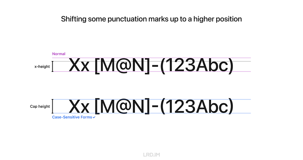
- Shift some punctuation marks up to a higher position;
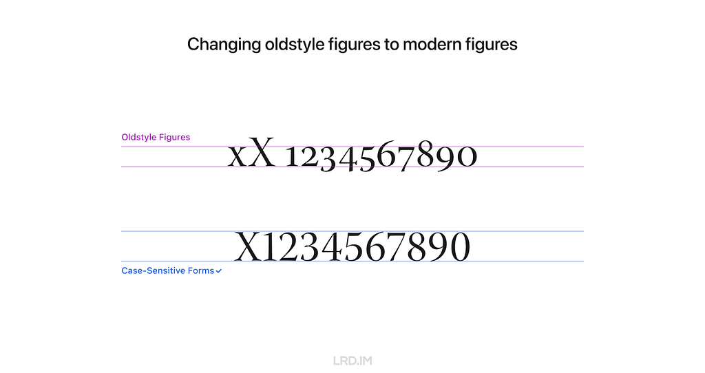
- Change oldstyle figures to modern figures.
Feature 1: Shifting some punctuation marks up to a higher position
In general, punctuation marks are vertically centered with lowercase characters, which is known as “x-height.”
However, when using the Case-Sensitive Forms feature, some punctuation marks are aligned with the height of uppercase characters, which we call “Cap height.”
Feature 2: Changing oldstyle figures to modern figures
Some fonts use oldstyle figures by default to add visual attraction. It is often used in traditional publications like books and newspapers since this font has a rhythmic beauty with varied heights.
When using the Case-Sensitive Forms feature, fonts will be directly changed to modern figures, also known as “lining figures.”
Realistic practices
Inspiring by the feature 1, shifting some punctuation marks up to a higher position, it is well-suited for compositions that mix uppercase characters, figures, and CJK characters.
Here is a list of compositions that might be visually improved by using the Case-Sensitive Forms feature.
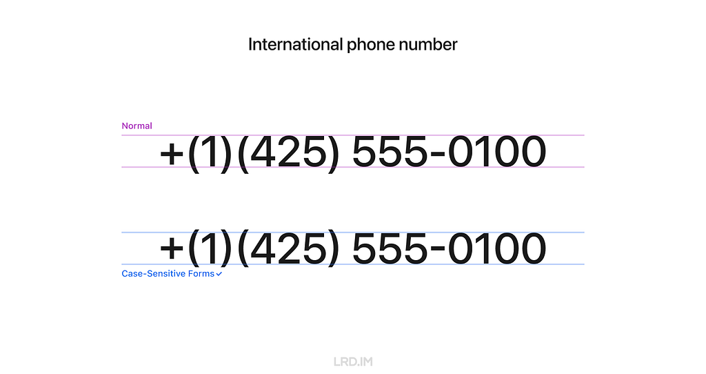
1. International phone number
Because figure glyphs are as high as uppercase characters, the use of Case-Sensitive Forms is ideal for displaying phone numbers that include area codes.
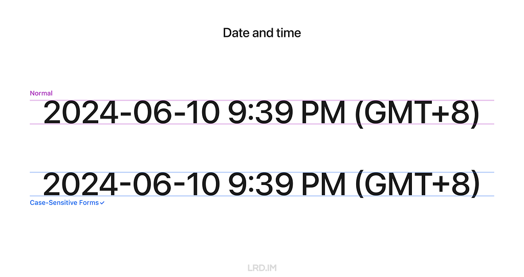
2. Date and time
Similarly, date and time is also well-suited for using the Case-Sensitive Forms feature since they are typically consisted of figures and marks.
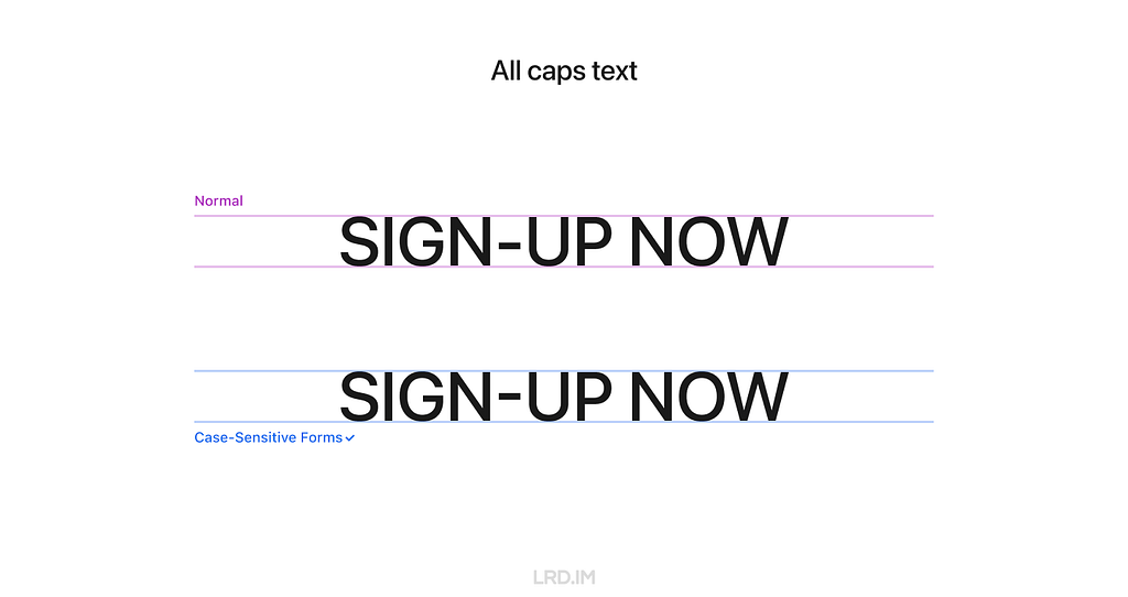
3. All caps text
To make titles or other important information visually prominent, we often capitalize the text, which is also ideal for using the Case-Sensitive Forms feature.
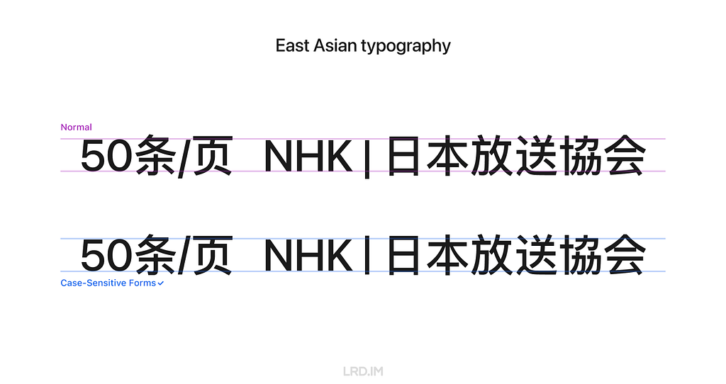
4. East Asian typography
East Asian typography looks like a square, meaning the visual height of Chinese, Japanese, Korean, and Vietnamese characters is similar to the “X” letter’s cap height.
Therefore, the Case-Sensitive Forms feature are also fitting for the East Asian typography scenario, ensuring marks are vertically aligned with the characters.
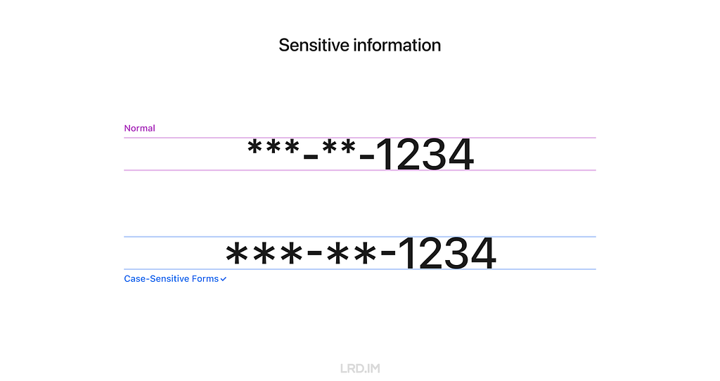
5. Sensitive information
When displaying sensitive information on digital interfaces, such as Social Security Number(SSNs), bank account numbers, and phone numbers, we often use asterisks (*) or dots (•) to partially obscure it. In that case, the Case-Sensitive Forms feature is highly suitable.
6. Text face
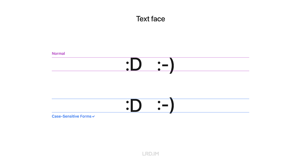
A rare scenario that may be ideal for using the Case-Sensitive Forms feature is text faces, such as “:D” and “:-)”
How to use
1. Supported typefaces
Only typefaces that support the OpenType feature of Case-Sensitive Forms can enable this feature.
It means that not ALL typefaces support this feature, even if we implement this setting in design tools or through coding. I’ve simply made a list to clarify which typefaces support it and which not.
Typefaces that support the Case-Sensitive Forms feature:
- DIN Pro;
- Inter;
- San Francisco (fonts for Apple platforms);
- Inria Sans;
- Warnock Pro…
Typefaces that DO NOT support the Case-Sensitive Forms feature:
- Arial;
- Helvetica;
- Noto Sans;
- Roboto;
- Source Sans;
- Segoe UI…
In other words, the Case-Sensitive Forms feature only works on Apple devices if we use the system default font on our website.
2. Figma
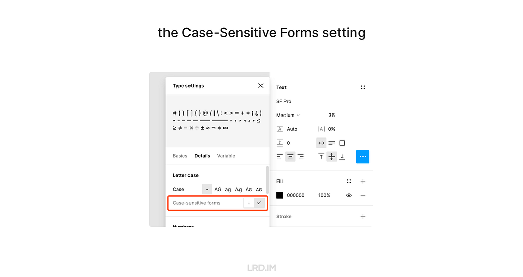
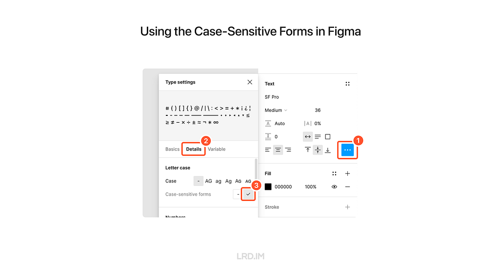
Follow these steps to implement the Case-Sensitive Forms feature in Figma. Select a text layer, then:
- Open the “Type settings” panel;
- Switch to the “Details” tab;
- Check the “Case-sensitive forms” option.
3. CSS
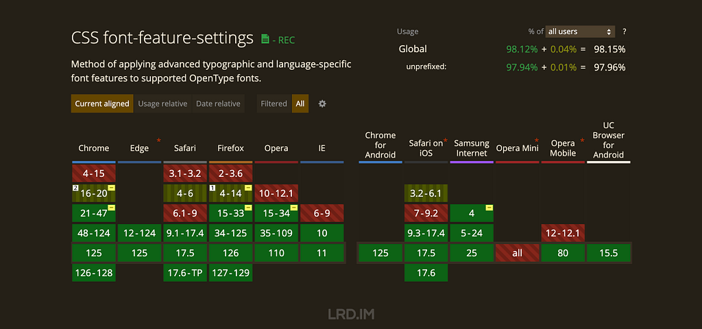
To use the Case-Sensitive Forms feature on the website, we just need to simply add font-feature-settings: ‘case’; to the element that we want to implement this feature.
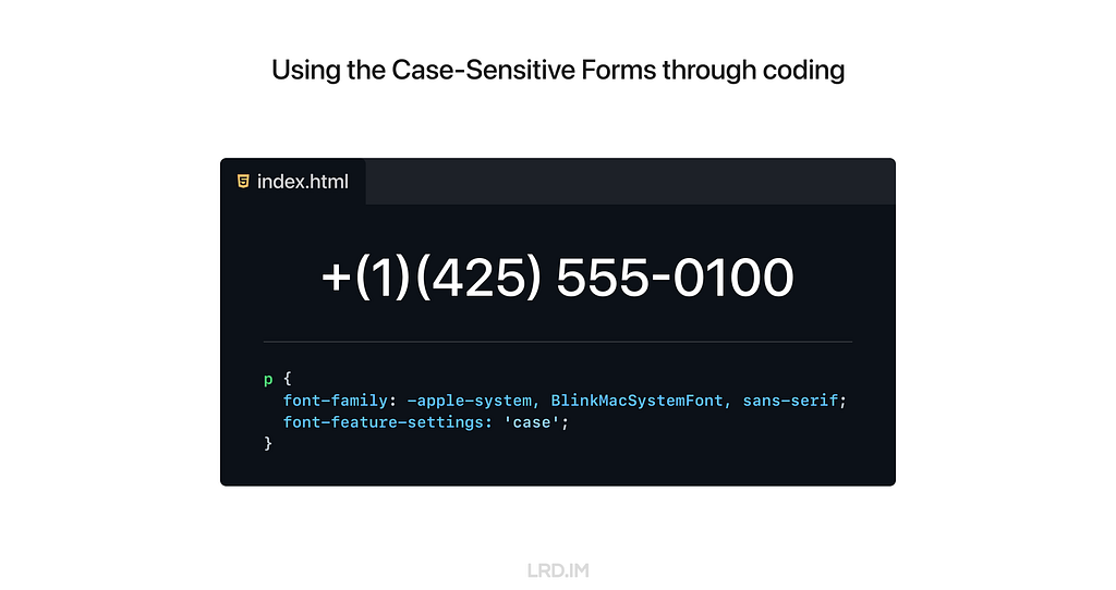
The CSS Compatibility of this style is quite good. Again, we need to ensure the typefaces support the Case-Sensitive Forms feature; otherwise there will be no changes.
Set as default?
We’ve discussed many scenarios and advantages of using the Case-Sensitive Forms feature. So should we set it as the default style?
My answer is NO.
Although it can uplift visual details with numbers and capital text, it is quite awful when used with lowercase letters, which are more commonly used on our website.
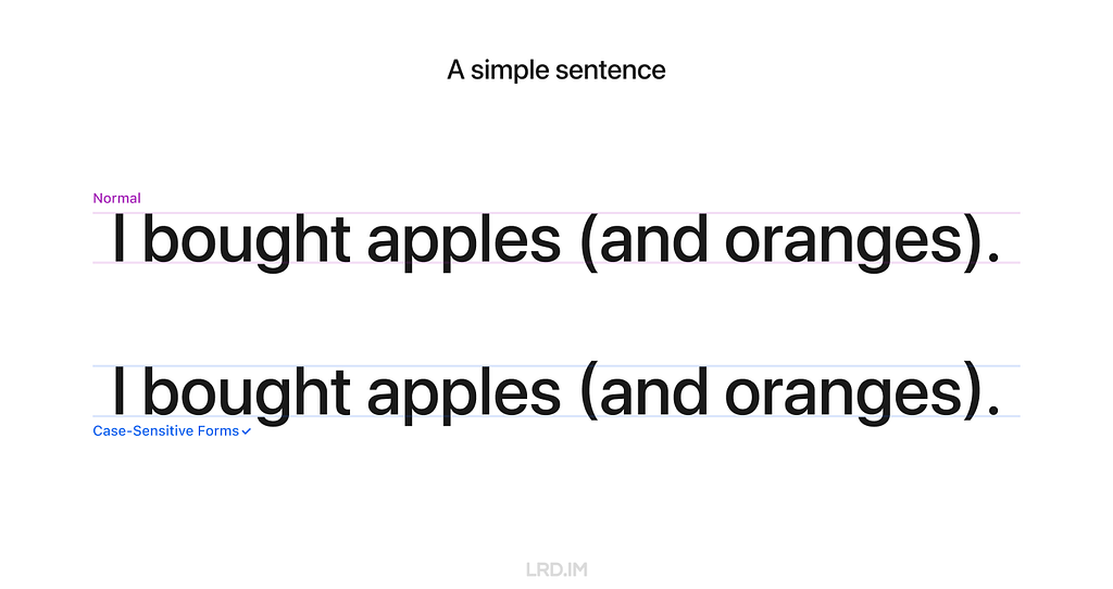
However, we can safely implement the Case-Sensitive Forms feature in some components that always consist of numbers, marks, and capital letters. Here is the list of UI components:
- Avatar;
- Badge;
- Pagination (Image viewer, Swiper and the likes);
- Letter counter.

For comparison, let’s see the most common solution in which the Case-Sensitive Forms feature is not implemented on digital interfaces.
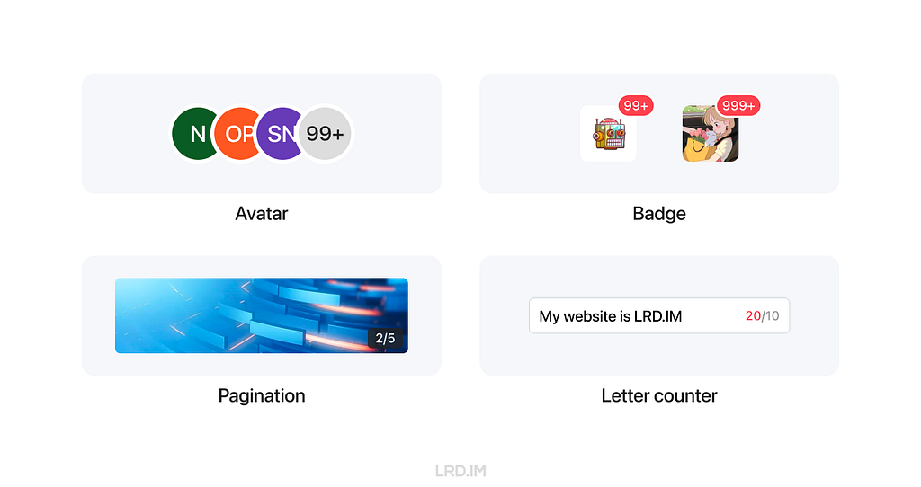
Recently, my team has been redesigning our mobile component library. I’ve suggested using the Case-Sensitive Forms feature on the components listed above. Let’s see the outcomes in the future.
References
Uplifting your design details with the Case-Sensitive Forms feature was originally published in Bootcamp on Medium, where people are continuing the conversation by highlighting and responding to this story.