Reading view

There are new articles available, click to refresh the page.

Reading visual art: 173 Sage

Sage and wise people are harder to distinguish visually, without using the cliché of the white-haired and bearded figure more commonly seen as Father Time. To the Romans, the personification of Wisdom was the goddess Minerva or Athena, whose complex background proved a challenge for painters.

goltziusminerva
Hendrik Goltzius (1558–1617), Minerva (as the Personification of Wisdom) (1611), oil on canvas, 214 × 120 cm, Frans Hals Museum, Haarlem, The Netherlands. Wikimedia Commons.

Hendrik Goltzius shows a classical and fairly complete set of her attributes: the owl, her distinctive helmet here decorated with olive leaves, a spear, books, a writing quill, and great beauty.

Athena may go back to an even earlier Mycenean goddess. In archaic images, she’s often seen with an owl perched on her hand, and there is a suggestion that she may have originally been a bird goddess, nearly two thousand years BCE. Whatever the origins, there’s no doubt that Athena then Minerva were goddesses of wisdom, learning, crafts, and skill, and that they were strongly associated with owls, who became proxies for wisdom and knowledge. Minerva of the Romans also had Etruscan influences that determined her name in the goddess of war Menrva, with origins from an Italic moon goddess of similar name, hence her helmet and spear.

Solon was a key figure in the development of classical Greek civilisation, most significantly for laying down the tables of law for Athens, and best known for his legendary involvement with Croesus, the fabulously rich king whose name endures in English and other languages in the phrase as rich as Croesus.

vandenhoeckecroesusshowingsolon
Gaspar van den Hoecke (fl 1603–1641), Croesus Showing his Treasures to Solon (c 1635), oil on canvas, 131.5 × 191 cm, Muzeum Narodowe w Warszawie, Warsaw, Poland. Wikimedia Commons.

Gaspar van den Hoecke’s Croesus Showing his Treasures to Solon is one of several similar paintings made in about 1635, presumably from a common source; others attributed to Cornelis de Vos and Frans Francken II survive. Here Croesus at the right is showing the bald and bearded Solon one of his treasure chambers. Troops in the background may refer to Croesus’ imminent fate at the hands of Cyrus and his Persian forces.

Accounts of wisdom in the Old Testament are generally focussed on the judgement skills of King Solomon, as displayed when he was called to settle a dispute between two women claiming to be the mother of one baby. Solomon commanded that the infant should be cleaved in two by a sword, leading to the real mother relinquishing her claim to the child, to ensure its survival.

poussinjudgementsolomon
Nicolas Poussin (1594–1665), The Judgment of Solomon (1649), oil on canvas, 101 x 150 cm, Musée du Louvre, Paris. Wikimedia Commons.

Nicolas Poussin’s famous painting of The Judgement of Solomon from 1649 is timed slightly before the sword is raised, and depicts the body language clearly. Solomon’s hands indicate his role as the arbiter, in showing a fair balance between the two sides. The true mother, on the left, holds her left hand up to tell the soldier to stop and spare the infant. Her right hand is extended towards the false mother, indicating that she has asked for the baby to go to her rather than die. The false mother points accusingly at the child, her expression full of hatred. Hands are also raised in the group at the right, suggesting reactions to Solomon’s judgement. Without knowing the story well, though, there are no visual cues to suggest this young king is exceptionally wise.

giorgionejudgementsolomon
Giorgione (1477–1510), Judgment of Solomon (c 1505), oil on panel, 89 x 72 cm, Galleria degli Uffizi, Florence. Wikimedia Commons.

This panel attributed to Giorgione and dated around 1505 mirrors the composition of his Trial of Moses (c 1496-9), to which it might have been a pendant. Solomon is shown in advanced age, thus inherently wise, commanding a courtier who has raised his short sword ready. The two women straddle the midline of the panel, their body language not clear enough to indicate who is the true mother.

More problematic still are visual accounts of the adoration of the Magi, three ‘wise men’ who are drawn by their observations of a comet to pay homage to the infant Jesus. Most take the easy option of depicting them as three kings, and only a few show them as pioneering astronomers.

giottoadorationofmagi
Giotto di Bondone (1266–1337), The Adoration of the Magi (c 1305), fresco, approx 200 x 185 cm, Scrovegni Chapel, Padua. Wikimedia Commons.

Giotto’s frescoes in the Scrovegni Chapel at Padua, Italy, show a more elaborate depiction of The Adoration of the Magi (c 1305). The infant Christ rests on the Virgin Mary’s knee; she was originally clad in her signature ultramarine blue, but that has worn away with the years. Mary is accompanied by Joseph and an angel, and the Holy Family is within a wooden shed. The three Magi pay their respects and present their gifts, accompanied by camels and at least two attendants. The comet that attracted their attention is shown as a fireball crossing the sky.

velazquezadorationmagi
Diego Velázquez (1599–1660), Adoration of the Magi (1619) [10], oil on canvas, 203 x 125 cm, Museo Nacional del Prado, Madrid, Spain. Wikimedia Commons.

Diego Velázquez broke with tradition in his Adoration of the Magi from 1619 in depicting the figures as real humans rather than idealised models. He had to be careful to maintain distinct appearances for those such as Mary and Jesus who are divine, even covering the Virgin’s feet for the sake of propriety. But the other figures here all look to be real, living and breathing people, and the Magi for once aren’t visual clichés.

With the Age of Enlightenment, paintings came to include the most enlightened in more innovative ways, as ‘philosophers’, particularly in the chiaroscuro images of Joseph Wright of Derby.

jwrightorrery
Joseph Wright of Derby (1734–1797), A Philosopher Giving that Lecture on the Orrery, in which a Lamp is Put in Place of the Sun (1766), oil on canvas, 147.3 x 203.2 cm, Derby Museum and Art Gallery, Derby, England. Wikimedia Commons.

In 1766, Wright exhibited one of his most enduring images of the period, A Philosopher Giving that Lecture on the Orrery, in which a Lamp is Put in Place of the Sun. The orrery, a miniature planetarium showing the movements of the planets and their moons, was an impressive high-end Grand Orrery, an expensive device that would undoubtedly have captivated the minds of those able to gaze at it.

There are numerous cues here to different narratives: to Locke’s educational theories with their emphasis on geography, understanding of astronomy, and Newton’s gravitation and mechanics. It has been proposed that the philosopher in the red gown is modelled on Isaac Newton, and the figure at the left taking notes is Wright’s friend Peter Perez Burdett.

In the nineteenth century, wisdom was strongly associated with science and technology, and the equipment used.

sorollasimarromicroscope
Joaquín Sorolla y Bastida (1863–1923), Portrait of Dr. Simarro at the Microscope (1897), oil on canvas, 80 x 100 cm, Universidad Complutense de Madrid, Madrid, Spain. Courtesy of Legado Luis Simarro, via Wikimedia Commons.

Joaquín Sorolla’s Portrait of Dr. Simarro at the Microscope from 1897 shows Doctor Luis Simarro Lacabra (1851-1921), who was an eminent psychiatrist in Madrid, and undertook pioneering research looking at the fine structure of the brain. Among his many achievements was a modification of an established technique for staining microscopic sections of brain, which proved a major advance and an inspiration to the great Spanish neurohistologist Ramon y Cajal. He is shown here with one of the most popular scientific instruments associated with knowledge and wisdom, the microscope.

Few artists have ever gathered as many of the great and wise as Raphael, in his large fresco of The School of Athens, painted between about 1509-10.

raphaelschoolathens
Raphael (1483–1520), The School of Athens (c 1509-10), fresco, 500 x 770 cm, Stanza della Segnatura, Palazzo Vaticano, The Vatican City. Wikimedia Commons.

This wasn’t recognised as depicting eminent Greek philosophers until 1695, with Vasari’s account in his biography of Raphael assuming that it included a group of evangelists, and others claiming the figures are taken from Dante’s Divine Comedy.

This assorted collection of Greek philosophers, with a few extras, are chatting, teaching, and generally loafing about in an impressive building of grand classical style that is probably Raphael’s extended fantasy based on the contemporary architecture of Bramante. Although there’s no coherent narrative, it contains numerous diverting scenes in which the viewer is challenged to recognise the participants.

The central figures are Plato (left), who carries in his left hand a book titled TIMEO, and Aristotle (right), whose book bears the word ETICA. Seen further to the left in profile is Socrates, and below him is Pythagoras, who is writing in a book while a boy holds in front of him a small blackboard showing the theory of harmony.

raphaelschoolathensd1
Raphael (1483–1520), The School of Athens (detail) (c 1509-10), fresco, 500 x 770 cm, Stanza della Segnatura, Palazzo Vaticano, The Vatican City. Wikimedia Commons.

His opposite number on the right is Euclid, who is bent over and holding a pair of compasses in his right hand. Behind him are Ptolemy, who is holding a globe and facing away, and Zoroaster, who holds a celestial sphere with his right hand. One striking figure for which I haven’t seen any plausible identification is the woman behind Pythagoras, who appears to have just walked out of Leonardo da Vinci’s Mona Lisa.

Inside M4 chips: P cores hosting a VM

One common but atypical situation for any M-series chip is running a macOS virtual machine. This article explores how virtual CPU cores are handled on physical cores of an M4 Pro host, and provides further insight into their management, and thread mobility across P core clusters.

Unless otherwise stated, all results here are obtained from a macOS 15.1 Sequoia VM in my free virtualiser Viable, with that VM allocated 5 virtual cores and 16 GB of memory, on a Mac mini M4 Pro running macOS Sequoia 15.1 with 48 GB of memory, 10 P and 4 E cores.

How virtual cores are allocated

All virtualised threads are treated by the host as if they are running at high Quality of Service (QoS), so are preferentially allocated to P cores, even though their original thread may be running at the lowest QoS. This has the side-effect of running virtual background processes considerably quicker than real background threads on the host.

In this case, the VM was given 5 virtual cores so they could all run in a single P cluster on the host. That doesn’t assign 5 physical cores to the VM, but runs VM threads up to a total of 500% active residency across all the P cores in the host. If the VM is assigned more virtual cores than are available in the host’s P cores, then some of its threads will spill over and be run on host E cores, but at the high frequency typical of host threads with high QoS.

Performance

There is a slight performance hit in virtualisation, but it’s surprisingly small compared to other virtualisers. Geekbench 6.3.0 benchmarks for guest and host were:

  • CPU single core VM 3,643, host 3,892
  • CPU multi-core VM 12,454, host 22,706
  • GPU Metal VM 102,282, host 110,960, with the VM as an Apple Paravirtual device.

Some tests are even closer: using my in-core floating point test, 1,000 Mloops run in the VM in 4.7 seconds, and in the host in 4.68 seconds.

Host core allocation

To assess P core allocation on the host, an in-core floating point test was run in the VM. This consisted of 5 threads with sufficient loops to fully occupy the virtual cores for about 20 seconds. In the following charts, I show results from just the first 15 seconds, as representative of the whole.

vmpcoresm4pro0

When viewed by cluster, those threads were mainly loaded first onto the first P cluster (pale blue bars), where they ran for just over 1 second before being moved to the second cluster (red bars). They were then regularly switched between the two P clusters every few seconds throughout the test. Four cycles were completed in this section of the results, with each taking 2.825 seconds, so threads were switched between clusters every 1.4 seconds, the same time as I found when running threads on the host alone, as reported previously.

For most of the 15 seconds shown here, total active residency across both P clusters was pegged at 500%, as allocated to the VM in its 5 virtual cores, with small bursts exceeding that. Thus that 500% represents those virtual cores, and the small bursts are threads from the host. Although the great majority of that 500% was run on the active P cluster, a total of about 30% active residency consisted of other threads from the VM, and ran on the less active P cluster. That probably represents the VM’s macOS background processes and overhead from its folder sharing, networking, and other Virtio device use.

vmpcoresm4pro1

When broken down to individual cores within each cluster, seen in the first above and the second below, total activity differs little across the cores in the active cluster. During its period in the active cluster, each core had an active residency of 80-100%, bringing the cluster total to about 450% while most active.

vmpcoresm4pro2

In case you’re wondering whether this occurs on older Apple silicon, and it’s just a feature of macOS Sequoia, here’s a similar example of a 4-core VM running 3 floating point threads in an M1 Max with macOS 15.1, seen in Activity Monitor’s CPU History window. There’s no movement of threads between clusters.

vmm1maxtest1

P core frequencies

powermetrics, used to obtain this data, provides two types of core frequency information. For each cluster it gives a hardware active frequency, then for each core it gives an individual frequency, which often differs within each cluster. Cores in the active P cluster were typically reported as running at a frequency of 4512 MHz, although the cluster frequency was lower, at about 3858 MHz. For simplicity, cluster frequencies are used here.

vmpcoresm4pro3

This chart shows reported frequencies for the two P clusters in the upper lines. Below them are total cluster active residencies to show which cluster was active during each period.

The active cluster had a steady frequency of just below 3,900 MHz, but when it became the less active one, its frequency varied greatly, from idle at 1,260 MHz up to almost 4,400 MHz, often for very brief periods. This is consistent with the active cluster running the intensive in-core test threads, and the other cluster handling other threads from both the VM and host.

CPU power

Several who have run VMs on notebooks report that they appear to drain the battery quickly. Using the previous results from the host, the floating point test used here would be expected to use a steady 7,000 mW.

vmpcoresm4pro4

This last chart shows the total CPU power use in mW over the same period, again with cluster active residency (here multiplied by 10), added to aid recognition of cluster cycles. This appears to average about 7,500 mW, only 500 mW more than expected when run on the host alone. That shouldn’t result in a noticeable increase in power usage in a notebook.

In the previous article, I remarked on how power used appeared to differ between the two clusters, and this is also reflected in these results. When the second cluster (P1) is active, power use is less, at about 7,100 mW, and it’s higher at about 7,700 when the first cluster (P0) is active. This needs to be confirmed on other M4 Pro chips before it can be interpreted.

Key information

  • macOS guests perform almost as well as the M4 Pro host, although multi-core benchmarks are proportionate to the number of virtual cores allocated to them. In particular, Metal GPU performance is excellent.
  • All threads in a VM are run as if at high QoS, thus preferentially on host P cores. This accelerates low QoS background threads running in the VM.
  • Virtual core allocation includes all VM overhead from the VM, such as its macOS background threads.
  • Guest threads are as mobile as those of the host, and are moved between P clusters every 1.4 seconds.
  • Although threads run in a VM incur a small penalty in additional power use, this shouldn’t be significant for most purposes.
  • Once again, evidence suggests that the first P cluster (P0) in an M4 Pro uses slightly more power than the second (P1). This needs to be confirmed in other systems.
  • powermetrics can’t be used in a VM, not unsurprisingly.

Previous article

Inside M4 chips: P cores

Explainer

Residency is the percentage of time a core is in a specific state. Idle residency is thus the percentage of time that core is idle and not processing instructions. Active residency is the percentage of time it isn’t idle, but is actively processing instructions. Down residency is the percentage of time the core is shut down. All these are independent of the core’s frequency or clock speed.

Apple has just released an update to XProtect for all macOS

Apple has just released an update to XProtect for all supported versions of macOS, bringing it to version 5282. The last version released was 5279. As usual, Apple doesn’t release information about what security issues this update might add or change.

Relative to the last version released for all supported versions of macOS (5279), this version renames several existing rules, as MACOS.DUBROBBER.A to MACOS.DUBROBBER.E, and adds new rules for MACOS.DUBROBBER.F, MACOS.DUBROBBER.G and MACOS.DUBROBBER.H. It also adds a new rule for MACOS.TAILGATOR.

You can check whether this update has been installed by opening System Information via About This Mac, and selecting the Installations item under Software.

A full listing of security data file versions is given by SilentKnight, LockRattler and SystHist for El Capitan to Sequoia available from their product page. If your Mac hasn’t yet installed this update, you can force it using SilentKnight, LockRattler, or at the command line.

If you want to install this as a named update in SilentKnight, its label is XProtectPlistConfigData_10_15-5282.

For Sequoia only: this update has already been made available in iCloud, which now returns an XProtect version of 5282. If you download and install it using Software Update, softwareupdate or SilentKnight, then once that’s complete you need to update the primary XProtect bundle in Terminal using the command
sudo xprotect update
then entering your admin password. If you’re unsure what to do, this article explains it comprehensively and simply.

I have updated the reference pages here which are accessed directly from LockRattler 4.2 and later using its Check blog button.

I maintain lists of the current versions of security data files for Sequoia on this page, for Sonoma on this page, Ventura on this page, Monterey on this page, Big Sur on this page, Catalina on this page, Mojave on this page, High Sierra on this page, Sierra on this page, and El Capitan on this page.

Reading visual art: 172 Fool

Jesters or fools appear to have originated as entertainers in ancient Rome, and were features in many of the royal courts in Europe. Among the most famous are those in the plays of William Shakespeare. In this article, I look at paintings of fools and jesters, and tomorrow those of their intellectual complements, sages and sundry wise persons.

Some of Shakespeare’s fools play significant roles in the plot, of whom the most famous must be Yoric, on whose skull Hamlet gives one of the most memorable speeches in the English language.

calderonyounglordhamlet
Philip Hermogenes Calderon (1833–1898), The Young Lord Hamlet (1868), oil on canvas, 87.6 × 139.7 cm, Private collection. Wikimedia Commons.

This was sufficient for Philip Hermogenes Calderon to paint a speculative scene of The Young Lord Hamlet in 1868, showing the prince long before the start of the play. Set in happier days before the death of Hamlet’s father, its reading is an interesting challenge. If the figure on hands and knees, wearing the standard jester’s rig, is Yoric, then presumably the young boy riding on his back is Hamlet, and the younger infant in the care of the three women on the right might be the young Ophelia.

dagnanbouveretamletgravediggers
Pascal Dagnan-Bouveret (1852–1929), Hamlet and the Gravediggers (1883), oil on canvas, 40 x 33.5 cm, Dahesh Museum of Art, New York, NY. Wikimedia Commons.

Pascal Dagnan-Bouveret shows the famous scene of Hamlet and the Gravediggers (1883) as the prince is about to lament the passing of Yoric to the gravediggers, opening with the words “To be, or not to be…”.

The fool in King Lear has a lesser role, although at least he remains alive and well throughout the play. His most prominent moment is when he accompanies the enraged king out into a tempest.

schefferlearfool
Ary Scheffer (1795-1858), King Lear and the Fool (Act III Scene 2) (1834), watercolour, dimensions not known, Folger Shakespeare Library, Washington, DC. Wikimedia Commons.

Ary Scheffer’s watercolour of King Lear and the Fool from 1834 places the pair on Shakespeare’s bleak heath.

learfoolstorm
William Dyce (1806–1864), King Lear and the Fool in the Storm (c 1851), oil on canvas, 136 × 173 cm, Scottish National Gallery, Edinburgh, Scotland. Wikimedia Commons.

In William Dyce’s King Lear and the Fool in the Storm from about 1851, the king is having a good rant into the wind of the storm, his body language profuse. Resting with his head propped on the heels of his hands, the Fool also looks up to the heavens.

Shakespeare’s other plays feature fools and jesters who sing and entertain, like Touchstone in As You Like It.

waterhousetouchstonejester
John William Waterhouse (1849–1917), Touchstone, The Jester (date not known), watercolour on card, 38.1 x 24.7 cm, Private collection. Wikimedia Commons.

JW Waterhouse painted his portrait in watercolour, in his undated Jester.

maclisewrestling
Daniel Maclise (1806–1870), The Wrestling Scene in ‘As You Like It’ (1854), oil on canvas, 129 x 177.1 cm, location not known. Wikimedia Commons.

Daniel Maclise’s Wrestling Scene in ‘As You Like It’ from 1854 shows the wrestler Charles on the left, as Orlando on the right prepares for their contest. The two daughters, Celia and Rosalind, embrace one another in anxiety, and Touchstone is seated at the front.

Collier, John, 1850-1934; Touchstone and Audrey
John Collier (1850-1934), Touchstone and Audrey (date not known), media and dimensions not known, Southwark Art Collection, London. Wikimedia Commons.

John Collier’s undated painting of Touchstone and Audrey catches the jester in one of his more serious moments, as he woos the simple Audrey.

My last Shakespearean fool appears in Twelfth Night.

deverelltwelfthnight
Walter Deverell (1827–1854), Twelfth Night, Act II, Scene IV (1850), further details not known. Wikimedia Commons.

Walter Deverell’s Twelfth Night, Act II, Scene IV (1850) show Feste the clown singing to Orsino and Viola, disguised as Cesario.

A few non-theatrical fools and jesters also appear in paintings.

chasekeyingup
William Merritt Chase (1849–1916), “Keying Up” – The Court Jester (1875), oil on canvas, 101 × 63.5 cm, Pennsylvania Academy of the Fine Arts, Philadelphia, PA. Wikimedia Commons.

“Keying Up” – The Court Jester was one of William Merritt Chase’s student paintings, made in 1875 when he was studying at the Academy of Fine Arts in Munich, Germany. He sent this back to his sponsors in St. Louis, Missouri, where it went on to win a medal at the Philadelphia Centennial Exhibition that year.

clairinkingsfool
Georges Clairin (1843–1919), The King’s Fool (1880), further details not known. Wikimedia Commons.

Georges Clairin had a reputation of being a socialite, but his King’s Fool from 1880 is unusual and great fun.

Other than the fictional Yoric, few jesters or fools have attained fame. One notable exception to this is Stańczyk, a Polish court jester who lived between about 1480-1560.

sichulskijozefapiłsudskiego
Kazimierz Sichulski (1879–1942), Portrait of Józef Piłsudski with Wernyhora and Stańczyk (1917), pastel on paperboard, 89 x 63 cm, Muzeum Narodowe w Warszawie, Warsaw, Poland. Wikimedia Commons.

In 1917 Kazimierz Sichulski painted this Portrait of Józef Piłsudski with Wernyhora and Stańczyk in pastels. Piłsudski was a major Polish statesman who was to become Chief of State after the First World War. Stańczyk (left) here symbolises Poland’s struggle for independence. Wernyhora (right) is a legendary Cossack bard who apparently told of the fall of Poland and its subsequent rebirth as a great nation. Both Piłsudski and Wernyhora feature in contemporary paintings by Jacek Malczewski.

Migrating to a new Mac, and claiming Time Machine backups

Over the last few years, Migration Manager in macOS has improved considerably, and when used wisely it can save you a great deal of time getting you new Mac up and running. This article explains how you can use it in Sequoia, and how that works with Time Machine and the backups from your old Mac.

There are two occasions when you can transfer your apps, settings and documents using the process of migration: during the initial personalisation and configuration of macOS, or using Migration Assistant at any time later. I always used to postpone that until macOS was set up and brought up to date, but lately I’ve preferred to get this over with first.

This time I faced a more difficult problem: I was replacing my old Mac Studio M1 Max with my new Mac mini M4 Pro, both of which are intended to use my single Studio display. While I could have run one of them headless (without a display connected), Migration Assistant expects both Macs to be used interactively, which would have required some cunning juggling. Instead of opting to connect them back-to-back, I therefore chose to migrate during initial setup from the Studio’s last Time Machine backup. As the backup storage for my Studio was a Thunderbolt 3 external SSD, this proved surprisingly quick.

Migration during setup

Before unboxing your new or previously owned Mac, prepare the source for migration, and any cable required to connect that Mac with the source. Migrating from a backup is here one of the simplest and fastest options, as all you need do is move your old Mac’s external backup storage over to the new Mac.

In the past, migration used the fastest connection available between two Macs that were connected back-to-back, but Apple’s current support note now states that Wi-Fi will be used. In my case, given that both Macs have 10 GbE, that could have been a disappointment if they were already connected by Ethernet cable.

Another important step is ensuring that your new Mac has a keyboard and mouse/trackpad. As I was moving those from my Studio, I connected both to the new Mac mini by their charging leads to ensure they’d work and pair correctly.

Unbox your Mac, connect it up to your migration source, its new keyboard and mouse/trackpad, then start it up. When the setup sequence reaches the Migration Assistant screen, select the migration source.

tmmigrate

If you’re migrating directly from your old Mac, at this point you’ll need to open Migration Assistant on that Mac and set it to migrate to another Mac. Follow the prompts to continue the process.

Migration after setup

Initiate this by running Migration Assistant in /Applications/Utilities, and follow its prompts to select and connect to the source as above.

Time Machine backups

Assuming that your old Mac made Time Machine backups, and you want your new Mac to continue doing so, now’s the time to connect that backup storage, if it wasn’t already used as the migration source. When you do, you’ll be offered two options, to claim the existing backups for the new Mac, or to leave them for the old one.

tmbackupclaim

You should see this dialog if:

  • you have migrated settings from an old Mac to this one,
  • you have migrated settings from a Time Machine backup of another Mac to this one,
  • you cloned the boot volume group used to start up your Mac,
  • your Mac’s logic board has been replaced.

If you claim the existing backups for your new Mac, then they’ll be used as part of its backup history, but you won’t be able to use them with the old Mac. You may prefer to leave those old backups as they are, and gradually delete them to free up space. Provided that you create the new backup volume for your Mac in the same container, old and new backups will share the same free space on your backup storage.

This apparently replaces the old tmutil inheritbackup command, which no longer appears to work with backups to APFS.

Postscript

I am very grateful to Csaba Fitzl for two useful pieces of information:

  • In macOS Sequoia 15.1 at least, tmutil inheritbackup does work again, when entered with the path to the backup volume, e.g. /Volumes/[TMDISK].
  • Claiming old backups is only offered when migration has taken place. If you set up your new Mac without migrating, it doesn’t appear to be offered, although you should then be able to use tmutil inheritbackup instead.

As Nicolai points out in the comments below, Apple’s support note is incorrect about migration only using Wi-Fi connections to another Mac. This should work as it always has, and select the fastest connection between them, which could include back-to-back Thunderbolt.

Changing Paintings: 45 Dryope, Byblis and Iphis

After he has told us of the birth of Hercules, Ovid uses Alcmena’s link with Hercules’ former lover Iole to introduce several obscure stories, starting with the transformation of Dryope.

Iole tells the tale of her sister Dryope, the fairest in all Oechalia. She had been raped by Apollo, then married Andraemon, by whom she had a baby boy. When her son was only one and still at the breast, Dryope and Iole came to a lake, and picked crimson water-lotus flowers to please the infant. They were horrified to see drops of blood on the foliage; these later turned out to be from the nymph Lotis, who had been transformed into that bush after fleeing from Priapus.
As Dryope tried to run away, she found herself literally rooted to the spot as she was transformed into a Lotus Tree, as punishment for picking the lotus flowers. Her distraught husband came and took his son away to be cared for by a nurse.

baurdryope
Johann Wilhelm Baur (1600-1640), Dryope Transformed into a Lotus Tree (c 1639), engraving for Ovid’s Metamorphoses, further details not known. Wikimedia Commons.

Baur’s engraving from about 1639 shows Dryope and Iole distant, at the right. As Dryope transforms into a Lotus Tree, she’s still holding her son, and Iole is praying to the heavens. Presumably the two males in the foreground are Dryope’s husband and a friend.

By the end of Iole’s story, Alcmena is in tears. They are then interrupted by Iolaus, Hercules’ former charioteer who took part in the Calydonian boar hunt, who had just been rejuvenated as a result of the intervention of Hercules, now a god, and Hebe, his heavenly wife.

Ovid briefly mentions the sons of Achelous’ daughter Callirhoe, whose years were advanced by Hebe to allow them to avenge their father’s murder. This in turn resulted in discord among the gods over Iolaus’ rejuvenation. Ovid uses this aside to link to the story of Byblis and Caunus, twins born to Miletus and the beautiful nymph Cyanee, the first of two concerning ‘unnatural love’ concluding book 9 of the Metamorphoses.

Byblis was strongly attracted to her twin brother Caunus. At first this was nothing more than sisterly love, but it grew into something more passionate, if not obsessive, as demonstrated in her long soliloquies. Eventually, Byblis decided the best way ahead was to write to her brother confessing her love for him. She did this on wax tablets, but kept erasing her words, until she eventually arrived at a long and elaborate message, given in full by Ovid, that she signed with her signet ring and despatched to Caunus via a slave.

On starting to read his sister’s message, Caunus flew into a rage, threw the tablets to the ground, and angrily sent the slave back to Byblis, with a clear message that his sister’s proposition was shameful. In another soliloquy, Byblis blamed herself for getting it so badly wrong, saying she shouldn’t have put her feelings in writing, but should have told them orally to her brother. She then pondered whether the slave had made some error, or that her brother had mistaken her true love for him for simple lust.

Becoming more confused and upset all the time, Byblis beat herself, tore her clothing, and ran through the countryside, until she fell on the ground by a forest. The wood nymphs there tried to comfort her, to no avail, as she dissolved in her tears to form a spring.

Despite its sensitive subject of an incestuous relationship, the story of Byblis and Caunus has appeared in a few paintings. In each case, they show Byblis’ transformation into a spring, or rather they provide an opportunity to paint a young nude woman outdoors.

hennerbyblis
Jean-Jacques Henner (1829–1905), Byblis Turning into a Spring (1867), oil on canvas, 88 x 138 cm, Musée des beaux-arts de Dijon, Dijon, France. Wikimedia Commons.

Jean-Jacques Henner includes a spring of sorts, and some garments that have been cast off, not exactly torn, in his Byblis Turning into a Spring (1867).

bouguereaubiblis
William-Adolphe Bouguereau (1825–1905), Biblis (smaller version) (1884), oil on canvas, 48 x 79 cm, Salar Jung Museum, Hyderabad, India. Wikimedia Commons.

This is a smaller version of Bouguereau’s painting of Biblis from 1884, the larger one having been exhibited at the Salon in 1885. His spring is more substantial, but there’s nothing to suggest that this wasn’t just another carefully posed nude.

pointbiblis
Armand Point (1860–1932), Biblis Changed into a Spring (date not known), further details not known. Wikimedia Commons.

This undated account by Armand Point, Biblis Changed into a Spring, reads a little more faithfully to Ovid’s story, but this image of it is too poor to see other potential narrative elements such as the figures in front of the temple at the left.

Ovid then concludes Book 9 of his Metamorphoses with one of his most remarkably insightful tales. I have to keep reminding myself that he wrote this over two thousand years ago, but the issues he considers are thoroughly modern, and his approach to the story of Iphis and Ianthe is sensitive even by current standards.

Ligdus lived in Phaestos in Crete, not far from the great Knossos. Telethusa his wife was pregnant with their first child. They weren’t rich, and as a consequence Ligdus told her that she had to bear him a son, as they couldn’t afford to have a daughter. If she were to give birth to a girl, he said the child would have to die. Telethusa begged her husband to accept a daughter, but he wouldn’t budge.

Late in her pregnancy, Telethusa had a vision of the Egyptian goddess Isis, with attendant deities. Isis told her to keep and rear the baby, whether it was a boy or girl, if necessary by deception. The goddess promised that she would answer her prayers and help in times of need. Telethusa promptly went into labour that morning, and was delivered of a girl. She followed Isis’ instruction and declared the child to be a boy. The couple then raised their daughter as a son named Iphis, a name ambivalent in gender.

Thirteen years later, Ligdus found his son a bride, Ianthe, and their match appeared excellent, each falling in love with the other. Iphis, though, knew that she was a girl, and became upset that because of her gender, their marriage couldn’t happen. She postponed the wedding, delayed it further, but eventually ran out of excuses, and a final date had to be fixed.

The day before their marriage, Telethusa prayed to Isis, with Iphis at her side. As they walked back together, Iphis was transformed into a man who then married Ianthe, and lived happily ever after, remembering to make offerings to Isis in thanks for the remarkable transformation.

As you can imagine, few if any patrons in the past would have commissioned artists to paint this story, although it has been tackled by those illustrating this book of the Metamorphoses.

picartisistelethusa
Bernard Picart (1673-1733), Isis Appears to Telethusa (c 1732), engraving for Ovid’s Metamorphoses, Amsterdam, 1732. Wikimedia Commons.

Bernard Picart’s engraving Isis Appears to Telethusa, from about 1732, dodges the real issues at stake by showing Telethusa’s vision of Isis and her entourage of Egyptian deities.

baurisisiphis
Johann Wilhelm Baur (1600-1640), Isis Changing the Sex of Iphis (c 1639), engraving for Ovid’s Metamorphoses, further details not known. Wikimedia Commons.

Johann Wilhelm Baur was braver in his engraving, showing Isis Changing the Sex of Iphis (c 1639) shortly before the wedding, although his composition keeps well away from any troublesome detail in the figure of Iphis.

godwardianthe1889
John William Godward (1861-1922), Ianthe (1889), oil on canvas, 64 x 29.5 cm, Private collection. The Athenaeum.

One artist who did show an interest in this story is John William Godward, whose own lifestyle demonstrated he wasn’t afraid to shock. Sadly, his two paintings of Ianthe dodge the issues, and are only weakly narrative in any case, although they’re still rather beautiful. Godward’s Ianthe (1889) above simply shows the bride-to-be, and I can see no hint of Ovid’s story.

His undated painting, again of Ianthe below is more elaborate, but I still cannot see any references to the issues or events.

godwardiantheund
John William Godward (1861-1922), Ianthe (date not known), oil, dimensions not known, Private collection. The Athenaeum.

There is another painting which, in recent years, had become associated with the story of Iphis and Ianthe, and on some websites has been re-titled to make it appear to be about this story.

kauffmanndesignlisteningtopoetry
Angelica Kauffmann (1741-1807), The Artist in the Character of Design Listening to the Inspiration of Poetry (1782), oil on canvas, 61.2 cm, Kenwood House, London. Wikimedia Commons.

This is Angelica Kauffmann’s The Artist in the Character of Design Listening to the Inspiration of Poetry (1782), which has been misinterpreted as showing a pre-transformed Iphis embracing Ianthe, as if in a lesbian relationship. As its real title demonstrates, that suggestion would be a travesty of Kauffmann’s intent. I also suspect that George Bowles, for whom she painted it, would have been shocked if someone had suggested that this was actually Iphis and Ianthe.

Perhaps Latin poetry can remain subtle enough for Ovid to get away with such a remarkable story so long ago, whereas the visual explicitness of a painting could never have enjoyed such licence. We could do with more brave paintings now, to challenge some of modern society’s remaining prejudices.

Solutions to Saturday Mac riddles 281

I hope that you enjoyed Saturday’s Mac Riddles, episode 281. Here are my solutions to them.

1: Second major version in 20 years came from the south near Carmel.

Click for a solution

Big Sur

Second major version in 20 years (it was the first increment to the Mac OS version number since Mac OS X 10.0) came from the south (Spanish ‘sur’) near Carmel (Big Sur is a section of rugged coast near Carmel, California).

2: Last stand for 32 is the desert with the valley of death.

Click for a solution

Mojave

Last stand for 32 (it’s the last version of macOS to support 32-bit code) is the desert (it’s one of the major deserts in North America) with the valley of death (it’s where Death Valley is located).

3: Fastest and first of ten sounds like a fraudster.

Click for a solution

Cheetah

Fastest (it’s the fastest land animal) and first of ten (first version of Mac OS X) sounds like a fraudster (a cheater).

The common factor

Click for a solution

They were each prominent versions of Mac OS X and later.

I look forward to your putting alternative cases.

Inside M4 chips: P cores

This is the first in a series diving deeper into Apple’s new M4 family of chips. This starts with details of its Performance (P) cores. Comparisons of their performance against cores in earlier M-series chips will follow separately when I have completed them.

M4 family

There are currently three M4 designs:

  • Base M4, with 4 P and 6 E cores, also available in a cheaper variant with only 4 active E cores, and a ‘binned’ variant for iPads with only 3 active P cores.
  • M4 Pro, with 10 P and 4 E cores, also available in a ‘binned’ variant with only 8 active P cores.
  • M4 Max, with 12 P and 4 E cores, also available in a ‘binned’ variant with only 10 active P cores.

Apple is expected to release an Ultra variant in 2025, consisting of two M4 Max chips connected and working in tandem, providing a total of 24 P and 8 E cores.

Apart from the number of cores in each design, their caches and memory, all P cores are the same, and different from E cores.

P core architecture

All CPU cores are arranged in clusters of up to 6. All cores within any given cluster share L2 cache, and are run at the same frequency (clock speed). The Base M4 has a single cluster of 4 P cores, while the Pro and Max have two clusters of 5 and 6 cores respectively.

Frequency

A prominent feature of both P and E cores is their variable frequency (clock speed). In the case of P cores, this can be set to any of 17 values between the minimum of 1,260 MHz and maximum of 4,512 MHz (1.3-4.5 GHz). When running macOS, cluster frequencies are set by macOS at a kernel level; other operating systems may offer more direct control.

P cores idle at 1,260 MHz, but can also be shut down altogether. Previous M-series chips have been reported by the powermetrics command tool as sometimes being idle at a frequency of 0 MHz, but the M4 is the first to have idle and down states reported separately, for example:
CPU 4 active residency: 0.00%
CPU 4 idle residency: 0.00%
CPU 4 down residency: 100.00%

when that core and its whole cluster are shut down rather than just idling. It’s not clear whether this is merely an administrative change, or M4 cores implement this state differently from previous cores.

Instruction set

There’s confusion over the Instruction Set Architecture (ISA) supported by M4 cores. This is explained in the LLVM source, where it’s claimed that they’re “technically” ARMv9.2-A, but without its Scalable Vector Extension (SVE). Some might consider that’s closer to ARMv8.7-A, one version more recent than the M3’s ARMv8.6-A.

Although this is now fully supported in LLVM clang, it’s not clear how fully it’s supported by Xcode, for example.

Power

When shut down, a P core consumes no power, of course, and at idle with no active residency, it uses only 1-2 mW, according to measurements reported by powermetrics.

Maximum power consumption rises to approximately 1,400 mW when running intensive floating point calculations at 100% active residency, and to approximately 3,230 mW when running NEON vector instructions at 100% active residency.

macOS core allocation

Threads are normally allocated by macOS to an available P core when their designated Quality of Service (QoS) is higher than 9 (Background), for example when using Dispatch, formerly branded Grand Central Dispatch (GCD). Running threads may also be moved periodically between P cores in the same cluster, and between clusters. Previous M-series chips appear to move threads less frequently, and may leave them to run to completion after several seconds on the same core, but threads appear to be considerably more mobile when running on M4 P cores.

VM4core4threadPcoresARes

This bar chart shows 4 threads from 4 virtual CPUs in a VM running for 3 seconds at 100% active residency. For almost all that period, the threads remain running on the 4 physical cores of the first P cluster in this M1 Max, with the second P cluster remaining idle for much of that time.

The following charts show 4 threads of intensive in-core floating point arithmetic running on the P cores of an M4 Pro.

m4threads1clusters

When viewed by cluster, those threads are loaded first onto the second P cluster (red bars), where they run for 0.4 seconds before being moved to the first cluster (pale blue bars). After running there for 1.3 seconds, they’re moved back to the second cluster for a further 1.3 seconds, before completing on the first cluster.

The next two bar charts show each cluster separately, illustrating thread mobility within them.

m4threads2cluster1

When running on the first cluster (above), threads appear to be moved to a different core approximately every 0.3 second, as they do when on the second cluster (below).

m4threads3cluster2

m4threads4frequency

Cluster frequency matches this movement, with each cluster being run up to maximum frequency (shown here averaged across the whole cluster) to process the threads running on its cores. The black line below those for the P clusters shows the small changes in average frequency for the E cluster over this period.

m4threads5power

This last chart shows the total CPU power use in mW over the same period. Of particular interest here is the consistent difference in power use reported by powermetrics between the two P clusters: the first (P0) used a steady 6,000 mW when running these four threads, whereas the second (P1) used slightly less, at 5,700-5,800 mW. That could be the result of measurement error in powermetrics, peculiar to this particular chip, or could reflect an underlying difference between the two clusters.

Thread mobility makes interpreting CPU History in Activity Monitor difficult, as the fastest frequency of sampling available there is every second, while powermetrics was sampling every 0.1 second when gathering the data above. As groups of threads may be moved between clusters every 1.3 seconds or so, this can give the impression that threads are being run on both clusters simultaneously. Once again, great care is needed when interpreting the data shown by Activity Monitor.

Key information

  • Current M4 chips offer 4-12 CPU P cores.
  • M4 P cores are arranged in clusters of up to 6, sharing L2 cache and running at a common frequency.
  • P core clusters can be shut down, idling at their minimum frequency of 1,260 MHz, or at one of 18 set frequencies up to a maximum of 4,512 MHz, as controlled by macOS.
  • Their instruction set is “technically” ARMv9.2-A, but without its Scalable Vector Extension (SVE).
  • They use 1-2 mW when idle, rising to peaks of 1,400 mW (floating point) or 3,230 mW (NEON vector code).
  • macOS preferentially allocates them threads at all QoS higher than 9 (Background).
  • Threads running on M4 P cores are mobile, and may be moved to another core in the same cluster frequently, and after just over a second may be transferred to a core in the other P cluster, when available.
  • Thread mobility makes interpretation of the CPU History window in Activity Monitor very difficult.

Explainer

Residency is the percentage of time a core is in a specific state. Idle residency is thus the percentage of time that core is idle and not processing instructions. Active residency is the percentage of time it isn’t idle, but is actively processing instructions. Down residency is the percentage of time the core is shut down. All these are independent of the core’s frequency or clock speed.

James Tissot’s Anglo-French stories: 2, to England and return

When the French painter James Tissot arrived in London in the summer of 1871, he had just a hundred francs to his name, and had left his reputation behind. He was soon earning more than enough to pay the bills, through his paintings of elegant women in fashionable scenes. He also resumed his narrative series, embarking on his first set in a tavern on the bank of the River Thames in London, probably in Rotherhithe or Wapping.

tissotinterestingstory
James Tissot (1836-1902), An Interesting Story (c 1872), oil on wood panel, 59.7 x 76.6 cm, National Gallery of Victoria, Melbourne, Australia. Wikimedia Commons.

The first of those to be exhibited was An Interesting Story from about 1872, which set the pattern. It’s the late eighteenth century, and an old soldier is telling one (or more) pretty young women interminable and incomprehensible stories about his military career, with the aid of charts spread out on the table. In this case, the word interesting is ironic to everyone except the veteran.

tissottediousstory
James Tissot (1836–1902), The Tedious Story (c 1872), oil on canvas, dimensions not known, Private collection. Wikimedia Commons.

In The Tedious Story (c 1872), there can be no doubt the young woman has drifted off into a world of her own, one far away from the veteran’s charts.

tissotbadnews
James Tissot (1836–1902), Bad News (The Parting) (1872), oil on canvas, 68.6 × 91.4 cm (27 × 36 in), National Museum Cardiff, Cardiff, Wales. Wikimedia Commons.

Tissot moved the exterior location further up-river for his Bad News (The Parting) (1872). The soldier is now young, and has just been recalled to duty, to leave the two young women who appear as heartbroken as he does. In the centre of the painting, a small boat full of uniformed soldiers is in transit, presumably coming to take this soldier away with them. He again returns to the enduring theme of loss and separation.

tissottooearly
James Tissot (1836–1902), Too Early (1873), oil on canvas, 71 × 102 cm, The Guildhall Art Gallery, London. Wikimedia Commons.

In contrast, Too Early (1873) is an insightful social comedy: this group has arrived at the soirée on time, when social convention is always to be late, so you aren’t the first to arrive. The four guests are embarrassed, and don’t know what to do, so they stand prominently in the middle of the empty floor while the hostess prepares the musicians, and the host waits idly at the door.

tissotprodigalsondeparture
James Tissot (1836-1902), The Prodigal Son in Modern Life: The Departure (c 1882), oil on canvas, dimensions not known, Private collection. Wikimedia Commons.

The first of the four paintings in his series The Prodigal Son in Modern Life, The Departure (c 1882) is set in another of his favourite waterside haunts along the Thames. The windows are now grimy, and the light filtered through the smoke of the city. Father, an elderly man, sits giving his younger son advice, having filled that son’s wallet with his share of inheritance. Bags are already packed and ready to go, and under the table a kitten seems to be leaving its litter too. Behind the younger son, one petal has fallen from the vase of nasturtiums. To the left, the older son stares with disappointed disinterest out towards the river. A sister (or perhaps the older brother’s wife) looks up from her sewing towards father and son.

The next two paintings take the younger son out to Japan, for clear allusions to immoral conduct, then to the prodigal son’s return on board a ship carrying pigs and cattle.

tissotprodigalsonfattedcalf
James Tissot (1836–1902), The Prodigal Son in Modern Life: The Fatted Calf (c 1882), oil on canvas, dimensions not known, Private collection. Wikimedia Commons.

The final painting, The Fatted Calf (c 1882), shows the prodigal son sharpening a knife for carving the roast joint of meat concealed under the silver platter on the table. The older brother has just climbed up from a boat on the river, where his friends remain, and is arguing with their father as to why his younger brother should be welcomed back with a ‘fatted calf’. There are other cues carefully placed in this painting: climbing on the trellis are nasturtiums, the flowers securely clustered together again. The mother strokes a dog, a symbol of fidelity, and the prodigal son appears to have gained a pretty female partner too.

This series was first exhibited as the centrepiece of his one-man exhibition in the Dudley Gallery, London, in 1882. He finally won a gold medal for it at the Exposition Universelle in Paris in 1889.

In the middle of the 1870s, Tissot had begun an intimate relationship with his Irish model, Kathleen Newton. She was a divorcee with a family of her own, but his Catholic faith was a barrier to their marriage. She developed tuberculosis in about 1880, and died in his arms in late 1882. He moved back to Paris, where he painted his largest series yet, fifteen canvases on the theme of the Woman of Paris.

tissotwomenofsport
James Tissot (1836-1902), Women of Sport (The Amateur Circus) (1883-5), oil on canvas, 147.3 x 101.6 cm, The Museum of Fine Arts, Boston, MA. Wikimedia Commons.

Women of Sport (The Amateur Circus) from 1883-5 must be among the strangest of this set, here showing many ‘modern women’ being entertained by scantily clad male trapeze artists.

In 1885, Tissot re-discovered his Catholic faith, and embarked on the most ambitious project of his career, to paint the whole of the life of Jesus Christ in more than 350 gouache paintings. This coincided with some experiments with the spirit world, and efforts to contact his dead partner.

Over the next decade, Tissot travelled to research locations and details of the period, and started this enormous task. In the spring of 1894, 270 of his paintings were exhibited in Paris to massive public acclaim. This show visited London in 1896, and toured America in 1898. The whole series of 350 paintings was then published, first in Paris then overseas, in a series of editions lasting until 1910. Critical views were mixed at best, but this was the greatest commercial success of Tissot’s career.

tissotjesusupmountainpray
James Tissot (1836-1902), Jesus Goes Up Alone onto a Mountain to Pray (1886-1894), opaque watercolor over graphite on gray wove paper, 28.9 × 15.9 cm, Brooklyn Museum, New York, NY. Courtesy of Brooklyn Museum, via Wikimedia Commons.

Despite the sheer effort and quantity involved, many of his images are innovative and artistic rather than being simply illustrative. Above is his account of Jesus Goes Up Alone onto a Mountain to Pray, and below is his provocative view of What Our Lord Saw from the Cross. His originals are now in the Brooklyn Museum in New York.

tissotlordsawfromcross
James Tissot (1836-1902), What Our Lord Saw from the Cross (1886-1894), opaque watercolor over graphite on gray-green wove paper, 24.8 × 23 cm, Brooklyn Museum, New York, NY. Courtesy of Brooklyn Museum, via Wikimedia Commons.

In his final years, Tissot worked on a series showing scenes from the Old Testament, of which he had completed almost a hundred when he died suddenly in 1902. Within a year, his paintings had collapsed in value, and by the 1920s he had been largely forgotten.

References

Wikipedia.

English translation of Tissot’ book, fully illustrated: volume 1, volume 2.

Dolkart JF (ed) (2009) James Tissot, the Life of Christ, Brooklyn Museum and Merrell. ISBN 978 1 8589 4496 8.
Marshall NR & Warner M (1999) James Tissot, Victorian Life / Modern Love, Yale UP. ISBN 978 0 300 08173 2.
Wood C (1986) Tissot, Weidenfeld and Nicolson. ISBN 978 0 297 79475 2.

Last Week on My Mac: Mac mini M4 Pro first impressions, cores and more

My Mac mini M4 Pro arrived four days early, and swiftly exceeded all expectations. Everyone who has seen this new design remarks on how tiny it is, and I still keep looking at it, wondering how the smallest Mac I have ever owned is also by far the fastest. For those who collect numbers, it matched the growing collection in Geekbench’s database, with a single-core score of 3,892, a multi-core of 22,706, and Metal GPU of 110,960. Of course those new MacBook Pros with M4 Max chips are doing better with their extra two CPU cores and twice the number of GPU cores, but second best is still far superior to anything I’ve run before.

Not only is this my fastest Mac ever, but it was also the quickest and simplest to commission. It replaces my Mac Studio M1 Max, and now sits under my Studio Display using the Studio’s old keyboard and trackpad. As I’ll explain in a future article, I opted to migrate to the mini during initial setup using the Studio’s backup SSD, a sleek OWC Envoy Pro SX connected by Thunderbolt 3. Including the inevitable macOS update, the whole process took less than two hours, from the start of unboxing to the first full Time Machine backup.

With 48 GB memory and an internal SSD of 2 TB, I was keen to benchmark that once its initial backup was done. Although I have reduced confidence in these figures, there’s no doubt that this SSD is significantly quicker than the 2 TB in the Studio; how much quicker is open to debate. AmorphousDiskMark reported a write speed of 7.7 GB/s, while my own Stibium gave 10.3 GB/s across a broad range of file sizes. There was closer agreement on read speed, at around 6.8 GB/s. Both of those are comfortably above what I expect when I can finally get hold of an external Thunderbolt 5 SSD.

CPU cores

My M4 Pro is the full-performance variant, with 10 P and 4 E cores, set in three clusters: an E cluster with all four E cores, and two clusters of five P cores. Since its M3 chips, Apple has increased the maximum number of cores in a cluster from 4 (in M1 and M2 chips) to 6 (M3 and M4).

M4 P cores run at frequencies between 1260 and 4512 MHz (1.3-4.5 GHz), their maximum frequency being 111% that of the M3 P core, and 140% that of the M1 P core. M4 E cores have a narrower range of frequencies than those in the M3, between 1020-2592 MHz (1.0-2.6 GHz), so running at 137% of M3 frequency when running low QoS threads, and 94% of M3 when running at maximum frequency for high QoS threads spilt over from P cores. Those are going to make comparisons between E core performance very interesting indeed.

Single-thread and single-core comparisons of P core throughput are inevitably in the M4’s favour, with significantly better performance across integer, floating point and vector performance, as shown in the chart below.

M4M3multiTests

The Y axis here gives loop throughput per second for my four basic in-core performance tests, a tight assembly code integer math loop, another tight assembly code loop of floating point math, NEON vector processor assembly code, and a tight loop calling an Accelerate routine run in the NEON unit. Pale blue bars are results for the M1, purple for the M3, and red for the shiny new M4.

Although improvements in integer and floating point performance might appear small here, these results are for single threads. When scaled up across more P cores, the differences are magnified, as shown in the regressions below.

M4vM3floatTimevThreads

This plots total times taken to execute multiple threads, each consisting of 10^9 (one thousand million, or one billion) loops of floating point assembly code, against the number of threads, the same as the number of cores used, as each core runs one thread. According to the fitted linear regression equations, each thread/core of 10^9 loops takes the same period: 6.04 seconds for the M3 P cores, and 4.69 for the M4. Those equate to 1.66 x 10^8 loops/second per thread for the M3, and 2.13 x 10^8 for the M4. On that basis, the M4 performs at 128% that of the M3, significantly better than expected by the 111% increase in maximum core frequency. That requires the M4 to have improved processing speed for the same frequency of the M3, a frequency-independent improvement.

Core allocation

One striking difference between M4 CPU cores and those of previous Apple silicon chips is their pattern of core allocation, something you may notice even in Activity Monitor, for all its faults. This is best illustrated in its CPU History window.

For these two series of tests, I waited until the Mac was idling quietly, with little happening on its CPU cores. I then ran, in rapid succession, a series of my in-core floating point tests of 10^9 loops at high QoS, starting with a single thread, then two, and so on up to six or eight threads. This results in a pattern distinct from anything you’ll see in Intel cores, as I have shown here since the early days of the M1.

m3profloptcompo

This is the series seen on my MacBook Pro M3 Pro running macOS 15.2 beta, and is typical of M1, M2 and M3 chips. Although the cores are out of order here, these are the six cores in the chip’s single P cluster. At the left is the obvious peak from 1 thread running on Core 9, then the 2 threads of the next test appear on cores 9 and 12. Three fully occupy 7, 9 and 12, with a little spilt onto 8, and so on until all six are fully occupied with 6 threads.

Activity Monitor is a little too crude to see how distinct this is, for which you have to resort to shorter sampling periods of 0.1 second, and the finer detail of active residency reported by powermetrics. Those confirm that, much of the time, these heavy in-core compute loads run in a single thread on a single core, and if they are moved around, it’s relatively infrequently. E cores are different, though.

Compare that with a similar sequence, this time for 1-8 threads, on the M4 Pro. Its ten P cores are divided into two clusters, which I’ve separated here with the blue line, although within each cluster the cores aren’t in numeric order.

m4profloptcompo

Reading again from the left, a single thread is run in cores 6 and 8, with a little in 14 in the second cluster. Two threads are run in all five cores of the second cluster, with a little at the end from those of the first cluster. Three threads are similar, with significant contributions from all ten cores, and from then on they are similar.

So, in the M4 P cores threads are no longer allocated to single cores, and it appears from the CPU History window that they may even be allocated across more than one cluster. In fact, when the detailed active residency and frequency data from powermetrics are used, while threads are often moved between two cores in the same cluster, macOS will normally avoid unnecessarily running threads on other clusters, although it will happily move all threads from one cluster to another.

The rationale behind running all threads within the same cluster is clear, as CPU core frequencies of all cores in the same cluster are the same. Constraining threads to a single cluster thus allows others to idle and use less energy. While that continues in M4 chips, it isn’t clear why threads are moved between cores so frequently, or moved together to another cluster, and whether that brings improvements in performance.

James Tissot’s Anglo-French stories: 1, France

If you want to see fine paintings, visit more provincial galleries. While they don’t have many van Goghs, Rembrandts or Vermeers, you will have the chance to see some of the best paintings by artists whose work isn’t as overvalued. This weekend I look at a small selection of narrative works by the Anglo-French artist James Tissot, a contemporary of the Impressionists. Since his death in 1902, his work initially fell into deep disfavour, but in the late twentieth century became more popular again.

Jacques Joseph Tissot was born in the busy port of Nantes, in the north-west of France, in 1836. His father was a prosperous draper there, dealing daily with women’s fashions and apparel. The young Tissot resolved to become a painter when he was seventeen, but it took a further three years before he could persuade his family to allow him to study in Paris. He had also become an Anglophile, and adopted the name of James at about that time.

In Paris, he first stayed with a family friend, the painter Élie Delaunay (1828-1891), and studied under Hippolyte Flandrin briefly, and for several years under Louis Lamothe, both former pupils of JAD Ingres. Although Lamothe’s work is now forgotten, he also taught Edgar Degas, and ensured Tissot’s technical brilliance. The young Tissot also became friends with Whistler, Degas, and Manet. His first successful submission to the Salon was in 1859, when he was fascinated by the Middle Ages.

tissotdanceofdeath
James Tissot (1836–1902), The Dance of Death (Way of Flowers, Way of Tears) (1860), oil on canvas, 37.2 x 122.4 cm, Rhode Island School of Design, Providence, RI. Wikimedia Commons.

His Dance of Death or the Way of Flowers, Way of Tears was among his paintings exhibited at the Salon in 1860, and one of that series based on the Middle Ages.

At this time, he started a series of scenes based on Goethe’s Faust. In this he was influenced by another largely forgotten painter, the Belgian Baron Henri Leys (1815-1869). Tissot loved this historical romanticism, which was also becoming popular in the work of Delaroche, Gérôme, Ingres, and the Pre-Raphaelite Brotherhood in Britain.

tissotfaustmargarethe
James Tissot (1836–1902), Faust Meets Marguerite (study) (c 1860), oil on canvas, 15.5 x 22 cm, location not known. Wikimedia Commons.

The best-known painting of the introduction of Gretchen into Goethe’s play is that by James Tissot in the Musée d’Orsay. I haven’t been able to locate an image of that work, Faust Meets Marguerite, from 1860, but above is his signed study for it.

tissotfaustmargueritegarden
James Tissot (1836-1902), Faust and Marguerite in the Garden (1861), oil on canvas, dimensions not known, Musée d’Orsay, Paris. Wikimedia Commons.

He continued with this carefully executed view of Faust and Marguerite in the Garden (1861), shown here in its finished version, also in the Musée d’Orsay. The couple are sat talking together on a bench, still quite distant, with Gretchen looking intently at a daisy she’s holding.

tissotmargueriteinchurch
James Tissot (1836–1902), Marguerite in Church (c 1861), oil on canvas, 50.2 × 75.5 cm, National Gallery of Ireland, Dublin. Wikimedia Commons.

This scene from Act 4 of Faust, Marguerite in Church (c 1861) shows her cast in the role of the penitent Magdalene, a theme that Tissot was to revisit in his later paintings of the life of Christ. Two innocent children kneel in front of a shrine, praying in the normal and obvious manner. Marguerite’s inner turmoil cannot bring her any closer to that shrine, or even to break herself out of her posture of dejection, eyes cast down, hands apart rather than held together in prayer. Above her is a painting of the Last Judgement, anticipating her own fate in Act 5.

tissoteturnprodigalson
James Tissot (1836-1902), The Return of the Prodigal Son (1862), oil on canvas, dimensions not known, location not known. Wikimedia Commons.

Tissot’s explorations of Faust reached their climax in about 1861, and he next painted a series of much-admired works based on the theme of the prodigal son. These are derived from the parable related by Jesus, told in the Gospel of Luke chapter 15 verses 11-32. This shows the scene most popular among artists of all ages, The Return of the Prodigal Son (1862).

tissotriflerange
James Tissot (1836-1902), At the Rifle Range (1869), oil on canvas, 67.3 x 47.6 cm, Private collection. Wikimedia Commons.

He then abandoned formal narrative painting and started to paint scenes from modern life. By the end of the 1860s, though, life in Paris was clearly changing for the worse, when he painted this young woman practising her skills with firearms At the Rifle Range (1869).

Tissot’s life changed dramatically with the Franco-Prussian War that followed in 1870. He served in the National Guard in the defence of Paris, following which he may have become involved in the Commune, perhaps to protect his own property. When the Commune was suppressed, Tissot fled to London, where he arrived in June 1871 with just a hundred francs to his name.

tissotfarewell
James Tissot (1836–1902), The Farewells (1871), oil on canvas, 100.3 x 62 cm, Bristol Museums and Art Gallery, Bristol, England. Wikimedia Commons.

Tissot painted The Farewells soon after his flight to London that summer. This couple, separated by the iron rails of a closed gate, are in late eighteenth century dress. The man stares intently at the woman, his gloved left hand resting on the spikes along the top of the gate, and his ungloved right hand grasps her left. She plays idly with her clothing with her other hand, and looks down, towards their hands.

Reading her clothing, she is plainly dressed, implying she was a governess, perhaps. A pair of scissors suspended by string on her left side would fit with that, and they’re also symbols of the parting taking place. This is reinforced by the autumn season, and dead leaves at the lower edge of the canvas. However, there is some hope if the floral symbols are accurate: ivy in the lower left is indicative of fidelity and marriage, while holly at the right invokes hope and passion.

In tomorrow’s article, I will show how his art flourished in England.

References

Wikipedia.

English translation of Tissot’s Life of Christ, fully illustrated: volume 1, volume 2.

Dolkart JF (ed) (2009) James Tissot, the Life of Christ, Brooklyn Museum and Merrell. ISBN 978 1 8589 4496 8.
Marshall NR & Warner M (1999) James Tissot, Victorian Life / Modern Love, Yale UP. ISBN 978 0 300 08173 2.
Wood C (1986) Tissot, Weidenfeld and Nicolson. ISBN 978 0 297 79475 2.

Saturday Mac riddles 281

Here are this weekend’s Mac riddles to entertain you through family time, shopping and recreation.

1: Second major version in 20 years came from the south near Carmel.

2: Last stand for 32 is the desert with the valley of death.

3: Fastest and first of ten sounds like a fraudster.

To help you cross-check your solutions, or confuse you further, there’s a common factor between them.

I’ll post my solutions first thing on Monday morning.

Please don’t post your solutions as comments here: it spoils it for others.

A brief history of privacy protection on Macs

For the first 15 years of Classic Mac OS, right up to Mac OS 9 in 1999, Macs remained fundamentally single-user, and privacy wasn’t an issue of much concern. In those halcyon years of desktop publishing and HyperCard, users were more excited by opening information up than keeping it private, and the internet was in its infancy. It was Mac OS 9 that first integrated multiple user accounts and started to secure information using keychains.

Mac OS X brought the first full multi-user operating system to the Mac, but as internet connections became increasingly common and lasting, little attention was paid to privacy. By 2011, the Privacy tab in Security & Privacy, then in System Preferences, contained just three items: Location Services, Contacts, and Diagnostics & Usage. While privacy features developed elsewhere, for the sake of simplicity I’ll here focus on that pane in System Preferences, and its successor in System Settings.

sierraprivacy2

Four years later, in OS X 10.10 Yosemite (2015) and still in 10.12 Sierra (2017), those three items had grown to eight, with the addition of Calendars, Reminders, Accessibility, and two social media platforms, Twitter and Facebook.

Then at WWDC in 2018, Apple revealed its new privacy architecture, putting it at the forefront in macOS 10.14 Mojave, and eventually reversing the order to Privacy & Security.

mojaveprivacy02

Mojave protected information in the following 15 categories:

  • Location Services,
  • Contacts (address books),
  • Calendars,
  • Reminders,
  • Photos (Photos libraries),
  • Mail,
  • Messages,
  • Safari browsing history,
  • HTTP cookies,
  • Call history (iOS),
  • Time Machine backups,
  • iTunes backups,
  • camera input,
  • audio input through the built-in microphone,
  • automation (AppleScript and others).

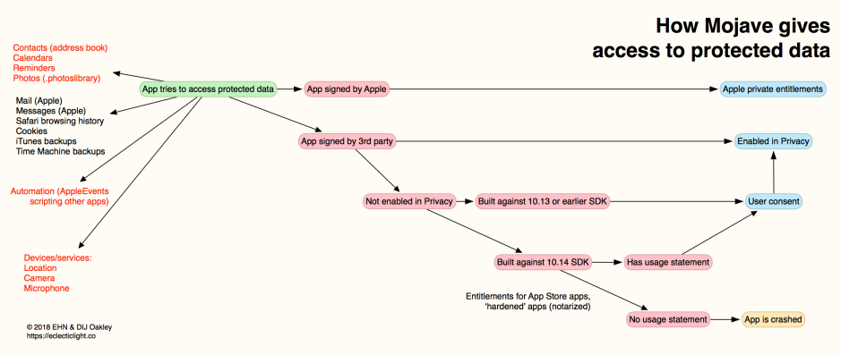
Its new protection system was dubbed TCC, for Transparency Consent and Control, and has since become prominent in the nightmares of developers, those who support Macs and many who use them. At its worst, it crashes apps that don’t comply with its rules, as shown in the diagram below for macOS 10.14.

MojavePrivacy1

Various classes of protected data are shown at the left, those in red being covered explicitly in Privacy controls. The first step was to determine whether the app trying to access protected data was signed by Apple: if it was, access was determined by private controls, and sometimes regular controls as well.

Apps developed by third parties were checked to see whether they already had access to that particular class of protected data according to Privacy settings. If they had, access was then granted without further dialogs. Note that the effect of adding an app to the Full Disk Access list was to give it access to all protected data, but not services or hardware, without any further consent being sought.

If they hadn’t already been given access, the next check was to see which version of the SDK they were built against. If they were built against 10.13 or earlier, then Mojave didn’t expect them to have support such as usage information, so it should have displayed a dialog inviting consent to the requested access. That would normally only contain the standard text information.

moprivprobs02

If consent was given, then that app was added to the appropriate class in Privacy settings; if it was declined, then it was denied access, but wasn’t put on any blacklist, so consent could still be given on another occasion.

If the app was built against the 10.14 SDK, then stricter rules were applied. It was then required to have a usage statement for the class of data it was trying to access, where that was in the class-specific list at the top, or a protected device or service. If the app didn’t provide the appropriate usage statement, TCC considered the request to access protected data was unintended, and crashed the app as an ‘unexpected quit’.

If the app did contain a usage statement appropriate for that class of protected data, then Mojave displayed the consent dialog, this time containing the text from that usage statement as well. If consent was then given, the app would be added to the list in Privacy.

Since Mojave, TCC has been a fertile source of vulnerabilities for third-party researchers to discover, and the malicious to exploit. Three were reported shortly after the initial release of 10.14. Two, discovered by Patrick Wardle and Jeff Johnson, weren’t disclosed, to allow Apple to address them, and the third, in ssh, wasn’t so much a vulnerability as a feature that could be exploited.

Each successive major version of macOS has added further to that list from Mojave. Catalina (10.15, 2019) added new locations that required user intent or consent to access, including:

  • ~/Desktop, widely used for active documents
  • ~/Documents, main document storage
  • ~/Downloads, the default location for downloaded files
  • iCloud Drive, now widely used for shared working documents
  • third-party cloud storage, if used
  • removable volumes
  • network volumes.

privacy43

This is one of the late Security & Privacy panes from macOS Catalina in 2019.

By the time that macOS 13 Ventura was released in 2022, its shiny new Privacy & Security section in System Settings listed 20 categories. Some, like Full Disk Access and Files and Folders, overlapped, while others like Accessibility appeared to have been misnamed. Controls provided varied between different categories, and many users dreaded having to tinker with them.

tcc01

At this rate of growth, Privacy will soon have its own app alongside System Settings.

Interiors by design: Studios, history and light

The revival of paintings of interiors in the middle of the nineteenth century flourished in several ways. For some, it was an opportunity to reveal their studio, and perhaps provide the viewer with a little insight into the artist. For others it was a way to recreate interiors of the past, or to deliver open-ended narrative.

stevenspaintermodel
Alfred Stevens (1823–1906), The Painter and His Model (1855), oil on canvas, 92.4 x 77.3 cm, Walters Art Museum, Baltimore, MD. Wikimedia Commons.

The Painter and His Model (1855) shows one of Alfred Stevens’ young and fashionable models leaning over his shoulder, as he works on her portrait.

stevensthepsyche
Alfred Stevens (1823–1906), The Psyché (My Studio) (c 1871), oil on panel, 73.7 x 59.1 cm, Princeton University Art Museum, Princeton, NJ. Wikimedia Commons.

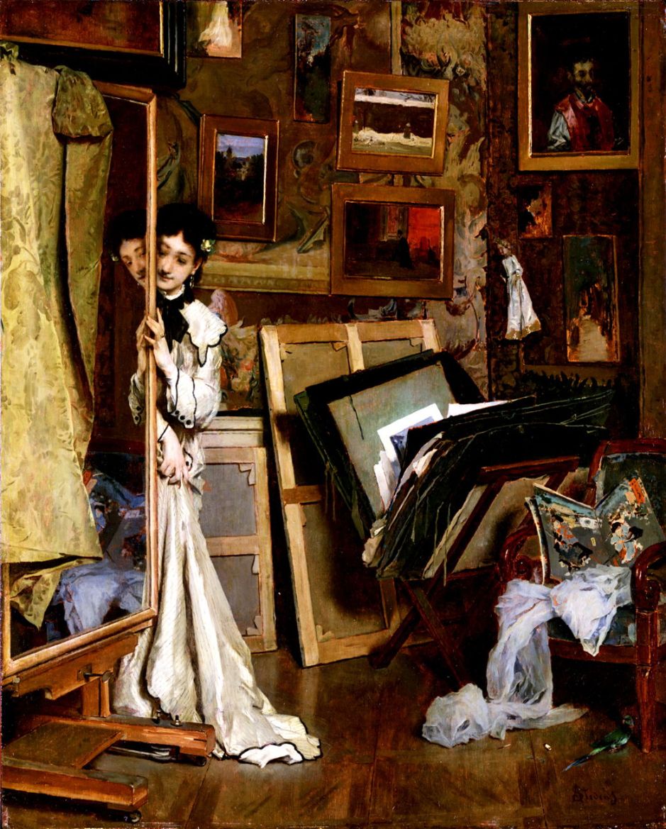
Stevens was an early enthusiast for the Japonisme that swept Paris. Insights into his life such as his The Psyché (My Studio) (c 1871) repay closer reading. The French word psyché refers to the full-length mirror seen in this apparently informal view of Stevens’ studio, the name deriving from the legend of Cupid and Psyche.

For this painting, Stevens doesn’t actually use a proper psyché, but has mounted a large mirror on his easel, perhaps to suggest that art is a reflection of life. A Japanese silk garment is draped over the mirror to limit its view to the model, breaking up her form in an unnatural way. At the lower right, the artist indicates his presence with a cigarette, and there is a small parrot who might imitate his speech. The studio is littered with Japanese prints and the artist’s canvases, and one painting on the wall is a study for his early What They Call Vagrancy, lacking most of its figures.

fredericstudiointerior
Léon Frédéric (1856–1940), Studio Interior (1882), media and dimensions not known, Museum of Ixelles, Ixelles, Belgium. Image by Sailko, via Wikimedia Commons.

Léon Frédéric’s extraordinary Studio Interior from 1882 appears to be a fantasy self-portrait of the artist naked with a skeleton on his lap. The latter has been dressed up in undergarments with a long starry veil over them. His palette and brushes are at the lower right, and his clothes, including a top hat, are draped on chairs.

almatademasundaymorning
Lawrence Alma-Tadema (1836–1912), Sunday Morning (c 1871), oil on wood, 40 x 33 cm, The Tate Gallery (Bequeathed by R.H. Prance 1920), London. © The Tate Gallery and Photographic Rights © Tate (2016), CC-BY-NC-ND 3.0 (Unported), http://www.tate.org.uk/art/artworks/alma-tadema-sunday-morning-n03527

Lawrence Alma-Tadema’s Sunday Morning from about 1871 goes back to the interior of a house in the Netherlands in the seventeenth century. The mistress of the house has just had a baby, and her midwife is holding that baby as she looks out into the daylight. This is a smaller version of a previous painting by Alma-Tadema titled A Birth Chamber, Seventeenth Century (1868), that extended the view to include the mother in bed.

tenkatemusicroom
Herman Frederik Carel ten Kate (1822–1891), The Music Room (1871), oil on panel, 65.3 x 98 cm, location not known. Wikimedia Commons.

The Music Room, painted by Herman Frederik Carel ten Kate in 1871 using oils, shows the fine quality of his conservative oil paintings. It’s worth bearing in mind that at this time the French Impressionists had already established their very different style, and this work is more typical of paintings from a century earlier. While this music room features a couple singing to the accompaniment of the piano, and there are musical instruments in the centre foreground, everyone else in the room is engaged in decidedly non-musical activities.

tissotinterestingstory
James Tissot (1836-1902), An Interesting Story (c 1872), oil on wood panel, 59.7 x 76.6 cm, National Gallery of Victoria, Melbourne, Australia. Wikimedia Commons.

In 1872, James Tissot embarked on a series of paintings and engravings set in a tavern on the bank of the River Thames in London, probably in Rotherhithe or Wapping. The first to be exhibited was his An Interesting Story (c 1872). It’s the late 1700s, and an old soldier is telling one or more pretty young women interminable and incomprehensible stories about his military career, with the aid of charts spread out on the table. Here, the story is dubbed ‘interesting’ in irony.

degascottonoffice
Edgar Degas (1834–1917), A Cotton Office in New Orleans (1873), oil on canvas, 74 × 92 cm, Musée des beaux-arts de Pau, Pau, France. Wikimedia Commons.

Edgar Degas painted A Cotton Office in New Orleans in 1873, when he visited his mother’s family in New Orleans. It features several family portraits, and has a narrative background, showing a cotton buyer visiting the Musson cotton merchants. The elderly gentleman wearing a top hat, in the foreground, is Michel Musson, Degas’ uncle, and a partner in the business. Edgar Degas’ brothers Achille and René are slightly further back on the left (leaning idly against the open window), and sat reading a newspaper, respectively. Standing at the desk on the right is John Lavaudais, the cashier. The figures echo and repeat one another across and into the depths of the room, in dress, posture, and appearance.

While almost everyone else in the painting is lounging around, business is being transacted between the buyer and broker on either side of the table covered with the cotton, the broker being at the centre of the canvas. This small pool of commerce within an image dominated by idleness and dolce far niente reflects the situation of Degas and his family at the time.

johnsonnotathome
Eastman Johnson (1824–1906), Not at Home (c 1873), oil on laminated paperboard, 67.1 x 56.7 cm, Brooklyn Museum, New York, NY. Wikimedia Commons.

At about the same time in New York, the American genre artist Eastman Johnson painted a narrative work that only makes any sense when you know its title of Not at Home (c 1873), showing the interior of the artist’s home. Without those three words of the title, all you see is a well-lit and empty parlour, and the presumed mistress of the house starting up the stairs, in relative gloom in the foreground. At the right is a child’s push-chair, parked up and empty.

Those three words, of course, are the classic excuse offered in someone’s absence – “I am sorry, but the Mistress is not at home” – even when they are very much at home, but simply don’t want to see the visitor. So the title could imply that the woman is ascending the stairs in order not to see visitors. Or, if we know that this is the artist’s home, could it be that it’s Johnson himself who’s not at home?

beroudstaircaseopera
Louis Béroud (1852–1930), The Staircase of the Opéra Garnier (1877), media and dimensions not known, Musée Carnavalet, Paris. Wikimedia Commons.

Interiors don’t have to be domestic, as demonstrated by Louis Béroud’s early Staircase of the Opéra Garnier from 1877.

At about this time, Nordic artists started to realise the potential of interiors as explorations of light, led by the work of Harriet Backer.

backerfarewell
Harriet Backer (1845–1932), Avskjeden (The Farewell) (1878), oil on canvas, 81.5 x 89 cm, Nasjonalgalleriet, Oslo. Wikimedia Commons.

Avskjeden (The Farewell) (1878) was probably Backer’s first really successful painting. It shows a grown daughter, left of centre, bidding farewell to her family as she leaves home. Backer probably painted this from her own emotional experience, as her father died in 1877, and she had informed her mother that she didn’t intend returning home, but to pursue her painting career instead.

backersolitude
Harriet Backer (1845–1932), Solitude (c 1880), media and dimensions not known, Private collection. The Athenaeum.

When she travelled to France, her style began to loosen up: another early success was her Solitude (c 1880), her first painting accepted for the Salon in 1880. This was one of her first interiors featuring limited light, whose play was to become a dominant theme in her art.

backerblueinterior
Harriet Backer (1845–1932), Blue Interior (1883), oil on canvas, 84 x 66 cm, Nasjonalgalleriet, Oslo. Wikimedia Commons.

Backer’s Blue Interiør from 1883 develops the theme of the play of light from the window on the person and contents of the interior of the room. Here the composition is complicated by the presence of a large mirror at the left.

Why % CPU in Activity Monitor isn’t what you think

One of the most frequently quoted measurements in Activity Monitor is % CPU. When the fans blow, or a Mac becomes sluggish, it’s often the first figure to look at and wonder why that process is pulling over 100%. That’s the first thing you learn: here, per cent doesn’t mean out of 100, but the sum of the real percentage for each core. As this Mac has eight cores, that allows it up to 800%, until you realise that Intel processors can use Hyper-Threading to pretend that each is two cores, making a maximum of 1,600%, not bad for a single processor. Then you come completely unstuck with Apple silicon.

Apple defines % CPU as “the percentage of CPU capability that’s being used”, a phrase that doesn’t appear to have any definition either in Apple’s documentation or elsewhere. So like everyone else, you assume that 100% for a core represents its maximum processing capacity. Only you couldn’t be more incorrect: in truth, the number given as % CPU is nothing like that.

Tests

To examine this more clearly, I have an app that runs tight loops of assembly code to load CPU cores on Apple silicon chips and measure their performance. For this, I got it to run several threads, each consisting of 500 million loops of floating point calculations. By running those at different Quality of Service (QoS) settings, macOS will send them to different core types.

When I run two threads at low QoS so they’re run only on E cores of a MacBook Pro M3 Pro, each takes 10.2 seconds to complete. If I instead run eight threads at high QoS, the first six of those will be run on the P cores, but the remaining two spill over onto two of the E cores, where they complete in just 3.0 seconds each.

Yet, according to % CPU in Activity Monitor, the two threads on the E cores come to 200%, and the two from eight run in the second test also come to 200%. You can see this in the CPU History window.

m3activitymon

Here are the 6 E cores at the top, and 6 P cores below. ① marks the first test on two E cores, and shows the total of 200% spread across all six E cores over the 10.2 seconds it took to complete. ② marks the second test, with all 6 P cores and two E cores hitting 100% each, for a total of 800%, as shown in Activity Monitor’s window.

By now I’m sure you guessing how running the same code on the E cores could vary in speed by a factor of 3.4 (10.2 against 3.0 seconds) although they’re the same % CPU: that measurement doesn’t take into account core frequency.

Frequency

Unlike traditional Intel CPUs, CPU cores in Apple silicon chips can be run at a wide range of frequencies, as set by macOS. To make this frequency control a bit simpler, cores are grouped into clusters, that also share L2 cache, and within each cluster all cores run at the same frequency. The M3 Pro chip consists of two clusters, one of 6 E cores, the other of 6 P cores.

When macOS loads two of those E cores with low QoS threads, it sets them to run at a low frequency to make the most of their energy efficiency. When it loads two E cores with threads that were intended to be run on P cores, as they have a high QoS, it runs the E cluster up to high frequency, so they perform better.

Measuring frequency of CPU cores is straightforward using the powermetrics command tool. When those threads were being run on E cores at low QoS, frequency was held at their minimum of 744 MHz, but run at high QoS their frequency was set to maximum, at 2748 MHz, 3.7 times faster. If full load at maximum frequency is 100% of their capability, then at low QoS they were really running at 27%, not the 100% given by Activity Monitor, and that largely accounts for the difference in time that those threads took to complete their floating point calculations.

What is % CPU?

What Activity Monitor actually shows as % CPU or “percentage of CPU capability that’s being used” is what’s better known as active residency of each core, that’s the percentage of processor cycles that aren’t idle, but actively processing threads owned by a given process. But it doesn’t take into account the frequency or clock speed of the core at that time, nor the difference in core throughput between P and E cores.

The next time that you open Activity Monitor on an Apple silicon Mac, to look at % CPU figures, bear in mind that while those numbers aren’t completely meaningless, they don’t mean what you might think, and what’s shown as 100% could be anything between 27-100%.

Commemorating the centenary of the death of Hans Thoma: 2, from 1886

One century ago today, 7 November 1924, the German painter Hans Thoma died in Karlsruhe, Germany. This is the second of two articles commemorating his life and art. Prior to 1886, he had struggled to get the critical attention and patronage that he thought his work deserved.

thomaapollomarsyas
Hans Thoma (1839–1924), Apollo and Marsyas (1886), oil on panel, 45 × 55 cm, location not known. Wikimedia Commons.

Apollo and Marsyas (1886) is his painting of the grisly myth of the contest between the god Apollo and the satyr Marsyas, playing the aulos, a type of double oboe commonly referred to as a flute. This was judged by the nine Muses, and resulted in the horrific flaying of the satyr, a popular motif for the great classical narrative painters. Thoma chooses to show the contest itself, with Marsyas playing, and only three of the Muses in the background. Although not a strongly narrative painting, as it makes no reference to the outcome, this was probably appreciated by contemporary viewers.

thomaeightdancingwomen
Hans Thoma (1839–1924), Eight Dancing Women with Bird Bodies (1886), oil on panel, 38 × 58.5 cm, location not known. Wikimedia Commons.

Eight Dancing Women with Bird Bodies (1886) is a more puzzling mythological painting. The best-known women with bird bodies were the sirens, who range in number from two to five. In another painting showing the sirens trying to lure a passing ship, Thoma paints similar figures, suggesting these are intended to be sirens.

thomaheavyshower
Hans Thoma (1839–1924), The Sower (1886), oil on canvas, 60.5 × 73 cm, location not known. Wikimedia Commons.

The Sower in Thoma’s 1886 painting is strongly reminiscent of Jean-François Millet’s sowers, here at work in the ploughed field in the foreground. Beyond, the heavens have opened in a sudden downpour.

thomamemoriesumbria
Hans Thoma (1839–1924), Memories of Orte or Travel Memories to Orte in Umbria (1887), oil on cardboard, 51.5 × 71.5 cm, Neue Pinakothek, Munich, Germany. Wikimedia Commons.

Memories of Orte from 1887 refers to Thoma’s second visit to Italy, and this ancient town about forty miles north of Rome. Two cloaked riders are silhouetted against the glowing buildings of Orte, perched on its tuff butte above the valley of the River Tiber.

thomalonelyride
Hans Thoma (1839–1924), Lonely Ride (1889), oil on canvas, 74.1 × 62.4 cm, Städelsches Kunstinstitut und Städtische Galerie, Frankfurt, Germany. Wikimedia Commons.

Lonely Ride (1889) shows a mediaeval knight riding alone in full armour, through rolling, hilly countryside. This and others of his paintings suggest Thoma may have seen and been influenced by paintings of the Pre-Raphaelite movement when he visited Britain.

In 1890, Thoma’s career was transformed by his first one-man show in Munich, which brought him critical acclaim and national recognition. For the next twenty years or so, he was ranked among the leading artists in Germany.

thomasummerkarlsruhe
Hans Thoma (1839–1924), Summer (Landscape near Karlsruhe) (1891), oil on canvas, 71.1 × 88.9 cm, North Carolina Museum of Art, Raleigh, NC. Wikimedia Commons.

Summer (Landscape near Karlsruhe) (1891) shows a fine summer’s afternoon on a country track, on the plain which he must have known well.

thomawondrousbirds
Hans Thoma (1839–1924), Wondrous Birds (1892), oil on cardboard, 92.4 × 74 cm, North Carolina Museum of Art, Raleigh, NC. Wikimedia Commons.

He returned to his idiosyncratic mythology with this fascinating painting of Wondrous Birds completed in 1892. The birds shown here aren’t storks or cranes, but are based on the grey heron, a common sight across much of the countryside of Europe. There are various myths and legends associated with storks and cranes, but I’m not aware of any for the heron.

thomaspring
Hans Thoma (1839–1924), Spring (1895), oil on canvas, 113 × 87.6 cm, Los Angeles County Museum of Art, Los Angeles, CA. Wikimedia Commons.

Spring (1895) refers not to the season, but to the source of water shown here, in German, Die Quelle, the source). Thoma avoids the conventional classical treatment with an old river god, but shows a young man slaking his thirst. The woman with the lute could perhaps be a water nymph, or Naiad.

thomaspringfairytale
Hans Thoma (1839–1924), Spring Fairytale, An Allegory (1898), oil on canvas, 120 × 75 cm, location not known. Wikimedia Commons.

Thoma does refer to the season in his Spring Fairytale, An Allegory (1898), showing a woman who may have been influenced by the figure of Flora in Botticelli’s famous Primavera (c 1482). She is surrounded by meadow flowers, two small fawns, and sundry winged putti. Thoma seldom if ever depicted his putti with bird-like wings, but seems to have preferred the more unusual insect or butterfly wings, with their rich colours.

By 1899, Thoma had become associated with the Kronberg artists’ colony, and could afford to move his family into an apartment with its own studio near to the Schloss Friedrichshof in Kronberg im Taunus, outside Frankfurt. He was appointed professor at the academy in Karlsruhe (to the south of Frankfurt), and director of the Kunsthalle in that city, posts he held until he retired in 1920.

thomaselfportrait
Hans Thoma (1839–1924), Self-portrait in Front of a Birch Grove (1899), oil on canvas, 91 × 75.5 cm, Städelsches Kunstinstitut und Städtische Galerie, Frankfurt, Germany. Wikimedia Commons.

Thoma’s Self-portrait in Front of a Birch Grove (1899) is his best-known self-portrait, and probably marked his sixtieth birthday that year.

thomalauterbrunner
Hans Thoma (1839–1924), The Lauterbrunnen Valley (1904), oil on canvas, 130 × 110 cm, location not known. Wikimedia Commons.

The Lauterbrunnen Valley (1904) shows one of the deepest valleys in the Swiss Alps, a gorge travelling five miles up to the spectacular Staubbach Falls, with the Eiger and other peaks beyond.

From 1905 to 1918, Thoma served in the upper chamber of the Baden State Parliament.

thomawar
Hans Thoma (1839–1924), War (1907), oil on canvas, 72 × 64 cm, Städelsches Kunstinstitut und Städtische Galerie, Frankfurt, Germany. Wikimedia Commons.

Prior to the First World War, like many German artists of the day including Lovis Corinth, Thoma was strongly supportive of the militarisation of Germany. His painting of War from 1907 thus seems strange, with its bleak apocalyptic vision.

thomaspringmelody
Hans Thoma (1839–1924), Spring Melody (1914), oil on canvas, 101 × 76 cm, location not known. Wikimedia Commons.

In the year that war broke out, Thoma painted Spring Melody (1914), which could be interpreted as an idealistic longing for peace, rather than a statement of nationalism.

thomalandscape
Hans Thoma (1839–1924), Landscape (1917), oil on cardboard, 80.3 × 100.3 cm, North Carolina Museum of Art, Raleigh, NC. Wikimedia Commons.

Thoma continued to paint through the war, and completed this Landscape in 1917. Then in his late seventies, this almost deserted view expresses a tranquillity that must have been wishful thinking at the time.

His eightieth birthday in 1919 was marked by a celebration organised by Ernst Oppler and Lovis Corinth. He died five years later, in 1924.

Reference

Wikipedia (in German).

Which M4 chip and model?

In the light of recent news, you might now be wondering whether you can afford to wait until next year in the hope that Apple then releases the M4 Mac of your dreams. To help guide you in your decision-making, this article explains what chip options are available in this month’s new M4 models, and how to choose between them.

CPU core types

Intel CPUs in modern Macs have several cores, all of them identical. Whether your Mac is running a background task like indexing for Spotlight, or running code for a time-critical user task, code is run across any of the available cores. In an Apple silicon chip like those in the M4 family, background tasks are normally constrained to efficiency (E) cores, leaving the performance (P) cores for your apps and other pressing user tasks. This brings significant energy economy for background tasks, and keeps your Mac more responsive to your demands.

Some tasks are normally constrained to run only on E cores. These include scheduled background tasks like Spotlight indexing, Time Machine backups, and some encoding of media. Game Mode is perhaps a more surprising E core user, as explained below.

Most user tasks are run preferentially on P cores, when they’re available. When there are more high-priority threads to be run than there are available P cores, then macOS will normally send them to be run on E cores instead. This also applies to threads running a Virtual Machine (VM) using lightweight virtualisation, whose threads will be preferentially scheduled on P cores when they’re available, even when code being run in the VM would normally be allocated to E cores.

macOS also controls the clock speed or frequency of cores. For background tasks running on E cores, their frequency is normally held relatively low, for best energy efficiency. When high-priority threads overspill onto E cores, they’re normally run at higher frequency, which is less energy-efficient but brings their performance closer to that of a P core. macOS goes to great lengths to schedule threads and control core frequencies to strike the best balance between energy efficiency and performance.

Unfortunately, it’s normally hard to see effects of frequency in apps like Activity Monitor. Its CPU % figures only show the percentage of cycles that are used for processing, and make no allowance for core frequency. It will therefore show a background thread running at low frequency but 100%, the same as a thread overspilt from P cores running at the maximum frequency of that E core. So when you see Spotlight indexing apparently taking 200% of CPU % on your Mac’s E cores, that might only be a small fraction of their maximum capacity if they were running at maximum frequency.

There are no differences between chips in the M4 family when it comes to each type of CPU core: each P core in a Base variant is the same as each in an M4 Pro or Max, with the same maximum frequency, and the same applies to E cores. macOS also allocates threads to different types of core using the same rules, and their frequencies are controlled the same as well. What differs between them is the number of each type of core, ranging from 4 P and 4 E in the 8-core variant of the Base M4, up to 12 P and 4 E in the 16-core variant of the M4 Max. Thus, their single-core benchmark results should be almost identical, although their multi-core results should vary according to the number of cores.

Game Mode

This mode is an exception to normal CPU and GPU core use, as it:

  • gives preferential access to the E cores,
  • gives highest priority access to the GPU,
  • uses low-latency Bluetooth modes for input controllers and audio output.

However, my previous testing didn’t demonstrate that apps running in Game Mode were given exclusive access to E cores. But for gamers, it now appears that the more E cores, the better.

GPU cores

These are also used for tasks other than graphics, such as some of the more demanding calculations required for Machine Learning and AI. However, experience so far with Writing Tools in Sequoia 15.1 is that macOS currently offloads their heavy lifting to be run off-device in one of Apple’s dedicated servers. Although having plenty of GPU cores might well be valuable for non-graphics purposes in the future, for now there seems little advantage for many.

Thunderbolt 5

M4 Pro and Max, but not Base variants, come equipped with Thunderbolt ports that not only support Thunderbolt 3 and 4, but 5, as well as USB4. Thunderbolt 5 should effectively double the speed of connected TB5 SSDs, but to see that benefit, you’ll need to buy a TB5 SSD. Not only are they more expensive than TB3/4 models, but at present I know of only one range that’s due to ship this year. There will also be other peripherals with TB5 support, including at least one dock and one hub, although neither is available yet. The only TB5 accessories that are already available are cables, and even they are expensive.

TB5 also brings increased video bandwidth and support for DisplayPort 2.1, although even the M4 Max can’t make full use of that. If you’re looking to drive a combination of high-res displays, consult Apple’s Tech Specs carefully, as they’re complicated.

Although TB5 will become increasingly important over the next few years, TB3/4 and USB4 are far from dead yet and are supported by all M4 models.

Which M4 chip?

The table below summarises key figures for each of the variants in the M4 family that have now been released. It’s likely that next year Apple will release an Ultra, consisting of two M4 Max chips joined in tandem, in case you feel the burning desire for 24 P and 8 E cores.

m4configs2

Models available next week featuring each M4 chip are shown with green rectangles at the right.

There are two variants of the Base M4, one with 4P + 4E and 8 GPU cores, the same as Base variants in M1 to M3 families. There’s also the more capable variant, for the first time with 4P + 6E, which promises to be a better all-rounder, and when in Game Mode. It also has an extra couple of GPU cores.

The M4 Pro also comes in two variants, this time differing in the number of P cores, 8 or 10, and GPU cores, 16 or 20. Those overlap with the M4 Max, with 10 or 12 P cores and 32 or 40 GPU cores. Thus the gap between M4 Pro and Max isn’t as great as in the M3, with the GPUs in the M4 Max being aimed more at those working with high-res video, for instance. For more general use, there’s little difference between the 14-core Pro and Max.

Memory and storage

Chips in the M4 family also determine the maximum memory and internal SSD capacity. Apple has at last eliminated base models with only 8 GB of memory, and all now start with at least 16 GB. Base M4 chips are limited to a maximum of 32 GB, while the M4 Pro can go up to 64 GB, and the 16-core Max up to 128 GB, although in its 14-core variant, the Max is only available with 36 GB (I’m very grateful to Thomas for pointing this out below).

Unfortunately, Apple hasn’t increased the minimum size of internal SSD, which remains at 256 GB for some base models. Smaller SSDs may be cheaper, but they are also likely to have shorter lives, as under heavy use their small number of blocks will be erased for reuse more frequently. That may shorten their life expectancy to much less than the normal period of up to 10 years, as was seen in some of the first M1 models. This is more likely to occur when swap space is regularly used for virtual memory. I for one would have preferred 512 GB as a starting point.

While Base M4 chips come with SSDs up to 2 TB in size, both Pro and Max can be supplied with internal SSDs of up to 8 TB.

I hope this proves useful in guiding your decision.

The Real Country: Potatoes

One important staple crop has been largely forgotten from both agricultural and rural history: the humble potato. First imported from South America to Europe in the latter half of the sixteenth century, for the first couple of centuries it was considered exotic eating. It quietly became increasingly important during the eighteenth century, and is now widely credited as the food that enabled the population boom in much of Europe in the nineteenth century.

For several years from 1845, a fungus-like organism late blight caused widespread crop failure in the poorer parts of Ireland, Scotland and elsewhere, causing the Great Irish Famine, with at least a million dying from starvation.

The potato is unusual for storing large amounts of starch in its tuber. Although starch is only about one fifth of the potato by weight, the remainder being water, it came be the staple food for much of the working population, in both country and city. Overton has calculated using estimated crop yields from the early nineteenth century that an acre of potatoes would have provided about 2.5 times as many calories as an acre of wheat.

Like wheat, growing potatoes is a process of amplification. Tubers from the previous crop are sown in the ground, and multiply to yield many times the weight originally sown. Production is thus not dependent on conventional seed, but on seed potatoes with a more limited life. If a whole crop is destroyed by blight, not only is there nothing to eat that year, but the seed potatoes for the following year are also lost. Blight remains in the soil, and once affected that land has to be used for crops other than potatoes.

However, potatoes had other advantages in a war-torn and taxed Europe. While troops rampaging in foreign countryside would often raid or burn fields of grain, damaging or stealing potatoes proved more resistant to invaders. They were also likely to escape taxes or charges levied on other arable crops.

During the eighteenth century, labourers fortunate enough to have a little land they could farm for themselves started to grow potatoes, to supplement their limited diet. Small potato patches sprung up in the countryside, and around towns. Production at scale remained unusual until the following century, when some English counties including Lancashire and Middlesex devoted significant areas to supply the growing cities. That in turn depended on transport such as canals and then railways to deliver sacks of potatoes to urban consumers.

vangoghpotatoes
Vincent van Gogh (1853–1890), Still Life with Potatoes (September 1885), oil on canvas, 47 x 57 cm, Museum Boijmans Van Beuningen, Rotterdam, The Netherlands. Wikimedia Commons.

When Vincent van Gogh was living in Borinage in Belgium, he was among labourers whose staple food was potatoes, in one of the areas that had grown them for longer than most. His Still Life with Potatoes, painted in September 1885, is his tribute to the humble vegetable.

Potato production was painted extensively by social realists including Jean-François Millet, in the middle of the nineteenth century.

milletpotatoplanters
Jean-François Millet (1814–1875), Potato Planters (c 1861), oil on canvas, 82.5 x 101.3 cm, Museum of Fine Arts Boston, Boston, MA. Wikimedia Commons.

Millet shows this back-breaking work in his Potato Planters from about 1861.

milletpotatoharvestwalters
Jean-François Millet (1814–1875), The Potato Harvest (1855), oil on canvas, 54 x 65.2 cm, Walters Art Museum, Baltimore, MD. Wikimedia Commons.

The Potato Harvest from 1855 is another more substantial work developed from Millet’s drawings. In the foreground, a man and woman are working together to fill sacks with the harvested potatoes, to be loaded onto the wagon behind them. The other four work as a team to lift the potatoes using forks and transfer them into wicker baskets, a gruelling task. Although the fields in the left distance are lit by sunshine, the dark scud-clouds of a heavy shower fill the sky at the right. Being poor, none of the workers has any wet-weather gear. The soil is also poor, full of stones, and yields would have been low despite the full sacks shown at the right.

milletangelus
Jean-François Millet (1814–1875), L’Angélus (The Angelus) (1857-59), oil on canvas, 55 x 66 cm, Musée d’Orsay, Paris. Wikimedia Commons.

Millet’s most famous single work, The Angelus, was completed around 1857-59. This had been commissioned by the American collector Thomas Gold Appleton, as Prayer for the Potato Crop, but underwent modification before Millet renamed it. At some stage, it’s thought to have included a child’s coffin, but that was overpainted.

It shows a couple, praying the Angelus devotion normally said at six o’clock in the evening, over the potatoes they have been harvesting. It’s dusk, and as the last light of the day fades in the sky, the bell in the distant church is ringing to mark the end of work, and the start of the evening. Next to the man is the fork he has been using to lift potatoes from the poor, stony soil; his wife has been collecting them in a wicker basket, now resting at her feet. Behind them is a basic wheelbarrow with a couple of sacks of potatoes on it, ready to be taken home.

blepageoctober
Jules Bastien-Lepage (1848–1884), October: Potato Gatherers (1878), oil on canvas, 180.7 x 196 cm, National Gallery of Victoria, Melbourne. Wikimedia Commons.

Twenty years later, Jules Bastien-Lepage painted what’s now sometimes known as October or Potato Gatherers (1878), but was originally shown as October: Potato Gatherers.

vangoghpotatoharvest
Vincent van Gogh (1853–1890), Woman Lifting Potatoes (1885), oil on canvas, dimensions not known, Van Gogh Museum, Amsterdam. Wikimedia Commons.

Vincent van Gogh painted Woman Lifting Potatoes (1885) and similar scenes during his time living with his parents in Nuenen, in North Brabant, the Netherlands.

molnarpotatoharvest
János Pentelei Molnár (1878–1924), The Potato Harvest (1901), oil on canvas, 79 x 109 cm, Private collection. Wikimedia Commons.

János Pentelei Molnár’s The Potato Harvest from 1901 takes this theme into the early years of the twentieth century, in Hungary.

ringmandiggingpotatoes
Laurits Andersen Ring (1854–1933), A Man Digging Potatoes (1901), oil on canvas, 86 x 67.5 cm, Statsministeriet, Copenhagen, Denmark. Wikimedia Commons.

Laurits Andersen Ring’s A Man Digging Potatoes from 1901 is pure social realism, as this smallholder uses his spade to lift the potatoes that are his staple diet. I believe that the plants shown here have suffered from potato blight, which also swept Europe periodically causing more famine and death.

fredericthreesisters
Léon Frédéric (1856–1940), The Three Sisters (1896), oil on canvas, dimensions not known, Private collection. Wikimedia Commons.

Although the girls shown in Léon Frédéric’s Three Sisters from 1896 are clean and well dressed, they’re sat together peeling their staple diet of potatoes in a plain and barren farmhouse. A glimpse of the shoes of the girl at the left confirms that they’re neither destitute nor affluent.

vangoghpotatoeaters
Vincent van Gogh (1853–1890), The Potato Eaters (1885), oil on canvas, 82 × 114 cm, Van Gogh Museum, Amsterdam, The Netherlands. Wikimedia Commons.

Vincent van Gogh’s The Potato Eaters (1885) is another revealing insight into the lives of poor labourers in Nuenen, who are about to feast on a large dish of potatoes under the light of an oil lamp.

friantfrugalmeal
Émile Friant (1863–1932), The Frugal Meal (1894), oil, dimensions and location not known. Wikimedia Commons.

Émile Friant’s The Frugal Meal (1894) continues the social theme, as a poor family with four daughters sits down to a meal consisting of a bowl piled high with potatoes, and nothing else. More worryingly, the pot on the floor at the left is empty.

Further reading

Christopher Shepherd’s brilliant essay on the history of the potato in The Oxford Handbook of Agricultural History (2024), ed. Jeannie Whayne, Oxford UP, ISBN 978 0 19 092416 4.

Sequoia catches: periodic and VMs

This article describes one change that has caught out some using macOS Sequoia, and considers what has changed in Sequoia Virtual Machines (VMs).

periodic has been removed

After many years of deprecation, the periodic scheduled maintenance command tool has been removed from macOS 15.0. In its heyday, periodic was responsible for running daily, weekly and monthly maintenance and housekeeping schedules including rolling the system logs. Over that time, macOS has been given other means for achieving similar ends. For example, logs are now maintained constantly by the logd service, and aren’t retained by age, but to keep the total size of log files fairly constant. I don’t think that Sonoma performed any routine maintenance using periodic.

If you use periodic, then the best option is to use launchd with a LaunchAgent or LaunchDaemon. If you’d prefer to use cron, that’s still available but is disabled in macOS standard configuration.

Sequoia VMs: AI

Sequoia VMs created from an IPSW image of Sequoia (rather than upgraded from Sonoma or earlier) running on Sequoia hosts are the first to gain access to iCloud features. Now that 15.1 has been released with AI, I’ve been trying to discover whether that can also be used in a VM. So far, my 15.1 VM has sat for hours ‘preparing’, but AI still hasn’t activated on it. I suspect that, for the present, AI isn’t available to VMs. If you have had success, please let me know.

Sequoia VMs: macOS builds

My test 15.1 VM has also behaved strangely. It was originally created in 15.0, updated successfully to 15.0.1, then to 15.1, where it was running build 24B83, the version released generally on 28 October. Later that week Software Update reported that a macOS update was available, and that turned out to be a full install of 15.1 build 24B2083, released on 30 October for the new M4 Macs. This VM is hosted on a Studio M1 Max!

Installation completed normally, and that VM now seems to be running the new build perfectly happily, although it hasn’t proved any help in activating AI.

Don’t be surprised if your 15.1 build 24B83 VMs behave similarly. If anyone can suggest why that occurred I’d be interested to know, as it’s generally believed that build 24B2083 has been forked to support only M4 models.

Apple has just released an update to XProtect for all macOS

Apple has just released an update to XProtect for all supported versions of macOS, bringing it to version 5279. As usual, Apple doesn’t release information about what security issues this update might add or change.

Relative to the last version released for all supported versions of macOS (5278), this version makes a small amendment to the detection rule for MACOS.PIRRIT.CHU.

You can check whether this update has been installed by opening System Information via About This Mac, and selecting the Installations item under Software.

A full listing of security data file versions is given by SilentKnight, LockRattler and SystHist for El Capitan to Sequoia available from their product page. If your Mac hasn’t yet installed this update, you can force it using SilentKnight, LockRattler, or at the command line.

If you want to install this as a named update in SilentKnight, its label is XProtectPlistConfigData_10_15-5279.

For Sequoia only: there’s no sign of this update being made available in iCloud, which now returns an XProtect version of 5278. If you download and install it using Software Update, softwareupdate or SilentKnight, then once that’s complete you need to update the primary XProtect bundle in Terminal using the command
sudo xprotect update
then entering your admin password. If you’re unsure what to do, this article explains it comprehensively and simply.

I have updated the reference pages here which are accessed directly from LockRattler 4.2 and later using its Check blog button.

I maintain lists of the current versions of security data files for Sequoia on this page, for Sonoma on this page, Ventura on this page, Monterey on this page, Big Sur on this page, Catalina on this page, Mojave on this page, High Sierra on this page, Sierra on this page, and El Capitan on this page.

Reading visual art: 171 Coffin

After death, most of us will end up in a coffin, sometimes known euphemistically as a casket. Despite their widespread use, they seldom appear in paintings, perhaps because they obscure the body. Although there’s no shortage of deaths in classical myth and legend, I’ve been unable to find any conventional narrative painting that includes a coffin. There is, though, one remarkable history painting that does.

pradillaortizjuanathemad
Francisco Pradilla Ortiz (1848–1921), Doña Juana “la Loca” (Juana the Mad) (1877), oil, 340 × 500 cm, Museo Nacional del Prado, Madrid. Wikimedia Commons.

This is Francisco Pradilla’s painting of Doña Juana “la Loca” – Juana or Joanna the Mad – from 1877, which won the Medal of Honour at the National Exhibition in Spain, went on to the Exposition Universel in Paris, and won further acclaim in Berlin.

Queen Joanna of Castile, or Juana the Mad, brought about the union of the kingdoms of Castile and Aragon, forming the basis of modern Spain. She married Philip the Handsome in 1496, shortly before her seventeenth birthday. He was crowned king of Castile in 1506, and was the first of the Habsburg monarchs in Spain. He died suddenly later that year, probably from typhoid fever, and Juana became mentally ill, refusing to let Philip’s body be buried. This is the basis of Pradilla’s painting, where Juana is shown in the nun’s habit she would have worn when she was eventually secreted into a convent. When her father, Ferdinand II, died in 1516, Juana inherited Aragon, and Spain was ruled under the personal union of her son Charles I, who was also elected Holy Roman Emperor.

Coffins do appear more in symbolic roles.

eggerlienzchristresurrected
Albin Egger-Lienz (1868–1926), Resurrection of Christ (1923-24), oil on canvas, 197 x 247 cm, Tirol Art Museum, Austria. Wikimedia Commons.

In 1923-24, Albin Egger-Lienz painted a thoroughly modern account of the Resurrection of Christ. His finished painting includes contemporary peasants, and the risen Christ standing in his own coffin.

And the Sea Gave Up the Dead Which Were in It exhibited 1892 by Frederic, Lord Leighton 1830-1896
Frederic, Lord Leighton (1830–1896), And the Sea Gave Up the Dead Which Were in It (1892), oil on canvas, 228.6 x 228.6 cm, The Tate Gallery (Presented by Sir Henry Tate 1894). Photographic Rights © Tate 2016, CC-BY-NC-ND 3.0 (Unported), http://www.tate.org.uk/art/artworks/leighton-and-the-sea-gave-up-the-dead-which-were-in-it-n01511

They also appear in Frederic, Lord Leighton’s unusual And the Sea Gave Up the Dead Which Were in It (1892), whose title is a quotation from the Book of Revelation:
And the sea gave up the dead which were in it; and death and hell delivered up the dead which were in them: and they were judged every man according to their works.
(Revelation Chapter 20, verse 13.)

Considered to be one of his most dramatic paintings, it was initially intended to decorate Saint Paul’s Cathedral in London, but was rejected as unsuitable. It was then commissioned at reduced size by Henry Tate for his new gallery of British art, now The Tate Gallery in London.

Unlike much of the fearsome imagery of the Second Coming described in the book of Revelation, this is essentially an optimistic scene, being the resurrection and spiritual salvation of those who have died at sea, an all too common fate around the British coast. A central family group shows stages of awakening: the man has been fully awakened, his son is just starting to breathe but still white, and his wife still bears the pale green hue of the dead.

Around them, others are likewise being awoken from their coffins, presumably from burial at sea, or from the water itself. Leighton’s tones and colours refer to Géricault’s The Raft of the Medusa (1819), by far the most famous painting of shipwreck and death at sea, with which Leighton was very familiar. There are also references to Michelangelo’s Entombment (1500-1), in the National Gallery and a favourite of Leighton’s at the time.

boecklinislanddead3
Arnold Böcklin (1827–1901), Island of the Dead (version 3) (1883), oil on panel, 80 x 150 cm, Alte Nationalgalerie, Berlin. Wikimedia Commons.

This third version of Arnold Böcklin’s famous Island of the Dead was painted in 1883 for his dealer. As with others he painted, this shows a coffin being brought by boat to the island for interment.

The few other paintings of coffins show them in more ordinary funerals.

axentowiczhutsulfuneral
Teodor Axentowicz (1859–1938), Pogrzeb huculski (Hutsul Funeral) (1882), oil on canvas, 86 x 115 cm, Private collection. Wikimedia Commons.

At the end of his training in Munich, Teodor Axentowicz paid his first visit to the lands of the Hutsul people, in the Carpathian Mountains of Ukraine. His oil painting of a Hutsul Funeral from 1882 shows the Hutsul in the rigours of winter, the coffin being towed on a sledge behind a cart, and the mourners clutching candles as they make their way through the snow to the stave church in the distance.

schikanedersadway
Jakub Schikaneder (1855–1924), The Sad Way (1886), oil on canvas, 141 × 217 cm, Národní galerie v Praze, Prague, The Czech Republic. Image by Ophelia2, via Wikimedia Commons.

Jakub Schikaneder’s finished version of The Sad Way from 1886 shows a single weary horse drawing the cart bearing a coffin. The woman, presumably a widow before her time, stares emptily at the rutted mud track, as a man walks beside them. In the background is the floodplain of a river in full flood. It appears to be in the late autumn, with the last of the brown leaves remaining on the trees. Schikaneder’s world is barren, bleak, and forlorn.

astrupfuneralday
Nikolai Astrup (1880–1928), Funeral Day in Jølster (before 1908), oil on canvas, 68 x 73 cm, Bergen Kunstmuseum, KODE, Bergen, Norway. The Athenaeum.

In his village in Norway, Nikolai Astrup recorded the public rites of the community, as in his Funeral Day in Jølster (before 1908). With the grandeur of the hills behind, a small party escorts the coffin of one of the villagers. The artist’s father, the pastor, leads the procession to the small churchyard.

Perhaps the most famous painting of a burial in European art is that below, Gustave Courbet’s Burial at Ornans (1849-50).

courbetburialatornans
Gustave Courbet (1819–1877), A Burial at Ornans (1849-50), oil on canvas, 315 x 668 cm, Musée d’Orsay, Paris. Wikimedia Commons.

Courbet’s monumental Burial at Ornans (1849-50), shows in remarkably unemotional and objective terms the funeral of the artist’s great uncle in this small provincial town. The event took place in September 1848, but the painting gives the impression that it is a faithful record.

Courbet actually painted the work entirely in the studio, using those who were present as models. It shows a moment that could only have existed in the artist’s memory: like Géricault’s Raft of the Medusa, it doesn’t necessarily represent an image that ever existed in reality. But it has been carefully researched, imagined, composed, and painted to give the impression of accuracy and objectivity, rather than some Romantic fantasy. Another feature it has in common is that its most significant object, the coffin, is almost obscured here by the bearers.

Finally, there’s one painting that explores one of the great fears of the nineteenth century, that of being presumed dead and being buried alive.

wiertzprematureburial
Antoine Wiertz (1806–1865), Premature Burial (1854), oil on canvas, 160 × 235 cm, Le Musée Antoine Wiertz, Brussels. Wikimedia Commons.

After his mother’s death, Antoine Wiertz became progressively more obsessed with death. His Premature Burial (1854) visits this not uncommon dread of the nineteenth century: that of being presumed dead, buried, and then recovering to find yourself in a coffin. This did happen, particularly during cholera epidemics, as indicated by the lettering on the opening coffin. The profound shock resulting from choleric dehydration could make the pulse and breathing so feeble as to escape detection; with hundreds or thousands of dead, many were dumped hurriedly into mass-produced coffins and so into mass graves. And a very few managed to survive, leading to coffins being designed with bells that could be rung by a recovered occupant. Wiertz’s victim is left with the nightmare scenario of trying to make it back to the land of the living.

Why notarize apps?

Signing and notarization of apps and other executable code is a controversial topic. Over the last decade and more Apple has steadily introduced increasingly demanding standards, now requiring developers to notarize apps and other code they distribute outside the App Store. This article tries to explain why, and how this contributes to Mac security.

I would hope that what we all want is confidence that all executable code that our Mac runs, in particular apps, is exactly as was built by its developer. In addition to that, in the event that any code is found to be malicious, then macOS can promptly protect us by refusing to launch it. The first requirement is thus about verification of apps and code, and the second is about having a system that can block code from being launched in the first place.

CDHashes

The well-proven way to verify that files and bundles haven’t changed is using cryptographic hashes of their contents. Compute a hash, save it in a way that can’t be tampered with, and you can verify a bundle by recomputing its hash and confirming that it hasn’t changed. Apple has been using this for a long time, and its approach is a little more complex, as explained in detail in this excellent tech note.

When an app is signed, hashes are computed for different parts of its contents and assembled into a code directory, a data structure rather than a folder/directory. That data structure is then hashed to form the cdhash, or CDHash with mixed case to aid its reading. Because it’s a hash of hashes, it uniquely identifies that app, bundle or other executable code. CDHashes are thus part of the signing process, and the signature contains those CDHashes. They are also part of the notarization process, in which Apple’s Notary Service signs the CDHashes for code when it undergoes notarization, and that forms the notarization ticket that’s issued for that app, and normally attached or ‘stapled’ to it.

Between them, code signing and notarization thus provide two levels of verification, in a signature attached to the code itself, and in a record kept by Apple following successful notarization.

Unsigned apps

An unsigned app has no CDHashes, so its contents are uncontrolled and no verification is possible. It can change its own contents, morph itself from benign to malicious, forge its identity by posing as a completely different app, or be hijacked to run malicious code. While macOS could compute its CDHashes and Apple could try to track them, there’s no way to verify its identity, so external checks aren’t feasible, and there’s no way to block the code from being launched, as all it would need to do to evade that would be to change itself so its CDHashes changed.

Although macOS running on Intel Macs long tolerated this, from their release four years ago, Apple silicon Macs have refused to run such unsigned code.

Ad-hoc signed apps

Since Apple required code to be signed for Apple silicon Macs, all self-respecting build systems for macOS have automatically signed the code they generate. However, unless the developer has a certificate issued by Apple, by default they use ‘ad hoc’ certificates that are created locally and lack any chain of trust. That enables anyone to create CDHashes at any time, without any traceability to a trusted root certificate.

This is a slight improvement on completely unsigned code, and does enable an app to be identified by its CDHashes, but as they’re so easy to create, there’s no reliable way to verify that the app hasn’t changed since its original build. Although Apple could try to collect those CDHashes, there’s no useful way to block code from being launched, as all an adversary needs is to resign the code to change its CDHashes: they’re simply too labile to be trustworthy.

Certificate signed apps

For many years, before Apple introduced notarization over six years ago, this was the standard expected, but not required, of apps distributed by third-party developers. Although in theory developers could have used certificates provided by other authorities, not all Certificate Authorities are equal in their diligence, and Apple rightly wanted to be responsible for all revocations.

Certificates add control and verification, within limits determined by the certificate user. CDHashes gathered from code can be collected, but again their provenance relies on their user. At one time, they were commonly abused by those distributing malicious software. Although abused certificates were revoked by Apple, before that could happen, the malware had to be detected and identified, which could allow it to be run by many users for long before it could be blocked.

Certificate checks were another problem with this approach. It isn’t practical to check each certificate every time code is to be launched, so approvals have to be cached locally, adding to the delay before any revocation becomes effective.

notariznhashes1

Notarization

To address the limitations of signing code using developer certificates, Apple introduced the process of notarization. In this context, it adds:

  • CDHashes from notarization are known to Apple, and stored in its database, for quicker online checks, and more rapid revocation.
  • Apple screens apps being notarized to detect those that may be malicious.
  • Apple has a complete copy of every app that has been notarized, and already knows its CDHashes.

This finally checks the provenance of all code being run, through its CDHashes; if they’re not already known to Apple, then that build of the app can’t have been notarized, and can be blocked from launching, provided the user doesn’t disable notarization checks. Screening for malware forces those trying to get malicious code notarized to adopt techniques of obfuscation, but even if those are successful, Apple already has a copy of that app and its CDHashes. That eliminates much of the delay incurred by certificate-signed apps. Together these have proved sufficient disincentive to malware developers to try to abuse notarization.

Key features of notarization are thus:

  • Verification that the app or code hasn’t changed since it was built by its developer, up to the moment that it’s run.
  • Independent verification against Apple’s database.
  • Rapid blocking if the app or code is discovered to be malicious.
  • Apple is provided with a full copy of the app or code, to aid any further investigation.
  • All apps or code are checked independently for evidence that they’re malicious, before they can be released.

If you can come up with a system that achieves those and could replace notarization, I’m sure that Apple would love to hear of it.

Changing Paintings: 44 The birth of Hercules

Having just told us of the events leading to the death and apotheosis of Hercules, Ovid continues book 9 of his Metamorphoses by telling the story of his birth. He leads into this by telling us that Alcmena, Hercules’ mother, had found Iole, Hercules’ lover, a good confidante. Since Hercules’ apotheosis, and at the hero’s instruction, Hyllus had married Iole, and she was now pregnant with his child.

This reminds Alcmena of her own pregnancy with Hercules, that had been cursed by Juno to be a difficult one. She was in labour for seven days and nights, in agony, and called on Lucina and the multiple Roman deities of childbirth to deliver her child. But Lucina had received instructions from Juno, and would not let the labour progress.

Lucina sat on an altar by the door, her legs crossed and her hands linked, preventing delivery. One of Alcmena’s most loyal maids, Galanthis, took matters into her own hands, and announced to Lucina that Hercules had been born. The goddess was so shocked that she jumped up, parting her hands, so allowing Alcmena’s labour to conclude at last. But Galanthis ridiculed Lucina for this. The goddess seized Galanthis by her hair and dragged her along the ground. As the maid struggled to rise she was transformed into a weasel, and Hercules entered the world.

I’ve been unable to find any paintings of this story, but there are several engravings.

solisalcmene
Virgil Solis (1514-1562), Alcmena’s Labour (date not known), engraving for Ovid’s Metamorphoses Book IX, 285-323. Francfurt, 1581, fol. 118 v., image 5. Wikimedia Commons.

Virgil Solis engraved Alcmena’s Labour at some time around 1550. Alcmena is in the left foreground, in the throes of her protracted labour, with four women attending to her. In the background, two women are talking, and at the far right, Lucina is dragging Galanthis to the ground by her hair. There’s also a weasel walking past.

Subsequent engravings have drawn on this. Some show Lucina and Galanthis fighting in the background, but most omit the weasel. One other comes close to showing the story as told by Ovid.

anonalcmenegivingbirth
Artist not known, Alcmena Giving Birth to Hercules: Juno, Jealous of the Child, Attempts to Delay the Childbirth (c 1606), line engraving in Nicolas Renouard, Les Métamorphoses d’Ovide, traduites en prose françoise, 11.5 x 14.1 cm, 1606, Wellcome Library (no. 16885i), London. Courtesy of The Wellcome Library, via Wikimedia Commons.

The unknown engraver who made Alcmena Giving Birth to Hercules: Juno, Jealous of the Child, Attempts to Delay the Childbirth, in about 1606, has an almost identical group around Alcmena. The same two women are talking in the background, but the weasel is prominent.

Other stories about Hercules as a baby and young child, which Ovid doesn’t tell here, have been much better represented in paintings. According to older Greek myths, the sons of Jupiter could only become divine if they were suckled at Juno’s breast. Shortly after the birth of Hercules, Mercury took the infant to Juno, who put him to her breast. When she realised who the baby was, she pulled him away, and the excess milk released as a result sprayed over the heavens, forming the Milky Way.

There are two outstanding paintings showing this unusual scene.

tintorettooriginmilkyway
Jacopo Tintoretto (c 1518–1594), The Origin of the Milky Way (c 1575), oil on canvas, 149.4 × 168 cm, The National Gallery (Bought, 1890), London. Image courtesy of and © The National Gallery, London.

Jacopo Tintoretto’s The Origin of the Milky Way from about 1575 shows the infant Hercules being pulled away by an anonymous assistant, with fine streams of milk gushing upwards to generate individual stars. In the background, Jupiter’s eagle appears to have a crablike object in its talons, perhaps representing the constellation of the Crab (Cancer), and Juno’s peacocks are at the right.

rubensbirthmilkyway
Peter Paul Rubens (1577–1640), The Birth of the Milky Way (1636-37), oil on canvas, 181 × 244 cm, Museo Nacional del Prado, Madrid, Spain. Wikimedia Commons.

Just a few years before his death, Rubens painted an even more wonderful version, The Birth of the Milky Way (1636-37). Jupiter sits in the background on the left, seemingly bored. Juno’s milk arcs out from her left breast over the heavens, and her peacocks look distressed.

Other myths tell that Juno was still furious that Hercules had been born, so she placed two serpents in his cradle, in an attempt to kill the child. Hercules’ mortal twin Iphicles (not mentioned by Ovid) screamed at the snakes, bringing their father Amphitryon running. He found Hercules strangling the serpents with his bare hands: proof that he was indeed the son of Jupiter.

Several fine paintings seize this unique opportunity to show an infant strangling serpents.

meiinfancyhercules
Bernardino Mei (1612–1676) (attr), Scene from the Infancy of Hercules (date not known), oil on canvas, 135 x 96 cm, location not known. Wikimedia Commons.

This painting from the mid seventeenth century, attributed to Bernardino Mei, has been neutrally titled Scene from the Infancy of Hercules. Rather than let his father discover the baby’s strange abilities, it’s Alcmena who has come running into his nursery.

batoniinfanthercules
Pompeo Batoni (1708–1787), The Infant Hercules Strangling Serpents in his Cradle (1743), oil on canvas, dimensions not known, Palazzo Pitti, Florence. Wikimedia Commons.

Pompeo Batoni’s account, The Infant Hercules Strangling Serpents in his Cradle from 1743, succeeds because it shows so well Hercules’ parents, disturbed from their bed, discovering their baby despatching the snakes, all by the light of an oil lamp.

The third version of this story comes from Sir Joshua Reynolds, who was commissioned by Catherine the Great of Russia in 1785 to paint her a history subject of his choice. Reynolds thought that he could flatter the Empress of Russia, perhaps, and produced this preparatory study for the heart of his final work.

reynoldsinfanthercules
Joshua Reynolds (1723–1792), The Infant Hercules (c 1785-89), oil on millboard, 25.5 x 21 cm, Princeton University Art Museum, Princeton, NJ. Wikimedia Commons.

The Infant Hercules was painted between about 1785-88, then exhibited at the Royal Academy before being sent to Russia. Reynolds is reputed to have used a real baby as his model, and later reused this for a painting of Puck as a baby.

reynoldsinfantherculesstrangling
Joshua Reynolds (1723–1792), The Infant Hercules Strangling Serpents in his Cradle (1788), oil on canvas, 307 × 297 cm, Hermitage Museum Государственный Эрмитаж, Saint Petersburg, Russia. Wikimedia Commons.

Reynolds’ finished painting of The Infant Hercules Strangling Serpents in his Cradle (1788) loses the baby among its elaborate supporting cast. It has also suffered problems with deterioration in its paint layer, a common issue with many of Reynold’s paintings.

Solutions to Saturday Mac riddles 280

I hope that you enjoyed Saturday’s Mac Riddles, episode 280. Here are my solutions to them.

1: Third prime should run at twice three or four, and four times two.

Click for a solution

(Thunderbolt) 5

Third prime (5) should run at twice three or four (Thunderbolt 5 should deliver 80 Gb/s speed, twice that of TB3 or TB4), and four times two (and four times that of TB2).

2: The third of XV brought AI for some.

Click for a solution

(macOS) 15.1

The third (version of macOS 15, which is shipping in last week’s new M4 Macs) of XV (macOS 15) brought AI for some (it did).

3: If E > P and E + P = GPU what does E equal?

Click for a solution

6

If E > P (6 > 4) and E + P = GPU (Macs with the full base M4 chip have 10-core GPUs) what does E equal? (6, the number of E cores in the full base M4 chip.)

The common factor

Click for a solution

They are properties of the new M4 Macs announced last week.

I look forward to your putting alternative cases.

How does QuickLook create Thumbnails and Previews? With an update to Mints

If you encounter problems with QuickLook not creating Thumbnails or Previews properly, one of the first steps is to discover which code is responsible for generating those for QuickLook. Prior to macOS Sequoia, the standard way to do that was using the command tool qlmanage, among whose options is -m, to list all the qlgenerators available on your Mac. If you’ve tried that in Sequoia, you’ll surely have noticed that no longer works.

qlmanage

Since Catalina, Apple has been encouraging developers to switch away from qlgenerators to app extensions to create custom Thumbnails and Previews for QuickLook, and Sequoia is the first version of macOS that can’t use third-party qlgenerators. I have noticed some document types that only a few weeks ago in Sonoma still used custom thumbnails and full previews, but now can’t do so, although others continue to work normally.

These are controlled in the Quick Look item in Login Items & Extensions in General settings.

qlextnsseq

That should list all third-party app extensions providing this service, and enabling the right one(s) could fix some of those problems. But it turns out this list isn’t complete, and doesn’t in any case tell you which app extension handles which file type. For those, you’d normally turn to qlmanage, but its -m option can only see the qlgenerators in macOS, and no third-party app extensions at all. In fact, qlmanage is now of little help for anything related to QuickLook. I’ve gone back through Sonoma and Ventura, and qlmanage there is no different: although it does list third-party qlgenerators, none of those provided in app extensions appear in its list.

QuickLook app extensions

As far as I can discover, Apple doesn’t provide any equivalent of qlmanage that can report on QuickLook app extensions. The closest it comes is in the pluginkit tool, that can list all app extensions known to macOS. With a bit of tweaking, its -m option can reveal which of those use the QuickLook SDKs for Thumbnails or Previews.

Armed with the appex bundle path from pluginkit, you can then inspect the Info.plist in each, where there’s an array of QLSupportedContentTypes giving the UTIs of all file types supported by that appex. Although I’m sure someone could implement that in a shell script, this seemed an ideal task for my free utility Mints.

Mints and QuickLook

Version 1.20 of my free utility Mints is now available from here: mints120
from Downloads above, from its Product Page, and via its auto-update mechanism.

mints1201

This adds a twenty-fifth button to the app’s control window, named QuickLook, at the bottom left. Click on that and Mints will open a new window and fill it with information about all the qlgenerators and QuickLook appexes your Mac knows about.

mints1202

For qlgenerators, you’re given the file UTI, the path to the qlgenerator file, and (when available) its version number, e.g.
com.adobe.pdf 👉/System/Library/QuickLook/PDF.qlgenerator (1002.2.3)

App extensions are divided into two, the first are those providing Previews, and the second those for Thumbnails, e.g.
com.apple.applescript.text 👉/Applications/PreviewCode.app/Contents/PlugIns/Code Previewer.appex

This is an appex provided in one of Black Pyramid Software’s superb Preview series, in PreviewBundle 2 from the App Store (highly recommended).

You will see a few entries like Safari’s
[none] 👉/System/Volumes/Preboot/Cryptexes/App/System/Applications/Safari.app/Contents/PlugIns/SafariQuickLookPreview.appex
with an appex that doesn’t have a list of file types in QLSupportedContentTypes.

Checking UTIs

It’s easy to guess which UTIs represent many file types, but some are a bit more cryptic. For those, copy and paste the UTI into the UTI field of my free UTIutility and it will give you clues as to its identity, including file extensions.

utilutil121

Unfortunately, some of the system qlgenerators support generic UTIs such as
public.audio 👉/System/Library/QuickLook/Audio.qlgenerator (1002.2.3)
public.image 👉/System/Library/QuickLook/Image.qlgenerator (1002.2.3)
public.movie 👉/System/Library/QuickLook/Movie.qlgenerator (1002.2.3)
which clearly cover broad ranges of more specific file types, but don’t provide any more specific information.

How to identify QuickLook extensions

  • List installed QuickLook extensions using Mints’ QuickLook button.
  • Identify the file’s UTI using UTIutility.
  • Locate the UTI in the list of extensions.
  • If no match is found, check UTIs listed in UTIutility as Conforms.
  • Check Quick Look item in Login Items & Extensions in General settings, to ensure that extension is enabled.

Next up for Mints is a feature to explore app extensions. I may be a little longer on that one.

Paintings of Gloucester Harbour and Dogtown: 1910-1936

We’re spending this weekend in the city of Gloucester, to the north-east of Boston, Massachusetts, in the company of some of the fine paintings of its harbour and coast. In the first of these two articles, I showed views from those of pioneer Fitz Henry Lane in 1850, up to Frank Duveneck in 1910.

glosmap
United States Geological Survey, Map of Annisquam River (Massachusetts) and environs (1893), printed map, USGS 15 Minute Series, Gloucester, MA Quadrangle, 1893. Northwest corner. United States Geological Survey, US Department of the Interior. Wikimedia Commons.

To remind you of the location, here’s the map from 1893 again.

Louise Upton Brumback was a pupil of William Merritt Chase, friend and contemporary of Frank Duveneck. She learned to paint en plein air in Chase’s summer school on Long Island, before moving to live in Kansas City, Missouri. From 1909, the Brumbacks spent their summers in the artists’ colony of Gloucester, Massachusetts, and the rest of the year in Manhattan; those summers were to prove her most productive seasons.

brumbackbathersalongshore
Louise Upton Brumback (1867-1929), Bathers Along the Shore (1910), oil on panel, 25.4 x 35.6 cm, Private collection. Wikimedia Commons.

From the outset, Brumback’s paintings reflected her nature. Bathers Along the Shore (1910) is decidedly post-Impressionist, highly individual, colourful, and expressed in strong terms.

brumbackgloucester
Louise Upton Brumback (1867-1929), Gloucester, Massachusetts (1912), oil on canvas, 60.3 x 72.4 cm, Private collection. Wikimedia Commons.

Gloucester, Massachusetts (1912) is an unusual view of part of what had been one of the USA’s busiest seaports.

In 1912 the Brumbacks had a house built for them in East Gloucester, and Louise started to exhibit more frequently, and much more successfully. By 1914, she showed paintings at the National Academy of Design, the Art Institute of Chicago, the Corcoran Gallery in Washington DC and in Boston, and had a solo show at the Fine Arts Institute in Kansas City. Her husband had been able to retire early from his legal practice, and devoted his time and effort to supporting her career.

brumbackgoodharborbeach
Louise Upton Brumback (1867-1929), Good Harbor Beach (1915), oil on canvas, 59.7 x 70 cm, Private collection. Wikimedia Commons.

With her more mature style, she became best-known for vibrantly colourful beach scenes, such as her Good Harbor Beach, showing the coast near Gloucester in 1915.

brumbackgoodharbour
Louise Upton Brumback (1867-1929), Good Harbor Gloucester (date not known), oil on canvas, 59.7 x 70 cm, Private collection. The Athenaeum.

Her undated Good Harbor Gloucester was probably painted in the same, or an adjacent, summer.

brumbackthreeumbrellas
Louise Upton Brumback (1867-1929), Three Umbrellas (date not known), oil on canvas, 63.5 x 76.2 cm, Private collection. The Athenaeum.

Three Umbrellas (undated) features impasto across the beach, and unusual brushstrokes in the sky.

brumbackgreydaygloucester
Louise Upton Brumback (1867-1929), Grey Day Gloucester (1920), oil, dimensions not known, Private collection. Wikimedia Commons.

Even some of her later paintings have a primitive look about them, as in Grey Day Gloucester from 1920, with its boxy houses, relaxed perspective, and simple reflections.

brumbackgloucesterharbor
Louise Upton Brumback (1867-1929), Gloucester Harbour (c 1921), oil on canvas, 76.3 x 102 cm, The Brooklyn Museum, New York, NY (gift of Alfred Bossom). Courtesy of The Brooklyn Museum. Note the original painting is in full colour.

Although I have only been able to obtain this monochrome image of her later view of Gloucester Harbour from about 1921, its details show a marked contrast. She died in Gloucester in 1929.

My last artist was another of Chase’s pupils, who was influenced by Henry David Thoreau, Ralph Waldo Emerson and the Transcendentalists: the Modernist painter Marsden Hartley. Although more strongly associated with his native Maine, he too visited Gloucester.

hartleygloucesterfantasy
Marsden Hartley (1877–1943), Gloucester Fantasy (c 1934-36), oil and pencil on board, 59.7 x 44.5 cm, Private collection. The Athenaeum.

Gloucester Fantasy (c 1934-36) shows the seaport of Gloucester Harbour, with graffiti made by Hartley using a pencil in the oil paint.

Both Brumback and Hartley visited a historic area in the hills between Gloucester and Rockport. Between 1693 and 1830, this had been a flourishing settlement known as Dogtown. In the middle of the eighteenth century this housed up to a hundred families. The growth of Gloucester drew people away, and in the early nineteenth century Dogtown had been largely depopulated, leaving a few occupants, some of whom were accused of witchcraft. The last building was demolished in 1845, and the land returned to dense forest.

brumbackdogtown
Louise Upton Brumback (1867-1929), Dogtown, Cape Ann, Massachusetts (1920), oil on canvas, 63.5 x 76.2 cm, Private collection. Wikimedia Commons.

Louise Upton Brumback’s Dogtown, Cape Ann, Massachusetts (1920) shows this area. Rocky and with poor soil, it now consists of woodland with a mesh of trails and old roads, as seen in the valley on the right.

hartleyblueberryhighway
Marsden Hartley (1877–1943), Blueberry Highway, Dogtown (1931), oil on composition board, 46.4 x 61 cm, High Museum of Art, Atlanta, GA. Wikimedia Commons.

When Marsden Hartley returned to the USA in 1930, he toured some of the classic locations in Massachusetts, including Dogtown. On an early visit there in 1931, he painted his Blueberry Highway, Dogtown, an unusual take on this desolate wooded and rocky area, which must have been in the fall/autumn. He wrote that Dogtown was a cross between Easter Island and Stonehenge.

hartleydogtowncommon
Marsden Hartley (1877–1943), Dogtown Common (1936), oil on academy board, 23.2 x 33 cm, Frederick R. Weisman Art Museum, Minneapolis, MN. The Athenaeum.

Dogtown Common (1936) is Hartley’s later and more conventional depiction of this abandoned settlement.

Last Week on My Mac: M4 incoming

Almost exactly a year after it released its first Macs featuring chips in the M3 family, Apple has replaced those with the first M4 models. Benchmarkers and core-counters are now busy trying to understand how these will change our Macs over the coming year or so. Before I reveal which model I have ordered, I’ll try to explain how these change the Mac landscape, concentrating primarily on CPU performance.

CPU cores

CPUs in the first two families, M1 and M2, came in two main designs, a Base variant with 4 Performance and 4 Efficiency cores, and a Pro/Max with 8 P and 2 or 4 E cores, that was doubled-up to make the Ultra something of a beast with its 16 P and 4 or 8 E cores. Last year Apple introduced three designs: the M3 Base has the same 4 P and 4 E CPU core configuration as in the M1 and M2 before it, but its Pro and Max variants are more distinct, with 6 P and 6 E in the Pro, and 10-12 P and 4 E cores in the Max. The M4 family changes this again, improving the Base and bringing the Pro and Max variants closer again.

As these are complicated by sub-variants and binned versions, I have brought the details together in a table.

mcorestable2024

I have set the core frequencies of the M4 in italics, as I have yet to confirm them, and there’s some confusion whether the maximum frequency of the P core is 4.3 or 4.4 GHz.

Each family of CPU cores has successively improved in-core performance, but the greatest changes are the result of increasing maximum core frequencies and core numbers. One crude but practical way to compare them is to total the maximum core frequencies in GHz for all the cores. Strictly speaking, this should take into account differences in processing units between P and E cores, but that also appears to have changed with each family, and is hard to compare. In the table, columns giving Σfn are therefore simply calculated as
(max P core frequency x P core count) + (max E core frequency x E core count)

Plotting those sum core frequencies by variant for each of the four families provides some interesting insights.

mcoresbars2024

Here, each bar represents the sum core frequency of each full-spec variant. Those are grouped by the variant type (Base, Pro, Max, Ultra), and within those in family order (M1 purple, M2 pale blue, M3 dark blue, M4 red). Many trends are obvious, from the relatively low performance expected of the M1 family, except the Ultra, and the changes between families, for example the marked differences in the M4 Pro, and the M3 Max, against their immediate predecessors.

Sum core frequencies fall into three classes: 20-30, 35-45, and greater than 55 GHz. Three of the four chips in the M1 family are in the lowest of those, with only the M1 Ultra reaching the highest. The M4 is the first Base variant to reach the middle class, thanks in part to its additional two E cores. Two of the M4 variants (Pro and Max) have already reached the highest class, and any M4 Ultra would reach far above the top of the chart at 128 GHz.

Real-world performance will inevitably differ, and vary according to benchmark and app used for comparison. Although single-core performance has improved steadily, apps that only run in a single thread and can’t take advantage of multiple cores are likely to show little if any difference between variants in each family.

Game Mode is also of interest for those considering the two versions of the M4 Base, with 4 or 6 E cores. This is because that mode dedicates the E cores, together with the GPU, to the game being played. It’s likely that games that are more CPU-bound will perform significantly better on the six E cores of the 10-Core version of the iMac, which also comes with a 10-core GPU and four Thunderbolt 4 ports.

Memory and GPU

Memory bandwidth is also important, although for most apps we should assume that Apple’s engineers match that with likely demand from CPU, GPU, neural engine, and other parts of the chip. There will always be some threads that are more memory-bound, whose performance will be more dependant on memory bandwidth than CPU or GPU cores.

Although Apple claims successive improvements in GPU performance, the range in GPU cores has started at 8 and attained 32-40 in Max chips. Where the Max variants come into their own is support for multiple high-res displays, and challenging video editing and processing.

Thunderbolt and USB 3

The other big difference in these Macs is support for the new Thunderbolt 5 standard, available only in models with M4 Pro or M4 Max chips; Base variants still only support Thunderbolt 4. Although there are currently almost no Thunderbolt 5 peripherals available apart from an abundant supply of expensive cables, by the end of this year there should be at least one range of SSDs and one dock shipping.

As ever with claimed Thunderbolt performance, figures given don’t tell the whole story. Although both TB4 and USB4 claim ‘up to’ 40 Gb/s transfer rates, in practice external SSD performance is significantly different, with Thunderbolt topping out at about 3 GB/s and USB4 reaching up to 3.4 GB/s. In practice, TB5 won’t deliver the whole of its claimed maximum of 120 Gb/s to a single storage device, and current reports are that will only achieve disk transfers at 6 GB/s, or twice TB4. However, in use that’s close to the expected performance of internal SSDs in Apple silicon Macs, and should make booting from a TB5 external SSD almost indistinguishable in terms of speed.

As far as external ports go, this widens the gap between the M4 Pro Mac mini’s three TB5 ports, which should now deliver 3.4 GB/s over USB4 or 6 GB/s over TB5, and its two USB-C ports that are still restricted to USB 3.2 Gen 2 at 10 Gb/s, equating to 1 GB/s, the same as in M1 models from four years ago.

My choice

With a couple of T2 Macs and a MacBook Pro M3 Pro, I’ve been looking to replace my original Mac Studio M1 Max. As it looks likely that an M4 version of the Studio won’t be announced until well into next year, I’m taking the opportunity to shrink its already modest size to that of a new Mac mini. What better choice than an M4 Pro with 10 P and 4 E cores and a 20-core GPU, and the optional 10 Gb Ethernet? I seldom use the fourth Thunderbolt port on the Studio, and have already ordered a Kensington dock to deliver three TB5 ports from one on the Mac, and I’m sure it will drive my Studio Display every bit as well as the Studio has done.

If you have also been tempted by one of the new Mac minis, I was astonished to discover that three-year AppleCare+ for it costs less than £100, that’s two-thirds of the price that I pay each year for AppleCare+ on my MacBook Pro.

I look forward to diving deep into both my new Mac and Thunderbolt 5 in the coming weeks.

Paintings of Gloucester Harbour: 1850-1910

This weekend I’d like you join me on a trip to one of the oldest artist’s colonies in America, and once one of it’s busiest ports, the city of Gloucester in Massachusetts, just over thirty miles (50 km) north-east of Boston. Its large natural harbour has been painted by a succession of many of the greatest American landscape artists since the middle of the nineteenth century, and my selection of their works in this weekend’s two articles is a potted history of modern painting styles.

glosmap
United States Geological Survey, Map of Annisquam River (Massachusetts) and environs (1893), printed map, USGS 15 Minute Series, Gloucester, MA Quadrangle, 1893. Northwest corner. United States Geological Survey, US Department of the Interior. Wikimedia Commons.

This map of the Cape Ann peninsula from 1893 shows the areas that you’ll see pictured, around Gloucester Harbor that encloses Ten Pound Island to the south of the city, surrounding beaches, and as a finale to tomorrow’s article, the old abandoned settlement of Dogwood in the hills to the north.

laneglosharbour1850
Fitz Henry Lane (1804–1865), Gloucester Harbor (1850), oil on canvas, dimensions not known, Cape Ann Museum, Gloucester, MA. Image by Daderot, via Wikimedia Commons.

It was local artist Fitz Henry Lane who first started painting the coast here, in the first half of the nineteenth century. His early style steadily evolved through paintings like this of Gloucester Harbor from 1850 as he increasingly explored the effects of light and atmosphere.

laneshipfog1860
Fitz Henry Lane (1804–1865), Ship in Fog, Gloucester Harbor (c 1860), oil on canvas, 61 x 99 cm, Princeton University Art Museum, Princetown, NJ. Wikimedia Commons.

By about 1860, when Lane painted Ship in Fog, Gloucester Harbor, this had reached Luminism, an approach allied with the writing of Ralph Waldo Emerson and the Transcendentalist movement.

In the summer of 1873, the aspiring Boston artist Winslow Homer visited, at a critical time in his career. He was in the process of making watercolour his preferred medium, and abandoning work as an illustrator, to devote his time to landscape painting.

Winslow Homer, Gloucester Harbour (1873), watercolour and gouache on paper, 24.1 x 34.3 cm, Private collection. Wikimedia Commons.
Winslow Homer (1836-1910), Gloucester Harbour (1873), watercolour and gouache on paper, 24.1 x 34.3 cm, Private collection. Wikimedia Commons.

This matching pair of watercolour (above) and oil (below) versions of the same motif demonstrate his skill in both.

Winslow Homer, Gloucester Harbour (1873), oil on canvas, 39.37 x 56.83 cm, Nelson-Atkins Museum of Art, Kansas City, MO. Wikimedia Commons.
Winslow Homer (1836-1910), Gloucester Harbour (1873), oil on canvas, 39.37 x 56.83 cm, Nelson-Atkins Museum of Art, Kansas City, MO. Wikimedia Commons.

Perhaps as a result of his visit to France, many of Homer’s paintings during the 1870s showed very loose brushwork, and greater emphasis on markmaking than previously. At first the critics were disparaging of his watercolours, but they were popular and sold well. He also developed and often used a wide range of techniques to enhance his watercolours. These included the use of both transparent and opaque watercolour, thin layered washes, scraping, texture, resist, splattering, and even abrasive paper.

In the late 1870s Homer became more reclusive, lived in Gloucester, and at one time in Eastern Point Lighthouse, before he travelled to England, where he lived and painted in the coastal village of Cullercoats in 1881-82.

metcalfgloucesterharbour
Willard Metcalf (1858–1925), Gloucester Harbour (1895), oil on canvas, 66.4 × 74.3 cm, Mead Art Museum, Amherst College, Amherst, MA. Wikimedia Commons.

Willard Metcalf, an American Impressionist who was born near Boston, visited and painted Gloucester Harbour in 1895. This is his view of Smith Cove in East Gloucester, looking towards its inner harbour, with the town itself on the opposite shore. It’s a superb set-piece of what had been a couple of decades earlier the busiest port in the USA. With the rapid decline of sail at the end of the nineteenth century, though, it was slowly returning to a quieter existence, with its supporting industries reducing.

Frederick Childe Hassam, Gloucester Inner Harbor (c 1899), oil on canvas, 61 x 50.8 cm, Dumbarton Oaks Research Library and Collection, Washington, DC. WikiArt.
Frederick Childe Hassam (1859-1935), Gloucester Inner Harbor (c 1899), oil on canvas, 61 x 50.8 cm, Dumbarton Oaks Research Library and Collection, Washington, DC. WikiArt.

In about 1899, Metcalf’s contemporary Frederick Childe Hassam, another American Impressionist, visited and painted Gloucester Inner Harbor. Hassam had also been born in Boston, and like Homer had been a successful illustrator before visiting Europe in 1883.

duveneckhorizongloucester
Frank Duveneck (1848–1919), Horizon at Gloucester (c 1905), oil on canvas, 61 × 91.4 cm, Cape Ann Museum, Gloucester, MA. Wikimedia Commons.

Frank Duveneck had been born in Kentucky and joined the German community in Cincinnati, Ohio, before studying alongside William Merritt Chase in Munich, Germany. When he returned to the USA, he found first success in Boston. Later in his career, he spent his summers in and around Gloucester, where he painted his Horizon at Gloucester (c 1905), showing the port’s distinctive skyline from Eastern Point.

duveneckyellowpiershed
Frank Duveneck (1848–1919), The Yellow Pier Shed (c 1910), oil on canvas, 30 x 36 cm, Private collection. The Athenaeum.

The Yellow Pier Shed (c 1910) is another of Duveneck’s summer paintings of Gloucester’s harbour.

duveneckbracesrock
Frank Duveneck (1848–1919), Brace’s Rock (c 1916), oil on canvas, dimensions not known, Private collection. The Athenaeum.

Curiously, in his final years he painted several views of Brace’s Rock (c 1916), off Eastern Point, Gloucester. Fitz Henry Lane had done the same shortly before his death.

Saturday Mac riddles 280

Here are this weekend’s Mac riddles to entertain you through family time, shopping and recreation.

1: Third prime should run at twice three or four, and four times two.

2: The third of XV brought AI for some.

3: If E > P and E + P = GPU what does E equal?

To help you cross-check your solutions, or confuse you further, there’s a common factor between them.

I’ll post my solutions first thing on Monday morning.

Please don’t post your solutions as comments here: it spoils it for others.

❌