A brief history of privacy protection on Macs
For the first 15 years of Classic Mac OS, right up to Mac OS 9 in 1999, Macs remained fundamentally single-user, and privacy wasn’t an issue of much concern. In those halcyon years of desktop publishing and HyperCard, users were more excited by opening information up than keeping it private, and the internet was in its infancy. It was Mac OS 9 that first integrated multiple user accounts and started to secure information using keychains.
Mac OS X brought the first full multi-user operating system to the Mac, but as internet connections became increasingly common and lasting, little attention was paid to privacy. By 2011, the Privacy tab in Security & Privacy, then in System Preferences, contained just three items: Location Services, Contacts, and Diagnostics & Usage. While privacy features developed elsewhere, for the sake of simplicity I’ll here focus on that pane in System Preferences, and its successor in System Settings.

Four years later, in OS X 10.10 Yosemite (2015) and still in 10.12 Sierra (2017), those three items had grown to eight, with the addition of Calendars, Reminders, Accessibility, and two social media platforms, Twitter and Facebook.
Then at WWDC in 2018, Apple revealed its new privacy architecture, putting it at the forefront in macOS 10.14 Mojave, and eventually reversing the order to Privacy & Security.

Mojave protected information in the following 15 categories:
- Location Services,
- Contacts (address books),
- Calendars,
- Reminders,
- Photos (Photos libraries),
- Mail,
- Messages,
- Safari browsing history,
- HTTP cookies,
- Call history (iOS),
- Time Machine backups,
- iTunes backups,
- camera input,
- audio input through the built-in microphone,
- automation (AppleScript and others).
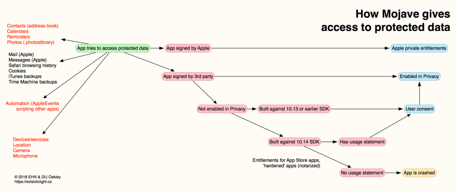
Its new protection system was dubbed TCC, for Transparency Consent and Control, and has since become prominent in the nightmares of developers, those who support Macs and many who use them. At its worst, it crashes apps that don’t comply with its rules, as shown in the diagram below for macOS 10.14.

Various classes of protected data are shown at the left, those in red being covered explicitly in Privacy controls. The first step was to determine whether the app trying to access protected data was signed by Apple: if it was, access was determined by private controls, and sometimes regular controls as well.
Apps developed by third parties were checked to see whether they already had access to that particular class of protected data according to Privacy settings. If they had, access was then granted without further dialogs. Note that the effect of adding an app to the Full Disk Access list was to give it access to all protected data, but not services or hardware, without any further consent being sought.
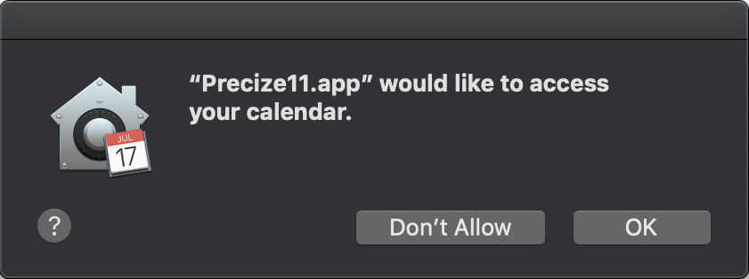
If they hadn’t already been given access, the next check was to see which version of the SDK they were built against. If they were built against 10.13 or earlier, then Mojave didn’t expect them to have support such as usage information, so it should have displayed a dialog inviting consent to the requested access. That would normally only contain the standard text information.

If consent was given, then that app was added to the appropriate class in Privacy settings; if it was declined, then it was denied access, but wasn’t put on any blacklist, so consent could still be given on another occasion.
If the app was built against the 10.14 SDK, then stricter rules were applied. It was then required to have a usage statement for the class of data it was trying to access, where that was in the class-specific list at the top, or a protected device or service. If the app didn’t provide the appropriate usage statement, TCC considered the request to access protected data was unintended, and crashed the app as an ‘unexpected quit’.
If the app did contain a usage statement appropriate for that class of protected data, then Mojave displayed the consent dialog, this time containing the text from that usage statement as well. If consent was then given, the app would be added to the list in Privacy.
Since Mojave, TCC has been a fertile source of vulnerabilities for third-party researchers to discover, and the malicious to exploit. Three were reported shortly after the initial release of 10.14. Two, discovered by Patrick Wardle and Jeff Johnson, weren’t disclosed, to allow Apple to address them, and the third, in ssh, wasn’t so much a vulnerability as a feature that could be exploited.
Each successive major version of macOS has added further to that list from Mojave. Catalina (10.15, 2019) added new locations that required user intent or consent to access, including:
- ~/Desktop, widely used for active documents
- ~/Documents, main document storage
- ~/Downloads, the default location for downloaded files
- iCloud Drive, now widely used for shared working documents
- third-party cloud storage, if used
- removable volumes
- network volumes.

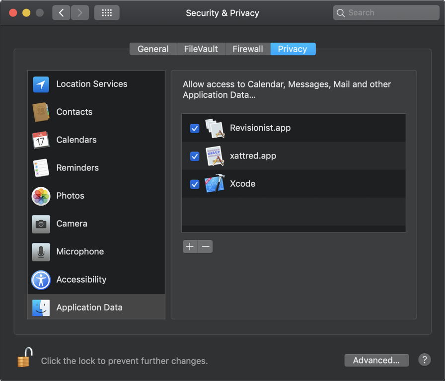
This is one of the late Security & Privacy panes from macOS Catalina in 2019.
By the time that macOS 13 Ventura was released in 2022, its shiny new Privacy & Security section in System Settings listed 20 categories. Some, like Full Disk Access and Files and Folders, overlapped, while others like Accessibility appeared to have been misnamed. Controls provided varied between different categories, and many users dreaded having to tinker with them.

At this rate of growth, Privacy will soon have its own app alongside System Settings.


