MAC 下安装 TestFlght 软件太小了 有什么第三方的软件可以拉取
zlpd:
安装的是 IOS 的软件,testflght 的,只能两个尺寸,还是很小,有什么第三方的软件可以让窗口扩大点?
谢谢各位彦祖
安装的是 IOS 的软件,testflght 的,只能两个尺寸,还是很小,有什么第三方的软件可以让窗口扩大点?
谢谢各位彦祖
This is the summary and contents for the series titled Urban Revolutionaries showing paintings of the urban growth of the eighteenth and nineteenth centuries in Europe and North America.

The lure of city life was all about the promise of material goods and wealth, fine clothes, and smart carriages, all the things that were lacking in rural life. By 1780, Paris had trebled in size from that of the early fourteenth century, to reach a population of 650,000. Its accelerated growth during the nineteenth century saw it grow to 2.7 million in 1901. This was enabled by the agricultural and industrial revolutions.

During these centuries, the majority of those who had farmed the country abandoned their homes and livelihoods for a fresh start in the growing cities. This Danish family group has just arrived in the centre of Copenhagen, and stick out like a sore thumb, with their farm dog and a large chest containing the family’s worldly goods.
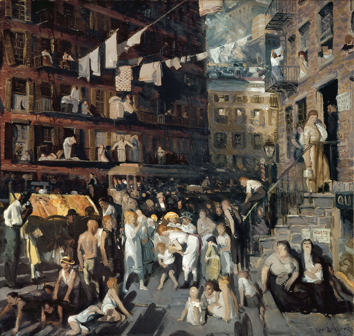
Those who arrived from the country found towns and cities to be alien places. Although many were extensively redeveloped during the nineteenth century, common people were often forced into cramped slums away from their grand buildings and streets, such as these tenements for immigrants in New York City.

Urban areas had to provide paid work, often in mills and factories. Towns grew rapidly across the coalfields of northern Europe as mines were sunk to extract coal, and again where iron ore was readily available.

Industry turned to coal to fuel its growth, and mining expanded in the coalfields across northern Europe. Industrial nations developed an insatiable need for young men to work as miners. In Britain alone, annual production of coal grew from 3 to 16 million tons between 1700 and 1815, and doubled again by the middle of the nineteenth century.

Unrest grew among the workers in industrial towns and cities, leading to the Paris Commune of 1871, and a succession of strikes across Belgium in 1886. Those spread to other areas, resulting in violent confrontations between workers and the police and military.

Cities had plenty of inns and taverns where folk could consume alcoholic drinks until they couldn’t pay for them any more. While alcohol abuse also took place in the country, it was in the towns and cities that it became most obvious and destructive.

Women were widely engaged in light factory work, such as production of fabrics and garments by spinning, weaving and assembly. Many were also employed in domestic service industries including laundry and sewing, to service the middle and upper classes.

Prostitution was one of the most common ways for women to earn a living in the growing cities of Europe during the nineteenth century. Like bars and places of entertainment, it only thrived where there were plenty of potential customers with money, in cities like London and Paris.

Few who migrated from the country ever made their fortune in the city, and most faced a constant battle to avoid poverty. Just as some social realists painted rural poverty in the middle of the nineteenth century, others depicted urban poverty.

A few who migrated to the towns and cities did prosper. For young women, success could come through the growing world of fashion.

As population density rose, so accommodation became crowded, the streets were often full of people, and vehicle traffic threatened the safety of pedestrians.

As cities grew and swallowed up surrounding countryside, some substantial areas within them were retained as urban parks. But those who used them were overwhelmingly middle class, not the city’s workers.
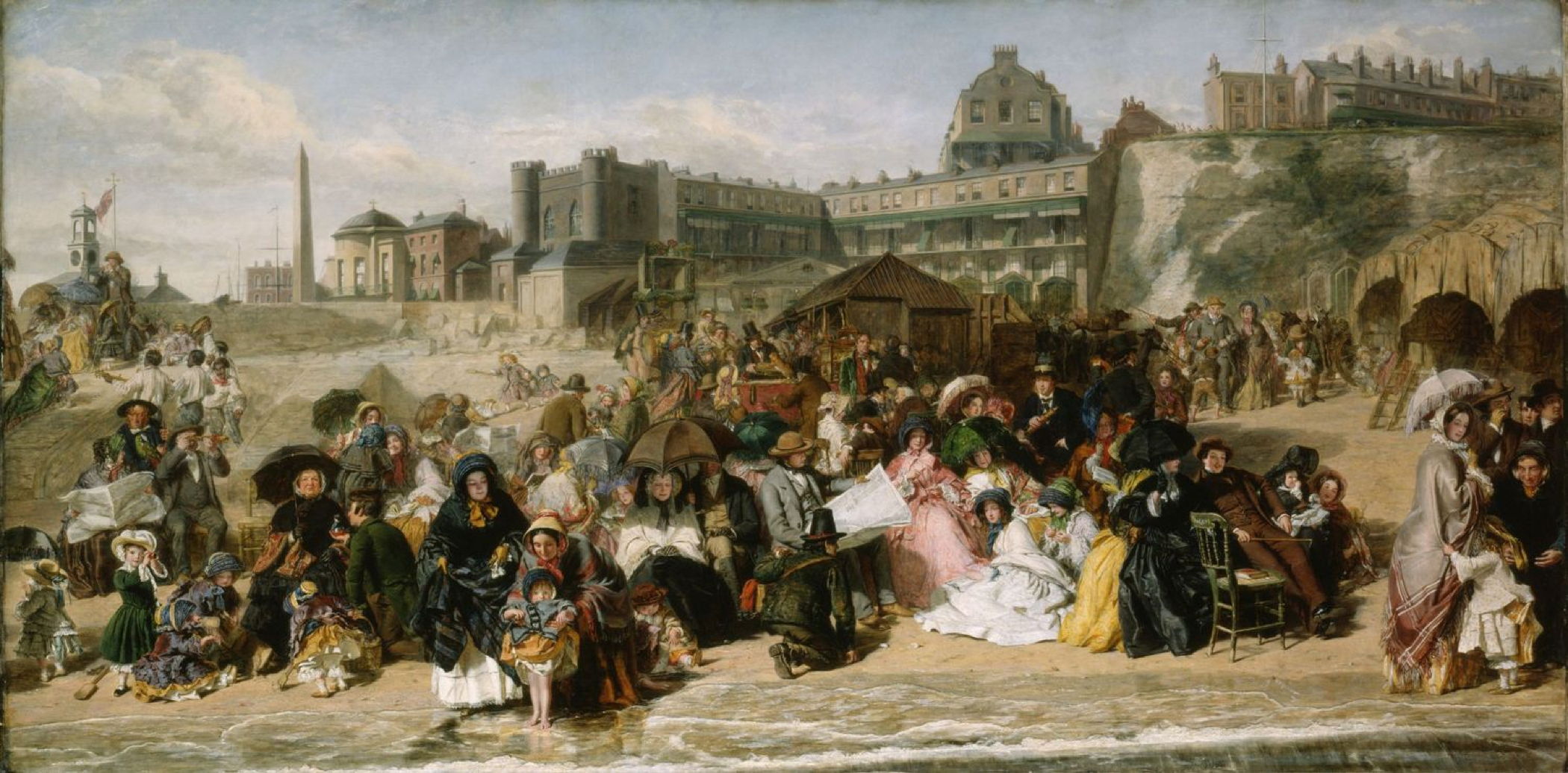
Holidays were a privilege for the lower classes, and unpaid until legislation often as late as the twentieth century. Despite that, some workers saved all year and took a week’s unpaid leave to travel by railway to coastal and other resorts.

Early cities were swept by epidemics of plague. In the nineteenth century, those were replaced by other communicable diseases including cholera, influenza and tuberculosis. Although improvements in sanitation brought cholera under control, epidemics continued to take their toll.

Although life in the country could be thoroughly miserable, stress of city life brought (and still brings) strain resulting from the stress of everyday life.

我的太烫了,日常写前端 CPU 温度 70 度上下
I have divided narrative forms in painting into the following categories:
The previous article showed examples of each apart from multiplex narrative, the subject of this sequel.
In more recent years, multiplex narrative has become considered by many narrative painters as being too complex for modern viewers. Given its popularity in ancient times and during the Renaissance, this appears curious.

Immediately on looking at this Roman painting of Perseus and Andromeda, you can see the duplicated images of Perseus: one flying in from the left, the other being congratulated at the right. If intended to be a literal telling of the story, Cetus the sea monster wouldn’t appear until after Perseus had freed Andromeda from her chains. It therefore contains at least two different moments in time, but isn’t divided into frames, and is therefore multiplex narrative.

Masaccio’s fresco in the Brancacci Chapel of The Tribute Money (1425-8) contains three images of Saint Peter, and two of the tax gatherer, carefully set and projected into the same single view. Although each is spaced apart from the next, no pictorial device is used to separate them into frames.
His literary reference is to the Gospel of Matthew, in a story in which Christ directs Peter to find a coin in the mouth of a fish so that he can pay the temple tax. In the centre, the tax collector asks Christ for the temple tax. At the far left, as indicated by Christ and Peter’s arms, Peter (shown a second time) takes the coin out of the mouth of a fish. At the right, Peter (a third time) pays the tax collector (shown a second time) his due.
Masaccio demonstrates how important space and layout are in successful multiplex narrative.

In Piero di Cosimo’s Andromeda freed by Perseus (c 1510-15), Perseus appears three times: flying down from the top, stood on Cetus about to kill the monster, and in the subsequent party at the bottom right. Andromeda also appears at least twice. These separate events are combined in its multiplex narrative.

The five different sets of Adam and Eve shown in Lucas Cranach the Elder’s The Garden of Eden (1530) are set within the representation of the garden as a whole, making this multiplex narrative.
Following the Renaissance, multiplex narrative was largely forgotten, until its more recent revival.

At the centre of Camille Corot’s painting, Diana and her attendant nymphs are bathing in a stream, and soaking up the sunshine. At the right, Actaeon with one of his hunting dogs is just about to run straight into them. Diana, appropriately crowned, stands pointing to the distant figure at the left, which is again Actaeon, antlers growing from his head as she transforms him into a stag.
Actaeon appears twice in spatially separate scenes, with Diana and her group being part of both. In the first, they are simply bathing and larking about, but in the second Diana stands, points, and transforms Actaeon.
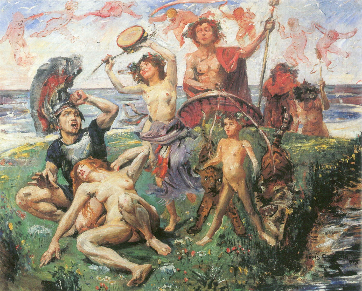
In the early twentieth century, Lovis Corinth’s Ariadne on Naxos (1913) combines two separate events into a single image: the abandonment of Ariadne by Theseus on the left, and the arrival of Dionysus/Bacchus to be her future husband on the right. He does this without any duplication of actors, and it’s multiplex narrative.

At the centre of Thomas Hart Benton’s Achelous and Hercules from 1947 is Hercules, stripped to the waist and wearing denim jeans, who is about to grasp the horns of Achelous, shown in the form of a bull. Immediately to the right, Deianira is shown in contemporary American form, with a young woman next to her bearing a laurel crown and seated on the Horn of Plenty. To the left of centre, Benton shows a second figure of Hercules holding a rope, part of a passage referring to ranching and cowboys, and further to the left to the grain harvest. To the right, the Horn of Plenty links into the cultivation of maize (corn), the other major crop from the area.
This narrative technique is by no means confined to Europe, as shown in the next two examples.

This detail of Krishna Storms the Citadel of Narakasura (c 1840) contains two near-identical representations of Krishna, making it multiplex narrative.

My final example of multiplex narrative is that of the Heiji Monogatari Emaki (Sanjo Scroll) (late 1200s), in which time advances from right to left, and there is duplication of actors.

© Adam Gray for The New York Times

© Grant Hindsley for The New York Times

© Georgi Licovski/EPA, via Shutterstock
From the outset, the Macintosh was a single integrated unit, at a time when other personal computers came with separate displays.

It took three years for Macs to diverge into the all-in-one SE and the modular Macintosh II with its conventional case and separate colour monitor. The meteoric rise of desktop publishing demanded large, deep and heavy cathode-ray tube (CRT) colour displays that only came separately, and needed long graphics cards that had to be fitted inside the computer’s chassis.
Although the Mac SE weighed up to almost 10 kg (22 pounds), many lugged them around in soft cases slung over their shoulders, providing a degree of portability. There are some folk whose backs still bear witness to those days of the luggable Mac.
Integral CRT displays hardly changed over this period. The Macintosh 128K came with a 9 inch screen displaying a mere 512 x 342 pixels in monochrome. Ten years later, the Color Classic was the first all-in-one to come with a 10 inch colour screen, and that only increased resolution to 512 x 384 pixels. Neither was there any support for external displays, until the LC 520 in July 1993, with its 14 inch colour CRT at 640 x 480 resolution and display port.
During the 1990s, Apple offered various Power Macintosh, Performa and LC all-in-one models featuring integral or piggybacked displays, culminating in the Power Macintosh 5500 in 1997, with its 15 inch CRT of which less than 13 inches were viewable, and supporting up to 832 x 624 pixels.

Apple’s next innovative all-in-one was the Twentieth Anniversary Macintosh (TAM), released a year late in 1997. It came with a 12.1 inch backlit active-matrix screen rather than the traditional CRT, in this unique design. Although a limited edition intended to be a collector’s item, it was overpriced and sold poorly, and has since been eclipsed by the most innovative model since the original 128K.
In May 1998, Apple announced the first iMac, based on a PowerPC G3 processor and a 15 inch CRT, of which 13.8 inches are viewable at resolutions of up to 1024 x 768 pixels. The design wrapped the case around the bulk of the display in the form of a ‘gumdrop’, using coloured translucent plastic later offered in a range of bright colours.

It was also technically innovative, featuring novel USB ports and discarding the traditional floppy disk drive in favour of optical and hard drives. This shipped in August 1998, with hardware revisions that October and the following January.
A few months later Apple quietly slipped out the Power Macintosh G3 All-in-One, but that proved to be a dead-end and has been largely forgotten in favour of the iconic iMac.
By January 2002, flat-panel displays were starting to displace bulky CRTs, and Apple made use of them in its first flat-panel iMac. This featured a PowerPC G4 processor, and a 15 inch TFT active-matrix LCD delivering up to 1024 x 768 pixels. The computer components were assembled into a heavy hemispherical base on which the display was mounted using a hinged stainless steel arm resembling an Anglepoise desk lamp, which had been designed in 1932 by George Carwardine and is still in production.

This ‘Anglepoise’ mount remains the best adjustable mechanism used with a display, ensured effortless positioning to suit each user, and eventually supported 20 inch flat-panel displays.

With displays now thin enough to allow computer components to be integrated behind the screen, the next step was to eliminate the heavy base. Apple achieved that in August 2004 with the iMac G5, in its 17 and 20 inch models. With the switch to Intel processors and further integration in computer components, display size rose to 24 inches in 2007, and 27 inches two years later.
For many, the zenith of the iMac came in Retina 5K displays first offered in 2014, and the most powerful Intel iMac of all, the 27 inch iMac Pro released at the end of 2017. The latter features Intel Xeon processors with 8 or 10 cores together with the new T2 security chip. Although it doesn’t appear to have sold well, it was popular with developers and others during the hiatus between the Mac Pro models of 2013 and 2019.
Although the iMac Pro was the first Mac to feature a T2 chip, their inclusion in other iMacs was delayed until Apple had already announced its move to Apple silicon models. The last Intel iMac with a 27 inch Retina 5K display was released in August 2020, three months before Apple shipped the first M1 Mac mini and others.
Since May 2021, Apple has offered a succession of three iMacs powered by its M-series chips, all with a 24 inch Retina 4.5K display. They follow in the line of the original iMac from 1998, and come in a range of colours. But there are many who are still clinging onto ageing Intel iMacs in the hope that, one day, Apple will offer an all-in-one in the spirit of the iMac Pro, with a Pro grade chip and a 27 inch Retina 5K display.

去年 9 月,华为余承东在直播间表示,目前的华为电脑是最后一批 Windows PC,然后抛出重磅消息:接下来会有鸿蒙电脑产品。
这一下子引起了大家的热烈讨论,毕竟比起手机,要做一个电脑系统的难度无疑更高,并且可以想象的空间也要更大。
终于在今天的沟通会上,鸿蒙电脑操作系统正式面世,和华为手机、平板一样,都基于 HarmonyOS 5 构建。
做一个操作系统很难,而做成一个操作系统更是难上加难,不仅需要攻克技术上的难关,更重要的是打造一个软件生态,才能说服用户从成熟的平台上转移。
而对于能摸着「手机鸿蒙」过河的鸿蒙电脑来说,软件生态至少可以跳过「从零开始」的阶段。由于从 X86 架构转向和手机、平板平台一样的 ARM 架构,鸿蒙电脑操作系统能无缝兼容手机和平板应用,开发者一次开发就能实现三端部署。
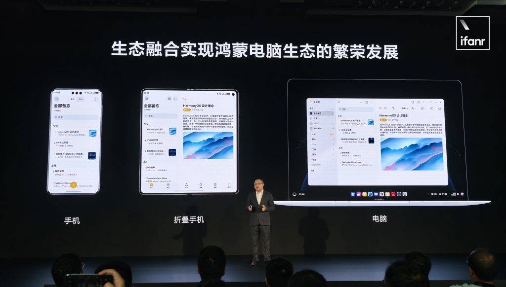
像是 WPS Office 这样的应用,原本在鸿蒙平板平台上就是一个桌面量级的应用,就完全可以直接迁移到鸿蒙电脑。
不过根据现场实际的体验,并非所有的现存鸿蒙应用都能直接在鸿蒙电脑应用商店中搜索到,或许还需要开发者进行主动的分发,因此暂时还不能实现笔记本触控屏玩《王者荣耀》。
值得一提的是,鸿蒙电脑不支持侧载,所有应用都需要从应用商店中获取。
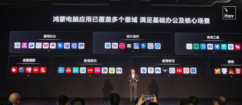
除了手机平板原有的鸿蒙应用,沟通会上也揭晓了第一批鸿蒙电脑端应用:办公、设计创作、理财、影音娱乐、教育的几个国产头部平台都有覆盖,甚至还有几个轻量级的小游戏。
比起手机这种 App 更吃重的场景,其实电脑端不少服务和功能,都能用网页浏览器完成,比如 ChatGPT、Canvas 等等。但专业度较高的工科以及类似 Adobe 全家桶之类的创意软件,或许短期内很难看到适配鸿蒙电脑的可能性。
因此,在初期最适合鸿蒙电脑的场景,是主打轻度办公和商务的轻薄本,不追求极致的性能释放,而尽量平衡功能与能耗,而这刚好也是华为笔记本品牌的舒适区。
其实对于像我们这样的文字工作者来说,鸿蒙电脑现在的生态已经基本满足,因此不由得期待实际上手工作的体验。
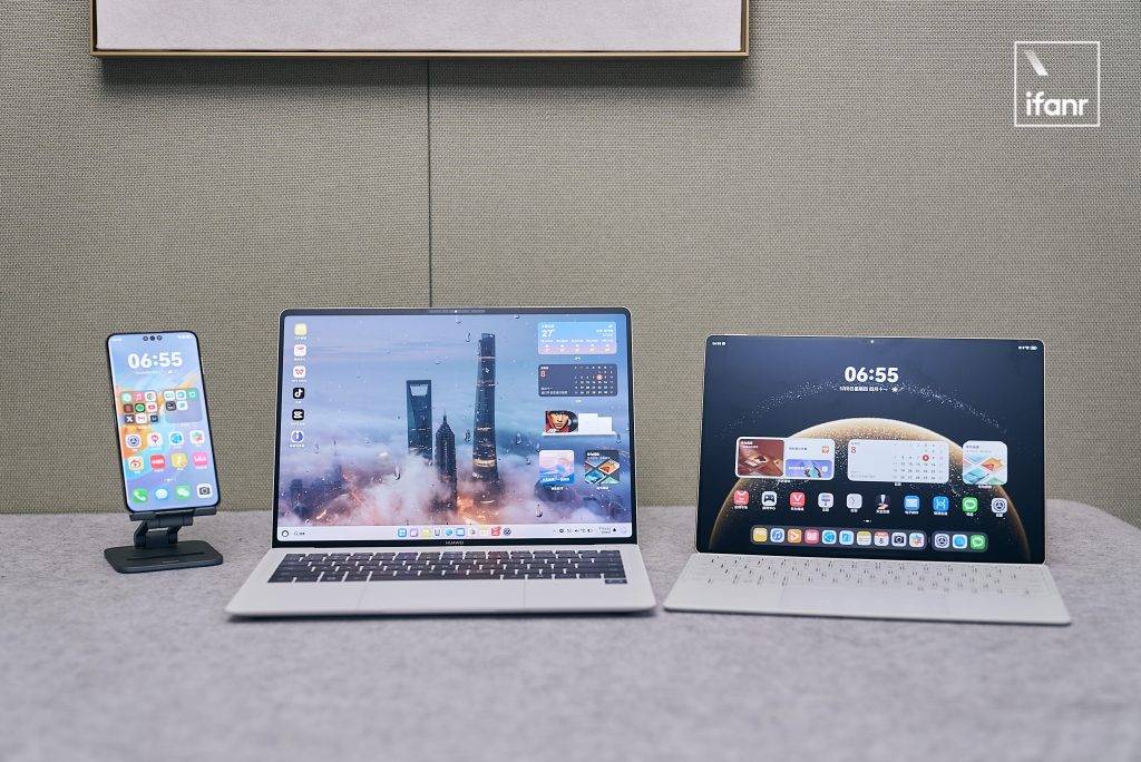
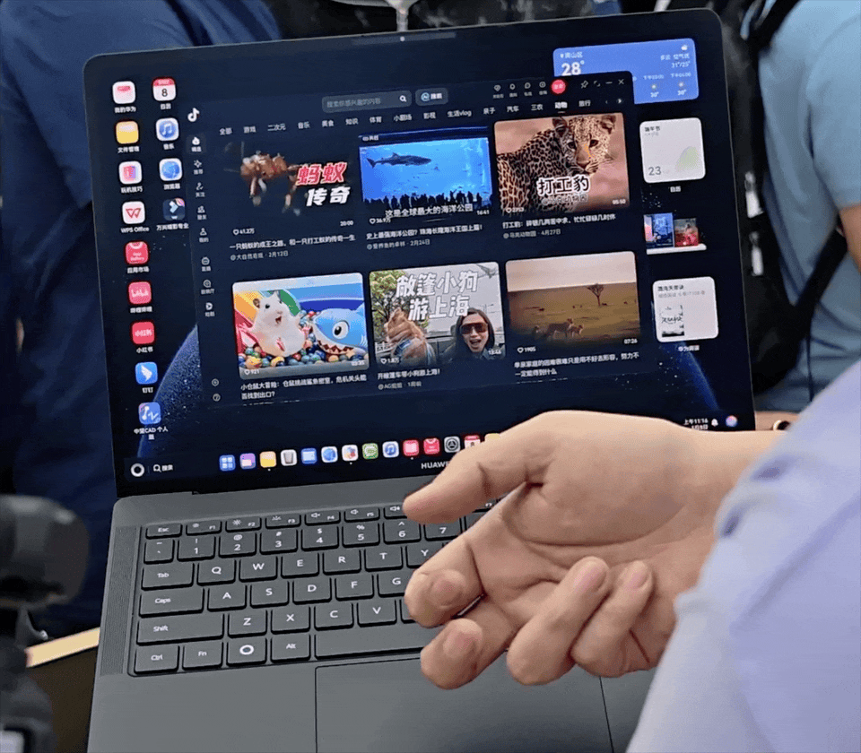
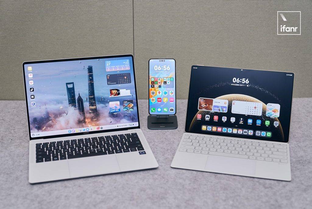
现场展示的全新鸿蒙电脑 MateBook Pro,采用了去年 900 多克的 MateBook Pro X 的类似模具,或许比起 Intel + Windows,鸿蒙电脑才是它应有的形态。
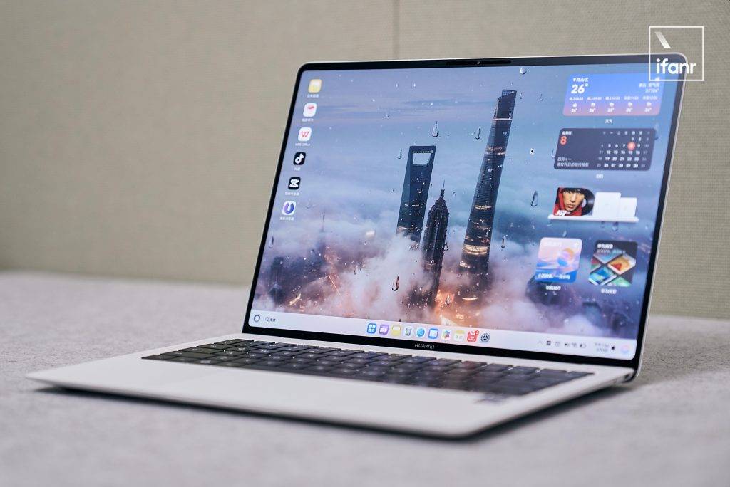
▲ MateBook Pro
鸿蒙电脑的界面可以说融合了 Windows、macOS 甚至 ChromeOS 以及平板原生鸿蒙等多个操作系统,降低用户使用习惯的迁移成本。
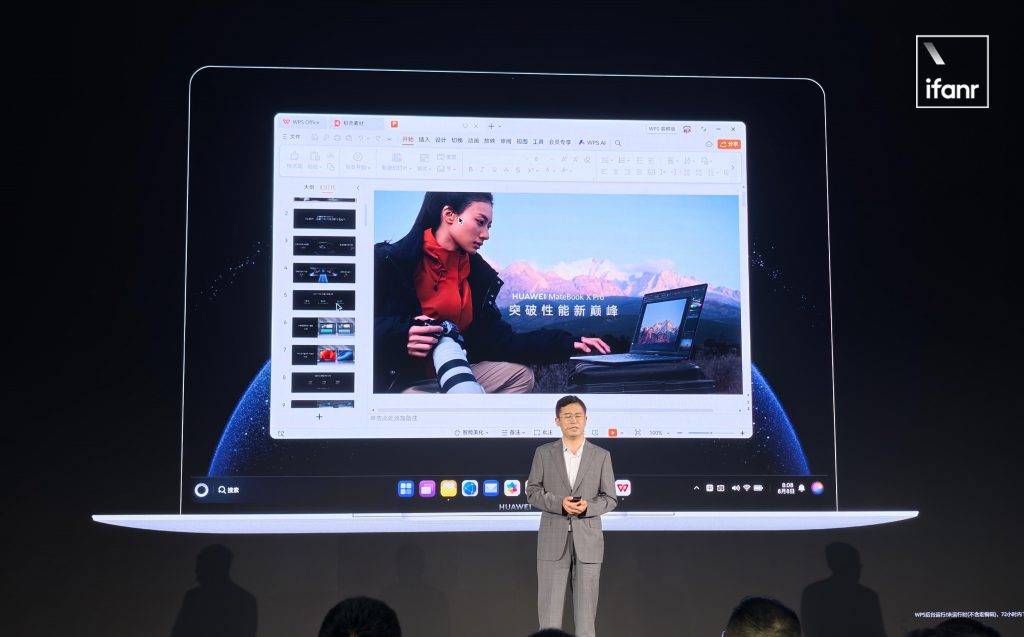
总体来说,系统和应用的界面,以及手势操作都有点接近平板电脑,系统的动效也是看齐原生鸿蒙级别,甚至还有打断动画,简直流畅得不像电脑。并且现场演示机中的大体积 PPT 文档,都能实现快速打开。
桌面上,可以放应用图标、文件这些常见的内容,也能摆放「鸿蒙卡片」的小组件,华为还将手机和平板的「收纳夹」搬到了桌面端,能够摆放应用文件,总体的桌面布局形式比较丰富
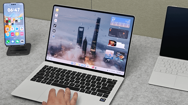
键盘布局也进行了重新设计:原本的「Windows 键」被一颗「鸿蒙键」代替,按下能呼出一个类似开始的菜单,里面有推荐应用、最近文件以及电源键,也支持和其他按键组合成快捷键,类似 Mac 上的 Command 按键。
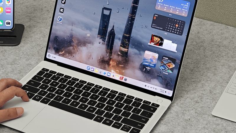
右边 Ctrl 键也变成了一个全新「小艺键」,能够直接呼出小艺助手的对话界面,能够语音输入或键盘输入。
比较有意思的是,华为将手机上备受好评的「指关节截图」的操作搬到了电脑的触控板上。
和手机、平板搭载一个系统,自然也为鸿蒙电脑带来了流转和接续能力,不仅电脑能直接远程操控熄屏手机,剪贴板和鼠标也是共用的,还有一个神奇的功能叫「手眼同行」,当用户看向平板、手机等其他华为设备的屏幕,只要点一下 Ctrl 按键,就能将鼠标移动过去。

还有应用的自然流转能力,比如说用户在户外用手机在飞书上开会,回到办公室点击一下就能将会议转移到电脑上,不需要繁琐的重新进入流程。
作为后起之秀的鸿蒙电脑,反而有机会在 AI 时代弯道超车,因为现存的电脑操作系统,都不是专门围绕 AI 构建的,不管是 Apple 智能还是微软 Copilot,目前都只能算是一种集成在系统中的工具。
而作为一个 AI 时代下诞生的电脑系统,鸿蒙电脑系统和 AI 的结合要更加深度。

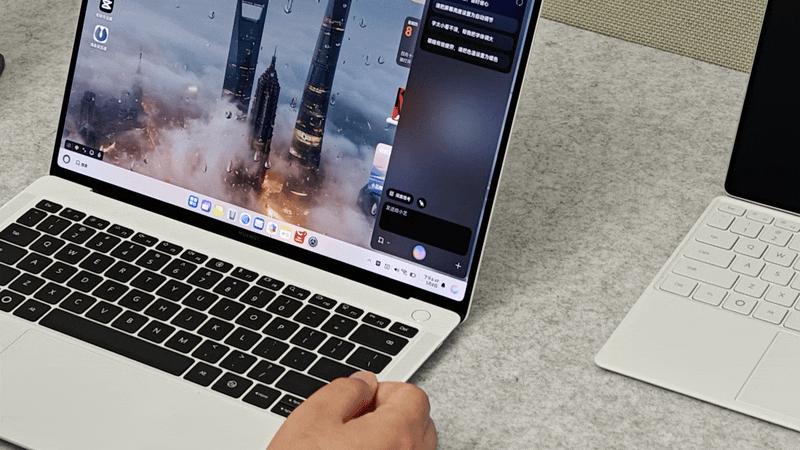
比如说,不管是文字还是文件,通过鼠标选中后,右键都能直接发送到小艺助手进行 AI 分析。
以及系统全局的搜索,可以通过关键字提示或者提问的形式,从电脑中精准检索出来。
由于和系统底层深度结合,小艺还能实现其他第三方 AI 助手做不到的系统设置能力。作为一个全新的系统,鸿蒙电脑对基本上所有消费者来说,都会比较陌生,这个功能可以说是内置了一个智能的「说明书」。
至于会议智能记录、AI 生成文档这些原本就在华为笔记本以及鸿蒙手机平板上有的功能,自然不会缺席鸿蒙电脑。
其实和手机系统长久以来基本只有 Android 和 iOS 两个选项不同,电脑系统的选择要更加丰富,除了 macOS 和 Windows 之外,还有大大小小开放的 Linux 发行版可用。
今年 3 月的华为笔记本产品,也确实开始出厂搭载了 Linux 系统,但这也只是一个过渡,华为最终肯定会选择 All in 鸿蒙电脑系统。
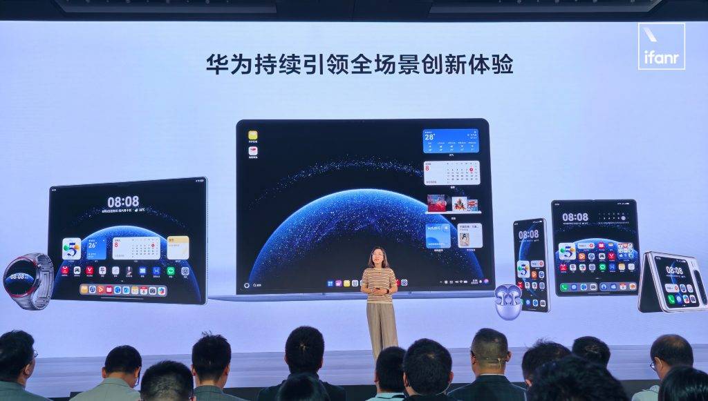
以手机为中心,华为用鸿蒙内核构建了一个包括平板、智能配件、智能家居、新能源汽车在内的全方位生态,但缺少了最后一块拼图——电脑。
再怎么用「鸿蒙电脑管家」魔改 Windows,它终究和手机跑的不是一个系统,并非真正位于一个生态之内。
因为外部原因不能用 Windows 系统,对华为笔记本产品来说当然是一个非常巨大的打击,但也给了华为一个契机,能够放手尝试一个挑战性更高的平台。
从 2016 年第一台华为 MateBook,到去年国内第二的笔记本出货量,华为笔记本品牌历史其实不长,但足够深入人心,在商务本和学生本领域累积了口碑,这也是他们换用全自研电脑系统的信心和底气。
如果说现在鸿蒙电脑的最大优势,或许还是「鸿蒙互联」上。目前鸿蒙生态设备突破 9 亿台,「鸿蒙全家桶」用户越来越多,一台和手机、平板搭载同一个操作系统的电脑,能够共享一个剪贴板、鼠标,文件和应用一点就能流转……最终就能靠这种独特的体验,构建出鸿蒙生态壁垒,吸引用户,留住用户。
当然,作为一个新生的系统,加上电脑这种生产力工具的定位,鸿蒙电脑在短时间之内,或许都难以成为大部分人的第一选择。
但至少我们,比以前多了一个选择,一个抓在自己手里的选择。
华为也已经宣布,首款华为鸿蒙电脑产品 MateBook Pro 将于 5 月 19 日正式发布,爱范儿也将在第一时间追踪报道,也即将为大家送上鸿蒙电脑更详细的评测体验。
#欢迎关注爱范儿官方微信公众号:爱范儿(微信号:ifanr),更多精彩内容第一时间为您奉上。
As cities grew during the nineteenth century, what had been countryside in and around them was swallowed up by housing and factories. In the first couple of decades, livestock grazed and cows were milked within a couple of miles of the centre of London.

The American history painter Benjamin West painted this view of Milkmaids in St. James’s Park, Westminster Abbey beyond in about 1801. Two cows and attendant milkmaids are providing a supply of fresh milk for the crowds in this royal park with Buckingham Palace on its edge. This remains 57 acres (23 hectares) of grass, trees and lakes.

John Linnell’s Evening, Bayswater from 1818, only two centuries ago, shows what was then a rural part of London, out to the west of what’s now Paddington Station, in more peaceful times before this area was assimilated into the growing city. Although it has retained some garden squares, this became a densely populated area during the nineteenth century.

Kensington Gardens: Vicinity of the Pond, painted by Paul Fordyce Maitland in about 1907, shows the Oval Pond in the middle of these gardens, another of the royal parks in London, to the west of the Serpentine Lake in the adjacent Hyde Park.
Over the same period, central Paris was extensively rebuilt, but preserved some of its green spaces, including the gardens of the Tuileries Palace.
Camille Pissarro’s Garden of the Tuileries on a Spring Morning from 1890 is an aerial view, with the trees in full leaf, in their brilliant fresh green foliage.
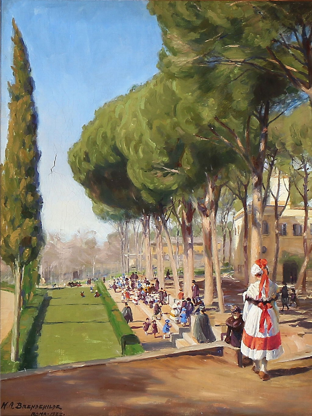
Hans Andersen Brendekilde painted this Summer Day in Villa Borghese in Rome late in his career, in 1922. It shows this large public park, which was originally landscaped in ‘English style’ from a former vineyard. It was bought by the city and made properly public in 1903, and has since hosted many events, including part of the 1960 Olympic Games.
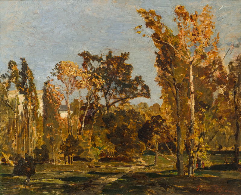
The Austrian Post-Impressionist landscape painter Tina Blau painted her favourite park, Vienna’s Prater Gardens, as its trees were just starting to change colour one autumn, probably around 1890. The Prater covers an area of 1,500 acres (600 hectares) and was opened to the public in 1766.
On the other side of the Atlantic, expansion of cities occurred slightly later, but preserved some notable parks.

This map of New York City and its environs in about 1885-90 shows Central Park on Manhattan Island and Prospect Park, then on the southern edge of Brooklyn.

William Merritt Chase’s view of Prospect Park, Park in Brooklyn from about 1887, shows housing at the edge. This now has an area of 526 acres (200 hectares), and was originally laid out by Frederick Law Olmsted and Calvert Vaux, and completed in 1873.

Olmsted and Vaux were also responsible for the first and most famous New York park of them all, Central Park, now 843 acres (341 hectares). Chase’s View from Central Park shows the park in 1889, and relegates the large buildings of Manhattan to its distant skyline.

Maurice Brazil Prendergast’s view of carriages in Central Park, 1900 (1900) shows how crowded it could become in fine weather.
These and many other views of urban parks have one feature in common: those who took advantage of them were seldom working class. Enjoying these small enclaves of countryside inside cities was almost exclusively for the middle class, who had the time and opportunity. There were also few such parks in industrial cities.
As more people were drawn from the surrounding countryside to populate growing towns and cities, the density of people within them rose. Accommodation became crowded, the streets were often full of people, and vehicle traffic threatened the safety of pedestrians.
The people that cities thrived on for their labour force were also its greatest threat. Outbreaks of infectious disease were common: in London, over fourteen thousand died from cholera in 1849, and a further ten thousand in 1853. From the middle of the nineteenth century, cities across Europe improved their sanitation and water-borne diseases became infrequent. The biggest killer of young adults remained ‘King Death’, tuberculosis, which spreads well in densely populated urban areas, and there were also local outbreaks of diseases like smallpox.

Extensive redevelopment of central Paris retained many of its open spaces, although in fine weather these got crowded, as shown in Adolph Menzel’s Afternoon in the Tuileries Gardens from 1867. This appears to have been painted in homage to Manet’s Music in the Tuileries of 1862.

Many cities were just as crowded at night, as seen in Lesser Ury’s view of Leipziger Straße in Berlin, painted in 1889. Although street lighting was becoming increasingly common, it was inadequate for this hazardous mixture of electric trams (introduced in 1881), horse-drawn carriages and pedestrians. Accidents were frequent, and deaths not uncommon.

City markets such as Les Halles, the central market in Paris, depicted here by Léon Augustin Lhermitte in 1895, were packed with buyers and sellers for much of the day, as described by Émile Zola in his novel Le Ventre de Paris (1873).
Painting the crowded city streets was a challenge mastered by few, including Camille Pissarro for Paris and Colin Campbell Cooper for New York.

Pissarro’s Boulevard Montmartre, Spring from 1897 is a landscape composed primarily of buildings and streets, a plethora of figures, and countless carriages to move those people around.

In 1902, just a year before his death, Pissarro painted this amazing view of crowds on The Pont-Neuf bridge in Paris.

In Cooper’s The Rush Hour, New York City from about 1900, the canvas is literally teeming with people, who are pouring along the street, packing the stairways and walkways to a station, and seething around booths and tramcars.

Cooper followed those crowds onto The Ferries, New York (c 1905), where they are as densely packed as they were in The Rush Hour above.

Cooper’s Broadway from the Post Office (Wall Street) (c 1909) is one of his most famous skyscraper cityscapes. This shows the Singer Building or Tower, at Liberty Street and Broadway, that had only just been completed, and was still the tallest building in the world. Below in Broadway itself the street is packed with people.

George Bellows’ New York (1911) has a human horizon of figures walking past a white background, dividing the canvas into two. Above is a vague blur of buildings, below a cacophony of vehicles, stalls, and people.
Among the immigrants to arrive in New York City from Italy in 1896 was Giuseppe Michele Stella. Born in the small town of Muro Lucano, with a population of about ten thousand, he changed his name to Joseph, abandoned his medical studies, and became a painter of international renown. The shock of living and working among those crowds must have run deep, and between 1909-11 he had to return to Italy to recover.
Berlin’s Spittelmarkt, painted here by Paul Hoeniger in 1912, mixes early motor cars, horse-drawn wagons, trams, and people walking in every direction, all without any road markings or traffic controls.

Winter weather was no deterrent either, as Maximilien Luce demonstrates in his painting of The Gare de l’Est in Snow from 1917.
By the late nineteenth century, the classical format of the triptych that had been developed for altarpieces, was being used to tell secular stories as well as more traditional religious ones. Some artists had abandoned the use of three hinged panels intended to stand unsupported, and set three paintings within a single frame to be hung on a wall instead. Popular layouts included a central theme with subordinate wings, and a sequence read from left to right.

Constantin Meunier’s undated Triptych of the Mine is intended as a tribute to long-suffering underground workers, and makes a parallel with triptychs showing the Crucifixion. The left wing shows their descent, the centre their ascent of Calvary, and the right their ascent to surface at the end of their working day.

Akseli Gallen-Kallela’s Aino Myth (1891) is set in a gilt frame with quoted text from the Kalevala inset, similar to Arthur Hughes arrangement from 1856. This shows scenes from Songs 4-5 of the Finnish national epic, the Kalevala.
The left panel shows the first meeting between Väinämöinen, the central figure and hero of the epic, and the young Aino, Joukahainen’s sister, in the forest. The perpetually ancient Väinämöinen there asks Aino to be his wife, to her shock and anger. The girl runs back to her mother in tears, but she offers no sympathy, telling her to stop crying, and to rejoice at the offer.
Aino remains distressed at the prospect of marrying such an old man, so wonders off, and becomes lost in the forest. She comes across the shore of a strange lake, where she sees the maids of Vellamo playing in the water, as shown in the right panel. She enters the water to wash, and drowns.
In Song 5, Väinämöinen goes to fish for Aino in the lake, and catches a salmon, which he tries unsuccessfully to cut up, so the fish slips back into the water. It then changes into Aino, who mocks Väinämöinen that he may have held her in his hands, but he cannot keep her, shown in the centre panel. She then disappears, and Väinämöinen travels to Pohjola to court the Maiden there.

In 1894, Édouard Vuillard painted this large triptych of Public Gardens, where its panels form a continuous landscape view and divide its figures into three groups. At the left is a group of carers with children; in the centre is a trio of ladies, one of them cradling an infant, and at the right is an older woman sat alone wearing the black of widowhood.

Léon Frédéric’s Ages of the Worker from about 1905 is set in the crowded streets of a Belgian town. The left panel shows men engaged in manual labour, including two who are moving heavy props from a mine. In the centre, a group of young boys are enjoying an improvised meal on the pavement as young couples and a miner move around them. At the right, women are feeding and caring for their infants. I suspect that Frédéric may have intended the work to be read from right to left, rather than in the more usual direction.

Fedir Krychevskyi painted this triptych of Life in the latter half of the 1920s, and its centre panel was the most acclaimed work among paintings by Ukrainian artists shown at the Venice Biennale in 1928. From the left, its panels are titled Love, Family and Return. It blends his own distinctive approach with Art Nouveau, Klimt and mediaeval wall painting.

The Memorial was painted by Henri-Jean Guillaume Martin in 1932 as a public commission for the town of Cahors in southwest France. Its single continuous scene shows a commemoration of the dead of the First World War, centred symmetrically on the town’s war memorial.

In the early decades of the twentieth century, Kazimierz Sichulski painted several large triptychs of the Hutsul peoples, including this Adoration of the Shepherds in 1938. Although modern in style, this is laid out as a traditional Nativity, with the Virgin and Child in the centre, and shepherds looking on from its wings.
Reading larger polyptychs can be a greater challenge.

Among the most remarkable is The Ghent Altarpiece painted by the van Eyck brothers and their workshop in about 1432 for Saint Bavo Cathedral in Gent, Belgium. Its twelve panels are arrayed around the central panorama of the adoration of the Lamb of God. Its upper register features an array of figures with Adam and Eve outermost, and either Christ the King or God the Father at its centre. The lower register includes a gathering set against a continuous landscape background.
Polyptychs are also common outside Europe, including in East Asia where they were popular on screens. Some were also made from groups of woodblock prints.

Kitagawa Utamaro’s (喜多川 歌麿) Girl Fishers and Bathers from 1791 shows seaside activities at Enoshima. Although composed as a triptych with a continuous motif, the same topless woman appears in each of the sheets, making the whole a multiplex narrative. It’s not clear, though, whether it was intended to be read from left to right, or in reverse.
By the end of Book 13 of Ovid’s Metamorphoses, Aeneas is on the island of Sicily. Scylla has been combing Galatea’s hair, listening to her tell the tragic story of the death of her lover Acis. Ovid resumes the narration for the tale of Scylla, which doesn’t conclude until the start of the next book.
Scylla is walking naked along the beach when the figure of Glaucus suddenly breaks the surface of the water. He’s immediately enchanted by her, and tries to engage her in conversation to stop her from running away. But Scylla runs away in terror, and climbs a nearby cliff. There, she gets her breath back, and tries to work out whether he’s a god or monster with long hair and fishy scales below the waist.
Glaucus assures her that he’s a sea-god. He had once been an ordinary mortal, and fished with nets, and rod and line. One day, the fish that he had caught started to move when he had laid them out on the grass, and one by one they escaped back into the water. He couldn’t understand how that had happened, so chewed stems of the plants they had rested on. He was then transformed and swam off in the sea to visit the gods Tethys and Oceanus for removal of the last remains of his mortal form.
Scylla runs away, leaving Glaucus angry, so he makes his way to the sorceress Circe.

Bartholomeus Spranger painted his version of Glaucus and Scylla in 1580-82. Although the artist hasn’t followed Ovid’s distinctive colour scheme for his body, Glaucus is clearly pleading his case before the beautiful young woman. In the next book, Ovid will describe how Scylla was turned into a rock, and Spranger provides that link forward in the story in his background.

In the middle of the seventeenth century, Salvator Rosa makes Glaucus more of a beast, roughly mauling Scylla’s fair body and giving her good cause for her flight to the cliff.

A little later, probably in the late seventeenth century, Nicola Vaccaro is more sympathetic in his Glaucus fleeing from Scylla. Glaucus may be a bit rough, but arouses more pity. Scylla is accompanied by three Cupids as she flees not to the top of a cliff, but to the goddess Diana above.
The most interesting and unusual depiction of this story is surely JMW Turner’s from 1841, just a decade before his death.

Turner’s Glaucus and Scylla (1841) would perhaps have looked more at home among paintings made fifty or even eighty years later.
The naked Scylla is on the beach at the right, with a couple of cupids flying about. The inchoate form of Glaucus is emerging to the left of centre, holding his arms out towards Scylla. She will have none of it, though, and has already turned to run, and looks back over her shoulder towards him.
We look directly into the setting sun colouring the world a rich gold. In the right background the low coastal land rises to sheer cliffs with a temple on top. A tower atop a nearer pinnacle, or more distant lower red rocks, may be a reference to Scylla’s fate.

In the foreground are clues of the beach setting, with a crab, and several seashells. Turner has applied his paint in innovative and gestural ways, resulting in richly varied textures.
Turner had made an earlier and more traditional study in about 1810-15, but revised it almost completely by the time that he painted this in 1841. Its light appears influenced by the harbour landscapes of Claude, and its general lack of form anticipates Impressionism, perhaps even Abstract Expressionism in passages.
Rejected by the scared Scylla, Glaucus travels from Sicily to visit the sorceress Circe, whom he implores to use her dark arts to force Scylla to return his love. But Circe refuses, telling Glaucus to woo another: as she is in love with him, he could spurn Scylla and love Circe instead.
Glaucus rejects her, saying that nothing will change his love for Scylla. That annoys Circe, who cannot harm Glaucus because of her love for him, so turns her anger on Scylla instead. The sorceress prepares a magical potion from herbs, weaving her spells into it. Dressed in a deep blue robe, she then goes to a small bay where Scylla likes to bathe, and pours her potion into the water.
When Scylla wades into the water the lower half of her body is transformed into a pack of dogs. As Ulysses’ ship passes her, those dogs take some of its crew, but they allow Aeneas to pass safely. Scylla is finally transformed into a rock and becomes a famous hazard to navigation.

John William Waterhouse chose to portray the figure of Circe the sorceress in his Circe Invidiosa (1892). Despite its narrative limitations, this offers a marvellous insight into the character of Circe, as she pours her brilliant emerald green potion into the water, ready for Scylla to come and bathe.

John Melhuish Strudwick also chooses a moment early in Ovid’s story, which makes his painting of Circë and Scylla (1886) narratively rather thin. Circe, dressed in brown rather than blue, is sprinkling her potion into the water from within a small cave, as Scylla, at the left, walks down to bathe.

By far the most complete visual account is Eglon van der Neer’s Circe Punishes Glaucus by Turning Scylla into a Monster (1695). Circe takes the limelight, as she casts her potion from a flaming silver salver held in her right hand. Dripping onto that is the wax from a large candle, held in her left hand. In the water below, Scylla has already been transformed into a gorgonesque figure, with snakes for hair, and the grotesque Glaucus watches from behind. Above and to the right of Circe is a small dragon perched on a rock ledge.

Ary Renan’s Charybdis and Scylla (1894) shows Charybdis the whirlpool with its mountainous standing waves at the left, and the rocks of Scylla at the right.

This fragment of fresco by Alessandro Allori shows Odysseus’ ship passing Charybdis, depicted as a huge head vomiting forth the rough waters of the whirlpool at the right, and the dogs’ heads of Scylla, which have captured three of Odysseus’ crew.

Henry Fuseli’s Odysseus in front of Scylla and Charybdis (1794-96) is another vivid depiction of Odysseus passing the twin dangers. He stands on the fo’c’s’le of his ship, holding his shield up in defence as the oarsmen down below him struggle to propel the craft through the Straits of Messina.
Macs have developed their own mythology, and this week I unintentionally came across a myth that developed over a year ago. Like so many it was born from a chance observation, this time of a new background process that appeared on 25 October 2023 in macOS Sonoma 14.1, and was reported in 9to5Mac on 3 November 2023.
The process in question is liquiddetectiond, and as 9to5Mac’s headline claimed, it meant that “Macs can now inform Apple if any liquids have been detected in the USB-C ports”. That article argued that “it seems more likely that the data collected by this daemon will be used for technicians to determine whether a Mac is eligible for free repair.” “Putting a digital liquid detector on USB-C ports is just another way to ensure that technicians are right about claiming that a Mac has been exposed to liquids.”
That, and a couple of linked reports elsewhere, brought a small flurry of comments about how typical this was of Apple, then all went quiet until 9to5Mac’s article was picked up by Hacker News on 9 January 2024 and generated 340 comments. Predictably, most either castigated Apple’s behaviour or disappeared down rabbit holes about unrelated topics. Among them, though, was one precious insight: “It prevents the device from applying/draining power from any pin in such a state, mainly to reduce corrosion of the contacts and increase longevity.”
By the middle of January last year, the story had gone cold, and everyone must have gone away with their worst fears confirmed. You couldn’t even get a USB-C port damp in your Mac any more, as Apple would use that as an excuse to void your Mac’s warranty.
Apple’s first word on the subject seems to have been in a support note published on 23 November 2024, which passed largely unnoticed. This announced liquid detection as a feature new to macOS Sequoia when running on only the following models:
none of which had been released at the time of 9to5Mac’s report, although the second were released four days later, on 7 November 2023.
If there’s liquid in one of their USB-C receptacles (ports) when a USB-C cable is connected to it, this new sensor should detect it and alert the user, advising them to shut the Mac down, disconnect all cables and leave it to dry.
This is in addition to, and separate from, what Apple terms Liquid Contact Indicators (LCI), that have long been fitted to laptop Macs and some Apple wired and wireless keyboards “to help determine if these products have been exposed to liquid,” according to this support note.
Was Apple just making excuses, or was this new liquiddetectiond service intended to benefit the user?
I stumbled into this innocently last week when I was looking at Accessory Security, a feature confined to laptop Apple silicon models. By chance, the laptop I was using was a MacBook Pro M3 Pro, one of the few in which liquid detection works. There, on several occasions in its log, after connecting a Thunderbolt cable, its liquid detection system checked that the USB-C port was dry, in a series of log entries like:0.887 liquiddetectiond Starting LDCM Now
0.887 liquiddetectiond LDCM Discovery is enabled.
0.889 liquiddetectiond LDCM - Matched with V4...
0.890 liquiddetectiond LDCM - checkIsReceptacleEmpty: 0
0.890 liquiddetectiond LDCM - Handling LDCM interrupt event for port 2
0.890 IOAccessoryManager IOPortFeatureLDCMUserClient::_copyData(): Copying LDCM data... (target: Port-USB-C@2/LDCM)
0.890 liquiddetectiond LDCM - Feature Status: 0, Completion Status: 0, Measurement Pin: 0 Mitigations Status: 0, Wet: 0, Wet State Duration: 0
0.890 liquiddetectiond LDCM - checkIsReceptacleEmpty: 0
0.890 liquiddetectiond LDCM: liquidDetected: 0, receptacleEmpty: 0, shouldShow: 0
(Times given in seconds elapsed.)
But on my more recent Mac mini M4 Pro running Sequoia, all I saw was that LDCM is not supported on this device.
Attempts to connect over the network are obvious in the log, and on not one of the occasions that liquid detection was performed did that MacBook Pro try to connect to any remote site. Maybe its reports could have been embedded in other analytics data passed to Apple later, but there was absolutely no evidence that the results of liquiddetectiond went beyond the confines of my Mac.
This demonstrates the importance of testing out hypotheses, and of reading the log. Even without the benefit of Apple’s recent support note, it should have been easy to demonstrate this behaviour, yet no one seems to have attempted to.
Claims made of the role of liquid detection in USB-C ports also don’t make sense. As with most laptop manufacturers, Apple already builds Liquid Contact Indicators into components of laptop Macs within their case. These are most frequently affected by spillage of drinks on a laptop’s keyboard, resulting in any of a wide range of water-based liquids from coffee to cognac entering the case. That often results in extensive damage to the logic board and other components, that are expensive to replace.
But a damp USB-C port is quite a different matter. It could occur in a laptop that had been out in the cold and was then brought into a warm and more humid environment, the same sort of conditions that steam up your spectacles. Over time, that could lead to corrosion of the contacts in the USB-C ports, and unreliable connections.
Because each release of macOS is identical across all models of Mac, although only a few of the most recent models feature liquid detection sensors in their USB-C ports, the liquiddetectiond service runs in the background of all Macs running Sequoia. It’s to be found inside /System/Library/CoreServices/liquiddetectiond.app, which isn’t even a bundle, just its Mach-O binary and an image of the warning sign displayed. It’s run through its LaunchDaemon com.apple.liquiddetectiond.plist, which you’ll also find in the SSV of every Mac.
As is so often the case, the truth behind the myth is more prosaic, and doesn’t involve Apple secretly capturing data from your Mac, nor conspiring to dodge warranty repairs. In fact, if you look at the warranty terms of pretty well every other laptop manufacturer, they too exclude damage caused by liquid ingress, as demonstrated by their Liquid Contact Indicators. And some are also starting to fit similar liquid detection sensors in their USB-C ports. But don’t let those get in the way of a good myth.
Not content with adorning the walls of their mansions with paintings, some of the nobility covered them with tapestries, for which artists like Francisco Goya were employed to create cartoons. They were expensive, and those who still aspired to fortunes used wallpaper instead. That could be hand-painted, or more usually printed, and became sufficiently popular by the time of Oliver Cromwell in the middle of the seventeenth century to be a bone of contention with his Puritan government.
During the eighteenth century, Britain became the largest manufacturer of wallpaper in Europe, largely because it lacked the tapestry factories that had been established for other royal courts, and for the period 1712-1836 England even had a wallpaper tax.
Because paper could only be produced in relatively small sheets, early wallpaper had to be assembled from many of those. For example, Albrecht Dürer’s woodblock print of The Triumphal Arch for the Holy Roman Emperor Maximilian I in 1516-1518, required a total of 195 woodblocks printed onto 36 separate sheets of paper.
Wallpaper came of age and appeared on the walls of many more homes when paper could be produced in long rolls using the Fourdrinier process in the early nineteenth century.

The first of Augustus Egg’s narrative series Past and Present from 1858 shows an ordinary middle-class drawing room, with a deep-coloured heavily patterned wallpaper typical of this Victorian setting.
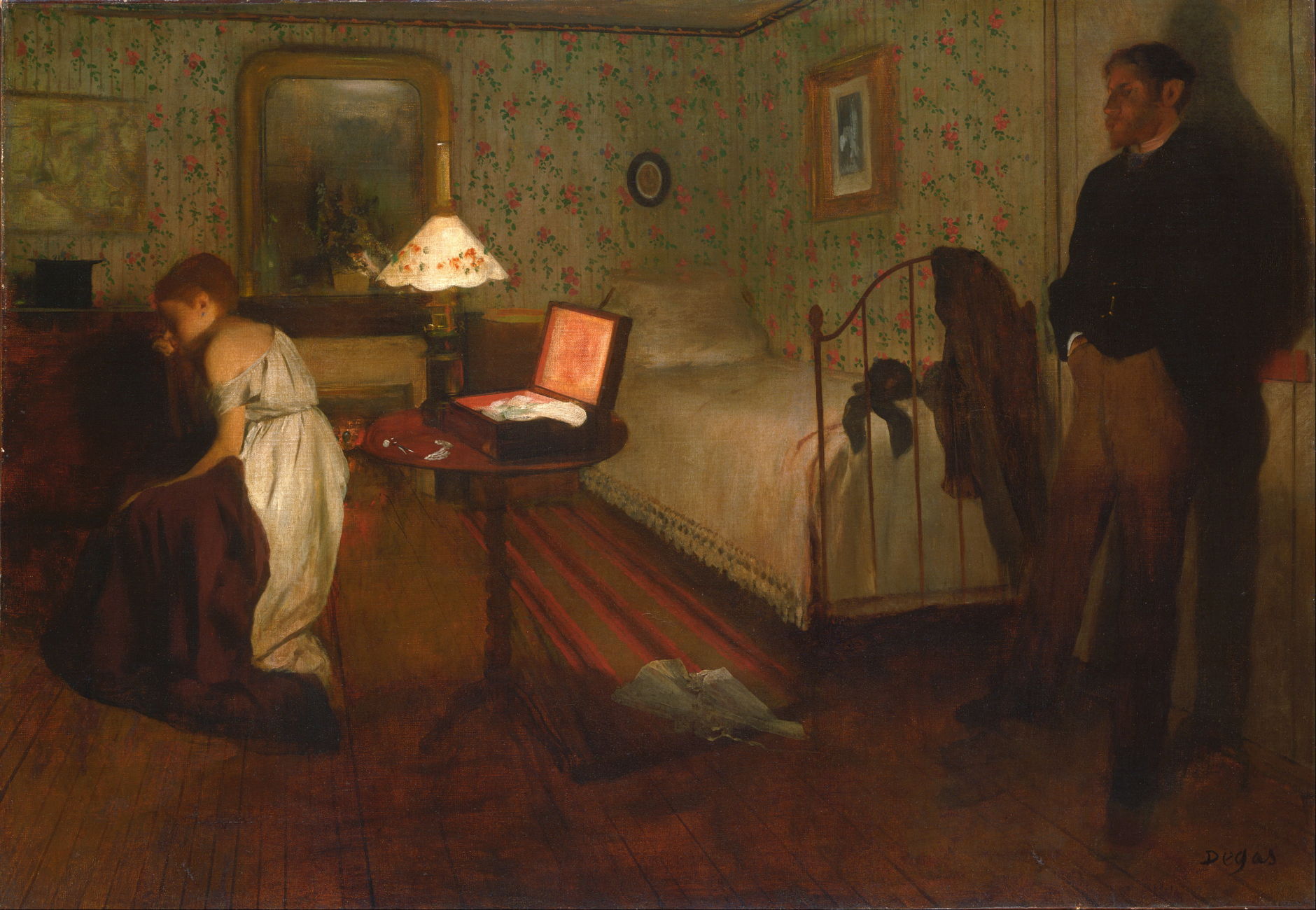
In Edgar Degas’ famously enigmatic Interior from 1868-69, the wallpaper is lighter and floral, matching the pattern on the lampshade, and making an association with the woman.

This exquisite wallpaper designed by Édouard Muller in 1854 is now in the Philadelphia Museum of Art, its five long rolls forming a trompe l’oeil of this enchanted garden from Torquato Tasso’s epic poem Jerusalem Delivered. Trompe l’oeils like this became popular, and have their origins in frescos painted on the walls of Roman villas in classical times. While a fresco was a costly one-off, improvements in printing made such wallpapers more widely available in the later nineteenth century.

Camille Pissarro painted a few delightful still lifes, among them this Still Life: Apples and Pears in a Round Basket from 1872, which ingeniously adds floating flowers from the wallpaper in its background.

Gustave Caillebotte’s portrait of Mademoiselle Boissière Knitting from 1877 is one of the first in which he might be said to be painting in Impressionist style. Its east Asian inspired wallpaper is typical of increasingly popular designs of that period.

Harold Gilman’s early Edwardian Interior from about 1907 shows the drawing room of his family home in the Rectory at Snargate, with the artist’s youngest sister as model. This wallpaper has a more complex design to make it appear less regular.

Wallpapers in the home of Pierre Bonnard make cameo appearances in several of his paintings, and usually feature bold stripes of colour, as seen in his famous Bowl of Milk from 1919. Although it looks informal if not spontaneous, this painting is the result of deliberate compositional work, and attention to details such as the form of the pillars on the balcony outside. In its informality is formality, in the model’s pose, the layout of the table settings, and the echoing verticals in the window and wallpaper.

When Édouard Vuillard painted his mother Madame Vuillard Sewing in 1920, he returned to a more Nabi style, and a wallpaper with a simple and bold pattern.

Further into the twentieth century, even bolder patterns appear in some of Eric Ravilious’ interiors, such as this Farmhouse Bedroom from 1939.
If you have a laptop Apple silicon Mac, you’ll no doubt have discovered one of its novel features: connect a USB or Thunderbolt peripheral to one of its USB-C ports, and you could be asked whether to allow it to connect, as a result of its Accessory Security. This isn’t available in desktop models, though. This article explores how it works and how it’s associated with liquid detection.

At the foot of the Privacy & Security section of System Settings in capable Macs is an extra control Allow accessories to connect. In macOS Sequoia this has four options:

This novel security mechanism is intended to prevent laptop Macs from being attacked using plug-in USB or Thunderbolt devices intended to breach their security. Apple considers laptop models to be most at risk, but surprisingly still hasn’t offered this as an option in any of its desktop models.
When you connect a USB or Thunderbolt device to one of your Mac’s USB-C ports, there will be a momentary delay and, if your approval is required, an alert will be displayed.

To approve or refuse that invitation, you’ll first need to unlock your Mac if it’s locked. Peripherals such as hubs and docks that can charge your Mac will still be able to do that even if you don’t allow them to connect, but all other features will be blocked until you click on Allow.
To examine how Accessory Security works, I connected a Thunderbolt 4 hub to a USB-C port on a MacBook Pro M3 Pro, which supports this feature, and a Mac mini M4 Pro, which doesn’t. The setting for the laptop was to Ask Every Time. I then captured their logs using LogUI and compared the contents of each.
This consisted of a long sequence of entries from IOAccessoryManager detailing port activation and initial configuration. Here are some waymarks among those, with elapsed time given in seconds:0.883 IOAccessoryManager IOPortTransportState::setActive(): [Port-USB-C@2: CC] active: YES (transportType: 1 [CC])
0.883 IOAccessoryManager IOServiceNotificationManager::handleServiceReregistration(): [Port-USB-C@2/CC] Re-registering service...
0.883 IOAccessoryManager IOPortTransportState::initWithTransportType(): Initializing IOPortTransportStateUSB3... (transportType: 3)
0.884 IOAccessoryManager IOPortTransportState::initWithTransportType(): Initializing IOPortTransportStateUSB2... (transportType: 2)
0.884 IOAccessoryManager IOPort::_updateConnectionActive_block_invoke(): [Port-USB-C@2] m_connectionActive: YES, m_connectionCount: 1, m_connectionUUID: F53E1B0B-8347-4528-B77C-FC79E8A657C5
The last entry there records the connection’s UUID.
Next, authorisation was assessed:0.885 IOAccessoryManager IOPort::_updateAuthorizationState(): [Port-USB-C@2] Updating authorization state...
0.885 IOAccessoryManager IOPort::_updateAuthorizationState_block_invoke(): [Port-USB-C@2] authorizationRequired: NO -> YES, authorizationPending: NO -> NO, userAuthorizationPending: NO -> NO, supervisedTransportActive: NO -> NO
Those will still appear in the log of a desktop Mac, but will say NO throughout.
There are repeated updates of the port’s pin configuration:0.885 IOAccessoryManager IOAccessoryManagerUSBC::setPinConfiguration(): Updating pin configuration...
0.885 IOAccessoryManager IOAccessoryManagerUSBC::setCableActive(): activeCable: NO
0.885 IOAccessoryManager 1605 IOAccessoryManagerUSBC::setCableOptical(): opticalCable: NO
0.885 IOAccessoryManager IOAccessoryManagerUSBC::setDisplayPortPinAssignment(): dpPinAssignment: 0
0.885 IOAccessoryManager IOAccessoryManagerUSBC::setPlugOrientation(): plugOrientation: 2
0.885 IOAccessoryManager IOPortTransportStateUSB::setDataRole(): [@: IOPortTransportStateUSB3] Setting data role... (dataRole: 2 [Host])
A little while later, in the laptop only, a hardware liquid detection sensor was checked, to see if there was any liquid present in the receptacle (port):0.887 liquiddetectiond Starting LDCM Now
0.887 liquiddetectiond LDCM Discovery is enabled.
0.889 liquiddetectiond LDCM - Matched with V4...
0.890 liquiddetectiond LDCM - checkIsReceptacleEmpty: 0
0.890 liquiddetectiond LDCM - Handling LDCM interrupt event for port 2
0.890 IOAccessoryManager IOPortFeatureLDCMUserClient::_copyData(): Copying LDCM data... (target: Port-USB-C@2/LDCM)
0.890 liquiddetectiond LDCM - Feature Status: 0, Completion Status: 0, Measurement Pin: 0 Mitigations Status: 0, Wet: 0, Wet State Duration: 0
0.890 liquiddetectiond LDCM - checkIsReceptacleEmpty: 0
0.890 liquiddetectiond LDCM: liquidDetected: 0, receptacleEmpty: 0, shouldShow: 0
On a desktop Mac running Sequoia, you’ll only see LDCM is not supported on this device.
Preparations are then made to display the approval dialog, and authorisation status is updated:1.116 IOAccessoryManager IOPort::_updateAuthorizationState_block_invoke(): [Port-USB-C@2] authorizationRequired: YES -> YES, authorizationPending: NO -> YES, userAuthorizationPending: NO -> YES, supervisedTransportActive: NO -> YES
As promised in Apple’s documentation, charging from the peripheral is enabled before approval:2.639 IOAccessoryManager IOPortFeaturePower::_addPowerSource(): [Port-USB-C@2/Power In] Adding power source (powerSourceName: Brick ID)...
and the power chime may be sounded2.718 gui/501/com.apple.powerchime xpcproxy spawned with pid 1677
Once approval is given in the dialog, this is recorded and the connection is then established fully:4.709 IOUIAgent Received notification response! (userNotification: 0x620364480, .responseReceived: 1, .notificationCancelled: 0, .notificationDismissed: 0, userAuthorizationStatus: 2, port: <private>)
4.709 IOAccessoryManager IOPortUserClient::setUserAuthorizationStatus(): Setting user authorization status... (target: Port-USB-C@2, newUserAuthorizationStatus: 2 [Authorized])
Although Accessory Security settings are in Privacy & Security, much of which is concerned with controls implemented by TCC, protection and authorisation is here controlled by IOAccessoryManager. Its list of previously approved devices isn’t exposed to the user, and the only control is its single setting.
The surprise feature is liquid detection, in the liquiddetectiond service and LDCM. This is a new feature in macOS Sequoia, and the following models:
If there’s liquid in one of their USB-C receptacles (ports) when a USB-C cable is connected to it, a sensor should detect it and alert the user, advising them to shut the Mac down, disconnect all cables and leave it to dry. Full details are given in this support note, dated 23 November 2024.
Previously, reports of this feature claimed that it was intended for use by Apple to determine whether a laptop Mac had been damaged by liquid ingress. Like all laptops, internal components of MacBook Air and Pro models contain several liquid sensors already intended to reveal whether ingress has occurred. Sensors in the USB-C receptacles are clearly different, and are being used to prevent damage by corrosion inside the receptacle, rather than limit warranty or AppleCare+ repairs.

这是一期 荒野楼阁 WildloG 和 皮蛋漫游记 的串台节目,由我和零号、初号一起,聊聊今年 Apple 发布的新产品以及一些周边的信息,作为 设以观复x两颗皮蛋 合作的那期视频内容的一些补充。
今年 iPhone 16 系列着实挺闹心的,一方面是 Apple Intelligence 的大饼迟迟未能落地,另一方面 Camera Control 独立按键加得有点莫名其妙。但我们还是决定在深入体验和使用 iPhone 16系列之后,能够匹配我们的深度测评内容一起,跟大家聊聊今年库克又挤出来了多少牙膏?
2:03 关键词:初号「过山车」苏志斌「意料之中」零号「Ridiculous」
8:10 AirPods 4 代很值得购买,刀法也足够精准
11:01 AirPods 助听器功能的背后
17:32 中文字体字重的调整
20:11 Siri 物理意义上变快了
22:31 相机控制按键:理想很丰满,现实…….
31:53 Mac 预览和 shownotes 支持 HDR 视频的延伸和补充
36:55 色彩风格+魔改 RAW
40:44 App Intents:让系统 应用互相直接能联动
45:57 Apple Watch:9 代到 10 代减薄的背后,11 代可预期的更大显示尺寸
54:55 相机按键如果是 AI 的视觉按键成立吗?
1:00:40 加了这个按键之后到处都是混乱和矛盾
1:06:25 手机为啥(暂时)不能 edge(显示)to edge(中框)
1:12:19 什么是产品的核心体验?
1:23:34 苹果会做折叠屏吗?
1:34:00 Meta Orion 是否是比 Apple Vision Pro 更正确的验证路线
1:41:54 为什么最好的虚拟现实 AI 设备一定是眼镜?
|登场人物|
苏志斌:从业 15 年的工业设计师,车联网智能硬件企业联合创始人及产品经理
零号:两颗皮蛋的零号,前手机行业产品经理,主管运营和项目管理
初号:两颗皮蛋的初号,前手机行业产品经理,主管内容创作和出镜
|更多皮蛋|
|拓展阅读|
视频:设以观复 x 两颗皮蛋 联合深度解析 iPhone 16 系列
|相关链接|
若你所使用的播客客户端未能完整显示插图,或遇网络问题未能正常播放,请访问:
荒野楼阁 WildloG 的地址:https://suithink.me/zlink/podcast/
阅读设计相关的各类文章:https://suithink.me/zlink/idea/
|其他社交网络媒体|
苏志斌SUiTHiNK @ Bilibili / YouTube / 小红书
|联络邮箱|
suithink.su@gmail.com
欢迎在 小宇宙、Spotify、YouTube、Apple Podcast 收听本节目,期待你的留言。


在 iPhone 16 发布之际,盘点了手机/Mac等产品线的外形演变史,设计哲学的背后,我们看到了产品理念、技术实力、组织架构也在决定着产品的外形。
03:30 – iPhone 16 设计解析:为什么「胶囊」形状摄像头和新增的按钮是在扶持 Vision Pro?为什么这一代的标准版大概率畅销?
手机设计盘点:为什么说「从 iPhone X 开始,手机的最终形态已经被确定了?」科幻电影中的「黑石」如何影响了 iPhone?
33:30 – 解构 Apple 历代产品设计:从 Mac/Watch 等产品线的外形变化背后,我们看到苹果的变化。Ive 在 2019 年的离去标志苹果设计的黄金年代结束了吗?为什么新一代的设计语言,藏在 HomePod、AirPods Max 和 Vision Pro 的 3D 编织材料里?
本期节目是和 脑放电波 的串台,推荐关注;也是脑放电波 Apple “Privilege”(苹果“特权”)系列的新一期节目,本系列旨在围绕苹果公司的发展历程和商业策略,剖析其在产品设计、品牌营销、供应链管理、隐私(及社会责任)等方面的种种“特权”,帮助你深入理解全球第一市值公司背后的故事,相关节目:苹果供应链迷思 / 苹果广告底层逻辑 / iPhone 15 和它的前任们 / 苹果零售店
欢迎在评论区留言发表你对本期节目的感受与看法。
|登场人物|
节目中用到的音乐:来自 monkeyman535 的 90’s Rock Style,地址 freesound.org;来自 kjartan_abel 的 Berlin Town,地址 freesound.org;基于 CC BY 4.0 DEED 使用
|拓展阅读|
苏志斌讲解iPhone”无边泳池”及灵动岛、苏志斌讲解iPhone 12、我们的标题模仿了李楠的文章 iPhone 可有设计哲学?
脑放电波往期节目精选(搜索关键词可收听)
脑放电波是一档关注科技前沿、品牌营销和个人成长的谈话类节目。每期带给您一个有趣有据的话题,帮您在信息严重过载的现代世界小幅自我迭代。您可以在小宇宙、苹果播客或者其他泛用型播客客户端搜索“脑放电波”找到并关注。
|相关链接|
若你所使用的播客客户端未能完整显示插图,或遇网络问题未能正常播放,请访问:
荒野楼阁 WildloG 的地址:https://suithink.me/zlink/podcast/
阅读设计相关的各类文章:https://suithink.me/zlink/idea/
|其他社交网络媒体|
苏志斌SUiTHiNK @ Bilibili / YouTube / 小红书
|联络邮箱|
suithink.su@gmail.com
欢迎在 小宇宙、Spotify、YouTube、Apple Podcast 收听本节目,期待你的留言。

这期视频是一期比较随性的闲聊,主要从产品、设计、混合现实三个角度,谈谈我对 Apple Vision Pro 这款产品的看法。因为几乎都是独白,所以也可以当作一期 podcast 来收听。
以下为文字大纲:
先说我的观点:苹果选择了一条更艰难的路线。但只要「不做缸中脑」的价值观继续贯彻,这款产品的生态和迭代就是非常值得期待的。但是,它不会取代iPhone,它的目标也不在此。从它的产品定义来看,恐怕还有一个更大的 one more thing 在等待发布。
关于产品
1、不是VR!太好了!
2、之前的预测基本都对了:一体机、眼手控制、层与深度的交互、空间建模、空间音频、LiDAR 人脸建模。技术路径的连贯性。我之前说 M2 芯片单独划出了图形引擎,可能是有手势操作的考虑。但当时我还觉得,可能得要到 M3 才会实装,那是我低估了苹果,从各方体验的反馈看,M2 处理手部操作已经非常强悍了。这样子的话,M3 就真的不着急了。
3、从各方体验的反馈来看,初代产品的完成度非常高。但第一代产品很显然不是面向消费者的,从售价和硬件配置来看,都是给开发者的入场券:「想在下一个时代展示你的才华吗?加入我们的开发平台吧!」所以,买不起没关系,因为不用买。虽然,它有初代 iPhone 的感觉了,但很多人不免怀疑是不是要等三四代以后才堪可用?我到觉得不用那么久,因为软硬件的完成度已经是接近 iPhone 4 的状态了,也就是说,它先奠定了空间交互的完整逻辑和操作体验,硬件也足够强大。要知道,iPhone 初代除了大屏幕和多点触控,几乎没有一样拿得出手的东西,但它的交互设计改变了整个时代。所以 avp 剩下需要做的,就是把软件生态做起来。以苹果今天的开发者号召力,软件神态会比 iPhone 初代更快达到 4 代的状态,这个过程会更短。
4、发布会时,我第一处惊讶的地方,外部屏幕显示实时的眼神:你看着它,它也在看着你,实时计算双方关系。之前的观点:空间重建,让设备认识世界。因此设备下方有大量摄像头,用于捕捉用户手部的精细动作,这种程度的认识现实世界,是 avp 空间交互的基础。
5、我之前说过,头显设备不会替代手机,它的续航、应用场景、对空间的要求以及使用方式,都不会是一台手机这样的随身电子设备。这一点,我们从后续的官方设计原则上也能看到苹果对这件事的理解。人是在室内、坐着使用的。因此续航在现阶段并不是问题,它可以连接常电来使用,和我们的任何一台桌面显示器一样。苹果甚至不建议开发者去设计界面还原的操作,因为它们直接在系统内处理好这件事,你换个座位、换张沙发、换张床后,设备自己识别环境来让你视野内的界面回到合适的位置上。
6、官方设计建议,移动时从沉浸空间中淡出,稳定下来后再回到沉浸空间,这也是官方在主动表达,坐下来、在固定的空间内使用。一方面,这是创造沉浸感的条件,另一方面也是考虑到人身安全,在虚实结合的环境里快速地移动或手舞足蹈是很容易弄伤自己的。因此,我们在用现有的 vr 产品时都会有划定安全区这个操作。
7、杀手级应用?很多人说「3D照片/视频」,但我不觉得这个有足够的吸引力。它确实可以提供新的、生动的体验,但要成为「杀手级应用」,需要足够的便利条件。手机摄影之所以可以动摇传统摄影,是随身携带和随时按下快门。但 avp 的拍摄,更类似无人机视角,是一个你需要这样的视角时,才会需要的东西,它不够便利,不够快。avp 真正的的杀手级应用一定不会在一年内出现,甚至是上市后的一年内也不一定有,它需要开发者和时间一起酝酿和探索。况且,比特与原子的融合,还需要很多后台的工作来完善,比如更大的世界模型,或者催生出新的需求场景。总之,独属于这个平台的杀手级应用,一定诞生在基础建设更完善的时机。
工业设计和交互设计
1、现有产品的大融合吗?在我看来,它更像加大号的 aw:如出一辙的曲面玻璃盖板,复杂的曲面贯穿铝合金机身和玻璃,有机的整体轮廓搭配编织物绑带,贴身部分全部由织物和硅胶材质构成。这就是苹果这几年做手表和耳机的过程中总结下来的,穿戴数字产品的设计原则。avp 上的所有细节,都能在 aw 和 app 上找到对应的处理方案。
2、可以说,继铝合金后,另一个材料探索的方向:织物。亲和力、强韧、富于变化,很适合穿戴式计算设备的设计。这类材料是传统工业设计师并不熟悉的,通常只有部分家具设计师和家纺类产品的设计师会接触到。但是要注意一点,编织物是一种复合材料,它不仅不是塑料、金属这类单一实体材料,它甚至可以是不同种类材料的混合编织,因此可探索的边界,以及可变化的范围,是具有很大想象空间的。这类材料师师会比我了解,看看她有没时间出些视频给大家讲一下这类材料的设计。许多年前的宝马概念车和“大白”,都是柔性材料在科技领域很好的启发。我觉得,这是苹果在工业设计上的进一步探索,也将会带来产业链上的变化,类似氧化铝合金的普及,设计师和产品经理可以关注。
3、所有界面片层化、小组件化,所以小组件可以交互了。在分析灵动岛那条视频里我就说,它是中间交互层在 Face ID 上的具体结合。现在再看 avp 的交互,尤其是应用边缘的交互菜单,是不是很自然地从已有的交互习惯转移到新的空间交互里来了?
4、与 iPhone 初代的拟物化界面类似,AVP 采用了和现在 Mac 一致的界面布局和风格,帮助用户和开发者尽快适应新的空间交互。但是,界面风格其实从 iOS7 开始就固定了,毛玻璃一方面是让界面与环境保持良好的光照、氛围的互动,也能让更多层的展开显得自然。值得注意的是,在设计时,设计师和开发者不需要自己做出立体的分层效果,只需要做好平面的分层,毛玻璃的立体分层效果,是系统来处理的。这些协助和预设不起眼,用户也不会注意到,但对于开发者来说是非常有帮助的,它们不仅规范了所有应用的整体品质,也减轻了开发工作量,让更多人愿意为这个生态去做更多的尝试和探索。这也是护城河的一部分。
5、一个细节:设计原则中建议,层窗口不应跟随视线,而是锚定在现实中的固定位置。换言之,作为设计师和开发者,是可以选择跟随或锚定的。据我了解,把虚拟物品和界面锚定在现实中,是一项比较复杂且难度较大的技术,非常容易因为抖动而破坏沉浸感。这是由于细微误差的累积造成的技术问题。我们目前不知道苹果的技术实现方式,但如果明年上市时看到的确实是稳稳锚定的界面,那这背后的技术储备其实是相当深厚的。
6、观看的内容放大放在远处,操控的部件放在近处并且较小。这里用到了一个符合直觉的设计逻辑:电影、模型、网页这些被观察的对象,应该与人保持距离,和显示屏一样,而操控部件应该在离手较近的地方,方便你的视野锁定并操作,和键盘鼠标触控板一样。
7、苹果对层级的设计有建议,新元素出现时,已有界面和元素应该向后退一些,确保主次关系,保证良好的视觉重心体验。但这个尺度所以所有开发者来说都是比较难把控的,后续的设计规范中应该会有系统层面的自动化方案,不需要设计和开发去重新考虑。
8、设计建议中有一项比较值得注意的,是声音。苹果说你可以让界面的声音从前方传来,也可以四面八方,或者某个指定的角度,这取决于你的应用怎么使用、怎么设计。这一点之所以要重点关注,不仅仅是它有空间音频,更重要的是在空间计算的设备中,声音其实已经是整个UI的一部分了。你对应用的体验、理解,以及交互,都将与空间中的声音紧密相关。因此,参与了这款产品开发的苹果前员工也在推上强调,声音的体验是极少人关注、但极为重要的事情,而这款产品会给人巨大的惊喜。我想,所有设计师和开发者都应该注意这件事。
9、通过最简短、清晰的标签和符号,指引人离开、退出。这不仅仅是 UI 规范的事。因为在沉浸空间内,指引不明确是会比操作电脑、手机,更容易感到困惑、惊慌或愤怒的。在你想离开时,眼睛看向标签,锁定,确定,这种确认方式既符合直觉,也给了人可以随时退出的安全感。
10、因为选定完全依靠眼球追踪,所以为了确保准确度,苹果在设计规范中也提到,按钮的实际可控面积是比按钮本身的面积更大一些的。这里我要补充一点,人眼的活动本身并不是完全线性的,在慢速运动时,其实是一顿一顿的,只是大脑算法弥补了这种抖动。因此,在盯着界面看的时候,人眼实际上就处于这种慢速抖动的状态,眼动追踪也会检测到这种眼球抖动。所以,无论是因为算法矫正,还是优化选择容错率,这种选定范围大于实际面积的设计原则都是必须的。这在触摸屏的交互上,也是很常见的规范。但苹果规定一个按钮至少要保证 60 像素的面积,那就是说,它的眼动锁定范围的极限,大概就是在 60 像素这个区间左右。这一点,在推远玻璃面板时,会自动放大的轮廓也有所体现。因为如果跟随距离缩小,会导致后层界面的交互精度下降,造成系统不可用的问题。至于选定具体文字的精准操作,根据前员工的披露信息,我个人猜测,是由传言中的「眼部脑机接口」的「读心术」来辅助完成的。这件事可以以后再跟进确认。
疑惑
1、交互的力反馈怎么处理?对体感游戏很重要。会有单独的游戏配件吗?
2、混合现实游戏的玩法:不是复原现实游戏,应该是现实中玩不到的玩法,比如巫师棋、游戏王。这样的话,其实也不需要力反馈了。
我对于 XR 的一些看法
1、选择了「不做缸中脑」的价值观,很棒!
2、增强现实和人的链接,是融合,不是制造一个虚拟世界代替。iPhone X 发布的时候,我曾写文章说,需要有边框来界定虚拟和现实的边界,因为沉浸感越强越需要清晰的退出机制,人才会有安全感,才更愿意用。这是交互设计要死守的底线。果然,苹果选择用数码表冠来切换融合程度,而且,这是一个实体旋钮,是唯二的实体操控部件之一。可想而知,其优先级和对交互体验的重要程度。
3、因此,是「多一个」,不是替代关系。但说实话,我对人性没有那么乐观,当其生态足够完善后,肯定会有多数人主动选择待在里面的世界。届时,不仅仅是手机被替代,而是连同电视、电脑、大房子、电影院、足球场这些东西,统统都会被吸引这个黑洞里。

从 2024 年的今天,回望 2019 年的 Apple 和 Ive 团队,我们会发现有些变化和趋势似乎是早已注定的。在过往的观察和分析中,我们所预言的事情正在成为现实和主流。常言道以史为镜可以知兴替,今天再看当时的 Apple 和 Ive 团队,关于产品的演进思路和设计策略的变化都早有端倪,也能预见在 AI 席卷的浪潮下,Apple 将会如何应对。
在这一期,你会听到:
—- 二十年前的专利文件:通体透光的 iPhone
—- 国产厂商和 Apple 在设计上的差异
—- 成功的设计:AirPods 只是剪掉线的 EarPods
—- 塑料手机的设计巅峰:iPhone 5c
—- 刘海与机器视觉:早早布局的 AI 伏笔
—- 未来十年的人机交互:人和人之间怎么交互?
—- 设计策略上的「S型曲线」体现在哪里?
—- 产品路径上迷路的 iPad
—- 光洁的划痕:是矫情还是哲学?
—- 史上最佳手机壳:iPhone 5c 的多彩硅胶壳
—- 拟物化的残党,现在理解扁平化的先进性了吗?
|相关图片|


查看更多图片和设计讨论:Mac Pro 2019
|拓展阅读|
如何看待 Evans Hankey 从 Apple 设计团队离职?
注定会离职的 Jonathan Ive 和科技产品的设计趋势
|登场人物|
苏志斌:工业设计师,车联网智能硬件产品经理 / 联创,《设以观复》作者
王汉洋:AI 行业从业者,多档播客主播,《拯救东北1910》《山有虎》作者
|相关链接|
若你所使用的播客客户端未能完整显示插图,或遇网络问题未能正常播放,请访问:
荒野楼阁 WildloG 的地址:https://suithink.me/zlink/podcast/
阅读设计相关的各类文章:https://suithink.me/zlink/idea/
|其他社交网络媒体|
苏志斌SUiTHiNK @ Bilibili / YouTube / 小红书
|联络邮箱|
suithink.su@gmail.com
欢迎在 小宇宙、Spotify、YouTube、Apple Podcast 收听本节目,期待你的留言。

前几天我去找一位科技媒体的朋友,体验了一晚上 Apple Vision Pro(苹果新推出的空间计算机),我将那晚体验的感受以及我们讨论的内容,整理出了这一期节目。本期节目为单人讲述。如果你遇到网络环境波动问题,加入列表缓存后,即可正常收听。
在这一期,你会听到:
—- 交互设计很优秀,但为什么说它不完整且反直觉?
—- 你的眼睛是你的注意力,你的手是你的行动,日常生活中我们这两个部份是分工协作,分头行动的,但在 Apple Vision Pro 的交互体验中,这俩完全没法分开;
—- 空间沉浸感一流,彩透效果超群,但多任务体验并不好;
—- 这种立体感,和在电影院里看 3D 电影是很不同的。Apple Vision Pro 这个恐龙的应用所展示出来的,是一种大脑完全相信的,是一个空间,而不是把前后景处理得很好的分层的画面;
—- 眼动追踪像魔法,但也很脆弱:
—- 当我刚设置完的时候,他非常的准,极其的精准,真的就是魔法一样,指哪打哪,很爽,但是在我用了一段时间以后,他会稍微有一些偏移,就对不准了;
—- 眼动追踪矫正流程中的色彩细节,为什么?
—- 最喜欢的两个应用:看星星,火星车;
—- 这就好比你画画的时候,需要用笔,但你一旦需要在三维的空间里去做雕塑,你需要的是雕刻刀和铲子;
—- 太顺理成章的工业设计:苹果的行活儿;
—- 缺少思考后的冲突感,仿佛设计部门和工程部门都没有怎么吵过架就落地了;
—- 预言:什么时候能普及?
—- 普及的好产品 = 渣男喜欢的类型
—- 强制性 vs 超越感官
—- 不要抽象地谈论科技:科技是由人文驱动的
|登场人物|
苏志斌:工业设计师,车联网智能硬件产品经理/联创,《设以观复》作者
|相关链接|
若你所使用的播客客户端未能完整显示插图,或遇网络问题未能正常播放,请访问:
荒野楼阁 WildloG 的地址:https://suithink.me/zlink/podcast/
阅读设计相关的各类文章:https://suithink.me/zlink/idea/
|其他社交网络媒体|
苏志斌SUiTHiNK @ Bilibili / YouTube / 小红书
|联络邮箱|
suithink.su@gmail.com
欢迎在 小宇宙、Spotify、YouTube、Apple Podcast 收听本节目,期待你的留言。

山灵m6 pro是国内老牌音响厂商推出的便携音频播放器,官方售价4598元。
我看行。不过仅有“钛”金色供选择,对只喜欢黑色的直男来说太不友好。
做工不太行,胶水都不均匀,拿在手上没高级感,只能说凑合,如果是4600块钱的手机估计会被喷死吧。右侧音量滚轮感觉略松,按下去时候的声音廉价,背面自家标志在两层面板间都没对齐。除此外还不错。
大概两个小时充满。
缺少实体hold健,太容易误触,另外不确定是否采用康宁玻璃,包装里送了贴膜,不过贴膜我是不会贴膜的,这辈子都不会贴膜的。TF卡接口太紧了,不用工具我是打不开的。官方皮套得单独购买,200块钱,目前我的机器背面已经有些划痕了。
自家播放器播放自己卡里的高码率音乐会有轻微发热,如果播放流媒体的话基本没明显发热,感觉不错。
是的,深度定制的安卓7.1系统,整体流畅度不错,比想象中的好,不过这个系统是没有经过谷歌认证的,即便是国外的版本也无法安装谷歌框架和商店,官方倒是给出了安装方法,略复杂。
目前我也没安装谷歌框架,通过apkpure安装了spotify和tidal,运行良好,系统整体也比较稳定,至少没有出现什么必须重启才能解决的bug,一般清除后台就可以了。

不行,不过可以同时使用2.5和4.4这两个平衡接口,这已经挺让我意外了,还等什么快跟你喜欢hifi的对象分享音乐吧。
不错,常用功能都有,对于音频的设定也都放在了下拉通知栏里,方便操作,本身还自带云音乐,不过也是要花钱加会员才行。软件扫描tf卡里的音频速度很快,这点让我印象深刻。不过除了本身软件外,其他部分都还是原始的安卓痕迹。
可能是为了让一部分担心安卓会劣化音质的朋友放心,所以确实有个纯音模式,但我觉得并不是网上说的另一套系统,而只是一个只能运行山灵播放器这一个软件的安卓7.1而已。反正我从来不用。
我家里是meshi网,几个房间自动切换没问题,公司里的WiFi隔了一堵墙表现也挺好,这方面我觉得不用担心,有时候我倒是希望它能支持sim卡,这样真的可以随便带出门玩耍了。

能,我装了plex可以晚上睡不着的时候看看nas里的影片,一般也不卡,不过如果看高清4k什么的应该还是会卡的吧,没试过,不太可能拿它长时间看视频。
感觉一般,目前我只用2.5平衡和4.4平衡,要不停地听8个小时应该没问题,但谁会这样听歌呢?加上待机,以及偶尔听流媒体,还要打开spotify找找歌啥的,一天一充肯定是要的。
有三个:
AKG K3003,3.5单端,用低增益。
AKG n5005,2.5平衡(原装线),用高增益,整体感觉都比K3003有提高,目前主要使用这个耳塞。
Sony Z7第一代,4.4平衡(金宝线),用超高增益,要论素质我觉得可能比不上n5005,但是音乐氛围好很多,就是戴着太热。
这三个耳机我觉得都是能”推得动“的,音量不超过35%,至于有些网友说能推到7成啥啥的,我也不知他们是如何判断出来的。
另外机器还支持高清蓝牙音频传输,不过我没有什么好的蓝牙耳机就没试。
已经有很多年没有关注过播放器了,这次总体来说还是满意的,在此之前我一直都是流媒体加蓝牙耳机,已经快忘记好听的声音应该是什么样子的了,所以一下子听到如此清晰,有质感的声音的时候甚至都感动了,这样又可以玩耍一阵子了。

是的,为了能愉快的看PDF我又买了surface pro 7。
在确定购买surface pro之前确实非常认真地考虑过要不要买一台iPad pro,毕竟80%的时间我是需要爱奇艺的,但:
达到了,非常爽,不用像iPad或者安卓设备那样考虑网络问题,不论是办公室的电脑还是家里的nas都能非常方便的连接,文件放一个地方随时同步,关键是没有那些限制,要连哪个服务器用什么协议非常清楚。
问题是为了这么一个目的花了8000多块,我脑子有坑吗?为啥不买Sony电子纸?还能充值信仰。
我需要(排名分先后)
那么surface pro是一个好的选择吗?
如果以平板电脑的眼光来看,硬件部分几乎没什么亮点,比如二合一的设计从第一代开始就是如此,现在第七代了体验几乎没变化,所以只能降低标准,自己跟自己比吧。
作为一名surface pro 3的老用户,相隔这么多年后再次使用surface,本来期望在体验上能有全面的提升,但非常遗憾,并没有,所有我对于surface pro 3的记忆可以全部套在pro7上。
如果抱着购买一个平板的心态来买surface的话在2019年仍然是令人失望的,如果主要是使用完整的Windows偶尔看看PDF的话还是非常合适的。当然用来看爱奇艺也是极好的。
是的。
有。


