In two-dimensional visual art, particularly painting, the term frieze is used to describe an arrangement of figures that are flattened into a plane parallel to the plane of the picture, thus resembling those seen in architectural friezes. These returned to fashion in the late nineteenth century for their unusual visual effect.
John Roddam Spencer Stanhope (1829–1908), Why seek ye the living among the dead? (St Luke, Chapter XIV, verse 5) (1896), oil on paper, 15.3 × 22.8 cm, location not known. Wikimedia Commons.
John Roddam Spencer Stanhope’s Why seek ye the living among the dead? (St Luke, Chapter 14, verse 5) (1896) refers to the account of the Resurrection in which Mary Magdalene and companion(s) return to Christ’s tomb, only to find its door open and the tomb empty. They are then greeted by two men who inform them that Christ has risen from the dead. Stanhope depicts this in the style of a frieze, the four figures arranged across the painting in a single parallel plane. Although part of a complex narrative, he depicts only a limited window from the story, and in doing so makes his painting simpler and more direct.
Gustav Klimt (1862–1918), Beethoven Frieze (‘The Hostile Powers’) (1902), casein, stucco, gold leaf, on mortar, 217 x 639 cm, Österreichische Galerie Belvedere, Vienna, Austria. Wikimedia Commons.
In 1902 Gustav Klimt painted a frieze of 24 metres in length for the fourteenth exhibition of the Vienna Secession, his Beethoven Frieze, of which the above is a section known as The Hostile Powers, and that below is Nagging Grief. This is not only a frieze in the sense of a flat wall painting, but its composition is flattened as well.
Gustav Klimt (1862–1918), Beethoven Frieze (‘Nagging Grief’) (1902), casein, stucco, gold leaf, on mortar, 220 x 640 cm, Österreichische Galerie Belvedere, Vienna, Austria. Wikimedia Commons.Ferdinand Hodler (1853–1918), Einmütigkeit (Unanimity) (1913), mural, dimensions not known, Neue Rathaus, Hanover, Germany. Image by Bernd Schwabe, via Wikimedia Commons.
Another frieze or mural painted at this time is Hodler’s Unanimity from 1913, in the Neue Rathaus in Hanover, Germany. This has survived adverse criticism, the Nazi regime, and the bombing of the city during the Second World War. At its centre is the figure of Dietrich Arnsborg (1475-1558), who on 26 June 1533 brought together an assembly of the (male) citizens of Hanover in its market square, by the old town hall. Together they swore to adhere to the new Reformation doctrine of Martin Luther, as shown here in their unanimous raising of right hands.
Evelyn De Morgan (1855–1919), The Cadence of Autumn (1905), oil on canvas, dimensions not known, The De Morgan Centre, Guildford, Surrey, England. Wikimedia Commons.
Evelyn De Morgan’s Cadence of Autumn from 1905 shows five women in a frieze against a rustic background. From the left, one holds a basket of grapes and other fruit, two are putting marrows, apples, pears and other fruit into a large net bag, held between them. The fourth crouches down from a seated position, her hands grasping leaves, and the last is stood, letting the wind blow leaves out from each hand.
There are also a few paintings in which a frieze forms the background rather than figures in the foreground.
Frederick Sandys (1829–1904), Medea (1866-68), oil on wood panel with gilded background, 61.2 x 45.6 cm, Birmingham Museum and Art Gallery, Birmingham England. Wikimedia Commons.
Frederick Sandys shows Medea (1866-68) at work, preparing a magic potion for one of Jason’s missions. In front of her is a toad, and other ingredients. Behind her, in a gilt frieze, is Jason’s ship the Argo.
Dante Gabriel Rossetti (1828–1882), How Sir Galahad, Sir Bors and Sir Percival Were Fed with the Sanct Grael; but Sir Percival’s Sister Died by the Way (1864), watercolour and gouache on paper, 29.2 x 41.9 cm, The Tate Gallery, London. Wikimedia Commons.
Dante Gabriel Rossetti’s painting of Arthurian legend, How Sir Galahad, Sir Bors and Sir Percival Were Fed with the Sanct Grael; but Sir Percival’s Sister Died by the Way from 1864, awards haloes to what at first appear to be secular women. In fact he has stretched this legend to include the Virgin Mary, in the left foreground with her white lilies, also given haloes, and a host of angels with wings forming a background frieze.
Finally, paintings may incorporate a frieze above or below a more conventional three-dimensional image.
Félicien Rops (1833–1898), Pornocrates (1878), watercolour, pastel and gouache on paper, 75 x 45 cm, Musée Provincial Félicien Rops, Namur, Belgium. Wikimedia Commons.
Félicien Rops’ notorious Pornocrates (1878) shows a blindfolded and nearly-naked woman being led by a pig tethered on a lead like a dog. Below is a frieze containing allegories of sculpture, music, poetry and painting. Make of them what you wish.
While the use of colour to encode meaning in terms of sex/gender or devils is relatively unusual, there are other situations where colour conventions are employed in paintings. Among these are standards seen in religious paintings, such as those of the Virgin Mary.
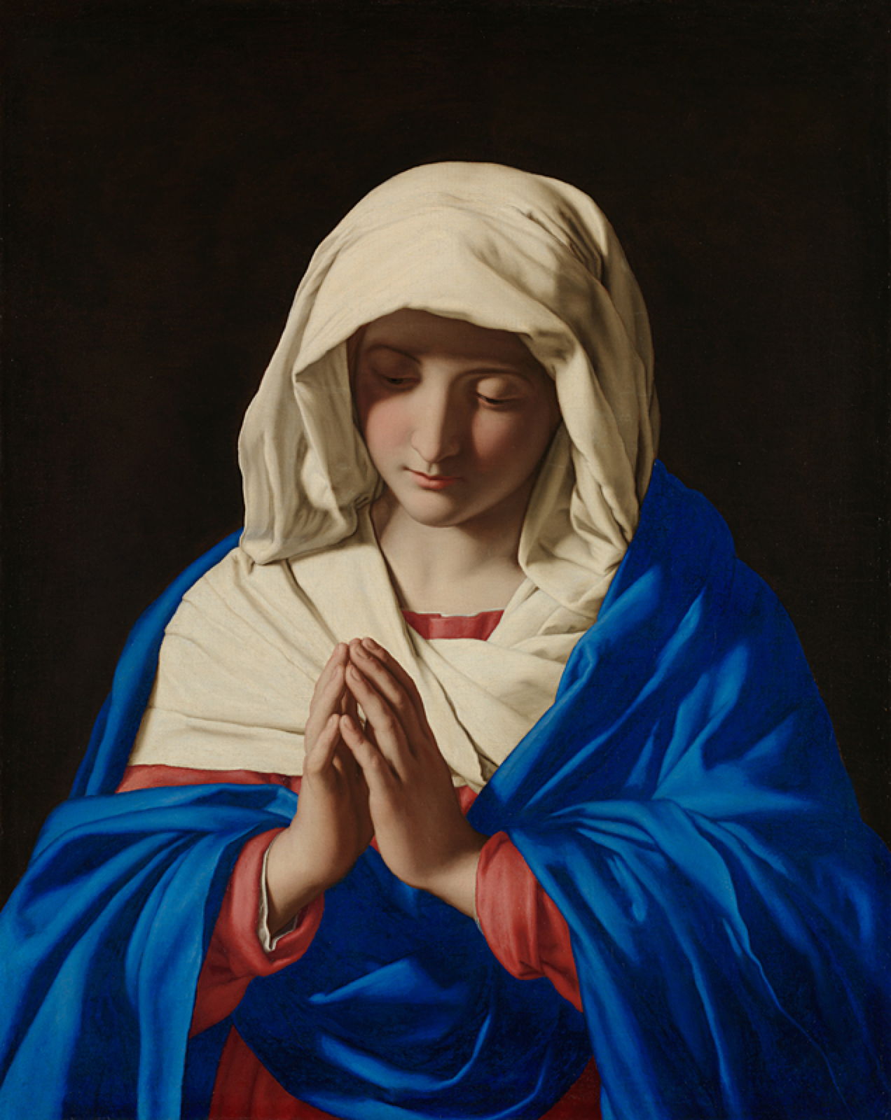
In many paintings of the Virgin Mary, she’s shown wearing a cloak of ultramarine blue, although there are also examples of her wearing green, or a combination of red and green. In Sassoferrato’s The Virgin in Prayer, her cloak looks as if it was painted only yesterday rather than nearly four centuries ago. The choice of ultramarine may have originated from the fact that the pigment was weight-for-weight more expensive than gold, and visually even more stunning.
Dante Gabriel Rossetti’s painting of The Girlhood of Mary Virgin (1848–9) shows her embroidering with her mother Saint Anne, while her father Saint Joachim prunes a vine. Her red embroidery signifies the Passion to come, and the colour is often a symbol of Christ’s blood shed in the crucifixion. It was also adopted as the colour code for cardinals in the Roman Catholic church.
Raphael (1483–1520), Portrait of a Cardinal (1510-11), oil on panel, 79 x 61 cm, Museo Nacional del Prado, Madrid, Spain. Wikimedia Commons.
Raphael’s magnificent Portrait of a Cardinal from 1510-11 is notable not only for the lifelike modelling of flesh, but for his attention to the surface textures of the fabrics, something he had developed since his early days with Perugino. Three distinct fabrics are shown in the cardinal’s choir dress: the soft matte surface of the biretta (hat), the subtly patterned sheen of his mozzatta (cape), both in cardinal red, and the luxuriant folds of his white rochet (vestment).
With a limited range of colours available, it was inevitable that there were unfortunate conflicts, as red not only signifies the Passion and crucifixion, and cardinals, but the scarlet woman as a carnal red.
There are two origins proposed for the term scarlet woman: the earlier is the New Testament book of Revelation, in its characterisation of the Whore of Babylon in chapter 17, verses 4-5, where she’s described as being dressed in purple and scarlet, and decked with gold, precious stones and pearls. William Blake’s watercolour of The Whore of Babylon from 1809 follows this literally, although his purple has faded now.
Carolus-Duran (1837–1917), Portrait of Mademoiselle de Lancey (1876), oil on canvas, 157 × 211 cm, Le Petit Palais, Paris. Wikimedia Commons.
Carolus-Duran’s Portrait of Mademoiselle de Lancey (1876) was exhibited at the Salon, and in its own way became infamous as ‘the lady with the red cushion’. Most of those who attended that Salon knew only too well that she was one of the great courtesans of the Belle Epoque, and could name many of her succession of rich lovers. The scarlets and crimsons and her direct wide-eyed gaze at the viewer left little to the imagination, and the critics were almost as merciless with Carolus-Duran as they had been in 1865 with Manet’s Olympia.
A few artists have used distinctive colour codes in other ways.
Félix Vallotton (1865–1925), Andromeda Standing with Perseus (1907), oil on canvas, 92 x 73 cm, Private collection. Wikimedia Commons.
Félix Vallotton’s Andromeda Standing with Perseus (1907) shows the sea monster Cetus heading for a defenceless Andromeda, as hero Perseus charges to her aid through a cleft in the black sky. Each figure is colour coded: green for the sea monster, pink for the near-victim, and blue for the hero, against a straw-coloured sea.
Evelyn De Morgan (1855–1919), The Cadence of Autumn (1905), oil on canvas, dimensions not known, The De Morgan Centre, Guildford, Surrey, England. Wikimedia Commons.
Evelyn De Morgan’s Cadence of Autumn from 1905 shows five women in a frieze, against a rustic background. From the left, one holds a basket of grapes and other fruit, two are putting marrows, apples, pears and other fruit into a large net bag, held between them. The fourth crouches down from a seated position, her hands grasping leaves, and the last is stood, letting the wind blow leaves out from each hand. They wear loose robes that are coloured (from the left) lilac, gold, brown, green, and black, the sequence seen in nature.
Colour can be at its most important in multiplex narrative, to indicate each occurrence of an actor, so helping the viewer assemble each part of the story into a whole.
Masaccio (1401–1428), The Tribute Money (1425-8), fresco, 247 x 597 cm, Brancacci Chapel, Florence. Wikimedia Commons.
Masaccio’s Tribute Money (1425-8) contains three images of Saint Peter, and two of the tax gatherer, each carefully set and coherently projected into the same single view. Although each is spaced apart from the next, no pictorial device is used to separate them into frames, and they form multiplex narrative. This refers to the Gospel of Matthew, in a story in which Christ directs Peter to find a coin in the mouth of a fish so that he can pay the temple tax. In the centre, the tax collector asks Christ for the temple tax. At the far left, as indicated by Christ and Peter’s arms, Peter (for the second time) takes the coin out of the mouth of a fish. At the right, Peter (a third time) pays the tax collector (shown a second time) his due.
By about 1862, most artists had abandoned trying to paint Pre-Raphaelite landscapes because of their impossible demands. To conform to the prescriptions of critic John Ruskin required long weeks painting painstaking details of a view in front of the motif, and an independent income. The only artist who proved able to sustain this was John Brett (1831–1902), who continued to produce paintings conforming to Ruskin’s ideals and keeping the same ‘look’ until at least 1870. This weekend’s two articles look at those exceptional landscapes, and how they changed later.
Brett was a relative latecomer to the Pre-Raphaelite circle. Although he and his older sister Rosa started painting professionally from about 1850, John Brett wasn’t admitted to the Royal Academy Schools for training until early 1853, by which time the Pre-Raphaelite Brotherhood was dissolving. When in London, he made contact with artists of the Pre-Raphaelite movement, and discussed their art and techniques with Holman Hunt in particular. He read Ruskin, and admired the paintings of John Constable.
After painting portraits to bring in some income, he went to Switzerland in the summer of 1856, where he ascended to the glacier above the village of Rosenlaui, and painted his first real landscape work.
Glacier of Rosenlaui (1856) is an extraordinarily accomplished first landscape painting. Influenced by the fourth volume of Ruskin’s Modern Painters, and the nearby work of John William Inchbold, who was painting about ten kilometres away at the time, it appears to have been painted entirely en plein air, in front of the glacier. Despite its great detail, particularly in the foreground, as prescribed by Ruskin, he signed and dated it 23 August 1856.
He also painted a few impressive watercolours before returning to England. In December, this painting had impressed Dante Gabriel Rossetti and Holman Hunt, and had even received praise from Ruskin himself. But the painting didn’t sell.
The following summer, Brett started work on a less technically-challenging and hopefully more marketable painting, which was possibly inspired by Gustave Courbet’s now-lost painting of stonebreakers, first shown in 1851.
John Brett (1831–1902), The Stonebreaker (1857-58), oil on canvas, 51.5 x 68.5 cm, Walker Art Gallery, Liverpool, England. Wikimedia Commons.
The Stonebreaker (1857-58) was painted closer to home, at a popular beauty spot in the south of England, near Box Hill, which dominates the distance. The milestone at the left shows the distance to London as 23 miles, and David Cordingly considers this places it along a historic track known as Druid’s Walk, leading from the Pilgrim’s Way over the Leatherhead Downs to Epsom and London.
This time, perhaps following his experience in Switzerland, Brett made extensive sketches and studies of the motif, worked on the final oil painting for at least twenty days en plein air, but then completed it in the studio during the following autumn and winter. The painting was shown at the Royal Academy in 1858, where it aroused considerable critical interest.
In the summer of 1858, Brett set off again to the Alps, where he ended up painting a second remarkable mountain view, this time at Val d’Aosta in north-west Italy.
John Brett (1831–1902), Val d’Aosta (1858), oil on canvas, 87.6 x 68 cm, Private collection. Wikimedia Commons.
Val d’Aosta (1858) was painted from a hill about a kilometre north-east of where Brett was lodging, according to Christopher Newall. In contrast to Glacier of Rosenlaui, Brett augments the geological details in the foreground with a sleeping woman and a brilliant white goat. Surprisingly, it omits the fortress of Châtel Argent and the Château de Saint-Pierre, although they appear in sketches he made at the time. The only buildings shown are smaller rustic farms and dwellings, set among finely detailed orchards, vineyards, and pastures.
Probably started in a series of studies and sketches, Brett seems to have worked on the oil version in front of the motif, then brought it back to England for completion during the late autumn of that year. He considered it finished by Christmas, and it was exhibited at the Royal Academy in 1859. Ruskin’s remarks were uncommitted, and the artist wasn’t made a single offer for its purchase.
Brett then tried for success with figurative and genre painting, and it wasn’t until 1861 that he returned to attempt any more proper Pre-Raphaelite landscapes. He first visited Florence in November 1861, and a year later left England to work on his next major work, a view encompassing almost the whole of the city that had been the cradle of much of the southern Renaissance.
He probably started on Florence from Bellosguardo (1863) in January 1863, and painted without the aid of significant preparatory studies, working entirely from the motif. Even with Brett’s apparent eye for fine detail at a distance, much of it must have been painted with the aid of a telescope, and it has been suggested that he may also have used a camera lucida and/or photographs. Regardless of how he managed to paint such great detail, it’s a triumph of painting, both technically and artistically, and it came as a shock when it was rejected by the Royal Academy in 1863.
Thankfully for Brett, the painting was purchased in May that year by the National Gallery, and he was acclaimed in the press as “head of the Pre-Raphaelite landscape school”, although by that time he must have been the last of its practitioners. Brett had also intended the painting as homage to the Brownings, as he had enjoyed the support of Robert Browning through that difficult period.
Brett didn’t hang around in England after this, but later that summer was back in Italy working again.
John Brett (1831–1902), Near Sorrento (1863), watercolour and bodycolour on paper, 24.9 x 33.4 cm, Birmingham Museum and Art Gallery, Birmingham, England.
Near Sorrento (1863) is a watercolour that Christopher Newall believes to have been painted from the Via del Capo, and shows the coastline at least five kilometres from that point, making it almost certain that its fine foreground detail was painted with the aid of a telescope. It still conforms to the basic requirements of a Pre-Raphaelite landscape, with fine detail, bright colours, and its careful rendering of geology.
John Brett (1831–1902), Massa, Bay of Naples (1863-64), oil on canvas, 63.8 x 102 cm, Indianapolis Museum of Art, Indianapolis, IN. Wikimedia Commons.
Massa, Bay of Naples (1863-64) is perhaps the most spectacular of the oil paintings Brett completed during this Mediterranean campaign, and appears to have been painted from a vessel on the water.
John Brett (1831–1902), Massa, Bay of Naples (detail) (1863-64), oil on canvas, 63.8 x 102 cm, Indianapolis Museum of Art, Indianapolis, IN. Wikimedia Commons.
He had travelled there on board the SS Scotia, although it’s unclear whether that ship served as his floating studio, or he transferred to another vessel. The Scotia arrived in the Bay of Naples by 9 September, following which he went to stay in Sorrento, then on to Capri by November. It’s therefore probable that he continued to work on this canvas during the following winter.
To his delight, Alfred Morrison bought this painting on 6 May 1864, for the substantial sum of £250, although Morrison may actually have paid in guineas. Brett was to benefit further from Morrison’s generous patronage, and by August in 1865 could afford to buy his own yacht. That enabled him to concentrate on painting in British waters.
John Brett (1831–1902), February in the Isle of Wight (1866), watercolour, bodycolour and gum on paper, 46 x 35.4 cm, Birmingham Museum and Art Gallery, Birmingham, England. Wikimedia Commons.
During the winter of 1865-66, Morrison remained on or near the Isle of Wight, where Brett’s new boat had been built. He painted two watercolour landscapes of the Island, of which only February in the Isle of Wight (1866) has been traced. Although a superb painting, its style is starting to drift away from the principles laid down by the Pre-Raphaelites.
References
Barringer T (2012) Reading the Pre-Raphaelites, revised edn, Yale UP. ISBN 978 0 300 17733 6.
Cordingly D (1982) ‘The Stonebreaker’: an examination of the landscape in a painting by John Brett, Burlington Mag. 129, March 1982, pp 141-145.
Newall C (2007) ‘Val d’Aosta’: John Brett and John Ruskin in the Alps, 1858, Burlington Mag. 149, March 2007, pp 165-172.
Newall C (2012) Review of Payne (2010), Burlington Mag. 154, July 2012, pp 498-499.
Payne C (2010) John Brett: Pre-Raphaelite Landscape Painter, Yale UP. ISBN 978 0 300 16575 3.
Prettejohn E (2000) The Art of the Pre-Raphaelites, Tate Publishing. ISBN 978 1 854 37726 5.
Staley A (2001) The Pre-Raphaelite Landscape, 2nd edn, Yale UP. ISBN 978 0 300 08408 5.
One of the common presentations for European paintings has been in the form of a folding, self-supporting group of several panels. As altarpieces these have graced the space above and behind the altar in a great many of the churches across the continent. While they can have anything from two to twenty or more panels, triptychs with three have been particularly popular, and have become widely adopted for secular paintings as well.
Polyptychs are often used to solve the problem of telling narratives in visual art. By providing two or more images they spare the artist the task of composing a single image that refers to two or more moments in time, for example using multiplex narrative. However, the viewer then needs to know in which order to read the panels, and to see how they integrate into a whole. In this and tomorrow’s article I show some examples of solutions.
Masaccio (1401–1428), Triptych of San Giovenale (1422), egg tempera on wood, 108 x 65 cm, 88 x 44 cm, Cascia di Reggello, Reggello, Italy. Photo by Sailko, via Wikimedia Commons.
Masaccio’s Triptych of San Giovenale was painted early in his career, in 1422, and was only discovered in 1961. It adopts a popular if not conventional layout for an altarpiece, with its central panel showing the Virgin Mary and infant Christ, with two winged angels in attendance. The left wing shows Saints Bartholomew and Blaise, and the right Saints Juvenal, patron of the commissioning church, and Anthony Abbot. Figures in the wings are looking at the central panel, although Saint Blaise is glancing furtively towards the viewer.
Robert Campin (1375/1379–1444), workshop of, Triptych with the Entombment of Christ (c 1410-1420), oil on panel, centre panel 60 x 48.9 cm, wings 60 x 22.5 cm, Courtauld Institute Gallery, London. Wikimedia Commons.
Robert Campin’s workshop painted this early narrative triptych of The Entombment of Christ in about 1410-1420. The thread runs from the Crucifixion at the left, where Christ’s cross is empty, through the central entombment scene, to the Resurrection with the empty tomb in the right wing. The figure kneeling at the foot of the left wing is the donor.
Hieronymus Bosch was a prolific painter of triptychs, and several of his finest have survived in excellent condition, considering that they’re more than five centuries old. They follow different compositional strategies.
Hieronymus Bosch (c 1450–1516), The Adoration of the Magi (Interior) (Saint Peter with donor, The Adoration of the Magi, Saint Agnes with donor) (1490-1500) (CR no. 9), oil on oak panel, 138 cm x 138 cm overall when open, Museo Nacional del Prado, Madrid. Wikimedia Commons.
The three panels of Bosch’s Adoration of the Magi from 1490-1500 form a continuous view of the local Brabant countryside, with its low rolling hills, and a city in the distance; this may be based on Antwerp, the donor’s city, or possibly ‘s-Hertogenbosch where the artist lived and worked. The Adoration itself is in the centre panel, while the wings show the donor and his family with countryside behind.
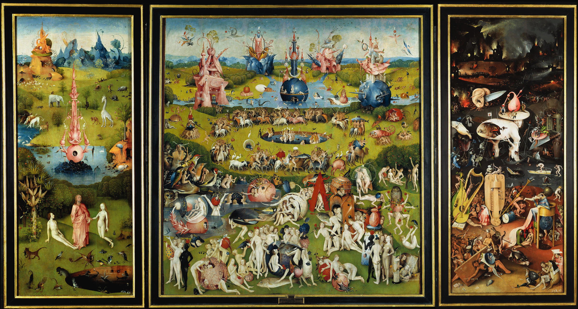
Hieronymus Bosch (c 1450–1516), The Garden of Earthly Delights (c 1495-1505), triptych, oil on oak panel, 220 x 390 cm, Museo Nacional del Prado, Madrid. Wikimedia Commons.
His famous Garden of Earthly Delights from about 1495-1505 follows a pattern distinctive to Bosch, with the left wing showing a scene from the garden of Eden before the fall of man, the centre containing the main theme, and the right wing the chaos and suffering of the apocalypse. This past-present-future layout is repeated in several of his other triptychs, and was adopted by others.
Hieronymus Bosch (c 1450–1516), The Haywain Triptych (c 1510-16), oil on oak panel, left wing 136.1 x 47.7 cm, central panel 133 × 100 cm, right wing 136.1 × 47.6 cm, Museo Nacional del Prado, Madrid. Wikimedia Commons.
This is perhaps best developed in his late Haywain Triptych from about 1510-16. The left wing here has a multiplex account of the Fall of Man set in the Garden of Eden, with God the Father shown in the narrative content and in Heaven above, and the fall of angels occurring at the same time. The central panel shows a rich cavalcade of figures, including the emperor and Pope, nobility, courtiers, and many peasants, accompanying a huge and heavily-laden wagon of hay, which is processing from left to right. They are being overseen from Heaven by Jesus Christ. Finally, the right panel shows sinners entering into Hell and undergoing physical torments, with its fires destroying all in the distance.
Although religious polyptychs continued through the Renaissance into the nineteenth century, secular triptychs didn’t become popular until the middle of the nineteenth century, when they were adopted by the Pre-Raphaelites and spread to continental Europe.
Dante Gabriel Rossetti painted the story of Paolo and Francesca da Rimini in this watercolour triptych in 1855. At the left the lovers are reading the legend of Lancelot and Guinevere; in the centre are Dante and Virgil, and at the right Paolo and Francesca are being blown in the storms of the Second Circle of Hell in Dante’s Inferno.
The following year Arthur Hughes told the story of The Eve of St Agnes in this triptych, also read from left to right. At the left Porphyro is approaching the castle. In the centre he has woken Madeline, who hasn’t yet taken him into her bed. At the right the couple make their escape over drunken revellers. There is also a second, undated version in the Ashmolean, Oxford, in which the left wing shows a slightly later moment, where Porphyro meets Angela at the entrance to the castle.
Hughes breaks from the tradition of the three panels being hinged, which allowed the wings to be closed over and protect the centre panel, and sets them into a single gilt whole, containing a lengthy quotation from the literary source.
Léon Frédéric (1856–1940), The Legend of Saint Francis (1882), media and dimensions not known, Palais des beaux-arts de Lille, Lille, France. Wikimedia Commons.
Léon Frédéric’s triptych showing The Legend of Saint Francis (1882) frames the panels individually, but is set in a single outer frame. These show separate episodes from this popular legend, ending at the right with the story of the wolf of Gubbio/Agubbio.
Fritz von Uhde (1848–1911), The Sacred Night (Triptych) (1888-89), oil on canvas, 134.5 x 117 cm, Staatliche Kunstsammlungen Dresden, Dresden, Germany. Wikimedia Commons.
Fritz von Uhde’s setting of the Nativity, The Sacred Night from 1888-89, centres on a modern interpretation of the classic Virgin and Child, with the adoration of the magi on the left, and an angelic choir singing amid the rafters of the barn on the right.
Folding screens were first recorded in ancient China, where they were used as portable room dividers and as decorative furniture. They’re thought to have made their way to Europe in the late Middle Ages, and started to spread more widely during the seventeenth and eighteenth centuries.
Kanō Hideyori, Maple Viewers (紙本著色観楓図) (Muromachi, early 1500s), colour on paper, six-section folding screen (byōbu), 150.2 cm x 365.5 cm, location not known. Wikimedia Commons.
Early screens were made of wood, but were soon covered with painted paper or silk. Kanō Hideyori’s magnificent Maple Viewers (紙本著色観楓図) (Muromachi, early 1500s) is painted on paper in the classical style of the Kanō school, then applied to a six-section folding screen.
In Europe, screens served several purposes in addition to dividing a larger space into two. They could be used to keep drafts away, provide privacy, hide a feature like a servant’s entrance to a kitchen, or purely for decoration.
William Hogarth (1697–1764), Marriage A-la-Mode: 4, The Toilette (c 1743), oil on canvas, 70.5 × 90.8 cm, The National Gallery, London. Courtesy of The National Gallery London, inventory NG116.
In the fourth painting in William Hogarth’s moralising narrative series Marriage A-la-Mode, The Toilette (c 1743), Countess Squander is being entertained while completing her dressing and preparations for the day. In the background at the right is a painted screen showing a masquerade ball.
It was the popularity of East Asian artefacts in the latter half of the nineteenth century that put folding screens in many homes and quite a few paintings. They featured in at least two of James Abbott McNeill Whistler’s works from the mid-1860s.
James Abbott McNeill Whistler (1834–1903), The Princess from the Land of Porcelain (1863-65), oil on canvas, 201.5 x 116.1 cm, Freer Gallery of Art, Smithsonian Institution, Washington, DC. Wikimedia Commons.
Behind Whistler’s Princess from the Land of Porcelain (1863-65), from his Peacock Room, is a painted screen from Japan.
James Abbott McNeill Whistler (1834-1903), Caprice in Purple and Gold: The Golden Screen (1864), oil on panel, 50.1 x 68.5 cm, Freer Gallery of Art, Washington, DC. Wikimedia Commons.
A more elaborately painted screen forms the backdrop to Whistler’s Caprice in Purple and Gold: The Golden Screen from 1864.
Lucy Madox Brown Rossetti (1843–1894), The Duet (1870), media not known, 30.2 × 32.8 cm, Private collection. Wikimedia Commons.
Lucy Madox Brown Rossetti’s The Duet (1870) attracted favourable reviews when exhibited at the Royal Academy. This features a decorated folding screen from East Asia in the left background. The artist was the daughter of the Pre-Raphaelite painter Ford Madox Brown, and was Dante Gabriel Rossetti’s sister-in-law.
William Quiller Orchardson (1832–1910), Dolce Far Niente (1872), oil on canvas, 76.2 x 99.7 cm, Private collection. Wikimedia Commons.
In 1872 William Quiller-Orchardson completed Dolce Far Niente, incorporating in its painted screen a contemporary flavour of Japonisme. His woman, dressed in sober black, reclines on a thoroughly European chaise longue, her open book and fan beside her as she stares idly out of an unseen window.
Elihu Vedder (1836–1923), Japanese Still Life (1879), oil on canvas, 54.5 x 88.4 cm, Los Angeles County Museum of Art, Los Angeles, CA. Wikimedia Commons.
Like other artists of the day, Elihu Vedder developed a fascination for objets d’art from the Far East, which he assembled in this Japanese Still Life in 1879. This unusual collection may have been assisted by the fact that his brother was a US Navy doctor who was stationed in Japan as it was being re-opened to the West.
Pascal Dagnan-Bouveret (1852–1929), Bouderie (Sulking, Gustave Courtois in his Studio) (1880), oil on canvas, 48.3 × 63.5 cm, location not known. Wikimedia Commons.
Bouderie, which means sulking, is a splendid and intimate portrait of Pascal Dagnan-Bouveret’s friend and colleague Gustave Courtois, painted in 1880. Courtois is seen at one end of a large sofa, smiling wryly and staring into the distance. He holds his palette and brushes in his left hand, and what may be a long mahlstick in the right. At the opposite end of the sofa, turned with her back towards Courtois, is a young woman dressed in fashionable clothing, in black throughout, apart from white lace trim at the foot of her skirts. Also shown is a screen decorated with Japanese imagery, and on the floor the skin of a big cat, perhaps a lioness.
Pierre Bonnard (1867-1947), Man and Woman (c 1900), oil on canvas, 115 x 72.5 cm, Musée d’Orsay, Paris. The Athenaeum.
Pierre Bonnard developed his earlier Man and Woman in an Interior into his Man and Woman in about 1900. Marthe isn’t getting dressed here, but sits up in the sunshine. A folded wooden screen divides the painting into two. Bonnard stands at the right edge of the painting, his legs looking skeletal in the sunlight.
William McGregor Paxton (1869–1941), Tea Leaves (1909), oil on canvas, 91.6 x 71.9 cm, Metropolitan Museum of Art, New York, NY. Wikimedia Commons.
William McGregor Paxton’s Tea Leaves (1909) show two well-dressed young women taking tea together. The woman in the blue-trimmed hat seems to be staring into the leaves at the bottom of her cup, a traditional means of fortune-telling, and behind them is a large folding screen, whose details are intentionally blurred and vague.
William McGregor Paxton (1869–1941), The New Necklace (1910), oil on canvas, 91.8 x 73.0 cm, The Museum of Fine Arts Boston (Zoe Oliver Sherman Collection), Boston, MA. Image courtesy of The Museum of Fine Arts Boston.
The New Necklace from the following year is one of Paxton’s best-known paintings, and perhaps his most intriguing open narrative. A younger woman is sat at a narrow bureau writing. She has turned her chair to reach behind and hold out her left hand to receive the new necklace from a slightly older woman in a dark blue-green dress. Their backdrop is another folding screen, this time with its East Asian painting clearly visible.
My final screen is the painting itself.
Pierre Bonnard (1867-1947), Stork and Four Frogs (c 1889), distemper on red-dyed cotton fabric in a three paneled screen, 159.5 x 163.5 cm, Private collection. The Athenaeum.
Pierre Bonnard’s exquisite three-panelled Japoniste screen of The Stork and Four Frogs was painted at the outset of his career, in about 1889. Its story is contrastingly European, and based on one of Aesop’s fables retold by Jean de La Fontaine’s The Frogs who Demand a King.
The version retold by La Fontaine centres on a colony of frogs, who ask Jupiter for a king. The god’s first response to their request is a laid-back and gentle leader, whom the frogs reject as being too weak to rule them. Jupiter’s second attempt is a crane, who kills and eats the frogs for his pleasure. When the frogs complain to Jupiter, he then responds that they had better be happy with what they have got this time, or they could be given something even worse. Bonnard’s magnificent panel is traditionally interpreted not as showing the evil crane of the second attempt, but the first and gentle ruler.
Aside from the ecstasy brought by intense religious experiences, considered in the first of these two articles, this trance-like state can most commonly result from physical pleasure. Until recently, professional painters have been cautious to stay within the bounds of what has been deemed decent for their time and society. One way to push those boundaries is to depict classical times.
Lovis Corinth (1858–1925) Ariadne on Naxos (1913), oil on canvas, 116 × 147 cm, Private collection. Wikimedia Commons.
Lovis Corinth’s painting of Ariadne on Naxos from 1913 shows a group of figures from classical myth on a symbolic, if not token, island. At the left and in the foreground, Ariadne lies in ecstasy on Theseus’ left thigh, as shown in the detail below. He wears an exuberant helmet, and appears to be shouting angrily and anxiously towards the other figures to the right. They are from the later part of this myth, after Theseus abandoned Ariadne on the island. Bacchus then turned up and the couple married.
Lovis Corinth (1858–1925) Ariadne on Naxos (detail) (1913), oil on canvas, 116 × 147 cm, Private collection. Wikimedia Commons.
Bacchic festivities or Bacchanals are another opportunity for a bit of physical ecstasy.
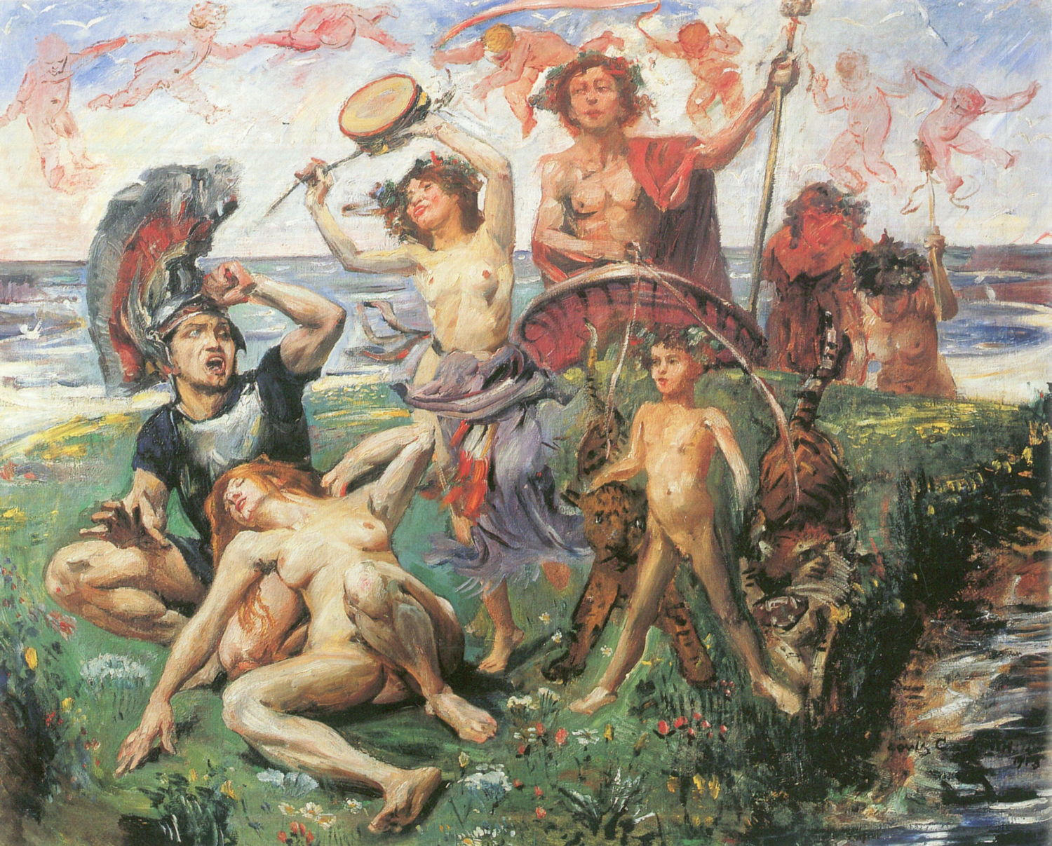
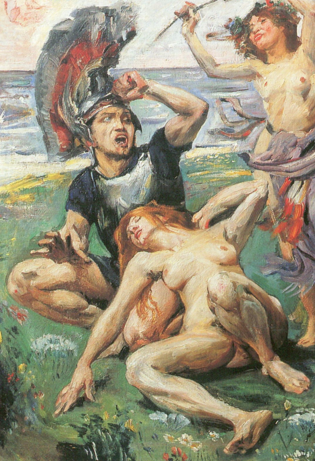
Lovis Corinth (1858–1925), Bacchanal (1896), oil on canvas, 117 × 204 cm, Kunstmuseum Gelsenkirchen, Gelsenkirchen. Wikipedia Commons.
In 1896, Lovis Corinth painted this Bacchanal, with several of its participants staring heavenward with open mouths, clearly in physical ecstasy.
The ecstasy of love and sex was a trickier theme left for the brave or foolish, like Jacques-Louis David in 1809, when Napoleon was approaching the height of his power. David then chose to paint a legend that tells of the love of the poet Sappho for Phaon the ferryman, who plied the waters between Lesbos and the Anatolian mainland. Almost certainly illiterate and hardly a good audience for Sappho’s verse, Phaon’s redeeming feature was his great physical beauty. He was given this one day when he carried Venus in his boat; the goddess was travelling in disguise as an old woman, Phaon didn’t charge her for the crossing, so she returned the favour by transforming his physical appearance. Ovid’s description of Sappho’s affair with Phaon leaves little to the imagination, even down to their lovemaking.
Jacques-Louis David (1748–1825), Sappho and Phaon (1809), oil on canvas, 225 × 262 cm, Hermitage Museum Государственный Эрмитаж, Saint Petersburg, Russia. Wikimedia Commons.
David’s Sappho and Phaon was necessarily not as explicit as Ovid, showing the couple fawning over one another with their recently occupied bed behind them, and an ecstatic gaze on Sappho’s face, resembling those of Corinth’s Bacchantes.
Dante Gabriel Rossetti (1828–1882), Sir Launcelot in the Queen’s Chamber (1857), black and brown pen and ink on paper, 26.2 x 35.4 cm, Birmingham Museum and Art Gallery, Birmingham, England. Wikimedia Commons.
Dante Gabriel Rossetti was more coy in his pen and ink painting of Sir Launcelot in the Queen’s Chamber from 1857, taken from the seamy side of Arthurian legend. While Lancelot is brandishing his sheathed sword at knights on the other side of the door, Guinevere, King Arthur’s queen, already seems to be transported in ecstasy, to the consternation of her chambermaids behind. At least she conforms to Victorian standards of decency in being fully clothed, and doesn’t even expose her feet.
My remaining examples are taken from the transition of the story of John the Baptist’s martyrdom at the whim of Herodias, to the femme fatale of Salome in the closing years of the nineteenth century. Following Gustave Moreau’s startling paintings that changed the original post-Biblical story in The Apparition (c 1876), Oscar Wilde wrote his play Salomé, published in 1893.
Richard Strauss saw Wilde’s play performed in Berlin in 1902, and his opera of the same name premiered in Dresden at the end of 1905. The following year, as an even more immediate inspiration for Franz von Stuck, the dancer and choreographer Maud Allan produced the show Vision of Salomé in Vienna, featuring a notorious version of the Dance of the Seven Veils, and sparking the wave of ‘Salomania’ that swept Europe.
Franz von Stuck (1863-1928), Salome (1906), media not known, 114.5 x 92 cm, Staedtische Galerie im Lenbachhaus und Kunstbau, Munich, Germany. Wikimedia Commons.
Von Stuck’s Salome (1906) is one of several similar versions. His Salome is the erotic dancer of Wilde, Strauss, and Allan, decked with flamboyant ‘oriental’ jewellery, naked to the waist and in ecstasy. Behind her, in the dark shadows, an ape-like creature grins, and holds out a platter on which is the head of John the Baptist.
Gustav Klimt had already conflated this novel Salome with Judith, who had killed the enemy general Holofernes.
Gustav Klimt (1862–1918), Judith I (1901), oil on canvas, 84 × 42 cm, Österreichische Galerie Belvedere, Vienna, Austria. Wikimedia Commons.
Klimt’s approach was influenced by his decorative experience, and he returned to using gold leaf in what therefore became known as his Golden Phase. In his Judith I from 1901 he emphasises her neck with a broad gold choker studded with gems, and echoed in a golden belt at the foot of this painting. Her glazed eyes are almost closed and her mouth open in overt ecstasy.
Gustav Klimt (1862-1918), Judith II (Salome) (1909), oil on canvas, 178 x 46 cm, Ca’Pesaro, Galería de Arte Moderno, Venice. Wikimedia Commons.
In 1909, Klimt followed that with greater ambiguity in what could be Judith II or Salome (1909). Below her is the severed head of either Holofernes or John the Baptist, in a disturbing link between erotic ecstasy and death.