Google is so helpful now when you ask it to solve a problem, such as how to free up space on your Mac. Not only can it make its own suggestions, but it can tap into those from AIs like ChatGPT and Grok. This article shows how that can bring you malware, thanks to the recent research of Stuart Ashenbrenner and Jonathan Semon at Huntress.
Please don’t try anything you see in this article, unless you want AMOS stealer malware on your Mac.
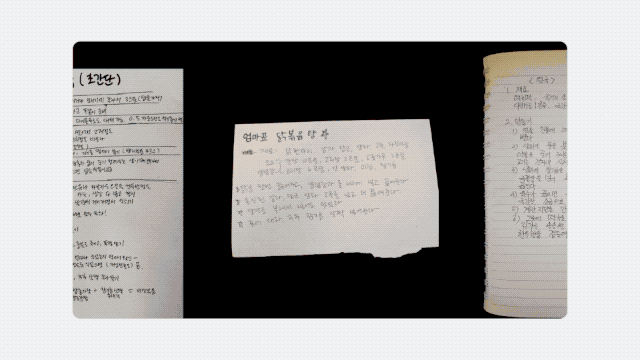
I started by entering a common search request, clear disk space on macOS, the sort of thing many Mac users might ask.
At the top of Google’s sponsored results is an answer from ChatGPT, giving its trusted web address. When I clicked on that, it took me to ChatGPT, where there’s a nice clear set of instructions, described impeccably just as you’d expect from AI.
This helpfully tells me how to open Terminal using Spotlight, very professional.
It then provides me with a command I can copy with a single click, and paste straight into Terminal. It even explains what that does.
When I press Return, I’m prompted for my password, which I enter.
Although I was a bit surprised to see this prompt, it looks genuine, so I allowed it.
Far from clearing space on my Mac, the malware, an AMOS stealer, has gone to work, saving a copy of the password I gave it, in the /tmp folder, and installing its payload named update.
Scripts like .agent are installed in my Home folder, and my (virtual) Mac is now well and truly owned by its attacker.
As Ashenbrenner and Semon point out, this marks a new and deeply disturbing change, that we’re going to see much more of. We have learned to trust many of the steps that here turn out to lead us into trouble, and there’s precious little that macOS can do to protect us. This exploit relies almost entirely on our human weakness to put trust in what’s inherently dangerous.
First, distrust everything you see in search engines. Assess what they return critically, particularly anything that’s promoted. It’s promoted for a reason, and that’s money, so before you click on any link ask how that’s trying to make money from you. If that’s associated with AI, then be even more suspicious, and disbelieve everything it tells you or offers. Assume that it’s a hallucination (more bluntly, a lie), or has been manipulated to trap you.
Next, check the provenance and authenticity of where that click takes you. In this case, it was to a ChatGPT conversation that had been poisoned to trick you. When you’re looking for advice, look for a URL that’s part of a site you recognise as a reputable Mac specialist. Never follow a shortened link without unshortening it using a utility like Link Unshortener from the App Store, rather than one of the potentially malicious sites that claims to perform that service.
When you think you’ve found a solution, don’t follow it blindly, be critical. Never run any command in Terminal unless it comes from a reputable source that explains it fully, and you have satisfied yourself that you understand exactly what it does. In this case the command provided was obfuscated to hide its true action, and should have rung alarm bells as soon as you saw it. If you were to spare a few moments to read what it contains, you would have seen the command curl, which is commonly used by malware to fetch their payloads without any quarantine xattr being attached to them. Even though the rest of the script had been concealed by base-64 encoding, that stands out.
If you did get as far as running the malicious script, then there was another good clue that it wasn’t up to anything good: it prompted you for a System Password:. The correct prompt should just be Password:, and immediately following that should be a distinctive key character that’s generated by macOS for this purpose. Then as you typed your password in, no characters should appear, whereas this malware showed them in plain text as you entered them, because it was actually running a script to steal your password.
Why can’t macOS protect you from this? Because at each step you have been tricked into bypassing its protections. Terminal isn’t intended to be a place for the innocent to paste obfuscated commands inviting you to surrender your password and download executable code to exploit your Mac. curl isn’t intended to allow malware to arrive without being put into quarantine. And ad hoc signatures aren’t intended to allow that malicious code to be executed.
As I was preparing this article Google search ceased offering the malicious sponsored links, but I expect they’ll be back another time.
AI is certainly transforming our Macs, in this case by luring us to give away our most precious secrets. This isn’t a one-off, and we should expect to see more, and more sophisticated, attacks in the future. Now is the time to replace trust with suspicion, and be determined not to fall victim.
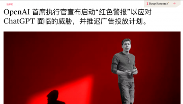
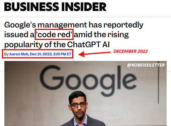
Google 这一次王者归来,震感甚至直接传导到了竞争对手的神经中枢。据 The Information 报道,面对 Google 步步紧逼的攻势,OpenAI CEO Sam Altman 本周一紧急在内部备忘录中宣布公司进入「红色警戒(code red)」状态,准备调动一切战略资源对 ChatGPT 的能力进行大幅升级。
据 The Verge 援引知情人士消息称,OpenAI 计划最早于下周初发布 GPT-5.2 模型, 这一时间表较原定的 12 月下旬计划大幅提前。
Logan Kilpatrick: 太赞了!这简直是 AI Studio 的完美宣传点,我们会把这段剪辑出来发布到网上。你刚才提到的一个重要话题是,在 Gemini 3 发布之际,我们同步推出了 Google Anti-gravity 平台。从模型角度来看,你认为这种产品架构对提升模型质量的重要性有多大?显然,这和工具调用、编码能力息息相关。
就像 Gemini、AI Studio 一样,Anti-gravity 平台也是如此。这些产品能让我们与用户紧密相连,获取真实的反馈信号,这是巨大的财富。Anti-gravity 平台作为我们的关键发布合作伙伴,虽然加入时间不长,但在过去两三周的发布筹备中,它的反馈起到了决定性作用。
搜索 AI 模式(AI Mode)也是如此,我们从那里获得了大量反馈。基准测试能帮助我们推动科学、数学等领域的智能提升,但了解现实世界的使用场景同样重要,模型必须能解决实际问题。
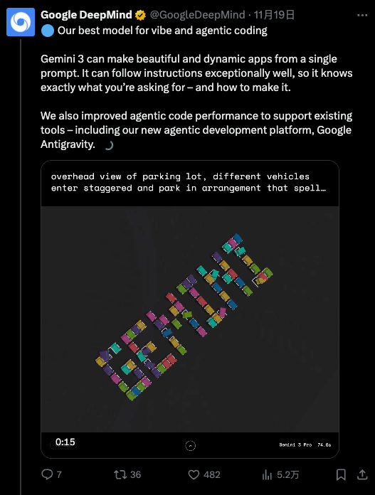
Gemini 3,一款全 Google 团队协作的模型
Logan Kilpatrick: 在你担任新任首席 AI 架构师后,你的职责不仅是确保我们拥有优秀的模型,还要推动产品团队将模型落地,在 Google 的所有产品中打造出色的用户体验。 Gemini 3 在发布当天就同步登陆 Google 所有产品端,这对用户来说是巨大的惊喜,也希望未来能覆盖更多产品。从DeepMind 的角度来看,这种跨团队协作是否增加了额外的复杂性?毕竟一年半前,事情可能还简单得多。
Koray Kavukcuoglu: 但我们的目标是构建智能,对吧?很多人问我,身兼 CTO 和首席 AI 架构师两个职位,会不会有冲突,但对我来说,这两个角色本质上是一致的。
要构建智能,就必须通过产品与用户的联动来实现。我的核心目标是确保 Google 的所有产品都能用上最先进的技术。我们不是产品团队,而是技术开发者,我们负责研发模型和技术,当然,我们也会对产品有自己的看法,但最重要的是,以最佳方式提供技术支持,与产品团队合作,在 AI 时代打造最优秀的产品。
这是一个全新的时代,新技术正在重新定义用户期望、产品行为和信息传递方式。因此,我希望能在 Google 内部推动这种技术赋能,与所有产品团队合作。这不仅对产品和用户有益,对我们自身也至关重要。
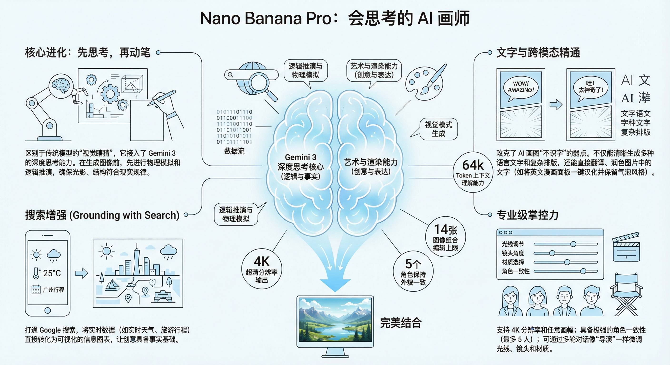
团队基于 Gemini 3.0 Pro 的架构,结合第一代模型的经验,通过扩大模型规模、优化调优方式,打造出了更强大的图像生成模型,这很合理。它的核心优势在于处理复杂场景:比如输入大量复杂文档,模型不仅能回答相关问题,还能生成对应的信息图表,而且效果很好。这就是输入多模态与输出多模态自然融合的体现,非常棒。
我们有幸生活在这个时代,很多人曾为 AI 或自己热爱的领域奋斗一生,希望能见证技术爆发,但这一切现在真的发生了。AI 的崛起不仅得益于机器学习和深度学习的进步,还离不开硬件、互联网和数据的发展,这些因素共同促成了今天的局面。所以,我既为自己选择了 AI 领域而自豪,也为能身处这个时代而感到幸运。这真的太令人兴奋了。
我可以肯定地说,20 年后,我们现在使用的大语言模型(LLM)架构肯定会被淘汰。所以,持续探索新方向是正确的选择。 Google DeepMind、 Google 研究院,以及整个学术研究社区,都需要共同推进多个领域的探索。
我认为,不必纠结于「什么是对的、什么是错的」,真正重要的是技术在现实世界中的能力和表现。
Logan Kilpatrick: 最后一个问题:我个人在 Google 的第一年多时间里,感受到了一种「 Google 逆袭」的氛围。尽管 Google 拥有强大的基础设施优势,但在 AI 领域,我们似乎一直在追赶。比如在 AI Studio 的早期阶段,我们没有用户(后来增长到3万人),没有收入,Gemini 模型也处于早期阶段。
而现在,随着 Gemini 3 的发布,我最近收到了很多来自生态系统各方的反馈,人们似乎终于意识到「 Google 的AI时代已经到来」。你是否也有过这种「逆袭」的感受?你相信我们能走到今天吗?对于团队来说,这种角色的转变会带来什么影响?
Koray Kavukcuoglu: 在大语言模型(LLM)的潜力逐渐显现时,我坦诚地说,我既认为 DeepMind 是前沿 AI 实验室,也意识到我们作为研究人员,在某些领域的投入还不够,这对我来说是一个重要的教训:我们必须拓宽探索范围,创新至关重要,而不是局限于某一种架构。
Google 选择 XREAL 这家初创公司的原因,大概率是看中了 XREAL 做 AR 眼镜硬件的强大实力:Aura 实现了 70° FOV,为消费级 AR 的最大实用视场,能够让 Gemini 助手更好地与真实世界进行互动,也能获得沉浸式的观影体验;性能方面则采用了 Galaxy XR 同款高通骁龙 XR2 Plus Gen 2 芯片组。
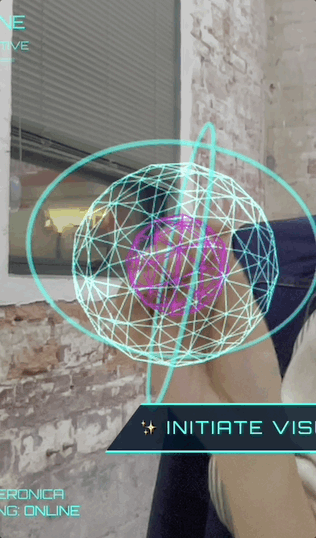
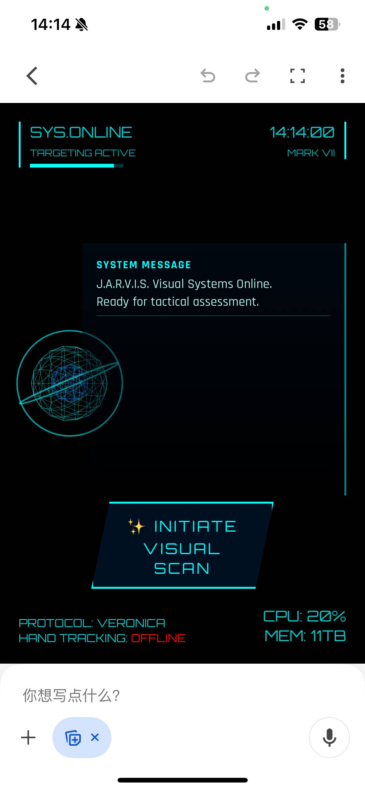
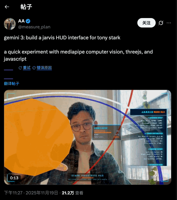
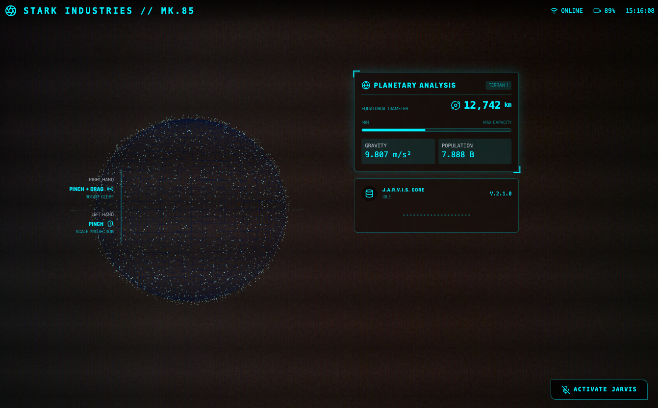
create a webapp using vanilla js, html, css, modern threejs, mediapipe. it should be a sci-fi tony stark / iron man / jarvis experience focused on simulating an AR heads up display experience. full screen webcam input shown. add a heads up display that tracks the user’s head (offset to the right), with live updating metrics. a minimal 3D world globe should be shown on the left center of the screen, that should be able to be rotated / sized by the user hand gestures
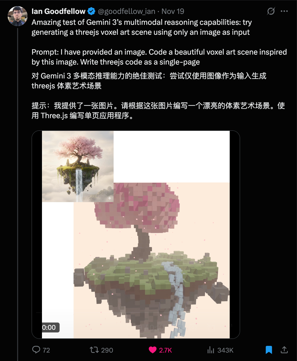
▲图片来源:X@fofrAI|提示词:Put this whole text, verbatim, into a photo of a glossy magazine article on a desk, with photos, beautiful typography design, pull quotes and brave formatting. The text: […the unformatted article]
还有网友直接丢给他一个 Markdown 文档或者 PDF,然后跟 Nano Banana Pro 说,将这个文档转成信息图,就得到了一个设计友好、信息准确的图片。
评论区都在说,插画师的时代,是不是也要结束了。
▲图片来源:X@tobi|提示词:Make this markdown transcript into a infographic
因为 Nano Banana Pro 现在能使用谷歌搜索,并且推理和理解能力都有了大的提升,所以在生成信息图上,如果没有太严格的要求,直接告诉它要做一个什么主体的信息图就能实现,不需要纠结太多提示词的结构。
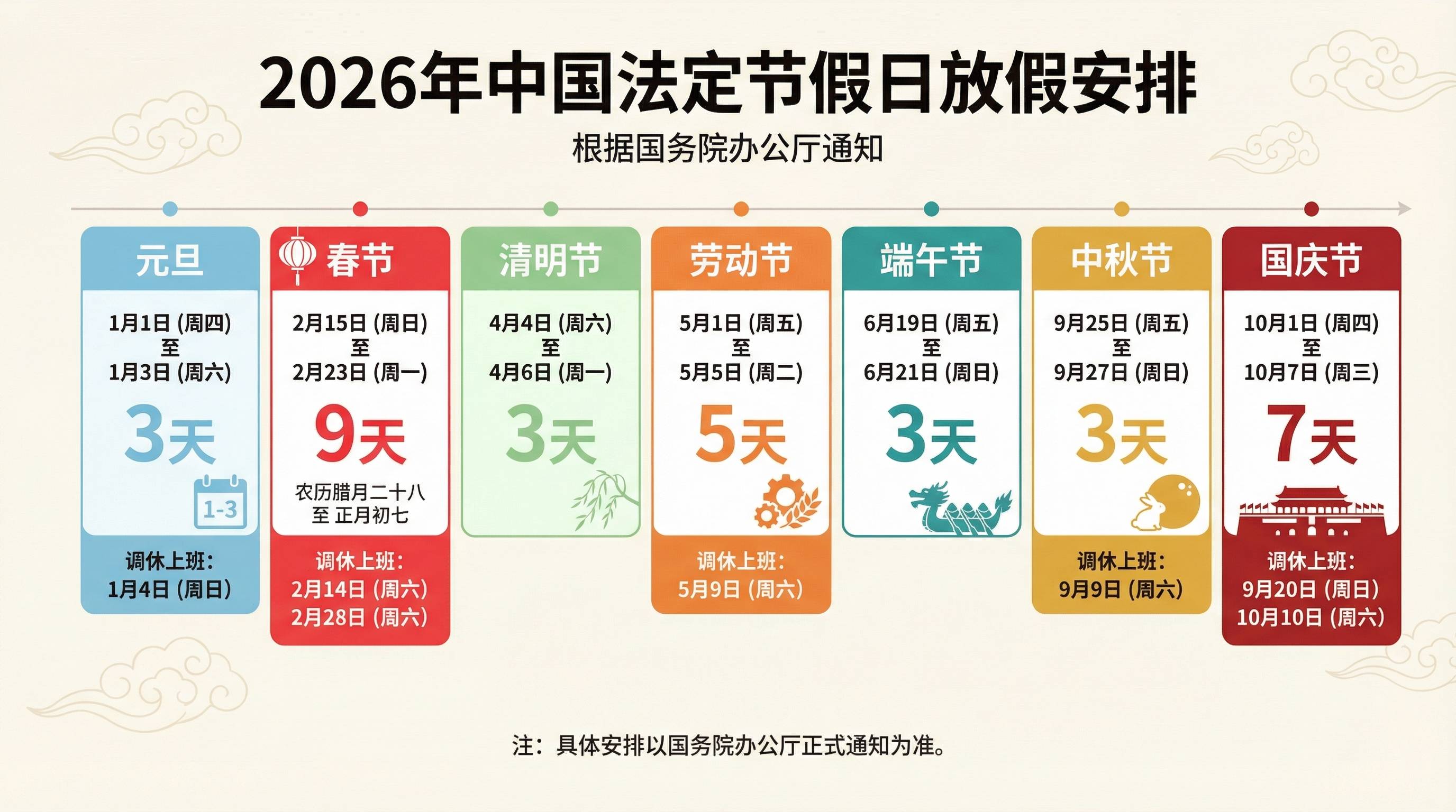
▲提示词:生成一张 2026 年中国放假安排的信息图,全部使用中文,4K画质,16:9
例如,当我们要他生成明年的节假日信息时,我看到 Gemini 里面给我的回复,有明确的使用 Google 搜索获取的信息结果,即多个官方的公告网页链接。
还有很多好看的信息图测试,网友们的提示词也比较简单,基本上都是「帮我生成一个xx的信息图」。
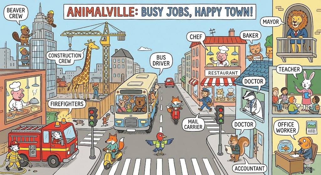
一张有趣的繁忙城镇信息图,展示动物们在繁忙城镇中上班的情景,并介绍它们从事的不同工作。
▲图片来源:X@unsoldwill|提示词:Make a fun busy town infographic of animals going to work in a busy town showcasing different jobs.
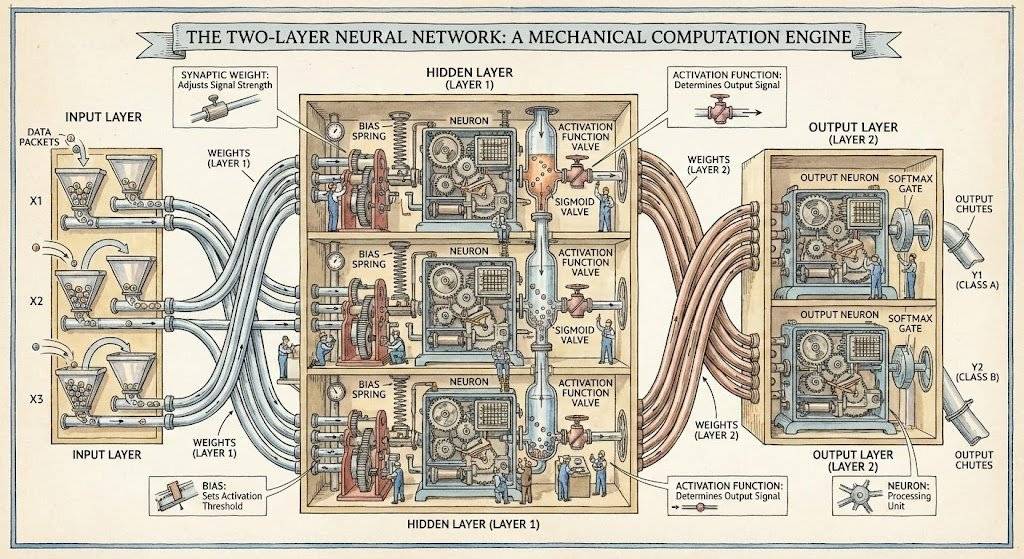
一张 Stephen Biesty 风格的双层神经网络图。
▲ 图片来源:X@jon_barron|提示词:Generate a diagram of a two-layer neural network in the style of Stephen Biesty
这位网友还把这张图片丢给 Google 的 Veo 3.1,让它动了起来。
将内容繁杂的文档,转换成清晰、可扫描的白板式信息图。
▲图片来源:X@denilgabani|Convert the attached research paper into a single whiteboard-style image. Break down all key concepts, diagrams, insights, and relationships in a way that is easy to understand at a glance. Add clear visual notes, arrows, highlights, summaries, and clever student-style annotations so I can quickly grasp the full paper and take notes from it.
生成精彩的连环画
结合长文本渲染和强大的一致性保持,除了渲染文本较多的信息图,Nano Banana Pro 用来制作连环画是再合适不过,并且,它现在支持在一次请求中,生成多张照片。
You are an expert Information Designer. Your goal is to extract the essential structure from a web page to create a clear, educational infographic.
Analyze the content at this URL: ${url}
TARGET LANGUAGE: ${language}.
Provide a structured breakdown specifically designed for visual representation in ${language}:
1. INFOGRAPHIC HEADLINE: The core topic in 5 words or less (in ${language}).
2. KEY TAKEAWAYS: The 3 to 5 most important distinct points, steps, or facts (in ${language}). THESE WILL BE THE MAIN SECTIONS OF THE IMAGE.
3. SUPPORTING DATA: Any specific numbers, percentages, or very short quotes that add credibility.
4. VISUAL METAPHOR IDEA: Suggest ONE simple visual concept that best fits this content (e.g., “a roadmap with milestones”, “a funnel”, “three contrasting pillars”, “a circular flowchart”).
Keep the output concise and focused purely on what should be ON the infographic. Ensure all content is in ${language}.
得到这一部分的文章总结后,我们就可以开始图像生成。
Create a professional, high-quality educational infographic based strictly on this structured content plan:
${structuralSummary}
VISUAL DESIGN RULES:
– ${styleGuidelines}
– LANGUAGE: The text within the infographic MUST be written in ${language}.
– LAYOUT: MUST follow the “VISUAL METAPHOR IDEA” from the plan above if one was provided.
– TYPOGRAPHY: Clean, highly readable sans-serif fonts. The “INFOGRAPHIC HEADLINE” must be prominent at the top.
– CONTENT: Use the actual text from “KEY TAKEAWAYS” in the image. Do not use placeholder text like Lorem Ipsum.
– GOAL: The image must be informative and readable as a standalone graphic.
有趣且充满玩乐的风格 Fun & Playful:styleGuidelines = STYLE: Fun, playful, vibrant 2D vector illustrations. Use bright colors, rounded shapes, and a friendly tone.
简约极简风格 Clean Minimalist:styleGuidelines = STYLE: Ultra-minimalist. Lots of whitespace, thin lines, limited color palette (1-2 accent colors max). Very sophisticated and airy.
深色模式科技风Dark Mode Tech:styleGuidelines = STYLE: Dark mode technical aesthetic. Dark slate/black background with bright, glowing accent colors (cyan, lime green) for data points.
现代编辑风 Modern Editorial:styleGuidelines = STYLE: Modern, flat vector illustration style. Clean, professional, and editorial (like a high-end tech magazine). Cohesive, mature color palette.
照着这种方法,我们把 Nano Banana Pro 发布的那篇文章丢给 Gemini,得到了下面这几张信息图。
官方下场,7 个生图技巧
除了用这种已经写好的提示词,Google 也是煞费苦心给了一份详细的 Nano Banana Pro 使用技巧,一方面是生怕我们不会操作,导致对模型的误会。另一方面,其实 Google 是希望 Nano Banana Pro 不单只是一个用来玩玩的生图模型,他们真的期待能提升我们的生产力。
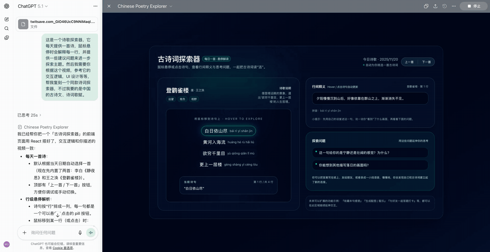
网上更火的 Gemini 3.0 Pro 测试,是有一个博主,在 Gemini 里面输入一句「Design a Capcut(设计一个剪映)」,然后只花了 239 秒,就复刻了一个能真实使用的剪映。完全不需要我们再打磨提示词,去详细列出应该做哪些功能,交互逻辑是如何,配色方案等;直接一句话搞定。
▲图片来源:X@lepadphone
还有相当一大部分的案例,是网友们都在谈的前端,即 Gemini 3.0 Pro 生成的网页,不仅摆脱了 AI 编程之前常见的渐变紫,还带来了耳目一新的大胆设计,就像是有个设计师在后台帮用户画初稿一样。
▲诸如此类「前端已死」的说法,在 Gemini 3.0 发布之后,X 上随处可见。
下面这些是网上热度比较高,由 Gemini 3.0 Pro 生成的前端页面例子。
一家人工智能公司的完整落地页。
▲提示词:You are the top 0.1% designer and developer for the world’s cutting-edge innovation on front-end design and development. You are tasked to create a full landing page with {Dither + Shaders} using {WebGL + ThreeJs} in the styling of an uploaded image for the AI company. – Focus mainly on the design part, not the development. Import all necessary files and libraries: Three.js、WebGL、GSAP、Any other animation libraries related to 3D development.|图片来源:X@natatatataat
下一代 AI 公司该有的美学追求和品味。
▲ 图片来源:X@eter_inquirer
一个双栏的响应式布局个人首页。
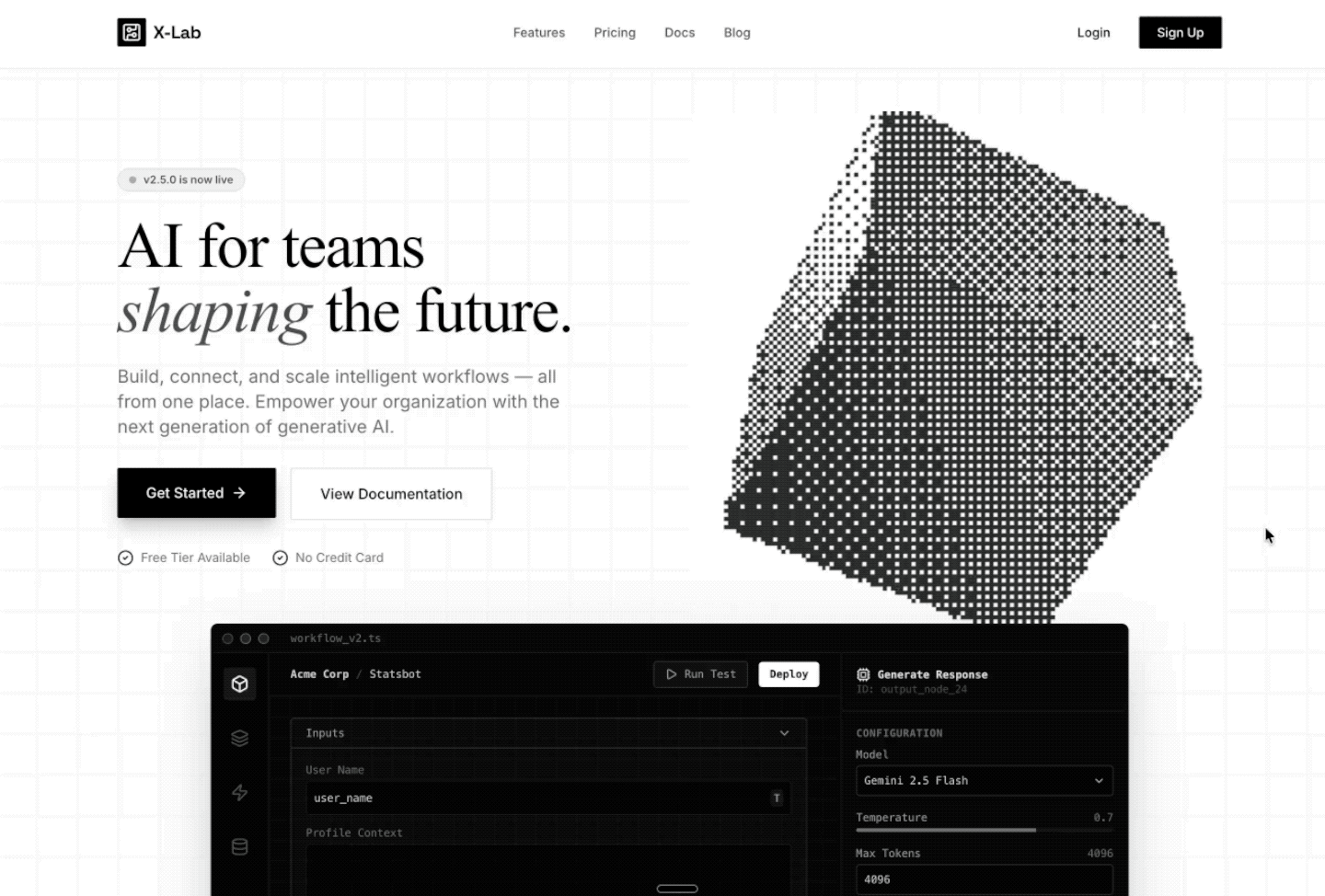
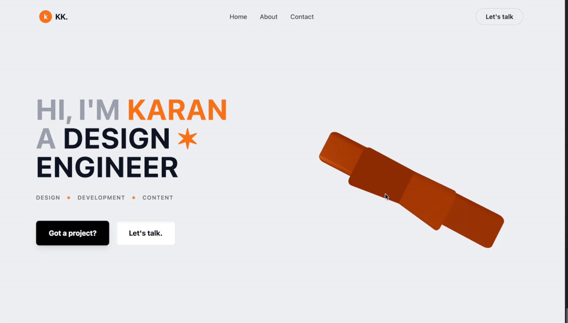
▲提示词:Create a hero section with a two-column responsive layout: left side has a large bold heading with orange accent highlights and star symbols, a tagline row with uppercase tags, and two CTA buttons (primary black, secondary white with border). Right side features a 3D animated orange star using React Three Fiber with slow rotation and float animations, orbit controls, and a subtle background glow. Include a top navigation bar with logo, menu items, and a “Let’s talk” button. Use Tailwind CSS for styling with a light gray background, generous spacing, and smooth hover transitions.|图片来源:X@karaan_dev
此外,在 Google AI Studio 和 Vertex AI 中, 通过 Gemini API 使用 Gemini 3 Pro 预览版的价格为:输入每百万 token 需要 2 美元, 输出每百万 token 需要 12 美元。在 Google AI Studio 中也可以免费使用, 但有调用限制。
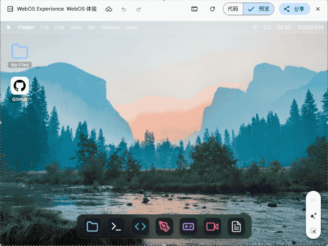
▲ Design and create a web os like macOS full functional features from text editor , terminal with python and code editor and a game that can be played to dile manager to paint to video editor and all important windows os pre bundled software Use whatever libraries to get this done but make sure I can paste it all into a single HTML file and open it in Chrome.make it interesting and highly detail , shows details that no one expected go full creative and full beauty in one code block
我要求它用单个 HTML 文件复刻一个完整的 macOS 系统, 包括文本编辑器、终端、代码编辑器、文件管理器、画板、视频编辑器等预装软件。生成的结果虽然审美一般, 但核心交互逻辑都实现了。
Anthropic 的内部团队正在利用 Claude Code 彻底改变他们的工作流程。无论是开发者还是非技术人员,都能借助它攻克复杂项目、实现任务自动化,并弥补那些曾经限制生产力的技能鸿沟。
为了深入了解,我们采访了以下团队:
通过这些访谈,我们收集了不同部门使用 Claude Code 的方式、它对工作带来的影响,以及为其他考虑采用该工具的组织提供的宝贵建议。
数据基础设施团队负责为公司内所有团队整理业务数据。他们使用 Claude Code 来自动化常规的数据工程任务、解决复杂的基础设施问题,并为技术和非技术团队成员创建文档化工作流,以便他们能够独立访问和操作数据。
利用截图调试 Kubernetes
当 Kubernetes 集群出现故障,无法调度新的 pod 时,团队使用 Claude Code 来诊断问题。他们将仪表盘的截图喂给 Claude Code,后者引导他们逐个菜单地浏览 Google Cloud 的用户界面,直到找到一个警告,指出 pod 的 IP 地址已耗尽。随后,Claude Code 提供了创建新 IP 池并将其添加到集群的确切命令,整个过程无需网络专家的介入。
为财务团队打造纯文本工作流
工程师向财务团队成员展示了如何编写描述其数据工作流程的纯文本文件,然后将这些文件加载到 Claude Code 中,以实现完全自动化的执行。没有任何编程经验的员工只需描述“查询这个仪表盘,获取信息,运行这些查询,生成 Excel 输出”等步骤,Claude Code 就能执行整个工作流,甚至会主动询问日期等必要输入。
为新员工提供代码库导览
当新的数据科学家加入团队时,他们会被指导使用 Claude Code 来熟悉庞大的代码库。Claude Code 会阅读他们的 Claude.md 文件(文档),识别特定任务所需的相关文件,解释数据管道的依赖关系,并帮助新人理解哪些上游数据源为仪表盘提供数据。这取代了传统的数据目录和发现工具。
会话结束时自动更新文档
在每项任务结束时,团队会要求 Claude Code 总结已完成的工作并提出改进建议。这创建了一个持续改进的循环:Claude Code 根据实际使用情况帮助优化 Claude.md 文档和工作流指令,使后续的迭代更加高效。
跨多个实例并行管理任务
在处理耗时较长的数据任务时,团队会为不同项目在不同的代码仓库中打开多个 Claude Code 实例。每个实例都能保持完整的上下文,因此即使在数小时或数天后切换回来,Claude Code 也能准确地记住他们当时正在做什么以及任务进行到哪里,从而实现了无上下文丢失的真正并行工作流管理。
无需专业知识即可解决基础设施问题
解决了通常需要系统或网络团队成员介入的 Kubernetes 集群问题,利用 Claude Code 诊断问题并提供精确的修复方案。
加速新员工上手
新的数据分析师和团队成员无需大量指导,就能迅速理解复杂的系统并做出有意义的贡献。
增强支持工作流
Claude Code 能够处理比人类手动审查大得多的数据量,并识别异常情况(例如监控 200 个仪表盘),这是人力无法完成的。
他们建议使用 MCP 服务器而不是 BigQuery 命令行界面,以便更好地控制 Claude Code 的访问权限,尤其是在处理需要日志记录或存在潜在隐私问题的敏感数据时。
分享团队使用心得
团队举办了分享会,成员们互相演示他们使用 Claude Code 的工作流程。这有助于传播最佳实践,并展示了他们自己可能没有发现的各种工具使用方法。
Claude Code 产品开发团队使用自家的产品来为 Claude Code 构建更新,扩展产品的企业级功能和 AI 智能体循环功能。
通过“自动接受模式”快速构建原型
工程师们通过启用“自动接受模式”(Shift+Tab)并设置自主循环,让 Claude 编写代码、运行测试并持续迭代,从而实现快速原型开发。他们将自己不熟悉的抽象问题交给 Claude,让它自主工作,然后在接手进行最后润色前,审查已完成 80% 的解决方案。团队建议从一个干净的 git 状态开始,并定期提交检查点,这样如果 Claude 跑偏了,他们可以轻松回滚任何不正确的更改。
同步编码开发核心功能
对于涉及应用程序业务逻辑的更关键功能,团队会与 Claude Code 同步工作,提供带有具体实现指令的详细提示。他们实时监控过程,确保代码质量、风格指南合规性和正确的架构,同时让 Claude 处理重复的编码工作。
构建 Vim 模式
他们最成功的异步项目之一是为 Claude Code 实现 Vim 快捷键绑定。他们要求 Claude 构建整个功能,最终实现中大约 70% 的代码来自 Claude 的自主工作,只需几次迭代即可完成。
生成测试和修复 bug
在实现功能后,团队使用 Claude Code 编写全面的测试,并处理在代码审查中发现的简单 bug。他们还使用 GitHub Actions 让 Claude 自动处理像格式问题或函数重命名这样的 Pull Request 评论。
代码库探索
在处理不熟悉的代码库(如 monorepo 或 API 端)时,团队使用 Claude Code 来快速理解系统的工作方式。他们不再等待 Slack 上的回复,而是直接向 Claude 提问以获取解释和代码参考,从而大大节省了上下文切换的时间。
更快的功能实现
Claude Code 成功实现了像 Vim 模式这样的复杂功能,其中 70% 的代码由 Claude 自主编写。
尽管对“JavaScript 和 TypeScript 知之甚少”,团队仍使用 Claude Code 构建了完整的 React 应用,用于可视化强化学习(RL)模型的性能和训练数据。他们让 Claude 控制从头开始编写完整的应用程序,比如一个 5000 行的 TypeScript 应用,而无需自己理解代码。这一点至关重要,因为可视化应用相对上下文较少,不需要理解整个 monorepo,从而可以快速构建原型工具,以便在训练和评估期间了解模型性能。
处理重复的重构任务
当遇到合并冲突或半复杂的文件重构时——这些任务对于编辑器宏来说太复杂,但又不足以投入大量开发精力——他们就像玩“老虎机”一样使用 Claude Code:提交当前状态,让 Claude 自主工作 30 分钟,然后要么接受解决方案,要么在不成功时重新开始。
创建持久性分析工具而非一次性笔记本
团队现在不再构建用完即弃的 Jupyter 笔记本,而是让 Claude 构建可重复使用的 React 仪表盘,这些仪表盘可以在未来的模型评估中重复使用。这很重要,因为理解 Claude 的性能是“团队最重要的事情之一”——他们需要了解模型在训练和评估期间的表现,而这“实际上并非易事,简单的工具无法从观察一个数字上升中获得太多信号”。
零依赖任务委托
对于完全不熟悉的代码库或语言中的任务,他们将整个实现委托给 Claude Code,利用其从 monorepo 中收集上下文并执行任务的能力,而无需他们参与实际的编码过程。这使得他们在自己专业领域之外也能保持生产力,而不是花时间学习新技术。
在让 Claude 工作之前保存你的状态,让它运行 30 分钟,然后要么接受结果,要么重新开始,而不是试图费力去修正。重新开始的成功率通常比试图修复 Claude 的错误要高。
必要时为了简化而打断它
在监督过程中,不要犹豫,停下来问 Claude “你为什么这么做?试试更简单的方法。” 模型默认倾向于更复杂的解决方案,但对于简化方法的请求反应良好。
产品工程团队致力于开发如 PDF 支持、引用和网页搜索等功能,这些功能将额外的知识引入 Claude 的上下文窗口。在大型、复杂的代码库中工作意味着不断遇到不熟悉的代码部分,花费大量时间来理解特定任务需要检查哪些文件,并在进行更改前建立上下文。Claude Code 通过充当向导,帮助他们理解系统架构、识别相关文件并解释复杂的交互,从而改善了这种体验。
第一步工作流规划
团队将 Claude Code 作为任何任务的“第一站”,要求它确定在进行 bug 修复、功能开发或分析时需要检查哪些文件。这取代了传统上在开始工作前手动浏览代码库和收集上下文的耗时过程。
跨代码库独立调试
团队现在有信心处理不熟悉代码库部分的 bug,而无需向他人求助。他们可以问 Claude “你觉得你能修复这个 bug 吗?我看到的行为是这样的”,并经常能立即取得进展,这在以前由于所需的时间投入是不可行的。
通过内部测试进行模型迭代测试
Claude Code 自动使用最新的研究模型快照,使其成为他们体验模型变化的主要方式。这为团队在开发周期中提供了关于模型行为变化的直接反馈,这是他们在之前的发布中从未体验过的。
消除上下文切换的开销
他们不再需要复制粘贴代码片段并将文件拖入 Claude.ai,同时还要详细解释问题,现在可以直接在 Claude Code 中提问,无需额外的上下文收集,从而显著减少了心智负担。
增强了处理不熟悉领域的信心
团队成员可以独立调试 bug 并调查不熟悉代码库中的事故。
在上下文收集中节省了大量时间
Claude Code 消除了复制粘贴代码片段和将文件拖入 Claude.ai 的开销,减轻了心智上的上下文切换负担。
加速轮岗员工上手速度
轮岗到新团队的工程师可以快速熟悉不熟悉的代码库并做出有意义的贡献,而无需与同事进行大量咨询。
提升开发者幸福感
团队报告称,随着日常工作流程中的摩擦减少,他们感到更快乐、更高效。
将其视为迭代伙伴,而非一次性解决方案
不要指望 Claude 能立即解决问题,而是把它当作一个与你一起迭代的合作者。这种方法比试图在第一次尝试中就获得完美的解决方案效果更好。
Make and explore music with Suno. Whether you’re a shower singer or a charting artist, we break barriers between you and the song you dream of making. No instrument needed, just imagination. Begin your musical journey with 10 free songs per day. – * Your subscription will be charged to your App…
如果你想体验看看类似的工作流程,可以试试看前两天推出的Google Gemini 免费 AI 修图!只要「一句话」,你就能改变图片,换背景、改风格、添加新元素,甚至创造连续漫画。 〔类似功能,在 Google Pixel 系列手机的 Google 相册中也能部分实现,Adobe、Canva 等的 AI 修图也能实现部分功能。〕
这篇文章,我会实测 Gemini 的 AI 修图能力〔而且免费即可使用〕,看看它怎么帮助我们「一句话变出想要的修图效果」!
Aux Machina 是一款由人工智能 AI 技术驱动的图片生成工具,协助设计师、运营人员和内容创作者快速、轻松地创建设置视觉内容,以往常见的图片生成器大多使用提示词〔Prompt〕来描述要生成的图片,Aux Machina 提供用户上传图片来制作类似结果,再利用文字描述对生成后的图片进行微调,最终生成令人惊叹的视觉效果。
Aux Machina 将这样的流程简化,直接上传图片后就可以快速生成四张相似、但又不太一样的结果。此外,也能够以关键词查找网络上的图片,再将它加入 Aux Machina 以生成近似的图片。
Aux Machina 在操作上也很容易,用户必须先注册账户〔免费〕,就能在免费试用方案下生成图片,每月最高的生成数量为 100 张图片,可使用于商业用途,若有更多生成需求可付费升级 Pro 方案或购买单次付费,不过当前服务的计价方式尚未很完整,有兴趣的朋友就先去试玩一下吧!
No Description
进入 Aux Machina 网站后点击右上角「Try for Free」,接着会看到注册、登入页面,推荐直接使用 Google 或是 Facebook 账户注册登入即可,完全不用经过任何验证。
关键词查找图片
登入后就会看到 AI 图片生成工具,先介绍第一种方法,直接输入关键词查找网络上的图片〔下方有 AI 图片生成器服务列表,不过在免费方案只能使用 Berserq 无法选择其他服务〕。
你是否因为不会写程序,总觉得无法打造自己的自动化工作流程?每次设置 AI 工具都需要大量手动操作,效率难以提升?试试看一个实验性的新工具:「tldraw computer」,通过直觉的流程图设计,就能将繁琐 AI 指令与工作流程视觉化,打造高效率的 AI 自动化系统!
一开始使用 AI 〔指得是 ChatGPT、 Google Gemini 这类工具〕,我们可能会问:「生成一个某某主题的报告。」但当继续深入使用,真的把 AI 当作工作辅助工具,就会发现这样简单的提问是不行的,我们需要把任务「切割成」不同步骤,一个阶段一个阶段让 AI 处理,然后通过反问讨论,整合出最终更好的内容。
这时候,我们要请 AI 生成报告草稿,可能会先请 AI 设置 TA、痛点,再请 AI 做资料研究、摘要,然后请 AI 根据资料思考出更好的报告论述逻辑,然后才请 AI 根据这样的逻辑与资料,最后总结出一个更深入的报告大纲。
那么,如果上述的操作流程,可以用「视觉化」的流程图规划出来,然后 AI 就会自动跑完所有流程,生出我们需要的成果呢?这就是今天分享的这个最新 AI 工具:「tldraw computer」所具备的独特功能。
「 tldraw 」是很知名且好用的在线流程图工具,不过她们最新推出的「 tldraw computer 」AI 功能,不是要帮我们画流程图,而是让我们用简单好上手的流程图,规划出自己想要的 AI 自动化工作流程,打造一个可以根据更复杂逻辑生成报告、文章、设计图、声音文件的 AI 自动化助手。
「tldraw computer」内核特色:
「tldraw computer」用途:
我们先来看看「tldraw computer」这个工具可以完成什么样的应用案例,分享一个简单版实例:我自己常常会需要把拍照扫描的纸张图片,转换成一个有效的文字内容,就利用这个工具来建立一个快速扫描与修正文字的 AI 工具。
我可以在「tldraw computer」流程图上设置一个上传图片的卡片框,然后拉一条连接线。接着在一个 AI 的指令框框里,输入我希望用什么样的逻辑来识别图片并修饰文字。然后接下来我再拉一条连接线,设置一个输出的文字框,让 AI 可以把完成的结果输出到这里。
另一种方式是让大模型获得本地管理员级别处理权限,帮助我们自动处理本地数据。之前我 给你介绍过的 Open Interpreter 就属于这种方式。看起来非常方便、灵活,但 AI 代理在本地以管理员权限进行各种操作,看到所有文件。如果它被植入不安全的代码,控制你的计算机,可能导致隐私和重要数据泄露,后果严重性不言而喻。
为解决上述两种极端数据交互方式带来的问题,Claude 提供了 MCP 作为一种解决方案。作为协议,它是完全开放的。后续其他主流 AI 企业能否跟进,咱们说不准。但是现在就可以用 Claude 来体验一下 MCP 带来的数据交互好处。
Recently, I heard that Coursera has a UX design course developed by Google’s design team. This course covers the entire design process and teaches us how to present our portfolio, prepare interviews, and the like.
It is necessary to enroll in this course even though it is designed primarily for beginners and fresh graduates. It would enhance my English skills on one hand, and deepen my understanding of Western design practices and culture on the other. Since the term “UX design” is called out by Western designers and I am eager to compare Western design cultures with those I’ve experienced in China.
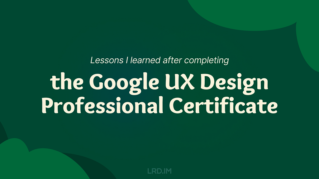
So I enrolled in this online course, trying to spare my time on it. Such as during lunch and dinner breaks on weekdays, or parts of the weekend. I completed the whole certificate within two months. And now I’d like to write down what I learned from this course:
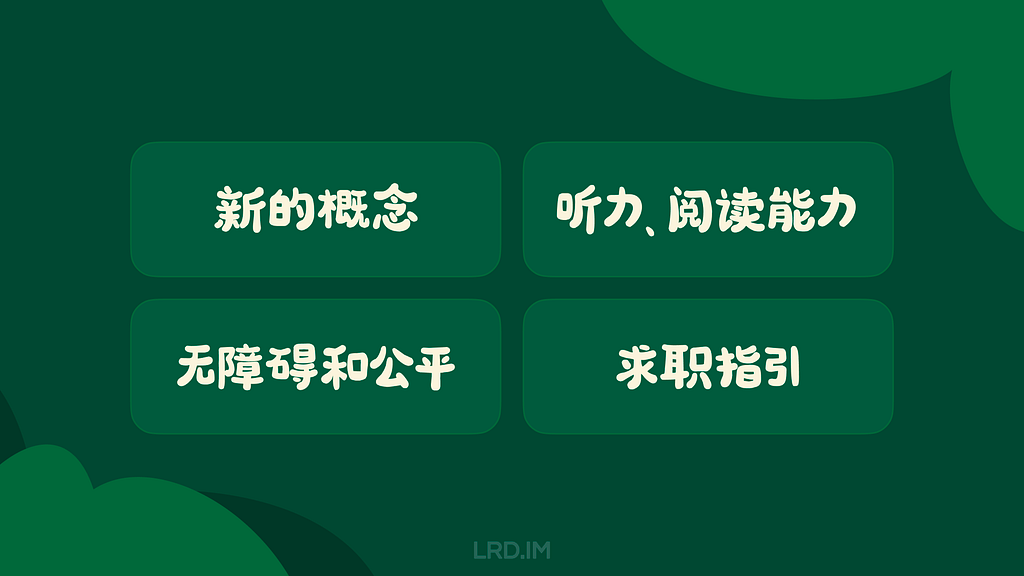
Introducing concepts I had never heard of. Despite my 5+ yoe in a wide range of companies, from startups to large corporations in China, those new concepts opened up a lot of room for me to explore.
Enhancing my listening and reading skills. The course covers plenty of video and reading materials that include industry jargon that translators cannot provide. Moreover, certain phrases and sentence structures are repeatedly used throughout the course. I think my reading skills and speed are slightly improved.
Pointing out concepts like accessibility and equity early throughout the course. I used to think only seasoned designers or well-developed products consider these aspects, however, they are mentioned early on and repeatedly. These concepts resonated with me and will truly influence my work.
Elaborating comprehensive and detailed guidance for designers to prepare their portfolios, resumes, and interviews. They not only tell us what content should be included in our portfolios, but also how to prepare for interviews at different stages. I resonated with these instructions as well, since I did think those details over when looking for a new job.
I have consistently tried to think about and expand design boundaries through different aspects, which requires a breadth of knowledge. Here, I will share several new concepts along with my personal understanding.
Affinity diagram
This is a method of synthesizing that organizes data into groups with common themes or relationships. It can be used in different stages of the design process, such as during brainstorming or after collecting users feedback. The example below focuses on the latter.
After collecting a batch of user feedback, the design team condense each piece of feedback into a single sentence and write it on sticky notes. Then we post them up on a whiteboard or digital tools like Figma. Then the design team look for sticky notes that reference similar ideas, issues, or functionality and collaboratively organizes them into clusters representing different themes.
When I first learned about this approach in the course, I realized that this approach is similar to another method called “Card sorting” that was included in an article I translated earlier named [English to Chinese Translation] How we rebuilt Shopify’s developer docs. Both methods involve clustering sticky notes, naming these groups and summarizing the themes or relationships.
However, card sorting is implemented by external participants and aims to uncover users’ mental models to improve information architecture; Whereas affinity diagramming organizes a large amount of raw data to show the team which problems users are most concerned about and consider high priority.
This concept refers to an individual’s ability to gather, communicate, and create content using digital products and the internet. For example, senior adults or those living in areas with poor internet infrastructure may find it difficult to understand interfaces and functionalities, they are considered to have lower digital literacy.
In contrast, young people, especially those working in the information technology industries, are typically familiar with new software and concepts, and can quickly adapt to them.
This course does not dig deeply into this concept, rather, it emphasizes the importance of understanding our users. If our product targets a broad range of users, it is good to consider the needs of users with lower digital literacy. Moreover, this factor should also be considered when recruiting participants for usability tests.
This concept refers to a group of UX methods that trick users into doing or buying something they wouldn’t otherwise have done or bought.
In the course, instructors clearly point out that this is an unethical and not a good practice. Businesses may lose their clients’ respect and trust once clients realize that they have fallen into deceptive patterns. I will share a few interesting examples that the course provided.
Confirmshaming: Making users feel ashamed of their decision. For example, a subscribe button on a news website usually reads “Subscribe now / No thanks”. BBut if the service provider wants to manipulate readers’ emotions, the text might be changed to: “Subscribe now / No, I don’t care about things around me.”
Urgency: Pushing users to make a decision within a limited time. For example, an e-commerce website might give you a coupon that is only available for 24 hours, prompting you to purchase items without a thoughtful consideration. The course doesn’t judge these marketing strategies or promotions; instead, it suggests that we should avoid putting pressure on users. As designers, we should try our best to balance business promotions and avoid manipulating users’ emotions.
Scarcity: Making users very aware of the limited number of items. For example, a popup or attractive advertisement stating “Only 5 items left in stock.” The course suggests that designers should concentrate on helping users to understand products better, rather than using designs to encourage impulsive buying.
It is really interesting that these deceptive patterns are so common in the Chinese e-commerce industry that it might seem unusual if those strategies were to disappear.
This seems to reflect cultural differences between China and the West. In China, core team members, such as designers, product managers, and operators, collaboratively discuss how to induce and prompt users to make a hasty decision. Also, we regularly hold reflections to discuss and share insights on how to deeply incite users’ motivation.
In 2018, I landed my first job as a UI designer at an e-commerce company. One of my main tasks is designing promotions, such as “claim your vouchers”, “flash sales ending in N hours”, and creating illustrations of red pockets and flying coins, and the like. I didn’t really like these approaches at that time, so I eventually turned to the B2B and SaaS industry, focusing more on UX design.
Although I am not fond of these types of designs, these seem to really help companies grow and generate income. We could stabilize our employment only if our company were earning profits. Perhaps that is an inextricable cycle: obviously, deceptive patterns are unethical and bad as they are inducing and annoying our users, but we must continuously implement these approaches and think about how to make them more effective.
The course thoroughly explains a concept called “implicit bias”. It refers to the collection of attitudes and stereotypes associated, influencing our understanding of and decisions for a specific group of people.
For example, imagine you’re designing an app to help parents buy childcare. To personalize your onboarding process, you start by displaying bold text saying, “Welcome, moms. We’re here to help you…”
This is an example of implicit bias, since it excludes every other type of caregiver, like grandparents, guardians, dads and others.
In addition, here are some interesting biases the course introduced:
Confirmation bias. Refers to the tendency to find evidence that supports people’s assumptions when gathering and analyzing information.
Friendliness bias. Refers to the tendency to give more desirable answers or positive comments in order to please interviewers. This usually occurs in usability tests, where participants may not share their honest feedback because they are afraid that real answers or negative comments might offend interviewers and be considered unfriendly.
False-consensus bias. Refers to the tendency that people tend to believe that their personal views or behaviors are more widely accepted than they actually are, and consider others’ opinions to be minor or marginal. For example, an optimist might think that most people around the world are optimistic; or designers can easily understand iconographies and illustrations they created, they might assume other users might easily to understand too.
I was shocked when I was learning this part. I strongly resonated with these biases which I had never perceived before. After all, the course lets us be aware of these biases and provides approaches to help us avoid falling into these pitfalls.
I listed some concepts above that I had barely encountered in my workspace. Becoming a UX designer appears to require a broad range of knowledge, such as design, the humanities, psychology, and sociology. I am now interested in psychology after completing this course.
Listening and Reading Proficiency
There are plenty of listening and reading materials involved in the course. Typically, each video lesson is accompanied by an article. If there are additional knowledge points, a single video might be accompanied by two or three articles.
Most instructors in the course speak with American accents. They also speak slowly and clearly, which makes me comfortable and usually allows me to understand without opening closed caption. Sometimes, I need to rewind a few seconds when they are speaking long sentences with many clauses or introducing new concepts, and I will open closed captions if I am still confused.
It is worth pointing out that the course contains lots of industry jargon, and I resonated with this because I used similar approaches or processes in my workspace by using Chinese. As a learner, I created a spreadsheet to record expressions that might be useful, such as:
Above the fold, the content on a web page that doesn’t require scrolling to experience;
Deliverable, final products like mockups or documents that can be handed over to clients or developers to bring designs to life.
Digital real estate, space within the digital interface where designers can arrange visual elements;
Firm parameters, refer to rigid design boundaries or limitations like time, project resources, and budget.
I think it is valuable to collect this industry jargon because it is authentically expressed, which can’t be translated by common translation tools. This will be helpful for me to read design articles and write blogs in English.
Accessibility and Equity
Accessibility
The course introduces several assistive technologies, such as color modification, voice control, switch devices, and screen readers, which can help people with different types of disabilities to use our products easily.
Instructors also point out that even people who don’t have disabilities, or who do not perceive themselves as having disabilities might benefit from these assistive technologies. The course suggests that we think these factors over throughout the entire design process. For instance:
Supporting color modification. Features that increase the contrast of colors on a screen, like high-contrast mode or dark mode;
Supporting voice control. Allows users to navigate and interact with the elements on their devices using only their voice. They also mention a concept called “Voice User Interface (VUI)”;
Supporting switch devices. This is a one-button device that functions as an alternative to conventional input methods such as the keyboard, mouse, and touch, allowing users to complete common tasks like browsing webpages and typing text;
Supporting screen readers. Allows users with vision impairment to perceive the content. The course suggests that we write alternative text to images, add appropriate aria labels to interactive elements like buttons, and consider the focus order of elements.
Here is a website that demonstrates the color modification feature:HubSpot.com
On the top navigation of this website, it provides a switch for us to toggle a high-contrast mode. Moreover, it also supports reduced motion effects — if I enable the reduced motion setting on my device, this website will minimize motion effects as much as possible.
Equity
The course also introduces a concept called “equity-focused design.”
Instructors clearly define the difference between “equality” and “equity”:
Equality: Providing the same amount of opportunity and support, everyone receives the same thing;
Equity: Providing different amount of opportunity and support according to individual circumstances, ensuring everyone can achieve the same outcomes.
The course also points out that equity-focused design means considering all races, genders, and abilities, especially focusing on groups that have been historically underrepresented or ignored when building products.
They use a survey question as an example: when gathering participants’ demographic information like gender, it is not enough to provide three options: “Male”, “Female” and “Other”. To make our design more inclusive and equitable, we should offer additional choices, including “Male”, “Female”, “Gender-nonconforming”, “nonbinary” and a blank field. The latter provides non-conventional gender options, uplifting those who might be marginalized in conventional surveys. This approach also aims to balance the opportunities for all groups to express themselves, ensuring their voices are treated fairly and heard.
In this lesson, I clearly faced a culture gap from the West. In fact, I don’t really like to dig into this concept deeply, mainly because I can’t determine whether this approach is right. Sometimes I think it is unnecessarily complicated, but at other times, I recognize that there are people with non-traditional genders around us who may truly be eager to be treated fairly.
When I was learning this lesson, I realized that there was an opportunity to incorporate accessibility features into the project I was recently working on. I will write a new post if this project lands successfully.
In the final course, instructors teach us how to lay out a portfolio and what content should be included. They also inform us the process of interviews and how to thoroughly prepare for interviews.
The guidance they mentioned is for the Western workplace, which may not seamlessly fit in the Chinese workplace. For example:
They point out that designers should have a personal website and case studies regularly. However, Chinese designers prefer to publish their case studies on public platforms like ZCOOL and UI.CN;
They also teach us how to build our digital presence and network through LinkedIn. However, these approaches are not common in the Chinese job market, where the most popular methods are directly submitting resumes and getting recommendations through acquaintances.
They inform us how to handle panel interviews. I have interviewed with a wide range of companies, from startups to corporations, and never encountered panel interviews, which means that the panel interview is not popular in this industry.
I was deeply impressed by how they elaborated on the preparation and important considerations during the interview process. For example:
Research the main business of the company you interview for beforehand, and clearly understand why you are a good fit for the company;
Prepare answers to common interview questions beforehand, such as a personal introduction, your strengths, and descriptions of your case studies;
We should learn how to answer difficult questions using the STAR method, and prepare well before starting an interview;
Adapt the focus and questions according to the interviewer’s role to show you are a professional;
During the interview process, you might be asked to complete a task. Therefore, we should practice the ability to think aloud and clearly define questions, since interviewers might pose vague questions on purpose.
I resonated with the approaches and tricks mentioned in the course that I had previously used, which gave me a strong feeling that I was on the right track.
Additionally, the course also provides detailed instructions on how to pursue freelance design work. For instance:
Clearly identify your target audience and understand why they should choose your service;
Know your competitors, identifying what they can’t provide but you can;
Promote your service and build word-of-mouth by attending online and in-person events, and getting recommended through acquaintances;
Calculate the business expenses, set fair prices for your services, and make financial projections — estimate what your finances will look like in the first month, the first 6 months, and the first year.
Well, above are lessons I’ve learned from the Google UX Design Professional Certificate on Coursera over the past two months. I think that this is an interesting course, although not all content can be applied in my daily work, I’ve also learned the thinking processes and workplace cultures of designers in another part of the world.
I strongly recommend designers reading this post consider to enrolling in the Google UX Design Professional Certificate, by doing this, you might probably gain new insights. The course costs $49 monthly, which is not expensive. It is likely to complete the entire course over two or three months if you have a full-time job.
Things worked as I expected, and I will start my next project in the second half of the year.


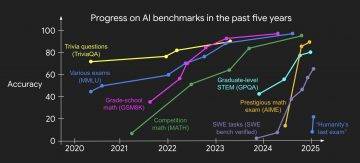


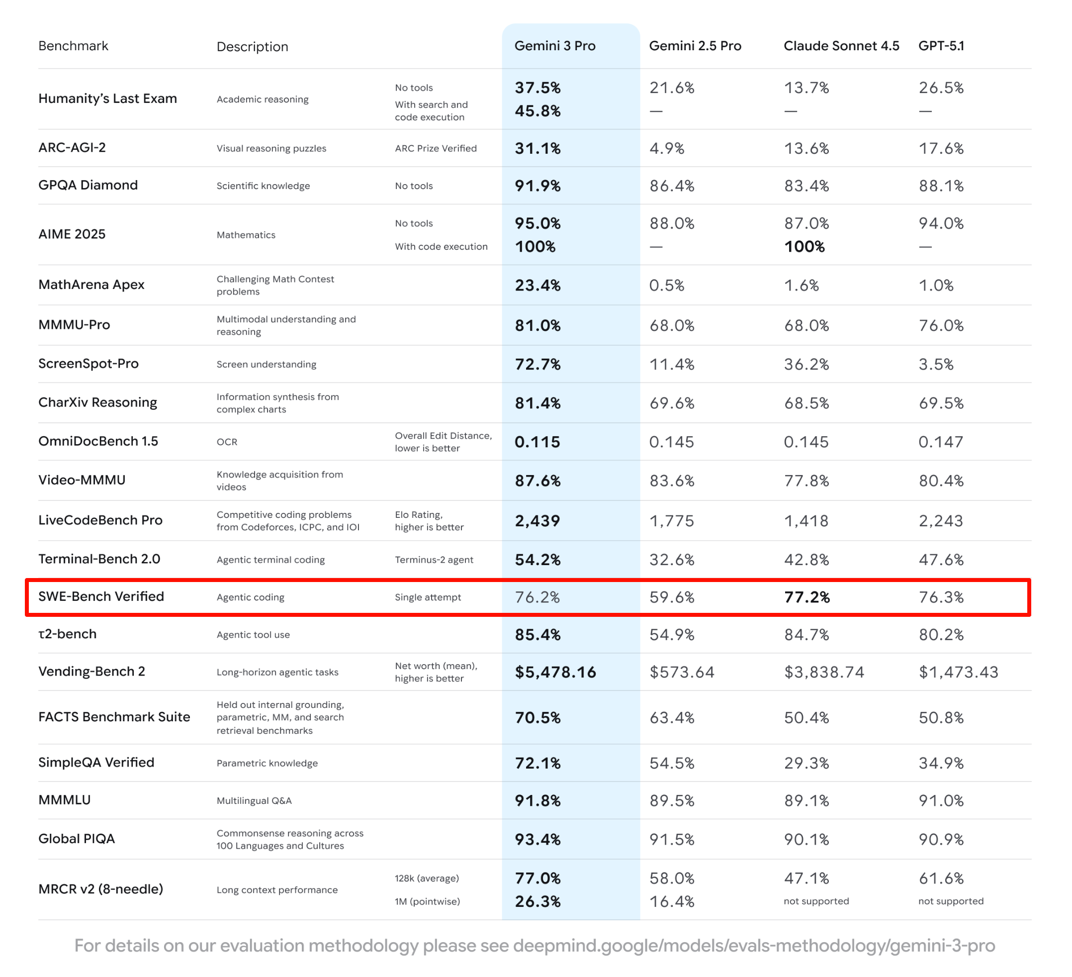

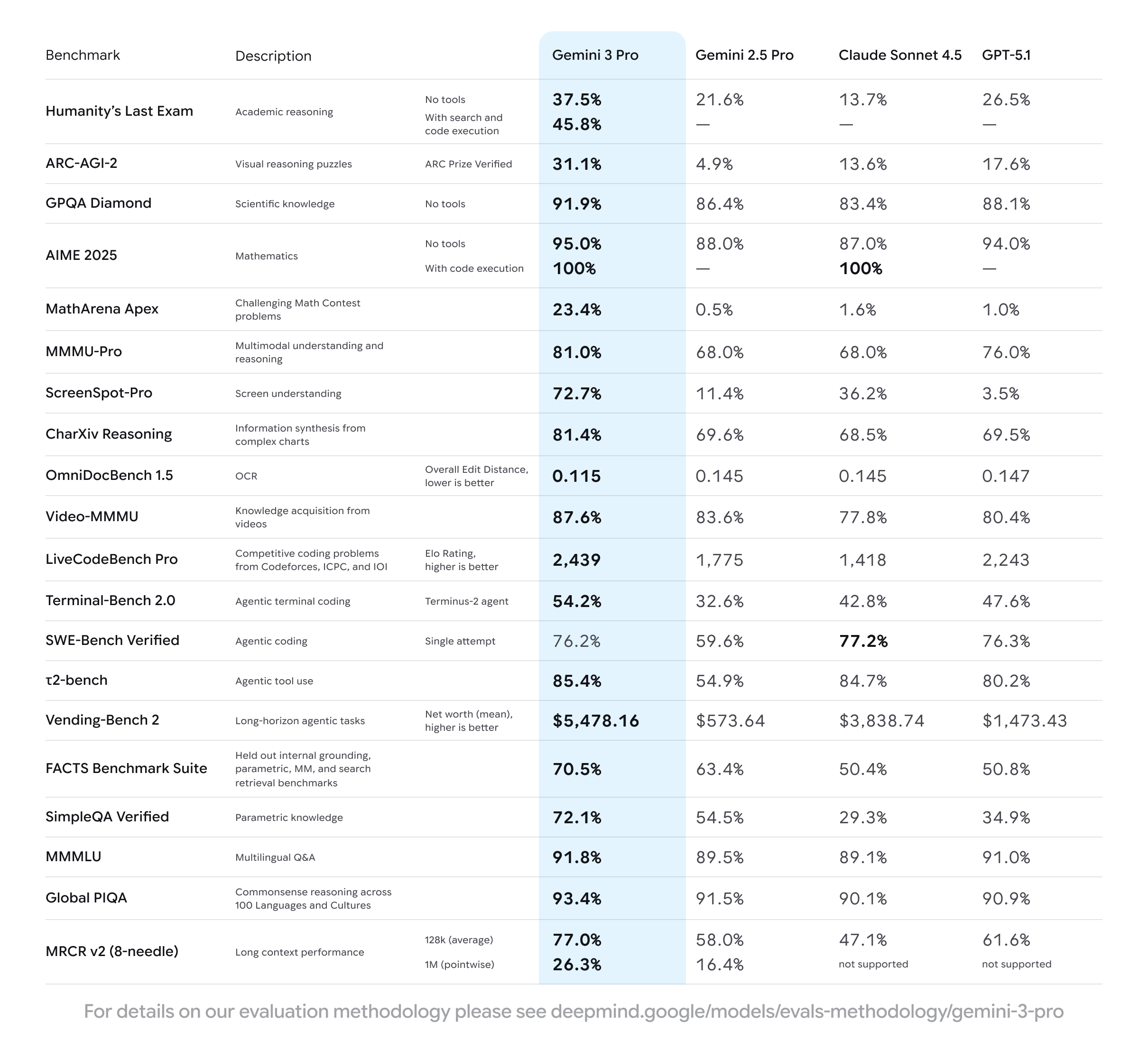
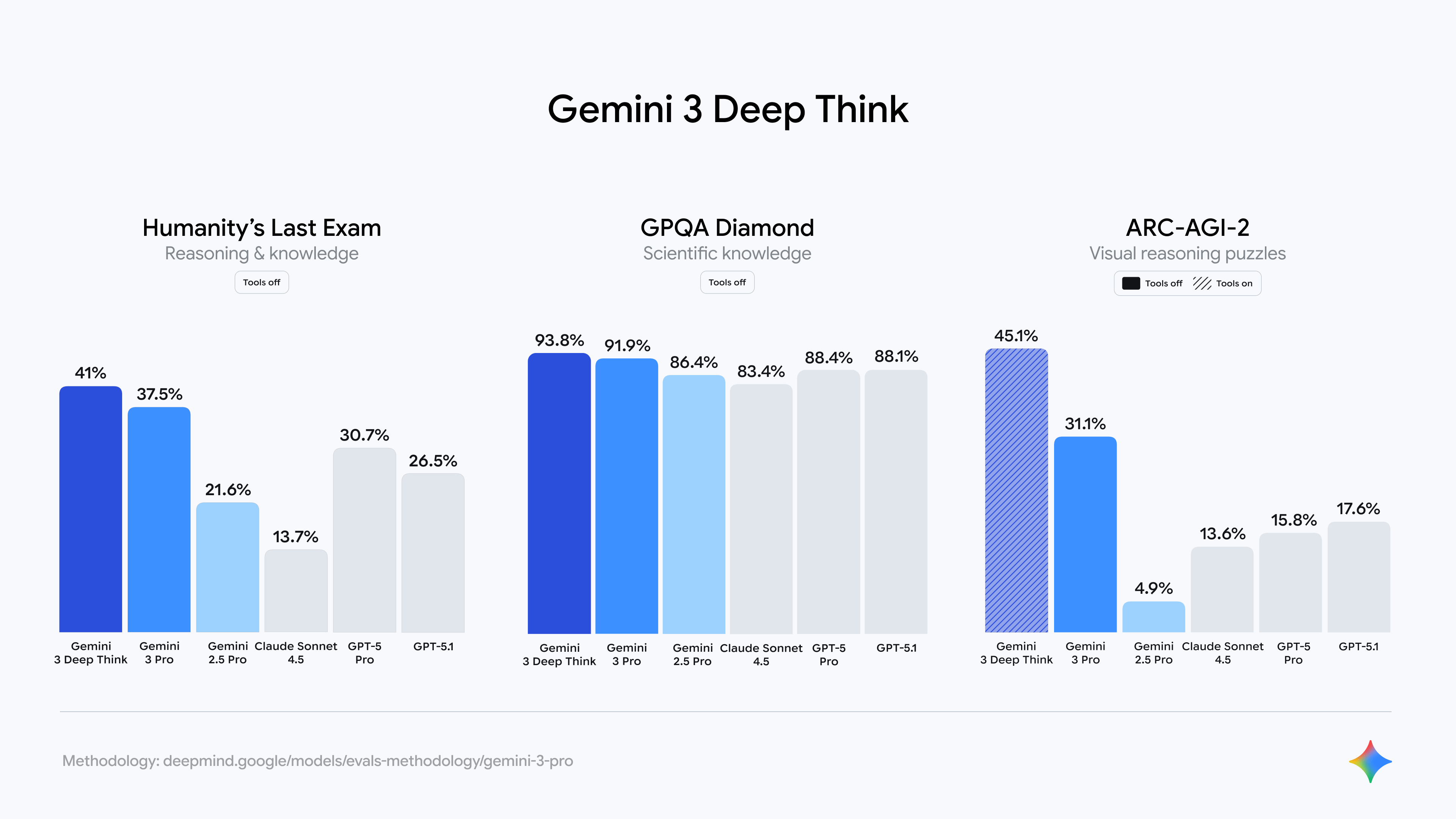
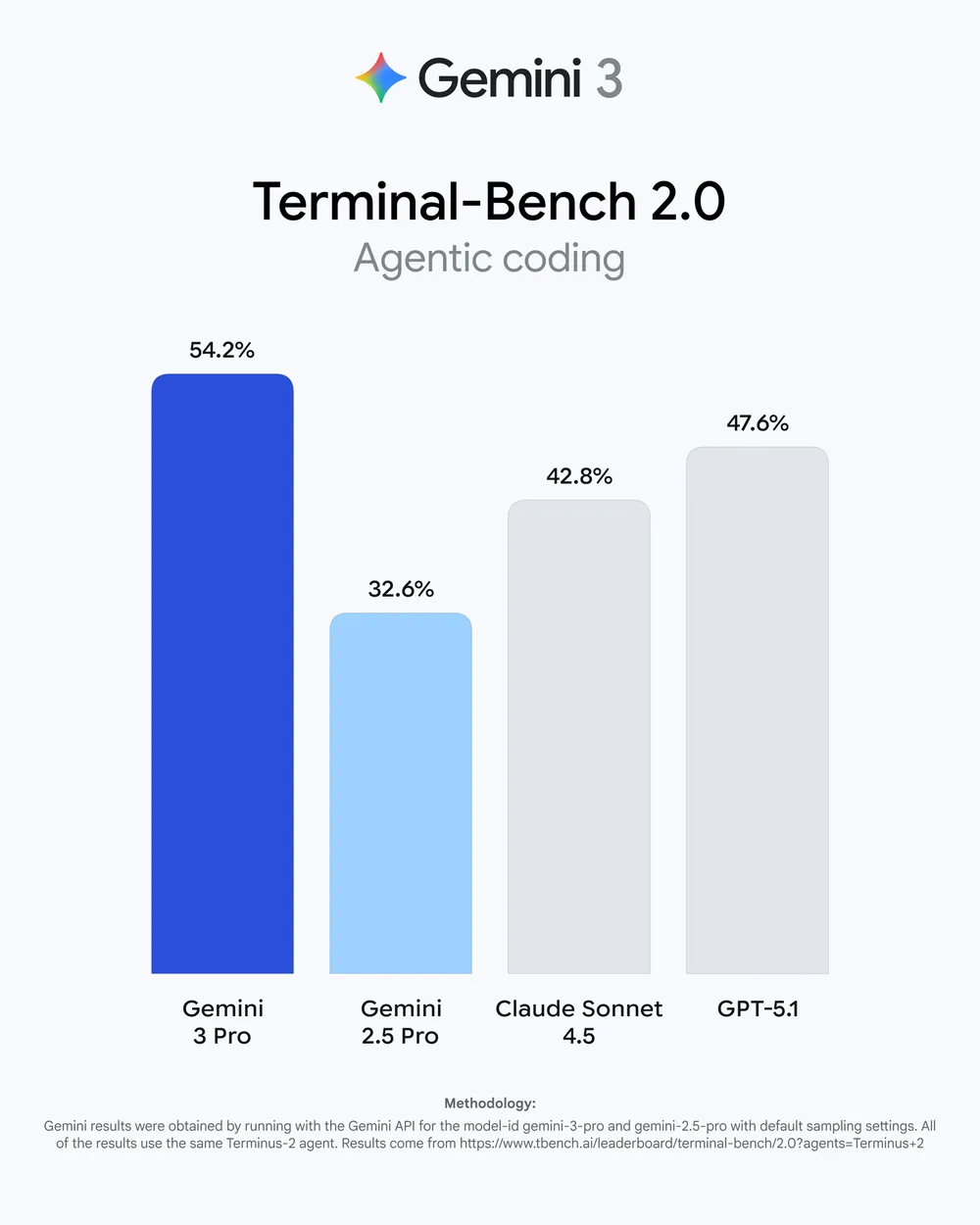
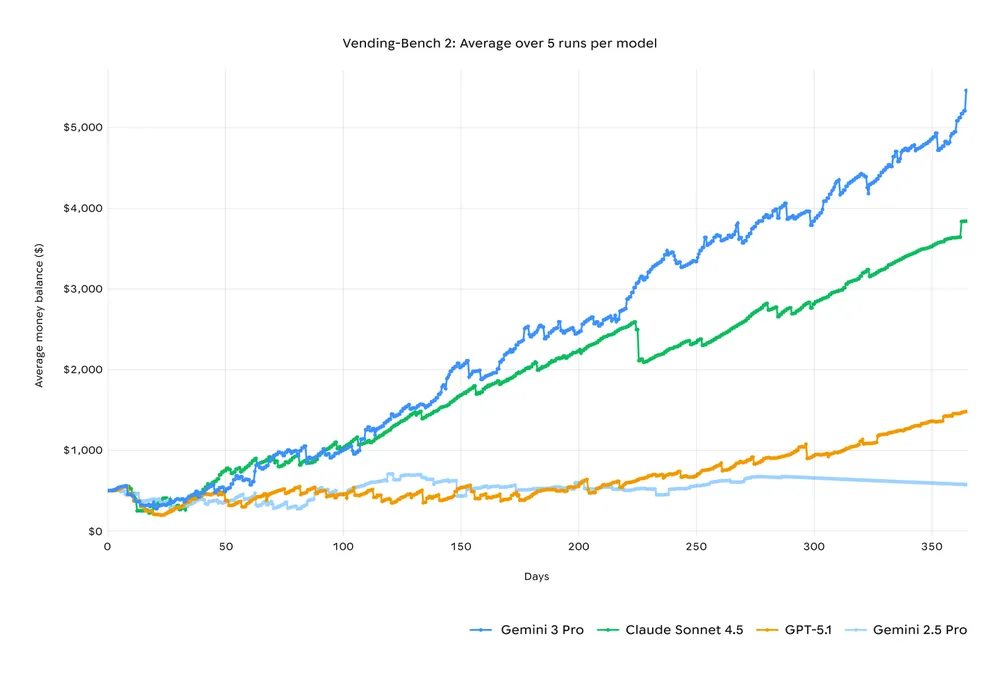
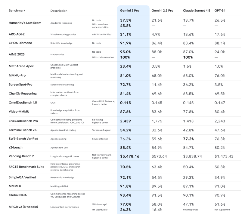 -推理能力:官方强调 Gemini 3 Pro 在 Humanity’s Last Exam、GPQA Diamond、MathArena 等一堆高难度推理和数学基准上,全部刷出了新高分,定位就是「博士级推理模型」。