Reading view

There are new articles available, click to refresh the page.

A green weekend: Viridian

The element chromium gains its name from the rich colours seen in many of its salts and compounds. One of them, chromium oxide, was discovered in about 1798 by Louis-Nicolas Vauquelin, who immediately recognised its future use as a pigment, because of its “fine emerald colour”. But painters were still enamoured with more toxic greens, and straight chromium oxide doesn’t look particularly brilliant, being a rather dull yellow-green. Its introduction into paintings probably didn’t start until around 1840, when landscape painting outdoors was becoming all the rage.

vonschwindmermaidstag
Moritz von Schwind (1804–1871), Mermaids Watering a Stag (c 1846), oil on canvas, 69 × 40 cm, Sammlung Schack, Bayerische Staatsgemäldesammlungen, Munich, Germany. Wikimedia Commons.

Some of the earliest paintings known to use chromium oxide are those of Moritz von Schwind, of which the first example that I can show is his Mermaids Watering a Stag from about 1846. He seems to have used the pigment quite extensively here in foliage, although probably in combination with other pigments.

vonschwindkingkrokus
Moritz von Schwind (1804–1871), King Krokus and the Wood Nymph (c 1855), oil on canvas, 78.7 x 45.5 cm, Bayerische Staatsgemäldesammlungen, Munich, Germany. Wikimedia Commons.

Von Schwind’s King Krokus and the Wood Nymph from about 1855 is a clearer image, where he probably used chromium oxide in combination for most of his greens.

As these works were being painted, an improved version of chromium oxide was being developed: hydrated chromium oxide, which became known as viridian during the 1860s. This first became available at a reasonable price after Guignet started to make it in quantity in 1859, so has also been known as Guignet’s green. It’s sometimes termed émeraude or emerald, which only serves to confuse viridian with copper acetoarsenate, more widely known as emerald green.

Viridian came into use during the 1860s, and has proved far more popular than chromium oxide. Both pigments are reliably lightfast, opaque, and have good covering power, but viridian is the more intense, and doesn’t appear dull like plain chromium oxide.

feuerbachpaolofrancesca
Anselm Feuerbach (1829–1880), Paolo and Francesca (1864), oil on canvas, 137 × 99.5 cm, Sammlung Schack, Bayerische Staatsgemäldesammlungen, Munich, Germany. Wikimedia Commons.

Anselm Feuerbach’s painting of Paolo and Francesca from 1864 is one of the earlier works found to contain viridian among its many rich greens.

manetbalcony
Édouard Manet (1832–1883), The Balcony (1868-69), oil on canvas, 170 × 124.5 cm, Musée d’Orsay, Paris. Wikimedia Commons.

The best example showing off the colour of viridian is perhaps Édouard Manet’s The Balcony (1868-69), where he appears to have used the pigment throughout the blinds and railings, most probably mixed with lead white, and unmixed for the woman’s parasol.

bocklintritonnereid
Arnold Böcklin (1827–1901), Triton and Nereid (1874), tempera on canvas, 105.3 × 194 cm, Sammlung Schack, Bayerische Staatsgemäldesammlungen, Munich, Germany. Wikimedia Commons.

Arnold Böcklin’s Triton and Nereid from 1874 is unusual in several respects. It’s reported as being painted in tempera rather than oils, but its deep lustrous greens were developed using a base of predominantly viridian, over which Böcklin applied a copper resinate glaze.
renoirskiff
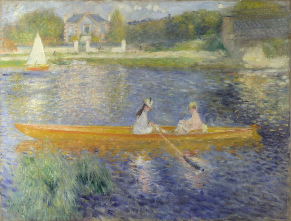
Pierre-Auguste Renoir (1841-1919), La Yole (The Skiff) (1875), oil on canvas, 71 x 92 cm, The National Gallery (Bought, 1982), London. Courtesy of and © The National Gallery, London.

Pierre-Auguste Renoir’s La Yole (The Skiff) of 1875 uses viridian as the main colour for the reeds in the left foreground.

monetarrivalnormandytrain
Claude Monet (1840–1926), Arrival of the Normandy Train, Gare Saint-Lazare (1877), oil on canvas, 59.6 x 80.2 cm, Art Institute of Chicago, Chicago, IL. Wikimedia Commons.

Analysis of Claude Monet’s series of paintings of the Gare Saint-Lazare in 1877 has revealed extensive use of viridian in mixtures, including the green shadows in the roof. In Arrival of the Normandy Train, Gare Saint-Lazare (1877), the pigment is apparent (and confirmed) throughout the green foreground of the platform, an optical effect resulting from light passing through the glass roof of the station.

renoirchrysanthemums
Pierre-Auguste Renoir (1841–1919), Chrysanthemums (1881-82), oil on canvas, 54.7 × 65.9 cm, Art Institute of Chicago, Chicago, IL. Image by Rlbberlin, via Wikimedia Commons.

Renoir used viridian together with malachite green and other pigments for the greens in his Chrysanthemums (1881-82).

Georges Seurat, Un dimanche après-midi à l'Île de la Grande Jatte (A Sunday Afternoon on the Island of La Grande Jatte) (1884-6), oil on canvas, 207.5 × 308.1 cm, Art Institute of Chicago, Chicago, IL. Wikimedia Commons.
Georges Seurat (1859-91), Un dimanche après-midi à l’Île de la Grande Jatte (A Sunday Afternoon on the Island of La Grande Jatte) (1884-6), oil on canvas, 207.5 × 308.1 cm, Art Institute of Chicago, Chicago, IL. Wikimedia Commons.

If you care to spend some time examining the myriads of tiny dots in Georges Seurat’s monumental Divisionist painting of A Sunday Afternoon on the Island of La Grande Jatte (1884-86), I’m assured that you’ll find many of those forming its vegetation contain viridian.

Viridian remained popular among the post-Impressionists, from whom I have two well-known paintings as examples.
vangoghwheatfieldcypresses
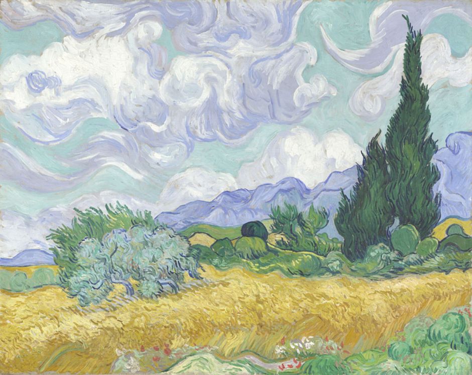
Vincent van Gogh (1853-1890), A Wheatfield, with Cypresses (1889), oil on canvas, 72.1 × 90.9 cm, The National Gallery (Bought, Courtauld Fund, 1923), London. Courtesy of and © The National Gallery, London.

Vincent van Gogh included viridian in the pigments used in the range of greens in his A Wheatfield, with Cypresses (1889), which is more unusual for his use of ultramarine blue mixed to form green.
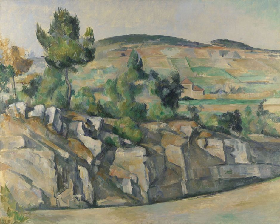
cezannehillsideprovence
Paul Cézanne (1839-1906), Hillside in Provence (1890-92), oil on canvas, 63.5 x 79.4 cm, The National Gallery (Bought, Courtauld Fund, 1926), London. Courtesy of and © The National Gallery, London.

Paul Cézanne is known to have had a strong preference for viridian as one of the key colours in his palette. However, in his Hillside in Provence (1890-92), it is emerald green that is the more prominent, and the major part of the painting’s more brilliant greens, even into its pale turquoise sky. Some green passages, such as the patch of yellow-green grass at the edge of the path in the foreground, at the right edge of the canvas, have been built with a base of lead white and viridian, over which he has applied a yellow lake glaze.

Chromium oxide and viridian remain widely available today; although the former is not popular or widely used, viridian remains a mainstay green widely recommended for its colour and other properties. Being virtually insoluble, chromium oxide and viridian pose minimal risks of toxicity to the artist. However, there is growing concern over their environmental effects, and great care is needed when handling waste paint containing either pigment.

Reference

Richard Newman (1997) Artists’ Pigments, vol 3, ed Elisabeth West FitzHugh, Archetype. ISBN 978 1 904982 76 0.

A green weekend: Malachite

As we all should really be on holiday, I’m taking a long weekend to look at the stories of three green pigments, starting today with the oldest and most elusive of them, the mineral malachite.

Because green is a secondary colour, it might seem better mixed from blue and yellow, as it has been in various recipes such as Prussian green. But the painter always prefers using single pigments for the purity of their chroma, and the fact that the more pigments that get mixed, the closer the colour comes to muddy grey.

Given the shortage of lightfast bright greens, it’s surprising how little-used malachite green is in European painting, despite its rich colour. For a while it rejoiced quietly under traditional names including chrysocolla, green verditer, and even green bice, but it only ever became popular in Japan and China.

As a natural mineral, malachite is not uncommon, and a reliable source of pure pigment, which is chemically basic carbonate of copper. Malachite green was known to the ancient Egyptians, who appear to have used it as eye-paint. Found abundantly in Japanese and Chinese paintings from the seventh century onwards, it wasn’t used much in Europe until the Renaissance. After that, it almost died out in Europe until the nineteenth century, when it enjoyed a brief revival.

Two versions of the painting by Watanabe Kazan 渡辺崋山 of Sato Issai 佐藤一斎(五十歳)像 show malachite green at its finest.

kazansatoissaiwashington
Watanabe Kazan 渡辺崋山 (1793-1841), Portrait of Sato Issai 佐藤一斎(五十歳)像 (1824), ink and colour on silk mounted on panel, 212.2 x 67 cm, Freer Gallery of Art (Purchase — Charles Lang Freer Endowment), Washington, DC. Courtesy of the Freer Gallery and the Smithsonian Institution.

This version from 1824, now in the Freer in Washington, is known to use malachite green with a slightly blue shade and deep in colour.

kazansatoissaitokyo
Watanabe Kazan 渡辺崋山 (1793-1841), Portrait of Sato Issai (age 50) 佐藤一斎(五十歳)像 (1821), colour on silk 絹本着色, 80.6 x 50.2 cm, Tokyo National Museum 東京国立博物館, Tokyo, Japan. Wikimedia Commons.

This smaller and earlier version from 1821, now in Tokyo, is a lighter, more yellow shade. I’m not aware of its pigment having been analysed, but I’d be surprised if it was straight malachite green.

The biggest problem with its adoption in Europe was the popularity there of oil paint. The pigment worked well where it could be ground quite coarsely and used in water-based media like fresco and egg tempera, but the finer you grind it, the paler it becomes. Oil painters like smooth buttery paints with fine pigment particles, which sadly didn’t work for malachite green.

aretinovirginenthroned
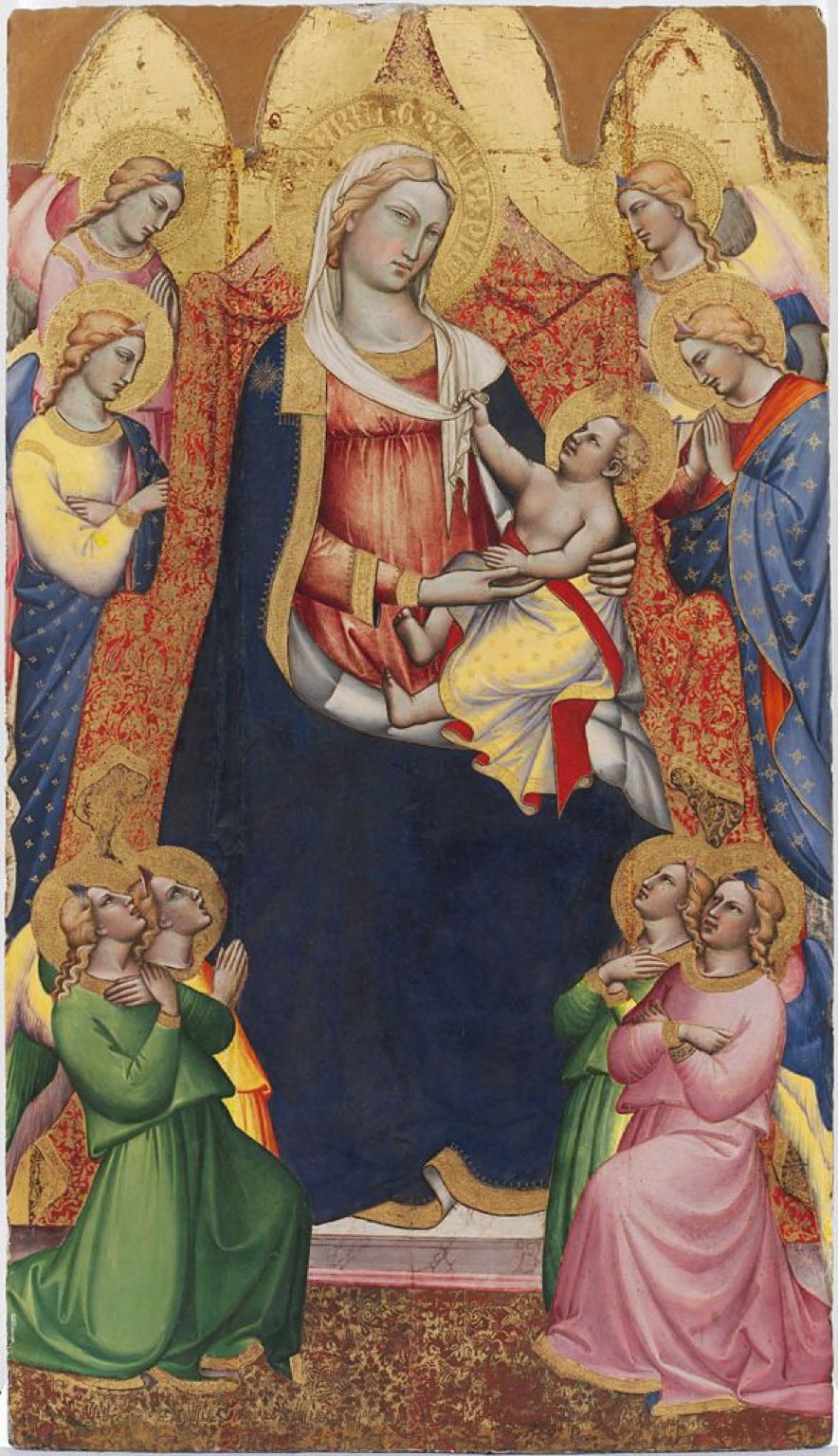
Spinello Aretino (1350/52-1410), Virgin Enthroned with Angels (c 1380), tempera and gold leaf on panel, 195.3 x 113 cm, Harvard Art Museums/Fogg Museum (Gift of Mrs. Edward M. Cary), Cambridge, MA. Courtesy of Harvard Art Museums/Fogg Museum.

The rich, almost emerald green robes of Spinello Aretino’s Virgin Enthroned with Angels from about 1380 contain malachite green, here in tempera medium.

vaneyckmysticlambd
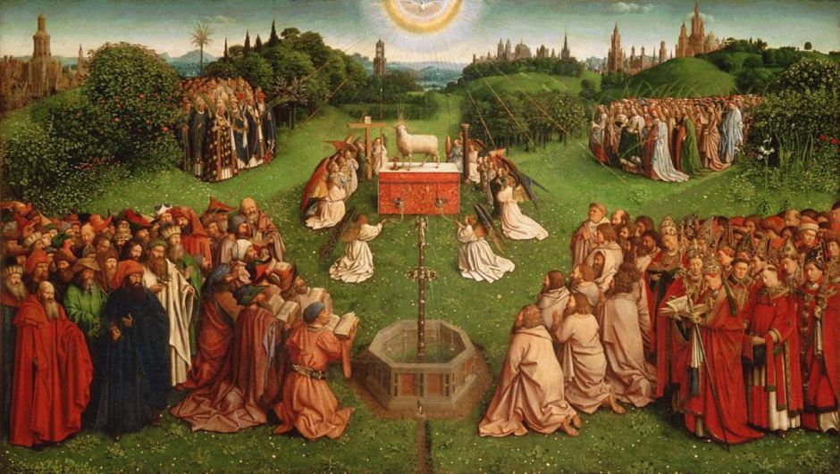
Hubert van Eyck (c 1366–1426) and Jan van Eyck (c 1390–1441), Adoration of the Lamb, panel from the Ghent Altarpiece (c 1425-1432), oil on panel, 137.7 x 242.3 cm (panel), Saint Bavo Cathedral Sint-Baafskathedraal, Ghent, Belgium. Wikimedia Commons.

Among its earliest appearances in oil paint is this spectacular centre panel of the van Eyck brothers’ Ghent Altarpiece, famous in its own right as the Adoration of the Lamb (c 1425-1432).

dellafrancescabaptismchrist
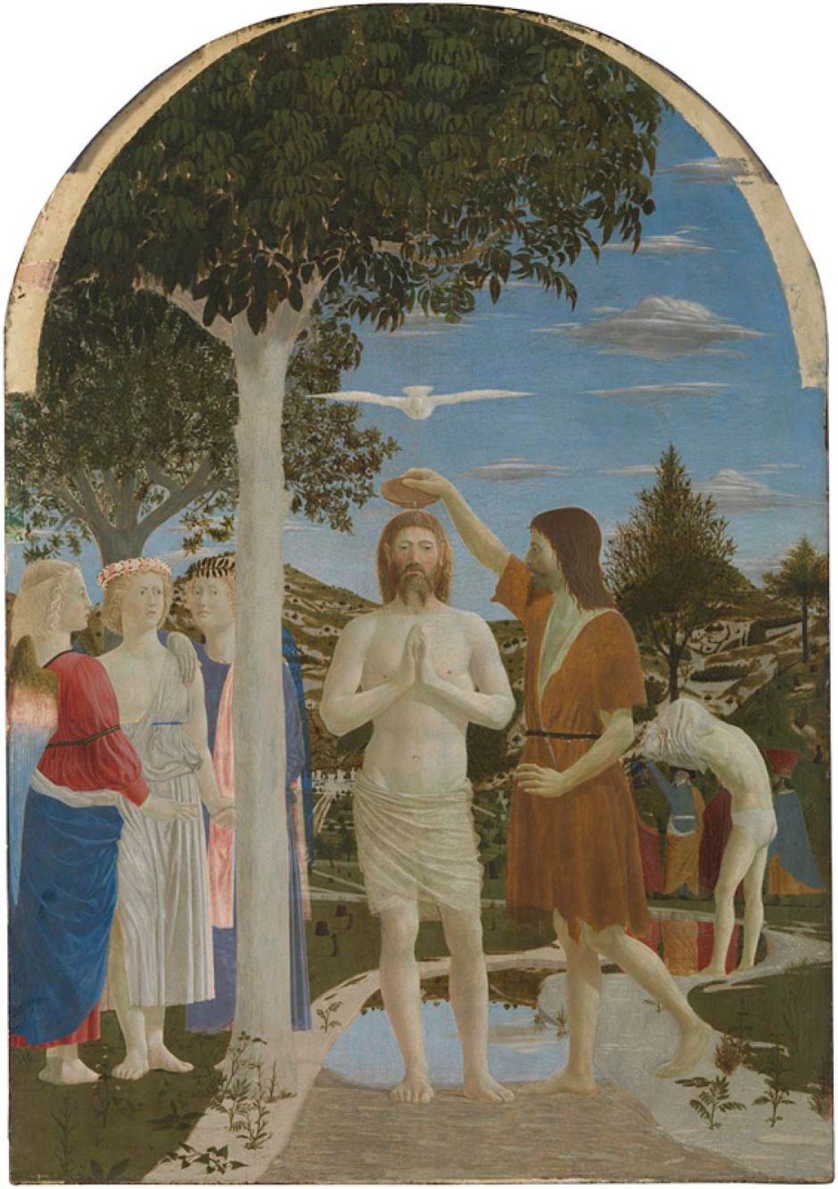
Piero della Francesca (c 1415/20-1492), The Baptism of Christ (after 1437), egg on poplar, 167 x 116 cm, The National Gallery (Bought, 1861), London. Courtesy of and © The National Gallery, London.

Continuing use of egg tempera in the Southern Renaissance helped it survive. Piero della Francesca’s famous The Baptism of Christ (after 1437), made in egg tempera on poplar wood, relies on the pigment for its greens. Microscopic examination of the paint layer here shows coarse mineral particles typical of natural malachite.

delcossastvincentferrer
Francesco del Cossa (c 1435/6-1477/8), Saint Vincent Ferrer (c 1473-75), egg on poplar, 153.7 x 59.7 cm, The National Gallery (Bought, 1858), London. Courtesy of and © The National Gallery, London.

In Francesco del Cossa’s Saint Vincent Ferrer from about 1473-75, it has been identified in the dark green grass at the foot of the painting. This too was made using egg tempera.

However, microscopy of this paint layer shows that these pigment particles don’t seem to have been fractured as if they have been ground, but are globular, as occurs when the malachite green has been made by a process of precipitation. Such artificial malachite green didn’t appear in European paintings until after about 1430, just in time for Francesco del Cossa.

tintorettostgeorgedragon
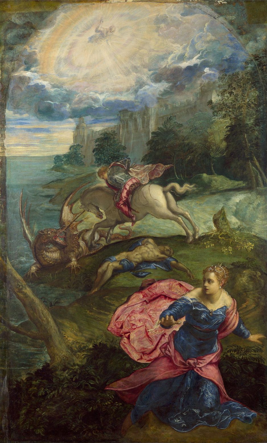
Tintoretto (1519–1594), Saint George and the Dragon (c 1555), oil on canvas, 158.3 x 100.5 cm, The National Gallery, London. Wikimedia Commons.

Although he painted in oils, Tintoretto was an enthusiastic user of malachite green. To obtain the range of greens seen in the rich and varied colours of vegetation in his Saint George and the Dragon from about 1555, he used this pigment with copper resinate glazes, a technique found in other paintings of the period.

tintorettolastjudgement
Tintoretto (1519–1594), The Last Judgment (1560-62), oil on canvas, 1450 x 590 cm, Chiesa della Madonna dell’Orto, Venice, Italy. Wikimedia Commons.

Tintoretto’s vast oil painting of The Last Judgment (1560-62) in the Chiesa della Madonna dell’Orto, Venice, has been found to contain malachite green, I suspect in the band of green depicting the Flood just below the centre. The detail below makes this a bit clearer.

tintorettolastjudgementd1
Tintoretto (1519–1594), The Last Judgment (detail) (1560-62), oil on canvas, 1450 x 590 cm, Chiesa della Madonna dell’Orto, Venice, Italy. Wikimedia Commons.
domenichinoapollopursuingdaphne
Domenichino (1581-1641) and assistants, Apollo pursuing Daphne (1616-18), fresco formerly in Villa Aldobrandini transferred to canvas and mounted on board, 311.8 x 189.2 cm, The National Gallery (Bought, 1958), London. Courtesy of and © The National Gallery, London.

When painting the frescoes formerly in the Villa Aldobrandini between 1616-18, Domenichino and his assistants relied heavily on malachite green. It has been formally identified in this section, showing Apollo pursuing Daphne, where it’s the mainstay colour remaining, and is suspected in most of the others.

Although only classed as moderately permanent, these and other examples of very old frescoes show how well malachite green has retained its colour after four centuries or more. But with the rise of oil painting in European art, it fell from favour.

renoirchrysanthemums
Pierre-Auguste Renoir (1841–1919), Chrysanthemums (1881-82), oil on canvas, 54.7 × 65.9 cm, Art Institute of Chicago, Chicago, IL. Image by Rlbberlin, via Wikimedia Commons.

One of those who participated in its revival in the nineteenth century was Pierre-Auguste Renoir, whose painting of Chrysanthemums from 1881-82 shows how it could still be used in oil paint. But by then there was a much wider choice of more modern green pigments; the revival was short-lived, and malachite green has hardly been used since.

Reference

Rutherford J Gettens and Elisabeth West Fitzhugh (1993) Artists’ Pigments, vol 2, edited by Ashok Roy, Archetype. ISBN 978 1 904982 75 3.

Blue from over the sea: ultramarine

Blue pigments used in painting include some of the oldest used by man, and others that led the change to modern synthetic pigments driven by the arrival of chemistry in the eighteenth century. This weekend I look at two examples, today the queen of pigments, ultramarine, and tomorrow the first synthetic chemical, Prussian blue.

Originally made by crushing and grinding the semi-precious stone lapis lazuli, the cost of ultramarine has exceeded that of gold. Seen in paintings, it produces a rich slightly reddish blue which stands the test of time, as distinctive and effective today as when it was first used. And its use has a history of unmasking fakes and forgeries.

anonbamiyan
Artist not known, wall paintings by the Buddahs of Bamiyan, Afghanistan, c 507-554 CE. Image by Carl Montgomery, via Wikimedia Commons.

The sole source of lapis lazuli in Europe and the West were quarries in Badakshan, described by Marco Polo and now in Afghanistan. It appears that wall paintings made around 507-554 CE adjacent to the great Buddahs of Bamiyan were the first to have used the mineral as a pigment. It was then used in early Persian miniatures, and in early Chinese and Indian paintings too. Tragically, these wall paintings in Bamiyan, Afghanistan, were damaged by the Taliban in 2001 when the two statues were destroyed, and their restoration has made little progress since.

The powdered pigment had made its way, first along the Silk Road, then by sea, to traders in Venice by about 1300. By the Renaissance, it was established as one of the most important and precious of all the pigments used in European art.

ducciohealingblind
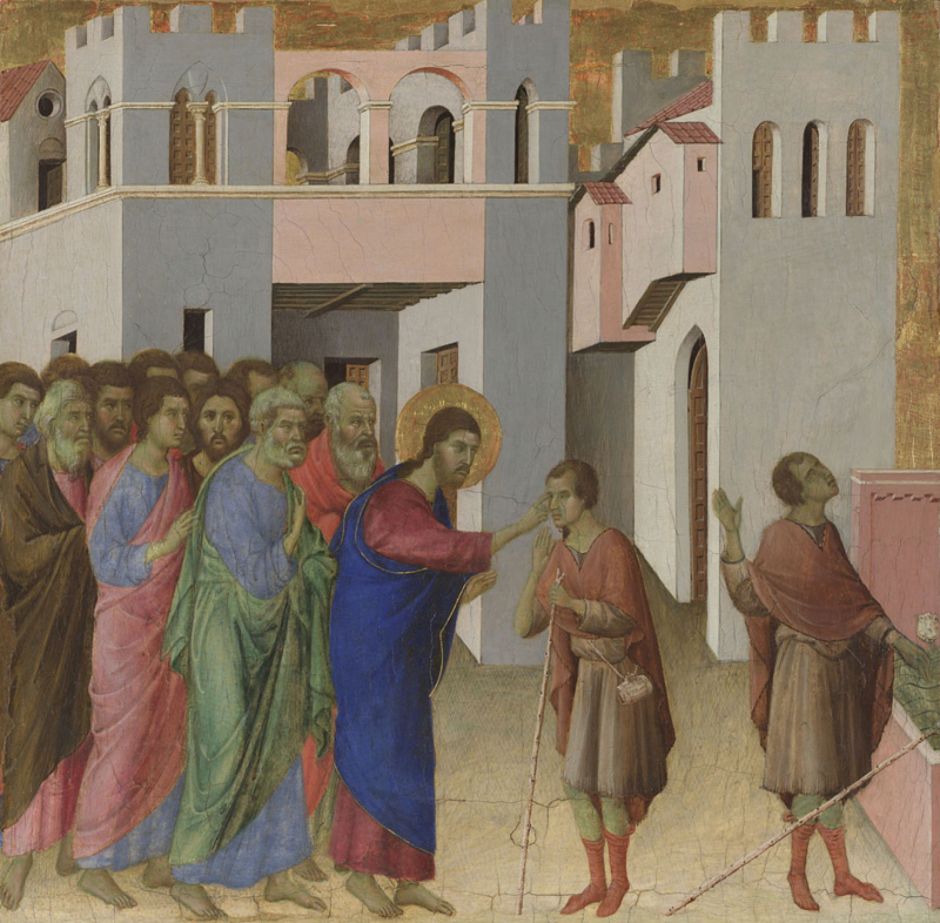
Duccio (fl 1278-1319), The Healing of the Man born Blind (Maestà Predella Panels) (1307/8-11), egg tempera on wood, 45.1 x 46.7 cm, The National Gallery (Bought, 1883), London. Courtesy of and © The National Gallery, London.

Because of its beauty and high cost, ultramarine blue was used for the robes of Jesus Christ and the Virgin Mary. Duccio’s panels from the Maestà Predella, including this of The Healing of the Man born Blind, show this tradition in its earliest years, around 1307-11. As a pigment, it proved practical in egg tempera as here, and in oils, watercolour, and fresco.

vaneyckghentaltarpiece
Jan van Eyck (c 1390–1441) and Hubert van Eyck (c 1366-1426), The Ghent Altarpiece (c 1432), oil on panel, open overall 350 x 461 cm, Saint Bavo Cathedral, Gent, Belgium. Wikimedia Commons.

Ultramarine blue has been found in the van Eyck brothers’ Ghent Altarpiece from about 1432 (above), and particularly in its most famous panel, The Mystic Lamb, below.

vaneyckghentaltarpiecedet
Jan van Eyck (c 1390–1441) and Hubert van Eyck (c 1366-1426), The Mystic Lamb, part of the Ghent Altarpiece (detail) (c 1432), oil on panel, open overall 350 x 461 cm, Saint Bavo Cathedral, Gent, Belgium. Wikimedia Commons.
botticelliadorationkings
Sandro Botticelli (c 1445-1510) and Filippino Lippi (c 1457-1504), Adoration of the Kings (c 1470), tempera on wood, 50.2 x 135.9 cm, The National Gallery (Bought, 1857), London.

Sandro Botticelli’s early tempera on panel painting Adoration of the Kings from about 1470, apparently made with Filippino Lippi, shows two different blue colours and purple. He painted the purple with an opaque underpainting of lead white tinted with a red lake derived from madder, to create pink. That was then glazed with quite coarse particles of ultramarine blue, so the pigment was thinly dispersed.

rubensdescentfromcross
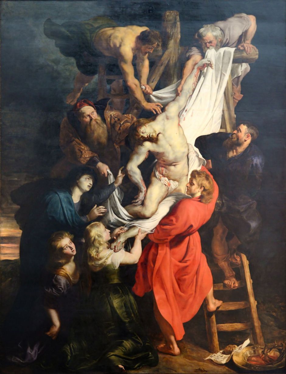
Peter Paul Rubens (1577–1640), Descent from the Cross (centre panel of triptych) (1612-14), oil on panel, 421 x 311 cm, Onze-Lieve-Vrouwekathedraal, Antwerp, Belgium. Image by Alvesgaspar, via Wikimedia Commons.

Peter Paul Rubens used ultramarine blue widely in his magnificent triptych now in Antwerp Cathedral. In its centre panel, Descent from the Cross (1612-14), it has been found combined with indigo and other pigments.

vandyckcharity
Anthony van Dyck (1599-1641), Charity (1627-8), oil on oak, 148.2 x 107.5 cm, The National Gallery (Bought, 1984), London. Courtesy of and © The National Gallery, London.

In van Dyck’s Charity from 1627-8, its most obvious use is in the blue cape, where ultramarine blue was painted over indigo, applied as both a tint and as a glaze over the top.

sassoferratovirginprayer
Sassoferrato (1609-1685), The Virgin in Prayer (1640-50), oil on canvas, 73 x 57.7 cm, The National Gallery (Bequeathed by Richard Simmons, 1846), London. Courtesy of and © The National Gallery, London.

Visit any of the larger galleries with substantial collections of paintings made before 1700, and you will see works with drapery that I can only describe as arresting in the brilliance of their ultramarine blue. One stunning example in the National Gallery in London is Sassoferrato’s The Virgin in Prayer from 1640-50. The Virgin’s cloak looks as if it was painted only yesterday, and that colour makes you stop in your tracks and draws you into the painting, like no other pigment can.

Given its importance, and limited supply, considerable effort was devoted to ensuring that natural ultramarine blue was of the highest quality, and alternative sources were sought. Deposits in the Chilean Andes, and near Lake Baikal in Siberia, weren’t developed until the nineteenth century, and attempts to make synthetic ultramarine proved unsuccessful until 1828, when Jean Baptiste Guimet was awarded a prize of six thousand francs for his discovery. Almost simultaneously, C G Gmelin of Tübingen discovered a slightly different method.

Commercial production had started by 1830, and it became known as French ultramarine, to distinguish it from the natural pigment. Although almost identical in colour and performance, there are significant differences between natural and synthetic ultramarine when tested in the laboratory. This has enabled the examination of paintings to determine the source of their pigment, and has brought some surprises. These most often relate to later overpainting during restoration. For example, two areas of much later painting have been discovered in the van Eycks’ Ghent Altarpiece.

manetcornercafeconcert
Édouard Manet (1832-1883), Corner of a Café-Concert (1878-80), oil on canvas, 97.1 x 77.5 cm, The National Gallery (Bought, Courtauld Fund, 1924), London. Courtesy of and © The National Gallery, London.

Examination of Édouard Manet’s Corner of a Café-Concert, from 1878-80, has shown that he used synthetic ultramarine in its blue passages, for example.

renoirumbrellas
Pierre-Auguste Renoir (1841-1919), The Umbrellas (c 1881-86), oil on canvas, 180.3 x 114.9 cm, The National Gallery (Sir Hugh Lane Bequest, 1917), London. Courtesy of and © The National Gallery, London.

Pierre-Auguste Renoir’s The Umbrellas, from about 1881-86, uses synthetic ultramarine in a methodical fashion. The first stage in its painting used only cobalt blue, but in its second stage synthetic ultramarine was applied extensively.

vangoghwheatfieldcypresses
Vincent van Gogh (1853-1890), A Wheatfield, with Cypresses (1889), oil on canvas, 72.1 × 90.9 cm, The National Gallery (Bought, Courtauld Fund, 1923), London. Courtesy of and © The National Gallery, London.

Vincent van Gogh’s A Wheatfield, with Cypresses (1889) contains synthetic ultramarine in its deepest blues, and in some areas of green, although it’s unusual to find ultramarine mixed to form green. Before synthetic pigment became available, this would have been far too expensive a way of making any significant amount of green, but once much cheaper pigment came onto the market, that became more feasible, if still unusual.

The ability to distinguish synthetic ultramarine, which didn’t exist before about 1828, and the natural pigment has proved important in detecting some forgeries. Only the most ignorant would attempt to pass off a painting made with synthetic ultramarine as being very old, but a few fakes fell at that hurdle.

vanmeegerenmenemmaus
Han van Meegeren (1889–1947), The Men at Emmaus (1937), oil on canvas, dimensions not known, Museum Boijmans Van Beuningen, Rotterdam, The Netherlands. Wikimedia Commons.

Han van Meegeren was far too knowledgeable and cunning to be caught so easily. He used natural ultramarine, for example when he sold The Men at Emmaus (1937) to the Museum Boijmans Van Beuningen as a Vermeer. What no one knew at the time was that his ultramarine looked genuine, but had been contaminated with a small amount of cobalt blue, which wasn’t discovered until 1803-04, and was first used as a pigment in 1806.

In 1960, the modern artist Yves Klein worked with the paint supplier Edouard Adam to ‘invent’ a paint he termed International Klein Blue (IKB). Although its formulation is a secret, it’s almost entirely synthetic ultramarine blue pigment in a polyvinyl acetate binder.

Like all the best queens, ultramarine blue has an unnerving habit of revealing the truth.

Reference

Joyce Plesters (1993) Artists’ Pigments, vol 2, ed Ashok Roy, Archetype. ISBN 978 1 904982 75 3.

❌