这是 Centro Stile 历史上的一座里程碑。作为 Murciélago 的继任者,Aventador 是第一台完全由兰博基尼内部设计和开发的旗舰车型。它的车身呈现出前所未有的线条和曲面复杂性,Y 字形和六边形元素在车灯、进气口、发动机罩乃至内饰上随处可见,整台车如同由无数几何形状构成的「陆地飞行器」。
The parade, held in North Korea’s capital to celebrate the 80th anniversary of the ruling Workers’ Party, gave its leader a chance to show off his growing power.
A photograph provided by North Korean state media showing what it says is a new intercontinental ballistic missile called the Hwasong-20. The missile was part of a military parade celebrating the 80th anniversary of the founding of the ruling Worker’s Party, in Pyongyang, North Korea, on Friday.
Joseph Herbert in 1996, with Detective Thomas Maher, left, at a news conference about the arrest of Heriberto Seda, whose killings mimicked those of the so-called Zodiac killer.
As the federal closure slides into a second week, Republicans are working to peel off five more Democratic senators to join them in voting to reopen the government.
The appearance of new objects or unexpected phenomena in the sky was an event of great significance in the past, and often considered to be a portent of the future, good or bad. This article considers the few that were recorded in paintings, and starts with the most famous of all, the star of Bethlehem that appears in many depictions of the birth of Christ.
The linked stories of the birth of Christ in a shed at Bethlehem, and the subsequent adoration of the infant by three wise men, kings or Magi “from the east”, are among the most popular and enduring among paintings in the Christian canon. The outlines given in the Gospels of Luke, chapter 2, and Matthew, chapter 2, have conventionally become elaborated.
Three wise men had seen a new star, possibly a comet or an unusually bright planet, which they believed would lead them to the birth of a great prophet. They travelled by the guidance of that star, to arrive at Bethlehem. There they found the newborn Christ with Mary his mother, paid homage to him in the shed in which the holy family was lodging, and presented their gifts of gold, frankincense, and myrrh.
Giotto di Bondone (1266–1337), The Adoration of the Magi (c 1305), fresco, approx 200 x 185 cm, Scrovegni Chapel, Padua. Wikimedia Commons.
Giotto’s Adoration of the Magi from about 1305 shows the star as a celestial ball of fire streaking across the sky, and the three wise men pay their respects to the newborn Christ and his mother.
Hieronymus Bosch (c 1450–1516), The Adoration of the Magi (Interior) (Saint Peter with donor, The Adoration of the Magi, Saint Agnes with donor) (1490-1500) (CR no. 9), oil on oak panel, 138 cm x 138 cm overall when open, Museo Nacional del Prado, Madrid. Wikimedia Commons.
Above Bosch’s view of the local Brabant countryside in his Adoration of the Magi of 1490-1500 he places a more modest and stationary star shining bright over its distant city, as shown in the detail below.
Hieronymus Bosch (c 1450–1516), The Adoration of the Magi (detail) (centre panel) (The Adoration of the Magi) (1490-1500) (CR no. 9), oil on oak panel, 138 cm x 138 cm overall when open, Museo Nacional del Prado, Madrid. Wikimedia Commons.William Blake (1757–1827), Adoration of the Kings (1799), tempera on canvas, 25.7 x 37 cm, Brighton and Hove Museums & Art Galleries, Brighton, England. The Athenaeum.
Blake’s version of the Adoration of the Kings is conventional in showing the three wise men presenting their gifts to Jesus and his parents. At the left, outside, shepherds are tending to their flocks of sheep beneath a stylised star, and at the right are the ox and ass.
There remains controversy over what celestial event might have occurred at the time.
Very few paintings show known events in the sky, and I know of only one depicting a full solar eclipse.
Enrique Simonet Lombardo (1866–1927), Eclipse (1905), oil on canvas, 75 x 55 cm, location not known. Wikimedia Commons.
Although many painters, particularly the Impressionists, have shown fleeting effects of light and the occasional rainbow, Enrique Simonet took the opportunity of a solar eclipse on 30 August 1905 to paint his Eclipse (1905). This was visible across eastern and northern Spain between about 1300 and 1320 UTC, and this painting is one of its few remaining records.
Realistic paintings of comets are also rare, and unimpressive.
William Dyce (1806–1864), Pegwell Bay, Kent – a Recollection of October 5th 1858 (c 1858), oil on canvas, 635 cm x 889 cm, The Tate Gallery, London. Wikimedia Commons.
Generally acclaimed as William Dyce’s finest painting, Pegwell Bay, Kent – a Recollection of October 5th 1858 (c 1858) shows this bay on the Kent coast, during a family holiday visit: a coastal scene worked up into a large finished oil painting. Although not easily seen in this image, there’s a small point of light high in the middle of the sky which is Donati’s comet, not due to return until 3811. Couple that with the inclination of the sun and the state of the tide, and you should be able to place this view precisely in both time and space, and confirm that it does indeed show this bay on 5 October 1858.
A few paintings show impossible celestial events.
John Martin (1789–1854), The Deluge (1834), oil on canvas, 168.3 x 258.4 cm, Yale Center for British Art, New Haven, CT. Wikimedia Commons.
John Martin’s painting of The Deluge from 1834 has two points of reference: the Biblical account of the flood, and Martin’s personal belief in prior catastrophe. As the sciences became ascendant during the nineteenth century, some educated people believed that in the past there had been an alignment of the sun, earth, and moon, and the collision of a comet resulting in global flooding. This was promoted by the French natural scientist Baron Georges Cuvier, and subscribed to by Martin.
True to form, his painting is dark and apocalyptic: near the centre, tiny survivors are just about to be overwhelmed by an immense wave bearing down at them from the left and above. The misaligned sun and moon barely penetrate the dense cloud, and to the top right is a melée of rock avalanche and lightning bolt. This was awarded a gold medal at the Paris Salon of 1835.
Paul Nash (1892–1946), Landscape of the Vernal Equinox (III) (1944), oil on canvas, 63.5 x 76.2 cm, Scottish National Gallery of Modern Art, Edinburgh, Scotland. The Athenaeum.
Several of Paul Nash’s surrealist landscapes show the moon in its phases, among them Landscape of the Vernal Equinox (III) from 1944, which presents the impossible view of a full moon and the sun visible close together and just above the horizon.
In their descent into the depths of Hell, Virgil and Dante have just entered circle eight for those who committed fraud in its broadest sense. This consists of what Dante refers to as malebolge, best translated as rottenpockets, a series of ten deep trenches each of which caters for a different type of fraud. Dante compares these to the defensive earthworks surrounding the outer walls of castles of the day.
Virgil leads Dante into the first of these rottenpockets, where souls are being lashed by demons to keep them moving constantly. These are pimps and seducers, among whom is a Bolognese man, a Guelph, who pimped his sister, the beautiful Ghisolabella, for political gain.
The pair move on past other sinners being scourged, where they see Jason, who seduced then abandoned the young Hypsipyle, queen of Lemnos, and later did the same with Medea. They then enter the second rottenpocket, for flatterers, who are wallowing in excrement.
Jan van der Straet, alias Giovanni Stradano (1523-1605), Canto 18 (1587), further details not known. Image by Sailko, via Wikimedia Commons.Gustave Doré (1832–1883), Inferno Canto 18 verses 116-117 (c 1857), engraving, dimensions and location not known. Wikimedia Commons.
They find a contemporary figure from Lucca, and see Thaïs, a Greek courtesan who notoriously flattered her partners. She is now covered in filth and thoroughly crabby.
Gustave Doré (1832–1883), Virgil shows Dante the Shade of Thaïs (c 1857), engraving, dimensions and location not known. Image by Karl Hahn, via Wikimedia Commons.
In the third rottenpocket, Dante and Virgil come across corrupt religious leaders or Simonists, who sold church privileges, and are trapped headfirst in rock holes, their protruding feet being roasted with flames. The key figure here is Pope Nicholas III, who at first confuses Dante with Pope Boniface VIII, who is also in the same rottenpocket. Pope Nicholas was known for his nepotism, which included appointing three of his own family as cardinals.
William Blake (1757–1827), The Simonist Pope (Dante’s Inferno) (1824-27), watercolour, 52.5 x 36.8 cm, The Tate Gallery, London. Wikimedia Commons.Gustave Doré (1832–1883), Dante Addresses Pope Nicholas III (c 1857), engraving, dimensions and location not known. Image by Karl Hahn, via Wikimedia Commons.
Virgil carries Dante on to the fourth rottenpocket, reserved for soothsayers. Their heads are turned to face backwards, so that the tears streaming from their eyes wet their buttocks.
Jan van der Straet, alias Giovanni Stradano (1523-1605), Canto 20 (1587), further details not known. Wikimedia Commons.
Virgil identifies several of them from classical times, including the Theban Tiresias; Dante recounts how he became a soothsayer after he had twice changed gender, as told by Ovid in his Metamorphoses. The list concludes with three near-contemporaries: Michael Scot, a scholar and astrologer to Emperor Frederick II, and two well-known Italians.
The fifth rottenpocket they find to be filled with corrupt public officials, or barrators, who sold public appointments and are immersed in a sea of boiling pitch, while being further tormented by a pack of vicious devils known as malebranche, ‘evil-claws’.
Giotto di Bondone (–1337), Devils Over City Landscape, detail of The Devotion of the Devils from Arezzo, scene in The Life of Saint Francis of Assisi (1296-1298), fresco, dimensions not known, Basilica di San Francesco d’Assisi, Assisi, Italy. Wikimedia Commons.
The latter are armed with long hooks, which they use to push the souls down into the pitch, much as you might push down lumps of meat that rise to the surface of a stew. Those devils are so evil as to threaten Dante, so Virgil whisks him on to the next rottenpocket for hypocrites.
Gustave Doré (1832–1883), The Demons Threaten Virgil (c 1857), engraving, dimensions and location not known. Image by Karl Hahn, via Wikimedia Commons.
Any resemblance to real persons, living or dead, is not only intentional, but of their own making.
The artists
William Blake (1757–1827) was a British visionary painter and illustrator whose last and incomplete work was an illustrated edition of the Divine Comedy for the painter John Linnell. Most of his works shown in this series were created for that, although he did draw and paint scenes during his earlier career. I have a major series on his work here.
Gustave Doré (1832–1883) was the leading French illustrator of the nineteenth century, whose paintings are still relatively unknown. Early in his career, he produced a complete set of seventy illustrations for translations of the Inferno, first published in 1857 and still being used. These were followed in 1867 by more illustrations for Purgatorio and Paradiso.This article looks at his paintings.
Giotto di Bondone (c 1267–1337) was one of the great masters who bridged between the late Middle Ages and the early Renaissance. He was born near Florence, and is reputed from about 1296 to have painted a cycle of frescoes in the Basilica di San Francesco d’Assisi, in Assisi. This is hotly disputed though, and those may have been painted by Cimabue instead. The scene of The Devotion of the Devils from Arezzo shows what may, directly or indirectly, have been an inspiration to Dante, although I don’t know whether there is any evidence that the poet ever visited Assisi.
Jan van der Straet, also commonly known by his Italianised name of Giovanni Stradano (1523-1605), was a painter who started his career in Bruges and Antwerp in Belgium, but moved to Florence in 1550, where he worked for the remainder of his life. Mannerist in style, he worked with printmakers in Antwerp to produce collections of prints, including an extensive set for The Divine Comedy.
Robin Kirkpatrick (trans) (2012) Dante, The Divine Comedy, Inferno, Purgatorio, Paradiso, Penguin Classics. ISBN 978 0 141 19749 4.
Richard Lansing (ed) (2000) The Dante Encyclopedia, Routledge. ISBN 978 0 415 87611 7.
Guy P Raffa (2009) The Complete Danteworlds, A Reader’s Guide to the Divine Comedy, Chicago UP. ISBN 978 0 2267 0270 4.
Prue Shaw (2014) Reading Dante, From Here to Eternity, Liveright. ISBN 978 1 63149 006 4.
Spades are agricultural tools of ancient origin, with a flat blade in line with its shaft, and used for digging. Their closest relative is the shovel with a broader blade for moving loose earth, gravel and snow, and the hoe whose blade is mounted at a right angle to the shaft. In some common applications, such as lifting potatoes and other root crops, a fork with three or more tines is normally preferred.
As a well-known tool for digging, the spade is often associated with the digging of graves, and appears in some religious paintings depicting the imminent interment of Christ’s body following the Crucifixion.
Jacopo Tintoretto (c 1518-1594), The Crucifixion (E&I 123) (1565), oil on canvas, 536 x 1224 cm, Albergo, Scuola Grande di San Rocco, Venice, Italy. Wikimedia Commons.
Jacopo Tintoretto’s huge and magnificent Crucifixion from 1565 shows a man digging a conventional grave, as seen in the detail below.
Jacopo Tintoretto (c 1518-1594), The Crucifixion (detail) (E&I 123) (1565), oil on canvas, 536 x 1224 cm, Albergo, Scuola Grande di San Rocco, Venice, Italy. Wikimedia Commons.
On the left of this detail, two men are gambling with dice in a small rock shelter suggestive of a tomb. To the right of them, a gravedigger has just started his work with a spade.
A spade may also appear in depictions of Christ’s subsequent resurrection, in his appearance to Mary as a gardener, often known by the Latin words from the Vulgate as Noli Me Tangere, “touch me not”, the words attributed to Christ in the Gospels.
Lavinia Fontana (1552–1614), Jesus Appears to Mary Magdalene (1581), oil on canvas, 80 x 65.5 cm, Galleria degli Uffizi, Florence. Wikimedia Commons.
In her Jesus Appears to Mary Magdalene from 1581, Lavinia Fontana re-locates this encounter between Mary and Jesus, dressing him in the garb of a mediaeval Italian gardener, and holding a fine gardener’s spade with his left hand.
Alessandro Magnasco (1667–1749), Noli Me Tangere (1705-10), oil on canvas, 144.8 × 109.2 cm, The J. Paul Getty Museum, Los Angeles, CA. Courtesy of The J. Paul Getty Museum.
The eccentric Alessandro Magnasco painted his Noli Me Tangere (1705-10) over a background of ruins made by a collaborator. Christ is shown standing, holding a long-hafted spade with his left hand. Mary is on her knees, a small urn in front of her. Their clothes are rough, and Christ’s appear to be his burial linen, blowing in the wind.
Spades are not uncommon in paintings set in the countryside.
Hans Andersen Brendekilde (1857–1942), On Forbidden Roads (1886), oil on canvas, 126 x 160 cm, location not known. Wikimedia Commons.
Hans Andersen Brendekilde’s On Forbidden Roads from 1886 shows one of the core themes of Naturalist painting: itinerant workers making their way through neglected corners of the countryside. These two men are equipped for forestry, with a two-man saw, axes, and spades. Almost hidden among the vegetation at the far left is a third figure, who looks anxiously towards them. Maybe none of them should really be there at all.
Hans Andersen Brendekilde (1857–1942), People by a Road (1893), oil on canvas, 200 x 263 cm, Statens Museum for Kunst (Den Kongelige Malerisamling), Copenhagen, Denmark. Wikimedia Commons.
There’s a more complex story behind Brendekilde’s People by a Road from 1893. The group at the left are old road-workers, breaking larger rocks into coarse gravel. They lived out under the wooden shelter behind them, as they made their way slowly around the country roads. The woman holds what is either a small shovel or spade used in their work. Standing and apparently preaching to them is a cleanly dressed carpenter, his saw held in his left hand. The building behind them, on the opposite side of the road, is a church, from which a large congregation has just emerged.
Hans Andersen Brendekilde (1857–1942), The Rest (1887), oil on canvas, 70 x 91.5 cm, location not known. Wikimedia Commons.
One of the most physically demanding tasks of the year was clearing snow in the winter. Brendekilde’s The Rest (1887) shows a younger man taking a short break from cutting a track through to the elderly lady’s farmhouse. The blade of his spade is flat, confirming that it’s used to dig through compacted snow and pile the slabs seen behind him.
Hans Andersen Brendekilde (1857–1942), Home for Dinner (1917), further details not known. Wikimedia Commons.
In Brendekilde’s Home for Dinner from 1917, a young girl holding some fresh fish stands talking to a man with a spade.
Hans Andersen Brendekilde (1857–1942), Afternoon Work (1918), oil on canvas, 77 x 100 cm, Private collection. Wikimedia Commons.
The following year, Brendekilde painted a gardening story, in Afternoon Work (1918). A younger man is out on his finely tilled vegetable patch in front of his thatched cottage, wielding his spade as a weapon. Standing just outside the door, behind him, is his young daughter, and through the window is an older woman, presumably his wife. Both are watching him intently, with an air of fear at what he is about to do. He is about to attack a small crop of molehills that have appeared freshly in the midst of his seedling vegetable plants.
As Europeans and Americans started taking to the beaches, they realised how much fun it is to dig sand and build sandcastles using small buckets and spades.
William Dyce (1806–1864), Pegwell Bay, Kent – a Recollection of October 5th 1858 (c 1858), oil on canvas, 635 cm x 889 cm, The Tate Gallery, London. Wikimedia Commons.
This is William Dyce’s finely detailed view of Pegwell Bay, Kent, on the coast of south-east England, out of season, at the end of a fine day in early October. Visitors to the beach are wrapped for warmth as well as modesty. In the distance, a group of donkeys are being taken to graze for the night, after the day’s work being hired out for children to ride. In the foreground, at the left, a child holds a spade, although there is precious little sand suitable for sandcastles.
Évariste Carpentier (1845–1922), Tréport, Bathing Time (1882), oil on canvas, 50.5 x 80.5 cm, Private collection. Wikimedia Commons.
Later in the nineteenth century, at Le Tréport on the Channel coast of France near Dieppe, Évariste Carpentier’s Le Tréport, Bathing Time shows progress in the development of beach costume and culture. A young girl in the left foreground is playing with her bucket and spade, while her older brother is admiring the fashionable young woman parading her new clothes. A far cry indeed from the grave-digger.
Earlier in this series, I showed an example of the origin of all modern paintings in the decorated caves of pre-history. As shelters became buildings, our ancestors continued to paint their walls, using a technique now known as secco wall or mural painting, where wet paint is applied to dry stone or plaster.
Artist not known, Christ Pantocrator (c 1200), secco wall-painting, dimensions not known, apse of Braunschweig (Brunswick) Cathedral, Braunschweig, Germany. Image by PtrQs, via Wikimedia Commons.
Secco has been widely used outside Europe, and can still be seen in some very old European wall paintings, such as those in Braunschweig Cathedral, including Christ Pantocrator, thought to date from the early thirteenth century. Long before that was created, though, wall painting advanced to improve adhesion between its paint layer and ground. In secco technique, only thin layers of pigment can be used, resulting in weak colours, little detail, and the need for periodic re-painting as pigment is gradually lost over time.
Artists experimented with different binders and secco techniques. Although dry plaster is more absorbent and a better ground than bare stone, success has been limited, and failure a constant danger. At some time before about 1700 BCE, one of the Mediterranean cultures discovered that it was possible to apply paint onto a layer of wet plaster, and the technique of fresco (strictly, buon fresco) was born.
Artist not known, Garden room (before 79 CE), fresco, dimensions not known, The House of the Golden Bracelet, Pompeii, Italy. Image by Stefano Bolognini, via Wikimedia Commons.
The Romans loved frescos that made their rooms look as if they were in a spacious outdoors, like this from the House of the Golden Bracelet in Pompeii.
In fresco, the support remains the wall or ceiling of the building, but the ground is absorbent wet plaster applied to that surface. Pigment is diluted in water and applied directly to the ground while the latter is still wet; this allows the paint to be absorbed into the ground, providing good and durable bonding of the pigment. Plaster is made using lime, derived from crushed limestone, and sets by reaction with carbon dioxide in the air to form calcium carbonate (from which both chalk and limestone are composed) and water, which evaporates during drying.
Techniques became even more refined, with the use of additional layers of plaster prepared in specific ways, to which red pigment sinopia might be added, allowing the artist to draw construction and other lines to assist in final painting. Because these frescos are on a grand scale, transferring the design of a painting from final sketch to the wall or ceiling is also a challenge.
The central problem for the painter is that, to be successful, fresco has to be painted onto the plaster when it is still wet. That means only a limited area can be plastered and painted each day, known as giornate (singular giornata), a day’s work. For all but the smallest of ground-level fresco paintings, work has to be undertaken at height, from a scaffold, posing the very real risk that the artist would fall, or the scaffolding fail. Many fresco painters have fallen at work, some suffering serious injuries or death as a result.
Despite all these practical difficulties, some of the most important European works of art are frescos painted during the Renaissance in places of worship with their high walls and ceilings.
Masaccio (1401–1428), The Holy Trinity (1426-8), fresco, 640 x 317 cm, Basilica of Santa Maria Novella, Florence. Wikimedia Commons.
Masaccio’s magnificent fresco of The Holy Trinity in the Basilica of Santa Maria Novella in Florence, was painted in 1426-28. At the outset he would have made a preliminary plan including his giornate starting at the top and working downwards. Once ready to start the painting, a team of carpenters will have erected wooden scaffolding to give the artist and his assistants access to the whole of that section of the wall, to the full height of over six metres (21 feet). The first stage would then have been completed by assistants, who laid a rough under-layer of plaster known as the arriccio over the whole wall, and left it to dry for several days. This layer often contains abrasive sand particles to provide a key for the final layer of plaster.
Once that had dried completely, Masaccio and his assistants transferred the drawings onto the surface of the arriccio. This may have been performed by scaling up from the squared drawing and painting with sinopia, or full-size drawings may have been pricked to make holes in the paper and a bag of soot banged against the sheet held against the wall, a technique known as pouncing. Masaccio is known to have used both techniques, and may well have used each in different sections of this work.
On each day of painting, assistants would prepare the colours by mixing pigments in water. The day’s supply of plaster, the intonaco, is then prepared by mixing water with lime. That day’s giornata is covered with a thin layer of intonaco, and about an hour later Masaccio started painting into it. He then had about eight hours before it dried and he could apply no more fresh paint. Like many of the best fresco painters, Masaccio extended his painting time by using paint mixed with milk or casein and a little lime, effectively a lime-based casein medium, which could be laid onto dry intonaco.
The geometric requirements of this painting also merited special measures. When the intonaco was first applied, it was marked to indicate key construction lines, such as those in the barrel-vaulted ceiling, and down the pillars at the side. The remains of these incised lines are still visible when the fresco is viewed in raking light. In this case, there is evidence that Masaccio used lengths of string attached to a nail sunk at the vanishing point of the linear projection, below the base of the cross.
Masaccio (1401–1428), The Holy Trinity (1426-8), fresco, 640 x 317 cm, Basilica of Santa Maria Novella, Florence. Wikimedia Commons. Giornate proposed in 1950 marked in light green. Redrawn after the original by Leonetto Tintori (1950).
Although we think of frescos as being fixed, this one has now been moved twice within the same church, which hasn’t helped its appearance. During conservation work and movement of Masaccio’s painting in the 1950s, the opportunity was taken to study its construction. Leonetto Tintori drew up a plan of all the identified construction lines and edges of giornate; I have sketched in the latter from a reproduction of a drawing made at that time, which has since been destroyed.
It’s estimated the whole painting would have required some 24 giornate, although because of the long history of damage and attempts at its restoration, that number remains flexible. Assuming that Masaccio painted six days a week, that would have required a minimum of four weeks working for at least ten hours each day. Fresco painting doesn’t permit easy alterations either: if any repainting was required and couldn’t be accomplished using dry technique, that day’s giornata would have to be removed, replaced and repainted.
Giotto di Bondone (–1337), Scenes from the Life of Christ: 20. Lamentation (1304-06), fresco, 200 x 185 cm, Cappella degli Scrovegni, Padua, Italy. Wikimedia Commons.
Giornate can sometimes become obvious over time, as shown in Giotto’s fresco in the Scrovegni Chapel in Padua, Italy.
Michelangelo di Lodovico Buonarroti Simoni (1475–1564), The Last Judgement (1536-41), fresco, 1,370 × 1,220 cm, Cappella Sistina, The Vatican. Wikimedia Commons.
Perhaps the most famous fresco is Michelangelo’s The Last Judgement (1536-41) in the Sistine Chapel of the Vatican. It covers an area of 13.7 by 12 metres (539 by 472 inches), and took over four years to complete.
In the eighteenth and nineteenth centuries, fresco became relatively neglected.
Johann Friedrich Overbeck (1789-1869), Consecration of Godfrey (1819-27), fresco, dimensions not known, Casa Massimo, Rome, Italy. Image by Sailko, via Wikimedia Commons.
Some new frescos were commissioned for places of worship and other public buildings, and in the early nineteenth century Johann Friedrich Overbeck painted a series telling the story of Torquato Tasso’s epic Jerusalem Delivered, in the Casa Massimo in Rome. There are similar series showing Dante’s Divine Comedy and other long narratives, which are particularly suited to the medium.
William Dyce (1806–1864), Neptune Resigning to Britannia the Empire of the Sea (1847), fresco, 350 x 510 cm, Osborne House, East Cowes, Isle of Wight, England. Wikimedia Commons.
In 1845, the Scottish artist William Dyce was invited to paint frescos for the Royal Family, for which he travelled to Italy to learn technique. On his return in 1847, he painted this curious composition in Queen Victoria and Prince Albert’s new and luxurious holiday palace of Osborne House, at East Cowes, on the Isle of Wight. Neptune Resigning to Britannia the Empire of the Sea (1847) is an impressive fresco, and remains in pristine condition at the top of the main staircase in the house.
John Dixon Batten (1860-1932), The Creation of Pandora (1913), tempera on fresco, 128 x 168 cm, Reading University, Reading, England. Wikimedia Commons.
Frescos have continued in religious painting, with artists such as Sergei Fyodorov painting them in churches and cathedrals, and for the occasional trompe l’oeil. John Dixon Batten’s The Creation of Pandora was painted anachronistically in egg tempera on a fresco ground by 1913. Batten was one of the late adherents of the Pre-Raphaelite movement; this painting was deemed unfashionable in 1949, and was put into storage and quietly forgotten until its rediscovery in 1990.
Akseli Gallen-Kallela (1865–1931), The Defence of Sampo (part of Kalevala Fresco) (1928), fresco, lobby of the National Museum of Finland, Helsinki. Photo by Jean-Pierre Dalbéra, via Wikimedia Commons.
New frescos are still painted in some public buildings too. This work by Finnish painter Akseli Gallen-Kallela is one of a series he painted in the National Museum of Finland in Helsinki in 1928, but most other wall paintings of the twentieth century, such as those of John Singer Sargent in public buildings in Boston, have been painted in oils on canvas rather than buon fresco.
Frescos aren’t the only way of making very large and monumental paintings for places like churches, though. The walls of Venetian buildings are particularly unsuitable for secco or fresco, because they remain so damp all year round. Hence the painters of Venice were innovators in constructing very large canvases, and you will find few frescos there as a result.
Dice have been thrown and rolled by people throughout recorded history. Early dice were often irregular, made of bone or stone and used primarily for gambling. Although they don’t appear to have played any significant role in mythology, their role in the events of the Crucifixion is well recorded in the New Testament Gospels.
Jacopo Tintoretto (c 1518-1594), The Crucifixion (E&I 123) (1565), oil on canvas, 536 x 1224 cm, Albergo, Scuola Grande di San Rocco, Venice, Italy. Wikimedia Commons.
Jacopo Tintoretto’s huge and magnificent Crucifixion from 1565 depicts the biblical account of guards gambling with dice, as seen in the detail below.
Jacopo Tintoretto (c 1518-1594), The Crucifixion (detail) (E&I 123) (1565), oil on canvas, 536 x 1224 cm, Albergo, Scuola Grande di San Rocco, Venice, Italy. Wikimedia Commons.
On the left of this detail, two men are gambling with dice in a small rock shelter suggestive of a tomb. To the right of them, a gravedigger has just started his work with a spade.
The Christian Church has generally taken a dim view of gambling, and shunned dice. Several artists have expressed this in paint, but none so forcefully as Hieronymus Bosch.
Hieronymus Bosch (c 1450–1516), The Garden of Earthly Delights (right panel) (c 1495-1505), oil on oak panel, central panel 190 × 175 cm, each wing 187.5 × 76.5 cm, Museo Nacional del Prado, Madrid. Wikimedia Commons.
For Bosch and his patrons, gambling was definitely one of the cardinal sins. It appears in the garden of Hell in the right panel of his magnificent Garden of Earthly Delights from about 1495-1505. In this damning conclusion, figures are mutilated and tormented in a nightmare landscape dominated by non-human creatures and alarming objects, where gambling takes the foreground.
Hieronymus Bosch (c 1450–1516), The Garden of Earthly Delights (right panel, detail) (c 1495-1505), oil on oak panel, central panel 190 × 175 cm, each wing 187.5 × 76.5 cm, Museo Nacional del Prado, Madrid. Wikimedia Commons.
In the foreground, a huge blue bird, wearing a cauldron on its head and swallowing a whole human, presides over the scene. Two main groups of victims here are clustered around objects associated with gaming and gambling, and those for making music, then associated with the work of the devil, and immoral activities such as dancing. Playing cards are scattered on the ground beneath an overturned gaming table, and dice are balanced precariously on an index finger and on the head of a naked woman. From among that cluster of figures, a pair of dark blue non-human arms holds high a backgammon board with three dice.
Not all cultures have been as damning, though.
Albert Anker (1831–1910), Knucklebone Players (1864), media not known, 81 x 65 cm, Musée Gruérien, Bulle, Switzerland. Wikimedia Commons.
Albert Anker turns to classical times to put his spin on gambling games in his Knucklebone Players (1864). Three youths are here playing a game of greater skill, but still frequently the basis of gambling. The distinguished men in the background are hardly the sort to frequent a gambling den, surely?
Nevertheless, playing with dice continued as a cardinal sign of sin.
David Teniers the Younger (1610–1690), The Dice Shooters (1630-50), oil on panel, 45 × 59 cm, Rijksmuseum Amsterdam, Amsterdam, The Netherlands. Wikimedia Commons.
Alcohol, and that other vice tobacco, are cited in David Teniers the Younger’s The Dice Shooters (1630-50). In common with other paintings of card-playing and gambling in this period, it’s set in a dingy room in a rough tavern. Drawing on their clay pipes and with glasses of beer in hand, a group of men are completely absorbed in gambling large stacks of coins on the throw of their dice.
Thomas Rowlandson (1756–1827), The Gaming Table (1801), watercolour with pen and brown and gray ink, over graphite on moderately thick, moderatedly textured, cream, wove paper, 14.9 x 24.1 mm Yale Center for British Art, Yale University, New Haven, CT. Wikimedia Commons.
William Hogarth’s successor Thomas Rowlandson painted his Gaming Table in watercolour in 1801. Players here are putting their stakes on dice, which are about to be revealed by the man at the far right of the table, who seems to have been raking the money in.
Gustave Courbet (1819–1877), Louis Gueymard (1822–1880) as Robert le Diable (1857), oil on canvas, 148.5 x 106.6 cm, Metropolitan Museum of Art, New York, NY. Wikimedia Commons.
Although Gustave Courbet’s portrait of the operatic singer Louis Gueymard (1822–1880) as Robert le Diable (1857) shows the last scene in Act 1 of Giacomo Meyerbeer’s opera Robert le Diable (1831), its message is clear. In this scene, Gueymard’s character Robert gambles away his entire estate on dice; in the opera this is marked by the aria L’or est une chimère: ‘gold is but an illusion’.
Dante Gabriel Rossetti (1828–1882), Hesterna Rosa (1865), watercolour on paper 27.9 x 39.3 cm, Delaware Art Museum, Wilmington, DE. Wikimedia Commons.
Dante Gabriel Rossetti is less convinced. In his watercolour of Hesterna Rosa from 1865, he shows a moment from the contemporary play Philip van Artevelde, written by Henry Taylor in 1834. Van Artevelde was a Flemish patriot who lived between about 1340-1382, and led the Ghent rebellion in 1381, only to be crushed to death in battle the following year. In Taylor’s play, van Artevelde has a relationship with a woman of lower class; in this scene, his lover has paused to reflect on her life while he plays dice with a friend. The painting’s title means yesterday’s rose, and draws on the theme of the fallen woman, so popular with Rossetti.
Bartolomé Esteban Murillo (1617–1682), Young Boys Playing Dice (c 1675), oil on canvas, 145 x 108 cm, Alte Pinakothek, Maxvorstadt, Germany. Wikimedia Commons.
Murillo’s Young Boys Playing Dice of about 1675 adopts a different theme, of gambling among the poor and vulnerable. Two scruffy urchins from the streets of Seville are throwing dice for the small piles of change which are probably their entire fortunes. A third stands over them, chewing at a bread roll while his dog looks up longingly at the food.
Lovis Corinth wasn’t the only artist to have his own suit of armour. Rembrandt apparently bought at least one, while Jean-Léon Gérôme seems to have kept a suit hanging in his studio.
Jean-Léon Gérôme (1824–1904), The End of the Pose (1886), oil on canvas, 48.3 x 40.6 cm, Private collection. Wikimedia Commons.
The End of the Pose (1886) is the first of Gérôme’s series of unusual compound paintings, which are at once self-portraits of him as a sculptor, studies in the relationship between a model and their sculpted double, and further forays into issues of what is seen, visual revelation, and truth.
Here, while Gérôme cleans up, his model is seen covering up her sculpted double with sheets, as she remains naked. Hanging against the wall behind is a complete suit of armour, and there is a single red rose on the wooden platform on which the model and statue stand.
Armour has occasionally been purely symbolic, most famously in the collaborative painting of Touch by Jan Brueghel the Elder and Peter Paul Rubens in their series The Five Senses from 1618.
Jan Brueghel the Elder (1568–1625) and Peter Paul Rubens (1577–1640), Touch (The Five Senses) (1618), oil on panel, 64 × 111 cm, Museo Nacional del Prado, Madrid. Wikimedia Commons.
Touch extends beyond its title to encompass other tactile sensory modalities. Heat is associated with a brazier, fine touch with brushes nearby. Much of the panel is devoted to a collection of armour, weapons, and their manufacture by gunsmiths and armourers. The many suits on display, seen in the detail below, appear to be equipment that isolates rather than stimulates the sense of touch.
Jan Brueghel the Elder (1568–1625) and Peter Paul Rubens (1577–1640), Touch (The Five Senses) (detail) (1618), oil on panel, 64 × 111 cm, Museo Nacional del Prado, Madrid. Wikimedia Commons.
During the nineteenth century, many painters looked back at the age of knights and chivalry, which inspired German Romantics, Pre-Raphaelites, and some of the last academic artists of the century.
Carl Friedrich Lessing (1808–1880), The Return of the Crusader (1835), oil on canvas, 66 × 64 cm, LVR-LandesMuseum Bonn, Rheinisches Landesmuseum für Archäologie, Kunst- und Kulturgeschichte, Bonn, Germany. Wikimedia Commons.
The crusades presented Carl Friedrich Lessing with an ideal combination of mediaeval history, romance, and chivalry. In The Return of the Crusader from 1835, he shows a lone knight in full armour dozing as his horse plods its way up a path from the coast. Although his armour is still shiny, a tattered battle pennant hangs limply from his lance. This is based on a Romantic poem by the writer Karl Leberecht Immermann (1796-1840).
Edmund Blair Leighton (1852–1922), Conquest (1884), oil on canvas, 122 x 76 cm, Private collection. Wikimedia Commons.
Edmund Blair Leighton’s Conquest from 1884 shows a stereotype knight in shining armour walking through an arch with its portcullis raised, a fair maiden walking behind him, as this victor enters the castle he has just conquered. The knight appears to be an idealised self-portrait.
Edmund Blair Leighton (1852–1922), The Accolade (1901), oil on canvas, 182.3 x 108 cm, Private collection. Wikimedia Commons.
Leighton’s The Accolade (1901) apparently shows Henry VI the Good – of Poland, not the British Henry VI – being dubbed a knight. Every link in his chain mail has been crafted individually.
Manuel García Hispaleto (1836–1898), Don Quixote’s Speech of Arms and Letters (1884), oil on canvas, 152 x 197 cm, Palacio del Senado de España, Madrid, Spain. Wikimedia Commons.
Manuel García Hispaleto’s Don Quixote’s Speech of Arms and Letters (1884) shows the hero, his squire Sancho Panza behind, delivering one of his many orations after dinner, in a full suit of armour, as you would.
Eugène Delacroix (1798–1863), Combat Between Two Horsemen in Armour (c 1825-30), oil on canvas, 81 x 105 cm, Musée du Louvre, Paris. Wikimedia Commons.
Eugène Delacroix visited tales of chivalry in his Combat Between Two Horsemen in Armour, painted at some time between 1825-30.
Plate armour continued to be worn by soldiers well into the twentieth century, and appears in some paintings of contemporary history.
Paul-Émile Boutigny (1853–1929), Scene from the Franco-Prussian War (date not known), oil on canvas, 49 x 60 cm, location not known. Wikimedia Commons.
Paul-Émile Boutigny’s undated Scene from the Franco-Prussian War shows soldiers from both sides of this short war in 1870-71. The soldier on the left is French, and holds a French Chassepot musketon with a long yataghan bayonet, while his colleague on the right appears to be Prussian, with his pickelhaube spiked helmet and a heavy cavalry cuirass that’s essentially modernised armour. (I’m grateful to Boris for his expert interpretation of this motif.)
François Flameng (1856–1923), Germans (date not known), further details not known. Wikimedia Commons.
François Flameng’s undated scene of Germans from the First World War shows the odd combination of archaic plate armour with modern gas masks.
Finally, as everyone knows, a knight goes to their grave in their armour.
Briton Rivière (1840–1920), Requiescat (1888), oil on canvas, 191.5 x 250.8 cm, Art Gallery of New South Wales, Sydney, Australia. Wikimedia Commons.
Briton Rivière’s Requiescat from 1888 epitomises the faithful relationship between a dog and its master. As the knight’s body is laid out clad in armour, so his dog sits pining by the side of his body.
As we all should really be on holiday, I’m taking a long weekend to look at the stories of three green pigments, starting today with the oldest and most elusive of them, the mineral malachite.
Because green is a secondary colour, it might seem better mixed from blue and yellow, as it has been in various recipes such as Prussian green. But the painter always prefers using single pigments for the purity of their chroma, and the fact that the more pigments that get mixed, the closer the colour comes to muddy grey.
Given the shortage of lightfast bright greens, it’s surprising how little-used malachite green is in European painting, despite its rich colour. For a while it rejoiced quietly under traditional names including chrysocolla, green verditer, and even green bice, but it only ever became popular in Japan and China.
As a natural mineral, malachite is not uncommon, and a reliable source of pure pigment, which is chemically basic carbonate of copper. Malachite green was known to the ancient Egyptians, who appear to have used it as eye-paint. Found abundantly in Japanese and Chinese paintings from the seventh century onwards, it wasn’t used much in Europe until the Renaissance. After that, it almost died out in Europe until the nineteenth century, when it enjoyed a brief revival.
Two versions of the painting by Watanabe Kazan 渡辺崋山 of Sato Issai 佐藤一斎(五十歳)像 show malachite green at its finest.
Watanabe Kazan 渡辺崋山 (1793-1841), Portrait of Sato Issai 佐藤一斎(五十歳)像 (1824), ink and colour on silk mounted on panel, 212.2 x 67 cm, Freer Gallery of Art (Purchase — Charles Lang Freer Endowment), Washington, DC. Courtesy of the Freer Gallery and the Smithsonian Institution.
This version from 1824, now in the Freer in Washington, is known to use malachite green with a slightly blue shade and deep in colour.
Watanabe Kazan 渡辺崋山 (1793-1841), Portrait of Sato Issai (age 50) 佐藤一斎(五十歳)像 (1821), colour on silk 絹本着色, 80.6 x 50.2 cm, Tokyo National Museum 東京国立博物館, Tokyo, Japan. Wikimedia Commons.
This smaller and earlier version from 1821, now in Tokyo, is a lighter, more yellow shade. I’m not aware of its pigment having been analysed, but I’d be surprised if it was straight malachite green.
The biggest problem with its adoption in Europe was the popularity there of oil paint. The pigment worked well where it could be ground quite coarsely and used in water-based media like fresco and egg tempera, but the finer you grind it, the paler it becomes. Oil painters like smooth buttery paints with fine pigment particles, which sadly didn’t work for malachite green.
Spinello Aretino (1350/52-1410), Virgin Enthroned with Angels (c 1380), tempera and gold leaf on panel, 195.3 x 113 cm, Harvard Art Museums/Fogg Museum (Gift of Mrs. Edward M. Cary), Cambridge, MA. Courtesy of Harvard Art Museums/Fogg Museum.
The rich, almost emerald green robes of Spinello Aretino’s Virgin Enthroned with Angels from about 1380 contain malachite green, here in tempera medium.
Hubert van Eyck (c 1366–1426) and Jan van Eyck (c 1390–1441), Adoration of the Lamb, panel from the Ghent Altarpiece (c 1425-1432), oil on panel, 137.7 x 242.3 cm (panel), Saint Bavo Cathedral Sint-Baafskathedraal, Ghent, Belgium. Wikimedia Commons.
Among its earliest appearances in oil paint is this spectacular centre panel of the van Eyck brothers’ Ghent Altarpiece, famous in its own right as the Adoration of the Lamb (c 1425-1432).
Continuing use of egg tempera in the Southern Renaissance helped it survive. Piero della Francesca’s famous The Baptism of Christ (after 1437), made in egg tempera on poplar wood, relies on the pigment for its greens. Microscopic examination of the paint layer here shows coarse mineral particles typical of natural malachite.
In Francesco del Cossa’s Saint Vincent Ferrer from about 1473-75, it has been identified in the dark green grass at the foot of the painting. This too was made using egg tempera.
However, microscopy of this paint layer shows that these pigment particles don’t seem to have been fractured as if they have been ground, but are globular, as occurs when the malachite green has been made by a process of precipitation. Such artificial malachite green didn’t appear in European paintings until after about 1430, just in time for Francesco del Cossa.
Tintoretto (1519–1594), Saint George and the Dragon (c 1555), oil on canvas, 158.3 x 100.5 cm, The National Gallery, London. Wikimedia Commons.
Although he painted in oils, Tintoretto was an enthusiastic user of malachite green. To obtain the range of greens seen in the rich and varied colours of vegetation in his Saint George and the Dragon from about 1555, he used this pigment with copper resinate glazes, a technique found in other paintings of the period.
Tintoretto (1519–1594), The Last Judgment (1560-62), oil on canvas, 1450 x 590 cm, Chiesa della Madonna dell’Orto, Venice, Italy. Wikimedia Commons.
Tintoretto’s vast oil painting of The Last Judgment (1560-62) in the Chiesa della Madonna dell’Orto, Venice, has been found to contain malachite green, I suspect in the band of green depicting the Flood just below the centre. The detail below makes this a bit clearer.
When painting the frescoes formerly in the Villa Aldobrandini between 1616-18, Domenichino and his assistants relied heavily on malachite green. It has been formally identified in this section, showing Apollo pursuing Daphne, where it’s the mainstay colour remaining, and is suspected in most of the others.
Although only classed as moderately permanent, these and other examples of very old frescoes show how well malachite green has retained its colour after four centuries or more. But with the rise of oil painting in European art, it fell from favour.
Pierre-Auguste Renoir (1841–1919), Chrysanthemums (1881-82), oil on canvas, 54.7 × 65.9 cm, Art Institute of Chicago, Chicago, IL. Image by Rlbberlin, via Wikimedia Commons.
One of those who participated in its revival in the nineteenth century was Pierre-Auguste Renoir, whose painting of Chrysanthemums from 1881-82 shows how it could still be used in oil paint. But by then there was a much wider choice of more modern green pigments; the revival was short-lived, and malachite green has hardly been used since.
Reference
Rutherford J Gettens and Elisabeth West Fitzhugh (1993) Artists’ Pigments, vol 2, edited by Ashok Roy, Archetype. ISBN 978 1 904982 75 3.
Dante lost consciousness just before he was expecting to be ferried across the River Acheron in Charon’s boat, from Hell’s Gate to its First Circle.
Sandro Botticelli (1445–1510), Map of Hell (1480-90), silverpoint, ink and distemper, 33 x 47.5 cm, Biblioteca Apostólica Vaticana, Vatican City. Wikimedia Commons.
Botticelli’s Map of Hell from 1480-90 shows these stages of their descent at the very top: highest are the woods through which Dante was wandering when he encountered the three wild beasts. At the left, Virgil led Dante down to the area in which the cowards are trapped, neither being allowed admittance to Heaven, nor to Hell. Charon’s boat then crosses the River Acheron, shown in blue, taking Dante and his guide Virgil to the First Circle of Limbo.
Dante is woken by thunder, and realises that he’s on the edge of the abyss that is Hell. Virgil leads him down into darkness, where there is no grief or pain, and explains that the multitude there never sinned at all, but none was baptised in faith as they had lived before the Christian era. This is where Virgil’s ghost now inhabits, for despite his merit and attainments, he never revered the Christian God.
Gustave Doré (1832–1883), The Virtuous Pagans (1857), engraving, dimensions not known, location not known. Wikimedia Commons.
Dante asks whether any of those in Limbo, as this circle is known, have ever been blessed and been able to leave. This allows Virgil to explain the Harrowing of Hell by Christ after his crucifixion. This occurred not long after Virgil’s death: following his crucifixion, Jesus Christ descended into Hell, where he reached the First Circle, blessed and liberated from it the many Old Testament figures who had been faithful to the God of the Jews, also known as Anastasis.
The descent of Christ into Limbo and his Harrowing of Hell was a popular theme in religious painting until the end of the Renaissance, and would have been familiar to Dante’s readers. Here is a small selection of some of the finest paintings of this, from 1530 to 1600.
Domenico di Pace Beccafumi (1486–1551), The Descent of Christ into Limbo (1530-35), media not known, 398 x 253 cm, Pinacoteca Nazionale di Siena, Siena, Italy. Wikimedia Commons.Jacopo Tintoretto (c 1518-1594), The Descent into Limbo (E&I 144) (1568), oil on canvas, 342 x 373 cm, San Cassiano, Venice, Italy. Wikimedia Commons.Jan Brueghel the Elder (1568–1625) and Hans Rottenhammer (1564–1625), Christ’s Descent into Limbo (1597), oil on copper, 26.5 x 35.5 cm, Koninklijk Kabinet van Schilderijen Mauritshuis, The Hague, The Netherlands. Wikimedia Commons.Pablo de Céspedes (1538–1608), Christ’s Descent into Limbo (c 1600), oil on panel, dimensions not known, Indianapolis Museum of Art, Indianapolis, IN. Wikimedia Commons.
Virgil then introduces the great classical writers: Homer, Horace the satirist, Ovid and Lucan. Together with Virgil, these five invite Dante to join them as the sixth among the ranks of great writers, in an ambitious piece of self-promotion.
William Blake (1757–1827), Homer and the Ancient Poets in the First Circle of Hell (Limbo) (Dante’s Inferno) (1824-27), pen and ink and watercolour over pencil, dimensions and location not known. Wikimedia Commons.Gustave Doré (1832–1883), Homer, the Classic Poets (c 1857), engraving, dimensions not known, location not known. Image by Karl Hahn, via Wikimedia Commons.
The group walk on to the Dome of Light, and further to a castle surrounded by seven curtain walls and a moat. When they enter that they see many ancient heroes, including Electra, Hector, Aeneas, and other figures from classical history and legend. Next Dante notices a group of philosophers, including Socrates, Plato and others. Finally, he sees other learned figures from the past, including Euclid, Ptolemy and Hippocrates.
Here Dante and Virgil bid farewell to the spirits of those great figures as they move onward to the next circle.
The artists
Domenico di Pace Beccafumi (1486–1551) was one of the last of the Sienese School of Painting, which contrasted with the better-known Renaissance painting of Florence. He has been aptly summarised as “a mediaeval believer of miracles awaking in Renaissance reality.”
William Blake (1757–1827) was a British visionary painter and illustrator whose last and incomplete work was an illustrated edition of the Divine Comedy for the painter John Linnell. Most of his works shown in this series were created for that, although he did draw and paint scenes during his earlier career. I have a major series on his work here.
Sandro Botticelli (1445–1510) was one of the leading painters of the early Southern Renaissance, working in his native city of Florence. In addition to his huge egg tempera masterpieces of Primavera (c 1482) and The Birth of Venus (c 1485), he was a lifelong fan of Dante’s writings. He produced drawings that were engraved for the first printed edition of the Divine Comedy in 1481, but those weren’t successful, most copies only having two or three of the 19 that were engraved. He later began a manuscript illustrated edition on parchment, but few pages were ever fully illuminated.
Jan Brueghel the Elder (1568–1625) was the son of Pieter Brueghel the Elder, who specialised in floral still lifes. The painting shown above was made in collaboration with the figure painter Hans Rottenhammer, a relationship that lasted between 1595-1610. At the time of this painting, Brueghel had returned to Antwerp, and Rottenhammer was in Venice.
Pablo de Céspedes (1538–1608) was a Spanish polymath from Córdoba, who was an accomplished painter, poet and architect who worked for twenty years in Italy, largely because he fell foul of the Inquisition of Valladolid in Spain. He was also a linguist and theologian.
Gustave Doré (1832–1883) was the leading French illustrator of the nineteenth century, whose paintings are still relatively unknown. Early in his career, he produced a complete set of seventy illustrations for translations of the Inferno, that were first published in 1857 and continue to be used. These were followed in 1867 by more illustrations for Purgatorio and Paradiso.This article looks at his paintings.
Hans Rottenhammer (1564–1625) was a German figure painter who worked in Italy from 1593-1606. Later during that period, when he was in Venice, he collaborated with Jan Brueghel the Elder on the work shown above. He was probably responsible for the early training of Adam Elsheimer, and for introducing him to the technique of painting on a small scale using oil on copper plate.
Jacopo Tintoretto (c 1518-1594) was one of the three grand masters working in Venice in the middle and late sixteenth century, alongside the more senior figure of Titian, and Paolo Veronese. Primarily a religious painter, I have looked in detail at his major works and biography. His painting shown above was made to accompany his Crucifixion for the church of San Cassiano in Venice.
Robin Kirkpatrick (trans) (2012) Dante, The Divine Comedy, Inferno, Purgatorio, Paradiso, Penguin Classics. ISBN 978 0 141 19749 4.
Richard Lansing (ed) (2000) The Dante Encyclopedia, Routledge. ISBN 978 0 415 87611 7.
Guy P Raffa (2009) The Complete Danteworlds, A Reader’s Guide to the Divine Comedy, Chicago UP. ISBN 978 0 2267 0270 4.
Prue Shaw (2014) Reading Dante, From Here to Eternity, Liveright. ISBN 978 1 63149 006 4.
The Renaissance modernised the art of the late Middle Ages with realistic images that strived to resemble what we actually see, rather than presenting a world of stereotypes and symbols. This is best seen by comparing paintings of a common theme spanning the period, here those of the Madonna and Child.
Cimabué (1240–1302), Santa Trinita Maestà (1280-90), tempera on panel, 385 x 223 cm, Galleria degli Uffizi, Florence, Italy. Wikimedia Commons.
Cimabué’s Maestà was painted in egg tempera for the main altar of the church of Santa Trinita in Florence, between 1280-90. Little attempt is made to distinguish surface textures, although some use is made of lightness and pattern in fabrics to depict their folds. Faces are uniform and devoid of expression or emotion, most turned in directions determined by its structured composition. There’s no sign of any landscape or other background, and no impression of reality.
Domenico Ghirlandaio (1449–1494), Madonna and Child (c 1470-75), tempera on panel transferred to hardboard, dimensions not known, National Gallery of Art, Washington, DC. Wikimedia Commons.
While Ghirlandaio’s Madonna and Child from about 1470-75 was still painted in egg tempera, it’s much more realistic in its approach to the figures and the folds in fabrics. Modelling of the figures is still restrained, and there’s no natural background, but its intent is clearly to resemble a real mother and her infant.
Raphael (Rafael Sanzio de Urbino) (1483–1520), Madonna della Sedia (Seated Madonna with the Child on her Lap and the Young Saint John) (1513-14), oil on panel, diameter 71 cm, Palazzo Pitti, Florence, Italy. Wikimedia Commons.
Raphael’s Madonna della Sedia (Madonna of the Chair) from 1513-14 shows a thoroughly real and natural mother with two infants, every surface texture rendered as in life, with wisps of hair, differentiation between types of fabric, and convincing expressions and postures.
Many of the changes seen here in the Renaissance can be elaborated as follows:
surface texture of skin, hair and fabrics;
individual faces expressing emotions;
telling stories using body language;
individual natural posture;
realistic landscape backgrounds;
three-dimensional perspective projection with controlled vanishing points;
varied composition;
the air of reality;
use of oil paints;
increasing production of easel paintings;
references to both secular and classical literature;
introduction of new genres such as landscapes and secular paintings;
direct patronage;
independent and secular masters.
Technically the Renaissance provided the painter with all the tools for painting anything that might be seen in life. However, the great majority of paintings were commissioned for religious use, so depicted motifs drawn from the Bible and other Christian writing.
One of the early and most skilled practitioners of oil painting was the brilliant but short-lived Venetian master Giorgione, who has the added distinction of painting what was probably the first landscape painting of the southern Renaissance.
Giorgione (1477–1510), The Tempest (c 1504-8), oil on canvas, 83 × 73 cm, Gallerie dell’Accademia, Venice. Wikimedia Commons.
Giorgione’s revolutionary landscape The Tempest from just after 1500 remains enigmatic today, and may have religious references, but it marked the start of a new and wholly secular genre.
Late in the Italian Renaissance, emphasis shifted from its birthplace Florence to other centres such as Bologna and, most of all, Venice, where the effects of colour (Italian colore) came to dominate form and design (Italian disegno).
Jacopo Tintoretto (c 1518-1594), The Crucifixion (1565), oil on canvas, 536 x 1224 cm, Albergo, Scuola Grande di San Rocco, Venice, Italy. Wikimedia Commons.
Jacopo Tintoretto’s Crucifixion from 1565 is over 5 metres (17 feet) high, and 12 metres (40 feet) across, larger than many frescoes of the Renaissance. He makes use of this space with a narrative technique based on the popular ‘multiplex’ form: its single image shows events at more than a single point in time, in an ingenious and modern manner.
Naturally, the painting centres on Christ crucified, but the two thieves executed beside him are not shown, as would be traditional, already hanging from their crosses. Instead, to the right of Christ, the ‘bad’ thief is still being attached to his cross, which rests on the ground. To the left of Christ, the ‘good’ thief is just being raised to the upright position.
Jacopo Tintoretto (c 1518-1594), The Annunciation (E&I 264) (c 1582), oil on canvas, 440 x 542 cm, Sala terrena, Scuola Grande di San Rocco, Venice, Italy. Wikimedia Commons.
Tintoretto’s Annunciation is thought to have been painted even later, in about 1582. Its composition is unusual by any contemporary standards, with natural rendering of brickwork, a wicker chair, and a splendidly realistic carpenter’s yard at the left. This is coupled with an aerial swarm of infants, at the head of which is the dove of the Holy Ghost in a small mandorla. Christ’s origins are here very real, tangible, and contemporary, in stark contrast to most traditional depictions of this scene.
If any single workshop brought the Renaissance to a close and moved on to what has become termed the Baroque it’s that of the Carraccis, initially in Bologna, then in Rome.
Annibale Carracci (1560–1609), Latona and the Lycian Peasants (date not known), oil on canvas, 90.6 x 78 cm, Arcidiecézní muzeum Kroměříž, Olomouc Museum of Art, Kroměříž, The Czech Republic. Wikimedia Commons.
Annibale Carracci’s Latona and the Lycian Peasants, probably from 1590-1620, is the first truly masterly painting of this myth told in Ovid’s Metamorphoses, and for once an easel painting on canvas rather than a fresco. Although not a religious theme, this drew on the other acceptable source of narratives at the time, classical myth.
If there’s one artist who clearly defined the start of a new era it was Caravaggio, who began his career in Milan, but transformed art when he was painting in Rome.
Caravaggio (Michelangelo Merisi da Caravaggio) (1571–1610), Narcissus (1594-96), oil on canvas, 110 × 92 cm, Galleria Nazionale d’Arte Antica, Rome. Wikimedia Commons.
His portrait of Narcissus from 1594-96 demonstrates how the tools of realism could be used in thoroughly secular paintings, but still of classical myth.
Lavinia Fontana (1552–1614), Judith with the Head of Holofernes (1600), oil on canvas, dimensions and location not known. The Athenaeum.
Caravaggio wasn’t alone. Among those who adopted and developed his style, the Caravaggists, was Lavinia Fontana, who came from Bologna and worked at the height of her career in Rome. Her Judith with the Head of Holofernes from 1600 also contrasts completely with the tondo Madonna by Raphael at the start of this article.
Annibale Carracci (1560-1609) and Domenichino (Domenico Zampieri) (1581-1641), Perseus and Phineas (1604-06), fresco, dimensions not known, Palazzo Farnese, Rome. Wikimedia Commons.
There was, of course, much more to the Baroque than Caravaggism. In 1604-06, Annibale Carracci and Domenichino (also from Bologna) joined forces in the Palazzo Farnese in Rome to paint this fresco of Perseus and Phineas. As Perseus stands in the centre brandishing the Gorgon’s face towards his attackers, Andromeda and her parents shelter behind, shielding their eyes for safety. The Renaissance was in the past, and Florence was no longer the beacon that it had been.
Signs of change occurred earlier in the north, where the first tentative steps were made towards a broadening of genres.
Hans Memling (c 1430-1494), Flowers in a Jug (c 1485), oil on panel (verso of Portrait of a Young Man Praying), 29.2 x 22.5 cm, Museo Nacional Thyssen-Bornemisza, Madrid, Spain. Wikimedia Commons.
It was probably Hans Memling (c 1340-1494) who painted one of the first still lifes, on the back of a panel bearing a portrait of a young man praying, in about 1485. It has been proposed that this was part of a diptych or triptych, and could have formed its back cover when folded.
His choice of jug and flowers confirms its religious nature: Christ’s monogram is prominent on the body of the jug, and each of the flowers has specific references. Lilies refer to the purity of the Virgin Mary, the irises to her roles as Queen of Heaven and in the Passion, and the small aquilegia flowers have associations with the Holy Spirit. The eastern pattern on the rug is so distinctive of the artist that these became referred to as Memling rugs.
Coming closer to what was soon to become the Dutch Republic, Pieter Bruegel the Elder founded a dynasty of Flemish artists who broke from the Renaissance mould and started depicting the everyday.
Pieter Bruegel the Elder (c 1525–1569), The Harvesters (1565), oil on panel, 119 x 162 cm, Metropolitan Museum of Art, New York, NY. Wikimedia Commons.
Two of his major paintings from 1565 were formative influences on what was to come in the Dutch Golden Age. The Harvesters is a complete account of the grain harvest in the Low Countries, and Winter Landscape with Skaters and Bird Trap below is a pure landscape.
Pieter Brueghel the Elder (1526/1530–1569), Winter Landscape with Skaters and Bird Trap (1565), oil on panel, 37 x 55.5 cm, Royal Museums of Fine Arts of Belgium, Brussels. Wikimedia Commons.
There are no figures particularly close by, and those on the ice are not demonstrating the many different activities they could be undertaking. It also happens that this was one of the first paintings to show Netherlandish people on the ice in the winter, a theme that shortly became very popular, and whose influence extended throughout Europe, across centuries and styles.
By 1600 the techniques of depicting the real world were well understood, and all it required was an abundant trade in art materials including drying oils and pigments, an increasingly wealthy population, seemingly insatiable demand for paintings, and an army of painters. Those all came in the Dutch Republic.
Until the advent of chemistry in the eighteenth century, early in the Age of Enlightenment, the vast majority of pigments occurred in nature, even if the minerals or plant matter from which they were derived had to be specially processed. The first truly synthetic pigment was so ancient that it had been forgotten completely by the Middle Ages: Egyptian blue was originally made before about 3000 BCE by heating together powdered rocks and sand, but that was an exception. It wasn’t until the early years of the eighteenth century that a hydrated iron hexacyanoferrate complex soon known as Prussian blue was synthesized.
No one knows who first made Prussian blue, nor exactly when it was first synthesized. It seems to have appeared initially around 1704, and its origins have been attributed variously to Diesbach in Berlin, or Mak in Leipzig. For once its name is appropriate, as it was a product of the Prussian Empire. Its potential as a colourant was recognised by 1710 when it went on sale in Berlin, and by about 1724 it was being manufactured across Europe.
Adriaen van der Werff (1659-1722) and Henrik van Limborch (1681-1759), Jacob Blessing the Sons of Joseph (before 1722-28), oil on panel, 61.1 x 47.5 cm, Allen Memorial Art Museum (Mrs. F. F. Prentiss Fund, 1963), Oberlin, OH. . Courtesy of the Allen Memorial Art Museum.
Among the earliest surviving oil paintings to use Prussian Blue is that by Adriaen van der Werff and Henrik van Limborch, of Jacob Blessing the Sons of Joseph. This was started by van der Werff before he died in 1722, and the paint containing Prussian blue pigment is thought to have been applied by him to the curtain at the upper left. After van der Werff’s death, his pupil Henrik van Limborch finished the painting between 1727-28.
Antoine Watteau (1684–1721), The Italian Comedians (c 1720), oil on canvas, 63.8 x 76.2 cm, National Gallery of Art, Washington, DC. Wikimedia Commons.
Another early example of the proven use of Prussian blue is Antoine Watteau’s The Italian Comedians from about 1720.
Canaletto (1697–1768) (attr), Grand Canal from Palazzo Balbi toward the Rialto (1720-23), oil on canvas, 144 x 207 cm, Ca’ Rezzonico, Venice, Italy. Wikimedia Commons.
Canaletto is one of the first Masters to have used the new pigment extensively. Grand Canal from Palazzo Balbi toward the Rialto from 1720-23 has been attributed to him as one of his earliest surviving works, and its blues have been found to contain Prussian blue.
Canaletto (1697–1768), Rio dei Mendicanti (1723-24), oil on canvas, 143 x 200 cm, Ca’ Rezzonico, Venice, Italy. Wikimedia Commons.
Canaletto was quick to adopt the pigment for use in almost all his paintings, including this view of the Rio dei Mendicanti from 1723-24, above, and his famous The Stonemason’s Yard (c 1725), below.
As experience was gained in using this pigment, it became controversial. Some artists were confident that its colour was stable and didn’t change or fade, but others experienced problems as bad as or even worse than those of the notoriously fugitive indigo blue, which it had generally replaced. It has gradually become understood that adverse results of lightfastness testing (and experience in paintings) have depended on the mixture of Prussian blue with other colours, particularly with white paint, and the presence of impurities in the pigment.
By the middle of the eighteenth century, Prussian blue was widely used with a range of binding media, with the notable exception of fresco and other alkaline media with which it proved incompatible.
William Hogarth (1697–1764), Marriage A-la-Mode: 2, The Tête à Tête (c 1743), oil on canvas, 69.9 × 90.8 cm, The National Gallery, London. Courtesy of The National Gallery London, inventory NG114.
William Hogarth’s paintings in his Marriage A-la-Mode series have been found to contain both smalt and Prussian blues. In The Tête à Tête (c 1743), smalt has been found in the ornate carpet, and I suspect that the ornamental pillars behind the woman rely on Prussian blue, at least in part. Hogarth trained as Prussian blue came to the ascendant, and wouldn’t have painted much before it had become widely available.
Jean-Baptiste Perronneau’s A Girl with a Kitten from about 1743 is a fine example of the use of Prussian blue in pastels: the girl’s blue dress and the background have both been found to contain the pigment.
William Blake (1757-1827), Lucia Carrying Dante in his Sleep (from Dante’s “Divine Comedy”) (1824-27), watercolour, black ink, graphite, and black chalk on off-white antique laid paper, 37.2 x 52.2 cm, Harvard Art Museums/Fogg Museum (Bequest of Grenville L. Winthrop), Cambridge, MA. Courtesy of Harvard Art Museums/Fogg Museum.
Prussian blue also became popular in water-based media. William Blake’s Lucia Carrying Dante in his Sleep, from his series depicting Dante’s Divine Comedy painted in watercolour between 1824-27, is a good example. In this and several other of his paintings, Blake used the pigment on its own and mixed with gamboge yellow in what was known as Prussian green.
James Abbott McNeill Whistler (1834–1903), The Princess from the Land of Porcelain (1863-65), oil on canvas, dimensions not known, Freer Gallery of Art, Smithsonian Institution, Washington, DC. Wikimedia Commons.
Prussian blue pigment has been found in the blue passages in Whistler’s The Princess from the Land of Porcelain (1863-65), from his Peacock Room, shown above and in the detail below.
James Abbott McNeill Whistler (1834–1903), The Princess from the Land of Porcelain (detail) (1863-65), oil on canvas, dimensions not known, Freer Gallery of Art, Smithsonian Institution, Washington, DC. Wikimedia Commons.
The use of different blue pigments varied markedly among the French Impressionists and their successors. Paul Cézanne and Georges Seurat appear to have used Prussian blue seldom if at all, but it’s well known in the work of Edgar Degas, Claude Monet and Vincent van Gogh.
Claude Monet (1840-1926), Bathers at la Grenouillère (1869), oil on canvas, 73 x 92 cm, The National Gallery, London. WikiArt.
Although Monet’s Bathers at la Grenouillère (1869) contains cobalt blue in the brighter mid-blues of the water surface and details in the boats, darker blues towards the left, and in the clothing of some of the figures and their reflections, are almost certainly Prussian blue.
Vincent van Gogh (1853-1890), La Mousmé (1888), oil on canvas, 73.3 x 60.3 cm, The National Gallery of Art (Chester Dale Collection), Washington, DC. Courtesy of The National Gallery of Art.
Vincent van Gogh’s portrait of La Mousmé from 1888 illustrates some of the difficulties of identifying pigment use. Its unusual title is derived from the Japanese word musume, meaning girl; at the time the French word was understood to mean an ‘easy’ girl.
Infra-red images demonstrate van Gogh’s use of at least two different blues, one of which has been identified as Prussian blue. The two (or more) blue pigments aren’t distributed evenly: on the girl’s jacket, the three blue stripes to the left of the row of buttons contain the most Prussian blue, while the three under her right armpit, which look darker, contain little or no Prussian blue. Van Gogh also mixed yellow with Prussian blue to form the green of the flowers she holds in her hand.
Prussian blue remained a popular pigment in oil and watercolour paints well into the twentieth century, and is still offered in commercial ranges. For many artists, though, it has been replaced by much more recent synthetic blue pigments, such as phthalocyanine (‘phthalo’) blue, introduced around 1970, and is seldom used in Prussian green.
Reference
Barbara H Berrie (1997) Artists’ Pigments, vol 3, ed Elisabeth West Fitzhugh, Archetype. ISBN 978 1 904982 76 0.
Blue pigments used in painting include some of the oldest used by man, and others that led the change to modern synthetic pigments driven by the arrival of chemistry in the eighteenth century. This weekend I look at two examples, today the queen of pigments, ultramarine, and tomorrow the first synthetic chemical, Prussian blue.
Originally made by crushing and grinding the semi-precious stone lapis lazuli, the cost of ultramarine has exceeded that of gold. Seen in paintings, it produces a rich slightly reddish blue which stands the test of time, as distinctive and effective today as when it was first used. And its use has a history of unmasking fakes and forgeries.
Artist not known, wall paintings by the Buddahs of Bamiyan, Afghanistan, c 507-554 CE. Image by Carl Montgomery, via Wikimedia Commons.
The sole source of lapis lazuli in Europe and the West were quarries in Badakshan, described by Marco Polo and now in Afghanistan. It appears that wall paintings made around 507-554 CE adjacent to the great Buddahs of Bamiyan were the first to have used the mineral as a pigment. It was then used in early Persian miniatures, and in early Chinese and Indian paintings too. Tragically, these wall paintings in Bamiyan, Afghanistan, were damaged by the Taliban in 2001 when the two statues were destroyed, and their restoration has made little progress since.
The powdered pigment had made its way, first along the Silk Road, then by sea, to traders in Venice by about 1300. By the Renaissance, it was established as one of the most important and precious of all the pigments used in European art.
Because of its beauty and high cost, ultramarine blue was used for the robes of Jesus Christ and the Virgin Mary. Duccio’s panels from the Maestà Predella, including this of The Healing of the Man born Blind, show this tradition in its earliest years, around 1307-11. As a pigment, it proved practical in egg tempera as here, and in oils, watercolour, and fresco.
Jan van Eyck (c 1390–1441) and Hubert van Eyck (c 1366-1426), The Ghent Altarpiece (c 1432), oil on panel, open overall 350 x 461 cm, Saint Bavo Cathedral, Gent, Belgium. Wikimedia Commons.
Ultramarine blue has been found in the van Eyck brothers’ Ghent Altarpiece from about 1432 (above), and particularly in its most famous panel, The Mystic Lamb, below.
Jan van Eyck (c 1390–1441) and Hubert van Eyck (c 1366-1426), The Mystic Lamb, part of the Ghent Altarpiece (detail) (c 1432), oil on panel, open overall 350 x 461 cm, Saint Bavo Cathedral, Gent, Belgium. Wikimedia Commons.Sandro Botticelli (c 1445-1510) and Filippino Lippi (c 1457-1504), Adoration of the Kings (c 1470), tempera on wood, 50.2 x 135.9 cm, The National Gallery (Bought, 1857), London.
Sandro Botticelli’s early tempera on panel painting Adoration of the Kings from about 1470, apparently made with Filippino Lippi, shows two different blue colours and purple. He painted the purple with an opaque underpainting of lead white tinted with a red lake derived from madder, to create pink. That was then glazed with quite coarse particles of ultramarine blue, so the pigment was thinly dispersed.
Peter Paul Rubens (1577–1640), Descent from the Cross (centre panel of triptych) (1612-14), oil on panel, 421 x 311 cm, Onze-Lieve-Vrouwekathedraal, Antwerp, Belgium. Image by Alvesgaspar, via Wikimedia Commons.
Peter Paul Rubens used ultramarine blue widely in his magnificent triptych now in Antwerp Cathedral. In its centre panel, Descent from the Cross (1612-14), it has been found combined with indigo and other pigments.
In van Dyck’s Charity from 1627-8, its most obvious use is in the blue cape, where ultramarine blue was painted over indigo, applied as both a tint and as a glaze over the top.
Visit any of the larger galleries with substantial collections of paintings made before 1700, and you will see works with drapery that I can only describe as arresting in the brilliance of their ultramarine blue. One stunning example in the National Gallery in London is Sassoferrato’s The Virgin in Prayer from 1640-50. The Virgin’s cloak looks as if it was painted only yesterday, and that colour makes you stop in your tracks and draws you into the painting, like no other pigment can.
Given its importance, and limited supply, considerable effort was devoted to ensuring that natural ultramarine blue was of the highest quality, and alternative sources were sought. Deposits in the Chilean Andes, and near Lake Baikal in Siberia, weren’t developed until the nineteenth century, and attempts to make synthetic ultramarine proved unsuccessful until 1828, when Jean Baptiste Guimet was awarded a prize of six thousand francs for his discovery. Almost simultaneously, C G Gmelin of Tübingen discovered a slightly different method.
Commercial production had started by 1830, and it became known as French ultramarine, to distinguish it from the natural pigment. Although almost identical in colour and performance, there are significant differences between natural and synthetic ultramarine when tested in the laboratory. This has enabled the examination of paintings to determine the source of their pigment, and has brought some surprises. These most often relate to later overpainting during restoration. For example, two areas of much later painting have been discovered in the van Eycks’ Ghent Altarpiece.
Pierre-Auguste Renoir’s The Umbrellas, from about 1881-86, uses synthetic ultramarine in a methodical fashion. The first stage in its painting used only cobalt blue, but in its second stage synthetic ultramarine was applied extensively.
Vincent van Gogh’s A Wheatfield, with Cypresses (1889) contains synthetic ultramarine in its deepest blues, and in some areas of green, although it’s unusual to find ultramarine mixed to form green. Before synthetic pigment became available, this would have been far too expensive a way of making any significant amount of green, but once much cheaper pigment came onto the market, that became more feasible, if still unusual.
The ability to distinguish synthetic ultramarine, which didn’t exist before about 1828, and the natural pigment has proved important in detecting some forgeries. Only the most ignorant would attempt to pass off a painting made with synthetic ultramarine as being very old, but a few fakes fell at that hurdle.
Han van Meegeren (1889–1947), The Men at Emmaus (1937), oil on canvas, dimensions not known, Museum Boijmans Van Beuningen, Rotterdam, The Netherlands. Wikimedia Commons.
Han van Meegeren was far too knowledgeable and cunning to be caught so easily. He used natural ultramarine, for example when he sold The Men at Emmaus (1937) to the Museum Boijmans Van Beuningen as a Vermeer. What no one knew at the time was that his ultramarine looked genuine, but had been contaminated with a small amount of cobalt blue, which wasn’t discovered until 1803-04, and was first used as a pigment in 1806.
In 1960, the modern artist Yves Klein worked with the paint supplier Edouard Adam to ‘invent’ a paint he termed International Klein Blue (IKB). Although its formulation is a secret, it’s almost entirely synthetic ultramarine blue pigment in a polyvinyl acetate binder.
Like all the best queens, ultramarine blue has an unnerving habit of revealing the truth.
Reference
Joyce Plesters (1993) Artists’ Pigments, vol 2, ed Ashok Roy, Archetype. ISBN 978 1 904982 75 3.
OpenWrt文档所提到的:An untagged port can have only 1 VLAN ID 反映在:OpenWrt中的Switch设置VLAN时单个untagged Port无法再再其他VLAN上为Untagged,否则回提示:LAN 1 is untagged in multiple VLANs!
Tagged on “CPU (eth0)” means that the two VLAN ID tags used in this example (1, 2) are sent to the router CPU “as tagged data”. Remember: you can only send Tagged data to VLAN-aware devices configured to deal with it properly.
Untagged means that on these ports the switch will accept only the incoming traffic without any VLAN IDs (i.e. normal ethernet traffic). The switch will remove VLAN IDs on outgoing data in such ports. Each port can only be assigned as “untagged” to exactly one VLAN ID.
Off: no traffic to or from the tagged ports of this VLAN ID will reach these ports.
Ports can be tagged or untagged:
The tagged port (t is appended to the port number) is the one that forces usage of VLAN tags, i.e. when the packet is outgoing, the VLAN ID tag with vlan value is added to the packet, and when the packet is incoming, the VLAN ID tag has to be present and match the configured vlan value(s).
The untagged port is removing the VLAN ID tag when leaving the port – this is used for communication with ordinary devices that does not have any clue about VLANs. When the untagged packet arrives to the port, the default port VLAN ID (called pvid) is assigned to the packet automatically. The pvid value can be selected by the switch_port section.
If the incoming packet arrives to the interface with software VLANs (incoming packet to eth1) and has a VLAN ID tag set, it appears on the respective software-VLAN-interface instead (VLAN ID 2 tag arrives on eth1.2) – if it exists in the configuration! Otherwise the packet is dropped. Non-tagged packets are deliveded to non-VLAN interface (eth1) as usual.
Add Configuration的时候选C++(GDB/LLDB),之后再选gcc.exe build and debug active file设置完成后会在工作目录下生成一个.vscode/launch.json的文件,文件定义了gdb作为exe的调试器,需要注意的是这里的preLaunchTask,定义了在执行调试在前需要使用gcc对代码进行编译,也就是下一步
回到C的源文件,点击Debug一栏的左上角绿色三角形开始调试,会提示Could not find the task ‘gcc.exe build active file’ ,点击Configure Task,再选gcc.exe debug active file,软件就会创建并打开.vscode/task.json,其中定义了gcc.exe编译的过程,也就是上一步的preLaunchTask


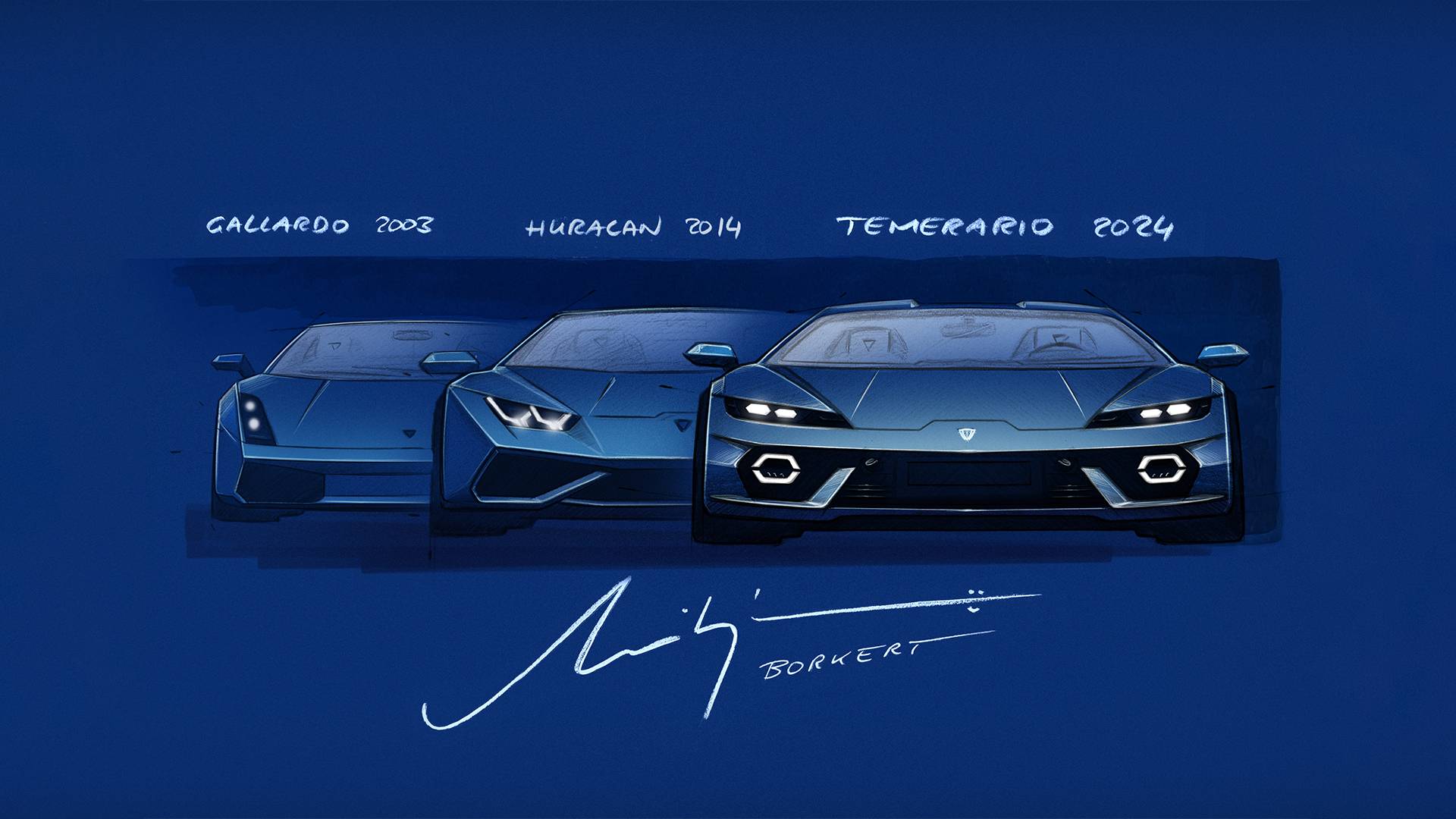


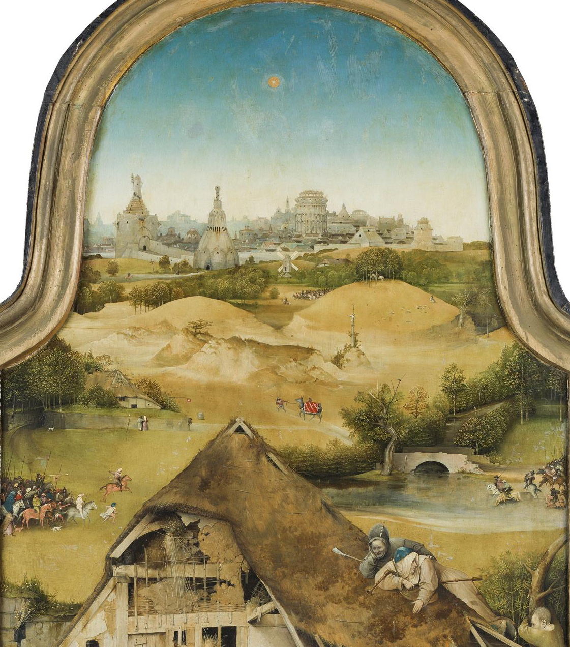


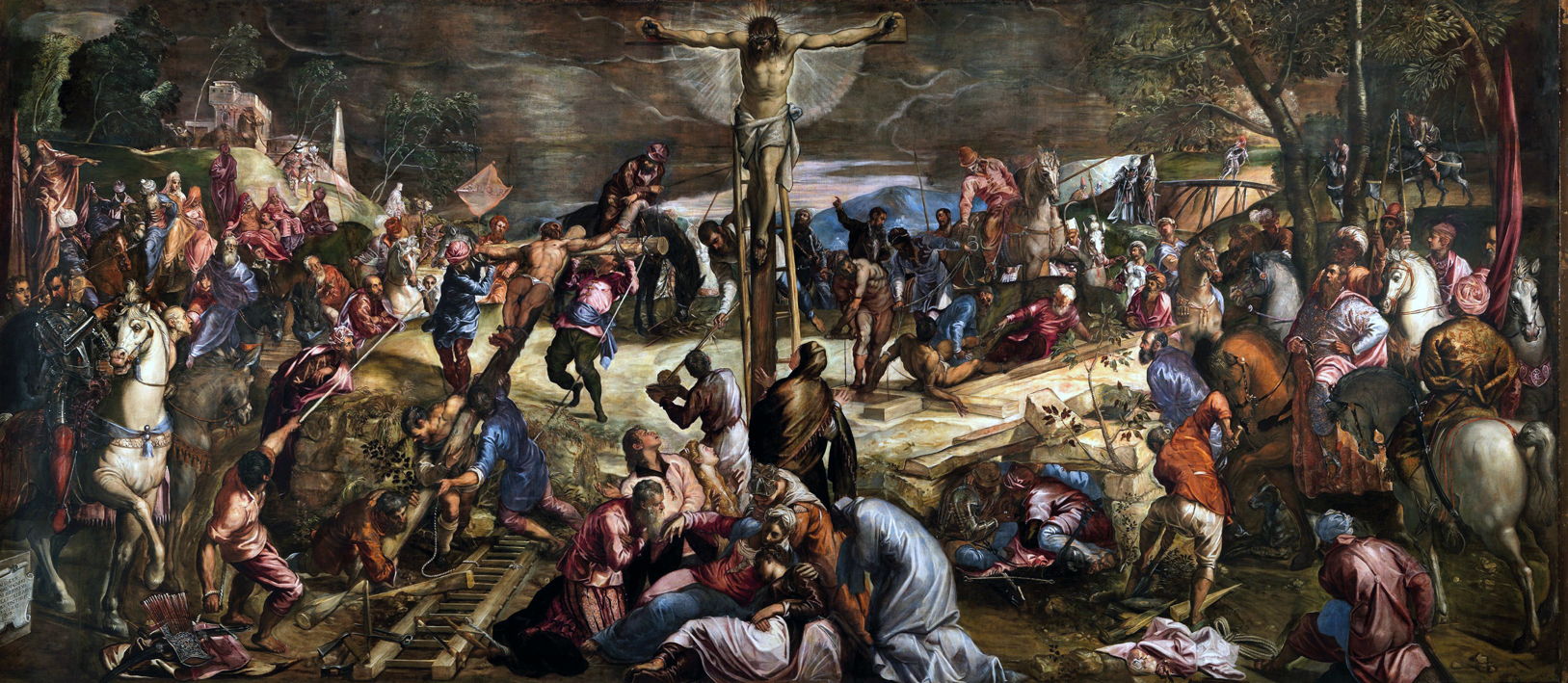
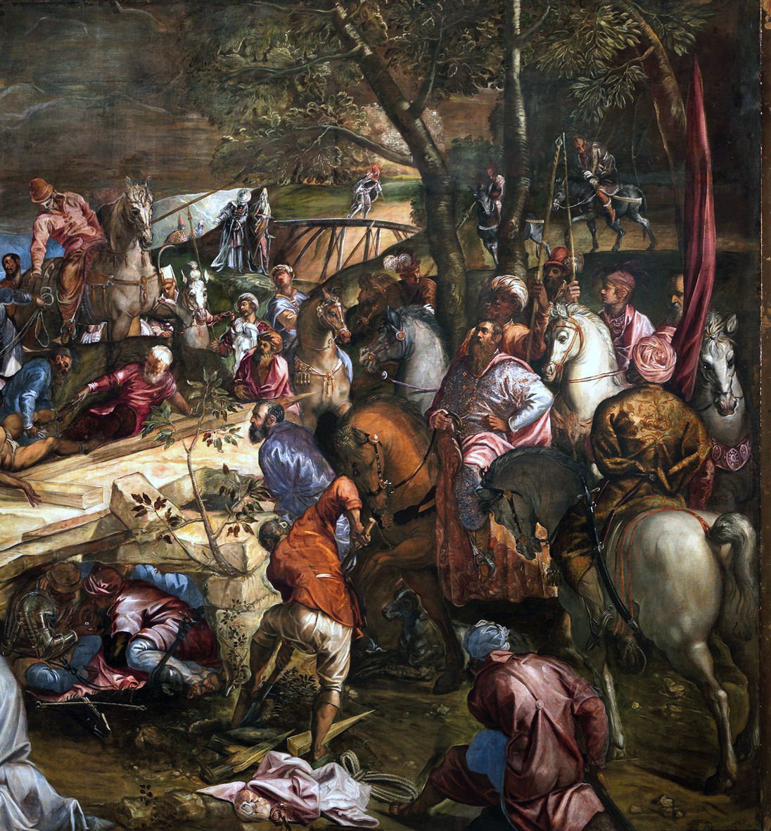


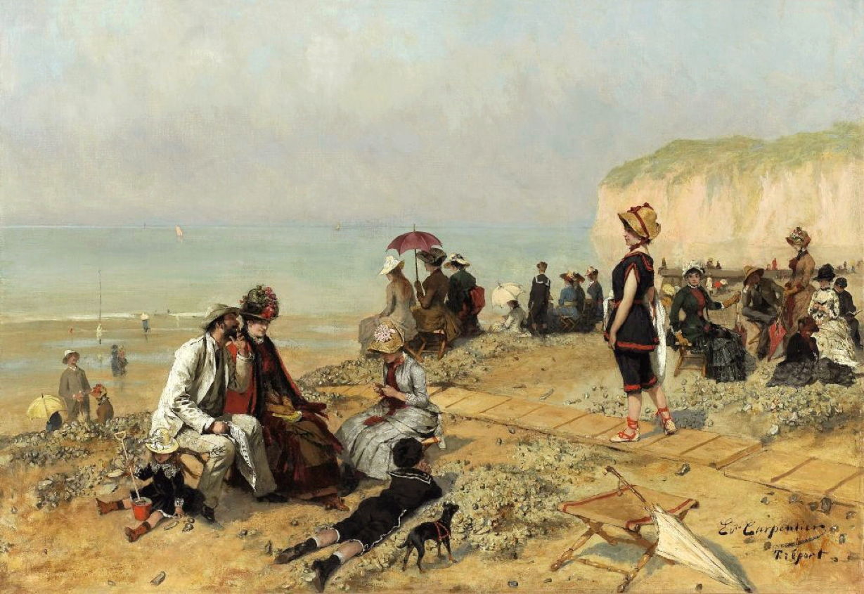


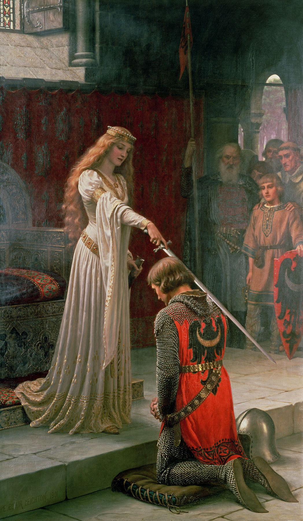


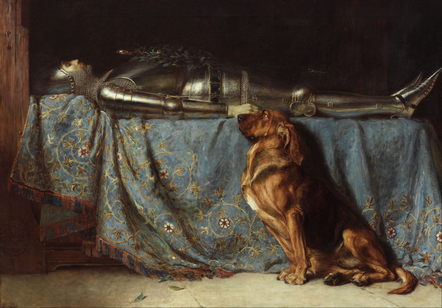
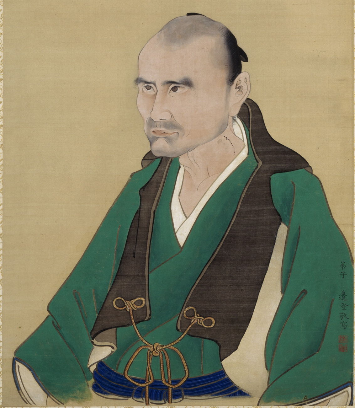


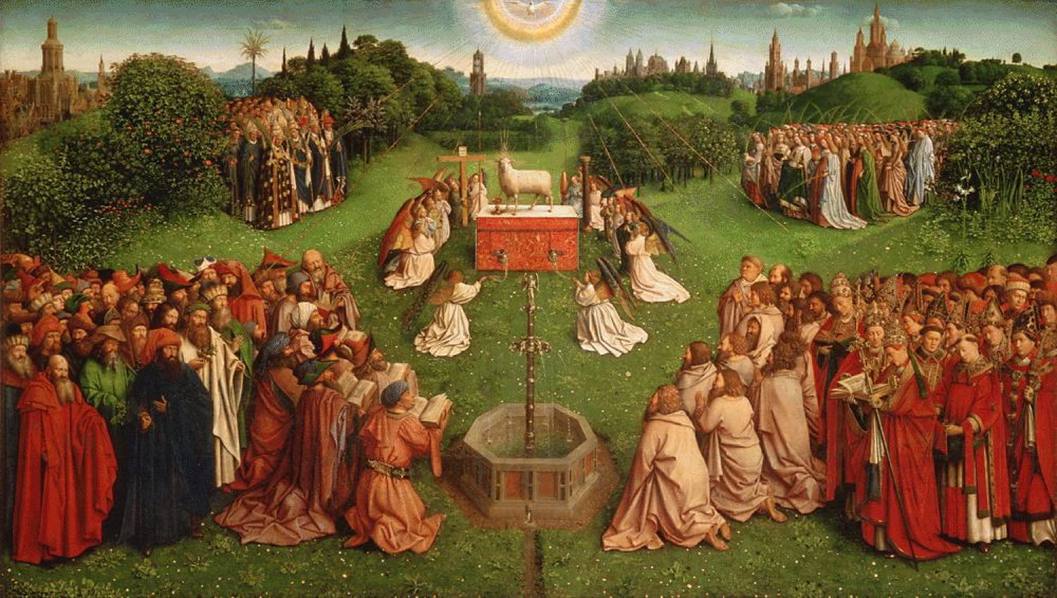
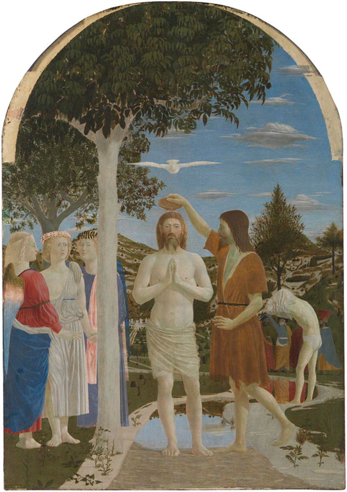


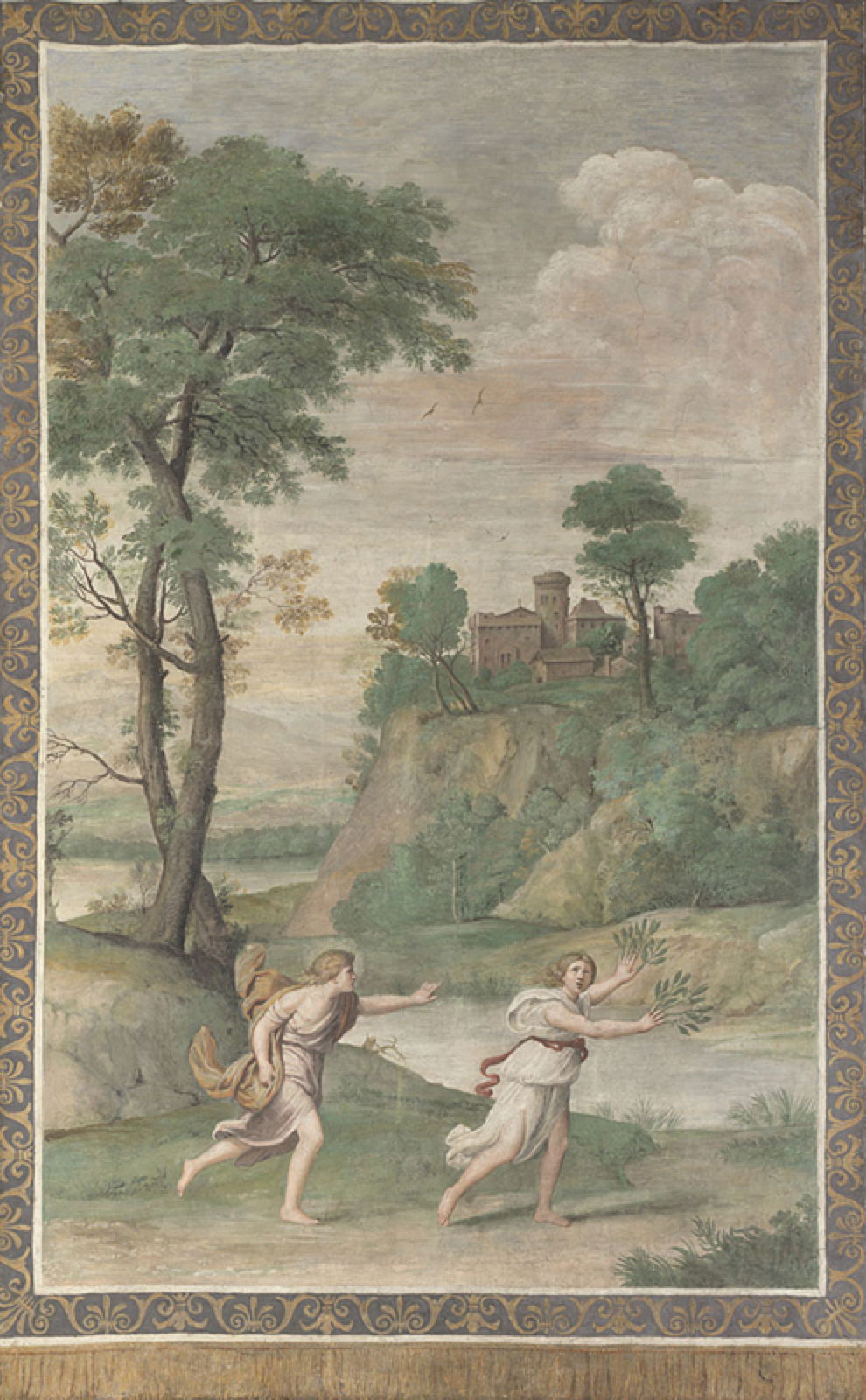
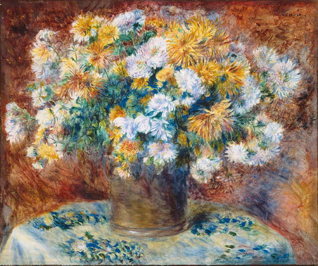


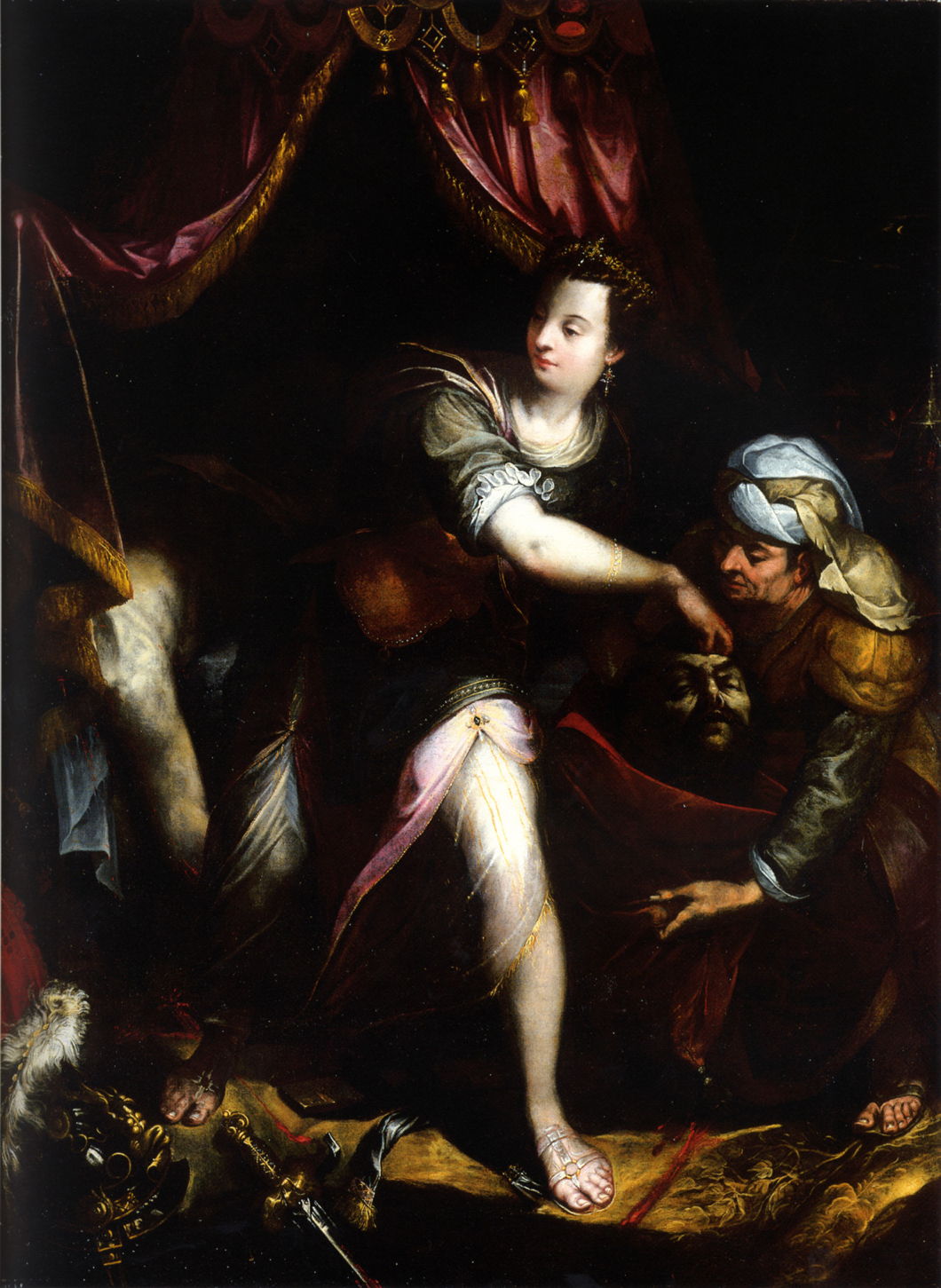


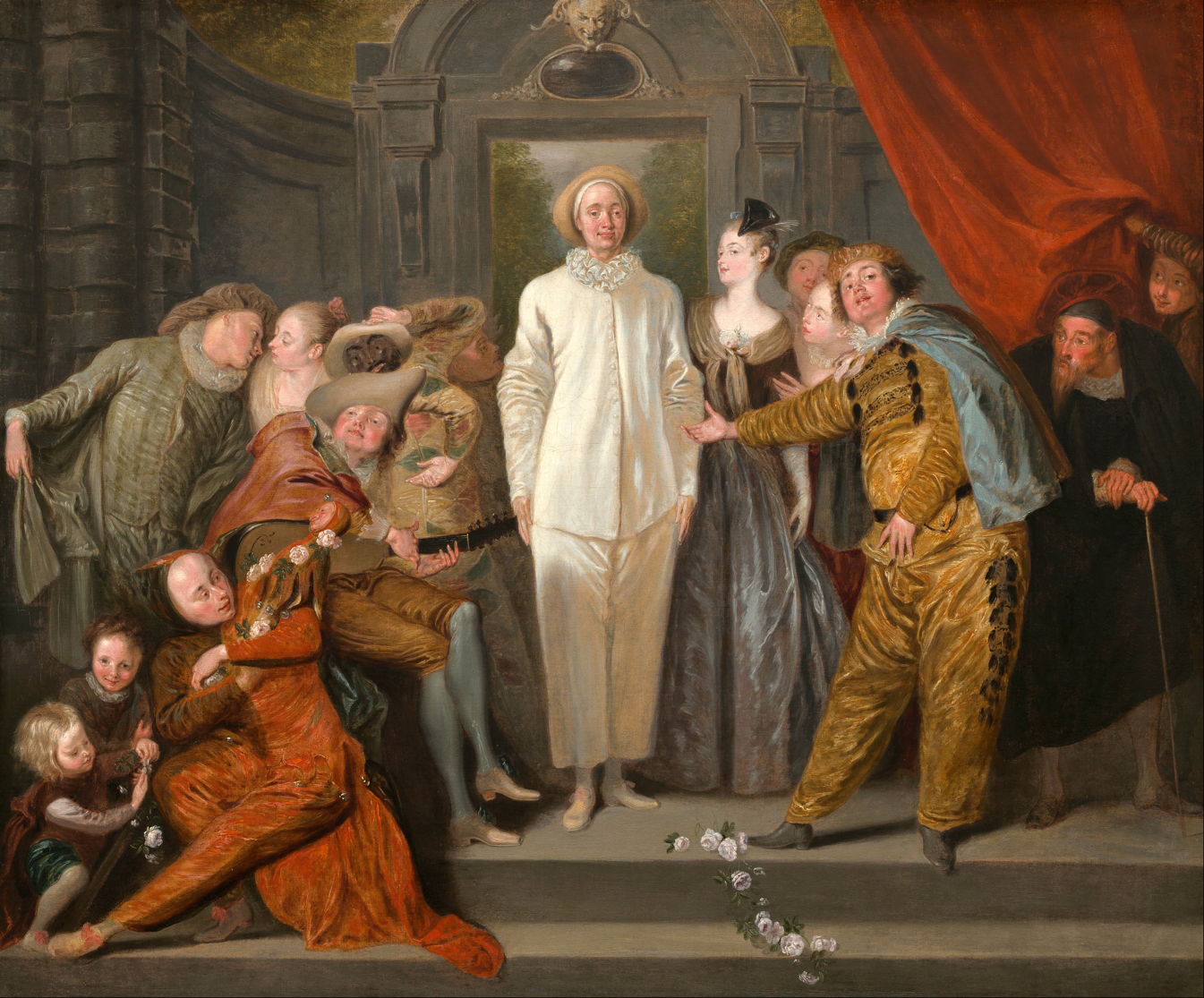


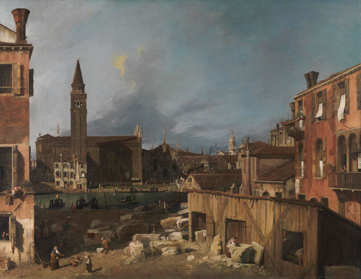

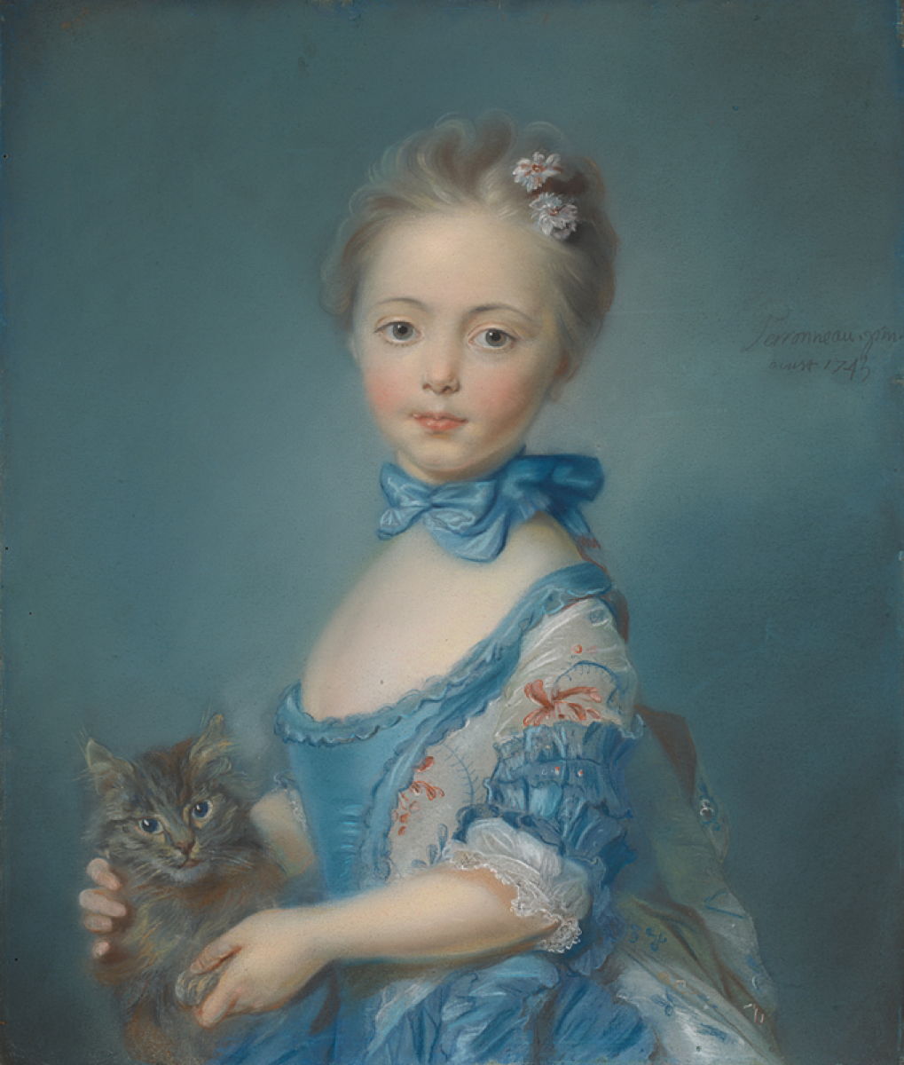


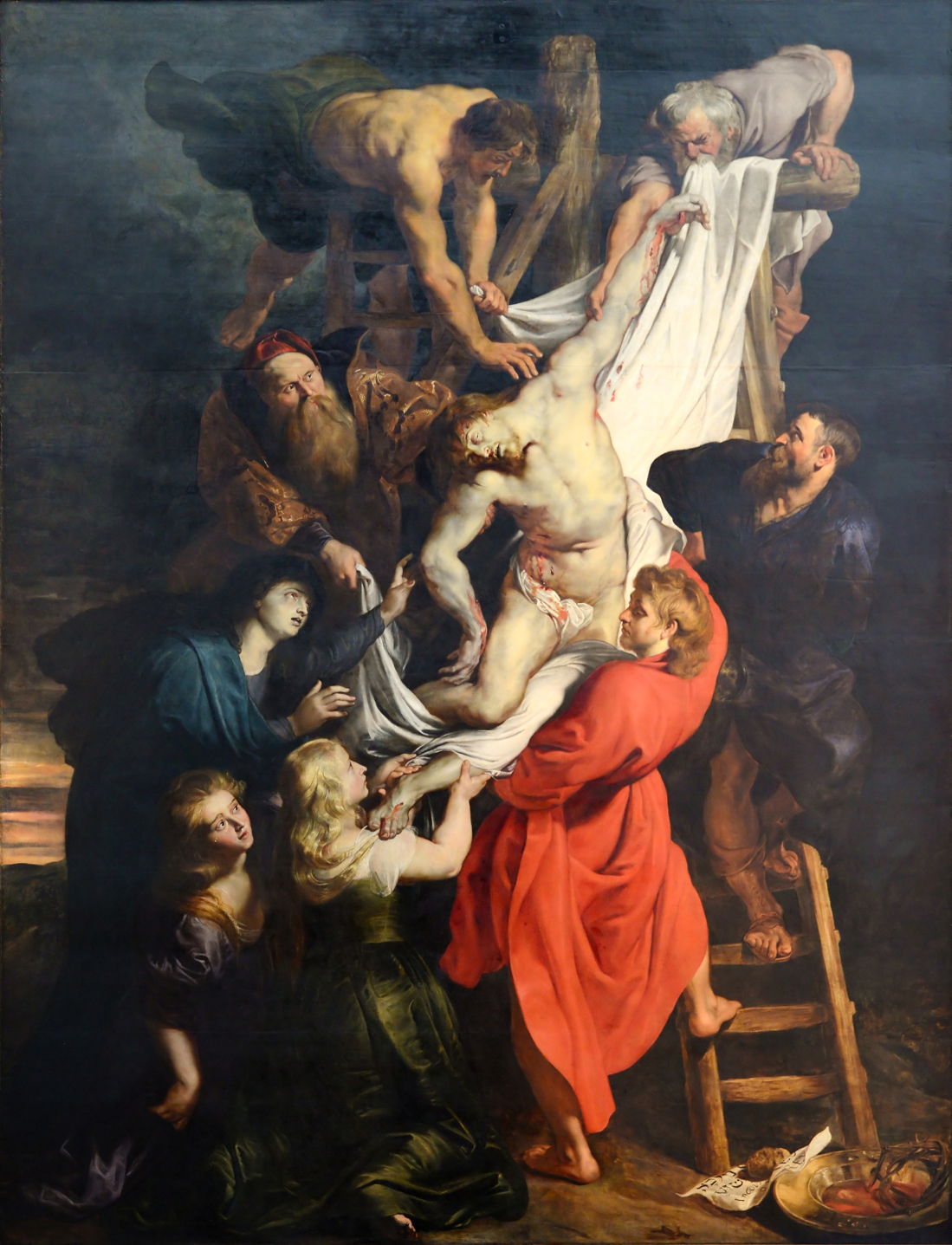

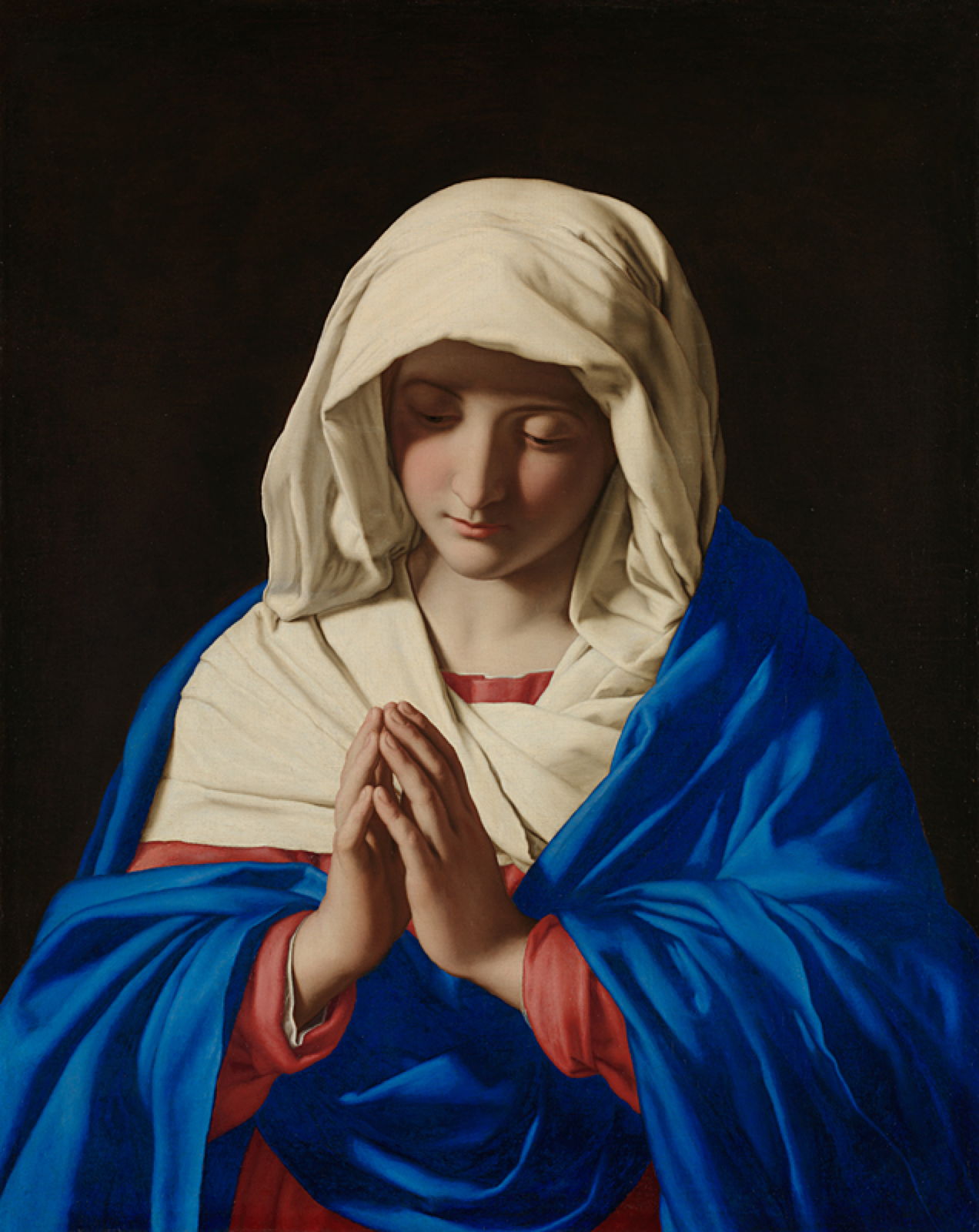


 拖动有些卡顿,打开的时候窗口大小有些异常,不过,不影响代码体验~(笔记本上可能对GPU负担太大从而影响续航)