Reading view

There are new articles available, click to refresh the page.

Last Week on My Mac: Five Tahoe bugs

In the early years of this blog, I used to keep track of some of the more serious bugs in macOS. As that developed into what would have occupied me full-time, I’ve cut back to try to cover some of the most significant. What has surprised me with macOS 26.1 is the sudden rush of new bugs in an update that’s normally expected to fix more than it creates. To consider what might have gone wrong, here’s an overview of those I’ve been investigating so far.

macOS virtualisation (new in 26.1)

A macOS 26.1 guest assigns itself a serial number of zero for the VM, whether the VM has been installed from the 26.1 IPSW image file, or updated from a previous version of macOS. This results in features that rely on the VM’s serial number to fail, the most important being access to iCloud.

Further details.

Virtualisation is exceedingly complicated, and has suffered some previous accidents, such as the inability of M4 hosts running macOS 15.1 to virtualise guests with macOS earlier than 13.4. Although it’s easy to claim that better testing should detect these problems, the number of combinations of host Mac and macOS, and guest macOS increases their risk. Perhaps Apple should actively encourage third-party beta-testing in VMs.

Accessibility (new in 26.1)

macOS 26.1 introduces a new Appearance setting for Liquid Glass, but Apple hasn’t mentioned any change to the existing Reduce Transparency setting in Accessibility. However, that setting in 26.1 no longer disables Liquid Glass effects in sidebars and toolbars as it does in 26.0. User documentation for 26.1 is identical to that in macOS 15:
Make transparent items solid
Some windows and areas of the desktop, such as the Dock and menu bar, appear transparent by default. You can turn these transparent areas a solid grey to make it easier to distinguish them from the background.

This can be seen in the following screenshots.

This is 26.0 without Reduce Transparency.

This is 26.0 with Reduce Transparency turned on. Both the navigation sidebar and the window toolbar are completely opaque, and their contents are fully readable as a result.

This is 26.1 with Reduce Transparency turned on. Although the tools themselves are on opaque backgrounds, other areas remain partially transparent, and the toolbar in particular is visually cluttered and impairs accessibility.

Although this could be claimed to be intentional on Apple’s part, one visual feature that now appears when Reduce Transparency is turned on is the unreadable mess at the top of the System Settings window, where its search box overlays scrolling content in that sidebar.

If that’s intentional on Apple’s part, then macOS 26.1 is unsuitable for users with most forms of visual impairment, and many without.

Finder (new in 26.1)

In some Finder views, such as Column View, selecting an item at the left displays that item’s thumbnail and associated metadata. Below those are a selection of tools offering Finder services, such as Rotate Left, Markup, and more. Those are non-functional in 26.1, and if you want to use any of those services, you’ll have to use an alternative method, such as the contextual menu.

Further details.

This is a strange bug, as it doesn’t occur in macOS VMs, suggesting there’s something more complicated going on. However, it’s also obvious, easy to test, and should never have survived into a release version of macOS.

Clock (macOS 15 and 26)

In macOS 15 and 26, including 26.1, the Clock app offers Timers that are implemented using the mobiletimerd service. The latter appears to hoard every past timer in its property list until that grows too large for the service to run, following which the feature fails to function.

Further details.

According to Apple Support, an earlier bug in the mobiletimerd property list was fixed in macOS Sequoia. However, Apple is apparently unaware of the current problem. The current behaviour of mobiletimerd appears to be the result of poor design: if a service keeps adding more items to its property list, that will grow unconstrained, and sooner or later will cause this problem. It’s possible that fixing the previous bug may have resulted in the introduction of a new bug. Either way, this should have been detected long before it was released to the public.

Spotlight indexing (macOS 10.14 and later)

Since macOS Mojave, plain text files starting with certain characters don’t have their content indexed. Those files are correctly assigned to have their contents indexed by the macOS RichText mdimporter, according to their UTI. However, at the start of content indexing the text is checked for its ‘magic’ content. Those files that aren’t indexed because their opening bytes are recognised as being those of other types, and indexing is abandoned because of an error in the mdimporter. Examples of opening UTF-8 characters that can trigger this include the uncommon LG and HPA, and more common Draw.

Further details.

This is the strangest bug among these, as the Rich Text mdimporter is supposed to index content according to the UTI of the file being indexed, which is being recognised correctly. There should be no need to perform another less reliable method of file type recognition using the ‘magic’ rules that is then causing content indexing to fail. That appears to have been introduced over seven years ago, but never tested adequately against a suitable search corpus.

The same mdimporter had suffered another bug that failed to index the content of any Rich Text file that was also undetected for over six months in 2020-21. Without thorough testing of mdimporters, further bugs are likely to occur in release code and remain undetected for long periods.

Conclusions

  • Of these five serious bugs in macOS 26.1, three are new to 26.1, one inherited from macOS 15, and one dates back seven years to macOS 10.14.
  • At least two of the five appear to have been introduced when trying to fix earlier bugs.
  • All five should have become obvious during testing, and none should have remained in any public release of macOS.
  • Both of the bugs that were inherited from macOS 15 appear to reflect flawed design.
  • Only one of the bugs, that in virtualisation, is noted in Apple’s developer release notes for 26.1, and that wasn’t carried forward to its release notes for users.

Acknowledgements

I’m very grateful to Rich Trouton, Michele, Paul, Jürgen, Drew, aldous and others who have provided invaluable information about these bugs.

Appearance revisited: Get Tahoe 26.1 looking in better shape

When Apple released macOS 26 Tahoe I published an article exploring how you can configure its redesigned interface, using its additional variations to appearance modes and its new Liquid Glass effects. When Tahoe 26.1 was released a couple of days ago, it changed those by adding a new control for those Liquid Glass visual effects. This article shows how that might change your options.

There are now four sets of controls:

  • Appearance mode, Light or Dark, in Appearance settings;
  • Liquid Glass setting, Clear or Tinted, in Appearance settings;
  • Display variations to Reduce transparency or Increase contrast, in Accessibility settings;
  • Icon & widget style, in Appearance settings.

Apple’s descriptions of the two states for Liquid Glass read:

  • “Clear is more transparent, revealing the content beneath.”
  • “Tinted increases opacity and adds more contrast.”

Those terms indicate an overlap with Accessibility settings. However, if either of the Accessibility settings is enabled, then the Liquid Glass setting is unavailable. I also presume that the word tinted here refers to the faint colouration that might be seen in what would otherwise be a transparent view, rather than any more generalised addition of colour.

Light mode

There are four overall variations of light mode, depending on Liquid Glass and Accessibility settings.

The starting point and default is in light mode, Liquid Glass clear, without Accessibility, and icon & widget style set to Default. Note the effects of transparency on the menu bar, widgets, the Liquid Glass effect in the left side of the Dock, and the upper row of icons in the Finder window. If you like those, you don’t have to change any settings.

This is the same, but with Liquid Glass set to Tinted. I’m unable to see any difference between those settings in this example.

This is light mode with Reduce transparency enabled in Accessibility settings. This disables all Liquid Glass effects and restores the traditional menu bar and Dock. The effect on Desktop widgets is perhaps less beneficial.

In light mode with Increase contrast (automatically coupled with Reduce transparency) enabled, the predominant effect is the outlining of controls within each window, rather than any change in contrast. Colours used by the system, such as the traffic light controls at the top left of each window, and those in themes, are darker, but those elsewhere, as in icons, aren’t changed. The effect here is to make controls clearer rather than actually changing contrast.

Dark mode

Without changing Accessibility and leaving Icon & widget style set to Default, and Liquid Glass set to Clear, dark mode shows transparency and Liquid Glass effects as you expect. These are again most visible in the menu bar, Dock, and the upper row of icons in the Finder window.

This is the same, but with Liquid Glass set to Tinted. Two most obvious differences are seen in the back-forward controls by the title of the Appearance settings, which oddly appears white, and the widgets, which are much darker. There are some inconsistent differences in the toolbar of the Finder and Tips windows, but they are more subtle.

With Reduce transparency enabled in Accessibility settings those transparency and Liquid Glass effects are removed.

Enabling Increase contrast outlines controls clearly, but any changes in system colours are more variable than in light mode.

Icon & widget style

This is new to Tahoe and only affects the rendering of icons and widgets. Liquid Glass settings don’t appear to have any effect on these.

Using light mode without any Accessibility changes, the Default setting for Icon & widget style is the baseline, showing icons in their ‘normal’ state.

Dark icon settings in light mode contrasts more but their readability may suffer.

When Icon & widget style is set to Clear, most are decolourised, making them significantly harder to read, and impossible to distinguish in the sidebar of System Settings.

The final option is for Icon & widget style to be Tinted (no relation to the Liquid Glass setting Tinted), where they’re rendered in monochrome using a colour of your choice, selected from the popup menu below. On iPhones and other devices that are available in several case colours, some have decided to set tinting to match the case, something you might like to try with an Apple silicon iMac, for example.

However, be careful in both Clear and Tinted styles, as it’s easy to end up making many icons unreadable and almost indistinguishable, here by setting the last of those to Graphite colour. This is one of the obvious drawbacks in Tahoe’s flexibility, in that many combinations of appearance mode, Accessibility settings and icon and widget style degrade its human interface rather than enhancing it. At least you now know what not to try, and how to return it to its defaults.

Summary of controls

  • Appearance mode, Light or Dark, in Appearance settings;
  • Liquid Glass, Clear or Tinted, in Appearance settings;
  • Display variations to Reduce transparency or Increase contrast, in Accessibility settings, but those automatically override Liquid Glass settings;
  • Icon & widget styles, in Appearance settings, with Icon, widget & folder colour when appropriate.

【译文】无障碍设计:三个 Jira 图标的故事

导读:Atlassian UX 团队的设计师 Hannah McKenzie 分享了一个优化图标的小案例。主要目的是使图标对色盲人士也具有良好的可访问性。
Photo by Harry Quan on Unsplash

小细节会产生巨大的影响

你知道世界上有很多种不同类型的色盲吗?在澳洲,有大约 50 万人生活在某种程度的色盲当中。在美国,这个数字接近 1200 万。而在全世界,估计有 3 亿人生活在某种程度的色盲当中,网上的一些资料显示,这个数字甚至接近 3.5 亿。

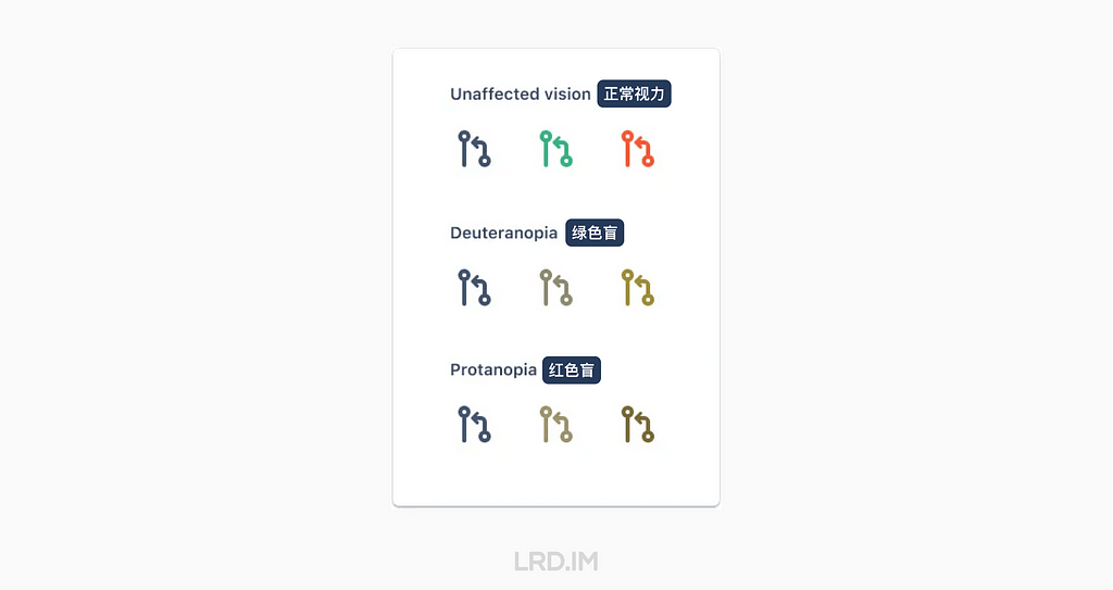
其中红绿色盲占据了大多数,他们难以区分红色和绿色。

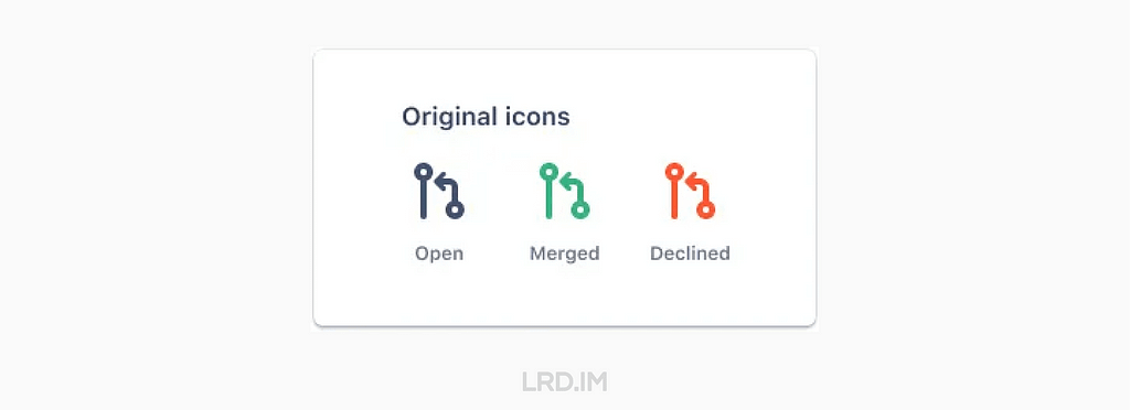
现在 Jira 的 Pull request 的图标是通过用灰色、绿色和红色来区分 Open, Merged, Declined 这三种状态。

原本的图标,灰色代表 Open,绿色代表 Merged,红色代表 Declined。

红绿色盲人士看到的图标就像这样:

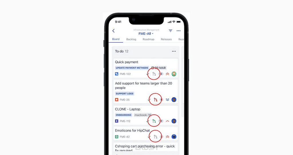
在 Jira 的软件项目管理看板当中,这些图标很小,并且与每个缺陷中其他小元素一起出现。比如故事点、负责人头像和缺陷 ID。

这是一个 Jira iOS app 项目看板的例子。其中 Pull request 图标用红色圆圈高亮起来作为示意。

虽然图标很小,但这些图标确实在传达有用的信息。

在 2021 年末,我开始进行优化开发状态图标的工作,并让色盲用户可以访问它们。它开始于一则我在无障碍团队 Slack 频道里的消息:

“我们最近有改进 Jira pull request 图标计划吗?现在这些图标是完全相同的,只能通过颜色来区分。”
Photo by GeoJango Maps on Unsplash

在 2022 年初,几位设计师和研发在 Slack 的讨论中尝试了一个粗略的方案:

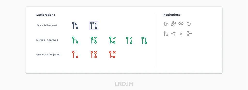
设计师开始尝试多种概念,产生了更多的方案:

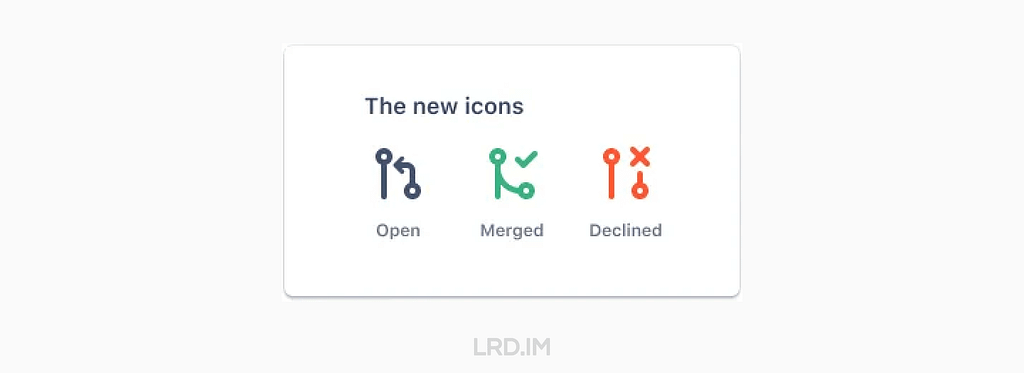
在几个发散性的讨论和设计环节之后,全新的,具有可访问性的 Pull request 图标诞生了!

虽然这些图标仍然由灰色、绿色和红色来分别代表 Open, Merged 和 Declined,但同时,使用了打勾代表 Merged,打叉代表 Declined。而且 Merged 的图标用线条连接在一起(表示合并到分支),Declined 的图标线条则没有与任何东西连接。

这段经历教会了我…

  • 即使过程很棘手,但也请坚持下去。如果你面向的是比较复杂的产品,或者在大型的机构中,你需要主动去在不同团队去联系到合适的同事;
  • 一些看起来很小的设计往往会涉及到很多不同的人。通常是很多件小事(就像在这个案例当中,有许多交流和发散性会议)汇聚成一件大事,以最终呈现在用户面前;
  • 设计一个支持无障碍的产品对很多人来说是至关重要的,小细节真的很重要。每个人都会受益,包括自认为是并非残障群体的的人士。比如电话和电动牙刷,最开始就是为残障人士而设计的。

Atlassian 里几位没有色盲的设计师和工程师对于新设计图标的看法:

“我不是色盲的,但这些图标让我一眼就能看懂。”
“这简直是宝藏。原本同样的图标,不同的颜色让我感到疑惑。我经常想,这是对应着什么分支状态?这是一个非常惊人的优化。”

所以这篇文章用来提醒大家关注细节 — — 即便是小细节也会产生巨大的影响。

Photo by Balázs Kétyi on Unsplash
❌