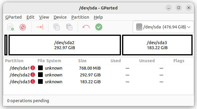
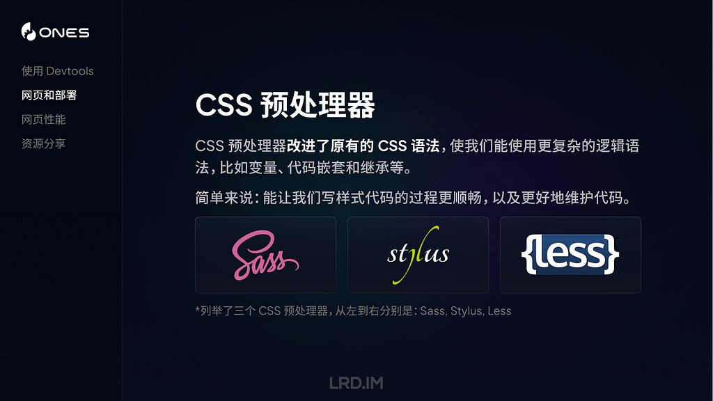
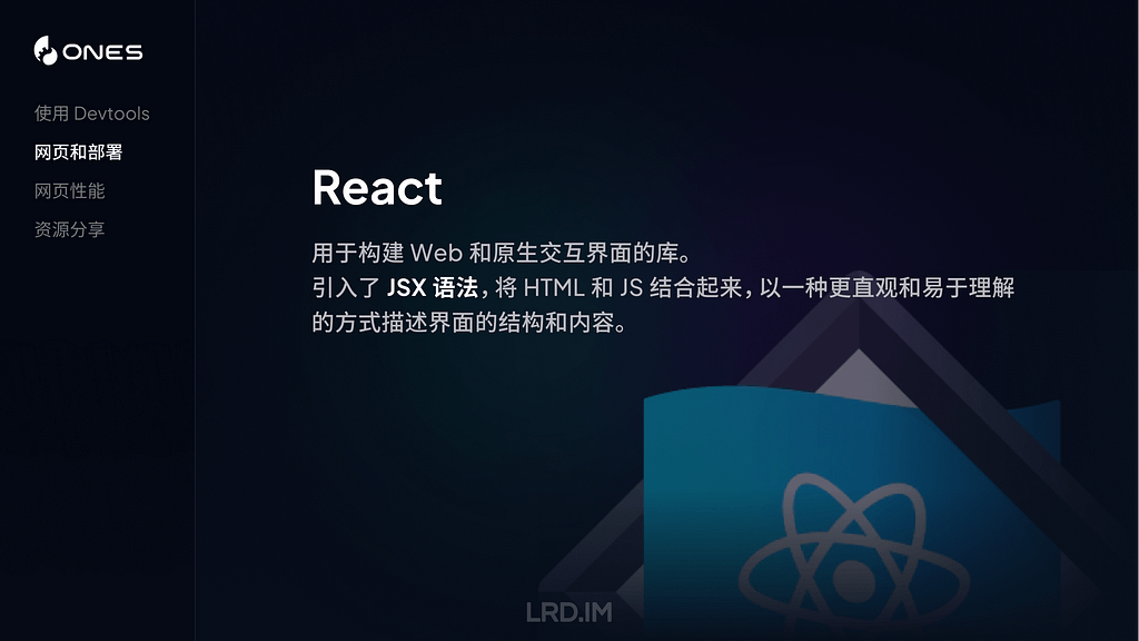
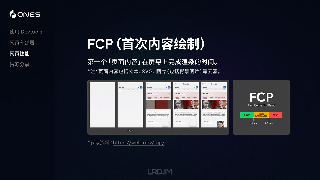
In post-classical European art the great majority of paintings are close to being square, with an aspect ratio (given as width to height) of between 0.75:1 and 1.5:1. Although there’s no generally agreed cut-off for what constitutes a panorama, those with an aspect ratio of 2:1 or greater should qualify.
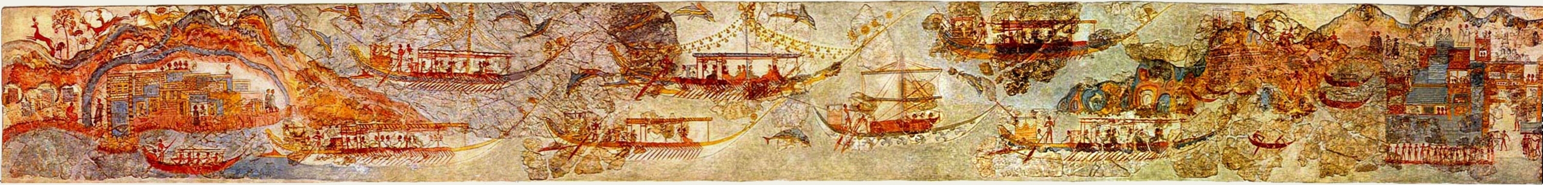
Anonymous, Flotilla Fresco (before c 1627 BC), fresco, Thera (Santorini, Greece). By pano by smial; modified by Luxo, Wikimedia Commons.
Ancient and classical paintings are different, though, and what’s probably the oldest landscape painting (excluding those in caves) is far broader than it is high. This Flotilla Fresco painted at Thera on the island of Santorini in Greece must have been completed before a catastrophic volcanic explosion in about 1627 BCE destroyed the local civilisation.
Paul Bril (c 1553/4–1626), View of Bracciano (c 1622), oil on canvas, 74.5 x 163.6 cm, Art Gallery of South Australia, Adelaide, South Australia. Wikimedia Commons.
Paul Bril was exceptional in this panoramic View of Bracciano painted in about 1622 with an aspect ratio of 2.2:1. Although strongly Italianate, it’s a painting ahead of its time in other respects, as a fairly accurate depiction of a real place, with all sorts of fascinating little scenes within it, like the young boy doffing his hat to the passing dignitary in his coach with armed guard.
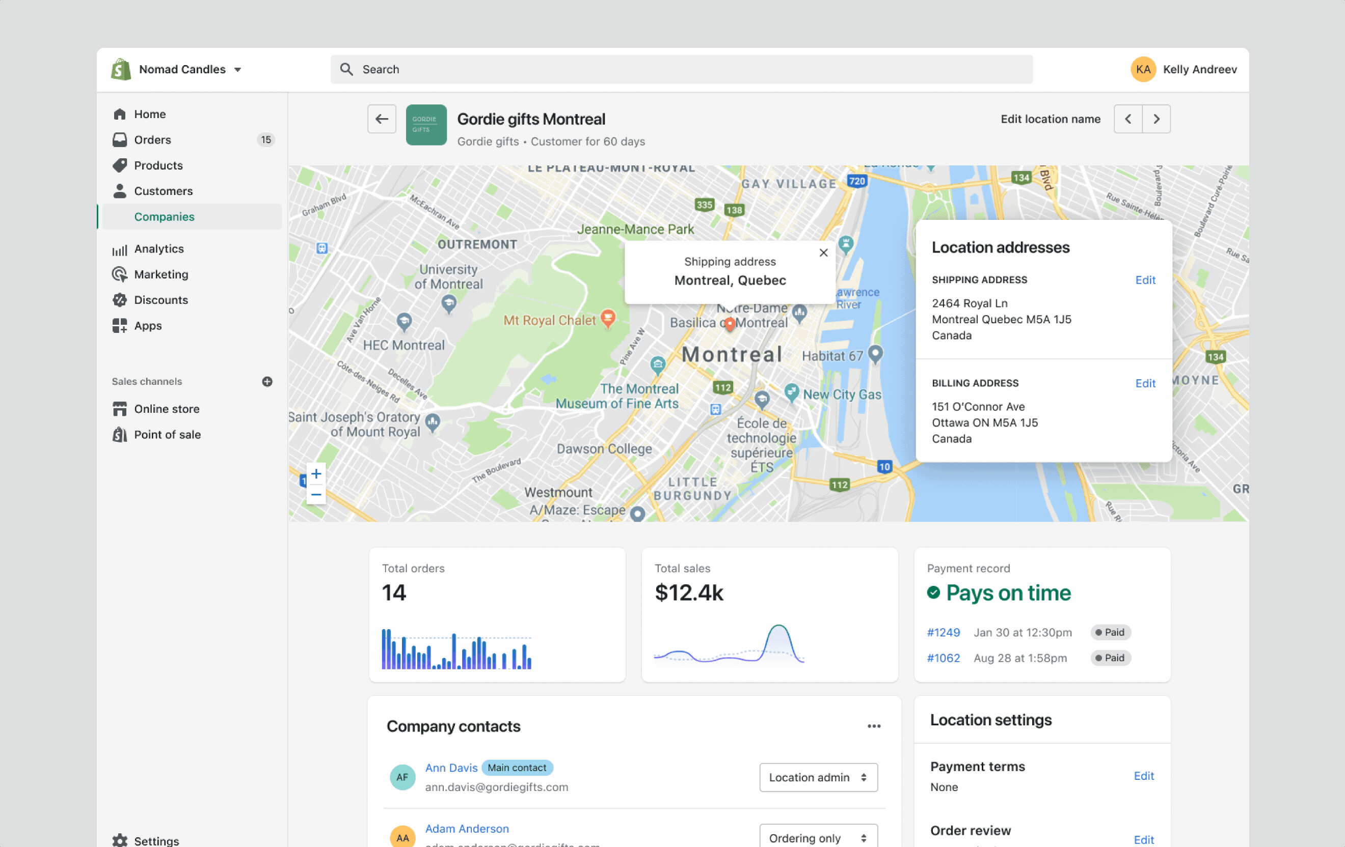
Bartholomeus van der Helst (1613–1670) and Jan Vos (1610–1667), The Celebration of the Peace of Münster, 18 June 1648, in the Headquarters of the Crossbowmen’s Civic Guard (St George Guard), Amsterdam (1648), oil on canvas, 232 x 547 cm, Rijksmuseum, Amsterdam, The Netherlands.
Just over twenty-five years later, the Dutch painters Bartholomeus van der Helst and Jan Vos used a panoramic canvas to accommodate all those in The Celebration of the Peace of Münster, 18 June 1648, in the Headquarters of the Crossbowmen’s Civic Guard (St George Guard), Amsterdam. This has an aspect ratio of 2.4:1, even greater than Bril’s.
Caspar Wolf (1735–1783), Panorama of Grindelwald with the Wetterhorn, Mettenberg and Eiger (1774), oil on canvas, 82 x 226 cm, Kunsthaus Zürich, Zürich, Switzerland. Wikimedia Commons.
The Swiss painter Caspar Wolf was another early exponent in his Panorama of Grindelwald with the Wetterhorn, Mettenberg and Eiger painted in 1774, although this couldn’t have been called a panorama at the time. This shows the distortion needed to include the whole of this view on a single canvas, with its remarkably high aspect ratio of 2.75:1. Today we’d envisage this as being painted through a wide-angle lens, although it was a century before such camera lenses came into use.
It’s generally accepted that the idea of a panorama was first formalised in British patent number 1612 of 1787 awarded to Robert Barker, where he coined the word, and the word’s first appearance in print occurred four years later.
Giovanni Battista Lusieri (1755-1821), A View of the Bay of Naples, Looking Southwest from the Pizzofalcone Toward Capo di Posilippo (1791), Watercolor, gouache, graphite, and pen and ink on six sheets of paper, 101.8 x 271.9 cm, The J. Paul Getty Museum, CA. Wikimedia Commons.
A little later, Giovanni Battista Lusieri attained high aspect ratios of around 2.7:1 by assembling multiple supports, in his case sheets of paper, as he worked in watercolour on this View of the Bay of Naples, Looking Southwest from the Pizzofalcone Toward Capo di Posilippo in 1791.
Robert Barker’s panorama wasn’t artistic in the slightest, but pure spectacle and entertainment. His original painting of Edinburgh was on a large roll of paper, and first exhibited in Leicester Square, London, an area now known for its leading movie theatres. Baker either stuck the painted roll on the inside of a large cylinder for rotation about the viewer (also known as a cyclorama), or later he scrolled the roll past the viewers’ eyes.
JMW Turner (1775-1851), Petworth Park: Tillington Church in the Distance (c 1828), oil on canvas, 60 x 145.7 cm, The Tate Gallery, London. Wikimedia Commons.
Many paintings in JMW Turner’s huge output are panoramic in nature if not in form. This example, Petworth Park: Tillington Church in the Distance (c 1828), is viewed from a higher level even though its content has little vertical extent, to emphasise its long cast shadows. It has a high aspect ratio of 2.4:1, and the odd arc of the path in the foreground enhances its wide-angle effect.
Théodore Rousseau (1812-67), Vue panoramique sur l’Île-de-France (Panoramic View of the Ile-de-France) (c 1830), oil on canvas, 22.1 x 75.9 cm, The National Gallery of Art, Washington, DC. Courtesy National Gallery of Art, via Wikimedia Commons.
In about 1830, Théodore Rousseau’s Panoramic View of the Ile-de-France attained the highest aspect ratio yet, of just over 3.7:1, which may have been driven by the growing popularity of panoramas as entertainment. He’s also more conventional in placing the viewer at the level of the rooftops, looking over foreground buildings. The angles of lines of trees and other objects in the foreground appear to show wide-angle lens distortion, although the earliest known photograph wasn’t made until 1838. One possible explanation is that Rousseau used a camera obscura to draw in the view, although I’m not aware of any evidence of that.
Jean-Baptiste-Camille Corot (1796-1875), Avignon from the West (1836), oil on canvas, 34 x 73.2 cm, The National Gallery, London. WikiArt.
Just a few years later, Jean-Baptiste-Camille Corot painted panoramic views en plein air and in his studio. This example of Avignon from the West (1836) shows how well he transferred the skills that he had learned when in the Roman Campagna to the French countryside. Its aspect ratio is more modest at 2.2:1, similar to that of Paul Bril two centuries earlier.
Frederic Edwin Church (1826-1900), Niagara (1857), oil on canvas, 101.6 x 229.9 cm, National Gallery of Art, Washington, DC. Wikimedia Commons.
Many of Frederic Edwin Church’s epic landscapes were painted far south beyond the US border, but this early panoramic view of Niagara made in 1857 remains one of his most important works, with its aspect ratio of 2.3:1.
Henri Harpignies (1819–1916), View of the Seine at Rouen (date not known), watercolour over black chalk, on heavy watercolour paper, 24.7 x 54.5 cm, The Morgan Library & Museum, New York, NY. Wikimedia Commons.
I don’t have a date for Henri Harpignies’ magnificent watercolour panorama of View of the Seine at Rouen, which I believe shows the view from Bonsecours, to the south-east of the city, looking north-west into the summer sunset, with an aspect ratio of 2.2:1.
By the end of the nineteenth century panoramas were attaining aspect ratios over 4:1, requiring custom supports, either being painted on the interior walls of a cylindrical building or rotunda, or on rolls like Robert Barker’s.
Hendrik Willem Mesdag (1831-1915), Panorama Mesdag (1880-81), media not known, 1400 x 12000 cm, Panorama Mesdag, Den Haag. Wikimedia Commons.
Hendrik Willem Mesdag’s staggering Panorama Mesdag from 1880-81 was commissioned as a view of the village of Scheveningen, the Netherlands, from its coastal dunes. It’s 14 metres high and 120 metres long, giving it an aspect ratio of 6.8:1. When tastes changed towards the end of the nineteenth century, the company exhibiting the panorama as an entertainment went bankrupt; Mesdag bought it back, and it remains housed in its dedicated building, an appropriately extreme memorial to this long-lasting fascination.
Over the following decades other huge panoramas were painted to commemorate wars and national history. I show here just two examples.
Paul Dominique Philippoteaux (1846–1923), Gettysburg Cyclorama (1883), oil on canvas panorama, overall 820 x 10940 cm. Gettysburg Museum and Visitor Center, Gettysburg, PA. Wikimedia Commons.
Paul Dominique Philippoteaux’s vast Gettysburg Cyclorama opened to public acclaim just twenty years after the battle, in 1883, and continues to draw attention at the battlefield’s visitor centre. It was commissioned by a group of Chicago investors, rather than anyone interested in its art, and has the highest aspect ratio of 13.3:1.
Árpád Feszty (1856–1914), Arrival of the Hungarians (Feszty Panorama) (detail) (1892-4), oil on canvas cyclorama, 1500 x 12000 cm, Ópusztaszer National Heritage Park, Ópusztaszer, Hungary. Wikimedia Commons.
As their popularity was waning at the end of the century, Árpád Feszty and a hoard of assistants depicted the narrative scenes they imagined of a millennium earlier, as the first Hungarians arrived to settle their country. Their whole panorama has an aspect ratio of 8:1.
~/Library/LaunchAgents Per-user agents provided by the user./Library/LaunchAgents Per-user agents provided by the administrator./Library/LaunchDaemons System-wide daemons provided by the administrator./System/Library/LaunchAgents Per-user agents provided by Apple./System/Library/LaunchDaemons System-wide daemons provided by Apple.
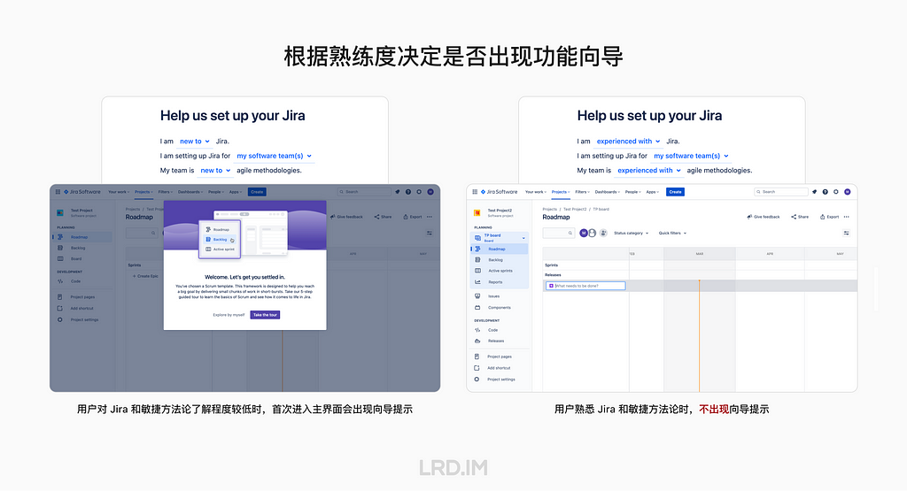
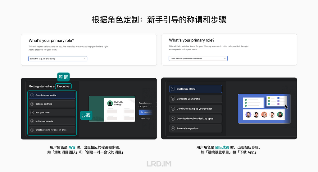
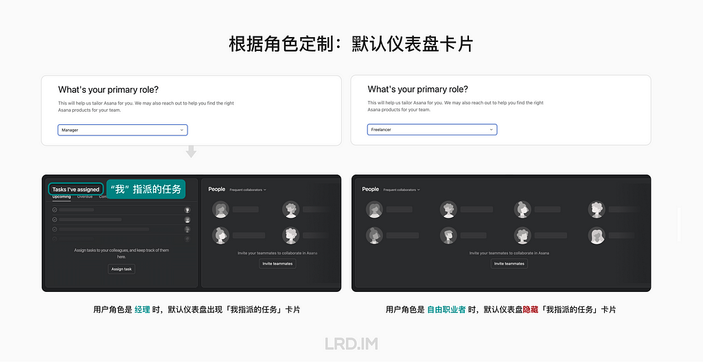
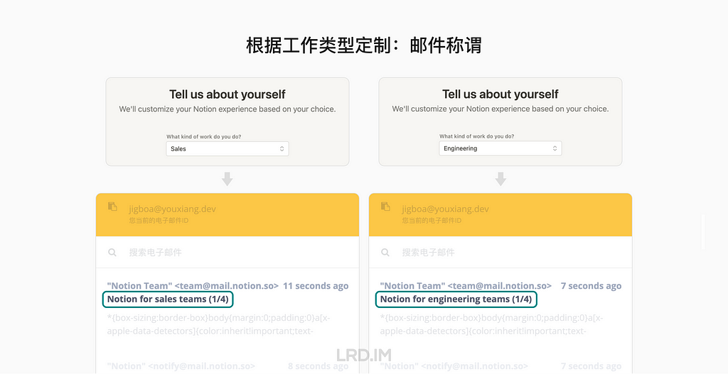
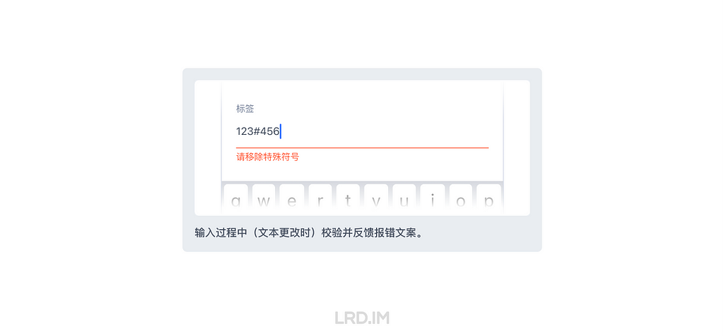
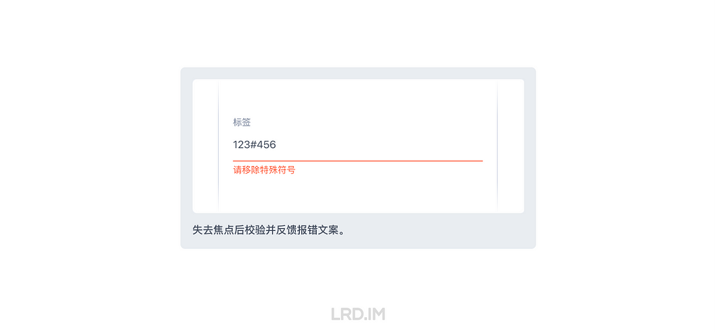
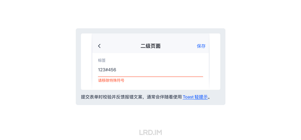
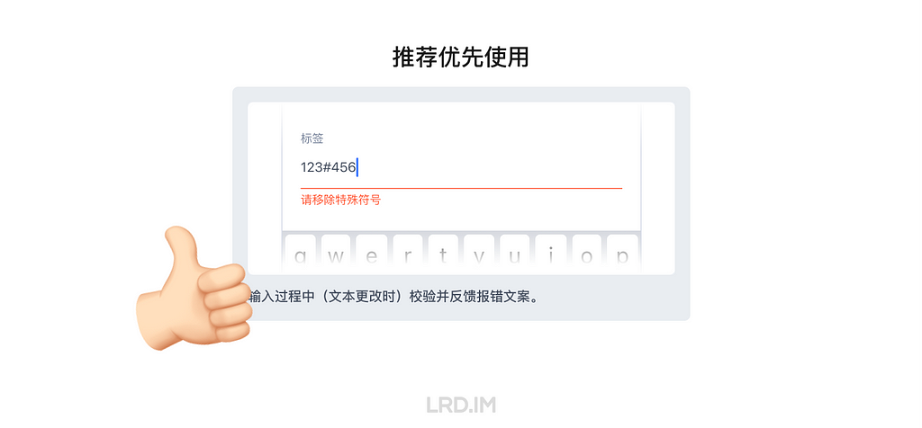
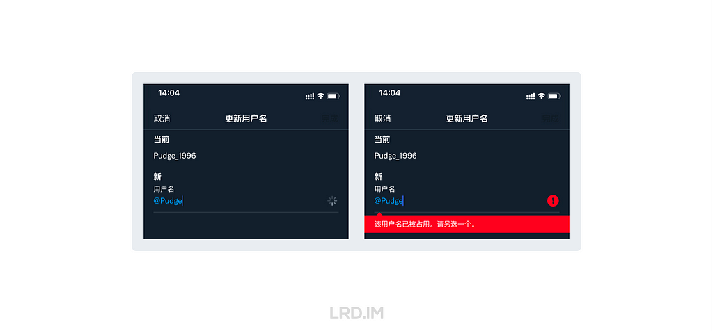
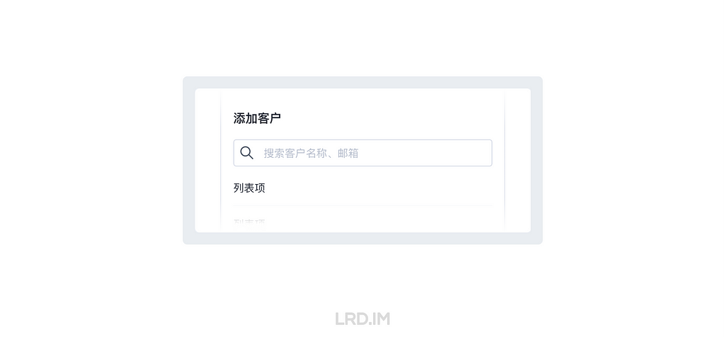
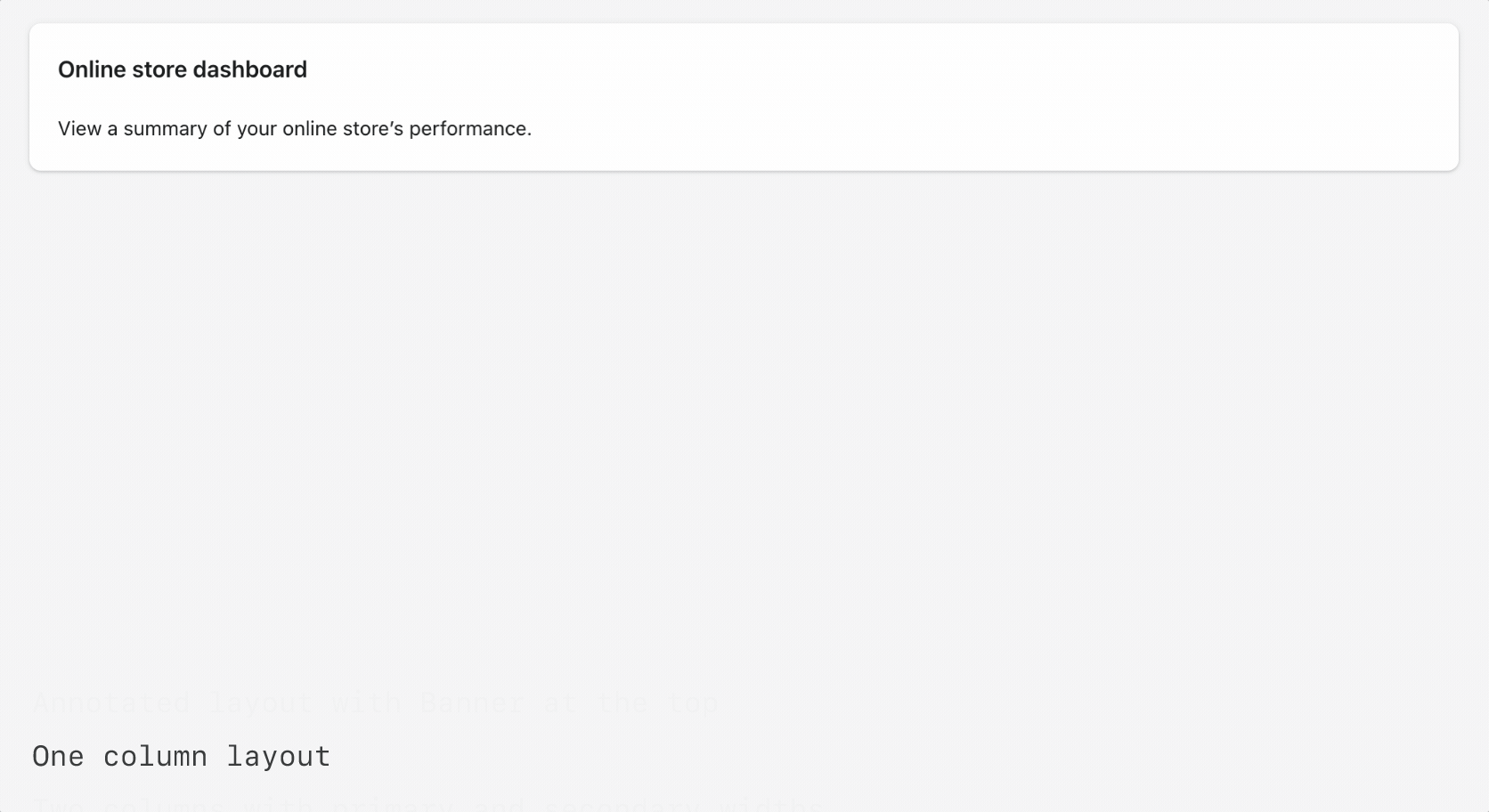
To improve conversion (i.e., get more people to finish your flow), think about everything you request from the user like a cost. Every question is a cost. Every minute is a cost
Recently, I heard that Coursera has a UX design course developed by Google’s design team. This course covers the entire design process and teaches us how to present our portfolio, prepare interviews, and the like.
It is necessary to enroll in this course even though it is designed primarily for beginners and fresh graduates. It would enhance my English skills on one hand, and deepen my understanding of Western design practices and culture on the other. Since the term “UX design” is called out by Western designers and I am eager to compare Western design cultures with those I’ve experienced in China.
So I enrolled in this online course, trying to spare my time on it. Such as during lunch and dinner breaks on weekdays, or parts of the weekend. I completed the whole certificate within two months. And now I’d like to write down what I learned from this course:
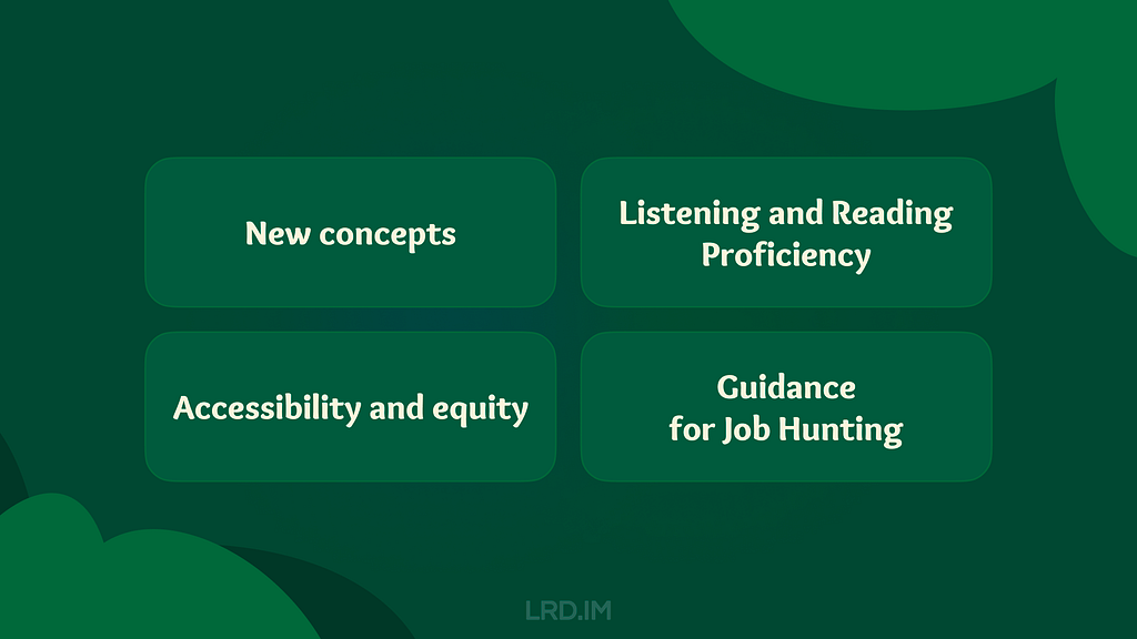
Introducing concepts I had never heard of. Despite my 5+ yoe in a wide range of companies, from startups to large corporations in China, those new concepts opened up a lot of room for me to explore.
Enhancing my listening and reading skills. The course covers plenty of video and reading materials that include industry jargon that translators cannot provide. Moreover, certain phrases and sentence structures are repeatedly used throughout the course. I think my reading skills and speed are slightly improved.
Pointing out concepts like accessibility and equity early throughout the course. I used to think only seasoned designers or well-developed products consider these aspects, however, they are mentioned early on and repeatedly. These concepts resonated with me and will truly influence my work.
Elaborating comprehensive and detailed guidance for designers to prepare their portfolios, resumes, and interviews. They not only tell us what content should be included in our portfolios, but also how to prepare for interviews at different stages. I resonated with these instructions as well, since I did think those details over when looking for a new job.
I have consistently tried to think about and expand design boundaries through different aspects, which requires a breadth of knowledge. Here, I will share several new concepts along with my personal understanding.
Affinity diagram
This is a method of synthesizing that organizes data into groups with common themes or relationships. It can be used in different stages of the design process, such as during brainstorming or after collecting users feedback. The example below focuses on the latter.
After collecting a batch of user feedback, the design team condense each piece of feedback into a single sentence and write it on sticky notes. Then we post them up on a whiteboard or digital tools like Figma. Then the design team look for sticky notes that reference similar ideas, issues, or functionality and collaboratively organizes them into clusters representing different themes.
When I first learned about this approach in the course, I realized that this approach is similar to another method called “Card sorting” that was included in an article I translated earlier named [English to Chinese Translation] How we rebuilt Shopify’s developer docs. Both methods involve clustering sticky notes, naming these groups and summarizing the themes or relationships.
However, card sorting is implemented by external participants and aims to uncover users’ mental models to improve information architecture; Whereas affinity diagramming organizes a large amount of raw data to show the team which problems users are most concerned about and consider high priority.
This concept refers to an individual’s ability to gather, communicate, and create content using digital products and the internet. For example, senior adults or those living in areas with poor internet infrastructure may find it difficult to understand interfaces and functionalities, they are considered to have lower digital literacy.
In contrast, young people, especially those working in the information technology industries, are typically familiar with new software and concepts, and can quickly adapt to them.
This course does not dig deeply into this concept, rather, it emphasizes the importance of understanding our users. If our product targets a broad range of users, it is good to consider the needs of users with lower digital literacy. Moreover, this factor should also be considered when recruiting participants for usability tests.
This concept refers to a group of UX methods that trick users into doing or buying something they wouldn’t otherwise have done or bought.
In the course, instructors clearly point out that this is an unethical and not a good practice. Businesses may lose their clients’ respect and trust once clients realize that they have fallen into deceptive patterns. I will share a few interesting examples that the course provided.
Confirmshaming: Making users feel ashamed of their decision. For example, a subscribe button on a news website usually reads “Subscribe now / No thanks”. BBut if the service provider wants to manipulate readers’ emotions, the text might be changed to: “Subscribe now / No, I don’t care about things around me.”
Urgency: Pushing users to make a decision within a limited time. For example, an e-commerce website might give you a coupon that is only available for 24 hours, prompting you to purchase items without a thoughtful consideration. The course doesn’t judge these marketing strategies or promotions; instead, it suggests that we should avoid putting pressure on users. As designers, we should try our best to balance business promotions and avoid manipulating users’ emotions.
Scarcity: Making users very aware of the limited number of items. For example, a popup or attractive advertisement stating “Only 5 items left in stock.” The course suggests that designers should concentrate on helping users to understand products better, rather than using designs to encourage impulsive buying.
It is really interesting that these deceptive patterns are so common in the Chinese e-commerce industry that it might seem unusual if those strategies were to disappear.
This seems to reflect cultural differences between China and the West. In China, core team members, such as designers, product managers, and operators, collaboratively discuss how to induce and prompt users to make a hasty decision. Also, we regularly hold reflections to discuss and share insights on how to deeply incite users’ motivation.
In 2018, I landed my first job as a UI designer at an e-commerce company. One of my main tasks is designing promotions, such as “claim your vouchers”, “flash sales ending in N hours”, and creating illustrations of red pockets and flying coins, and the like. I didn’t really like these approaches at that time, so I eventually turned to the B2B and SaaS industry, focusing more on UX design.
Although I am not fond of these types of designs, these seem to really help companies grow and generate income. We could stabilize our employment only if our company were earning profits. Perhaps that is an inextricable cycle: obviously, deceptive patterns are unethical and bad as they are inducing and annoying our users, but we must continuously implement these approaches and think about how to make them more effective.
The course thoroughly explains a concept called “implicit bias”. It refers to the collection of attitudes and stereotypes associated, influencing our understanding of and decisions for a specific group of people.
For example, imagine you’re designing an app to help parents buy childcare. To personalize your onboarding process, you start by displaying bold text saying, “Welcome, moms. We’re here to help you…”
This is an example of implicit bias, since it excludes every other type of caregiver, like grandparents, guardians, dads and others.
In addition, here are some interesting biases the course introduced:
Confirmation bias. Refers to the tendency to find evidence that supports people’s assumptions when gathering and analyzing information.
Friendliness bias. Refers to the tendency to give more desirable answers or positive comments in order to please interviewers. This usually occurs in usability tests, where participants may not share their honest feedback because they are afraid that real answers or negative comments might offend interviewers and be considered unfriendly.
False-consensus bias. Refers to the tendency that people tend to believe that their personal views or behaviors are more widely accepted than they actually are, and consider others’ opinions to be minor or marginal. For example, an optimist might think that most people around the world are optimistic; or designers can easily understand iconographies and illustrations they created, they might assume other users might easily to understand too.
I was shocked when I was learning this part. I strongly resonated with these biases which I had never perceived before. After all, the course lets us be aware of these biases and provides approaches to help us avoid falling into these pitfalls.
I listed some concepts above that I had barely encountered in my workspace. Becoming a UX designer appears to require a broad range of knowledge, such as design, the humanities, psychology, and sociology. I am now interested in psychology after completing this course.
Listening and Reading Proficiency
There are plenty of listening and reading materials involved in the course. Typically, each video lesson is accompanied by an article. If there are additional knowledge points, a single video might be accompanied by two or three articles.
Most instructors in the course speak with American accents. They also speak slowly and clearly, which makes me comfortable and usually allows me to understand without opening closed caption. Sometimes, I need to rewind a few seconds when they are speaking long sentences with many clauses or introducing new concepts, and I will open closed captions if I am still confused.
It is worth pointing out that the course contains lots of industry jargon, and I resonated with this because I used similar approaches or processes in my workspace by using Chinese. As a learner, I created a spreadsheet to record expressions that might be useful, such as:
Above the fold, the content on a web page that doesn’t require scrolling to experience;
Deliverable, final products like mockups or documents that can be handed over to clients or developers to bring designs to life.
Digital real estate, space within the digital interface where designers can arrange visual elements;
Firm parameters, refer to rigid design boundaries or limitations like time, project resources, and budget.
I think it is valuable to collect this industry jargon because it is authentically expressed, which can’t be translated by common translation tools. This will be helpful for me to read design articles and write blogs in English.
Accessibility and Equity
Accessibility
The course introduces several assistive technologies, such as color modification, voice control, switch devices, and screen readers, which can help people with different types of disabilities to use our products easily.
Instructors also point out that even people who don’t have disabilities, or who do not perceive themselves as having disabilities might benefit from these assistive technologies. The course suggests that we think these factors over throughout the entire design process. For instance:
Supporting color modification. Features that increase the contrast of colors on a screen, like high-contrast mode or dark mode;
Supporting voice control. Allows users to navigate and interact with the elements on their devices using only their voice. They also mention a concept called “Voice User Interface (VUI)”;
Supporting switch devices. This is a one-button device that functions as an alternative to conventional input methods such as the keyboard, mouse, and touch, allowing users to complete common tasks like browsing webpages and typing text;
Supporting screen readers. Allows users with vision impairment to perceive the content. The course suggests that we write alternative text to images, add appropriate aria labels to interactive elements like buttons, and consider the focus order of elements.
Here is a website that demonstrates the color modification feature:HubSpot.com
On the top navigation of this website, it provides a switch for us to toggle a high-contrast mode. Moreover, it also supports reduced motion effects — if I enable the reduced motion setting on my device, this website will minimize motion effects as much as possible.
Equity
The course also introduces a concept called “equity-focused design.”
Instructors clearly define the difference between “equality” and “equity”:
Equality: Providing the same amount of opportunity and support, everyone receives the same thing;
Equity: Providing different amount of opportunity and support according to individual circumstances, ensuring everyone can achieve the same outcomes.
The course also points out that equity-focused design means considering all races, genders, and abilities, especially focusing on groups that have been historically underrepresented or ignored when building products.
They use a survey question as an example: when gathering participants’ demographic information like gender, it is not enough to provide three options: “Male”, “Female” and “Other”. To make our design more inclusive and equitable, we should offer additional choices, including “Male”, “Female”, “Gender-nonconforming”, “nonbinary” and a blank field. The latter provides non-conventional gender options, uplifting those who might be marginalized in conventional surveys. This approach also aims to balance the opportunities for all groups to express themselves, ensuring their voices are treated fairly and heard.
In this lesson, I clearly faced a culture gap from the West. In fact, I don’t really like to dig into this concept deeply, mainly because I can’t determine whether this approach is right. Sometimes I think it is unnecessarily complicated, but at other times, I recognize that there are people with non-traditional genders around us who may truly be eager to be treated fairly.
When I was learning this lesson, I realized that there was an opportunity to incorporate accessibility features into the project I was recently working on. I will write a new post if this project lands successfully.
In the final course, instructors teach us how to lay out a portfolio and what content should be included. They also inform us the process of interviews and how to thoroughly prepare for interviews.
The guidance they mentioned is for the Western workplace, which may not seamlessly fit in the Chinese workplace. For example:
They point out that designers should have a personal website and case studies regularly. However, Chinese designers prefer to publish their case studies on public platforms like ZCOOL and UI.CN;
They also teach us how to build our digital presence and network through LinkedIn. However, these approaches are not common in the Chinese job market, where the most popular methods are directly submitting resumes and getting recommendations through acquaintances.
They inform us how to handle panel interviews. I have interviewed with a wide range of companies, from startups to corporations, and never encountered panel interviews, which means that the panel interview is not popular in this industry.
I was deeply impressed by how they elaborated on the preparation and important considerations during the interview process. For example:
Research the main business of the company you interview for beforehand, and clearly understand why you are a good fit for the company;
Prepare answers to common interview questions beforehand, such as a personal introduction, your strengths, and descriptions of your case studies;
We should learn how to answer difficult questions using the STAR method, and prepare well before starting an interview;
Adapt the focus and questions according to the interviewer’s role to show you are a professional;
During the interview process, you might be asked to complete a task. Therefore, we should practice the ability to think aloud and clearly define questions, since interviewers might pose vague questions on purpose.
I resonated with the approaches and tricks mentioned in the course that I had previously used, which gave me a strong feeling that I was on the right track.
Additionally, the course also provides detailed instructions on how to pursue freelance design work. For instance:
Clearly identify your target audience and understand why they should choose your service;
Know your competitors, identifying what they can’t provide but you can;
Promote your service and build word-of-mouth by attending online and in-person events, and getting recommended through acquaintances;
Calculate the business expenses, set fair prices for your services, and make financial projections — estimate what your finances will look like in the first month, the first 6 months, and the first year.
Well, above are lessons I’ve learned from the Google UX Design Professional Certificate on Coursera over the past two months. I think that this is an interesting course, although not all content can be applied in my daily work, I’ve also learned the thinking processes and workplace cultures of designers in another part of the world.
I strongly recommend designers reading this post consider to enrolling in the Google UX Design Professional Certificate, by doing this, you might probably gain new insights. The course costs $49 monthly, which is not expensive. It is likely to complete the entire course over two or three months if you have a full-time job.
Things worked as I expected, and I will start my next project in the second half of the year.
这是我见过的设计非常好看的一个网站:Kali Linux,无论在布局还是色彩、视觉效果上都给人美的感受。下面截图是桌面版的白色版、暗夜版。由于手机上截图的限制,暂时没有找到截取完整网页的办法。提醒:图片是一张完整的长图(分辨率:2560*19066),并没有做切片处理,因此加载、显示过程可能较为缓慢。1、Kali Linux 白色版2、Kali Linux 暗夜版
 Login
Login


 (Abstract)利用 adb 可以通过网络远程管理安卓设备。虽然我是苹果全家桶,但电视机是唯一却重要的安卓设备,因此也学到了不少与安卓相关的知识。
 (Abstract)感觉用了 cloudflared 之后,服务器已经没有暴露 SSH 端口的必要了。但是注意 cloudflared 默认会自动更新,更新后需要手动启动才能运行。如果是远程机器且无 root 权限的,注意关闭自动更新功能。


 因为我的固件可能有内存泄漏,所以想办法定时释放内存。其实就是用 Linux 的方式。


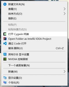
 bat 代码是真的难写。。。写这段代码我便踩了无数的坑。
 现在便可以在中文文件夹中右键打开 Cygwin 了。
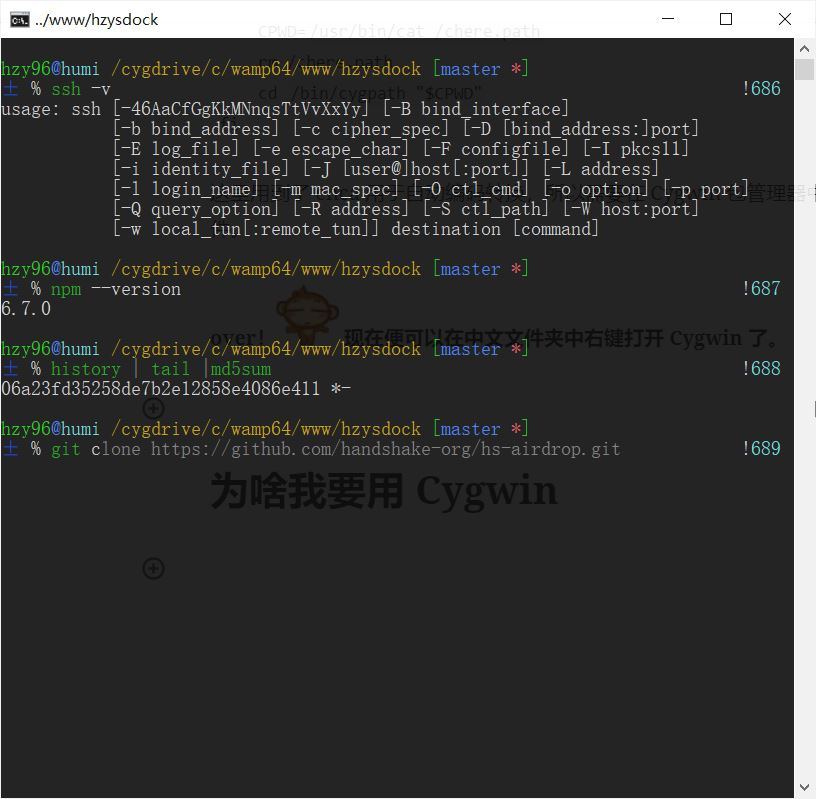