Viral Outbreaks Take a Common Path from Animals to People, Study Finds
Researchers have devised a new tool for discerning between naturally occurring viral outbreaks and those resulting from lab accidents.
The Golden Age of the Dutch Republic was a period of war and turmoil. It started in the latter half of the Eighty Years War, thrived when that came to an end in 1648, and collapsed following the Disaster Year (Rampjaar) of 1672. That year brought both the Franco-Dutch and Third Anglo-Dutch Wars, invasion, rebellion, economic crisis, and collapse of the art market.

When he was just twenty, the French artist Antoine Coypel painted this Glory of Louis XIV after the Peace of Nijmegen (1681), which gained him admission as a full member to the Académie Royale.
The Treaty of Nijmegen brought an end to the Franco-Dutch War of 1672-78, and was one of a series France signed between August 1678 and September of the following year. These were acclaimed a great success for Louis XIV and France, which gained extensive territory in the north and east as a result. Louis was henceforth known as the Sun King. In this elaborate allegorical flattery, the king is being crowned in the upper left, above a gathering of deities including Minerva, who is wearing her distinctive helmet and golden robes.
Painting didn’t stop, of course, and some artists continued into the following century, but the number of masters declined rapidly.

Domenicus van Wijnen continued to paint, for example his radical interpretation of The Temptation of Saint Anthony in about 1685. Although this may have appeared an outlier at the time, its symbols and composition may have inspired the ‘faerie’ paintings that became popular in the middle of the nineteenth century.

Other artists like Adriaen van der Werff reverted to more traditional themes and style, in his Judgement of Paris from 1716.

The Golden Age was revisited by artists in the nineteenth century, particularly in the period scenes painted by Herman Frederik Carel ten Kate. His Soldier and Men in an Inn shows a scene from the Eighty Years War, with the walls decorated by blue on white Delft tiles. This must have been painted between 1850-80, over two centuries after the end of that war.

Early in the career of the Dutch artist Jozef Israëls, he painted The Seamstress (1850-88) as a genre interior from the Golden Age. A young Dutchwoman works with her needle and thread in the light of an unseen window at the left. In the background to the right, there’s a group of Delft tiles on the wall, and there’s a single tulip in a glass vase at the left.
The impact of Golden Age paintings on European art history was broad and deep, with secular themes becoming more popular than the religious and mythological works that had dominated the art of the Renaissance. New genres, like still life, may not have been rated as highly as history painting, but became widespread.
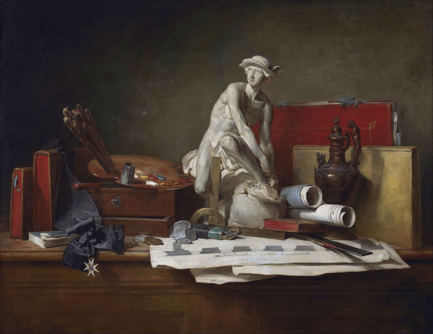
Late in his career, in 1766, Jean-Baptiste-Siméon Chardin painted The Attributes of the Arts and the Rewards Which Are Accorded Them, in which each object has a clear association. Painting is represented by the brushes and palette on top of a paintbox. Architectural drawings and drawing tools represent architecture. The bronze pitcher at the right refers to the work of the goldsmith. The red portfolio tied with ribbons represents drawing. The plaster model of the figure of Mercury in the centre is a copy of a sculpture by J B Pigalle, a friend of Chardin, who was the first sculptor to win the highest French honour for artists, the Order of Saint Michael, whose cross and ribbon are shown at the left.
Greatest impact was in landscape painting. Prior to the Golden Age, landscapes had primarily been used as accessories to other genres. Most were idealised rather than accurate representations of any real location, and many were mere settings for narratives.

The Dutch vogue for expressive skies spread steadily across Europe. This is reflected in Joseph Vernet’s Italianate Harbour Scene from 1749. He still retains formal compositional elements, with figures in the foreground, and scenery behind, but delights in showing us these towering cumulus clouds lit so richly.
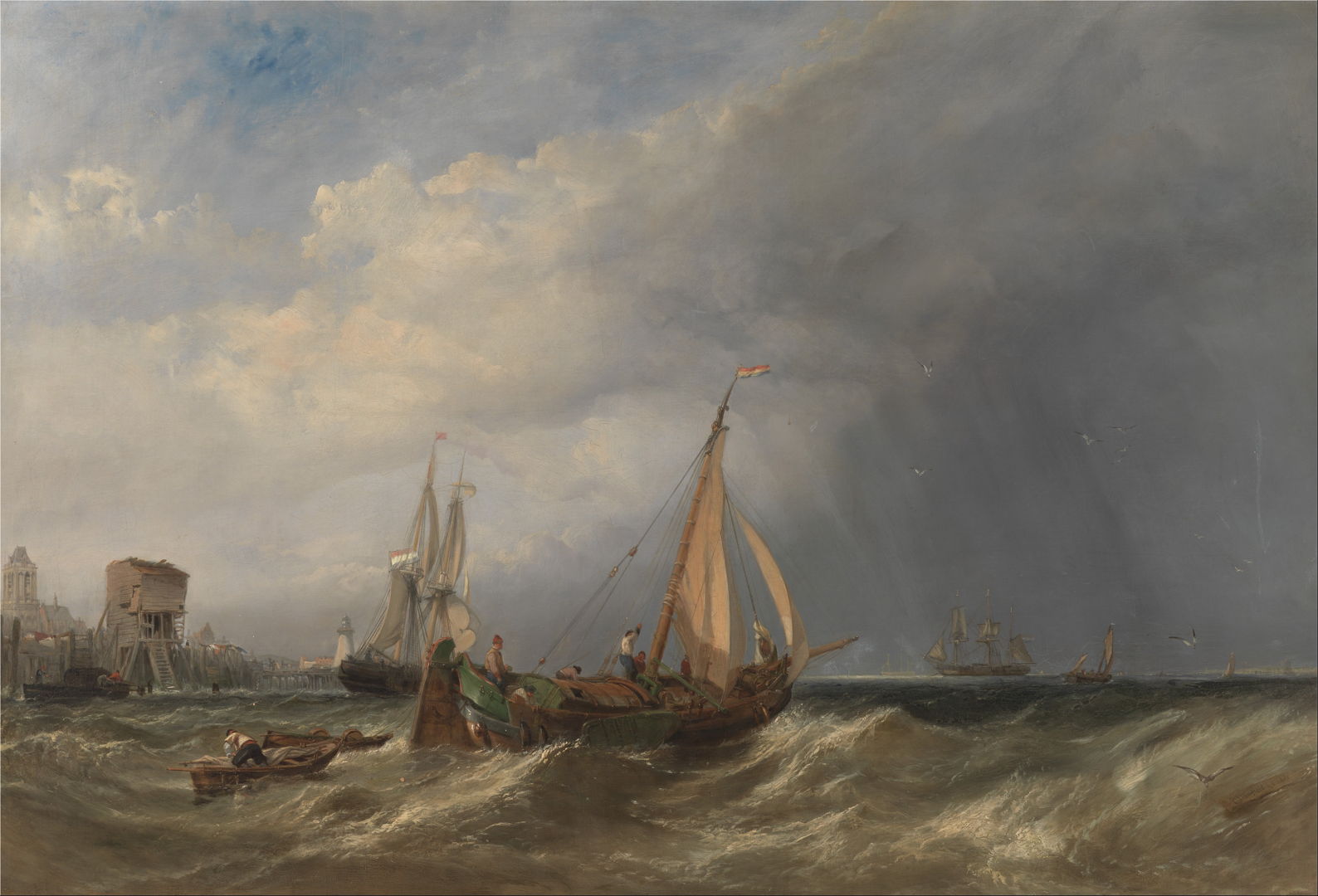
Marine painting became established as a sub-genre, as shown by the British painter Clarkson Stanfield, whose Dutch Barge and Merchantmen Running out of Rotterdam from 1856 includes rich detail, even down to dilapidated buildings on the waterfront.

Many of John Crome’s landscapes feature skies inspired by Dutch painters. His Landscape with Windmills is one of his most remarkable, as a signed painting that appears to have been sketched in front of the motif. Others who skied include John Constable and JMW Turner.
Nocturnes were less reliable, as they underwent phases when they were fashionable, then fell into neglect for a while.

James Abbott McNeill Whistler had a penchant for nocturnes, here his Nocturne: Blue and Gold — Southampton Water from 1872. Its vague blue-greys make the pinpoints of light and the rising sun shine out in contrast, a good reason for limiting his palette, while remaining faithful to nature.
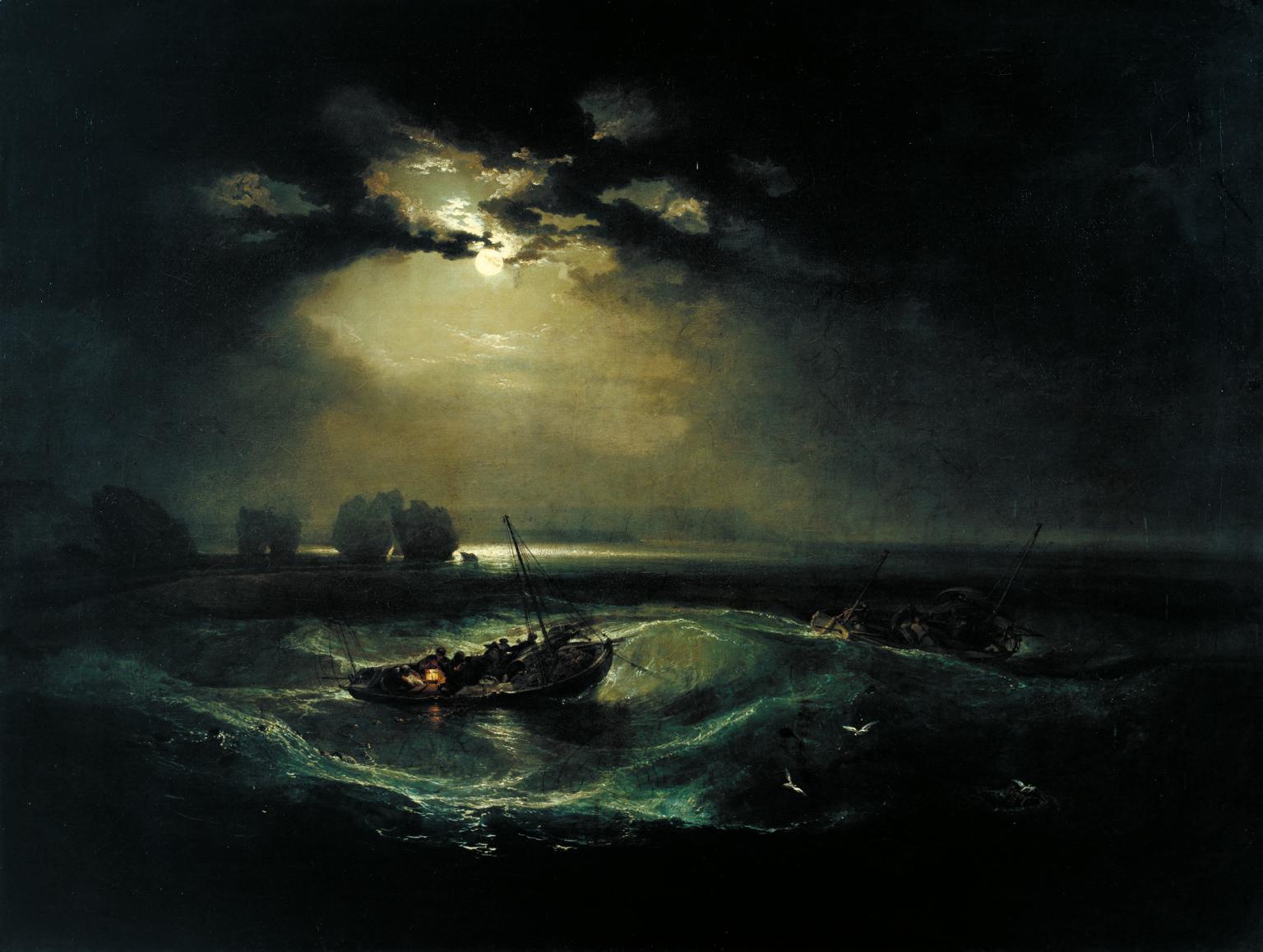
JMW Turner’s Fishermen at Sea from 1796, showing small fishing boats working in heavy swell off The Needles, on the Isle of Wight, is probably the most famous and successful coastal nocturne of all time. This was Turner’s first oil painting to be exhibited at the Royal Academy, when he was just twenty-one.
Paintings by artists of the Dutch Republic had been sold into collections across Europe, where many remain, influencing today’s artists.

在我接手 App 这波需求迭代的时候,发现一个很常见的问题却没有在设计规范里提到过(其实原本也没啥设计规范…)。那就是:表单的校验时机。
工作中我发现每个保存到数据库的表单都会有至少一个校验规则,最常见的是字数,其他的有类似格式(邮箱、数量)、上下限(价格、库存数)等。而表单的校验时机通常是在三种方式内选择:
由于接手时并没有规范或者指引帮助我如何判断使用哪种,工期紧张也没有足够时间去探索,我只能拍脑袋地大部分都采取了「失焦后校验」的方法。
后面我发现这其中的差异还是挺耐人寻味的,有必要探索三者之间的各自优劣势和适用场景,于是乎就有了这篇文章。
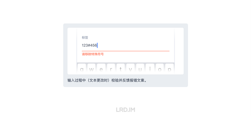
效果:输入过程中(即文本有更改时)校验并反馈报错文案。
优点:实时反馈,出错后立即提示。
缺点:容易误判。即未完成输入就提示出错。
适用场景:
1. 纯前端能满足校验需求时;
2. 校验规则较严苛时,如一个表单多条校验规则,或中途某个错误字符直接影响到表单提交时。
修正错误的成本:低 ★
在手机的的「键盘控件」内重新键入内容即可完成修正。
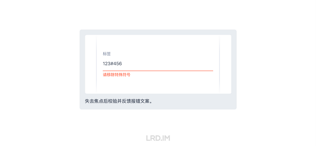
效果:失去焦点后校验并反馈报错文案。
优点:输入过程中无干扰,在输入完成后再反馈报错文案。
缺点:失焦后才知道结果,修正成本高。
适用场景:
1. 纯前端能满足校验需求时;
2. 用户对输入框内容格式有预期时,如邮箱、手机号等。
修正错误的成本:高 ★★
需要先「失焦」,再回到原本的输入框「重新聚焦」,并通过「键盘控件」修正。

效果:提交表单时校验并反馈报错文案,通常会伴随着使用 Toast 提示。
优点:后端校验时,不影响性能&体验。
缺点:报错反馈很不及时。
适用场景:
1. 大部分需要后端校验的表单。
修正错误的成本:较高 ★★★
需要先「提交表单」,再「找到」出错的的输入框,并「重新聚焦」原本的输入框,通过「键盘控件」修正。
至此,上面列出了三种校验方式的各自优劣势,对比后不难得出结论。

推荐优先使用「输入中校验」的规则。
原因:
1. 反馈最及时;
2. 修正错误的成本最低;
3. 对研发工作量和 App 性能无影响(前端校验时)。
理论支撑:
“理想情况下,所有验证都应该是内联的…”
“…在字段完成后立即修复错误对用户的交互成本最低…”
—— 来自 Nielsen Norman Group 的《如何反馈表单中的错误:10 条设计指南》
通过这次的对比,我决定了之后都将「输入中校验」作为主要的校验方式,当然这种方式也有一些不适用的场景,此时就需要换一种校验方式。举例一些常见的不适合用「输入中校验」的表单:
因为涉及到后端检验,意味着需要网络,那就会出现加载中/超时/加载失败/加载成功 的情况,所以这种表单一般是失焦后或提交时检验,这对输入体验会相对友好一些。
但也有例外,比如 Twitter 账号在重命名时,就使用的是输入中校验。可能是因为 Twitter 用户量庞大,特别容易重名。提交后检验反而效率更低。

常言道好的体验设计能减少用户出错,在表单输入之前,实际上我们也可以用多种方式明示暗示文本框的填写规则。
一、输入框长度

输入框长度能过暗示文本框的预期填入内容。比如在填地址和邮编时,通常地址我们会预留比较宽的输入框给用户填写,而邮编则可以相应缩减,因为这两个类型的字段,预期填写的文本长度是有明显不同的。
参考资料:整齐划一?不如错落有致。| Ant Design 4.0 系列分享
二、实时字数显示

在输入框旁边实时展示当前字数和上限是也是比较常见的做法。
优点:避免出错;让用户对表单的规则有一个预期。
缺点:页面出现过多此类提示会使页面臃肿,反而会增加视觉&认知负荷。
所以我对这个做法的态度是:每个表单都会有文字输入的上限,超过上限时也一定会禁止提交、出现提示。但是否将字数提示常驻展示,取决于「用户对长度是否有预期」。

比如在一些备注、描述、说明等大段文字里,用户可能会输入到大段文本,但又对这些输入框的上限没有预期,那我这里判断到是需要出现实时字数提示的。而像比如填写姓名、添加标签这种,字数上限只是一个兜底的判断逻辑,不需要特意暴露出来。
另外可以根据存量数据来决定是否展示实时字数提示。比如让后端同事帮忙导出在数据库里的数据,能知道用户在这个输入框里一般会填写多少个字,如果大部分情况都是接近字数上限的,意味着用户在这个输入框会输入较多的文本,此时就需要展示当前字数上限,甚至或者调整校验规则。这是我在上一家公司(千聊)里做过的事情。
三、占位符(Placeholder)

无论是 NNGROUP 还是 Shopify UX,都对占位符文本持有比较谨慎的态度,甚至会用到 Harmful、Avoid 等贬义词。他们主要批判的是用占位符代替标签的做法,我们在使用时避免这种用法就好了。

实际上占位符和标签共同使用时没什么毛病,占位符确实能起到一定的补充作用,用来提示要输入内容的类型和名称,只是不要用来展示重要内容和代替掉标签就好了。合理使用也是减少用户出错的方式之一。
四、常驻帮助文本(Help text)

帮助文本可以视为占位符的进阶版,具体效果在输入框附近常驻一段简短、必要的说明内容,帮助商家了解输入框所要求的格式,或输入后的内容会怎么处理。甚至还可以链接到 FAQ,有丰富的用法。
在文本有上限的输入框里,我们会面临一个选择是:超过字数后是否允许输入?
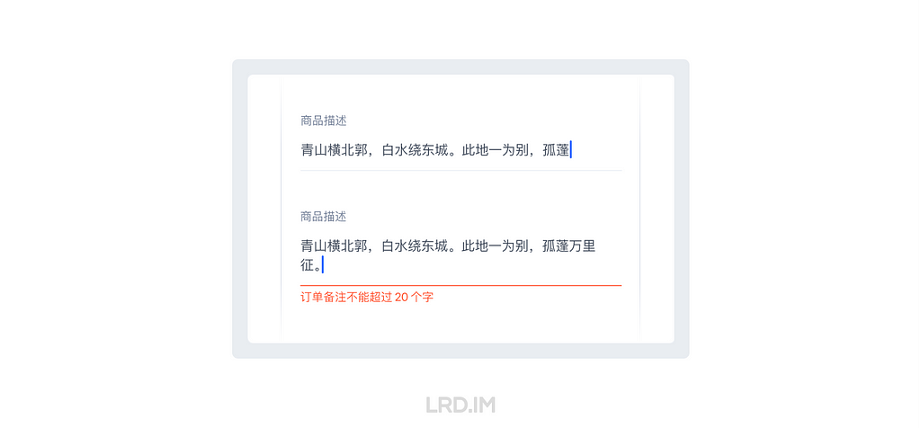
我在这里的建议是允许继续输入,同时会出现报错的反馈,告知规则。因为翻查了很多 UX 资料,都建议在设计中要避免「打断了用户行为」。下面放出两种方法的优劣对比,各位看官理性抉择:
超上限后允许继续输入
效果:输入的文本超过该文本框校验规则上限时,出现报错反馈,同时也可以继续输入文本。
优点:反馈及时,原因清晰。
缺点:🤔…
到达上限后禁止输入
效果:输入的文本到达该文本框校验规则的上限时,禁止输入更多的文字了。
优点:🤔…
缺点:没有反馈,不知道错误原因。
这么看下来,就体验而言是「超出上限后允许继续输入」要好很多。而且这种方法还照顾到一个场景是:允许用户在输入中发现超出长度后,把当前的单词输入完整后再去删减其他内容。
当然毫无疑问,到达上限后直接不允许输入是对设计和研发来说最省力的做法。这种做法下不用反馈,也就不需要做反馈时机的决策、反馈的文案及多语言、文本的适配、反馈后的布局适配…
我有一段经历是项目工期巨紧张,规范也没相关的指引。当时有很多比制定文本输入规则还重要的事情需要处理,于是乎我就都一拍脑袋用了「达上限后禁止输入」的方法。
后面与其他方式对比发现这种做法应该是体验比较差的做法了。像现在我把规范做法加进 App 设计的指引里面之后,就大多数情况下都会使用「允许继续输入,在输入中反馈」的方式实现。
以上内容就是目前来说我对文本框校验规则的一些认识,包含了各种校验时机的对比,输入前的体验设计,以及不打断用户操作的原则。
这次的总结是我挺久之前就想干的事情了,因为平常工作中一直遇到这种问题,也没有一个明确的设计指引能够参考,现在自己写下来这篇笔记之后,之后的设计方案会考虑得更周全,说服力也更强了(希望是吧)…
同时再浅挖一个坑:之后要探索下表单提交按钮相关知识,比如说什么时候要禁用按钮,什么时候是允许点击但报错等等,这个应该还要复杂一点…
