Here’s Who Attended the State Dinner at Windsor Castle
18 September 2025 at 06:03
The guest list ranged from members of the royal family to titans of business and technology.
The element chromium gains its name from the rich colours seen in many of its salts and compounds. One of them, chromium oxide, was discovered in about 1798 by Louis-Nicolas Vauquelin, who immediately recognised its future use as a pigment, because of its “fine emerald colour”. But painters were still enamoured with more toxic greens, and straight chromium oxide doesn’t look particularly brilliant, being a rather dull yellow-green. Its introduction into paintings probably didn’t start until around 1840, when landscape painting outdoors was becoming all the rage.

Some of the earliest paintings known to use chromium oxide are those of Moritz von Schwind, of which the first example that I can show is his Mermaids Watering a Stag from about 1846. He seems to have used the pigment quite extensively here in foliage, although probably in combination with other pigments.

Von Schwind’s King Krokus and the Wood Nymph from about 1855 is a clearer image, where he probably used chromium oxide in combination for most of his greens.
As these works were being painted, an improved version of chromium oxide was being developed: hydrated chromium oxide, which became known as viridian during the 1860s. This first became available at a reasonable price after Guignet started to make it in quantity in 1859, so has also been known as Guignet’s green. It’s sometimes termed émeraude or emerald, which only serves to confuse viridian with copper acetoarsenate, more widely known as emerald green.
Viridian came into use during the 1860s, and has proved far more popular than chromium oxide. Both pigments are reliably lightfast, opaque, and have good covering power, but viridian is the more intense, and doesn’t appear dull like plain chromium oxide.

Anselm Feuerbach’s painting of Paolo and Francesca from 1864 is one of the earlier works found to contain viridian among its many rich greens.

The best example showing off the colour of viridian is perhaps Édouard Manet’s The Balcony (1868-69), where he appears to have used the pigment throughout the blinds and railings, most probably mixed with lead white, and unmixed for the woman’s parasol.
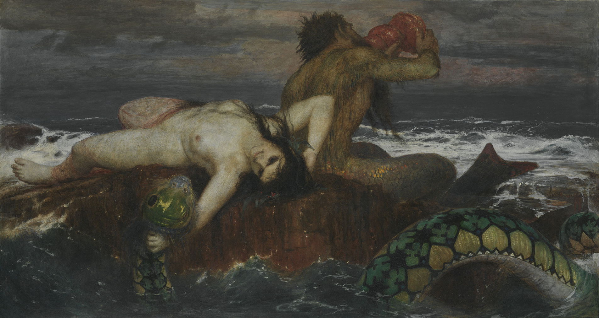
Arnold Böcklin’s Triton and Nereid from 1874 is unusual in several respects. It’s reported as being painted in tempera rather than oils, but its deep lustrous greens were developed using a base of predominantly viridian, over which Böcklin applied a copper resinate glaze.
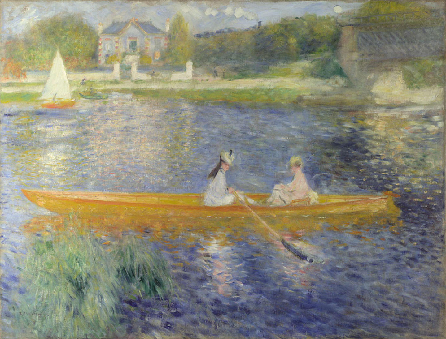
Pierre-Auguste Renoir’s La Yole (The Skiff) of 1875 uses viridian as the main colour for the reeds in the left foreground.

Analysis of Claude Monet’s series of paintings of the Gare Saint-Lazare in 1877 has revealed extensive use of viridian in mixtures, including the green shadows in the roof. In Arrival of the Normandy Train, Gare Saint-Lazare (1877), the pigment is apparent (and confirmed) throughout the green foreground of the platform, an optical effect resulting from light passing through the glass roof of the station.
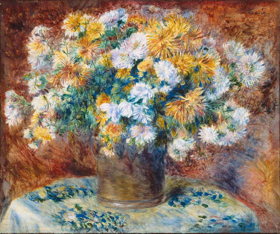
Renoir used viridian together with malachite green and other pigments for the greens in his Chrysanthemums (1881-82).

If you care to spend some time examining the myriads of tiny dots in Georges Seurat’s monumental Divisionist painting of A Sunday Afternoon on the Island of La Grande Jatte (1884-86), I’m assured that you’ll find many of those forming its vegetation contain viridian.
Viridian remained popular among the post-Impressionists, from whom I have two well-known paintings as examples.

Vincent van Gogh included viridian in the pigments used in the range of greens in his A Wheatfield, with Cypresses (1889), which is more unusual for his use of ultramarine blue mixed to form green.
Paul Cézanne is known to have had a strong preference for viridian as one of the key colours in his palette. However, in his Hillside in Provence (1890-92), it is emerald green that is the more prominent, and the major part of the painting’s more brilliant greens, even into its pale turquoise sky. Some green passages, such as the patch of yellow-green grass at the edge of the path in the foreground, at the right edge of the canvas, have been built with a base of lead white and viridian, over which he has applied a yellow lake glaze.
Chromium oxide and viridian remain widely available today; although the former is not popular or widely used, viridian remains a mainstay green widely recommended for its colour and other properties. Being virtually insoluble, chromium oxide and viridian pose minimal risks of toxicity to the artist. However, there is growing concern over their environmental effects, and great care is needed when handling waste paint containing either pigment.
Reference
Richard Newman (1997) Artists’ Pigments, vol 3, ed Elisabeth West FitzHugh, Archetype. ISBN 978 1 904982 76 0.
![]()
Rumours still abound as to the cause of Napoleon’s death over two centuries ago. One theory, not currently in favour, is that he was poisoned by arsenic in the wallpaper. At the time, that would have been unusual, but by the 1860s such deaths were significant enough to be reported in newspapers. Their ultimate cause was also one of the factors behind the success of Impressionist landscape painting: emerald green.
Getting a good range of green pigments was vital for landscape painting, and more generally for coloured commercial products such as wallpaper and clothing. The first of the ‘poison greens’ to be discovered was that named after Carl Wilhelm Scheele, the Swedish chemist who originally made it in 1775: copper arsenite, a highly toxic salt of arsenic. Soon after its introduction from about 1780, it became clear that it tended to darken with age, and the search began for a replacement.
Little attention has been paid to the use of Scheele’s green, and it isn’t clear how widely it was used, or even when it was first used in painting.

JMW Turner’s early oil sketch of Guildford from the Banks of the Wey, painted in about 1805, has been found to contain Scheele’s green. Given its range of greens, that could be quite extensive.
Wilhelm Sattler, a paint manufacturer in Schweinfurt, Germany, worked with Friedrich Russ to discover an even better arsenic compound for use as a colourant, and from 1814 Sattler’s company manufactured Schweinfurt or emerald green, the equally toxic copper acetoarsenite. Its alluringly brilliant green colour appears very stable, with only slight darkening resulting from reaction with hydrogen sulphide, a common atmospheric pollutant.

By about 1830-32, when Turner painted Going to School as an illustration for Rogers’s Poems, he had switched to using emerald green, obvious from its characteristic colour standing out from the small bag on the boy’s back.

Turner used emerald green again in this watercolour painting of Rouen, Looking Downstream from about 1832, here in combination with other pigments, so less brashly.
Concerns over the established toxicity of these two greens were raised by 1839, when warnings were first issued in Bavaria. Despite those, the use of emerald green became more widespread, and it was even ‘fixed’ to ball gowns using albumen or dextrin, which allowed its poisonous dust to brush free from the garment when dancing. It also became particularly popular, and insidiously toxic, in coloured wallpapers. When applied on damp walls, as were common at the time, fungal products could produce trimethyl arsine gas, which is thought to have been responsible for many of the symptoms and deaths that were reported.

Édouard Manet’s Music in the Tuileries (1862) is an unusual example of a painting containing both Scheele’s and emerald greens. Manet used them in combination in two different glazes applied to the areas of foliage. In one transparent glaze, they are mixed with yellow lake, small amounts of ivory black, and yellow ochre; the other more opaque glaze consists of the two greens, with yellow ochre and white.
The last recorded use of Scheele’s green was by Edwin Landseer in 1866.

The Impressionists relied heavily on emerald green for its brilliance and intensity of colour. Frédéric Bazille’s Self-Portrait with Palette (1865) shows some emerald green paint on his palette, squeezed out and ready to paint vegetation such as sunlit grass.

Claude Monet used emerald green among other green pigments and mixtures in his famous Bathers at la Grenouillère, painted in 1869. It has also been found widely in the landscapes of Cézanne, Gauguin, Pissarro and Vincent van Gogh.
By the late nineteenth century, concern over the consequences of using emerald green in household products had risen to the point where the pigment was banned in a succession of countries.

Paul Gauguin’s Arlésiennes (Mistral) (Old Women at Arles) (1888) uses emerald green for the band of bright green grass sweeping up across the painting from the right. It is also mixed for the skin and hair of some of the figures, and in the foliage more generally.

Odilon Redon’s pastel painting of Sîta from about 1893 uses emerald green, chrome yellow and chalk in the prominent yellow-green halo surrounding the woman’s head. Working with soft pastels containing this pigment was particularly hazardous, because of the likelihood of inhaling their dust. At least today we have effective respiratory protection available.
During the twentieth century, genuine emerald green was withdrawn from use as a pigment, although it wasn’t completely discontinued until the 1960s. Since then, paints sold as being emerald green have contained alternatives that are far less toxic.

Emerald green has been found in mixtures used by Paul Cézanne in the patches of vegetation in his huge The Large Bathers (1906). Alongside lead white, vermilion and ultramarine blue, this pigment appears to have been among his most frequently used.

Childe Hassam’s watercolour of White Mountains from Poland Springs from 1917 is one of the last major paintings that appears to have relied on emerald green. Its use in the meadow in the foreground is perhaps the pigment’s last brash farewell.
Reference
Inge Fiedler and Michael Bayard (1997) Artists’ Pigments, vol 3, ed Elisabeth West Fitzhugh, Archetype. ISBN 978 1 904982 76 0.
![]()
Many yellow pigments in use, even into the twentieth century, have shown a pronounced tendency to fade. So when someone comes along offering you a ball of compressed powder that is an intense yellow, and appears more lightfast than alternatives, you’ll believe anything they say. It comes from the urine of cows? No worries, just tell me how much, and when can you deliver?
This seems to have been the story behind the introduction of Indian Yellow into European painting. It had a long track-record of use in and around the Indian sub-continent, where it had featured in watercolours and gouache, and buyers in Europe were only too happy to pay high prices for it when it became available.

This exquisite watercolour miniature showing a Mongol Chieftain and Attendants from the Gulshan Album now in the Freer and Sackler Galleries is a good example, from around 1600. Its yellows and greens have lasted those four centuries very well, and careful testing by Elisabeth FitzHugh has shown the unmistakable presence of the chemicals known to be diagnostic of real Indian Yellow.
The snag with European paintings is that so few works have been tested, and records are so scant, that we don’t even know when Indian Yellow was first used as far west as Europe.

Ernst Willers’ Grove Near Ariccia in the Evening Light (1873) is one of the few European paintings known fairly unequivocally to contain Indian Yellow, probably used to form its rich greens.
We know with rather greater certainty when Indian Yellow came off the market, as by the end of the nineteenth century supplies had essentially dried up. The claim is that, between the late 1500s and then, some Indian herdsmen fed their cows with mango leaves, collected the cows’ urine, and dried it to generate the pigment in balls of compressed powder, some of which still exist. In the nineteenth century, this was increasingly viewed as being cruel to the cows, and the practice was progressively eliminated.
Whether this story is accurate, or indeed the pigment ever saw much use, remains open to doubt. Certain claims, for example of a ban on the production of the pigment from 1908, can’t be verified and appear legendary. But there is evidence that some artists in both India and Europe used the pigment in their paintings.
Its successor Chrome Yellow is part of a family of pigments ranging from pale lemon to deep orange-red, and based on lead chromate, which had been ‘discovered’ as a mineral in the middle of the eighteenth century. Its use as a pigment wasn’t recognised until the early nineteenth century, when it became increasingly popular and versatile.
Initially, supplies were limited and it was expensive. As general commercial demand for the mineral increased, new sources of supply were found, and its price fell accordingly. During the latter half of the nineteenth century it was probably the mainstay yellow and orange in the palette of most painters.

The first evidence of the use of chrome yellow as a pigment in painting dates from just before 1810. Johann Friedrich Overbeck’s painting of Italia and Germania (or possibly Sulamith and Maria) was made in 1828, and is thus from the early adoption phase, when the pigment was expensive and encountered infrequently. Although Overbeck was restrained in his use of colours from orange through to yellow and green, he has achieved a subtle chromatic effect in the green fabric.

Carl Blechen seems to have used Chrome Yellow more extensively in his imposing View of Assisi, painted a few years later in 1832-35. By this time the mixture of Chrome Yellow with Prussian Blue had become known as Green Cinnabar or Chrome Green, although the chromium salt used was not itself green, of course.

By the time that Arnold Böcklin painted this, his first version of Villa by the Sea in 1864, Chrome Yellow had established itself as the standard. However, this is one of a relatively small number of works using the pigment in an almost encaustic mixture of resin and wax.

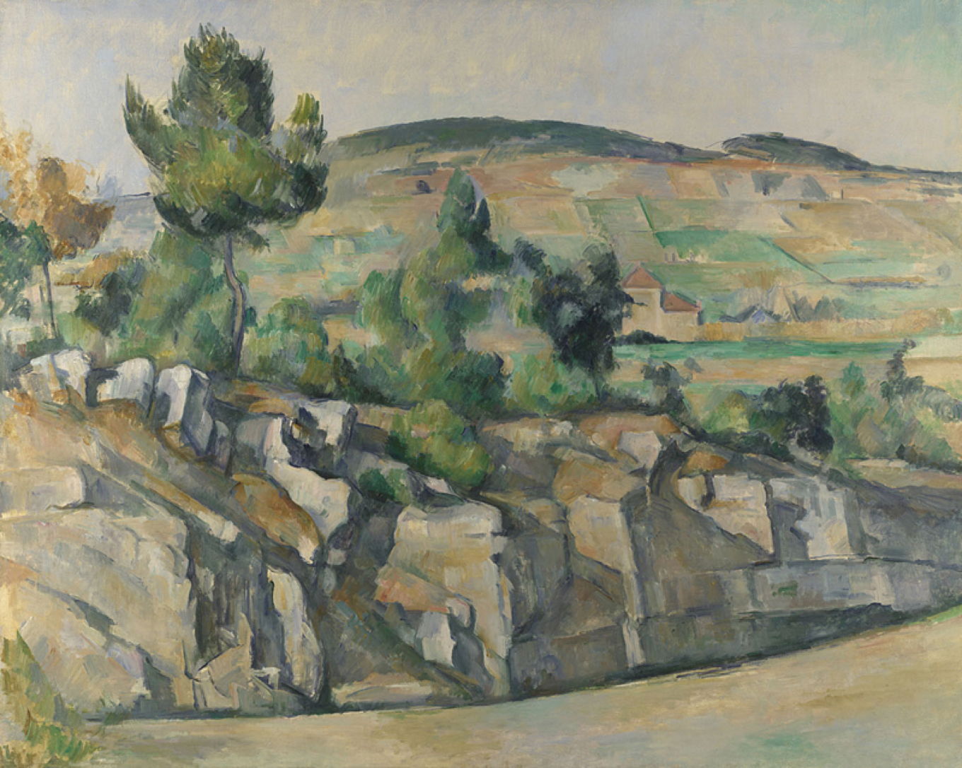
Chrome Yellow was widely used by the Impressionists and shown at the Salon, and is demonstrated well in Paul Cézanne’s famous painting of The Railway Cutting (c 1870). I believe that most if not all of the greens seen here rely on Chrome Yellow mixed with blue.
As some of the Impressionists, like Claude Monet, generated more income, they could afford to start using the newer and far more expensive cadmium-based pigments that were coming onto the market. Cadmium Yellow is also considerably more lightfast and durable than Chrome Yellow, so during the late nineteenth and early twentieth centuries, many painters switched away from Chrome Yellow.

Walter Crane’s Neptune’s Horses (1892) is one of the later works that apparently still relied on Chrome Yellow.
During the twentieth century, Cadmium continued to displace Chrome in pigments for paints ranging from lemon to orange-red. However, both are potentially environmentally damaging, and in this century more modern, less toxic synthetic organic pigments have been introduced as substitutes. Thankfully, as both Cadmium and Chrome pigments trap their toxic salts in insoluble particles, neither presents any danger to the careful painter when used in paint. For the pastellist, though, inhalation of pigment in dust is a more significant risk.
Chrome Yellow was one of the key colours of Impressionism, and features in many nineteenth century landscapes. No cows ever suffered in its manufacture.
References
NS Baer, A Joel, RL Feller & N Indictor (1986) Artists’ Pigments, vol 1, ed Robert L Feller, Archetype. ISBN 978 1 904982 74 6. (Indian Yellow)
Hermann Kühn, Mary Curran (1986) Artists’ Pigments, vol 1, ed Robert L Feller, Archetype. ISBN 978 1 904982 74 6. (Chrome Yellow)
![]()