Medium and Message: Paint to print
Over the many centuries before photography, the only way that most folk, including artists, could see paintings was by looking at prints or copies made of the originals. This was recognised early by some including Albrecht Dürer, who made woodcuts and engravings to reach a wider public, and some specialised in painting works that would generate additional income from their prints. Among those are some whose skills included both forms of visual art, including William Hogarth, William Frith, Gustave Doré, and later Mary Cassatt and Nikolai Astrup. This article looks at a few examples of their paintings that were turned into prints.
A largely self-taught painter, Hogarth entered the world of art as a copperplate engraver in 1720. He aspired to greater things, and became a pupil at an academy run by Thornhill in London, even marrying Thornhill’s daughter in 1729. His works in oil were usually strongly narrative, showing moments of climax and sometimes peripeteia in theatrical productions or everyday life in London. Many included social commentary, wit, and some overtly caricatured society. One of his reasons for painting was to provide a supply of original images for engraving, and all his series paintings were seen, from a commercial view at least, as a means to producing lucrative series of prints.
Following his successful narrative series of prints Industry and Idleness, Hogarth moralised again over one of his favourite issues: cruelty to animals. Victorian society was even harsher in its attitudes towards animals than it was towards the ‘lower classes’ of humans, and Hogarth saw the two as being linked.
As with Industry and Idleness, Hogarth wanted to reach the hearts of the ordinary people, and to make his prints as affordable as possible. He admitted to simplifying his drawings in order to put his points across as clearly and accessibly as possible. He stated that “neither minute accuracy of design, nor fine engraving, were deemed necessary”. In a further effort to cut costs, he commissioned them to be turned into woodcuts rather than engraved, but in the end only two of the plates were completed in wood, and Hogarth himself created conventional engravings.

This early sketch in pencil and red chalk gives a good idea of his initial concept for the first in this series.

That was progressed to a final drawing in red chalk (above) to be turned into the line engraving below, shown mirrored so that it matches the drawings.


This is the same print as seen by the viewer. Hogarth’s schoolboy Tom Nero is seen, together with many of his peers, in a street in the slum district of St Giles in London. He’s shown in a ragged white coat just below the centre of the image, inserting an arrow into a dog which is plainly in agony. The dog’s owner pleads for mercy, offering Tom a pie, but others help hold the dog for Tom. Just to his left, someone has drawn a hanged man with Tom’s name below, a grim prediction of what is to come.
All around there are vicious acts of cruelty taking place to animals. A cat and dog are fighting, cockfighting is in progress, another dog has a bone tied to its tail, two boys are burning a bird’s eyes out, two cats are suspended by their tails from a vintner’s sign, and a cat has been thrown out of a high window with balloons attached to it.
For some of his series, Hogarth worked up a set of full oil paintings in addition to prints. My example is taken from A Rake’s Progress, painted between 1732-5, the successful successor to his A Harlot’s Progress.

In Hogarth’s oil painting, Tom sets out to make a new man of himself with the aid of many tutors and hangers-on. The composer Handel plays the harpsichord, then there is a fencing master, a quarterstaff instructor, a dancing master with violin, Charles Bridgeman, a famous landscape gardener, Tom himself, an ex-soldier acting as bodyguard, a bugler from a foxhunt, and a jockey. In the background are others who are busy spending Tom’s inheritance on worthy causes no doubt.
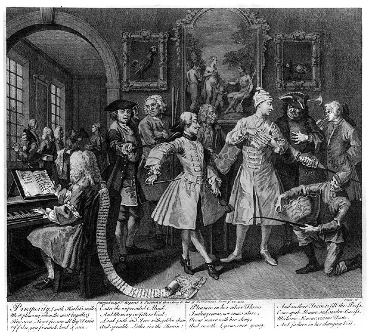
The print is different in many respects, as if the artist forked the painting and print from a late sketch. Details on the music being played at the left are different, and there’s a long scroll running down from the back of the chair in the print. Some of the facial expressions are altered and exaggerated in the print. Details, including those of clothing and frames of the paintings on the wall, also differ.
Artists like Edgar Degas and his protégé Mary Cassatt made prints for different reasons.
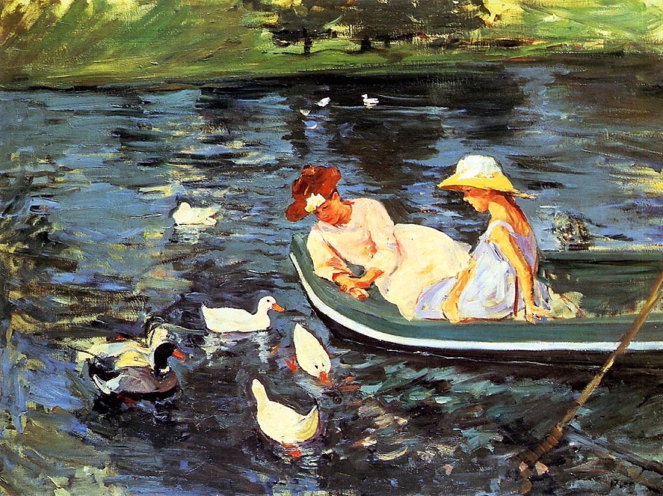
Towards the end of the nineteenth century, Cassatt made this very loose painting of a mother and daughter feeding ducks from a boat in Summertime (1894). I believe this was the source for the sophisticated print, called more appropriately Feeding the Ducks (c 1894), below.
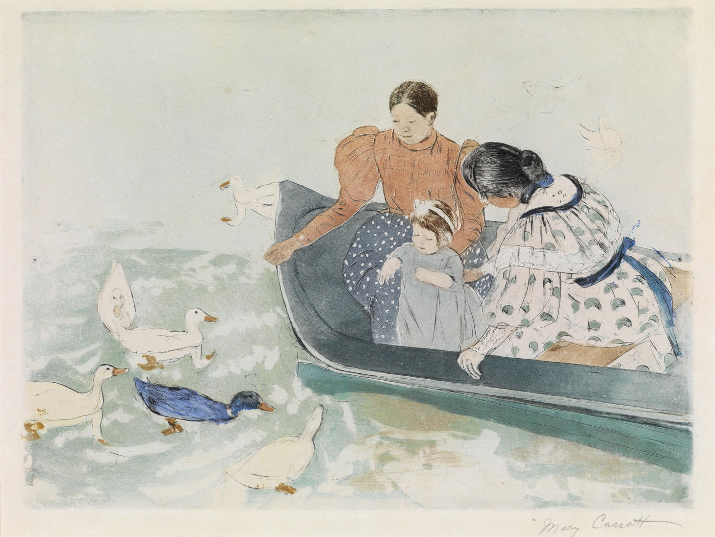
For this she combined her mature drypoint technique with aquatint, to which she added monotype. In monotype, the artist lays down an image on a plate using printing inks, then makes a single impression of that on the paper. This demands meticulous technique, and usually results in one completed print for each image made in ink. Although second prints can sometimes be made, they’re usually of low quality.
The Norwegian artist Nikolai Astrup was a prolific painter and printmaker, whose paintings informed his prints, and prints informed his paintings.
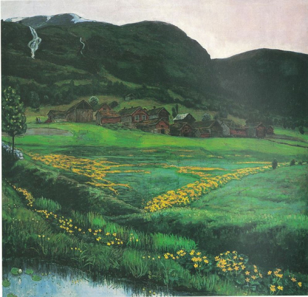
A Clear Night in June (1905-07), above, and A June Night and Old Jølster Farm (before 1911), below, are two of more than a dozen paintings Astrup made of this farm after about 1902. These were painted early each summer, when in some years there were still the remains of the winter’s snow on the rugged hills behind. The waterfalls cascading down the scarps are still in spate from the melting snow.
Astrup painted this view when the blossom was on the trees, and the meadows were a patchwork of yellow with the first of the summer flowers. Comparing these two paintings reveals a few differences in detail, such as the low fence in the foreground in the lower painting which is omitted in the upper, but by and large Astrup seems to have been consistent, suggesting his paintings were true to nature.


A few years later, he turned those into prints such as this Marsh Marigold Night (c 1915). By this time his printmaking technique had come a long way, and many of his later prints were extremely painterly, to the point where it can be difficult to distinguish his woodcuts from their painted originals.
Reference
Ayrton M & Denvir B (1948) Hogarth’s Drawings, London Life in the 18th Century, Avalon Press. No ISBN. [This has been my source for images of many of the scans above. The book bears no information about copyright, the press has long since vanished as far as I can tell, and I assume ‘fair use’ of these orphaned images. If you know any different, please contact me.]
![]()