Away from the turmoil in Washington, Americans will mark July 4 in their own patriotic ways. Expect rodeos, line dancing, Tejano music and Led Zeppelin.
Chinese whispers is an old children’s game where everyone sits in a circle, and one child whispers into the ear of the next on their right a sentence like Send reinforcements, we’re going to advance. That child then whispers the message they heard to the child on their right, until it reaches the one who started it, who says out loud what they heard, classically Send three-and-fourpence, we’re going to a dance, as a demonstration of how messages can so easily become corrupted. What this has to do with China remains one of childhood’s mysteries. I should also explain that three-and-fourpence was idiomatic British English in the days before our currency was ‘decimalised’, and meant three shillings and four (old) pence, about 17 (new) pence, sufficient at one time to enjoy a good night out.
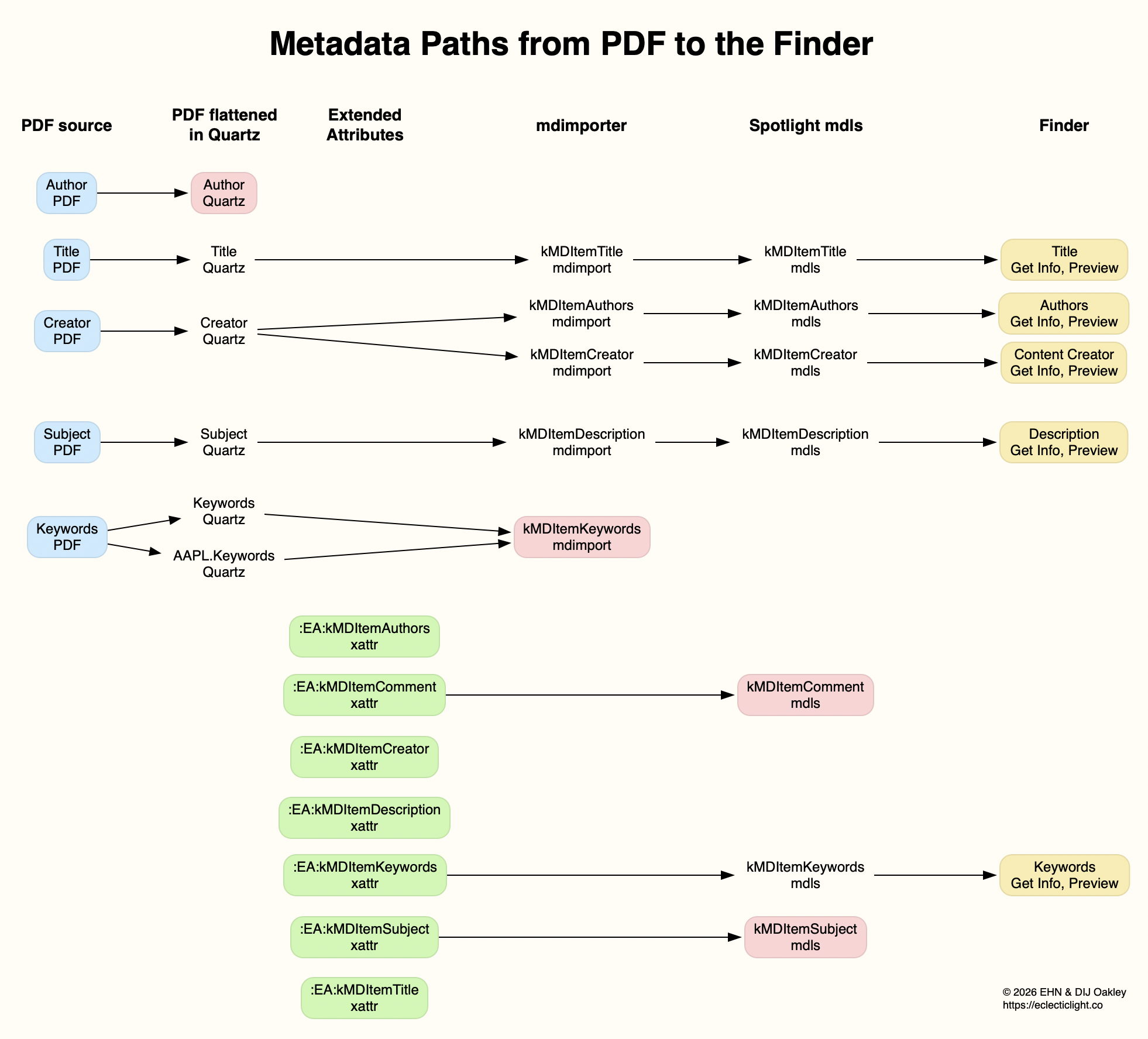
In this article I’m going to do much the same with metadata for a PDF document, tracing what gets indexed by Spotlight, so becoming discoverable by search, and what is displayed in the Finder. This relies on several of my utilities, most of which are available from this page.
Source PDF
I prepared a completely unrelated PDF using my favourite PDF editor, PDF Expert, by adding metadata to be saved in the file’s data. As you might expect, there are several ways that could be stored in the PDF format, including XMP metadata, but in this case for simplicity they were added in the document information dictionary.
I inspected that in a source view in Podofyllin, which found the following fields: /Author (Author name in pdf)
/Creator (Pages)
/Keywords (keyword1 pdf)
/Subject (Subject in pdf)
/Title (0PDFtest1accessdefault)
When rendered in macOS, those are ‘flattened’ by its Quartz PDF engine, to /Author (Author name in pdf)
/Creator (Pages)
/Keywords (keyword1 pdf)
/AAPL:Keywords [(keyword1 pdf)]
/Subject (Subject in pdf)
/Title (0PDFtest1accessdefault)
Note the copying of keywords into a new attribute AAPL:Keywords.
Extended attributes
I then added seven extended attributes using Metamer, with names such as com.apple.metadata:kMDItemAuthors, as shown below in xattred.
Spotlight import
I then inspected the file in SpotTest’s new Drop Window, which reported the following attributes found by mdimport: ":EA:kMDItemAuthors" = "author in xattr";
":EA:kMDItemComment" = "xattr comment";
":EA:kMDItemCreator" = "xattr creator";
":EA:kMDItemDescription" = "xattr description";
":EA:kMDItemKeywords" = "keyword1,xattr";
":EA:kMDItemSubject" = "xattr subject";
":EA:kMDItemTitle" = "xattr title";
all from the extended attributes, while those derived from the PDF data were kMDItemAuthors = (Pages);
kMDItemCreator = Pages;
kMDItemDescription = "Subject in pdf";
kMDItemKeywords = ("keyword1 pdf");
kMDItemTitle = 0PDFtest1accessdefault;
Those attributes have already changed, with PDF Subject becoming kMDItemDescription, Creator being duplicated into kMDItemAuthors, and the loss of PDF Author.
Spotlight indexes
Attributes reported by mdls changed again to kMDItemAuthors = (Pages)
kMDItemComment = "xattr comment"
kMDItemCreator = "Pages"
kMDItemDescription = "Subject in pdf"
kMDItemKeywords = ("keyword1,xattr")
kMDItemSubject = "xattr subject"
kMDItemTitle = "0PDFtest1accessdefault"
This has lost the xattr attributes kMDItemAuthors, kMDItemCreator, kMDItemDescription and kMDItemTitle, and the PDF kMDItemKeywords. That list of 7 attributes should then be searchable using Spotlight.
The Finder
The final step was to discover which of those could be displayed in the Finder, either in its Get Info dialog, or in the Preview panel of a Finder window.
Only 5 of those attributes survived in the Finder, and were given as Authors: Pages
Content Creator: Pages
Description: Subject in pdf
Keywords: keyword1,xattr
Title: 0PDFtest1accessdefault
Of those, 4 are taken from the metadata in the PDF file, and only the Keywords were taken from its extended attribute. The attribute named as Authors contains a duplicate of what had originally been in the PDF Creator field, but neither of the PDF Author or xattr kMDItemAuthors fields. Those paths are traced in the diagram below.
Conclusions
Of the total of 12 distinct metadata attributes added in the PDF data and extended attributes, only 6 different items were indexed by Spotlight, and 4 were displayed in the Finder (allowing for the duplication of Authors and Content Creator).
Before relying on metadata for search and access in the Finder, it’s essential to verify that the attributes you intend using are successfully indexed and displayed. Choose the wrong attributes and you’ll never find anything.
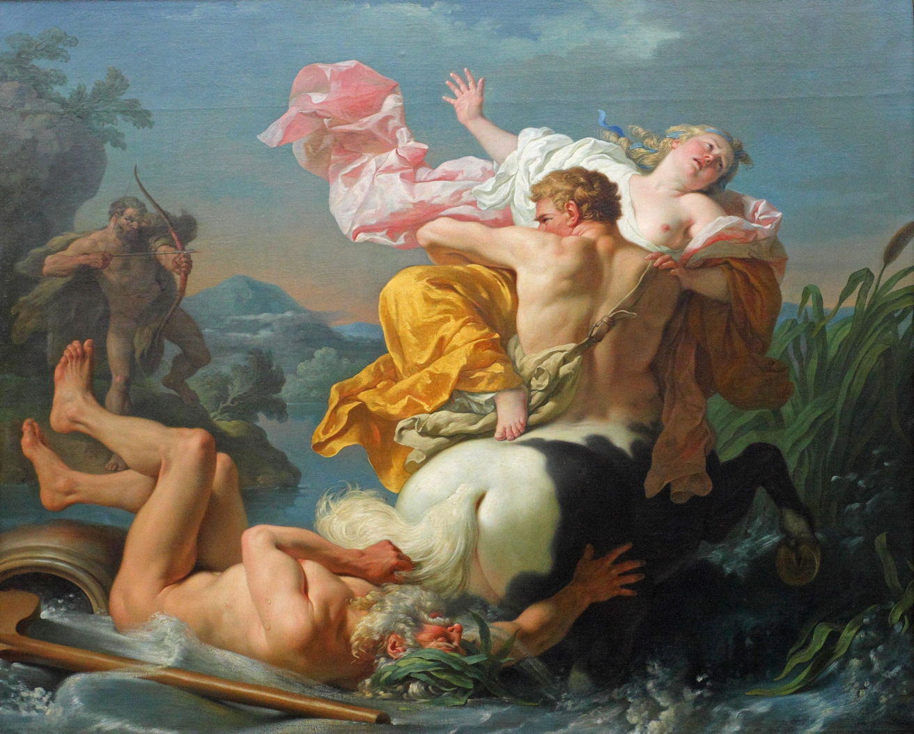
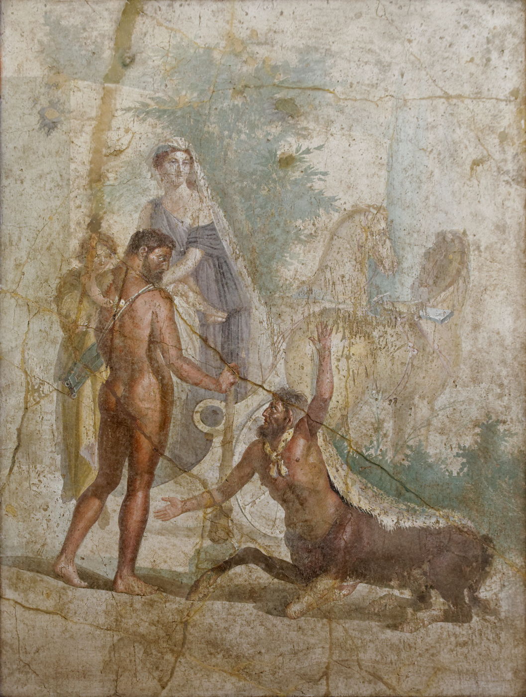
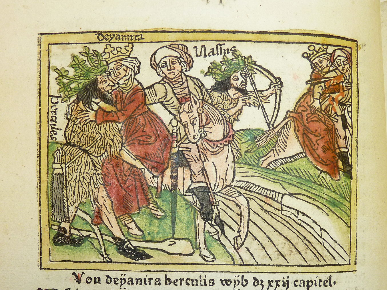
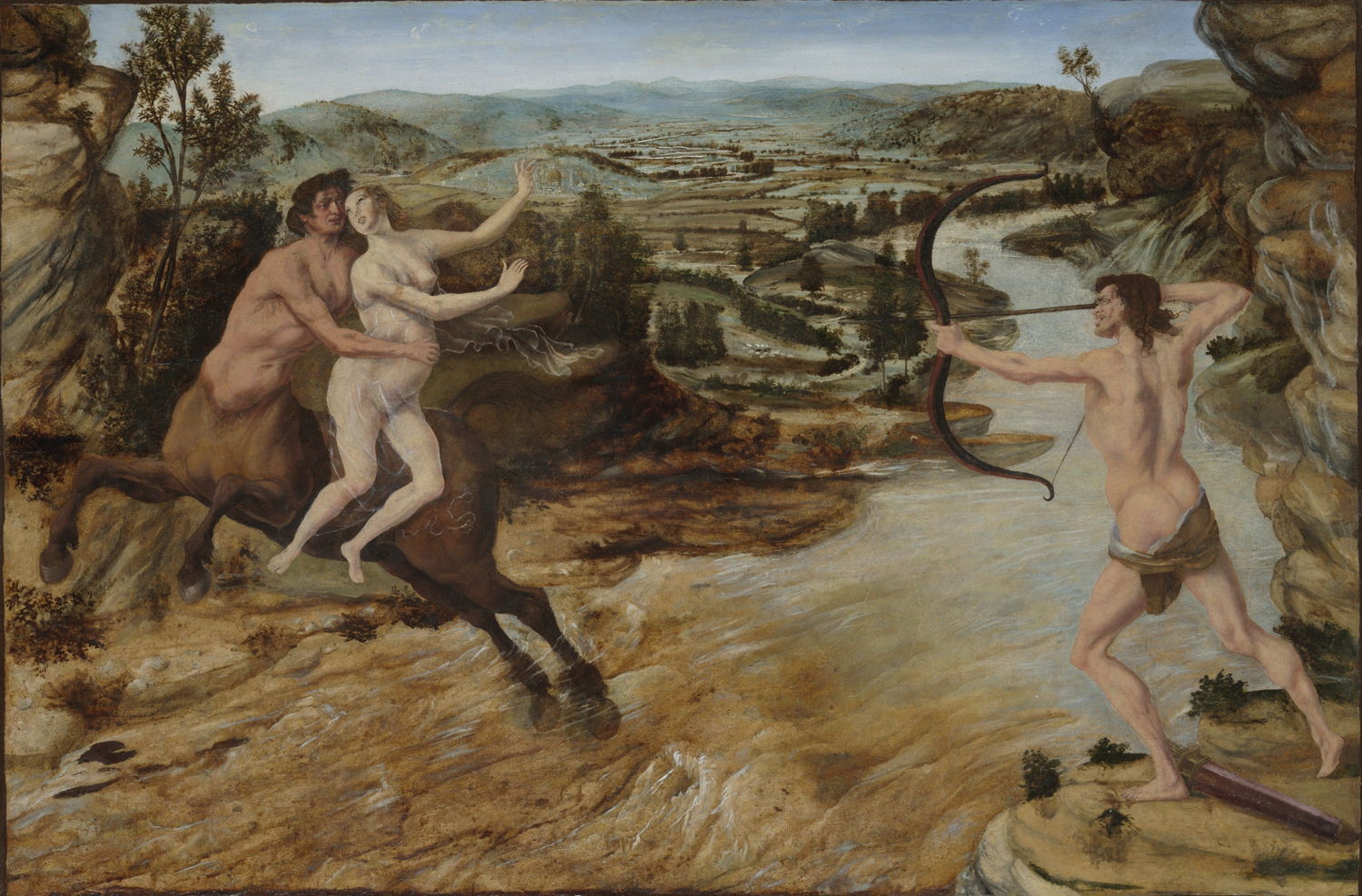
In addition to his account of the battle between Lapiths and centaurs at the wedding feast of Pirithous and Hippodame, Ovid tells the story of Nessus the centaur and his attempt to abduct Hercules’ wife.
Nessus had set himself up as the ferryman on the river Euenos, in western Greece. One day, Deianeira, the beautiful wife of Hercules, wanted to cross the river, so she mounted Nessus’ back and he took her across. As he was doing so, he decided to try to abduct and rape her. However, Hercules was on the bank they had just left, and heard her cries. He drew his bow and shot Nessus in the breast with an arrow whose tip was poisoned with the blood of the Lernean Hydra.
As Nessus lay dying, in an act of revenge he told Deianeira that his blood would act as a love charm to ensure that Hercules would be true to her forever, which she foolishly believed. She collected his blood, and kept it ready for use. Some years later, Hercules was having an affair with the young and beautiful Iole. When Deianeira discovered this, she spread Nessus’ blood on a shirt (chiton), which she gave to her husband to wear, in the hope that it would bring him back to her.
When Hercules was away, Deianeira accidentally spilt some of Nessus’ blood on the floor, where it lay smoking in the light of dawn. She realised that Nessus had tricked her, and that his blood would harm Hercules. She sent a messenger to warn him, but that was too late for Hercules, whose body had been horribly burned by the shirt. He took himself out to die a noble death on a pyre of oak branches, from where Zeus took him to Mount Olympus.
Unknown artist, Hercules carrying his son Hyllus looks at the centaur Nessus, who is about to carry Deianeira across the river on his back (c 50 CE), fresco, 152 x 124 cm, Museo Archeologico Nazionale di Napoli, Naples, Italy. Wikimedia Commons.
This story is shown on several Greek pots, and this Roman fresco from around 50 CE. Although an interesting painting, it seems to show a variant to the story involving Hercules’ son Hyllus and a chariot. The artist has also chosen to show the group before Nessus carries Deianeira across the river, thus before the attempted abduction, a puzzling choice.
Unknown artist, Hercules, Deianira and Nessus (c 1474), hand-coloured woodcut print from German translation by Heinrich Steinhöwel of Giovanni Boccaccio’s ‘De mulieribus claris’, printed by Johannes Zainer, Ulm. Penn Libraries, Philadelphia, PA. Wikimedia Commons.
This wonderful woodcut from around 1474 may not have quite grasped what a centaur is, but includes two complete copies of the protagonists in its single frame. Hercules is first seen placing Deianeira onto a horse, then Hercules has shot the horseman. In trying to squeeze these two instants into the image, it runs out of space at the right.
Antonio del Pollaiolo (1431–1498), Hercules and Deianira (c 1475–80), oil on panel transferred to canvas, 54.6 × 79.2 cm, Yale University Art Gallery, New Haven, CT. Wikimedia Commons.
Antonio del Pollaiolo’s painting from about 1475–80 tries a side-on view, requiring Nessus to be shot while still in the river, a slight adjustment to the original story. Deianeira appears precariously balanced, and must be grateful that Nessus’ muscular arms save her from being dropped into the river below. The artist also leaves it to the viewer to know that Hercules’ poisoned arrow strikes Nessus rather than Deianeira.
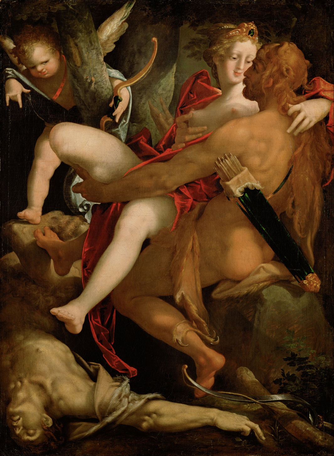
Bartholomeus Spranger (1546–1611), Hercules, Deianeira and the Centaur Nessus (1580-82), oil on canvas, 112 x 82 cm, Kunsthistorisches Museum, Vienna, Austria. Wikimedia Commons.
In about 1580, Bartholomeus Spranger painted one of the few accounts timed after the death of Nessus. Hercules has caught his wife up in his arms, and a winged Cupid looks a little puzzled from the top left, as if wondering how his arrow could have killed the centaur. The sequel story, relying on Nessus’ blood, appears to have been lost in the joy of reunion, leaving the viewer confused as to how this matches the literary narrative.
Paolo Veronese (1528–1588), Hercules, Deianira and the Centaur Nessus (c 1586), oil on canvas, 68.4 × 53.4 cm, Kunsthistorisches Museum, Vienna, Austria. Wikimedia Commons.
Paolo Veronese’s painting from about 1586 elects for a much earlier moment, as Hercules is readying his bow and arrow, with Nessus just reaching the opposite bank. He also shows the scene from Hercules’ position, but discovers the problems with that point of view: Nessus and Deianeira are now small, and Nessus is looking away (and his chest concealed), and even Hercules’ face is turned from the viewer.
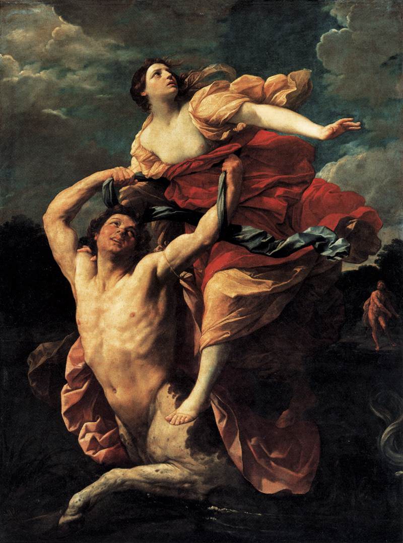
Guido Reni (1575–1642), The Abduction of Deianeira (1617-21), oil on canvas, 239 x 193 cm, Musée du Louvre, Paris. Wikimedia Commons.
Guido Reni’s masterly painting from around 1620, one of the finest of its period in the Louvre, almost fills the canvas with Nessus, who looks worryingly heroic, and Deianeira, who seems to be flying. The small figure of Hercules in the distance is well-lit, but loses the details of bow and arrow. In any case, the arrow could hardly strike Nessus in the chest.
Peter Paul Rubens (1577–1640) (workshop of), The Abduction of Deianeira by the Centaur Nessus (c 1640), media not known, dimensions not known, Niedersächsisches Landesmuseum Hannover, Hanover, Germany. Wikimedia Commons.
This painting is almost certainly not the work of Peter Paul Rubens, but was probably painted in his workshop around the time of Rubens’ death, in 1640. Like Veronese, the artist adopts the point of view from the bank on which Hercules is poised to shoot his arrow into Nessus. By turning the centaur round, to run across the width of the canvas, his face and chest are well exposed, and Hercules’ target is feasible. Even Deianeira appears more comfortable with the force of gravity.
They have added a winged Cupid, to make clear Nessus’ intentions, and Deianeira’s facial expression is marvellously clear in intent. The additional couple, in the right foreground, might be intended to be a river god and naiad, who would be superfluous apart from their role in achieving compositional balance.
Noël Coypel (1628-1707), Hercules and Deianeira (date not known), media and dimensions not known, Musée de Versailles, Versailles, France. Wikimedia Commons.
Noël Coypel’s painting from around 1680 includes more narrative elements than others, but in doing so I fear becomes confusing to read. Nessus has been struck, is bleeding, and holding out some cloth that is slightly blood-stained. An arrow lies on the ground in front of him, but none in his chest. Deianeira is still on his back, although his legs have buckled under him, and he looks distressed. Approaching them with a heavy club in his right hand is Hercules, perhaps coming to finish the centaur off.
To those Coypel adds three winged putti, who seem to be pointing out those clues to the story, and behind them is a river god, and another couple of figures, watching but not apparently part of this story.
Sebastiano Ricci (1659–1734), Hercules Fighting with the Centaur Nessus (1706-7), fresco, dimensions not known, Palazzo Marucelli-Fenzi, Florence. Wikimedia Commons.
In about 1706, Sebastiano Ricci embroidered the story further, showing Hercules, his left hand grasping Nessus’ mouth, about to club the centaur to death, while a slightly bedraggled Deianeira watches in the background. There is no arrow in Nessus’ chest, and Hercules’ quiver is trapped under Nessus’ right foreleg. Three other figures of uncertain roles are at the right, and a winged putto hovers overhead, covering its eyes with its right hand.
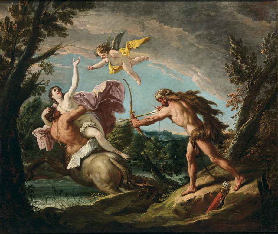
Gaspare Diziani (1689–1767), The Rape of Deianeira (date not known), oil on canvas, 62 x 74 cm, location not known. Wikimedia Commons.
Although Gaspare Diziani returned to the original story in his painting of about 1730, he fell foul of the same compositional problems as in earlier works. Nessus is making off with Deianeira as he is crossing the river. He clutches the woman in his arms, which at least allows us to see her face, and the hand calling for assistance, but his face and chest are almost occluded.
Hercules has to stand so close as to almost be able to touch him, so it is feasible for his arrow, when loosed, to enter the right side of the centaur’s chest, under the armpit. Hercules is looking down at his feet, although drawing back ready to shoot Nessus. Above them an incongruous winged putto forms the apex of a triangle with the other figures. Where will Hercules’ arrow strike?
Louis-Jean-François Lagrenée (1724–1805), The Abduction of Deianeira by the Centaur Nessus (1755), oil on canvas, 157 × 185 cm, Musée du Louvre, Paris. Wikimedia Commons.
In 1755 Louis-Jean-François Lagrenée clearly understood the compositional problem. His solution is unfortunately no better, despite his beautiful painting. Nessus, bearing a distressed Deianeira in his arms, has just reached the opposite bank, in the foreground. Hercules is on the left in the distance, and we can at least see his face, bow and arrow. Unlike Reni, he has not lit Hercules to best effect, and there appears to be no way that Hercules’ arrow could impale Nessus’ chest, without first passing through some of the abundant Deianeira. He also adds a river god, who seems to have been knocked over in Nessus’ haste to make off with his captive.
Gustave Moreau (1826–1898), Enlèvement de Déjanire (Abduction of Deianeira) (c 1860), pen and brown ink wash on pencil on paper, 22.6 × 15.6 cm, Musée National Gustave-Moreau, Paris. Wikimedia Commons.
Gustave Moreau’s final drawing of about 1860, squared up and ready to transfer to canvas for painting, alters the story to make its composition feasible. He puts Nessus in the foreground, with the attendant risk of making him appear the hero, somehow supporting the upstretched body of Deianeira. In the right distance, Hercules has already loosed the fatal arrow, which is prominently embedded not the front of Nessus’ chest, but his back. The centaur’s legs have collapsed under him, and his head and neck are stretched up in the agony of death.
Gustave Moreau (1826–1898), Autumn (Deianeira) (1872), oil on panel, dimensions not known, J. Paul Getty Museum, Los Angeles, CA. Wikimedia Commons.
Moreau’s eventual painting of Nessus and Deianeira, in 1872, was titled Autumn (Deianeira), and quite different from that drawing. Deianeira and Nessus are in very similar postures, although reversed onto the opposite bank of the river, with Nessus still very much alive, and Deianeira apparently in a trance-like state. Hercules may be lurking in the dense wood around them, but for the moment I cannot see him.
Arnold Böcklin (1827–1901), Nessus and Deianira (1898), oil on panel, 104 x 150 cm, Museum Pfalzgalerie Kaiserslautern, Kaiserslautern, Germany.
My last example is also the most puzzling: Arnold Böcklin’s painting from 1898. Nessus is far from part-human, and Deianeira not the beauty that she was claimed to be. As those two wrestle grimly, Hercules has stolen up behind them, and is busy pushing a spear into Nessus’ bulging belly. Blood pours from the wound, but Deianeira seems to be in no position to collect it.
In Greek and Roman mythology centaurs were creatures with the upper body of a human, down to the waist, fused onto the body of a horse, with all its four legs. Although some tales about centaurs suggest otherwise, in general they represented the lower appetites and behaviours of humans, and were more like wild horses than people. They were known for their fights with Lapiths, an Aeolian tribe, against whom they wielded rocks and limbs of trees. Centaurs persisted in legends and stories well into the Middle Ages, and are the subject of this weekend’s two articles about paintings.
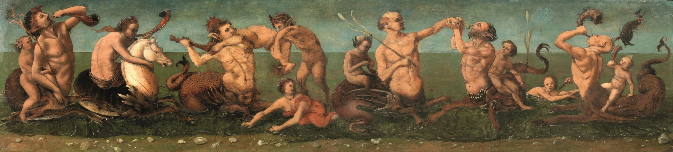
Piero di Cosimo (1462–1522), Tritons and Nereids, with Satyrs and Centaurs (c 1500-05), oil on panel, 37 x 158 cm, Private collection. Wikimedia Commons.
Piero di Cosimo’s assembly of Tritons and Nereids, with Satyrs and Centaurs painted in about 1500-05 shows an odd range of centaur-like creatures, and is believed to have been commissioned for the Palazzo Vespucci.
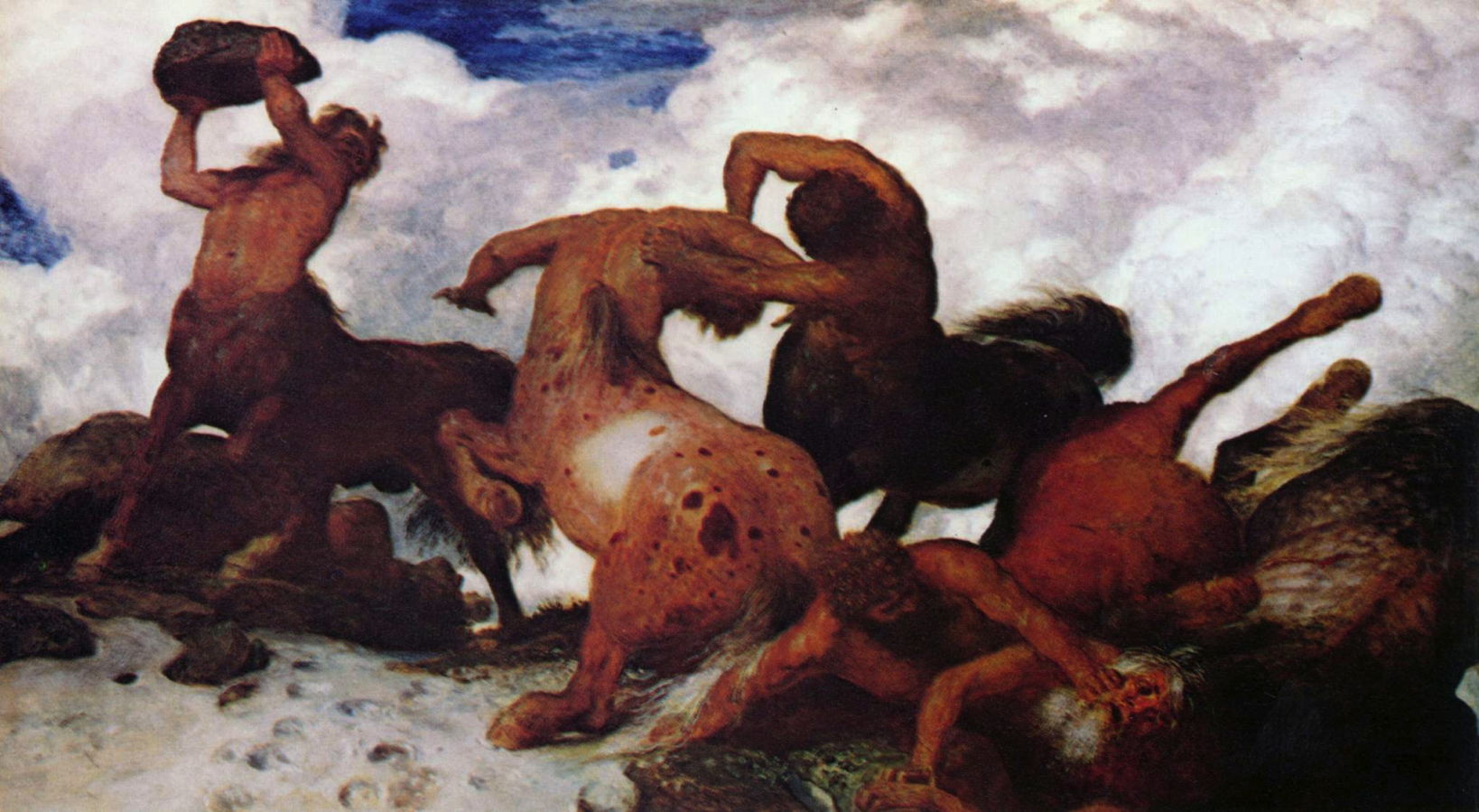
Arnold Böcklin (1827–1901), Fight of the Centaurs (1873), oil on canvas, 105 × 195 cm, Kunstmuseum Basel, Switzerland. Wikimedia Commons.
Those in Böcklin’s Fight of the Centaurs (1873) are behaving more in character, in hand-to-hand combat, and by wielding rocks.
But Eugène Delacroix had better to report.
Eugène Delacroix (1798–1863), Poetry: The Education of Achilles (1838-1847), oil on canvas, 221 x 292 cm, Bibliothèque de l’Assemblée nationale, Palais Bourbon, Paris. Wikimedia Commons.
In the Poetry cupola of the Library of the National Assembly in Paris, Delacroix painted The Education of Achilles. This shows the myth of the young Achilles with a bow and arrow, riding on the back of his tutor Chiron the centaur, on the steep slopes of Mount Pelion. This was to become one of Delacroix’s favourite motifs.
Eugène Delacroix (1798–1863), The Education of Achilles (c 1862), pastel on paper, 30.6 x 41.9 cm, Getty Center, Los Angeles, CA. Wikimedia Commons.
His last known pastel painting, and one of his finest, is The Education of Achilles, painted in about 1862, showing the same scene of the ‘wisest and justest of all the centaurs’ Chiron teaching Achilles to hunt. The artist gave this to his longstanding friend Aurore Dudevant, better known under her pen name of George Sand.
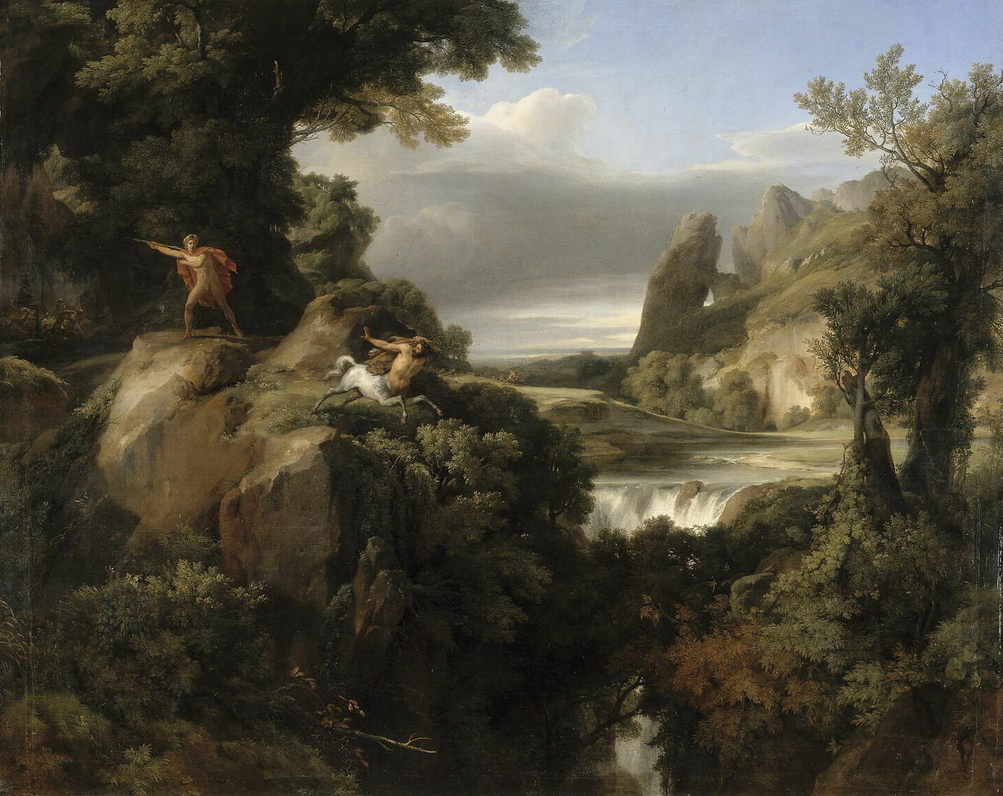
Achille Etna Michallon (1796–1822), Landscape: Theseus Pursuing the Centaurs (1821), oil on canvas, 218 x 273 cm, Musée du Louvre, Paris. Wikimedia Commons.
Following the tradition of Nicolas Poussin, Achille Etna Michallon (a namesake of Achilles) set mythological figures in some of his finished landscape paintings. His Landscape: Theseus Pursuing the Centaurs from 1821 shows the Greek hero about to throw his spear at a galloping centaur.
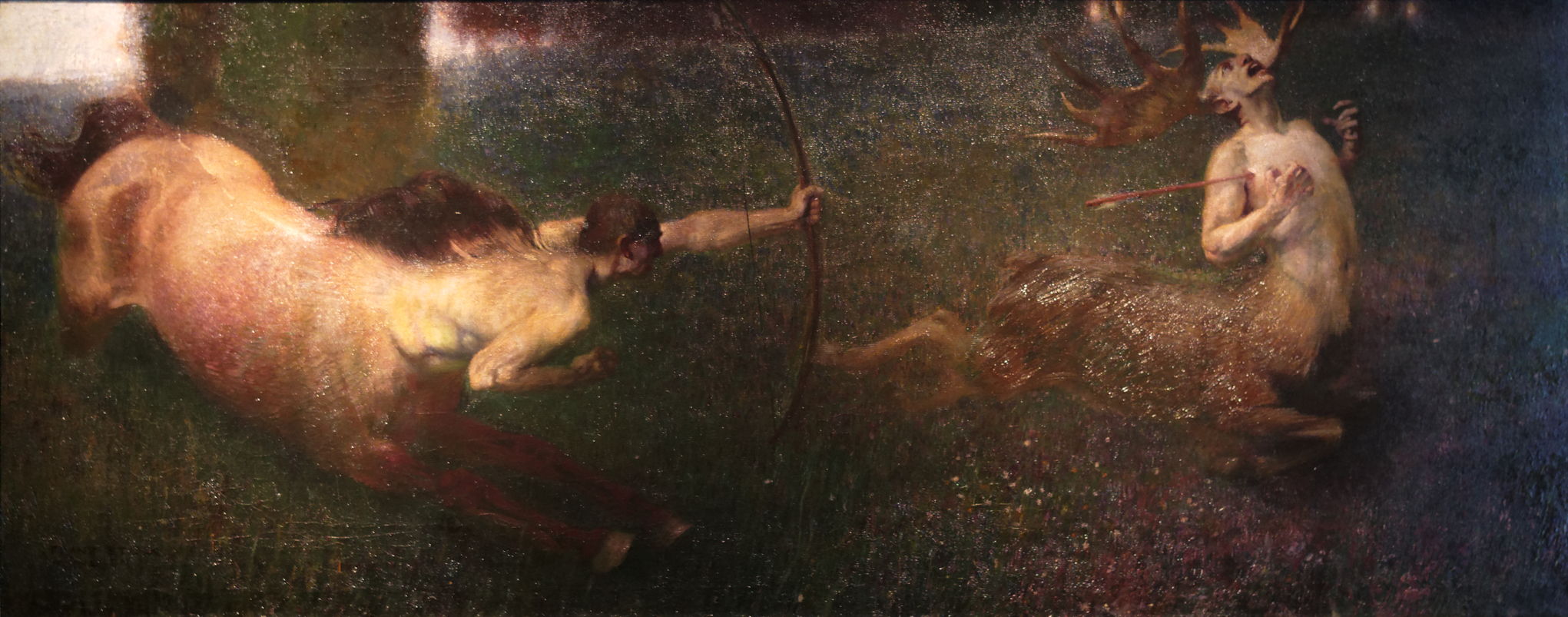
Franz von Stuck (1863–1928), Fantastic Hunt (1890), oil on canvas, dimensions not known, Museum Villa Stuck, Munich, Germany. Image by Yelkrokoyade, via Wikimedia Commons.
Franz von Stuck added centaurs to his repertoire of mythical beasts in his Fantastic Hunt (1890). Here an archer centaur has buried his arrow into the right axilla of a deer-like variant, perhaps resembling Actaeon after Diana’s vicious metamorphosis. The deer-centaur’s legs have already buckled under him, and his hands claw at the air in his agony.
There are two major myths involving centaurs that have been painted extensively, both picturing them at their worst, at a wedding feast that turned into a pitched battle, and the attempted abduction of the wife of Hercules.
The account of the former is given by Nestor in Ovid’s Metamorphoses, and is one of a pair of primaeval battles said to have established world order: that between the Titans and the Gods ended the heavenly Titanomachy, and that between the Lapiths and Centaurs ended the earthly Centauromachy.
When Pirithous married Hippodame, the couple invited centaurs to the feast. Unfortunately, passions of the centaur Eurytus became inflamed by drink and lust for the bride, and he carried Hippodame off by her hair. The other centaurs followed suit by each seizing a woman of their choice, turning the wedding feast into utter chaos, more like a city being sacked.
Theseus castigated Eurytus and rescued the bride, so the centaur attacked him. Theseus responded by throwing a huge wine krater at Eurytus, killing him. The centaurs then started throwing goblets and crockery, and the battle escalated from there. Nestor details a succession of grisly accounts of Lapiths and Centaurs killed. Gryneus the centaur ripped up the altar and crushed two Lapiths with its weight, only to have his eyeballs gouged out by a Lapith using the prongs of some antlers. Not content with using the objects around them as weapons, they started using their own lances and swords.
When the centaur Petraeus was trying to uproot a whole oak tree, the groom Pirithous pinned the centaur to the tree-trunk with his lance. Nestor also tells of the success of Caeneus, formerly Caenis, in killing five centaurs. The centaur Latreus taunted Caeneus, so the latter wounded the centaur with his spear. Latreus thrust his lance in Caeneus’ face, but was unable to hurt him, so he tried with his sword, which broke against the invulnerable Caeneus, leaving him to finish the centaur off with thrusts of his own sword.
The centaurs then united to try to overwhelm Caeneus by crushing him under their combined weight. Just as they thought they had succeeded, Caeneus was transformed into a bird and flew out from underneath them. With that the survivors dispersed, the Lapiths having won the day.
Piero di Cosimo (1462–1522), The Fight between Lapiths and Centaurs (1500-15), oil on wood, 71 x 260 cm, The National Gallery, London. Wikimedia Commons.
Piero di Cosimo’s The Fight between Lapiths and Centaurs (1500-15) is my favourite among the earlier paintings, and remains one of its best-structured and complete accounts. In the centre foreground, Hylonome embraces and kisses the dying Cyllarus, a huge arrow-like spear resting underneath them. Immediately behind them, on large carpets laid out for the wedding feast, centaurs are still abducting women. All around are scenes of pitched and bloody battles, with eyes being gouged out, Lapiths and Centaurs wielding clubs and other weapons at one another.
Peter Paul Rubens (1577–1640), The Rape of Hippodame (sketch) (c 1637-38), oil on panel, 26 × 40 cm, Koninklijke Musea voor Schone Kunsten van België / Musées Royaux des Beaux Arts de Belgique, Brussels, Belgium. Wikimedia Commons.
Towards the end of his life, Peter Paul Rubens painted this brilliant oil sketch of The Rape of Hippodame (c 1637-38). At the right, Eurytus is trying to carry off the bride, with Theseus just about to rescue her from the centaur’s back. At the left, Lapiths are attacking with their weapons, and behind them another centaur is trying to abduct a woman.
Peter Paul Rubens (1577–1640), The Rape of Hippodame (Lapiths and Centaurs) (1636-38), oil on canvas, 182 × 290 cm, Museo Nacional del Prado, Madrid, Spain. Wikimedia Commons.
That became the finished painting, The Rape of Hippodame (Lapiths and Centaurs) (1636-38), which remains faithful to Rubens’ sketch and its composition. Facial expressions, particularly that of the Lapith at the left bearing a sword, are particularly powerful.
Luca Giordano (1632–1705), Battle of Lapiths and Centaurs (1688), oil on canvas, 255 x 390 cm, State Hermitage Museum, Saint Petersburg, Russia. Image by Wayne77, via Wikimedia Commons.
Luca Giordano’s later painting of the Battle of Lapiths and Centaurs from 1688 lacks the narrative structure of Piero di Cosimo’s, and covers later action than Rubens’. As a result, its story has become a little lost in the mêlée of battle.
Sebastiano Ricci (1659–1734), The Battle of the Lapiths and Centaurs (c 1705), oil on canvas, 138.4 × 176.8 cm, The High Museum of Art, Atlanta, GA. Wikimedia Commons.
Sebastiano Ricci’s The Battle of the Lapiths and Centaurs from about 1705 has similar problems, although it does use multiplex narrative to help. In the left background, Hippodame is seen being carried away by Eurytus, and to the right there are further scenes of abduction.
Francesco Solimena (1657–1747), Battle between Lapiths and Centaurs (1735-40), oil on canvas, 104 x 130 cm, Private collection. Wikimedia Commons.
Francesco Solimena’s Battle between Lapiths and Centaurs (1735-40) puts multiple abductions in the foreground, with pitched battles taking place behind.
Tomorrow I’ll look at paintings of the fight between Nessus and Hercules, and how Nessus got his revenge.