On Reflection: Impressionism
The original intent of the French Impressionists was to paint quickly in front of the motif so as to capture its impression. Although many Impressionist depictions of reflections aren’t optically faithful, in practice there’s nothing to prevent them from that. This was amply demonstrated by the grandfather of Impressionism, Camille Corot, during his formative years spent developing his skills in Rome.

Corot’s earliest plein air works are truly prodigious in their quality, and his development of the art. By the time that the Impressionists were painting outdoors, after 1841, oil paint was widely available in far more convenient metal tubes. But when Corot was in Italy he enjoyed no such luxuries: paint came in small bladders that were far less portable and messier to work with. Despite that, his view of The Island and Bridge of San Bartolomeo from 1825/8 appears optically accurate.

Corot’s View of Rome: The Bridge and Castel Sant’Angelo with the Cupola of St. Peter’s from 1826-7 is another brilliant example painted on paper in front of the motif.
Claude Monet’s reflections are generally shown on broken water, and appear intended to be optically correct.

Monet painted The Thames below Westminster while he was in London in 1871, and returned over thirty years later to paint more radical series of views in different lighting conditions.

The following year, he painted this view of his home port of Le Havre, which gave rise to the movement’s name, Impression, Sunrise. This appears to be a brisk oil sketch of fog and the rising sun, and is one of his series depicting the port at different times and in varying lights, exhibited in the First Impressionist Exhibition two years later.

The same year, Alfred Sisley’s view of The Canal Saint-Martin, Paris shows a placid and almost disused stretch of canal near the centre of Paris. This too appears to be optically correct.

In 1873, Monet painted his masterwork Autumn on the Seine, Argenteuil, a textbook example of a river landscape in autumn painted in high Impressionist style, with high chroma, loose brushstrokes and faithful reflections.

Although Monet’s View of the Church at Vernon from 1883 doesn’t appear entirely optically accurate, its intent is clear. The reflection of the large house at the right is extended a little too far to the right, as if there had been a tall tree beside it on the bank, where the original image shows another lower house set further back.
Some of Monet’s later series relied on reflections for their visual effects, although they also take more optical liberties.
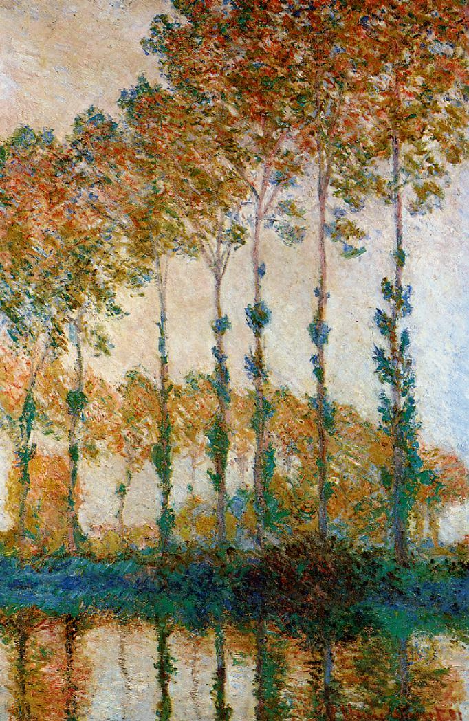
In 1891, Monet painted his first formal series showing poplars, including Poplars on the Bank of the Epte, Autumn. These articulate the contrasts in form within each tree, with sections of bare trunk, and those of extensive canopy, the colours cast by light and those of the leaves themselves, the rhythmic assembly of the line of trees, their reflections on the water, and the formation of the line of poplars into sweeping curves in depth.

The broken water surface in Sisley’s Bend on the Loing at Moret from 1886 remains surprisingly faithful.

In Moret Bridge in the Sunlight from 1892, Sisley captures the reflections of the buildings dominating the centre of this small town on the River Loing.

Claude Monet’s return to London in 1903 revisits The Houses of Parliament, Sunset fairly faithfully.
![]()