On Reflection: Extending the image
Jan van Eyck’s famous double-portrait of the Arnolfini Wedding (1434) introduced mirror-play, but didn’t quite demonstrate its use to extend the scene depicted because of the small size of its reflected image. Surprisingly it appears that four centuries were to pass before reflections became more widely adopted for this purpose, although I’m sure they had already been used for it in interior decoration.
One of the earliest of my examples refers back to the Arnolfini Wedding in its use of a circular and non-planar mirror.

The dates and background to Ford Madox Brown’s unfinished painting Take your Son, Sir! remain unclear. It’s thought that Brown started work on this in 1851, although it shows his second wife Emma with their newborn son. Their first son, Oliver, wasn’t born until 1855, and their second, Arthur, in September 1856, suggesting that he didn’t start this until at least 1855. It’s generally held that this shows not Oliver, who lived until 1874, but Arthur, who died aged ten months in July 1857, at which time Brown abandoned the painting. The detail seen reflected in the mirror is of a contemporary living room and a man, presumably a self-portrait.

A few years before that, William Holman Hunt’s The Awakening Conscience, painted over the period 1851-53, employs the reflection seen in a much larger mirror to add substantial detail to its unresolved narrative. This places the scene in a small if not cramped house in the leafy suburbs of London, in reality Saint John’s Wood, where this couple are clearly in an extra-marital relationship.
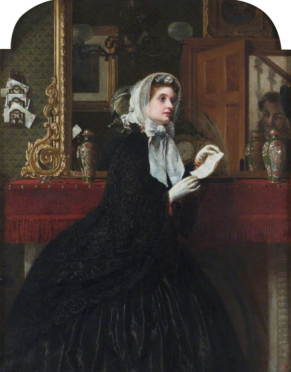
Rebecca Solomon’s Appointment (1861) is another early problem picture, with a deliberately open-ended narrative set in an interior. A beautiful woman stands in front of a mirror, and looks intently at a man, who is only seen in his reflection in the mirror, and stands in a doorway behind the viewer’s right shoulder. The woman is dressed to go out, and is holding a letter in her gloved hands.

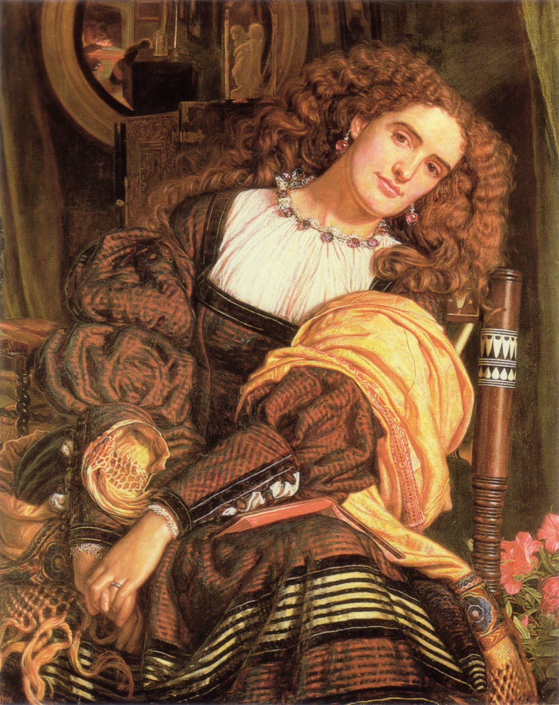
In 1872 Alfred Stevens’ The Japanese Parisian filled its canvas with the reflection of the face of his model framed by floating flowers, which must be behind the viewer.
Soon after William Holman Hunt had completed his Awakening Conscience above, he started work on another painting using a smaller circular mirror to extend the scene and its reading, Dolce Far Niente, which may have been started as early as 1859 but wasn’t completed until 1875. The reflection in the mirror above the woman’s head shows this to be a domestic scene, with another figure leaning over a large wooden bureau or a dressing-table, perhaps.
So far, these examples have all appeared to conform to optical principles. It was Édouard Manet who challenged those.

His Bar at the Folies-Bergère from 1882 poses the problem of resolving the optically impossible, no matter how you try to read it. This forlorn young woman is serving at the bar in front of her, with what is presumed to be a large mirror behind showing a reflection that doesn’t match its original. Arranged on the bar are assorted bottles of beers and spirits, that on the far left bearing the artist’s signature. According to the reflection, the audience at the Folies-Bergère are watching the show under the light of a huge chandelier.

John William Waterhouse’s Circe Offering the Cup to Odysseus from 1891 develops the circular mirror of the Arnolfini Wedding into a key narrative device. Circe sits on her throne, holding up a krater for Ulysses to drink, with her wand in the other hand. The viewer is Ulysses, seen preparing to draw his sword in the large mirror behind the sorceress. On the left side of the mirror is his ship.
In the closing years of his career, Waterhouse returned with an even larger mirror at the centre of his story.

His “I am Half Sick of Shadows” said the Lady of Shalott (1915) is the third and last of his paintings based on the poem The Lady of Shalott by Alfred Lord Tennyson (1809–1892), published in 1833 and 1842. This recounts part of the Arthurian legends, the tragedy of Elaine of Astolat, as retold in an Italian novella from the 1200s from which it draws its title.
The Lady of Shalott lives in a castle connected to Camelot by a river. She’s subject to a mysterious curse confining her to weaving images on her loom, and mustn’t look directly at the outside world, although she can view it using a mirror. Tennyson calls these reflected images ‘shadows of the world’, and this painting depicts the stanza from the poem:
But in her web she still delights
To weave the mirror’s magic sights,
For often thro’ the silent nights
A funeral, with plumes and lights,
And music, went to Camelot:
Or when the moon was overhead,
Came two young lovers lately wed;
‘I am half sick of shadows,’ said
The Lady of Shalott.
The circular image behind her isn’t a window, but a mirror revealing Camelot with its winding river. Although this includes her loom, the castle can’t be real, but one of “the mirror’s magic sights”.
My last example, painted just before the Second World War by Paul Nash, extends this deeper into the unconscious.
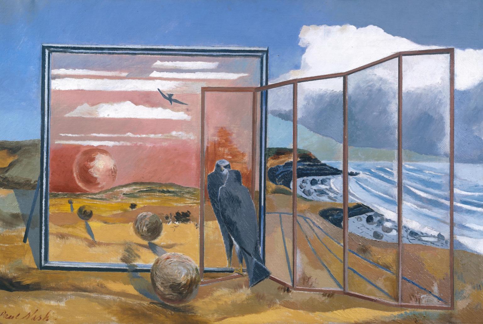
Landscape from a Dream (1936-38) was inspired by Freud’s theories of the significance of dreams as reflections of the unconscious. Nash locates this collection of incongruous objects on the Dorset coast, a landscape he associated with the praeternatural. Dominating the scene is a large framed planar mirror, almost parallel with the picture plane.
Stood at the right end of the mirror is a hawk staring at its own reflection, which Nash explained is a symbol of the material world. To the left, the mirror reflects several floating spheres, referring to the soul. The reflection shows that behind the viewer is a red sun setting in a red sky, with another hawk flying high, away from the scene. To the right of the hawk is a five-panelled screen made of glass, through which the coastal landscape can be seen: it’s a screen which doesn’t screen.
![]()