Paintings of Lake Geneva: Turner to Courbet
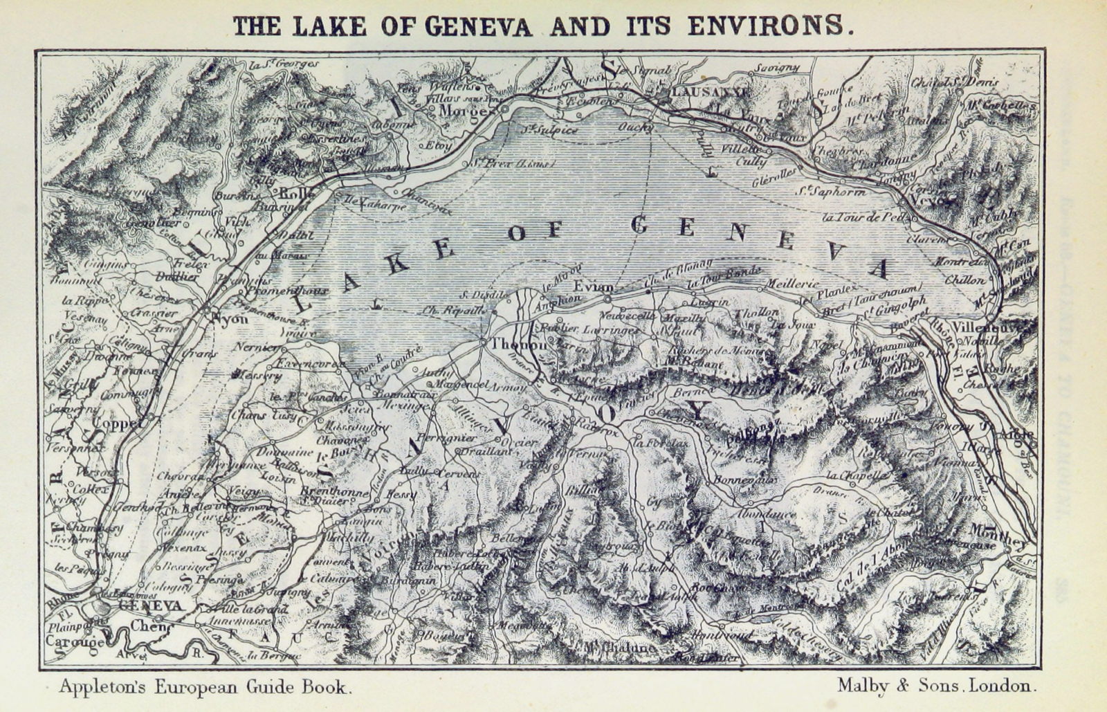
This weekend we’re off to visit Lake Geneva, also known by its French name of Lac Léman, the largest in Switzerland. It’s located in the far south-west of the country, where it forms much of its border with France. It makes a broad arc running north-east from the capital city of Geneva, with some of the highest peaks of the Alps to its south.
Today I start with a selection of paintings almost exclusively from the nineteenth century, when Switzerland was on the itinerary of the Grand Tour undertaken by aspiring young men of the upper class in both Europe and the Americas.
The city of Geneva has long attracted artists, and it was here the eccentric pastellist Jean-Étienne Liotard was born and later kept his studio, and where he eventually retired. His View of the Mont Blanc Massif from the Artist’s Studio from 1765-70 reveals only a little of the southern extreme of the lake, with a cameo self-portrait.

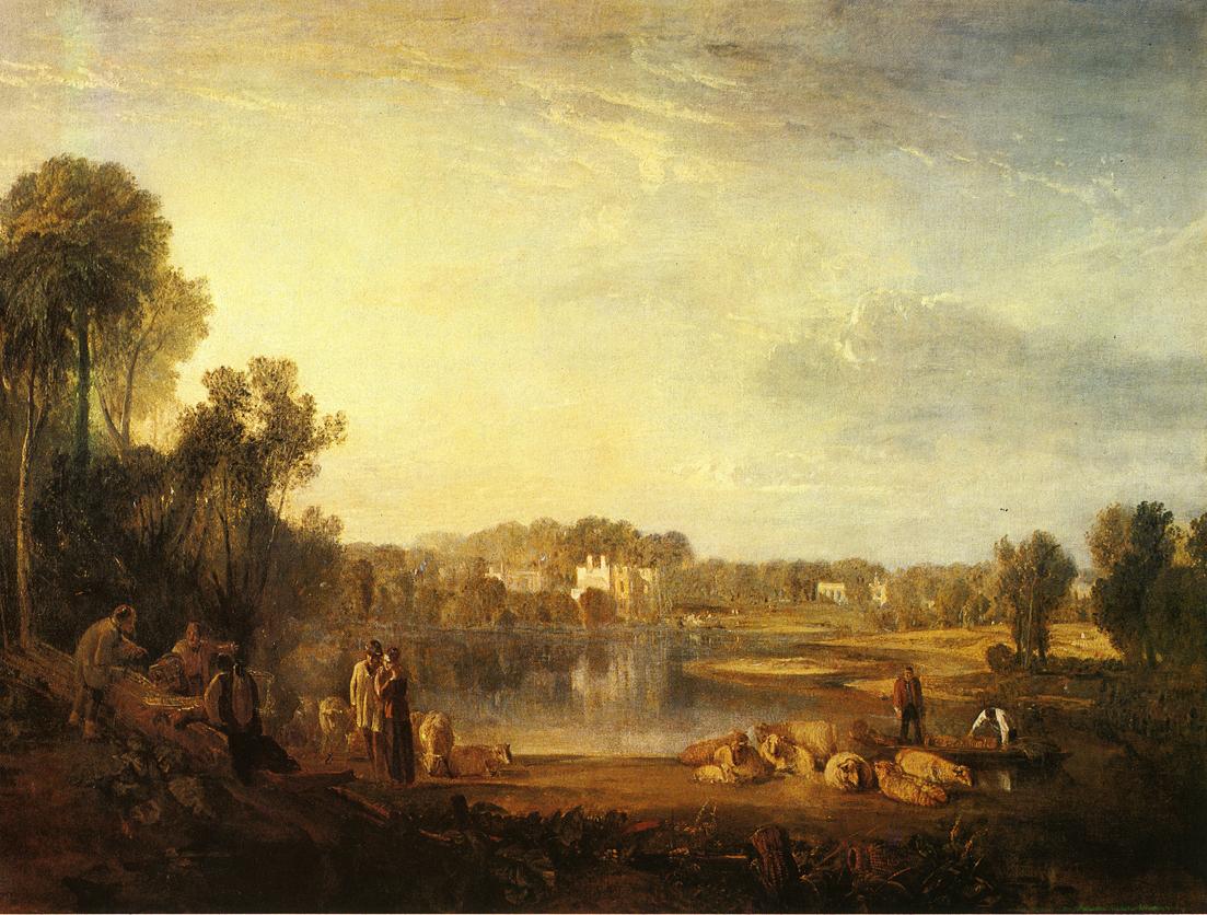
JMW Turner was by no means the first to paint the lake, but his watercolour of Lake Geneva and Mount Blanc from 1802-05 is one of its earliest depictions by a major artist. This view looks south-east over the city of Geneva towards the Mont Blanc massif in the far distance.

Alexandre Calame’s View of Bouveret from 1833 shows a grey heron fishing on the shore at the southern end of the lake, close to the border with France.

While Turner had toured the Alps once travel from England had become possible again in the early nineteenth century, Calame pioneered the painting of views like this of the lake, completed in his studio in 1849. It includes some of the distinctive sailing boats of the Swiss lakes, and a small bird in the shallows, but not a heron here.

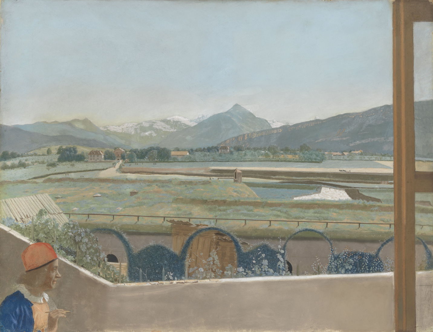
In the middle of the nineteenth century, several major American artists visited Switzerland to develop their skills painting mountain views. Despite its finish, John Ferguson Weir’s Lake Leman (Lake Geneva), Switzerland may have been painted in front of the motif, on 11 June 1869.
Following Gustave Courbet’s release from prison for his involvement in the Paris Commune and destruction of the Vendôme Column in 1871, he was forced to flee to the safety of Switzerland, where he lived his remaining years there, unable to return to France.

Courbet painted some of the finest landscapes of his career during his exile in Switzerland, like this Sunset over Lac Léman from 1874, the year of the First Impressionist Exhibition in Paris.

He became particularly obsessed with the island château at the extreme eastern end of Lake Geneva, Chillon Castle, here in 1875. This picturesque château dates back to a Roman outpost, and for much of its recorded history from about 1050 has controlled the road from Burgundy to the Great Saint Bernard Pass, a point of strategic significance. It has since been extensively restored, and is now one of the most visited mediaeval castles in Europe.

Chillon Castle from 1874-77 is another of the views he painted of the castle on the lake.

Sunset on Lake Geneva from about 1876 is reminiscent of Courbet’s earlier seascapes with breaking waves, but now the water is calm once more.
In May 1877, the French government informed Courbet that the cost of rebuilding the Vendôme Column would be over 300,000 Francs, which he could pay in instalments of 10,000 Francs each year, starting on 1 January 1878. Courbet died in Switzerland the day before, on 31 December 1877, at the age of only 58.
![]()