Reading Visual Art: 246 Apron
Aprons are protective garments normally worn over the front of the body and upper legs, where they’re intended to prevent other clothes from soiling, and sometimes the wearer underneath. Although frequently seen in paintings, their absence must be interpreted with caution: most figurative paintings are made in the studio, where the only folk likely to be wearing aprons are the artist and their assistants. The wear of aprons is also markedly gendered; although in real life many men wear them at work, those most likely to be depicted with them are overwhelmingly women.
Aprons have been strongly associated with those in domestic service, and appear in folk tales such as Cinderella.

Edward Burne-Jones’ Cinderella from 1863 shows her reverted to her plain clothes after the ball, but still wearing one glass slipper on her left foot. She is seen in a scullery with a dull, patched and grubby working dress and apron.

Intimate Conversation from about 1892 shows a young couple talking idly outdoors in the sun. Évariste Carpentier puts a prominent tear in the young woman’s apron to emphasise their poverty.
Probably the most famous painted apron is that worn by Johannes Vermeer’s Milkmaid in about 1658-59.

This woman, seen in three-quarter view, wears working dress: a stiff, white linen cap, a yellow jacket laced at the front, a brilliant ultramarine blue apron, with a dull red skirt underneath. Her work sleeves are pushed up to lay both her weathered forearms bare to the elbow. Her strong-featured face and eyes are cast down, watching the milk as it runs into the pot.

Jean-Baptiste Greuze’s Laundress (1761) is in the dilapidated servants’ area, probably in a cellar, where this flirtaceous young maid is washing the household linen, with her coarse white apron rolled up to enable her to lean forward and down.
Aprons were also common in women working outdoors, such as gleaners.

Those in Jules Breton’s Calling in the Gleaners (also known as The Recall of the Gleaners, Artois) (1859) are using theirs to carry their gleanings. Most are frayed and tatty, faded blue in colour.

They’re being worn by the two women in Jules Bastien-Lepage’s October: Potato Gatherers from 1878.

Some aprons could have more than one purpose, and may need more careful reading. Hans Andersen Brendekilde’s Cowed from 1887 shows gleaners at work in a field after the harvest. The family group in the foreground consists of three generations: mother is still bent over, hard at work gleaning her handful of corn. Her husband is taking a short break, sitting on the sack in his large blue wooden clogs. Stood looking at him is their daughter, engaged in a serious conversation with her father, as her young child plays on the ground. The daughter is finely dressed under her apron, and wears a hat more appropriate to someone in domestic service in a rich household in the nearby town.
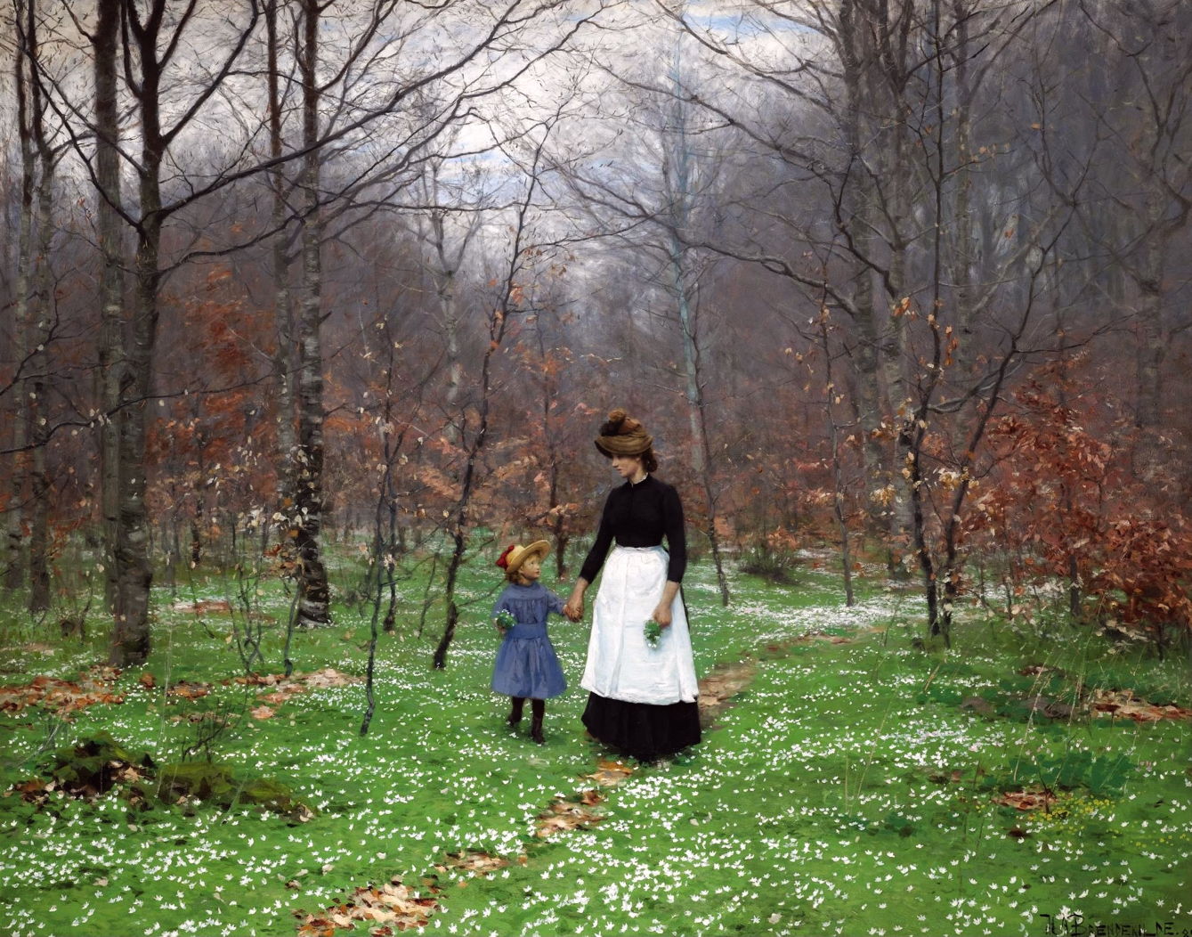
Another painting of Brendekilde’s from this period, his Springtime; The First Anemones from 1889, shows a young woman walking with a small girl in a wood in the early Spring. The woman is unlikely to be the girl’s mother. Instead, she wears the black dress and white apron of a woman ‘in service’, in this case probably as the little girl’s maid or nanny.

Camille Pissarro’s famous depiction of Apple Picking, Éragny, from 1887-88 shows a typical country scene, with three women wearing aprons, but the man still in a waistcoat and trousers.

A Kitchen is one of Maximilien Luce’s early Divisionist paintings, dating from 1888-89. It’s an unusual motif, showing domestic servants at work in the kitchen of a large bourgeois house, both of them wearing long white aprons. Kitchens have become one place where men are also expected to wear aprons.

Jehan Georges Vibert’s meticulously realist painting of The Marvelous Sauce from about 1890 shows its rotund hero wearing an apron and tasting a sauce with his chef in a palatial kitchen.
As they were painted at work during the late nineteenth century, it became clear how many men had been wearing aprons: blacksmiths, butchers, shoemakers, coopers and many other trades.

Maximilien Luce made many paintings of people at work, as his style moved on from Neo-Impressionism to Post-Impressionism during the 1890s. His Charleroi Foundry, Casting (1896) shows this well, and is one of a long series he painted showing those working in heavy industry in this city in the mining area of Belgium. Several of these metalworkers are wearing heavy leather aprons to protect their bodies from burns and injury.
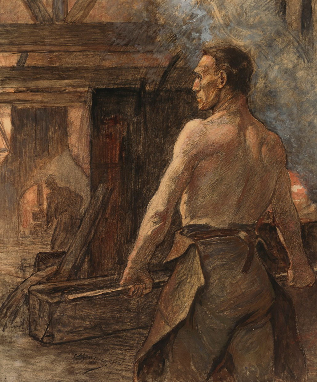
One of Constantin Meunier’s later paintings, Foundry from 1902, shows a worker stripped to the waist to cope with the heat, while wearing a protective leather apron.

In The Artist’s Model (1895), Jean-Léon Gérôme shows himself at work on a marble figure, and wearing a faded blue apron.
![]()