A green weekend: Viridian
The element chromium gains its name from the rich colours seen in many of its salts and compounds. One of them, chromium oxide, was discovered in about 1798 by Louis-Nicolas Vauquelin, who immediately recognised its future use as a pigment, because of its “fine emerald colour”. But painters were still enamoured with more toxic greens, and straight chromium oxide doesn’t look particularly brilliant, being a rather dull yellow-green. Its introduction into paintings probably didn’t start until around 1840, when landscape painting outdoors was becoming all the rage.

Some of the earliest paintings known to use chromium oxide are those of Moritz von Schwind, of which the first example that I can show is his Mermaids Watering a Stag from about 1846. He seems to have used the pigment quite extensively here in foliage, although probably in combination with other pigments.

Von Schwind’s King Krokus and the Wood Nymph from about 1855 is a clearer image, where he probably used chromium oxide in combination for most of his greens.
As these works were being painted, an improved version of chromium oxide was being developed: hydrated chromium oxide, which became known as viridian during the 1860s. This first became available at a reasonable price after Guignet started to make it in quantity in 1859, so has also been known as Guignet’s green. It’s sometimes termed émeraude or emerald, which only serves to confuse viridian with copper acetoarsenate, more widely known as emerald green.
Viridian came into use during the 1860s, and has proved far more popular than chromium oxide. Both pigments are reliably lightfast, opaque, and have good covering power, but viridian is the more intense, and doesn’t appear dull like plain chromium oxide.

Anselm Feuerbach’s painting of Paolo and Francesca from 1864 is one of the earlier works found to contain viridian among its many rich greens.

The best example showing off the colour of viridian is perhaps Édouard Manet’s The Balcony (1868-69), where he appears to have used the pigment throughout the blinds and railings, most probably mixed with lead white, and unmixed for the woman’s parasol.
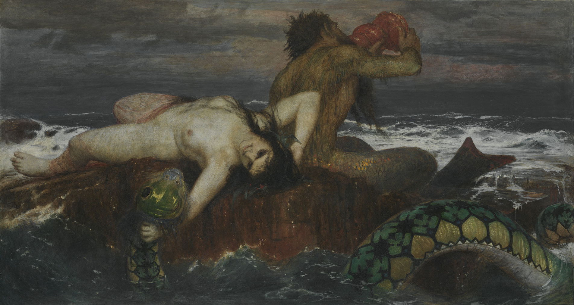
Arnold Böcklin’s Triton and Nereid from 1874 is unusual in several respects. It’s reported as being painted in tempera rather than oils, but its deep lustrous greens were developed using a base of predominantly viridian, over which Böcklin applied a copper resinate glaze.
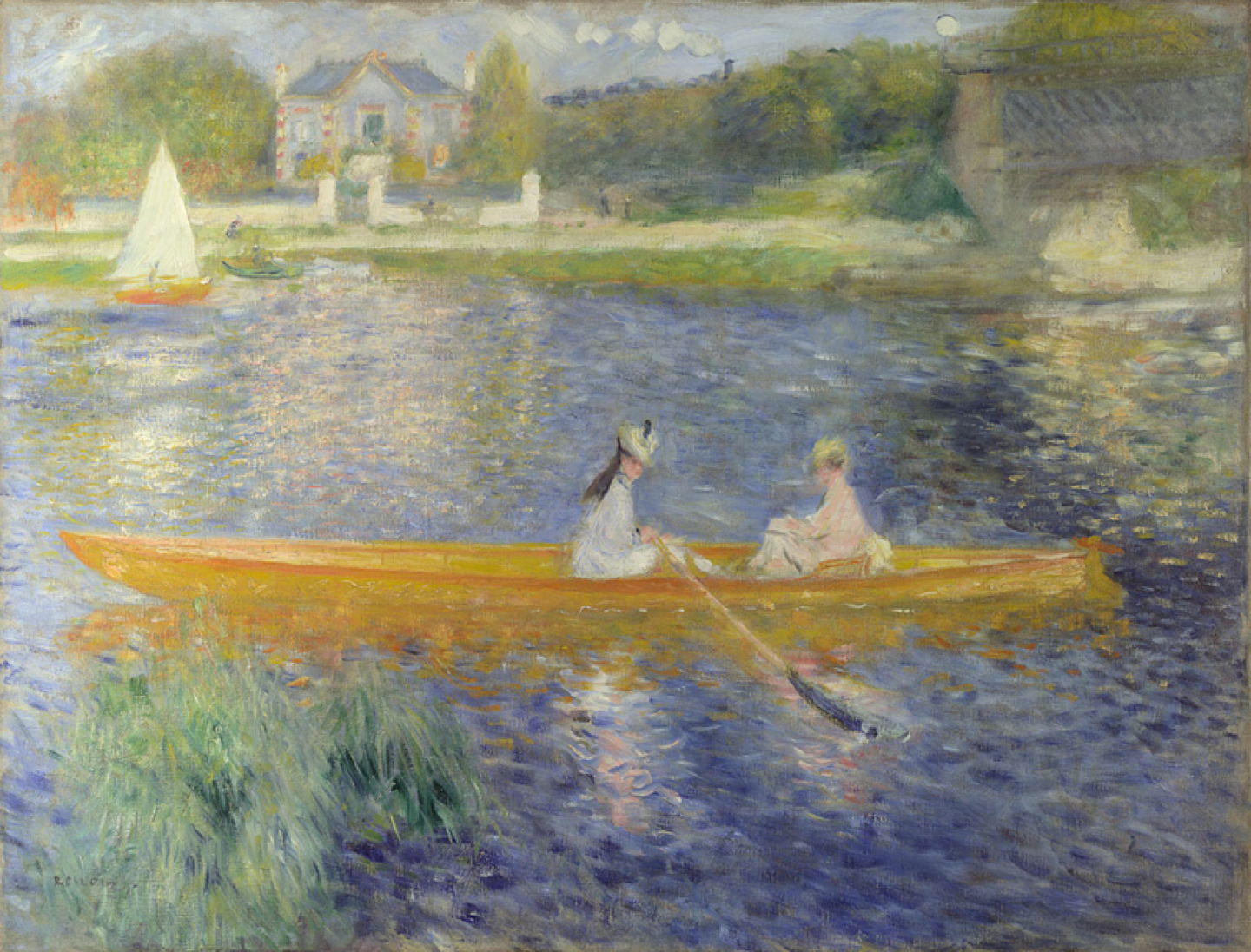
Pierre-Auguste Renoir’s La Yole (The Skiff) of 1875 uses viridian as the main colour for the reeds in the left foreground.

Analysis of Claude Monet’s series of paintings of the Gare Saint-Lazare in 1877 has revealed extensive use of viridian in mixtures, including the green shadows in the roof. In Arrival of the Normandy Train, Gare Saint-Lazare (1877), the pigment is apparent (and confirmed) throughout the green foreground of the platform, an optical effect resulting from light passing through the glass roof of the station.
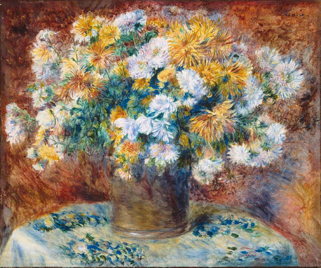
Renoir used viridian together with malachite green and other pigments for the greens in his Chrysanthemums (1881-82).

If you care to spend some time examining the myriads of tiny dots in Georges Seurat’s monumental Divisionist painting of A Sunday Afternoon on the Island of La Grande Jatte (1884-86), I’m assured that you’ll find many of those forming its vegetation contain viridian.
Viridian remained popular among the post-Impressionists, from whom I have two well-known paintings as examples.

Vincent van Gogh included viridian in the pigments used in the range of greens in his A Wheatfield, with Cypresses (1889), which is more unusual for his use of ultramarine blue mixed to form green.
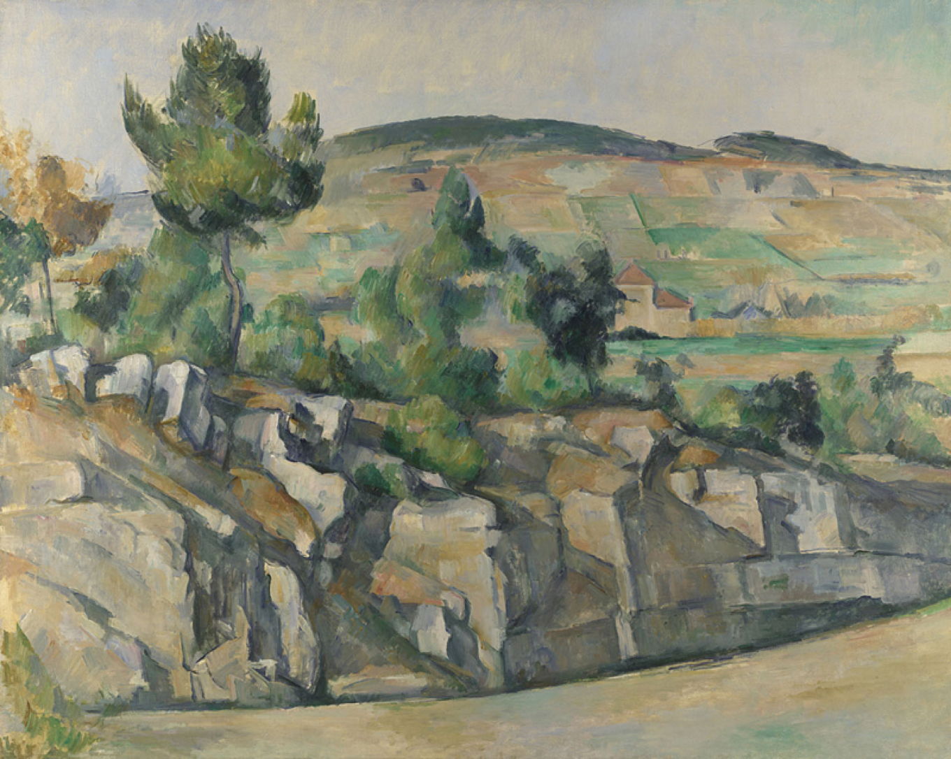
Paul Cézanne is known to have had a strong preference for viridian as one of the key colours in his palette. However, in his Hillside in Provence (1890-92), it is emerald green that is the more prominent, and the major part of the painting’s more brilliant greens, even into its pale turquoise sky. Some green passages, such as the patch of yellow-green grass at the edge of the path in the foreground, at the right edge of the canvas, have been built with a base of lead white and viridian, over which he has applied a yellow lake glaze.
Chromium oxide and viridian remain widely available today; although the former is not popular or widely used, viridian remains a mainstay green widely recommended for its colour and other properties. Being virtually insoluble, chromium oxide and viridian pose minimal risks of toxicity to the artist. However, there is growing concern over their environmental effects, and great care is needed when handling waste paint containing either pigment.
Reference
Richard Newman (1997) Artists’ Pigments, vol 3, ed Elisabeth West FitzHugh, Archetype. ISBN 978 1 904982 76 0.
![]()