On Reflection: Mirror play
These days, mirror play is something you do with babies and infants, but over the last six centuries or so it has also been a feature of many paintings. It all started in the Northern Renaissance, when leading Flemish painters including the van Eycks became fascinated in depicting optical phenomena including reflections in mirrors.
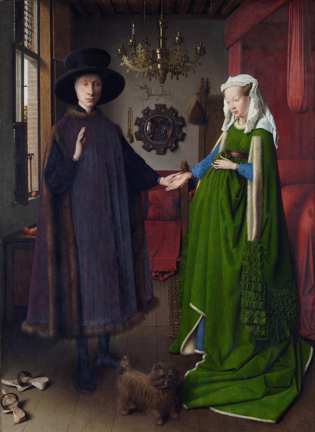
Jan van Eyck’s most famous painting, known as The Arnolfini Wedding (or similar variations), is a remarkable exploration of optics, featuring distorted reflections in the mirror near the centre of the painting, completed in 1434. Between this newly-wed couple holding hands next to their marital bed, in the midline of the painting, is a prominent circular convex mirror. Its reflection shows a view of the room looking in the opposite direction, past the couple to another two figures, who could be the artist and another, as shown in the detail below.

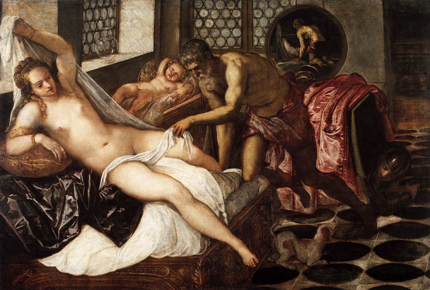
Just over a century later, in about 1545, in Venice, Tintoretto painted Venus and Mars Surprised by Vulcan. In this unusual interpretation, Vulcan is inspecting his wife, as Mars cowers under the bed at the right. A small dog is drawing attention to Mars’ hiding place, and Venus’ child, Cupid, rests in a cradle behind them. The circular mirror behind the bed reflects an image of Vulcan leaning over Venus, seen in the detail below.

For the pioneering still life painter Clara Peeters in the early years of the seventeenth century, reflections showed her self-portrait.

In her still life with Flowers and Gold Cups of Honour (1612) reflections in the gold cup at the right show her in the act of painting, as seen more clearly in the detail below.

In the middle of that century Diego Velázquez reversed the play in using a reflection to show the subjects of his painting, alongside his self-portrait.

Velázquez’ Las Meninas, translated as The Maids of Honour, from about 1656-57 is a well-known example of a group portrait with mirror play. In what is overtly a depiction of eleven people and a dog in a room in the Alcázar Palace, he uses composition and gaze to tell us more. Much depends on what we believe most of the figures are looking at. Reflected in the rectangular plane mirror on the far wall are King Philip IV and his wife Queen Mariana of Austria, shown in the detail below.
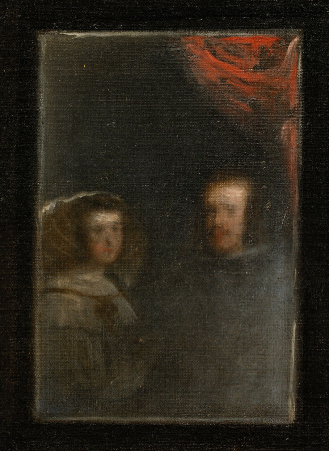
There has been dispute over whether the reflection shows the royal couple stood where the viewer is, or the mirror is reflecting their painted images on Velázquez’s canvas. How their images were generated is probably of secondary importance, as either way the gaze of most of the other figures is clearly directed not at the viewer, but at the King and Queen, who may be getting up to leave after sitting for Velázquez to paint them. In this reading, the most important people not in the painting only appear in reflection and the gaze of others.
Mirror play continued in a few more paintings up to the late nineteenth century.

Domenicus van Wijnen’s Witches’ Sabbath by Moonlight is set in a moonlit Italian landscape. This combines many of the now-classical symbols associated with ‘the dark arts’, and is taking place at an outdoor altar set up at the foot of the gallows, on which a dead body hangs. In front of the altar at the right is a soldier in armour, who is looking in a mirror at the image of another.

In about 1871, Alfred Stevens introduced a large mirror into The Psyché (My Studio). The French word psyché refers to the full-length mirror seen in this apparently informal view of Stevens’ studio, the name deriving from the legend of Cupid and Psyche. For this painting, Stevens doesn’t actually use a proper psyché, but has mounted a large mirror on his easel, perhaps to suggest that art is a reflection of life. A Japanese silk garment is draped over the mirror to limit its view to the model, breaking up her form in an unnatural way.
In the late nineteenth century mirror play became more popular, particularly in the paintings of Pierre Bonnard.
![]()