Portraits of trees: Introduction
Trees are prominent features of every continent apart from Antarctica, and even our more densely urban areas find room for a few of them. From our origins in East Africa to the city parks of New York, London and Tokyo, humans and trees have lived together. As a result, trees feature in a great many paintings. This series explores how they have been depicted in European and North American art from before the Renaissance to the early twentieth century.

Like many artists since, Peter Paul Rubens made studies of trees to support his studio paintings in oils. This one, known simply as Landscape, is a careful and quite detailed sketch in gouache (opaque watercolour) of a group of trees on the bank of a small river, painted during the last five years of his life. The evidence from the tree in the mid-right is that he constructed them anatomically, by putting in the structural curves and lines of the branches, then laying down areas of foliage, a method developed during the Renaissance and still widespread today.
This practice of painting studies from life was recommended by the great landscape artist and teacher Pierre Henri Valenciennes (1750-1819), who wrote in his book Elements of Practical Perspective for the Use of Artists:
“Be sure to make several painted studies of beautiful trees, whether standing alone or in groups. Pay close attention to every detail of the bark, moss, roots, branches, and the ivy that surrounds and clings to them; above all, make good choices and study the variety of wood, bark, and foliage, which is of the utmost importance.” (Second edition, 1820.)
Landscape specialists like John Constable painted studies of trees throughout their career, to inform finished works.
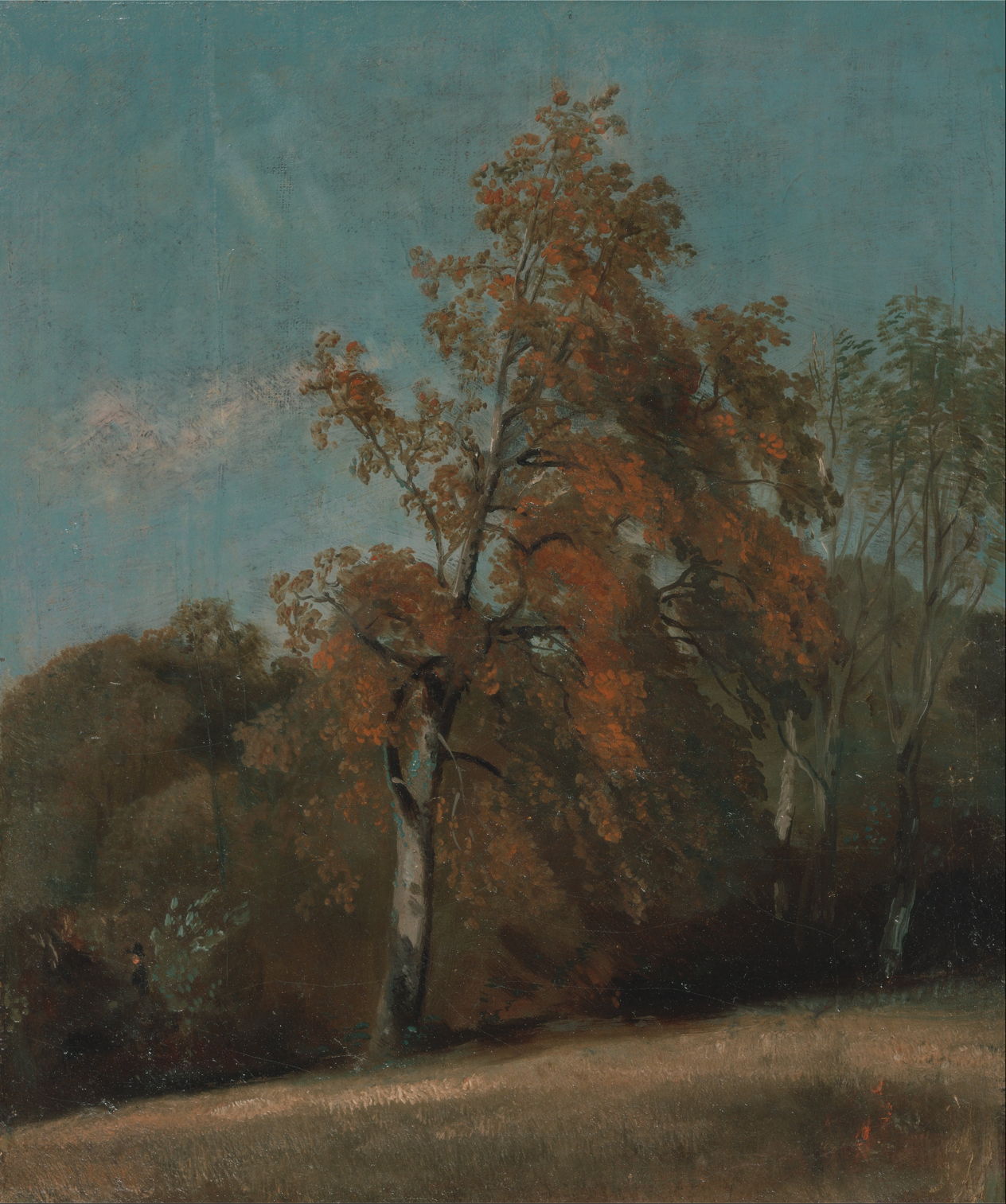
He learned to create plein air sketches in oils, which he used extensively for ‘skying’ particularly around Hampstead Heath near London, and for remarkable studies of trees, such as this ash, seen in its autumn colours. Here he too has taken the time to construct the tree anatomically, and to detail its foliage.
This continued through the middle of the nineteenth century, when landscape painting was evolving towards Impressionism.
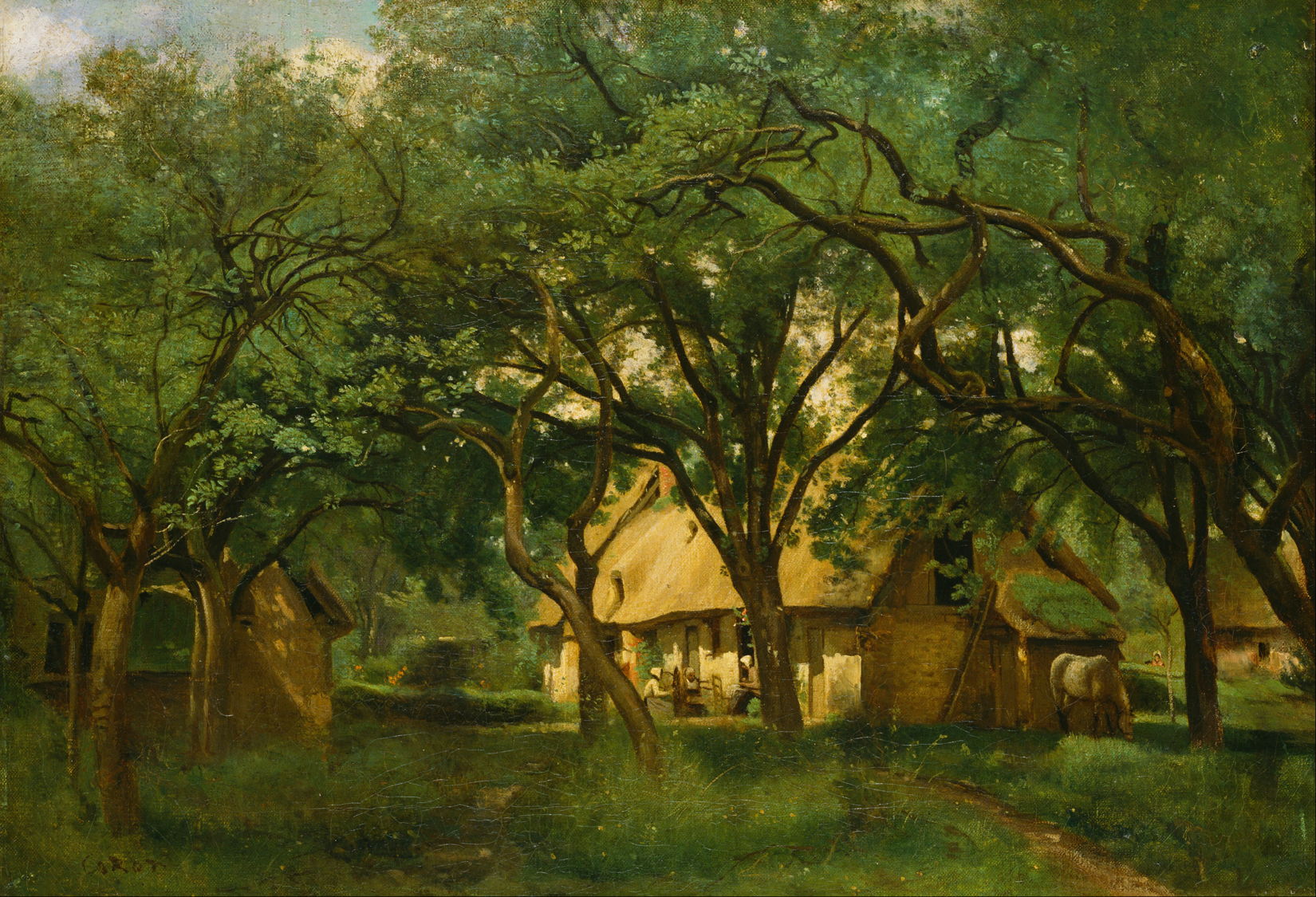
Camille Corot’s The Toutain Farm, Honfleur from about 1845 appears to be a finished studio painting, perhaps intended for the Salon. Its trees are marvellous and all but obscure and upstage the farmhouse beyond. Their sinuous limbs reflect his structured approach to painting their canopies with a catalogue of ways the trunk can give rise to branches. The canopy itself is shown in careful detail, although at the upper left it seems more vague and sketchy.
Europe has a rich and varied flora of tree species, and one of the challenges in painting its landscapes has been to capture their distinctive characteristics.

Jacob van Ruisdael gave insight into the stages in the life and looks of oak trees. In Road through an Oak Forest (c 1646-7) he captures the later life of a stag-headed oak on the left, which lost its crown long ago, a flush of new growth on a fallen trunk, and another still clinging onto life despite a great split at its base. Judging by the girth of their trunks, the oaks shown here are around 400 years old, making it likely they were saplings in the thirteenth century, possibly even earlier. They form a remarkable window in time back to the late Middle Ages.

Camille Pissarro’s Big Walnut Tree in Spring, Éragny from 1894 celebrates a species that is a source of binder in oil paint, in walnut oil, although it’s used far less frequently than linseed. Its wood is also sought after, making this tree a long-term investment for the landowner’s heirs.

Vincent van Gogh’s Cypresses (1889) are some of the best-remembered of all. As he moved style on beyond Impressionism, his swirling brushstrokes form solid but thoroughly living trees. These are most probably Italian cypresses, which are characteristic of the landscape around the Saint-Paul-de-Mausole asylum where he was living at that time, and throughout Provence.

In his Olive Grove (1889), those swirling strokes of foliage complement the tortuous curves of the branches and gnarled blue-grey trunks.
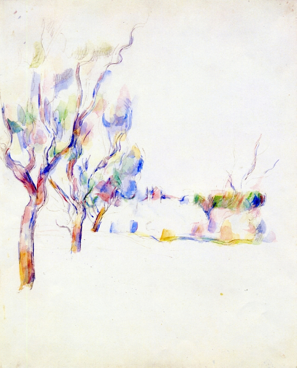
Paul Cézanne’s oil paintings of trees, although abundant, show his emphasis on patterned brushstrokes in what is known as his constructive stroke. This isn’t true of his watercolours, as shown in Almond Trees in Provence (1900), where each tree rises in a flare of brilliant colours.
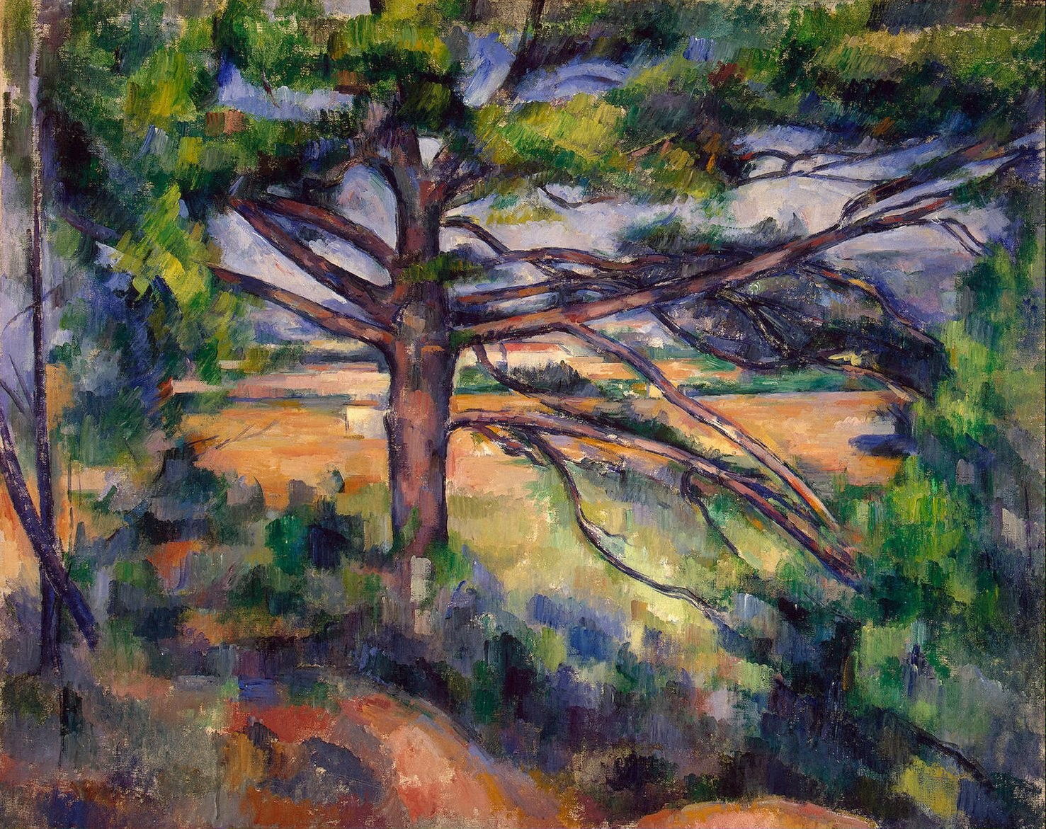
Cézanne’s constructive stroke became more prominent and started to dominate the structure of his oil paintings after 1890. In Large Pine and Red Earth (1890–5) it’s used throughout the foreground foliage and vegetation, and has even started to appear in some patches on the trunk.

Finally, Théo van Rysselberghe’s Pine by the Mediterranean Sea (1916) appears almost as substantial as the bleached rocks below it. Contrast between the lit segments and those in cast shadow behind is wide, as is seen on the shores of the Mediterranean.
I hope you will join me in exploring these and many other fine portraits of trees over the coming weeks.
![]()